VIVVIRA
Vivvira-Supplement
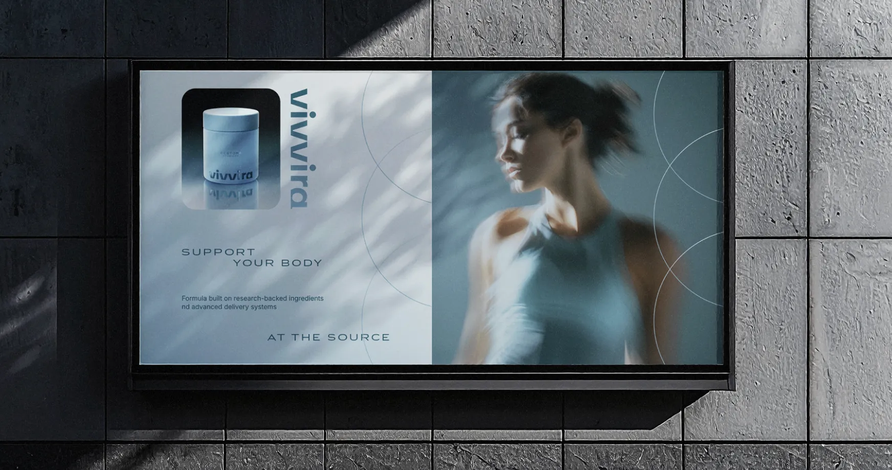
Vivvira is a modern wellness brand focused on restoring balance through clinically studied synbiotics, combining probiotics, prebiotics, and postbiotics into one intentional daily ritual.
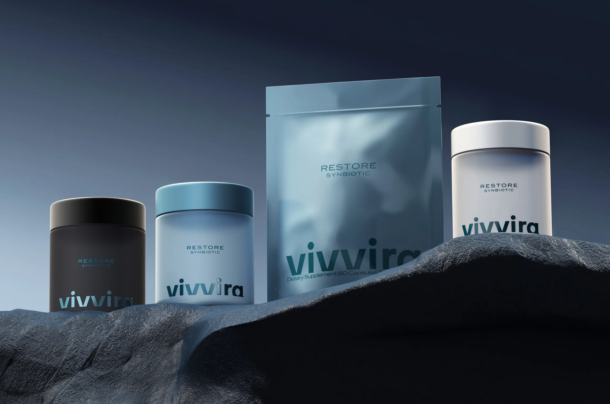
The brief Vivvira brought to MarkaWorks came with a constraint we agreed with immediately: no pharmaceutical cues. The category it enters is full of cold, clinical aesthetics, and copying them would have made the brand credible in exactly the way it did not want to be.
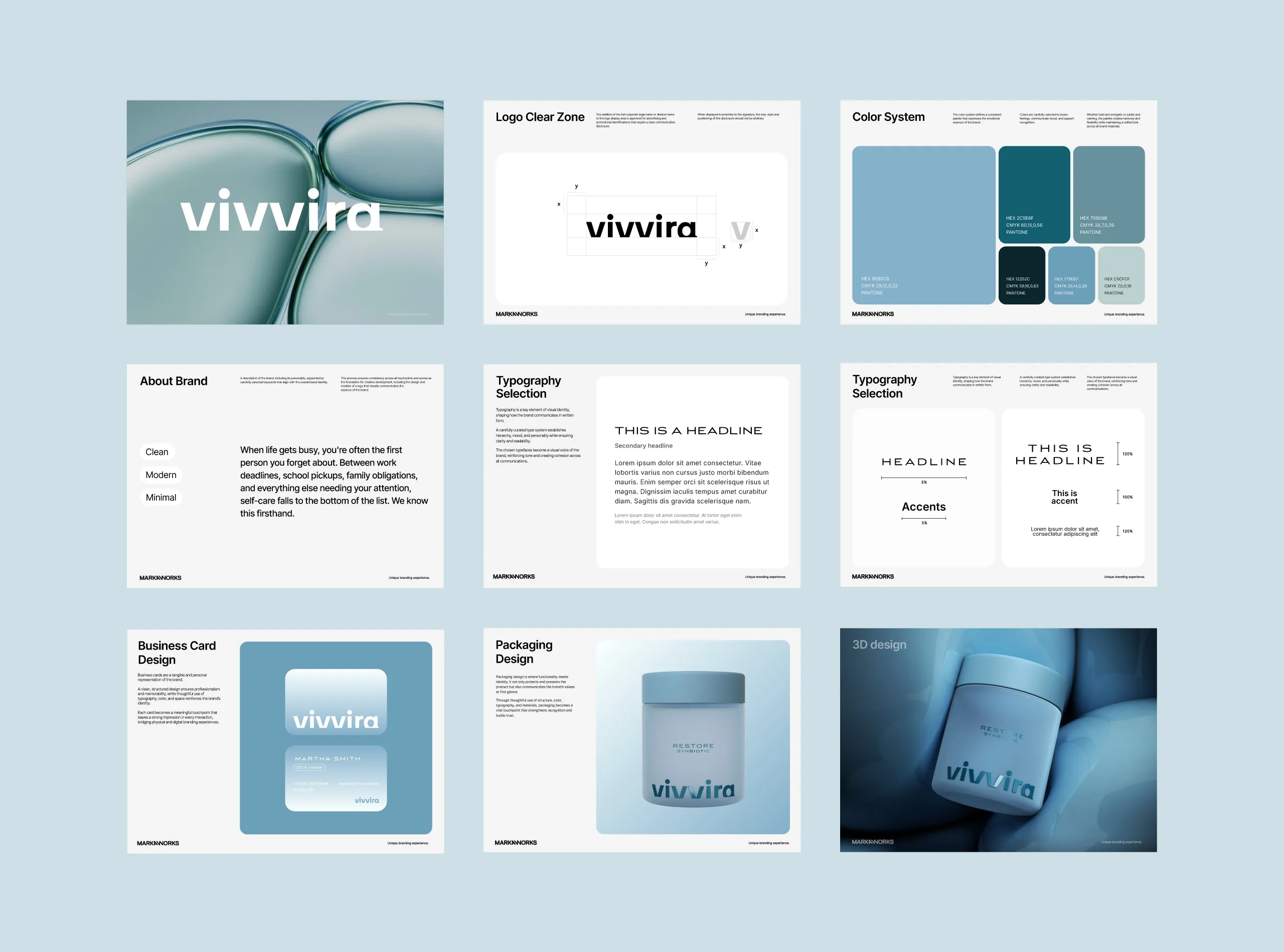
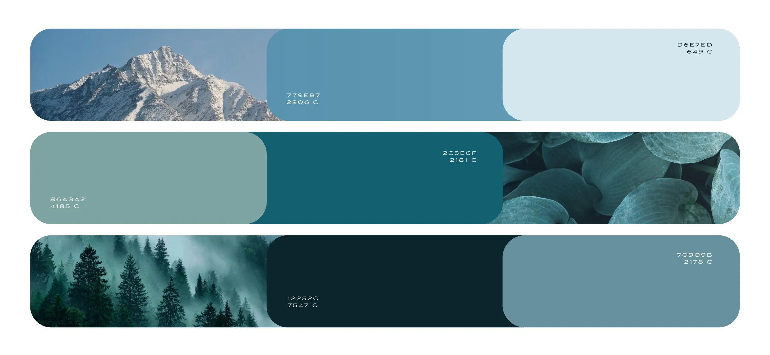
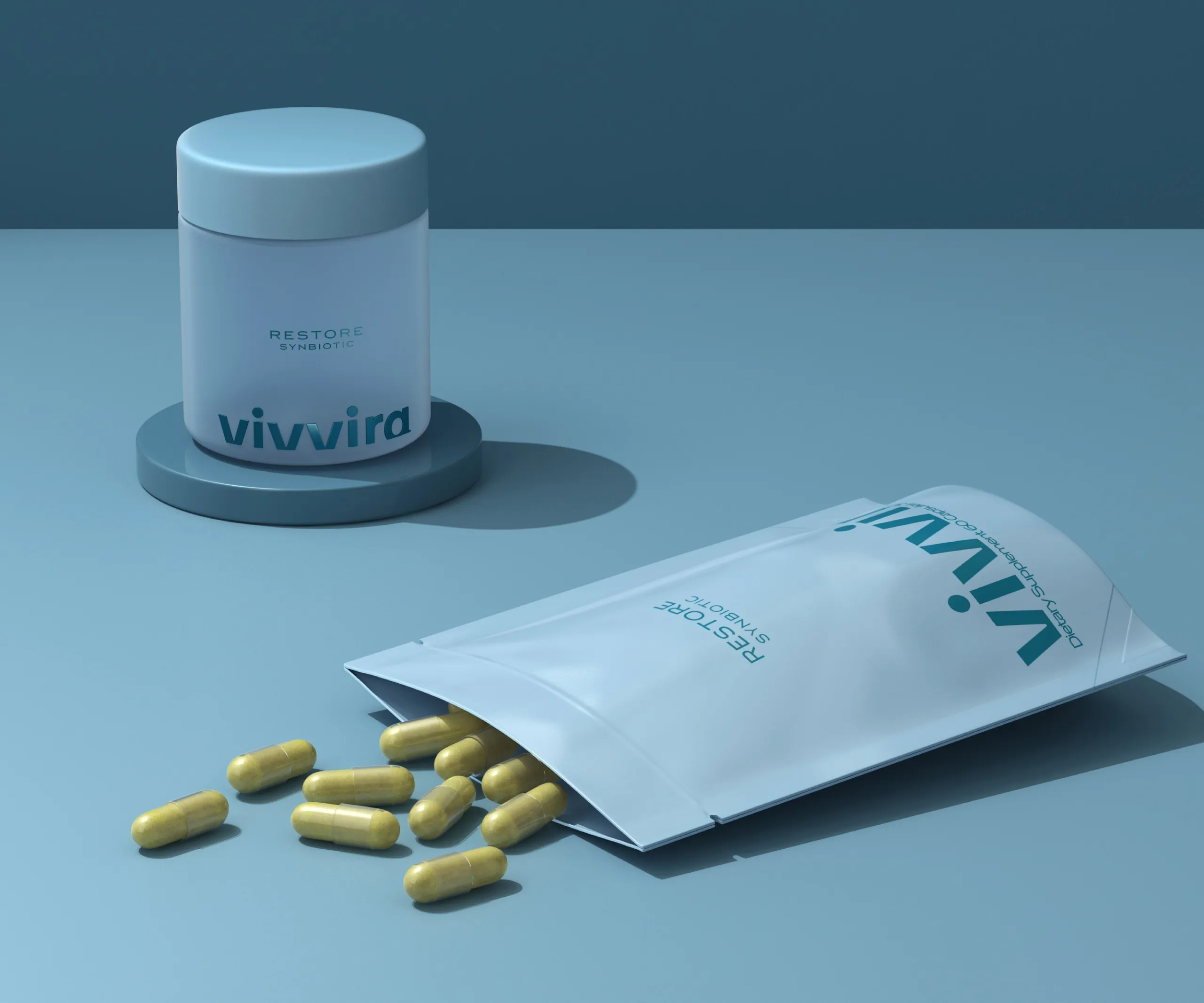
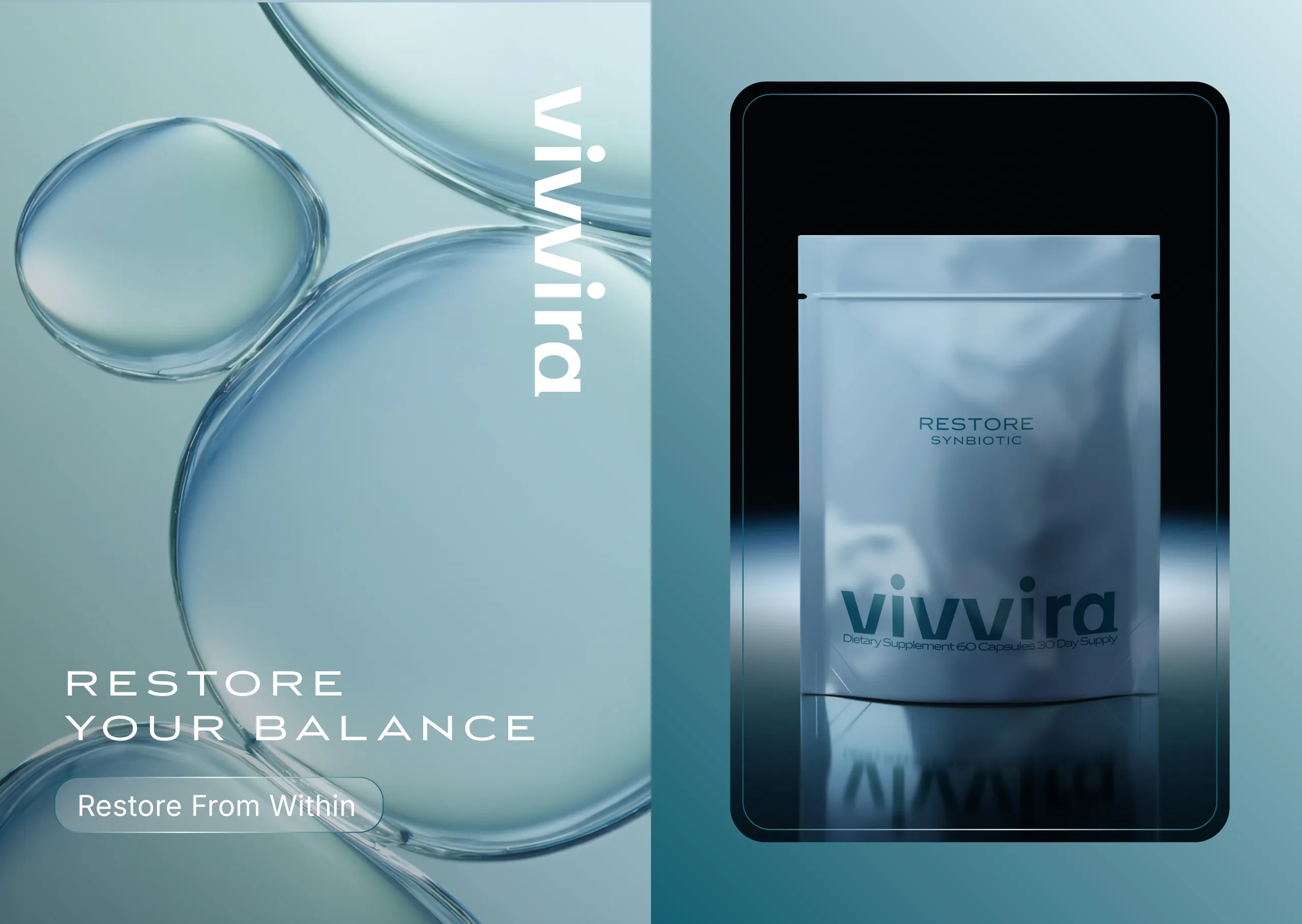
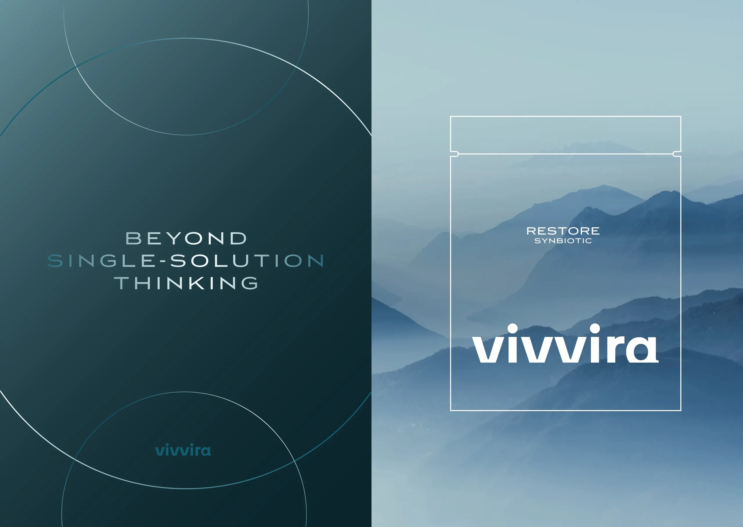
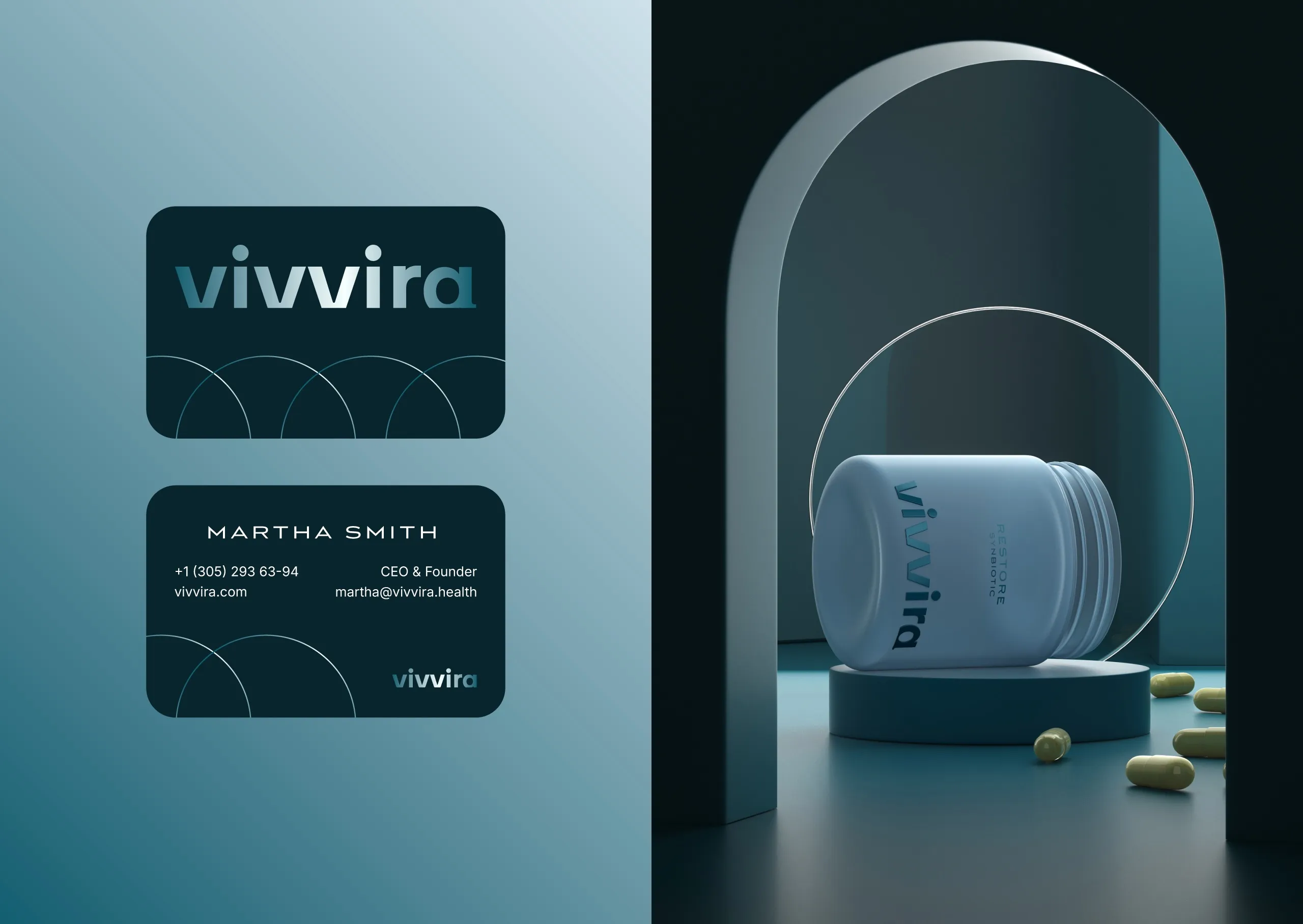
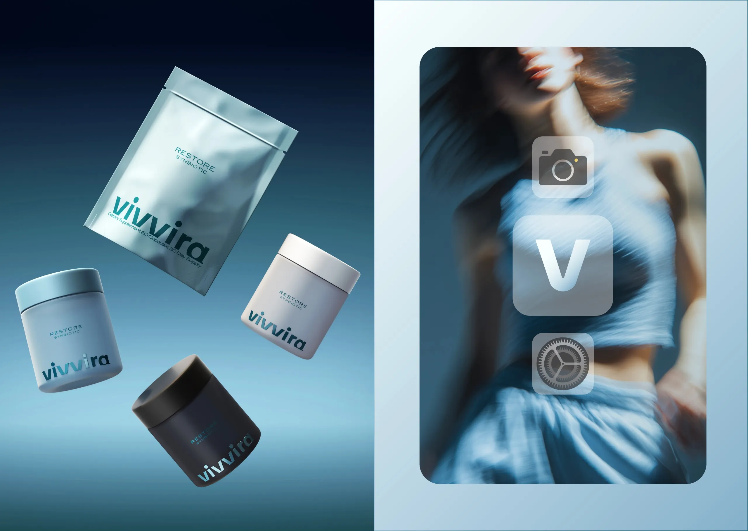
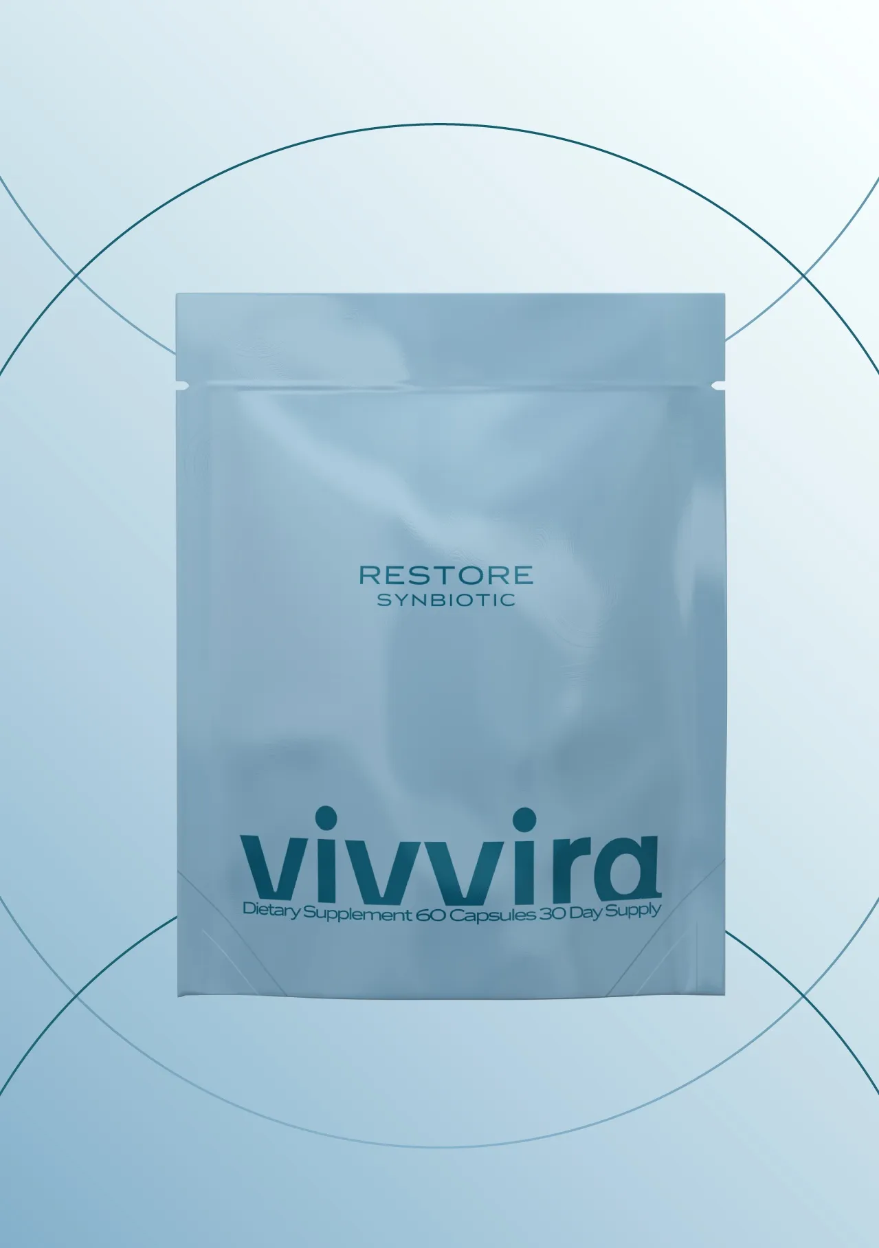
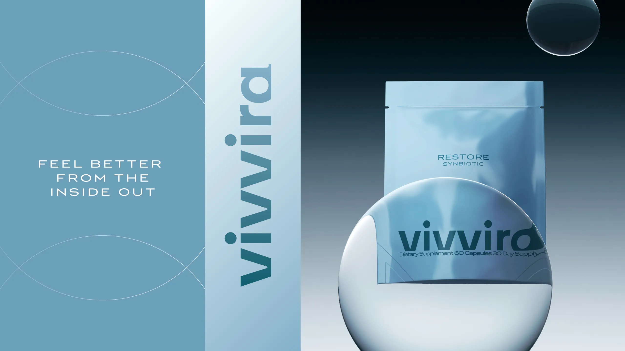
So the packaging design was built from the opposite direction, around clarity and calmness rather than around signals borrowed from medicine. The soft blue color system sets the temperature: present enough to feel considered, quiet enough that it never reads as institutional. Minimal typography carries the information without dressing it, which matters in a category where dense labelling is the norm and where restraint reads as confidence.
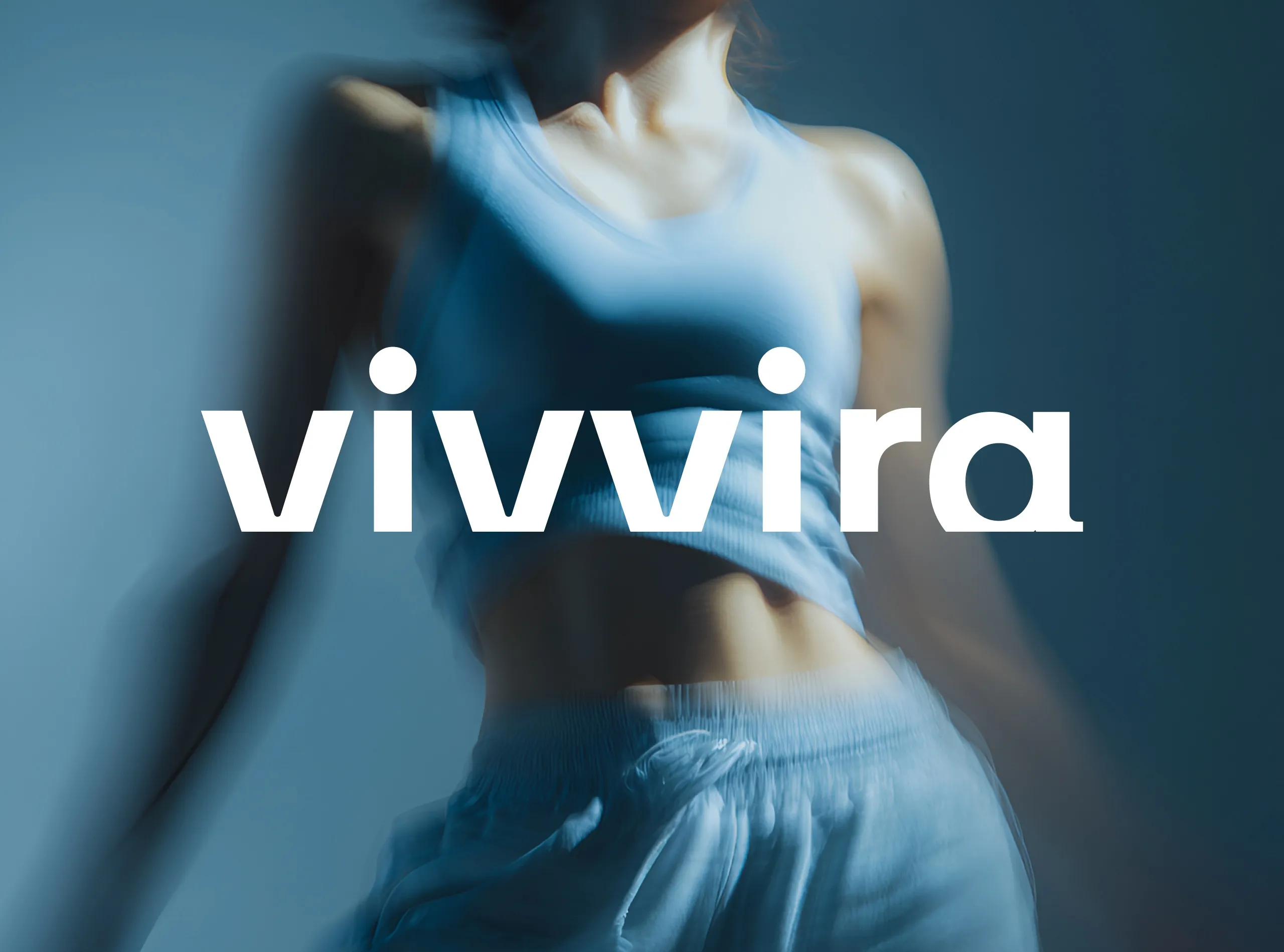
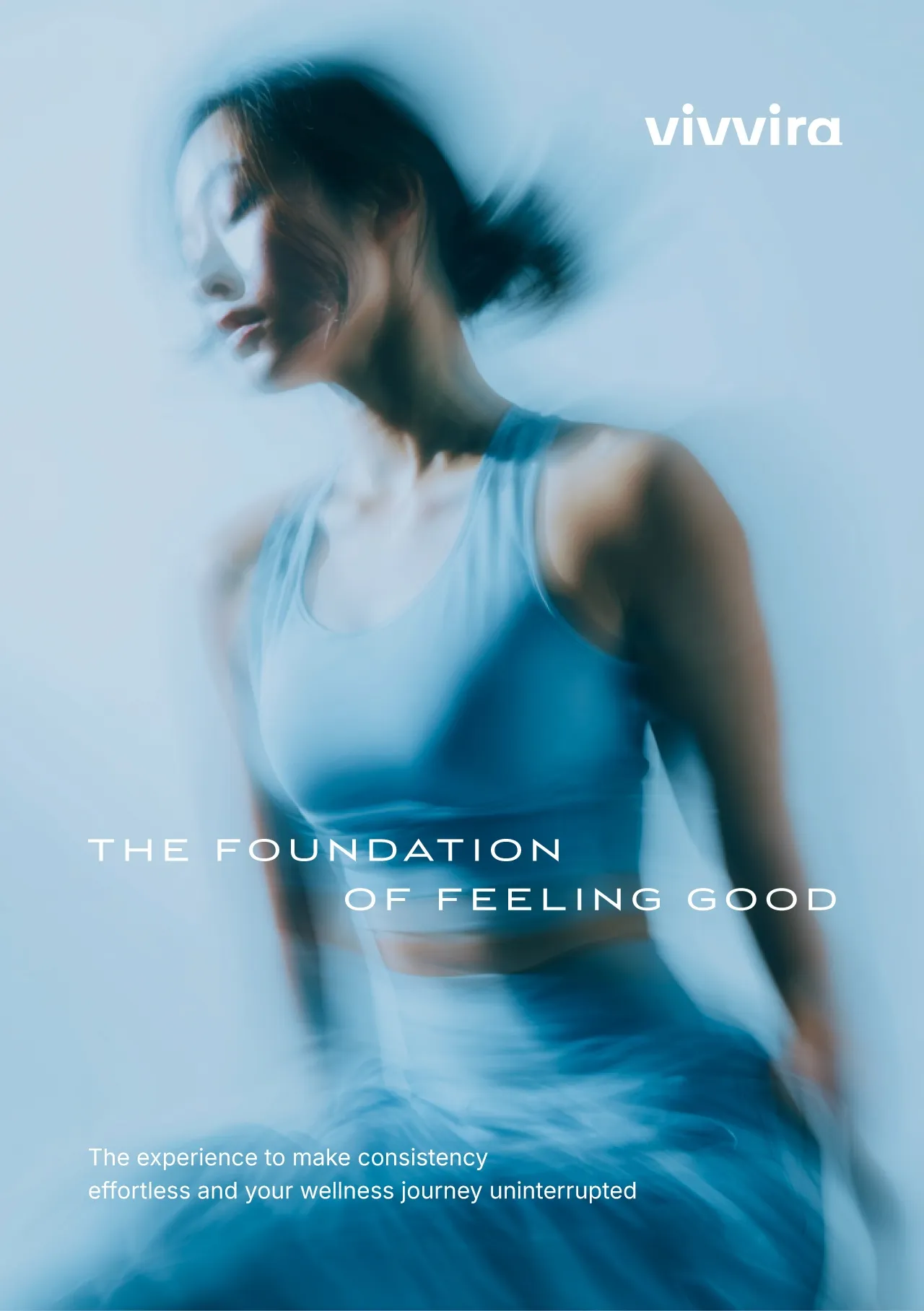
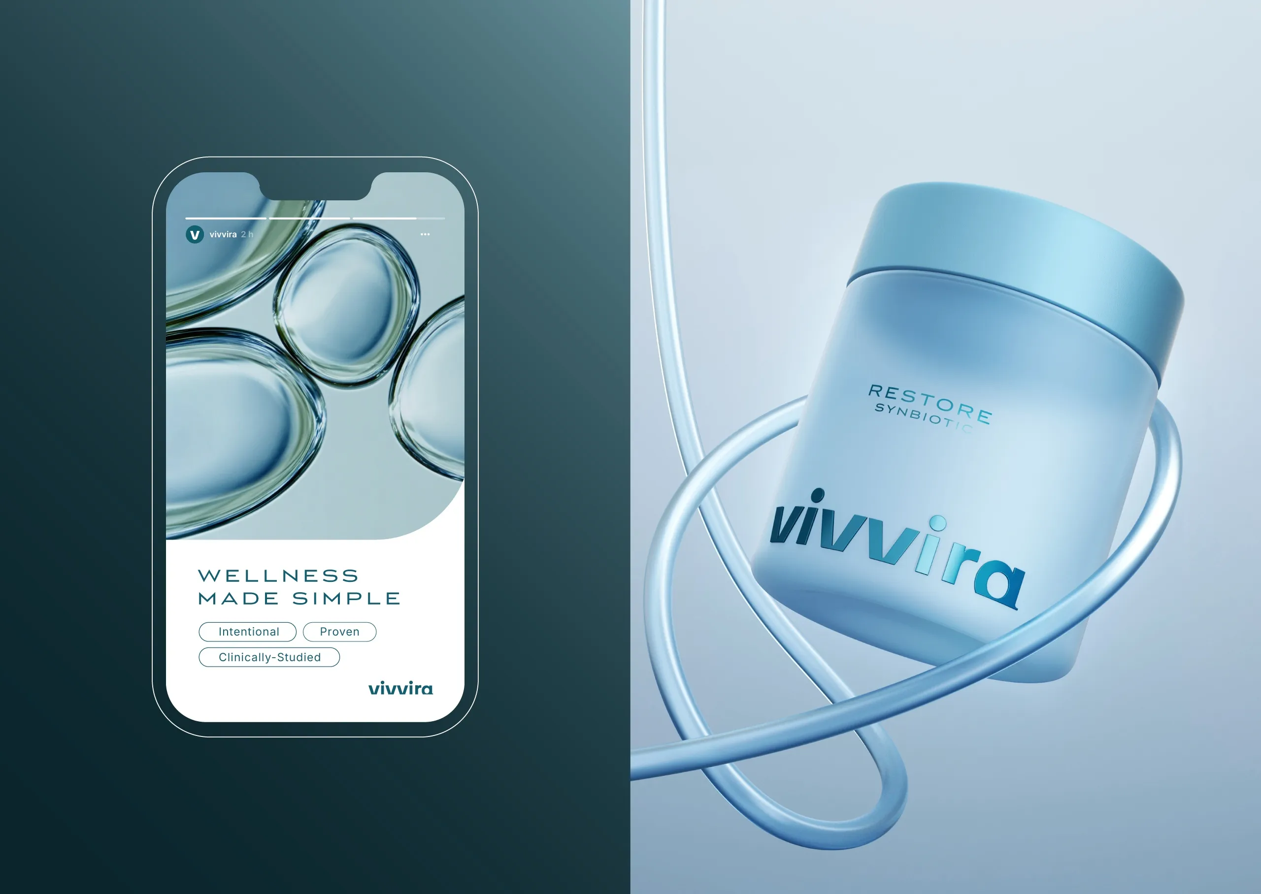
Minimal here also means edited rather than empty. Every element left on the pack has a reason to be there, and the ones that were removed were removed because the information they carried was already being carried somewhere else. Fluid forms and atmospheric imagery do the emotional work. They are the part of the system that keeps the brand from feeling austere, and they are deliberately soft edged, because the alternative, hard geometry, would have pulled the identity straight back toward the clinical language we set out to avoid.
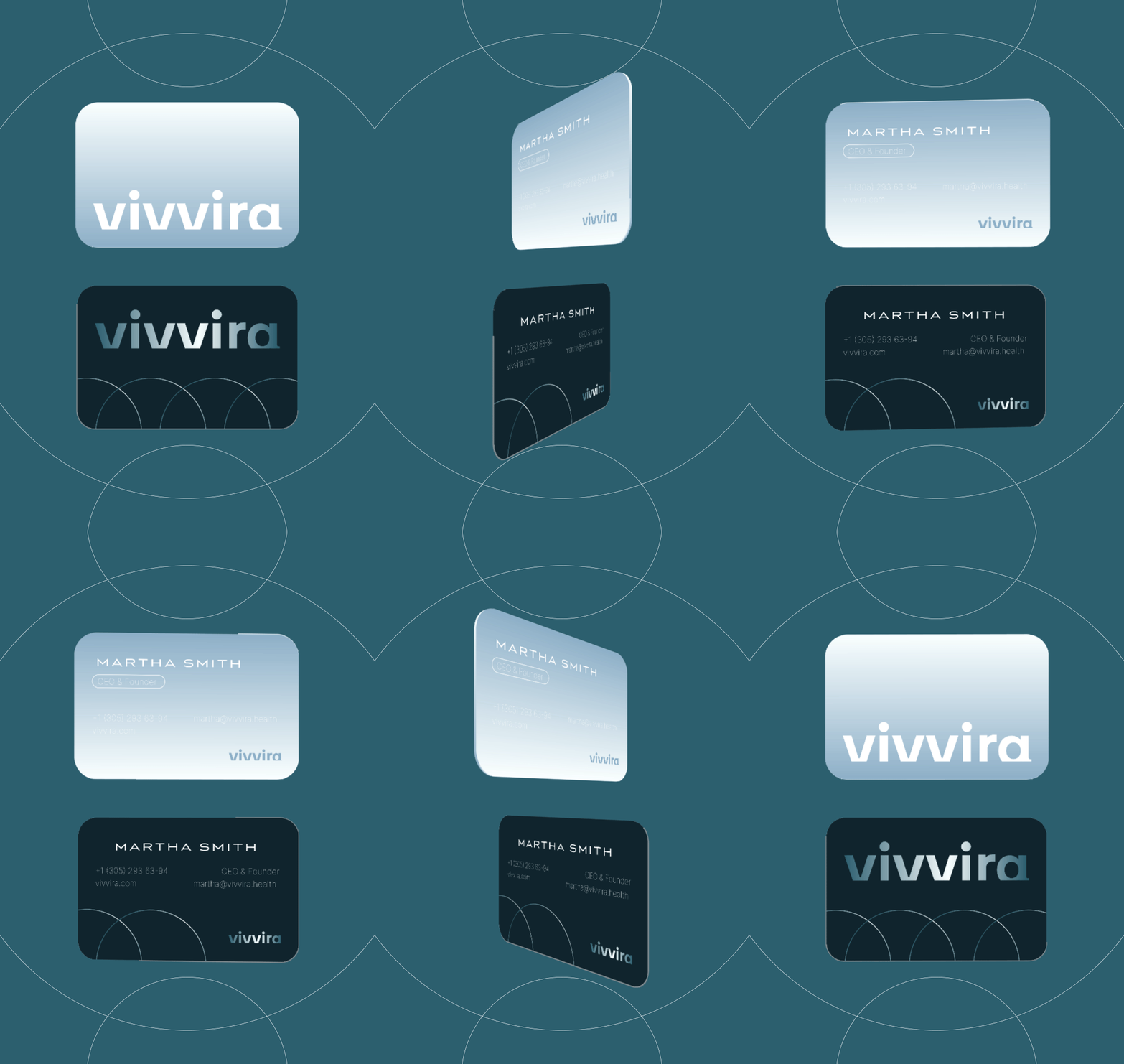
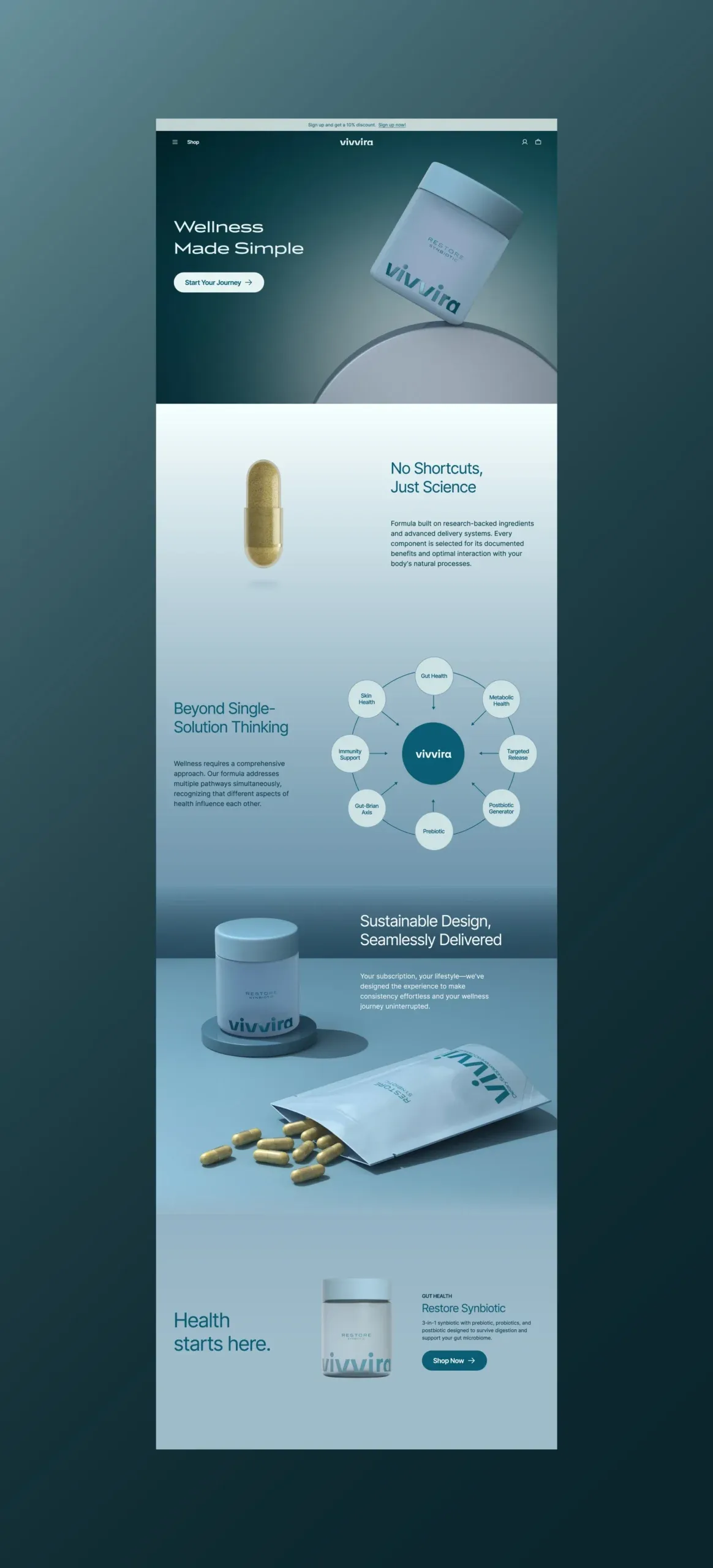
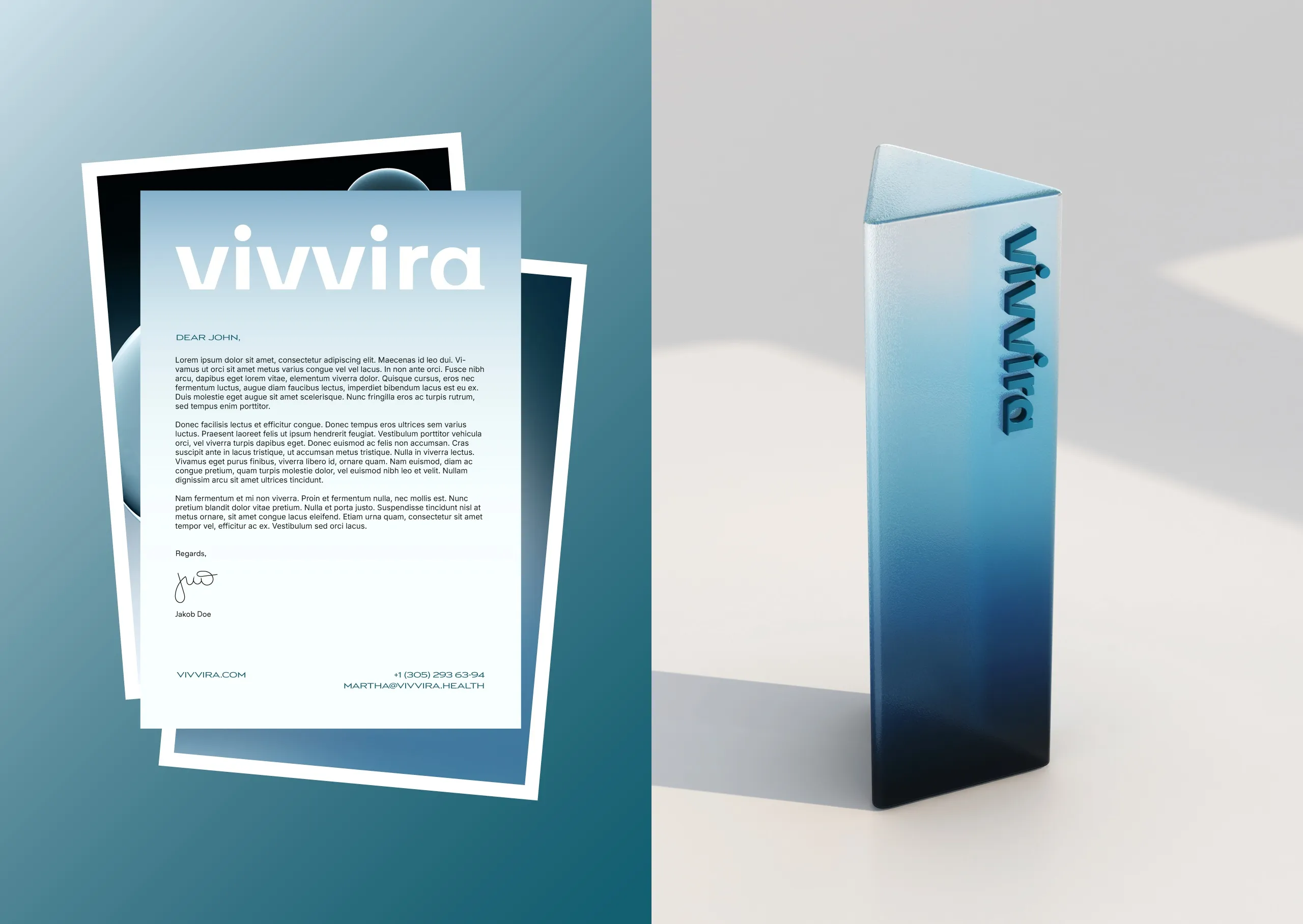
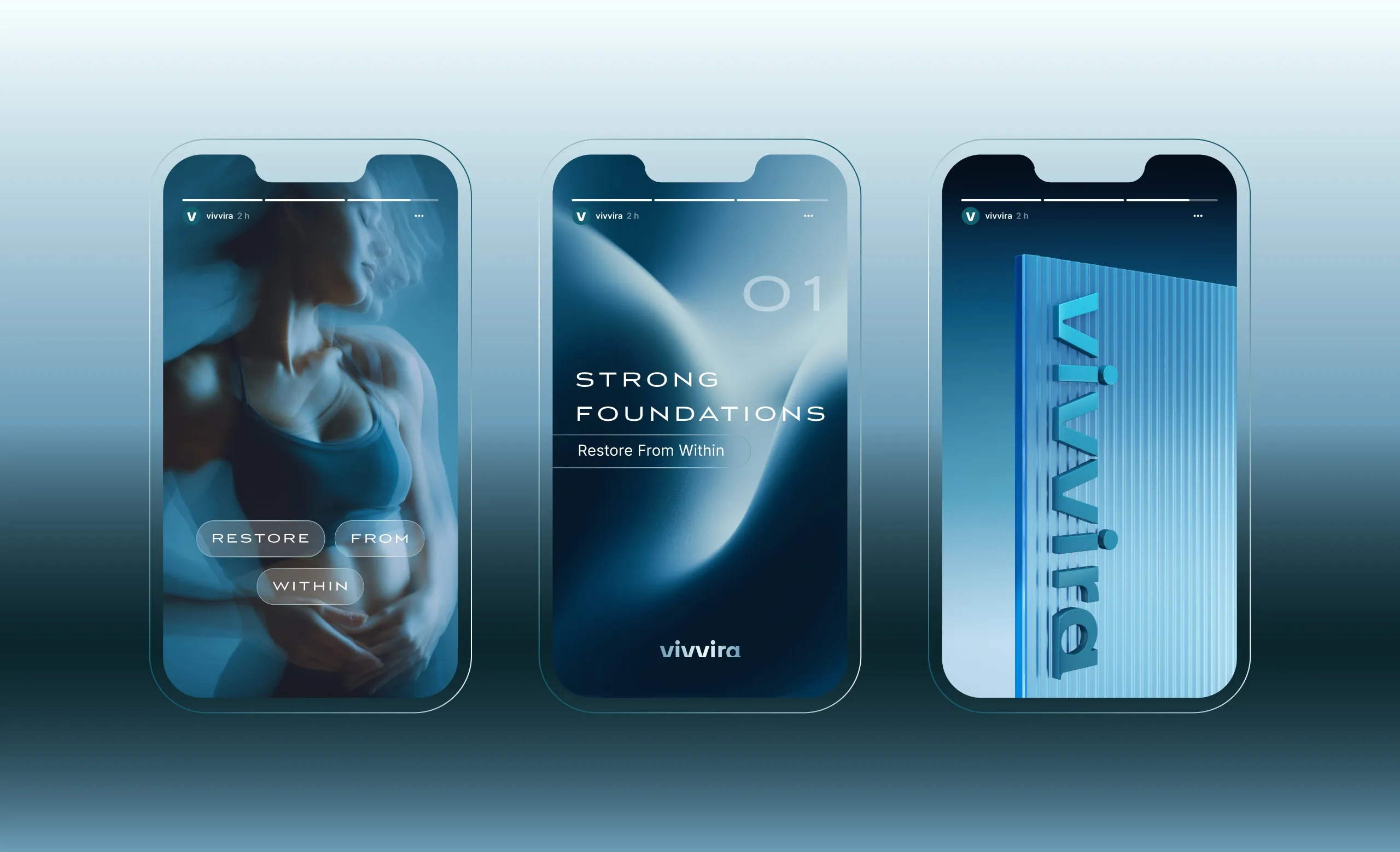
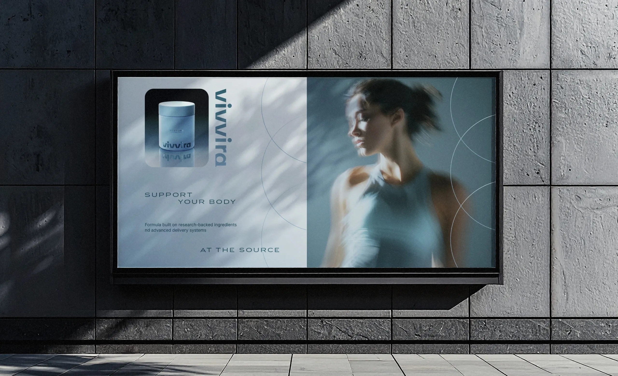
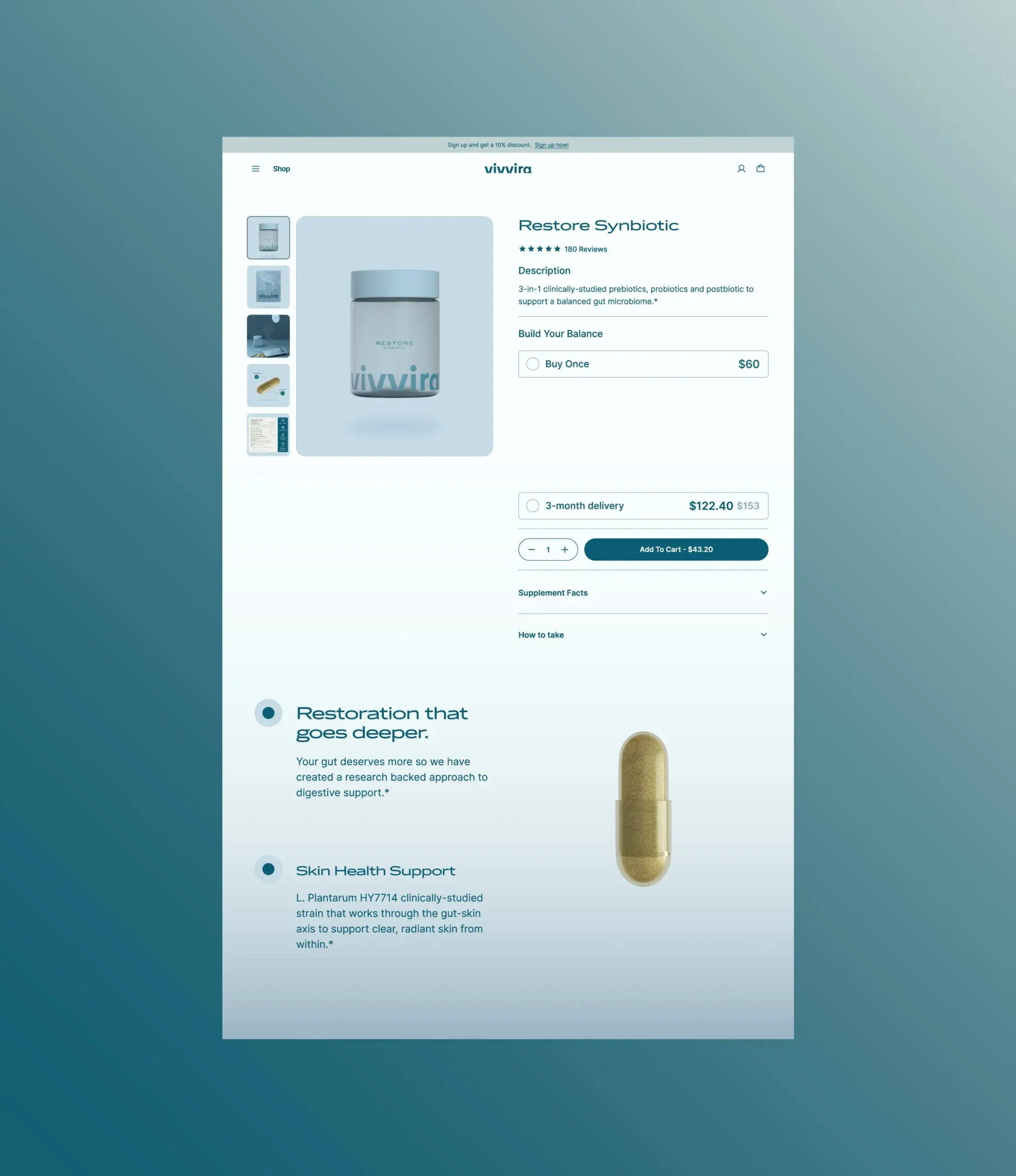
The system was designed as one ecosystem rather than as a pack plus a website. Product packaging, digital experiences, social content, and brand applications share the same rules, so a customer meeting the brand on a shelf and a customer meeting it on a phone are meeting the same thing. That consistency is not a finishing touch here, it is the mechanism: a brand built on calmness cannot afford a touchpoint that behaves differently from the others.
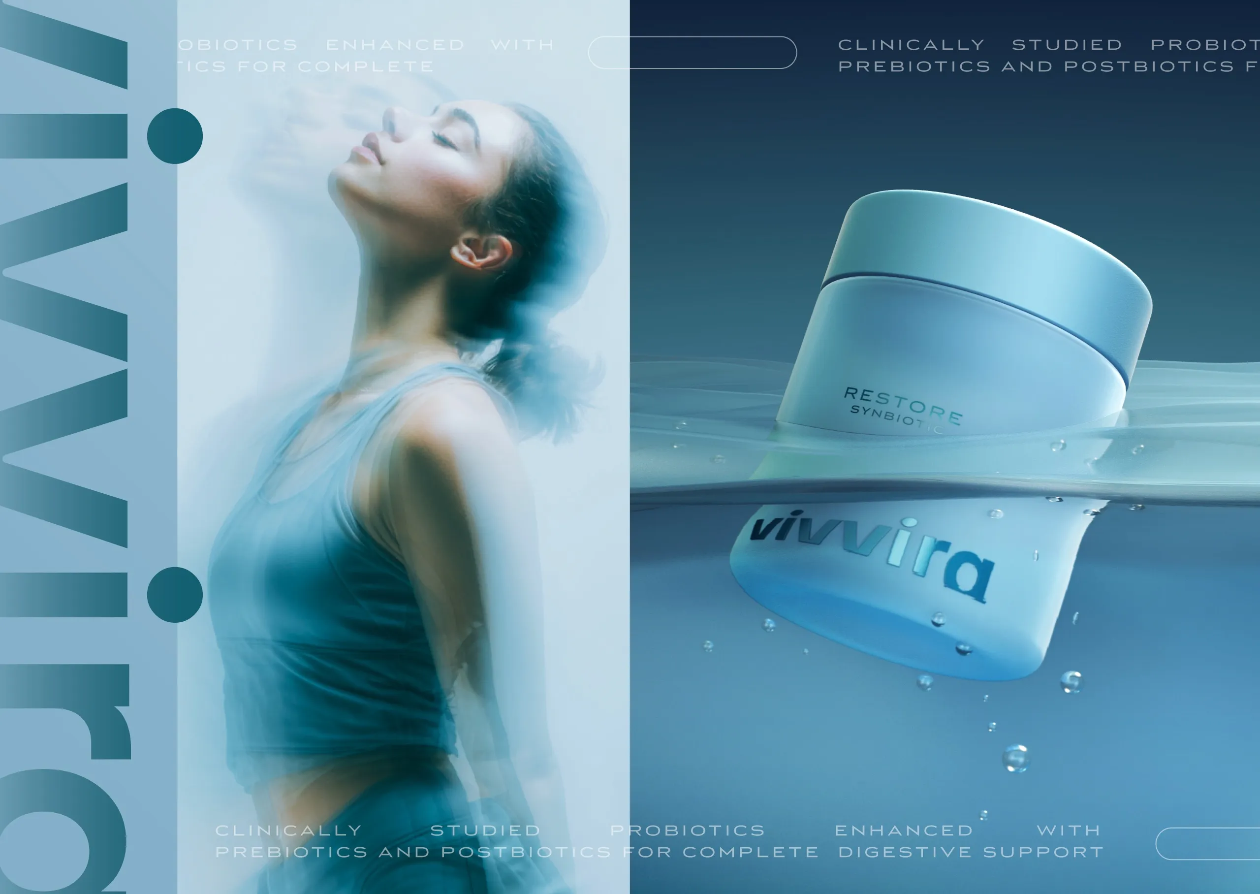
The imagery deserves a note of its own. Atmospheric photography is usually the first thing to drift when a system is applied by different hands, because it is the element with the fewest hard rules. Here it is anchored to the same soft blue temperature and the same generous spacing as the rest, so it stays inside the system even when the subject changes.
What Vivvira ends up with is a brand world that feels approachable, considered, and contemporary, built by subtraction rather than by adding reassurance. Nothing in the system is there to convince; the design lets the product be examined on its own terms, which in this category is the more confident position.




Let’s make the work they’ll copy.
Talk to an expert now
Work with a 38 team of the
industry’s top 1% talent.



