Updated October 2026
Coffee and tea branding: 20 case studies
The 20 MarkaWorks case studies on this page are 14 in coffee, 5 in tea and 1 for a cafe, and every case shows the finished work. The problem is the same on almost every bag: origin, roast and tasting notes have to be read in order on a small label, and the range has to stay one family as new origins arrive.
What a coffee label has to carry
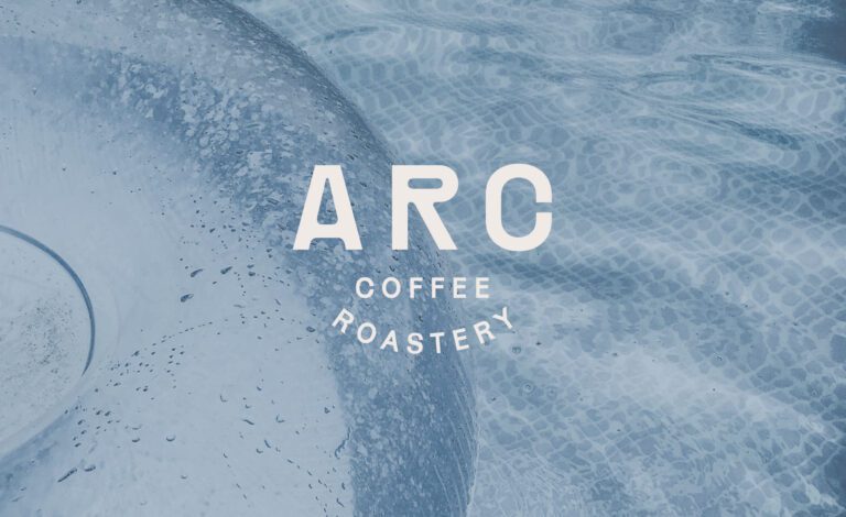
Coffee packaging design is the label and bag system that tells a buyer origin, roast and taste before the bag is opened, together with the identity that makes a range read as one brand. A coffee bag carries more product information than its size suggests, and the buyer comparing two bags looks for the same things in the same order. On Arc Coffee Roastery the labels put origin, roast level and flavor profile first, in a structured layout, with typography doing the informational work. La Palma orders the label the way people choose coffee: origin, roast, then tasting notes. Roadster Coffee uses a modular label system where each of those three has a fixed place, so two bags can be compared without hunting. Its brand line, quoted on the case page, states the positioning in seven words: “fuel your journey with timeless coffee”.
Caffeinication makes a different point about the same surface. In specialty coffee the premium signals are exhausted: kraft paper, hand lettering, origin stories. So we treated the palette as product information. Rich browns, warm bronze and deep neutrals point at roasted beans and chocolate notes, because color is the one channel that can suggest the product before it is tasted.
Range systems that grow without a redesign
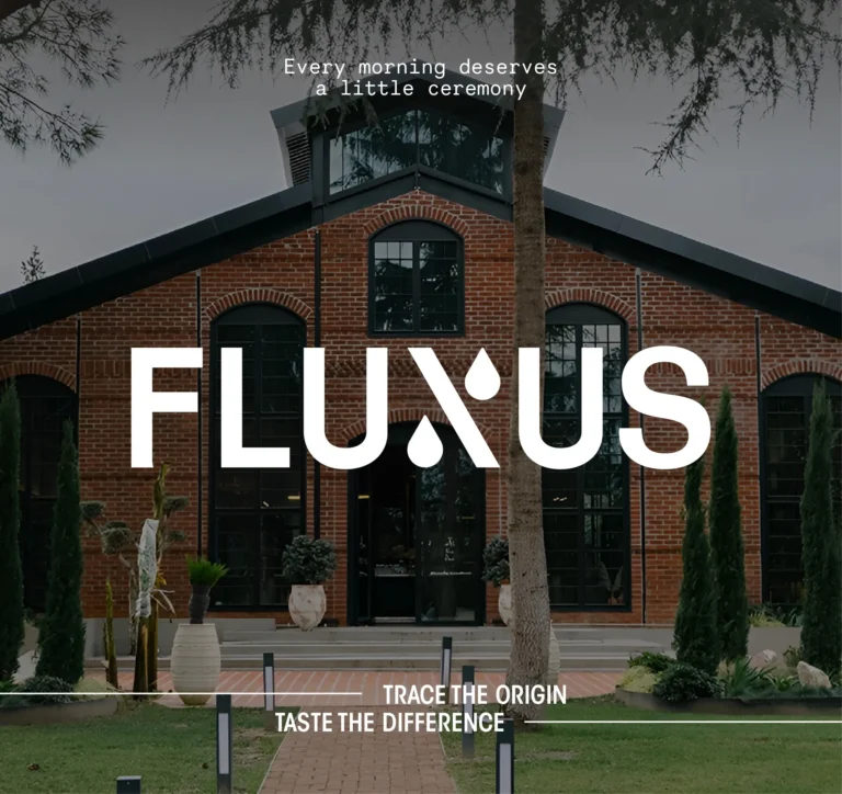
Range design is where coffee and tea branding usually comes apart, because every new origin or blend arrives as a new design problem. Fluxus came back to us as an established brand and the work was a rebuilt label structure: each origin reads on its own, the range still holds together, and a new origin enters the system without a new design. On the tea side, Sophia’s Tea has a pattern per flavor, drawn from one illustration and one color pair, and Dose Herbal Tea lets bright yellows, greens and soft corals sort the blends so a shopper finds a flavor at arm’s length. Mogan Tea fixes tea type, flavor profile and brewing guidance in one order on every label. YU, a Japanese tea brand covering Matcha and Hojicha, gives each tea its own color family, a bright green for Matcha and a burnt orange for Hojicha, so a buyer finds the tea by color before reading a word. Her ProperTea works by subtraction: a muted palette separates blends and the quiet reads as quality.
From the bag to the cup and the shop front
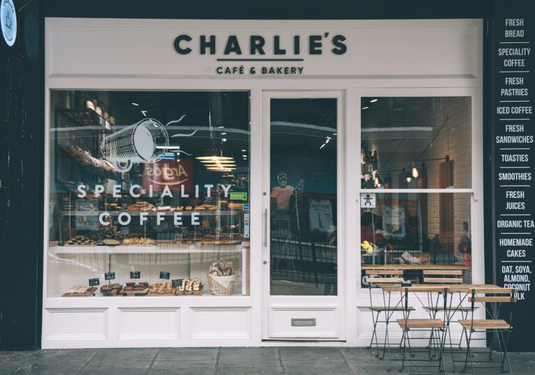
Most of these brands are read at several distances. Las Habitas Coffee Co. has two logo registers and two submarks so the same brand sits on a shop front, a cup, a bag and a juice bottle without being redrawn. Fluxus applies one hierarchy across packaging, cups, signage and digital, because a cup and a bag are glanced at rather than studied. Charlie’s Cafe Bakery holds to a monospaced logotype, a black and white palette and a pattern built from product icons, so that on a counter crowded with signage the brand says one thing. Roadster’s e-commerce build keeps the buying path short enough that the atmosphere does not become an obstacle.
Cases by product type
| Product type | Cases on this page | Examples |
|---|---|---|
| Coffee roasters and coffee brands | 14 | Arc Coffee Roastery, Caffeinication, Fluxus, Roadster Coffee |
| Tea brands | 5 | Dose Herbal Tea, Her ProperTea, Mogan Tea, Sophia’s Tea, YU |
| Cafe and bakery | 1 | Charlie’s Cafe Bakery |
The cases on this page
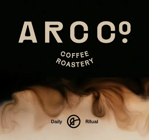
Arc Co Coffee Roastery: a specialty coffee brand built around sourcing, roasting precision and the individual character of each origin.
Arc Coffee Roastery: identity and packaging system designed together, origin and roast first on the label.
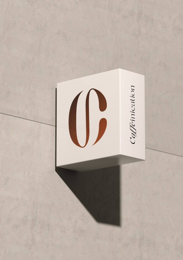
Caffeinication: monogram and expressive logotype, palette used as product information, textured and metallic packaging finishes.

Drop Co. Coffee Roasters: a modern identity built on bold typography and distinctive design elements.
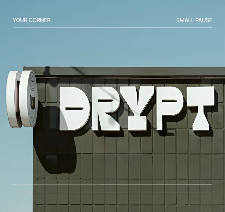
Drypt: a bold geometric emblem that survives signage, bag, merchandise and profile picture, with icons, patterns and palette built around it.
Fluxus: an established identity refined rather than replaced, label structure rebuilt by origin. The 2020 identity is on its own page.

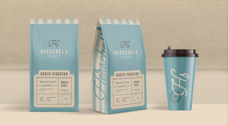
Herschel’s Coffee Co.: logo and packaging built around vintage charm and boldness.

La Casiana Coffee: a coffee shop identity combining classic typography with modern elements.
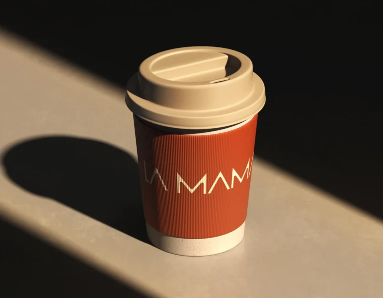
La Mama: order as the argument, clear hierarchy and structured grids across packaging and digital.
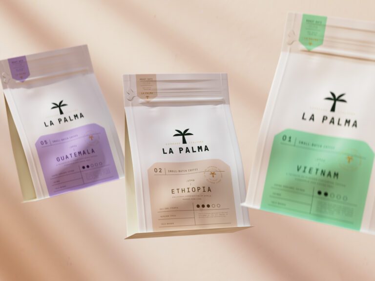
La Palma Coffee: a palm symbol and transparent material that shows the coffee, information ordered origin, roast, tasting notes.

Las Habitas Coffee Co.: two logo registers and two submarks for a growing coffee house.
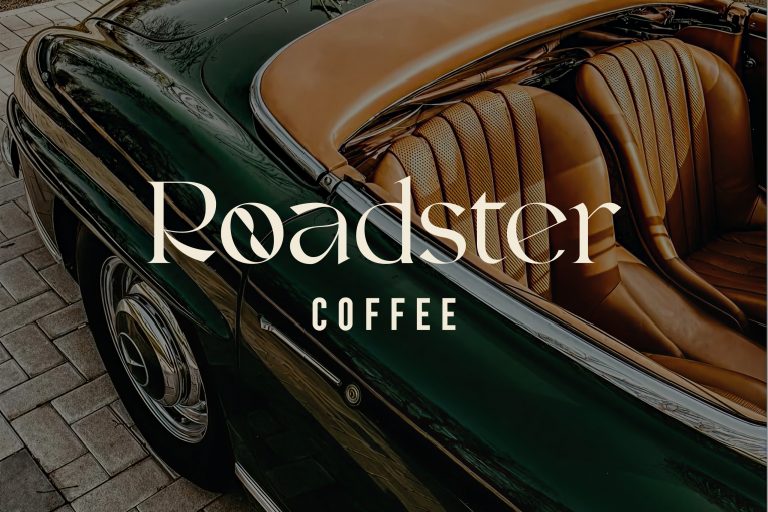
Roadster Coffee: a custom logotype drawn from vintage automotive lettering, a modular label system and 3D renders before production.
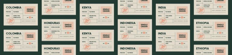
The Supreme Roastering Co.: vintage and minimalist principles balanced in typography, palette and packaging.

Dose Herbal Tea: color does the sorting, illustrated leaf and fruit patterns keep the range in one family.
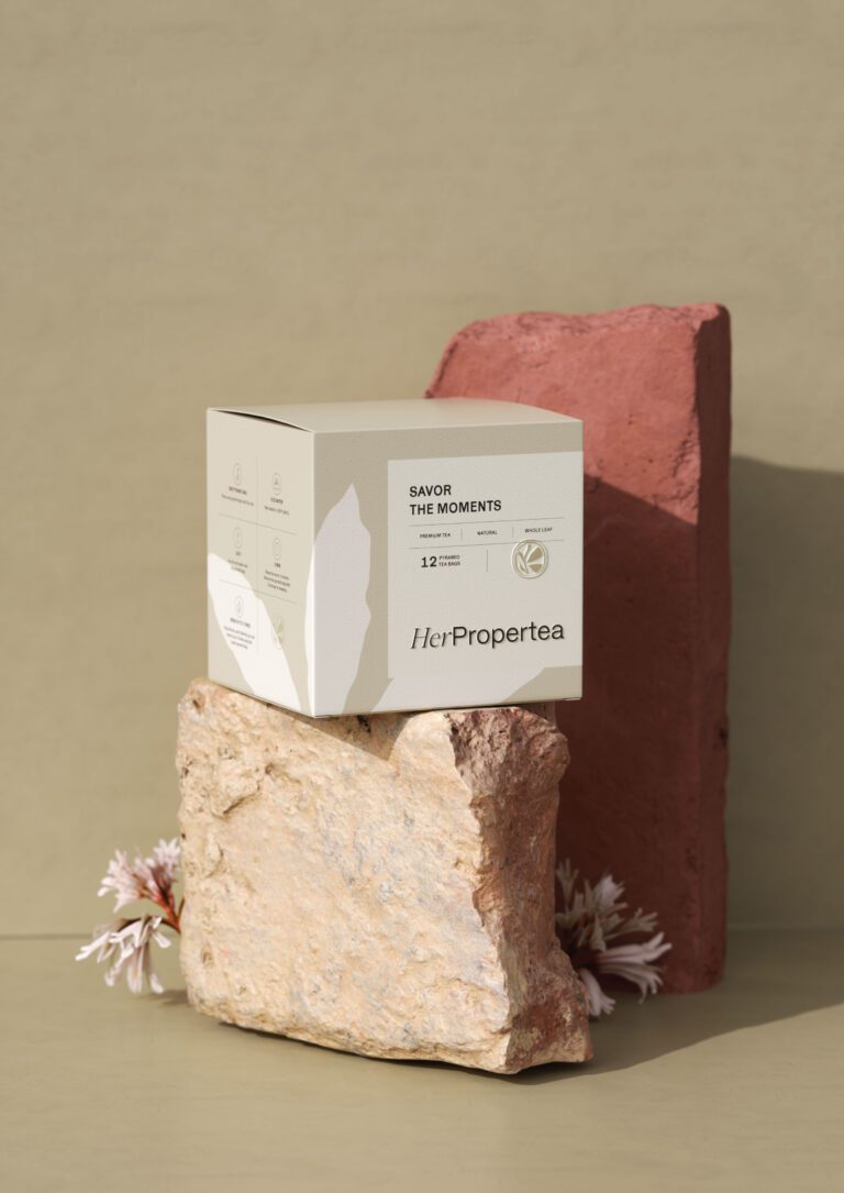
Her ProperTea: clean layouts, generous spacing, a muted palette that separates blends.
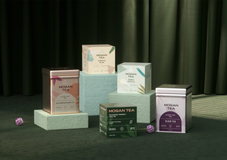
Mogan Tea: tea type, flavor profile and brewing guidance in a fixed order on every label.
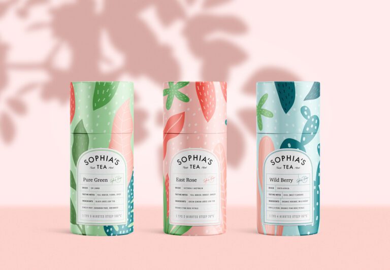
Sophia’s Tea: a sans serif chosen over a script for credibility, a pattern per flavor, brewing instructions on the label.
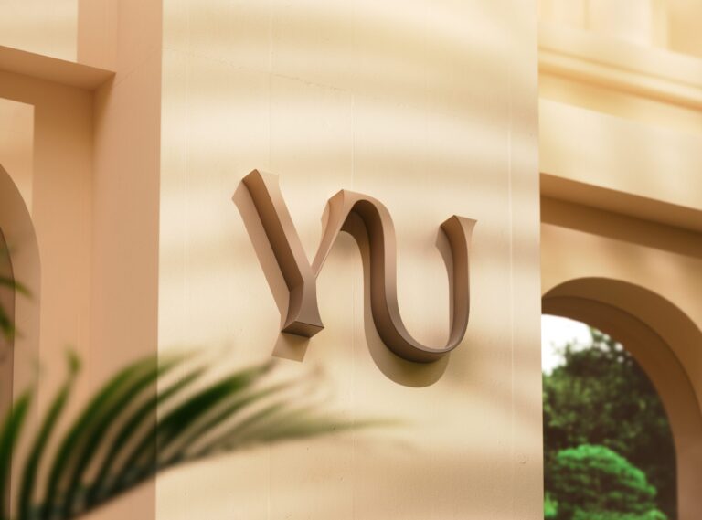
YU: a Japanese tea brand taken from naming to art direction, a color family per tea, a serif for the register and a sans for the small sizes.
Charlie’s Cafe Bakery: monospaced logotype with a single underline, black and white, a pattern from product icons.


Questions coffee and tea brands ask us
Coffee and tea is one of our deepest categories: Drypt, La Mama, Fluxus, Drop Co., Herschel's, La Casiana and Las Habitas on the coffee side, YU, Dose, Her ProperTea and Mogan Tea on the tea side, each with its own identity and packaging system.
Origin, roast and tasting notes, in that order, then the brand. Fluxus separates its coffees by origin with a clear label structure and a sharper typographic hierarchy, La Palma's labels run exactly that hierarchy, and Drop Co.'s carry processing, geography and flavor in a separated color block, so the buyer reaches the decision without hunting for it.
Coffee packaging stands out on a shelf through difference inside a family. Fluxus separates origins through label structure and a sharper typographic hierarchy, La Palma leaves the coffee visible through transparent material, and Drop Co. assigns a color to each flavor. In each the range still reads as one brand from a distance.