
Her Propertea
Designing a Modern and Feminine Tea Brand
Her ProperTea is a premium tea brand created to celebrate women, individuality, and refined taste. The name is a thoughtful play on the words Her Property and Tea, symbolizing ownership, self expression, and the freedom to define one’s own rituals. The brand positions tea not only as a beverage, but as a personal moment of calm, confidence, and intention.
Her ProperTea was designed to feel modern, simple, and distinctly feminine, with a strong emphasis on quality, craftsmanship, and emotional connection.
Brand Direction
The brand is built around the idea of tea as a personal choice, curated to reflect the owner’s taste and lifestyle. Each blend is selected for its rich flavor, premium quality, and natural character, creating a tea experience that feels intimate and elevated.
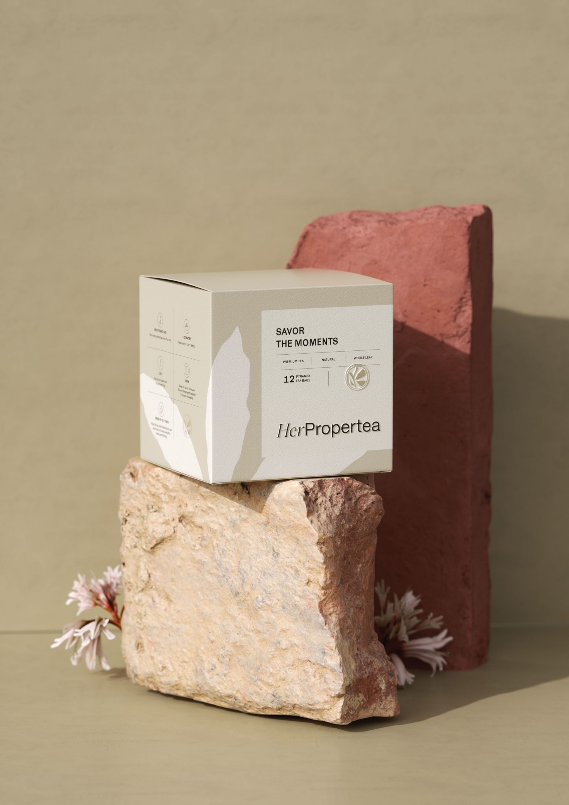
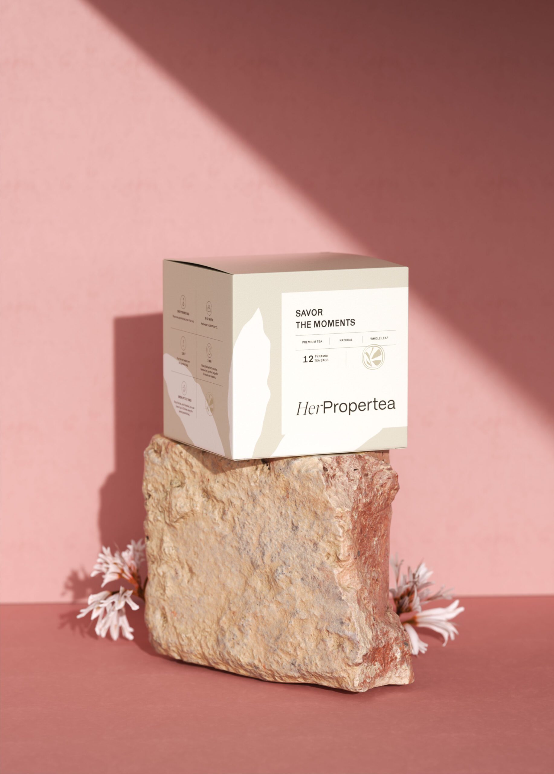
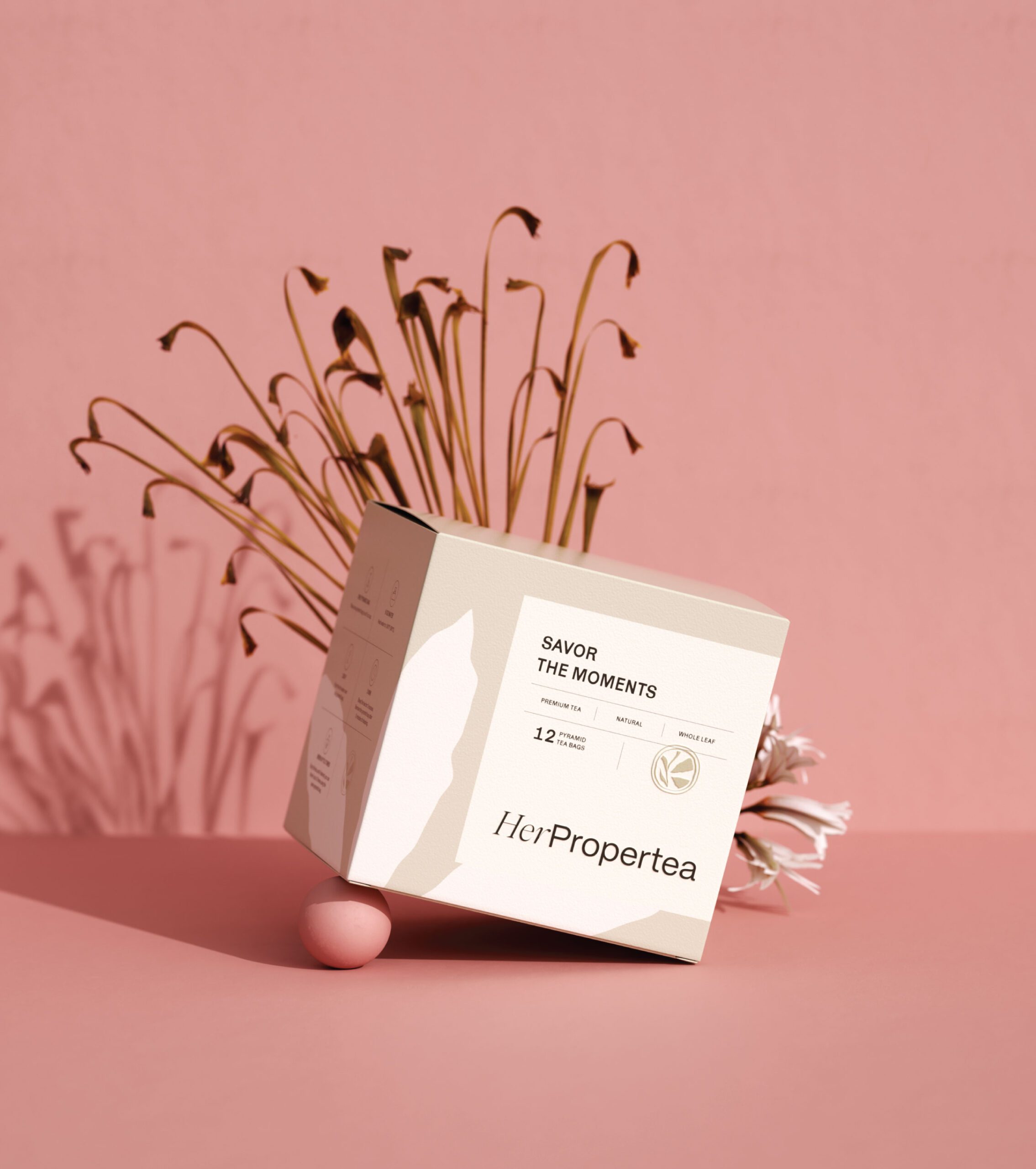
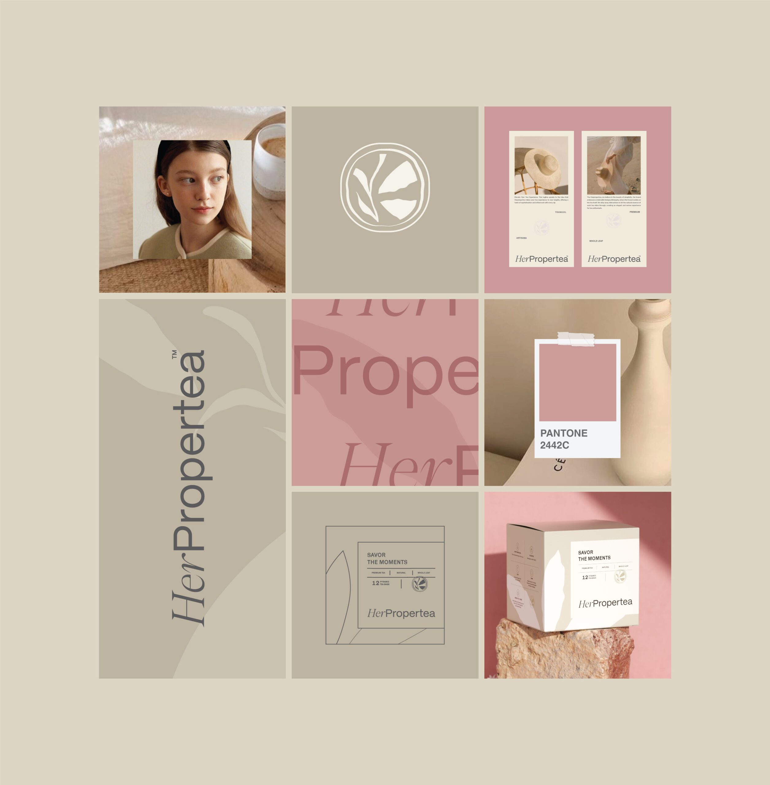
Her ProperTea’s tea branding works by subtraction. MarkaWorks built it on clean layouts, generous spacing, and a deliberately minimal information hierarchy, which leaves the pack quiet, and the quiet is what reads as quality. The muted palette we chose does the differentiating between blends, while the textures and soft transitions carry the part of the experience that only the hand notices. Each tea keeps its own character inside the system without the system having to be redrawn.
Her ProperTea focuses on empowering women through subtle confidence rather than bold statements, encouraging ownership of daily rituals and mindful moments.
See more coffee and tea branding case studies.
Visual Identity
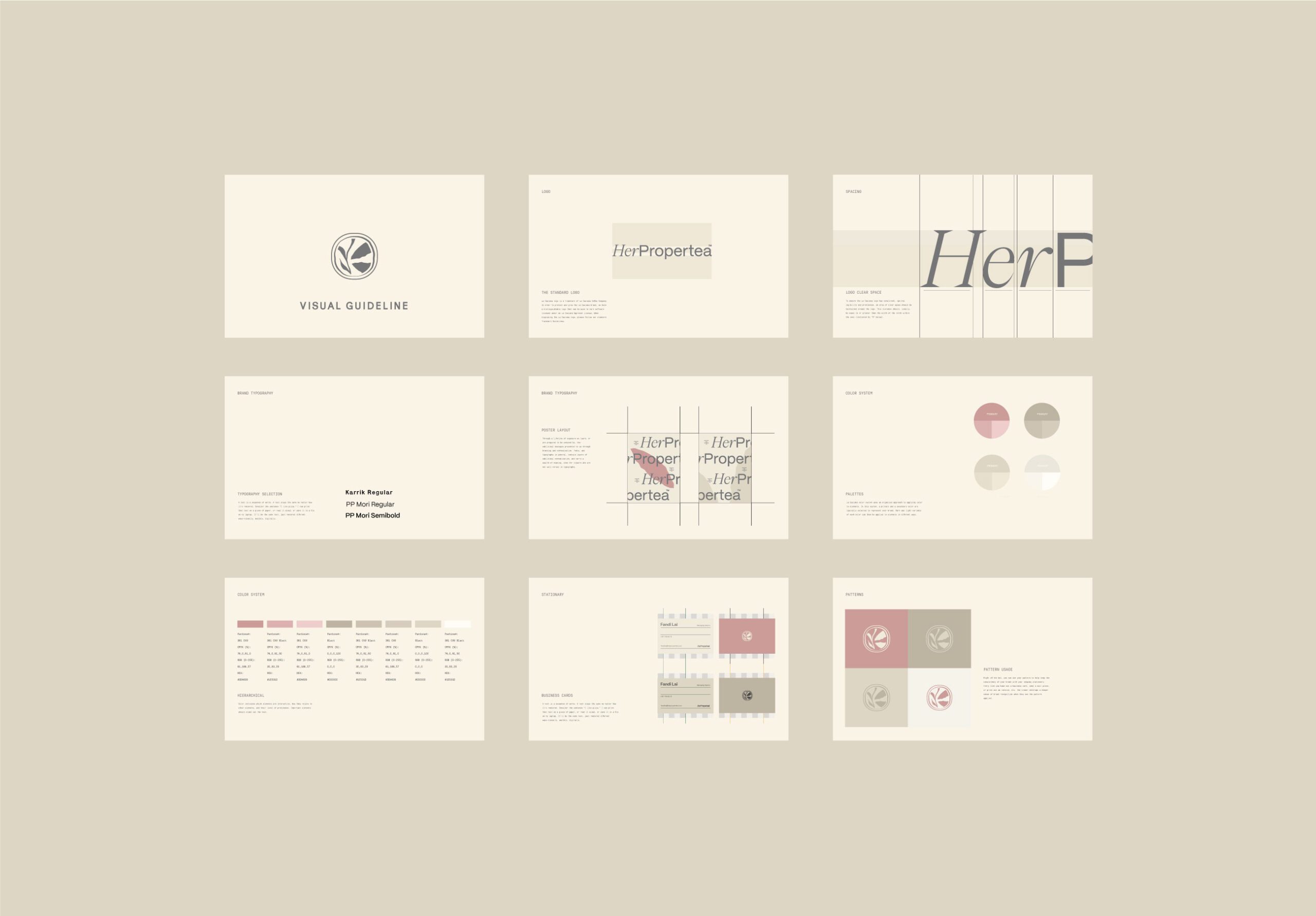
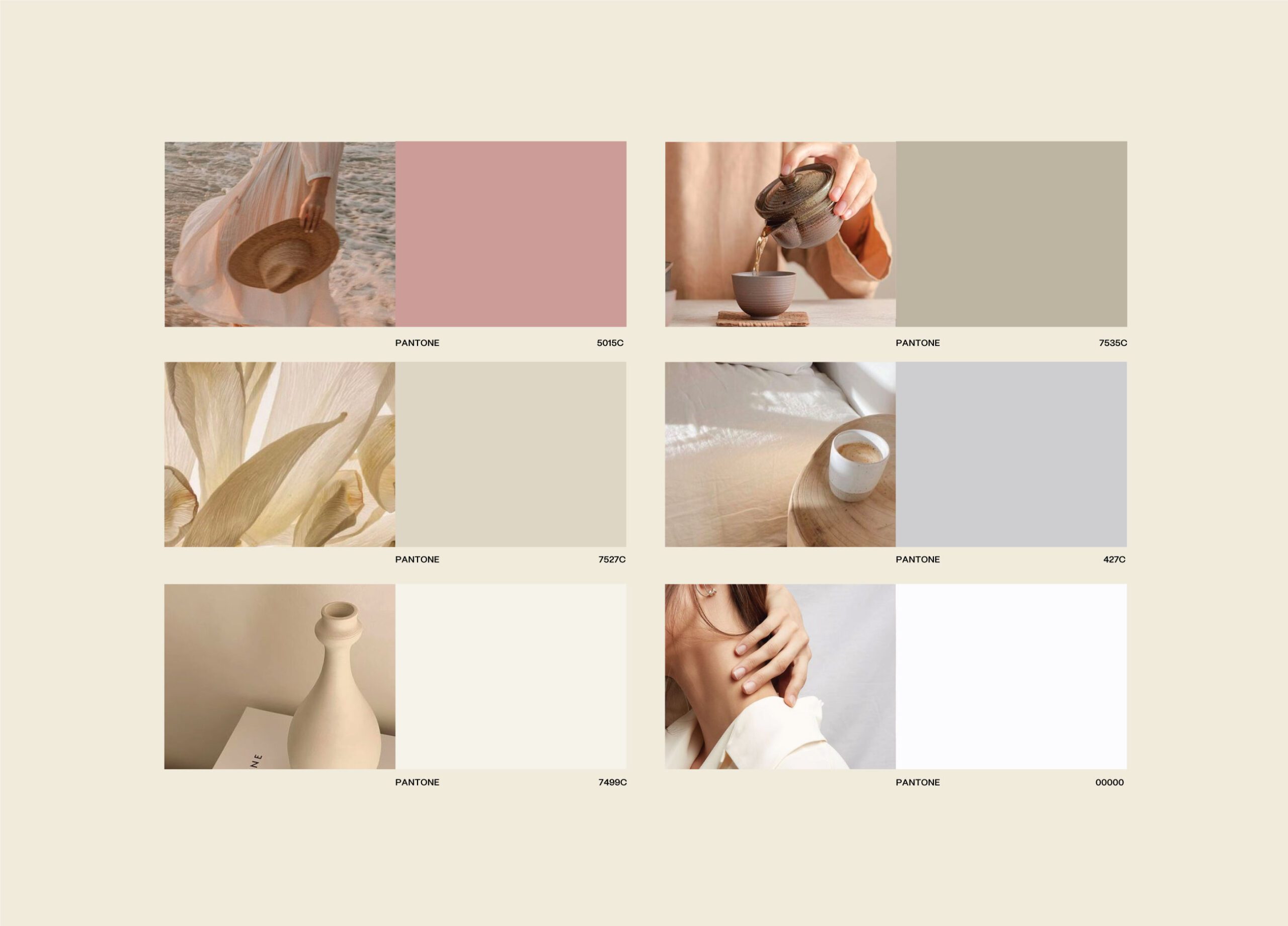
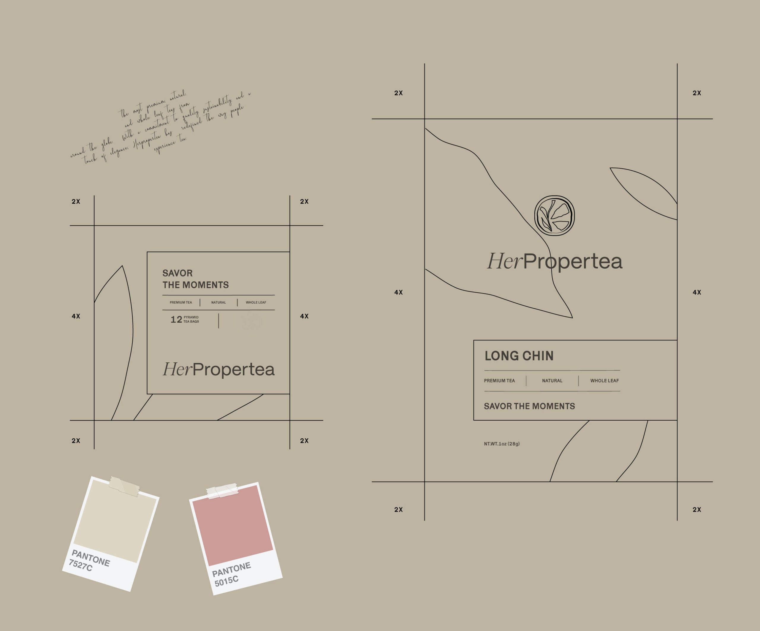
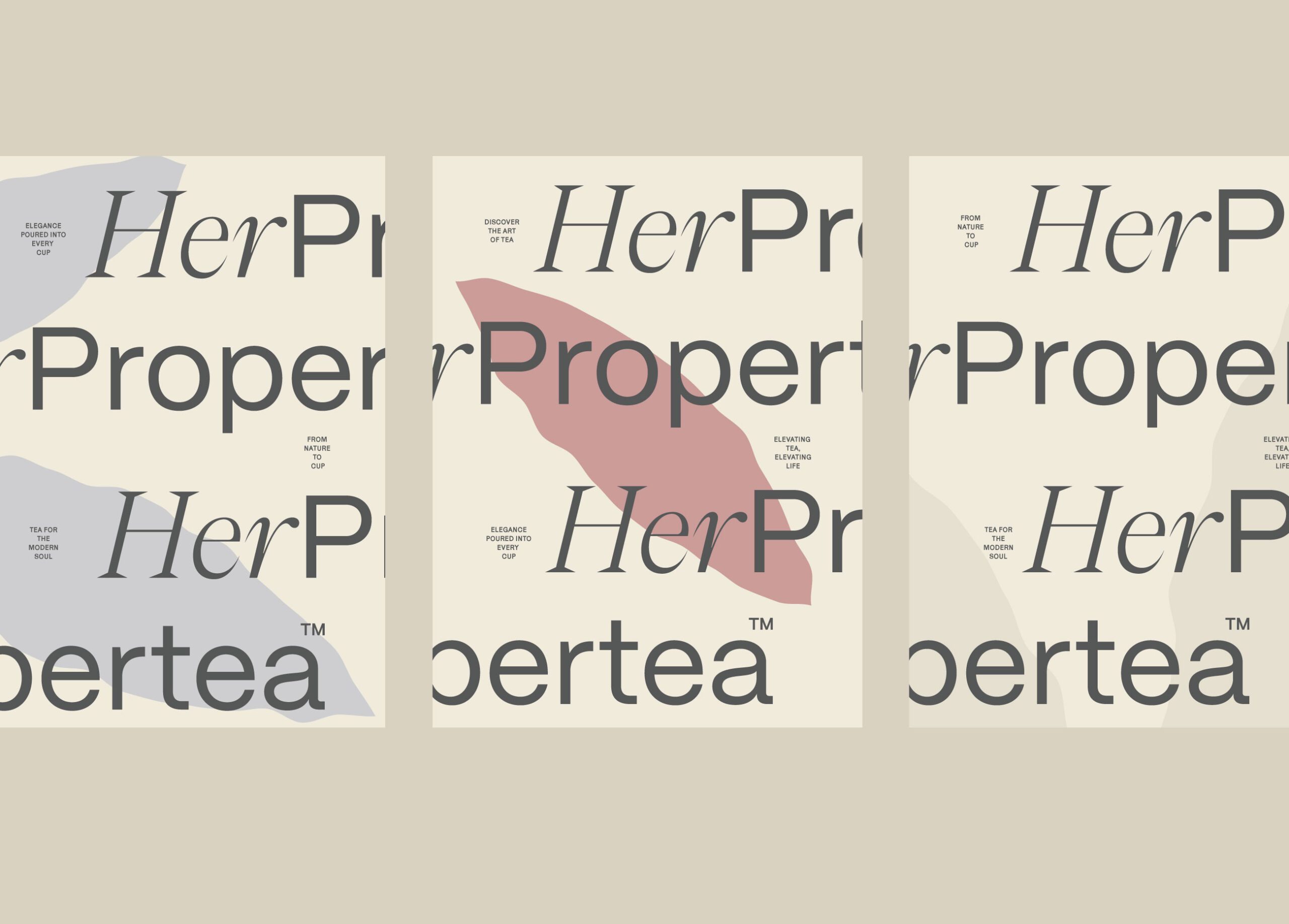
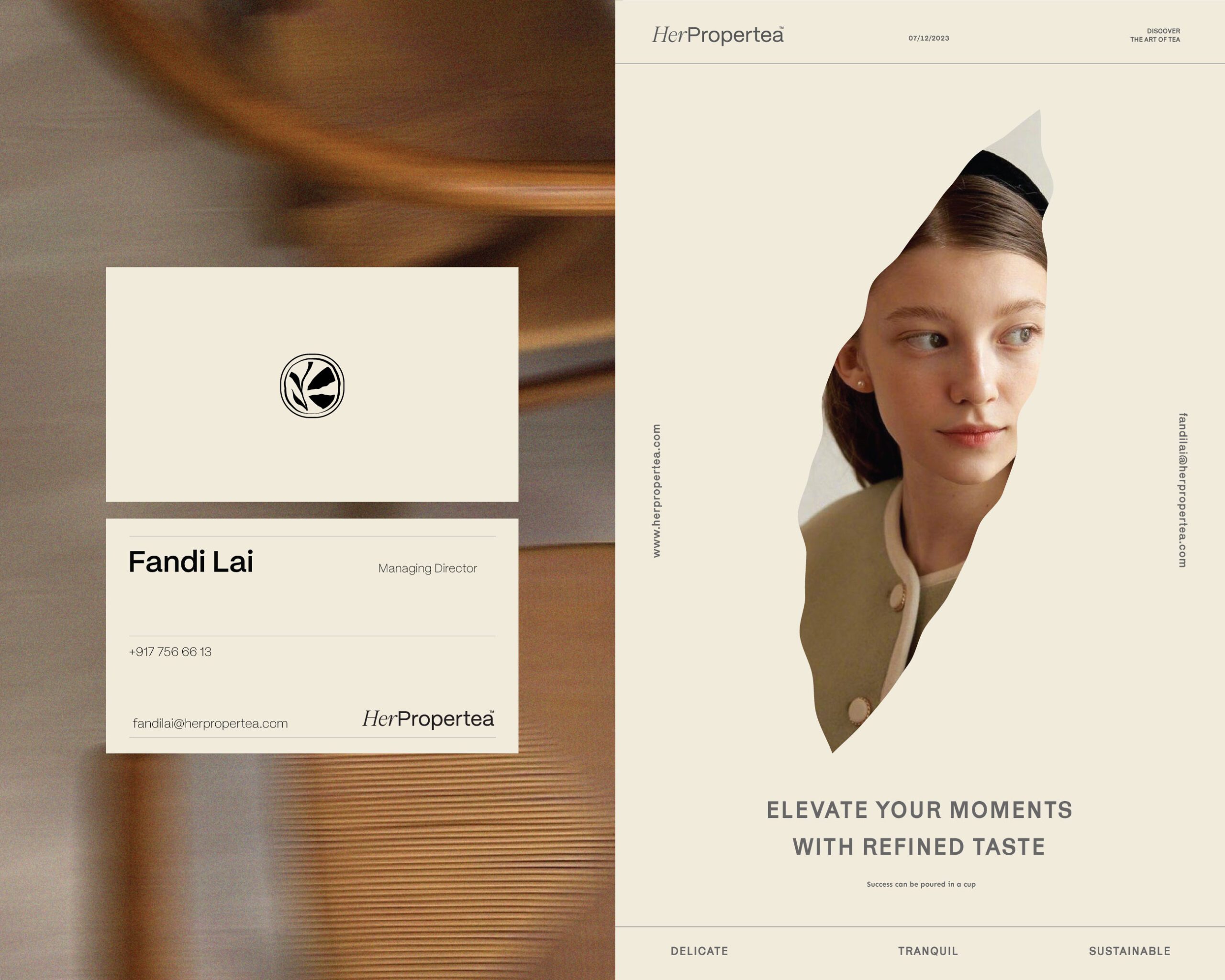
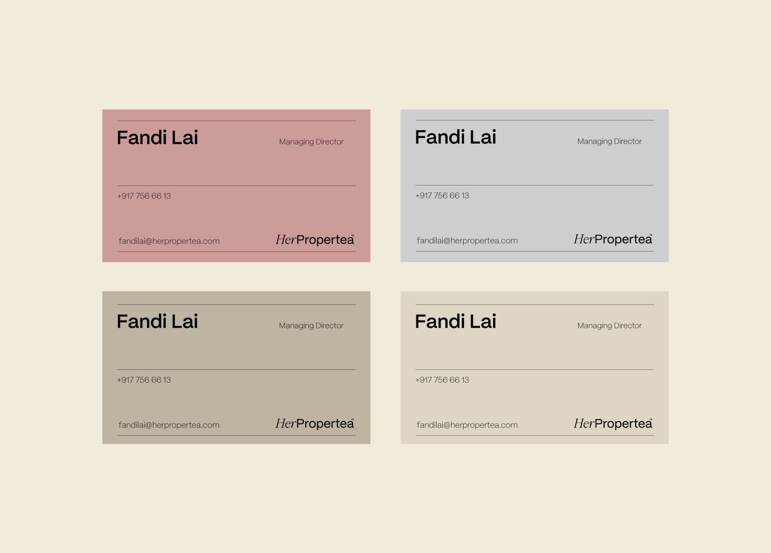
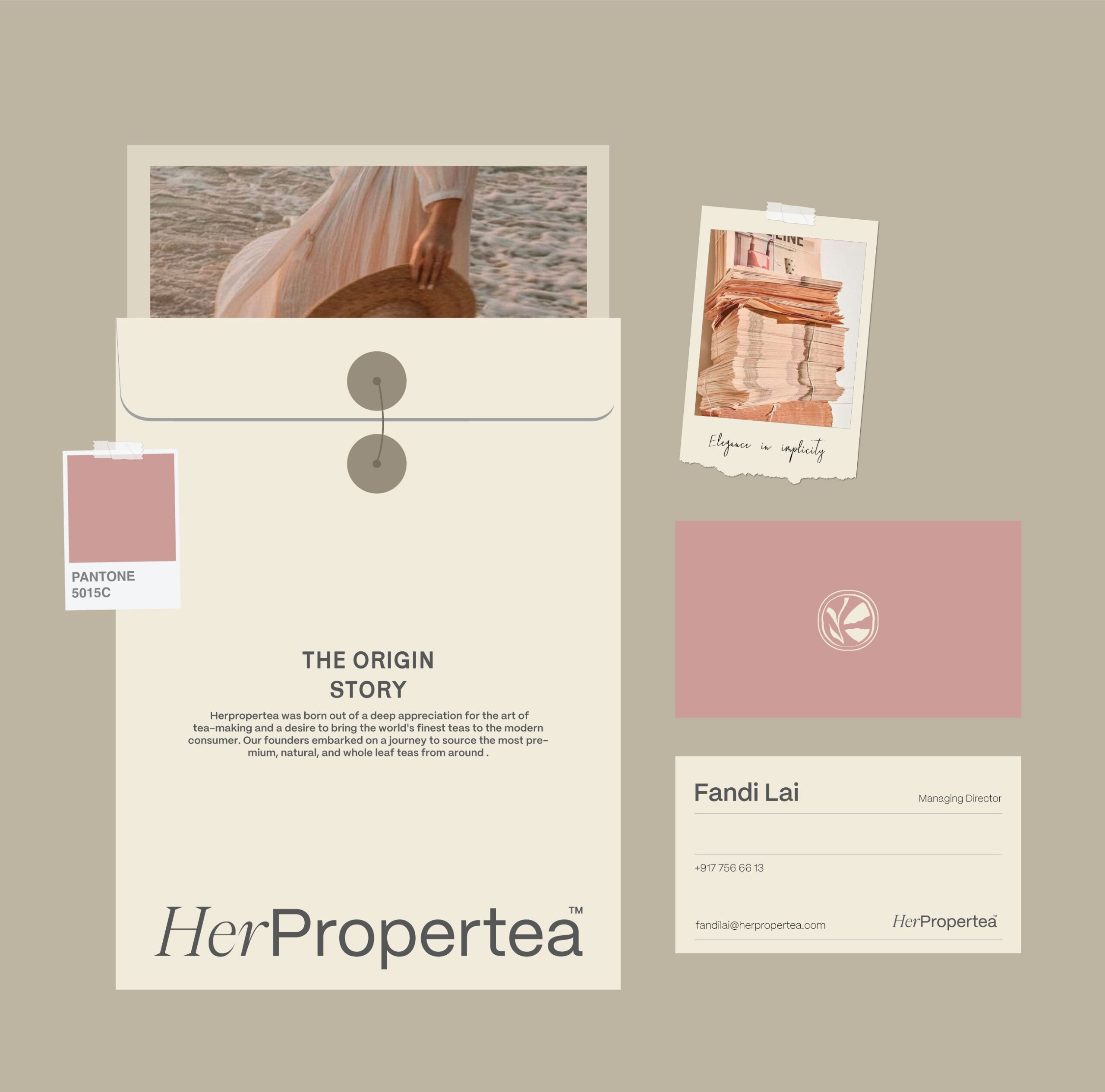
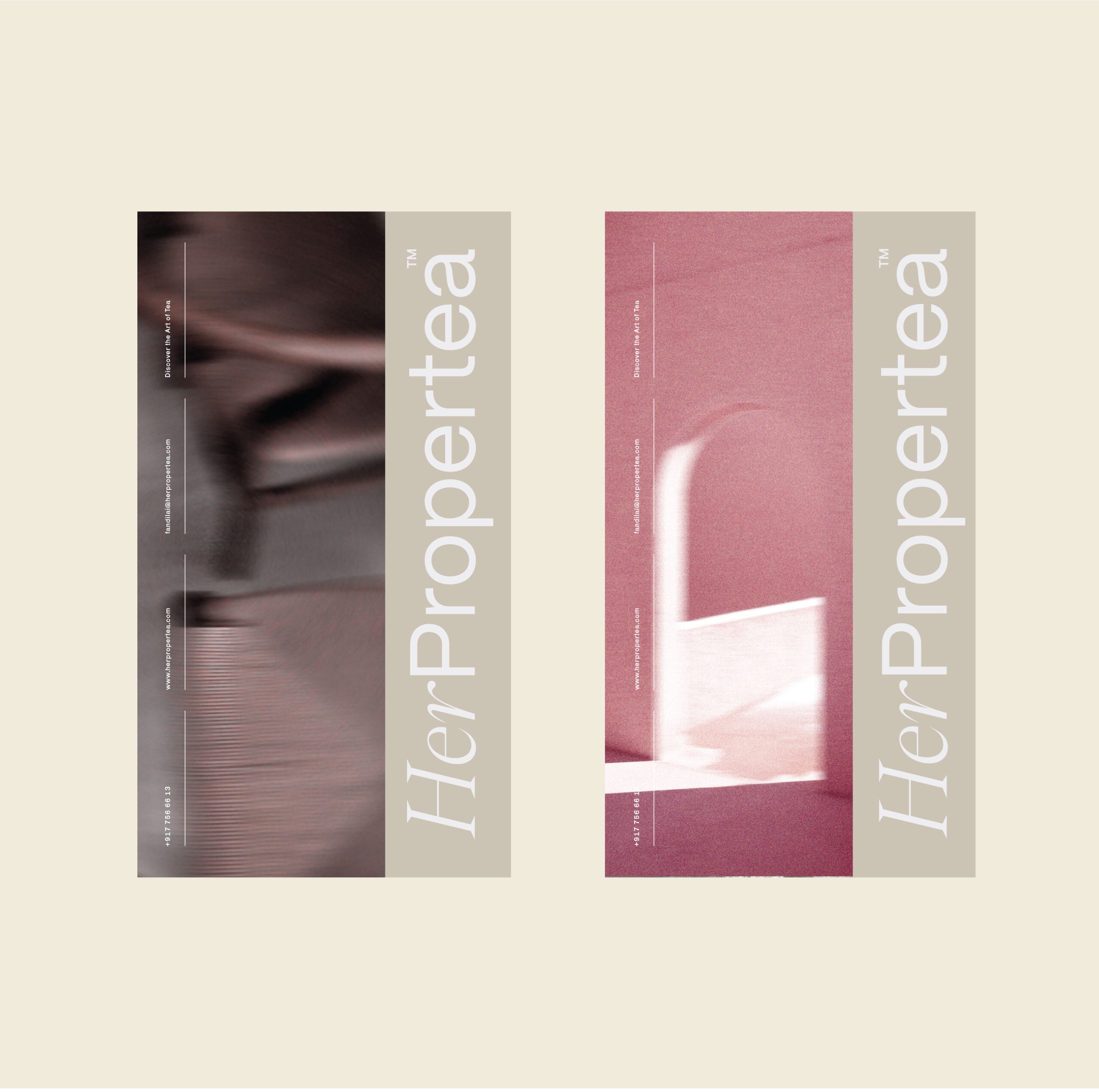
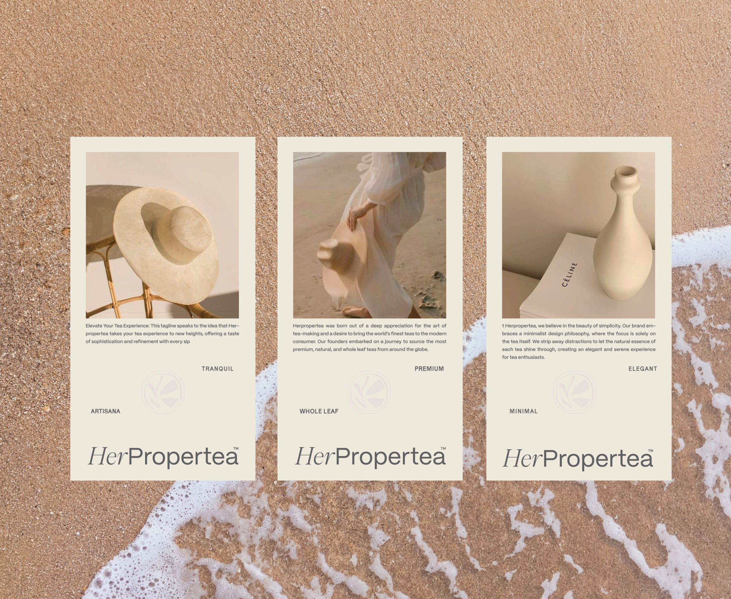
The visual identity reflects softness, balance, and elegance. A muted color palette of warm neutrals, blush tones, and earthy shades creates a calm and inviting atmosphere. These tones are inspired by natural materials, slow living, and tactile experiences.
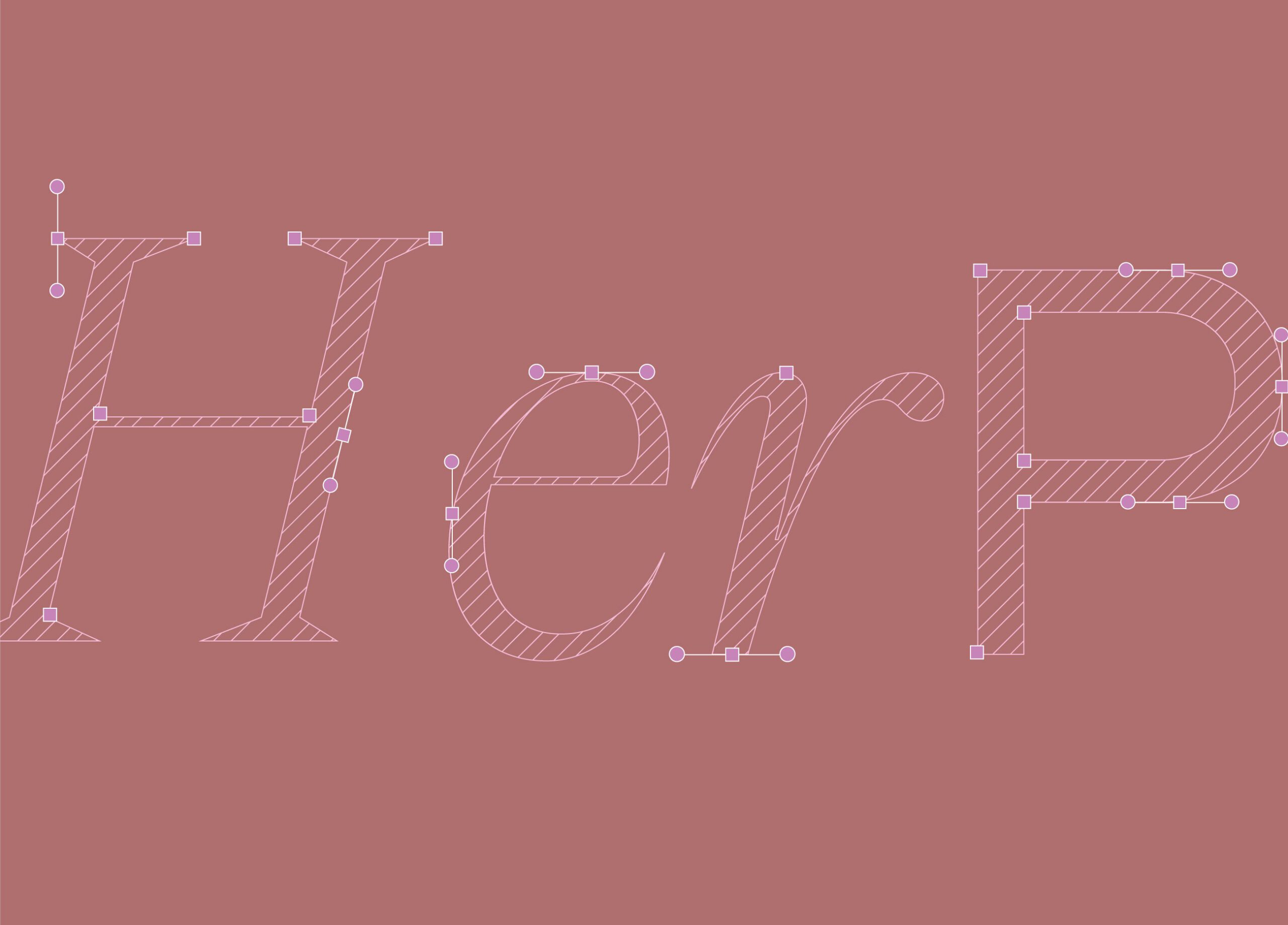
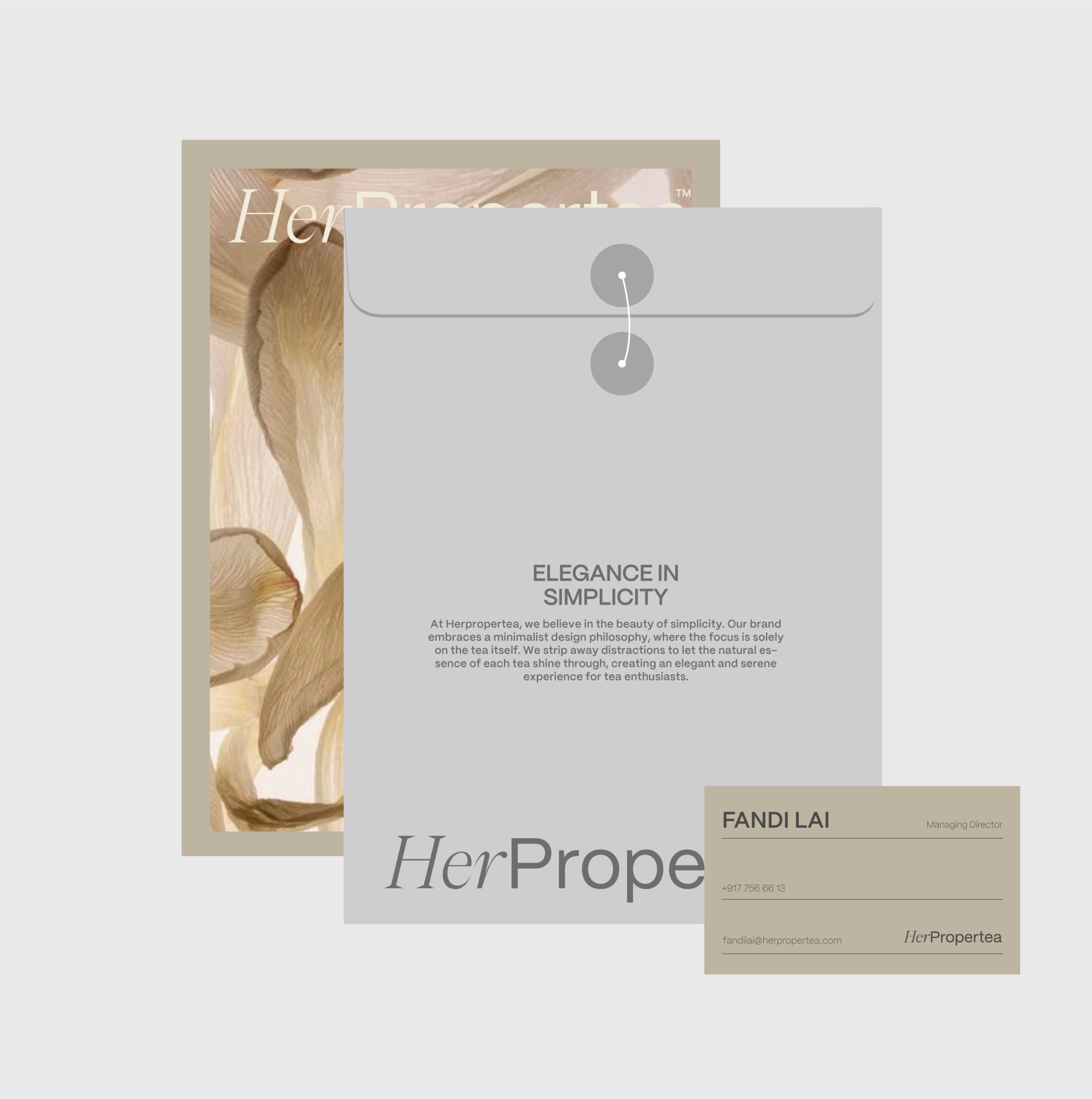
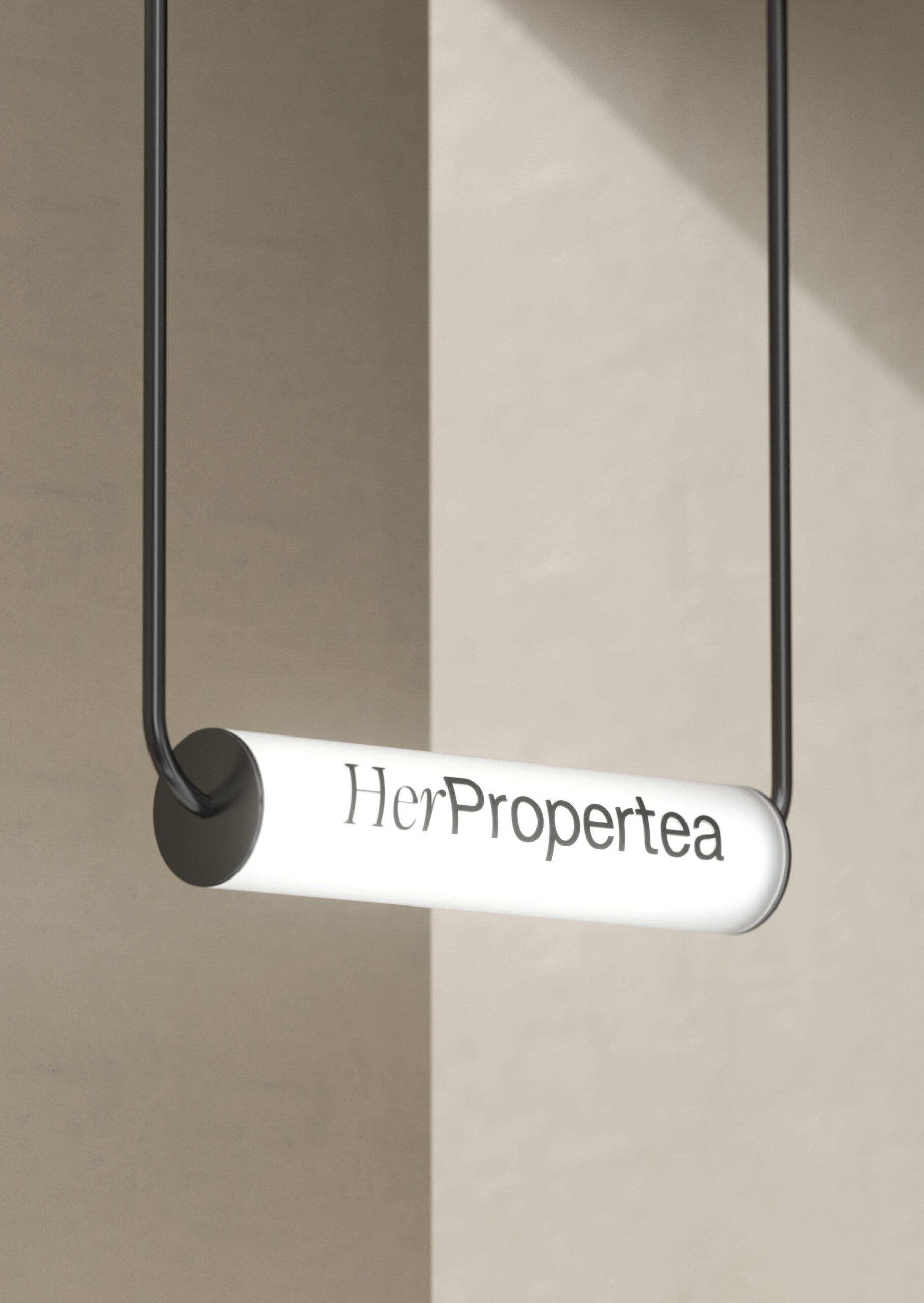
Typography is refined and modern, combining clarity with a graceful presence. The logotype feels confident yet gentle, reinforcing the brand’s feminine character without excess decoration.
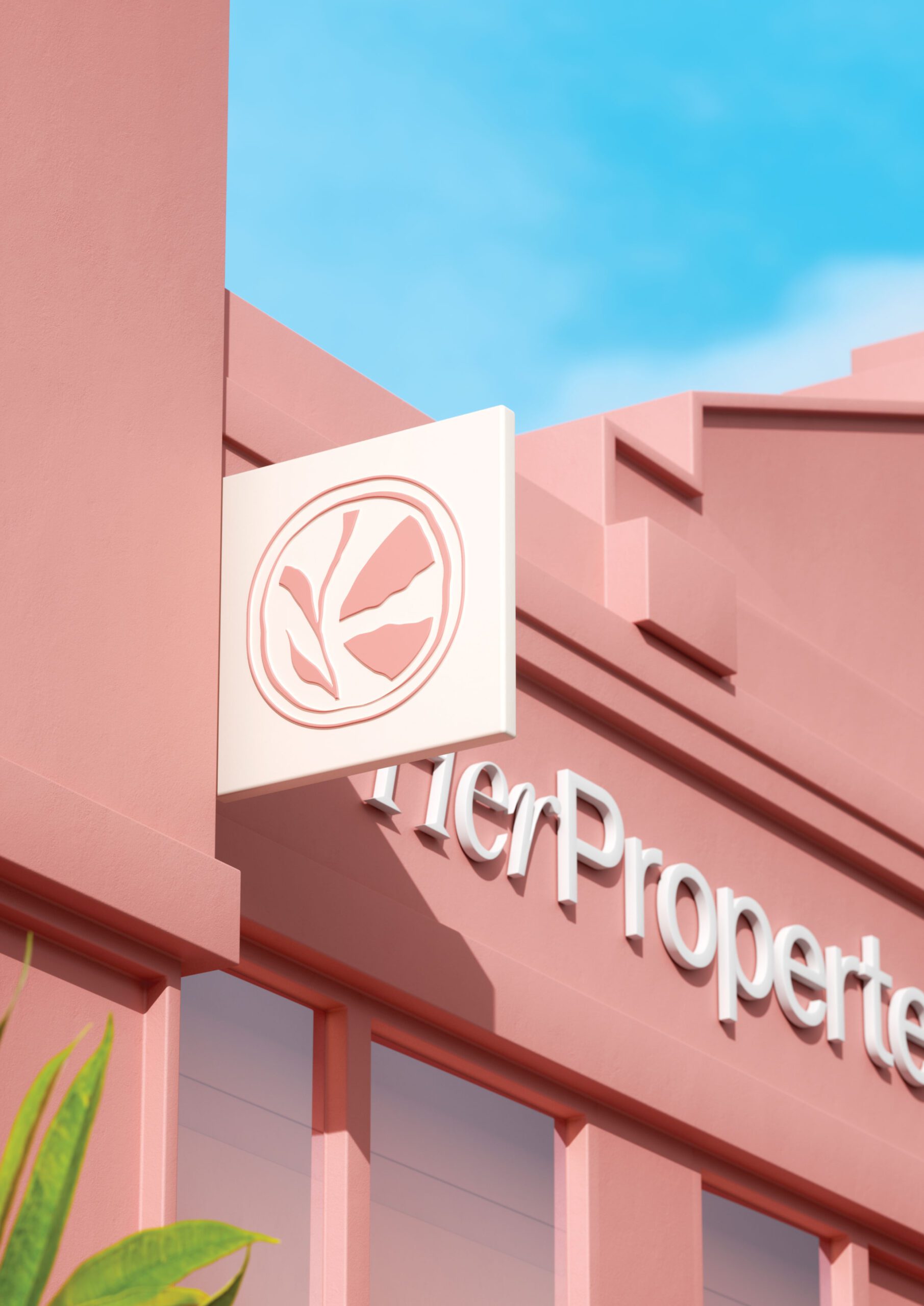
Organic shapes and minimal graphic elements add depth and warmth, supporting a visual language that feels intentional and quietly luxurious.
Packaging Design
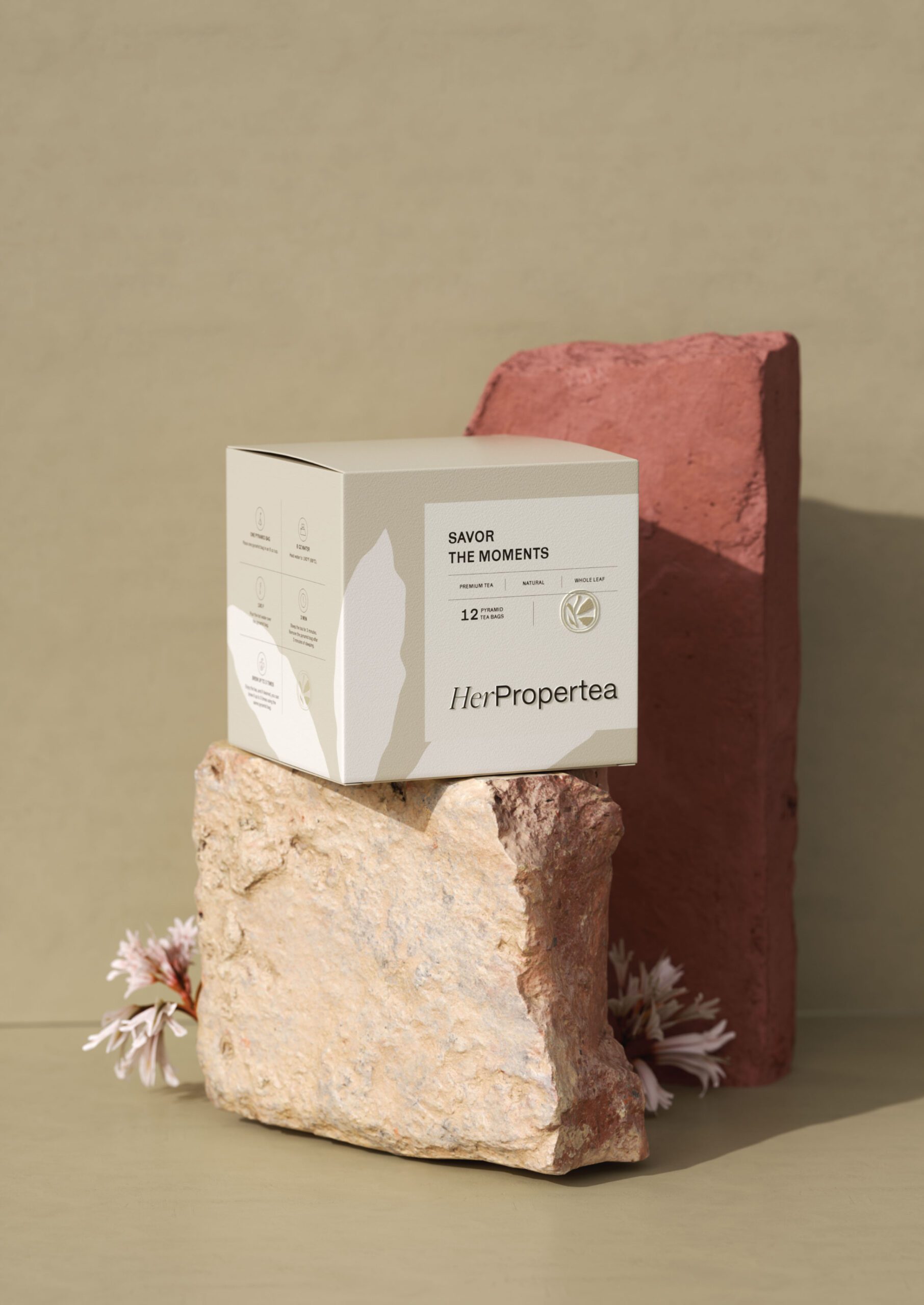
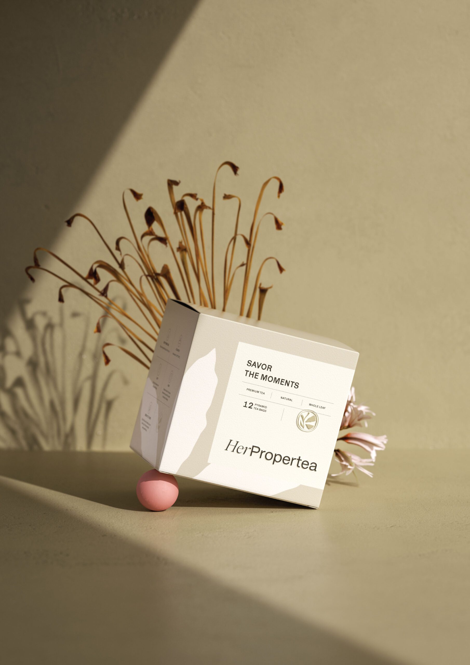
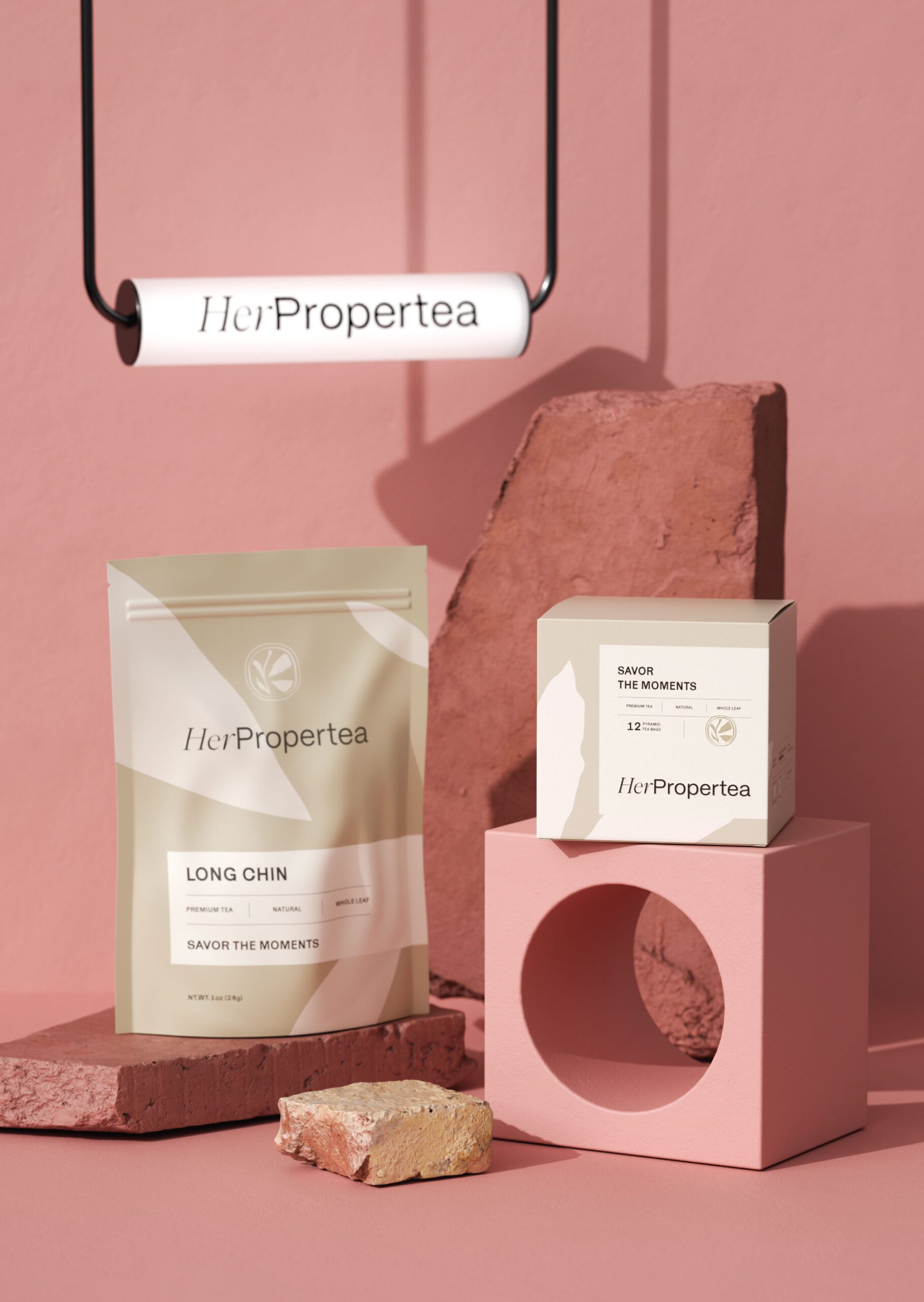
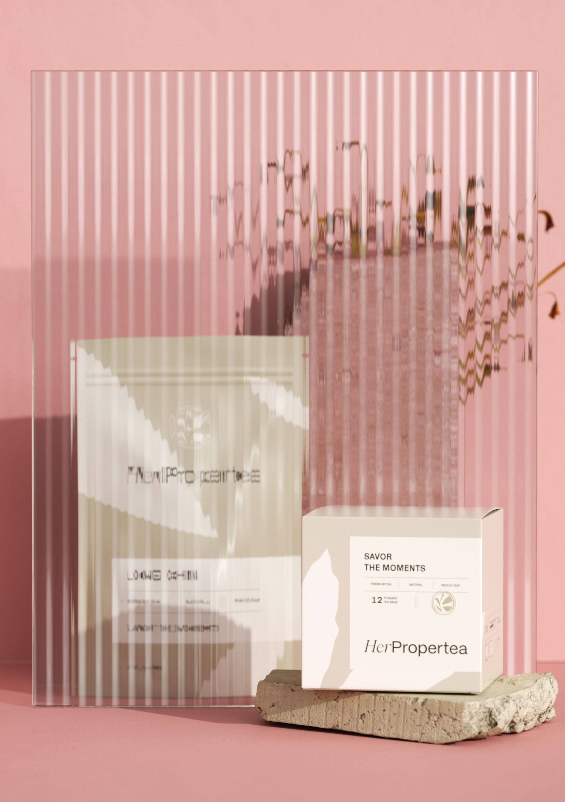
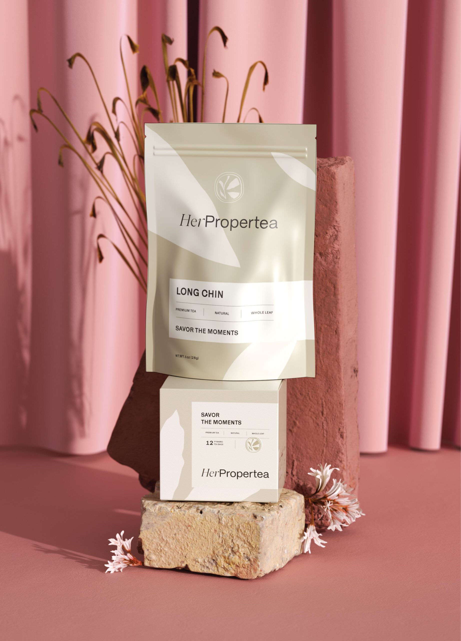
Packaging was designed to feel timeless and thoughtful. Clean layouts, generous spacing, and minimal information hierarchy allow the product to communicate quality with ease. Subtle textures and soft color transitions elevate the tactile experience, making each package feel like a personal keepsake rather than a commodity.
The packaging system remains consistent across the range while allowing each tea to express its own character within the brand world.
Outcome
Her ProperTea emerges as a refined tea brand that blends femininity, simplicity, and purpose. Through a calm visual language and carefully crafted brand system, the brand communicates confidence, ownership, and elegance.
The result is a cohesive and emotionally resonant identity that positions Her ProperTea as a modern ritual for women who value quality, self expression, and meaningful moments.

Let’s make the work they’ll copy.
Talk to an expert now
Work with a 38 team of the
industry’s top 1% talent.



