Arc Coffee Roastery
Arc Coffee Roastery Brand Identity and Packaging Design
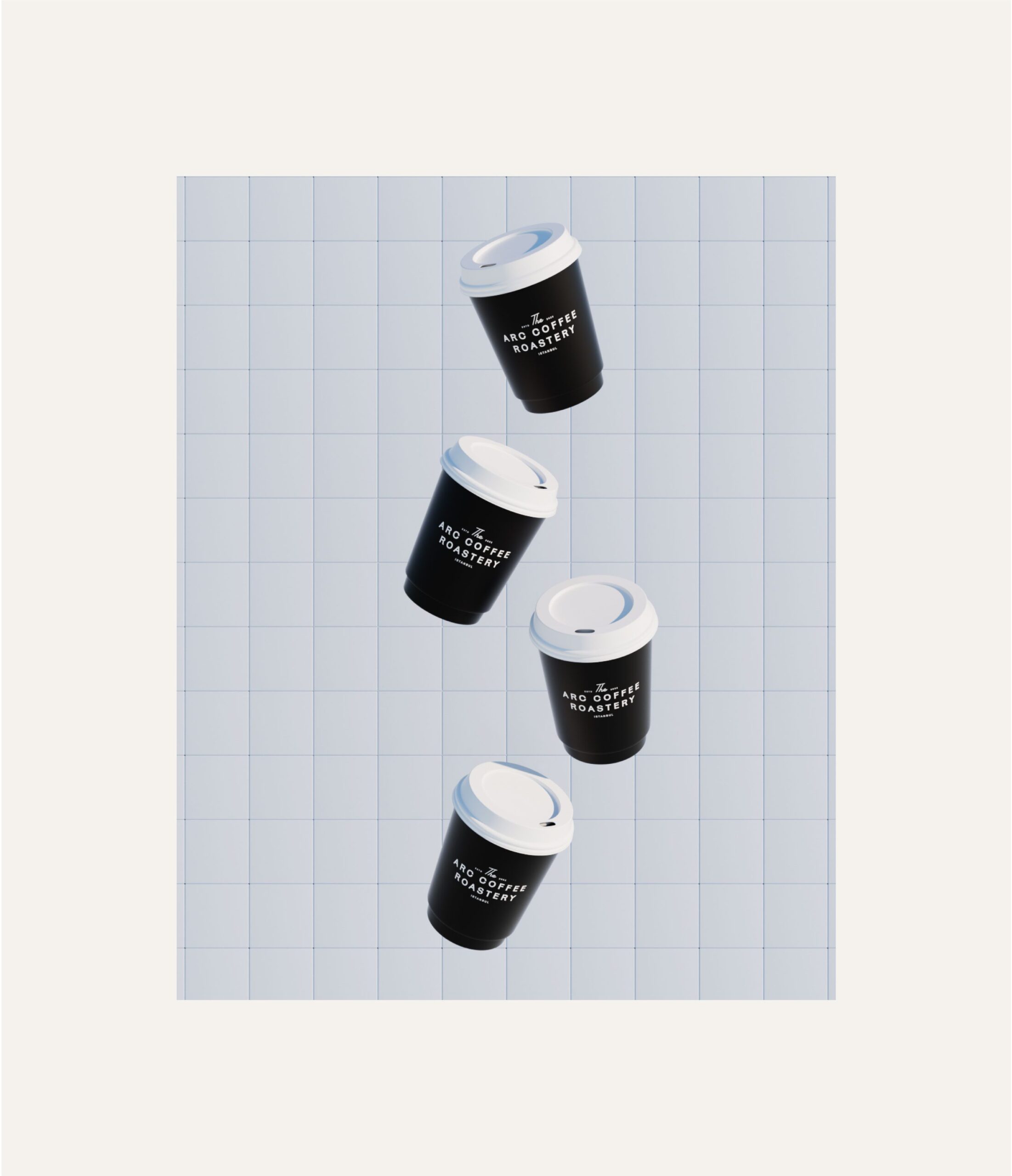
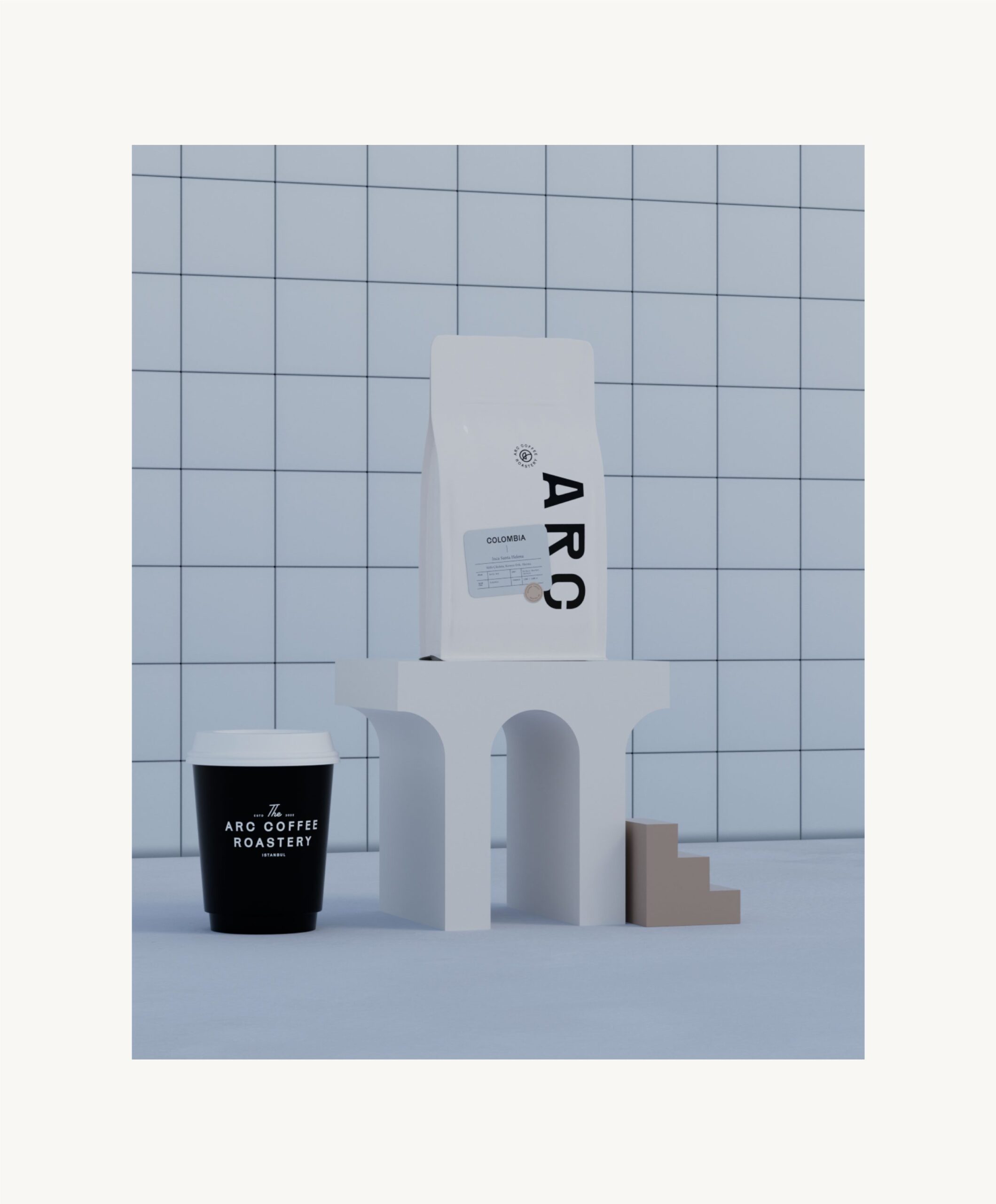
Arc Coffee Roastery is a specialty coffee brand created for coffee lovers who value craft, precision, and the sensory experience of coffee. The project focused on developing a brand identity and packaging system that reflects Arc’s commitment to quality beans, thoughtful roasting, and refined presentation.

Craft, precision, and the sensory side of coffee: Arc Coffee Roastery was built for drinkers who care about all three. Arc Coffee Roastery is a specialty coffee brand, and at MarkaWorks we designed its brand identity and packaging system together, so that the same design logic carries from the logo to the shelf.
The brief had a tension in it that most specialty coffee branding faces: the pack has to communicate a lot of product information, origin, roast level, tasting notes, without turning into a spec sheet. Structure is what resolves it. Form and precision ground the visual language; the logo and supporting graphics carry balance rather than decoration.
See more coffee and tea branding case studies.
Brand Strategy and Visual Identity
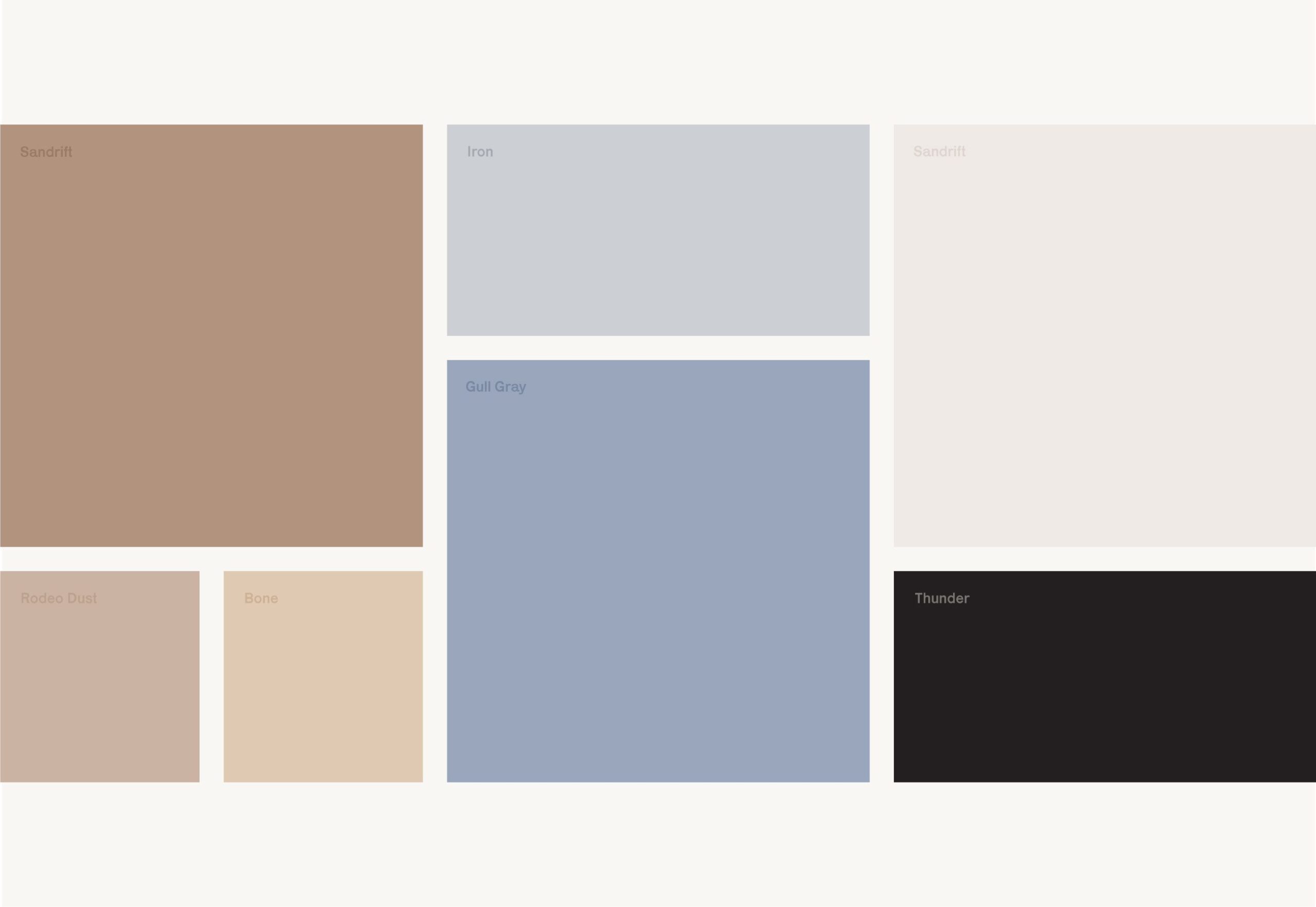
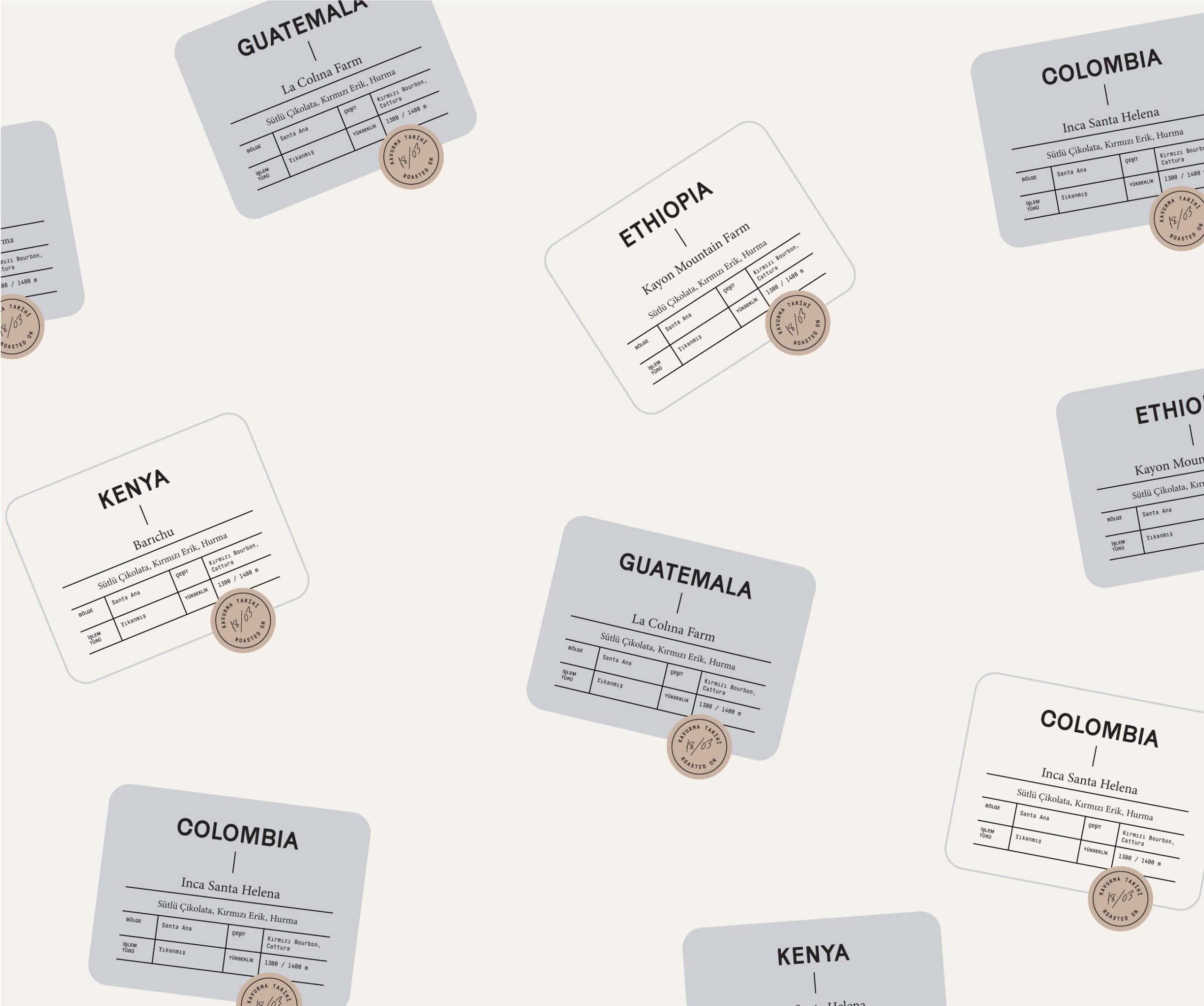
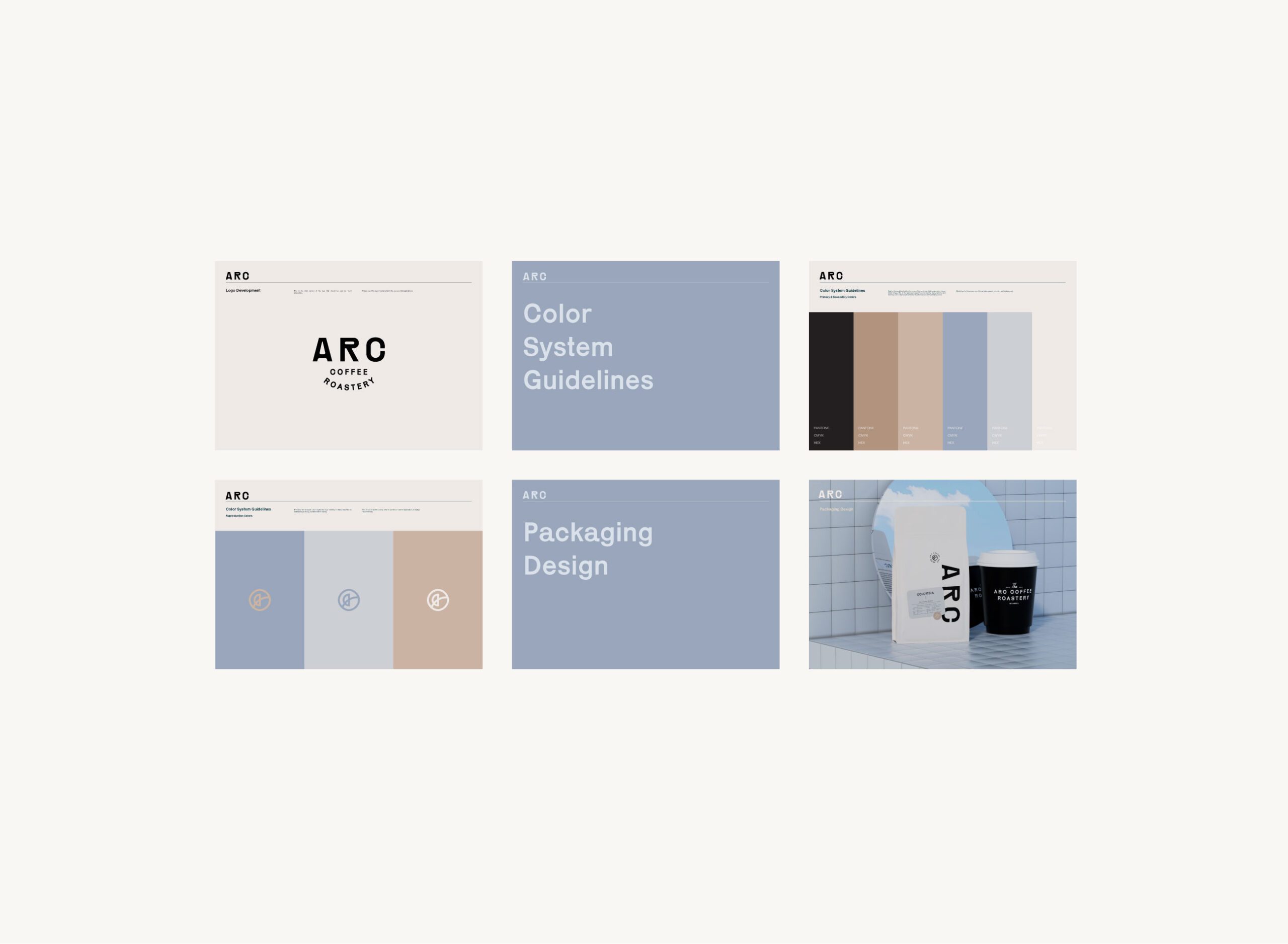
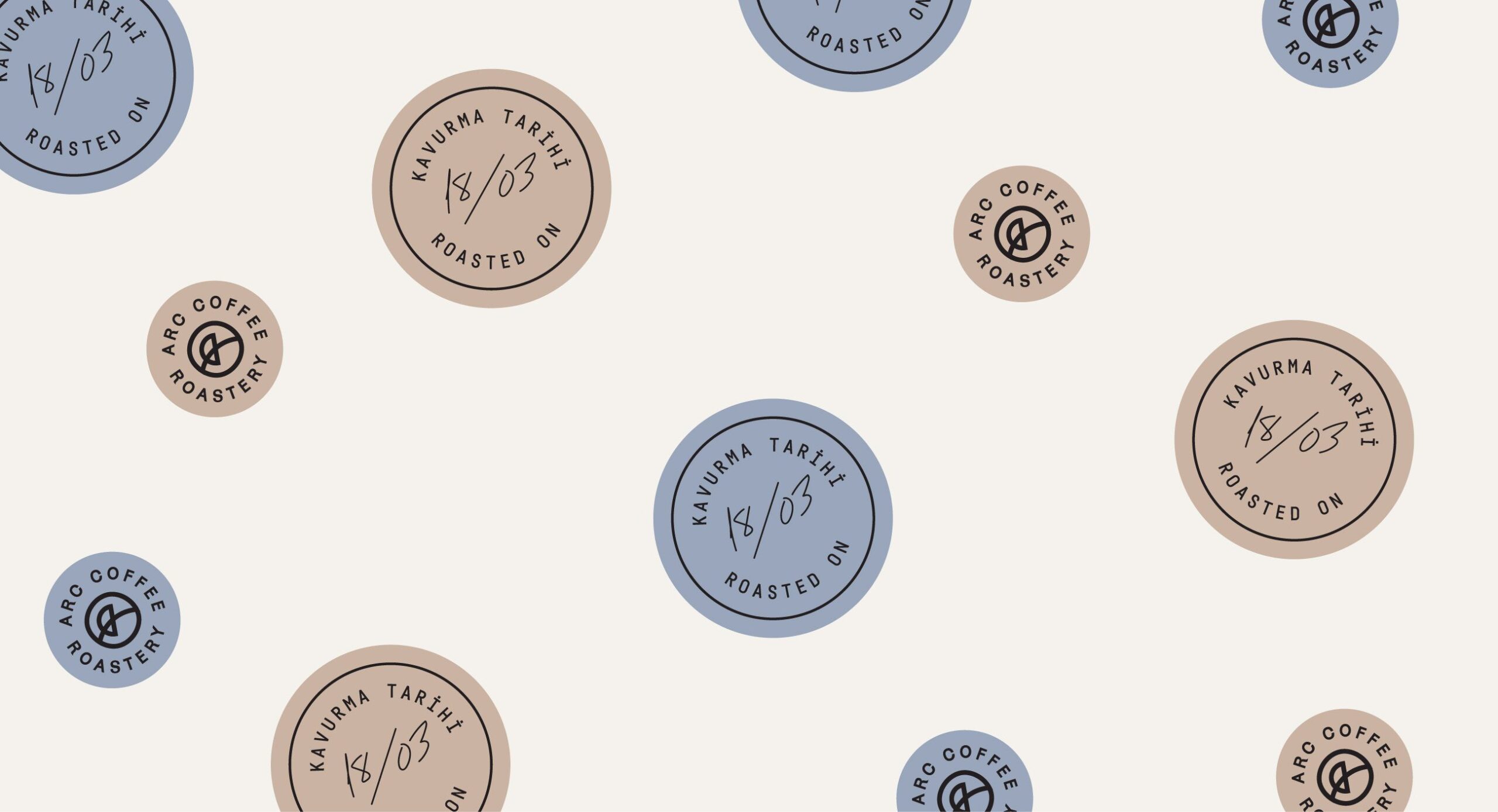
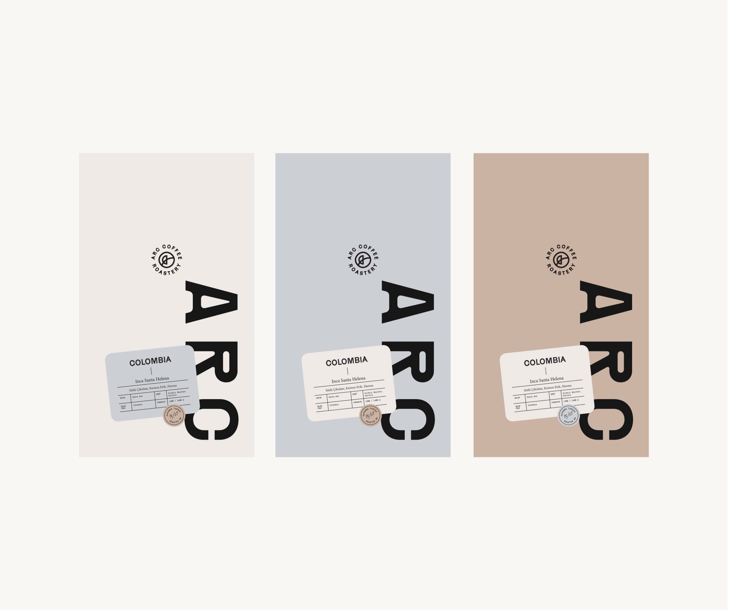
Typography does the informational work. Tasting notes, origin information, and product names sit in a clear hierarchy, so a buyer reads the essentials in order instead of hunting for them. The color system and graphic cues separate coffee blends and roast profiles at a glance while keeping the range recognizably one brand, which is the practical test of any coffee packaging system: distinct variants, coherent family.

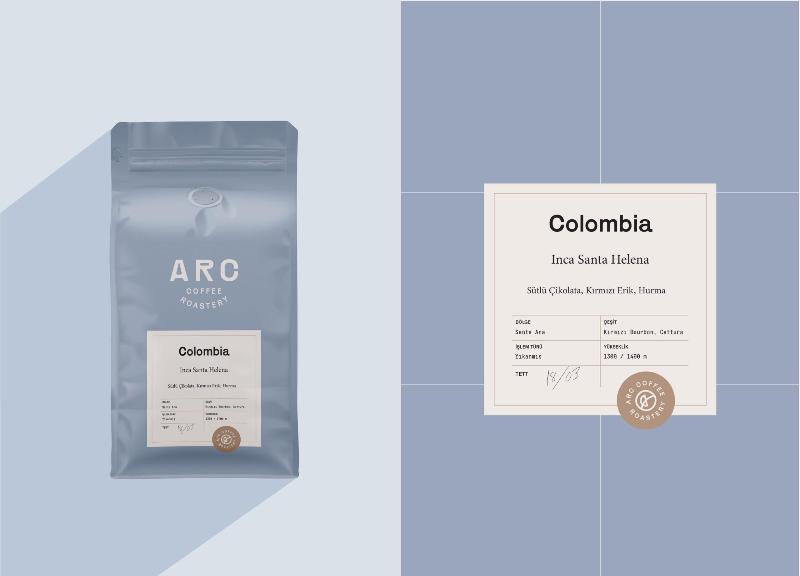
Packaging Design and Product Expression
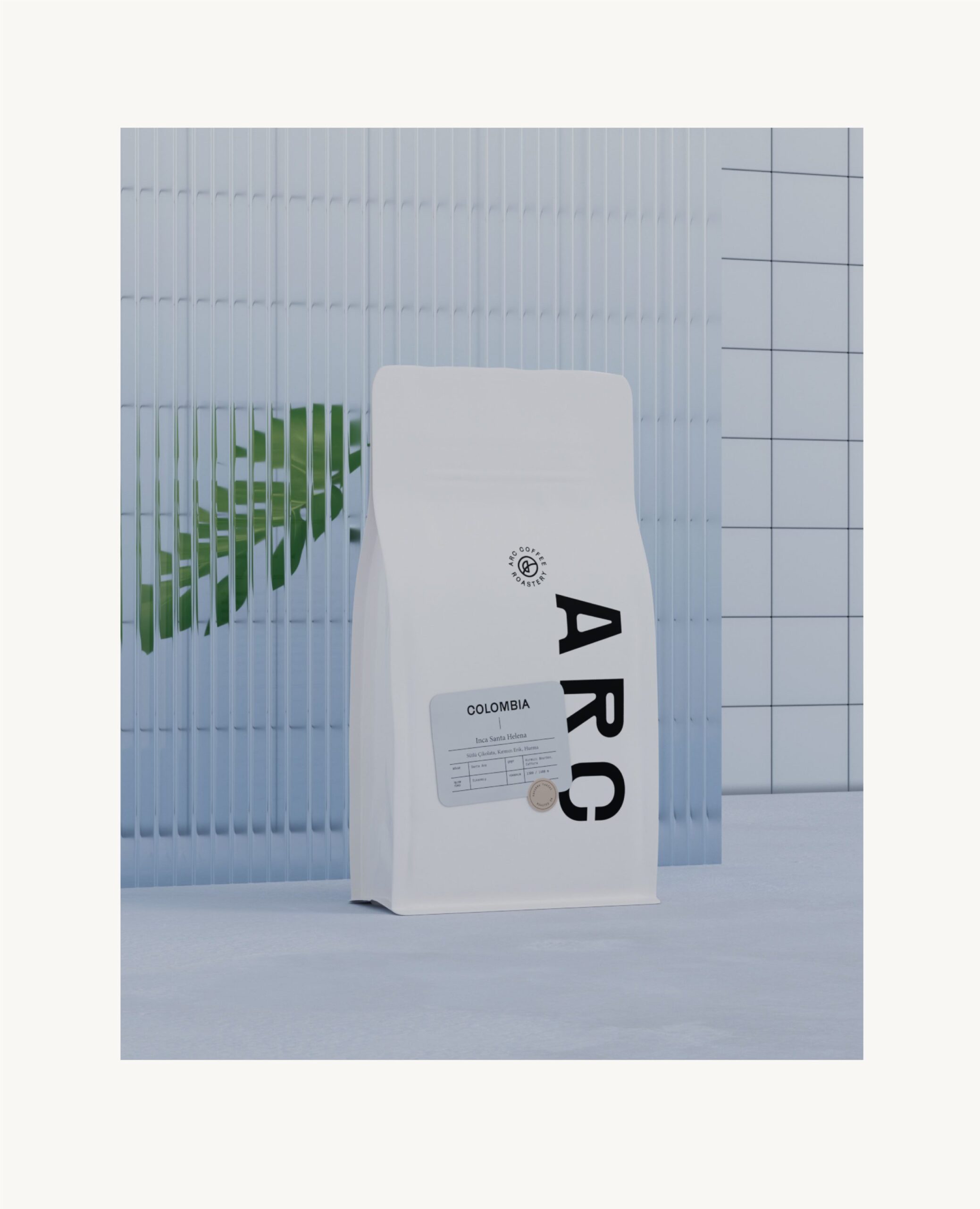
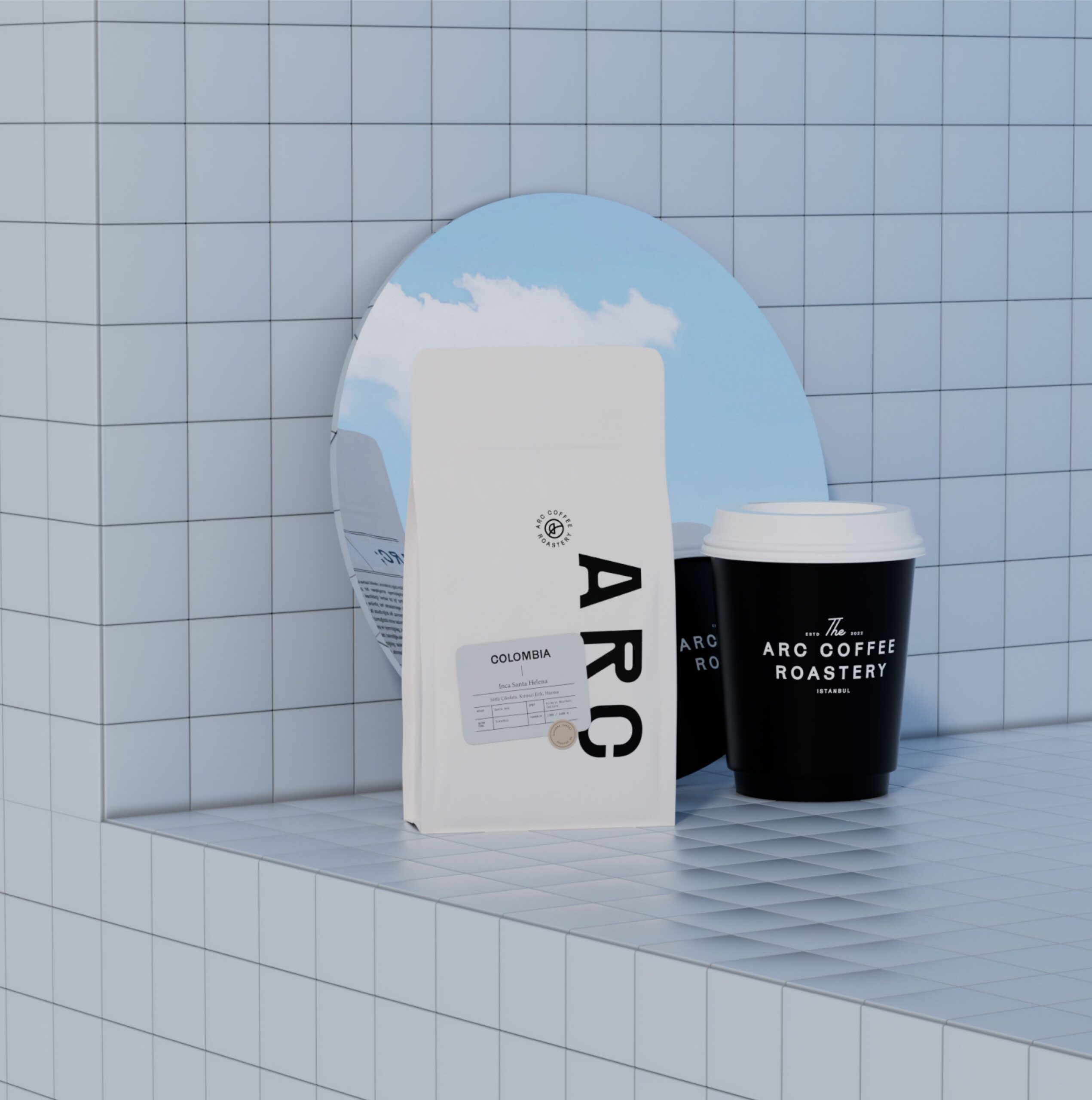
On the labels, the most important details come first: coffee origin, roast level, and flavor profile, in a structured, legible layout. Each variant has defined visual cues for differentiation, and we chose the materials and finishing to meet the expectations a specialty coffee buyer brings to the physical pack.

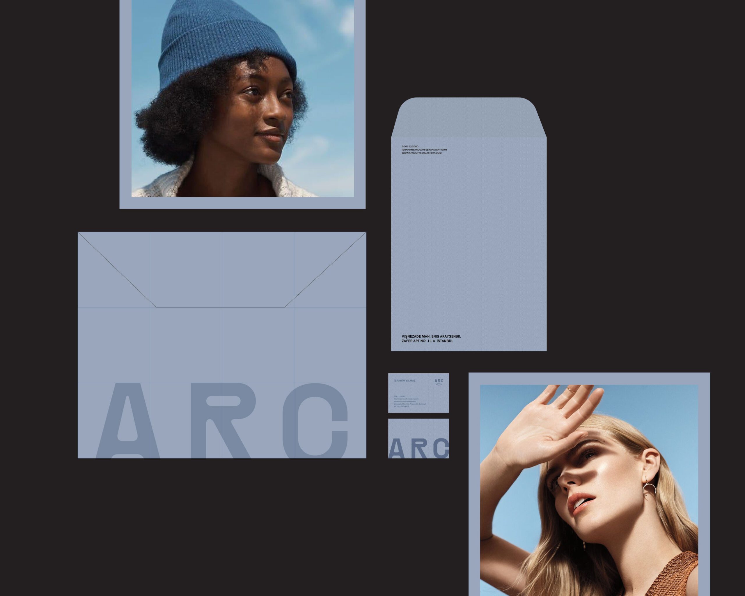
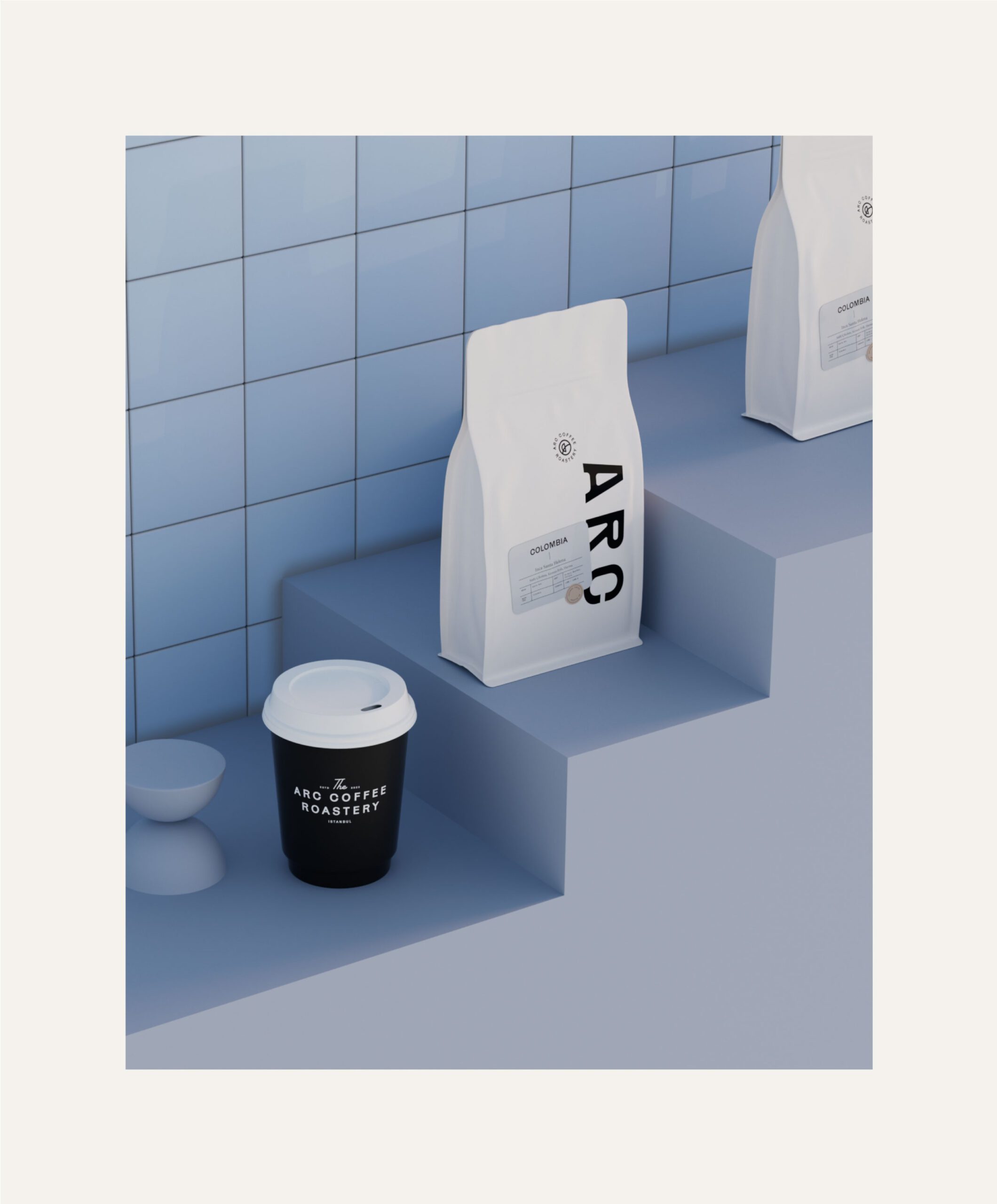
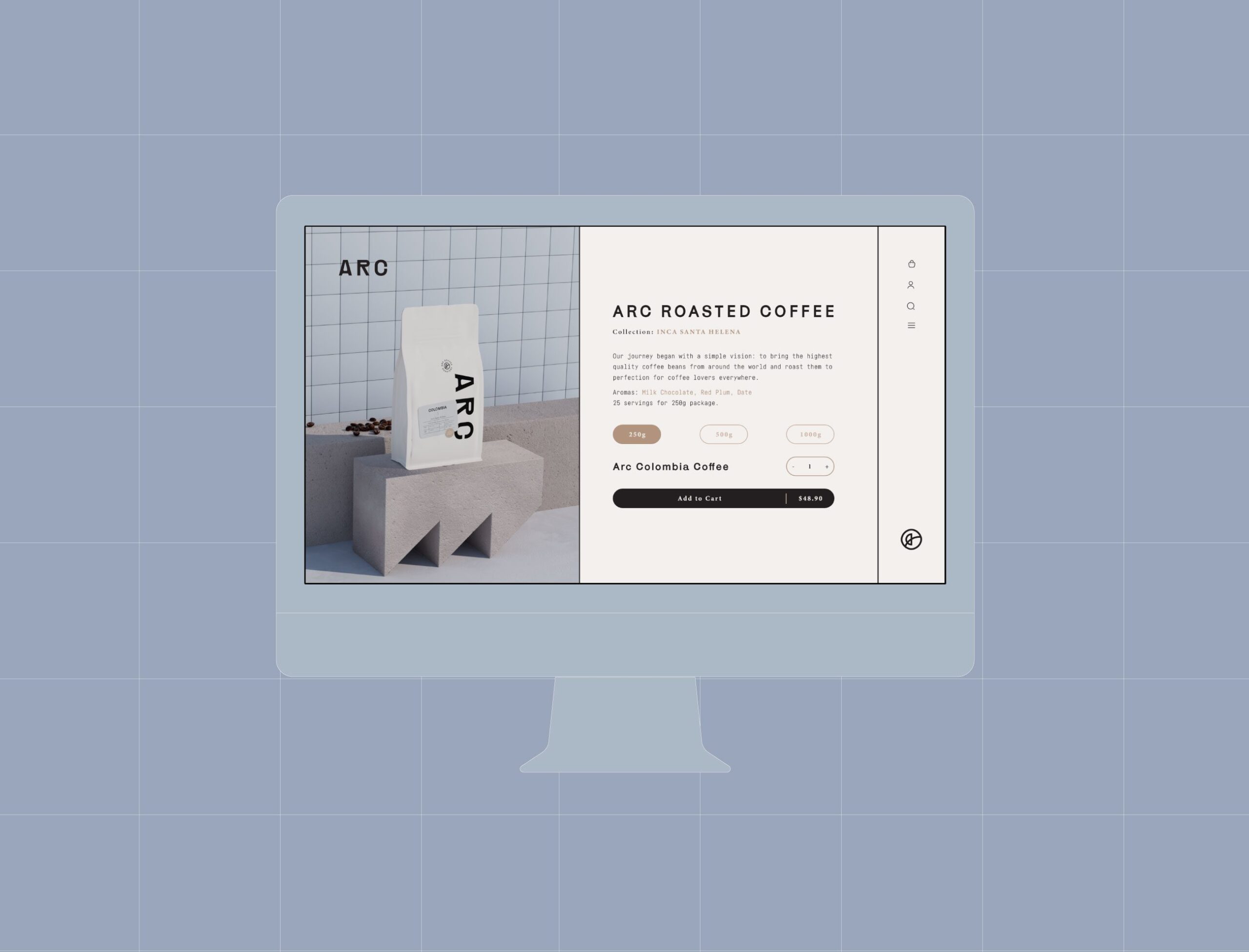
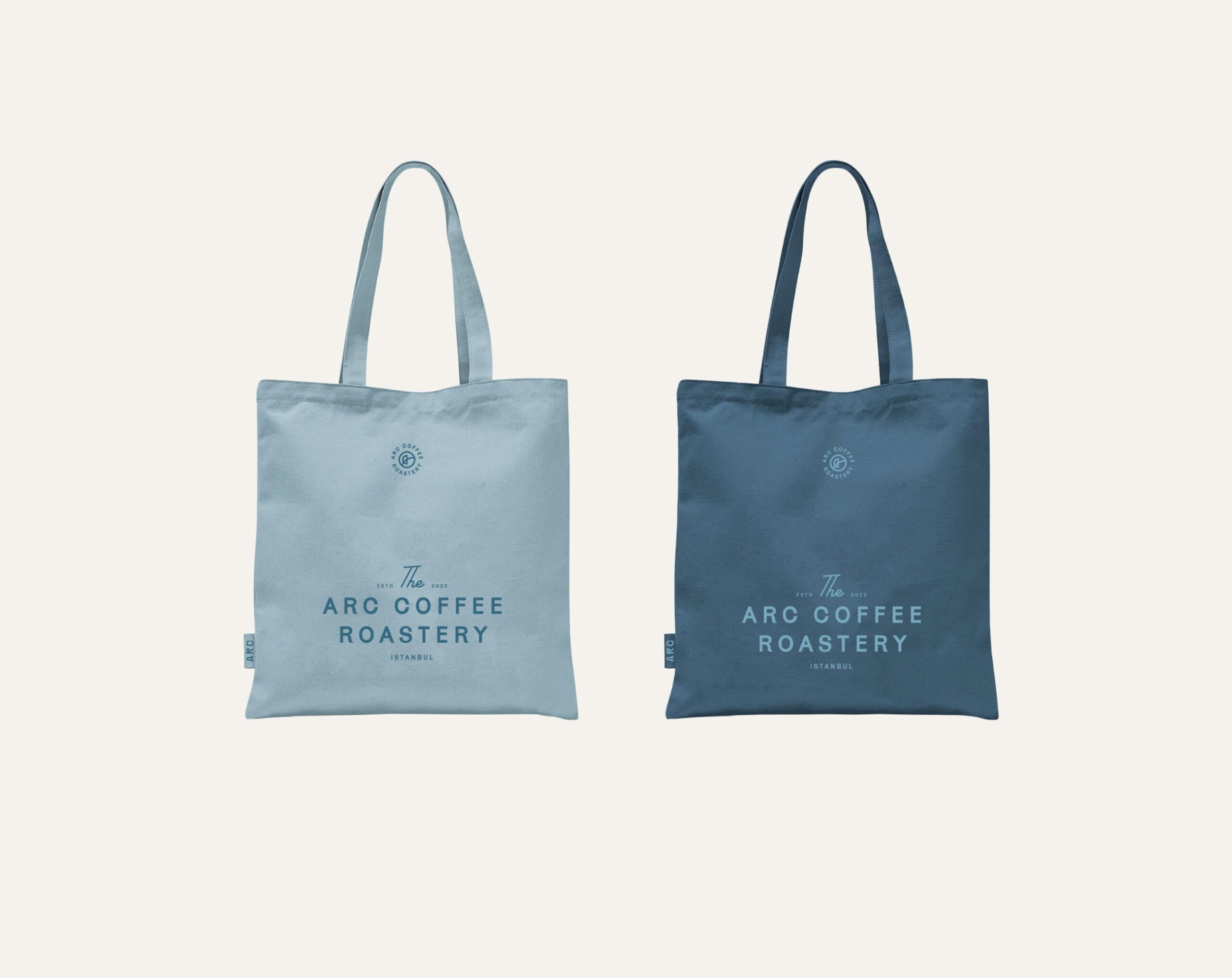
Brand Application and Market Presence
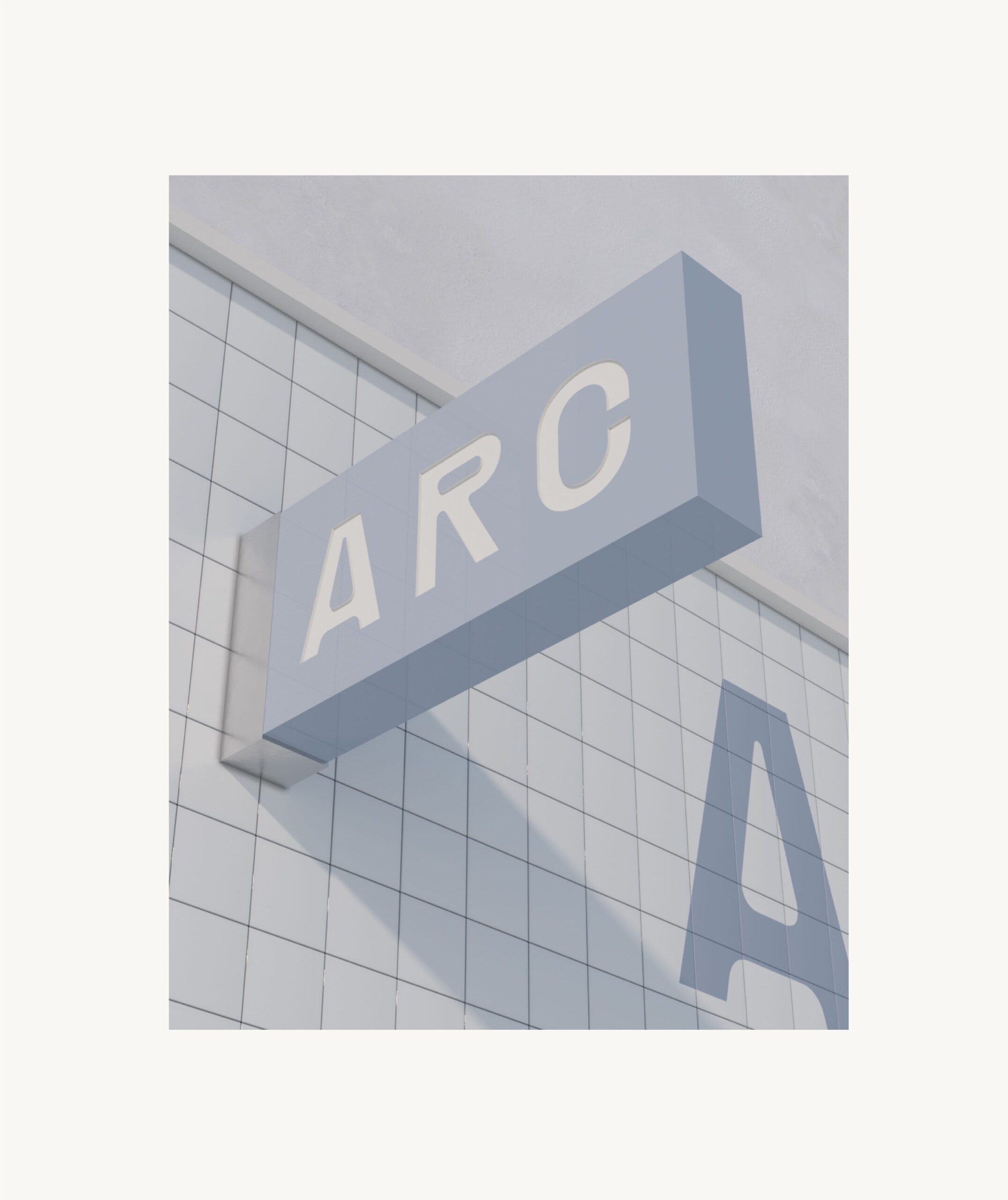
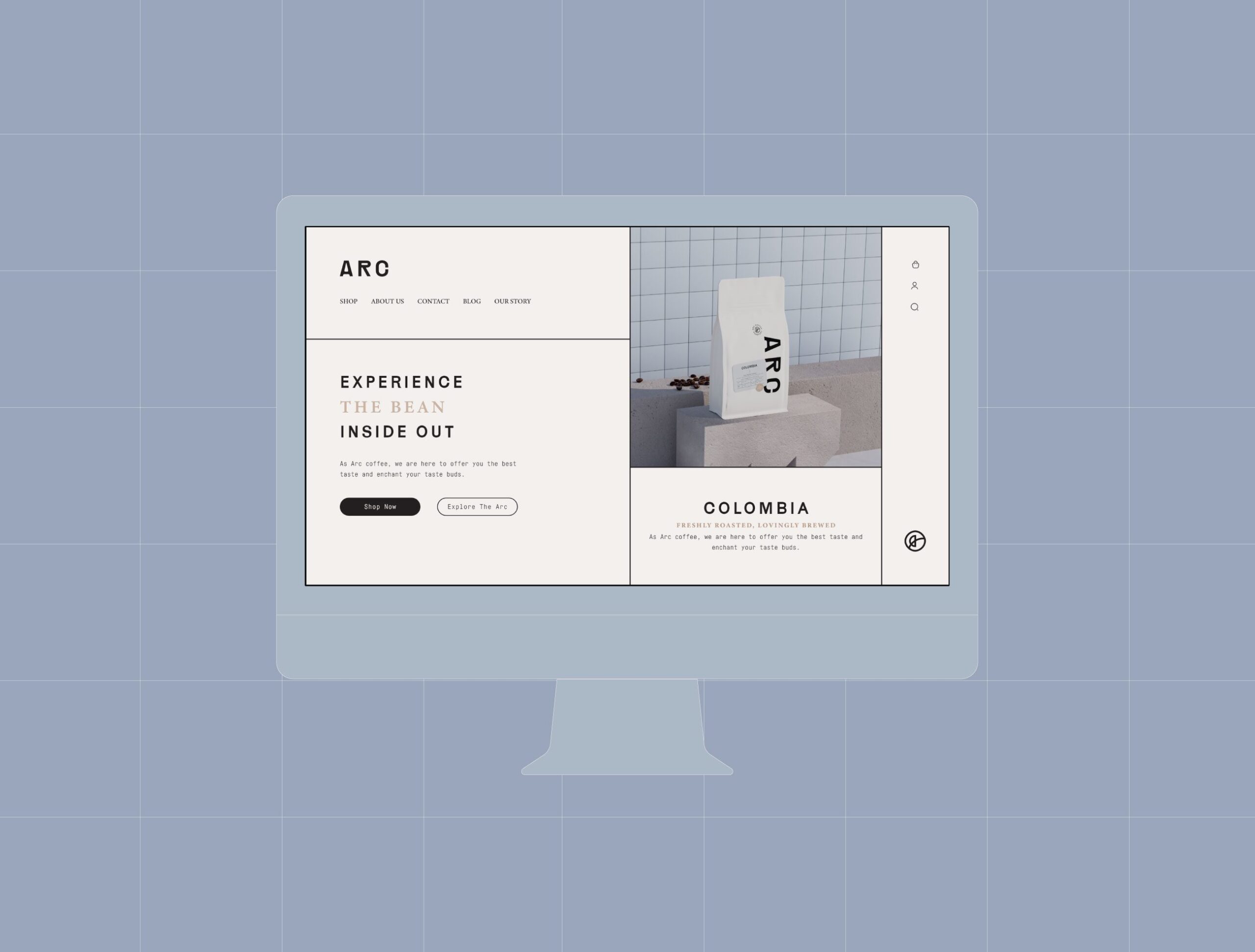
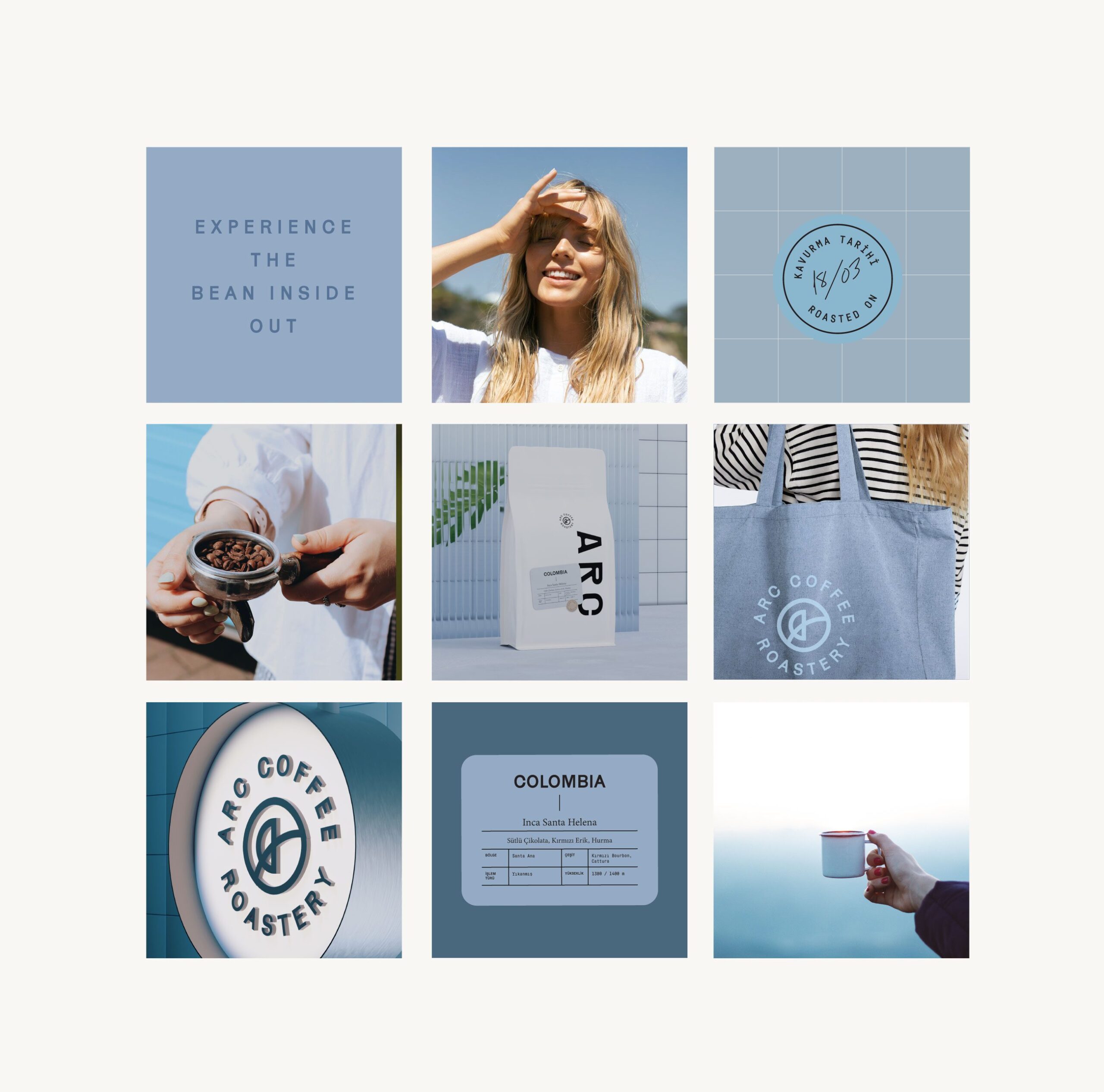
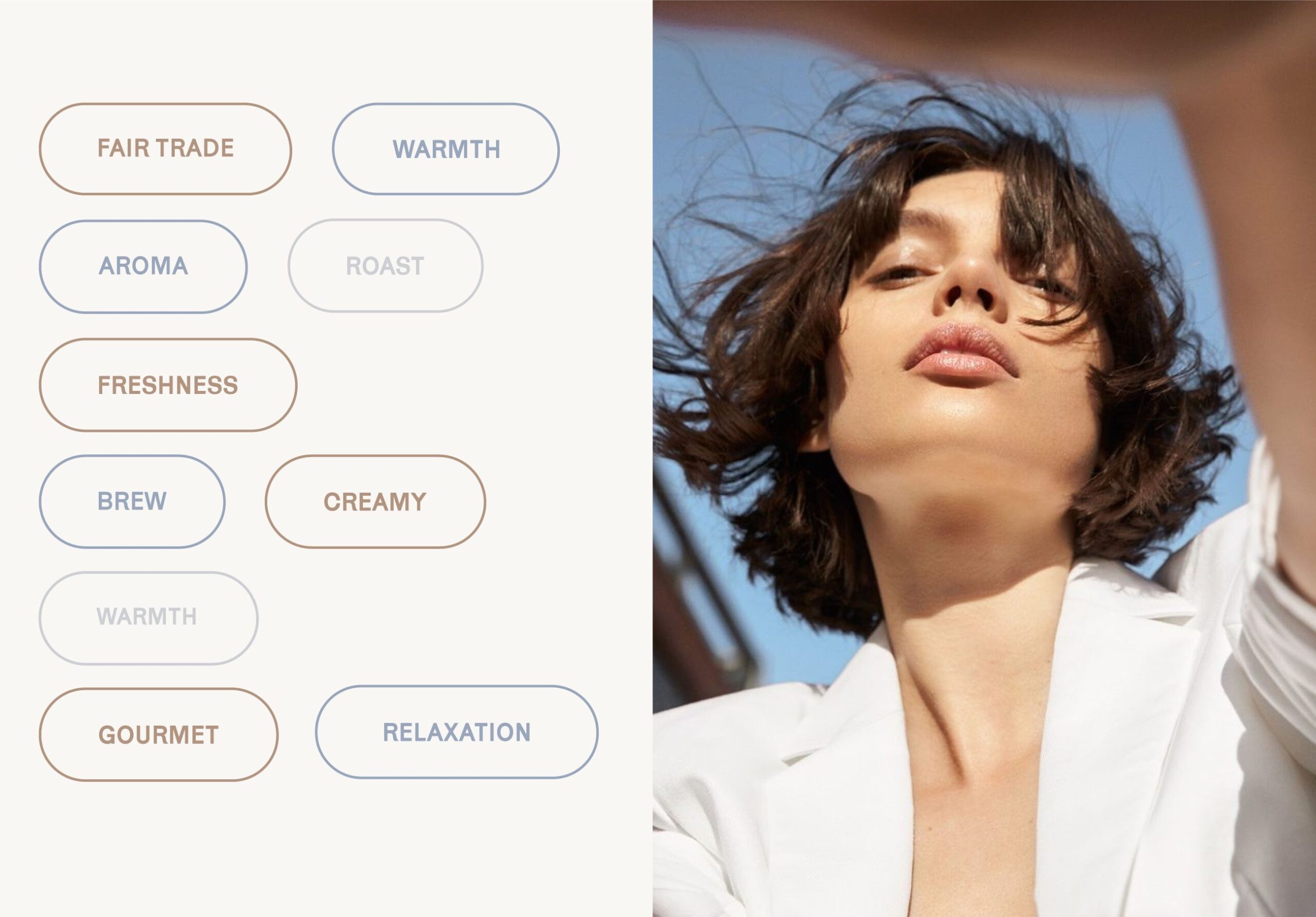
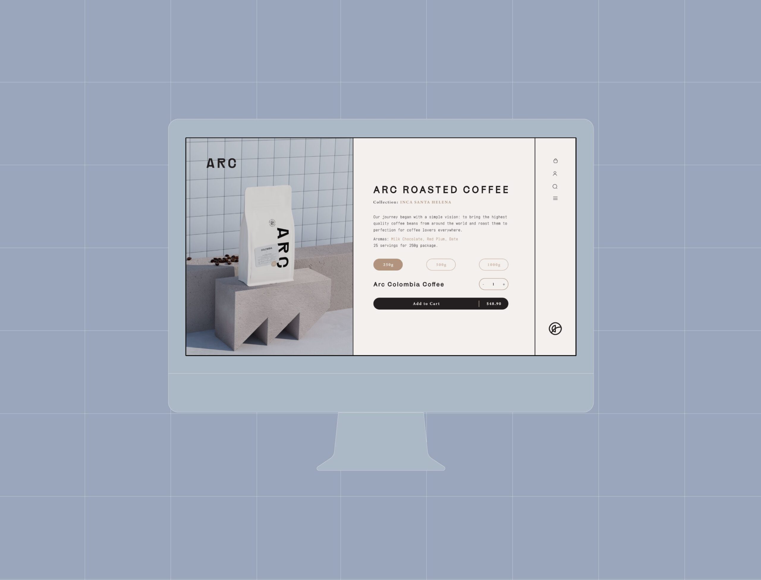
Digital platforms and social media carry the same principles used on the packaging, so recognition built on the shelf carries to the screen. The result is a coffee brand that presents itself through clarity: product information first, presentation refined around it, one system across every touchpoint.






Let’s make the work they’ll copy.
Talk to an expert now
Work with a 38 team of the
industry’s top 1% talent.



