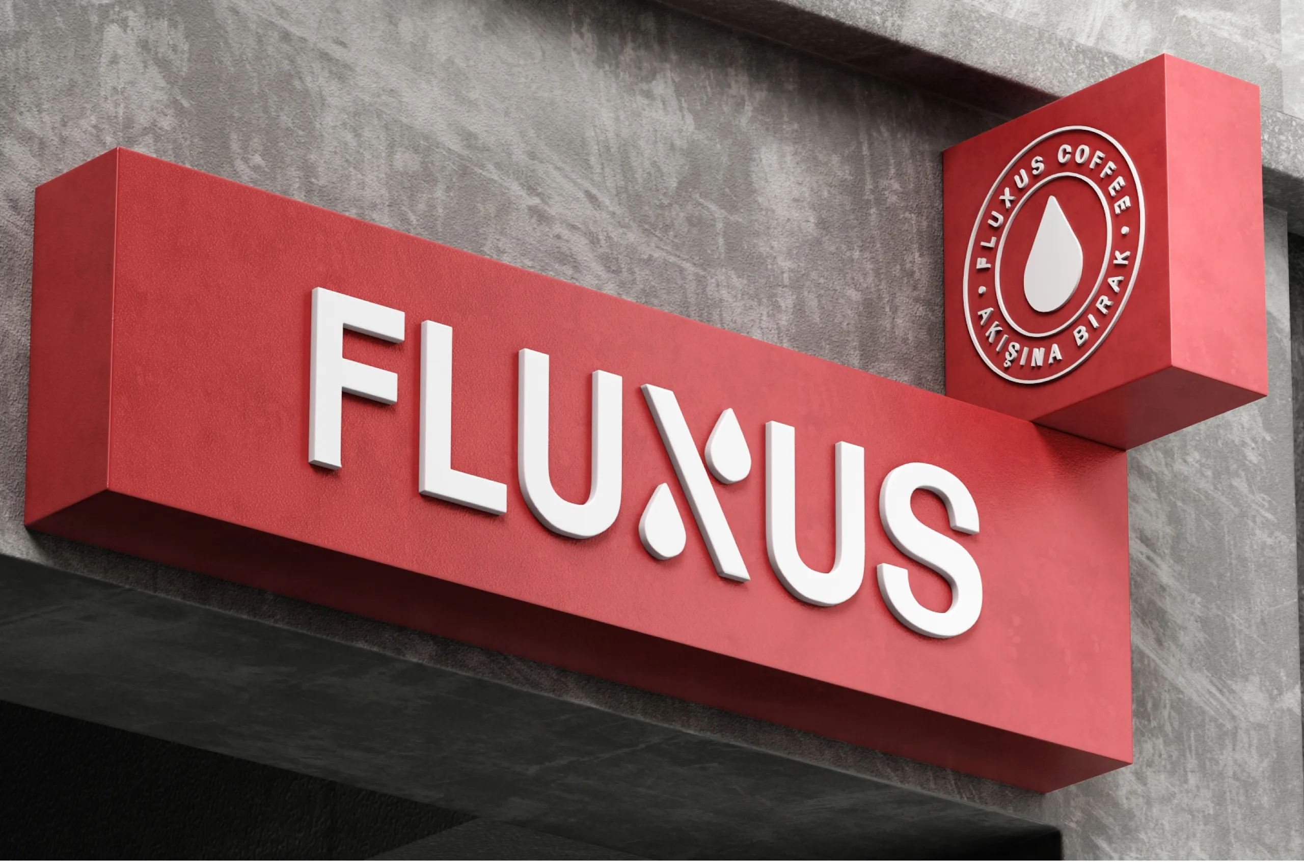
Fluxus Coffee
Coffee Brand Identity Evolution & Visual System
We first created the identity for Fluxus Coffee in 2020. As the brand grew, its visual system needed to evolve with it.
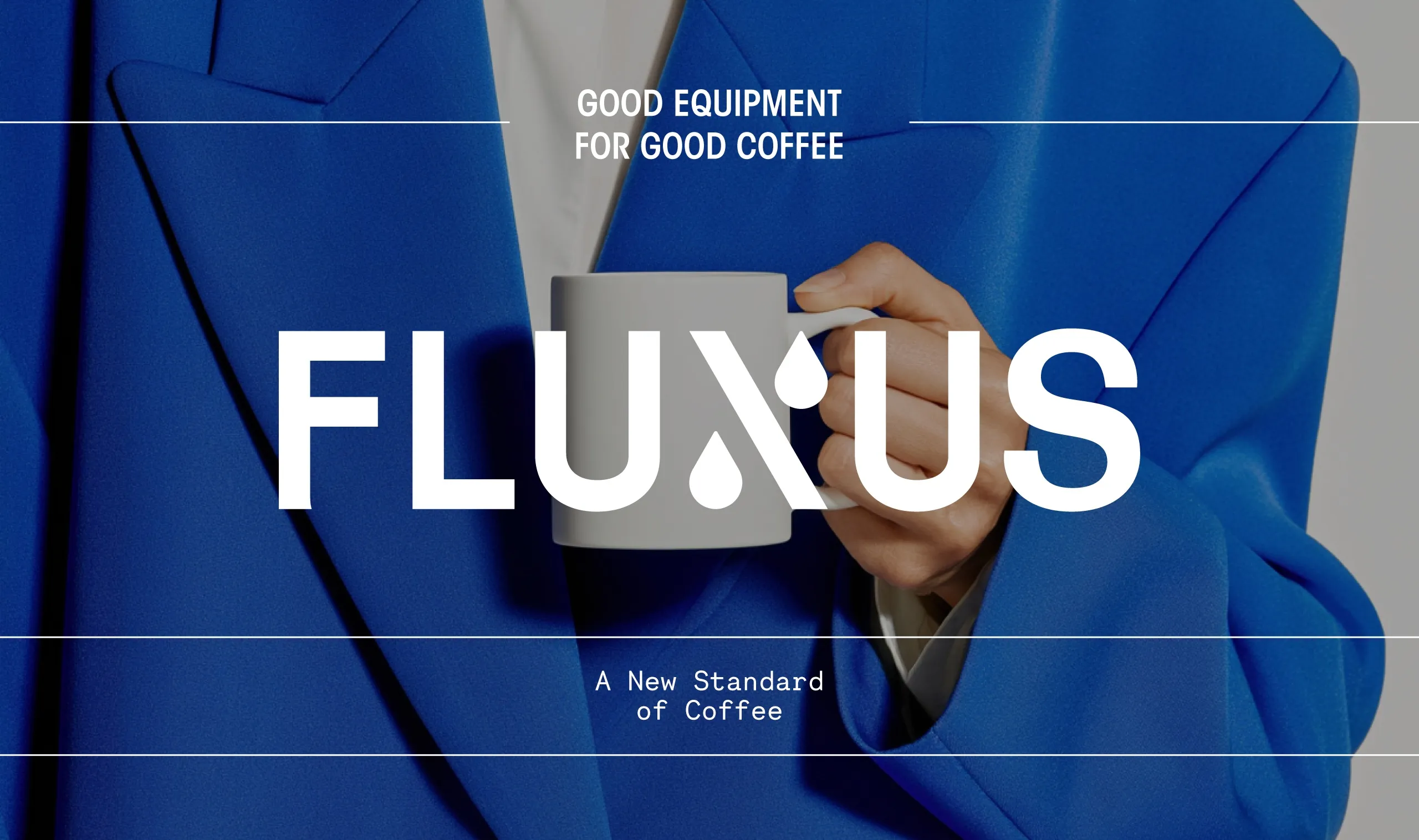
Fluxus Coffee came back to MarkaWorks as an established brand rather than a new one. We had built its original identity, the business had grown since, and the visual system was starting to strain against what the brand had become. The brief was not a rebrand in the usual sense. It was a question about what to keep, and rebranding an identity that still works is a different discipline from starting one. The risk is not that the new work will be weak. The risk is that the brand stops being recognizable to the people who already buy it.
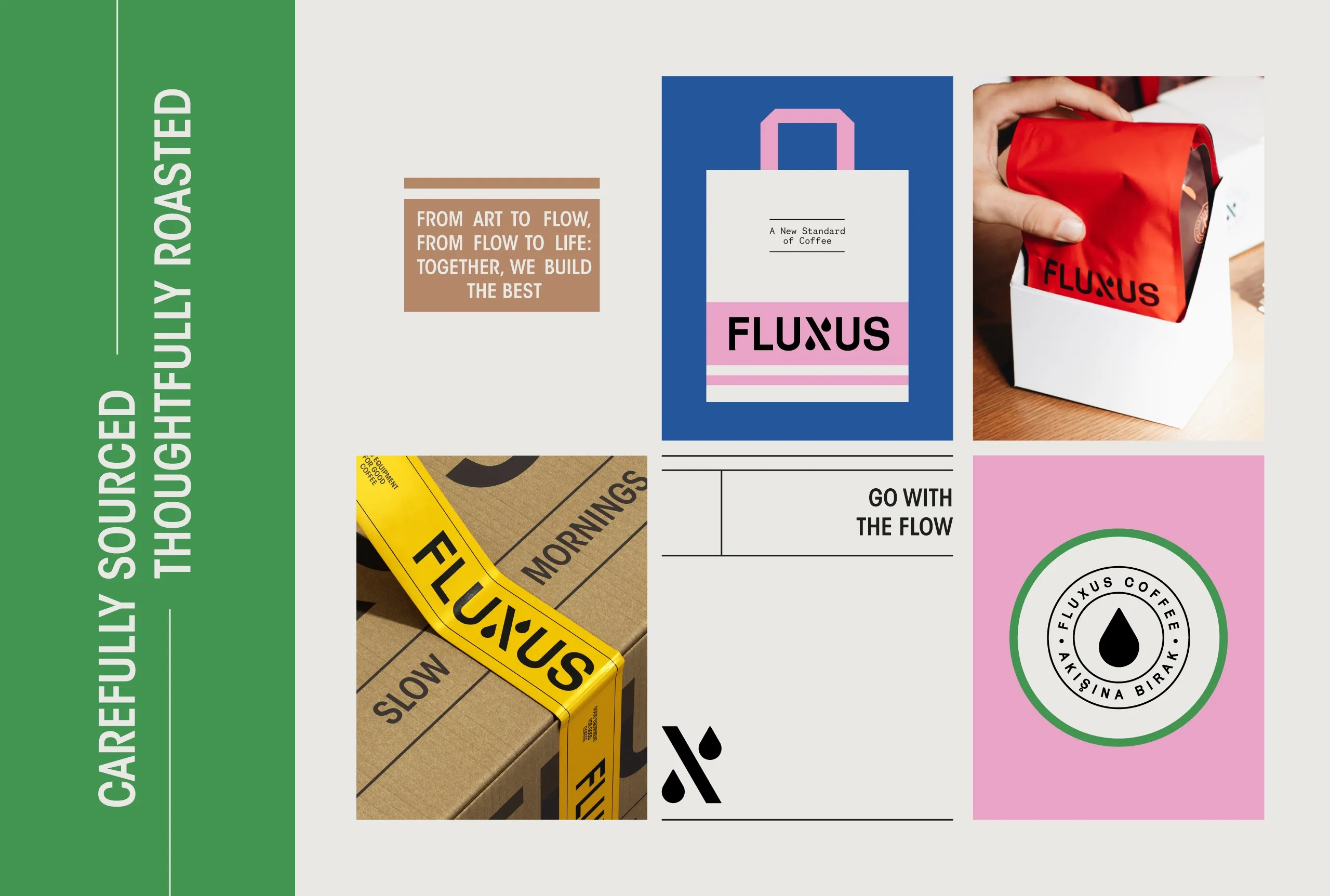
We chose to return to the original identity and refine it rather than replace it. Everything that was still doing its job stayed. What changed was the part of the system that had to carry more weight than it was designed for: the range.
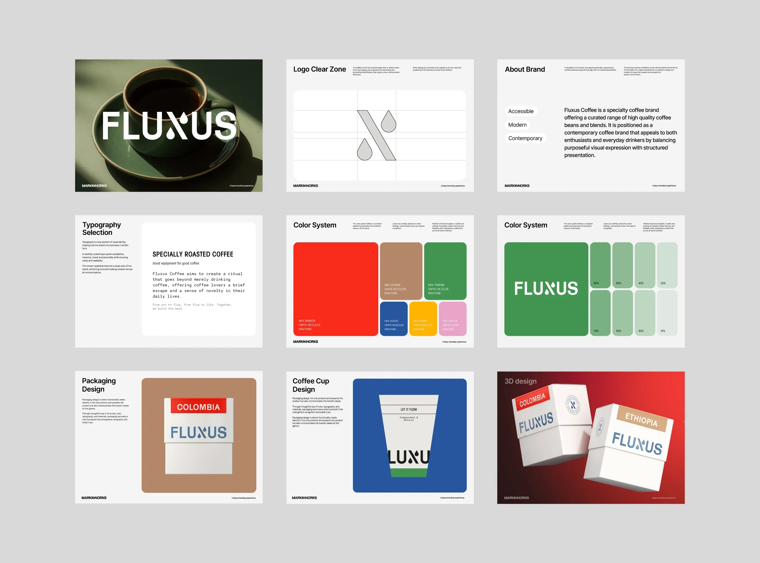
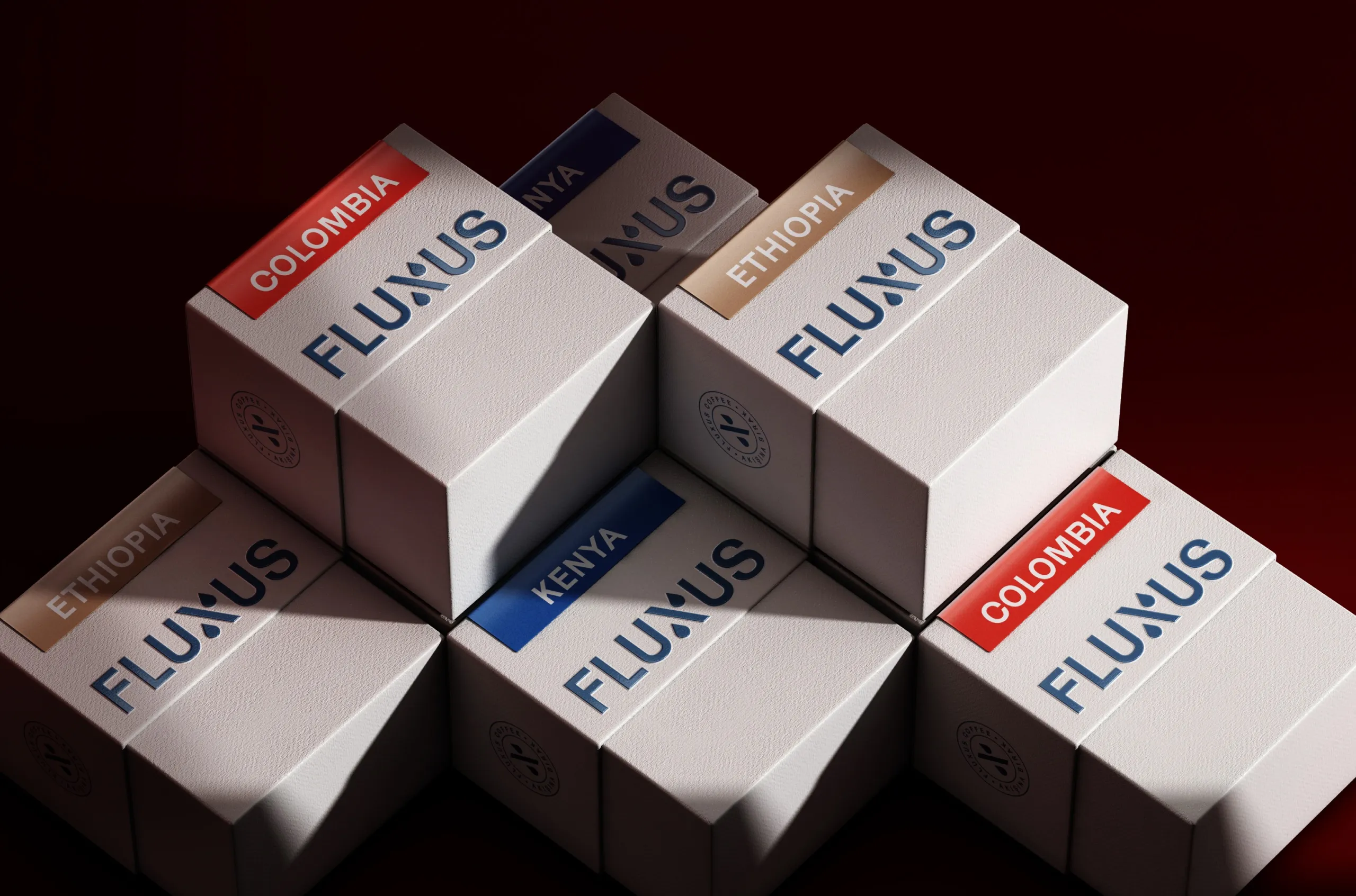
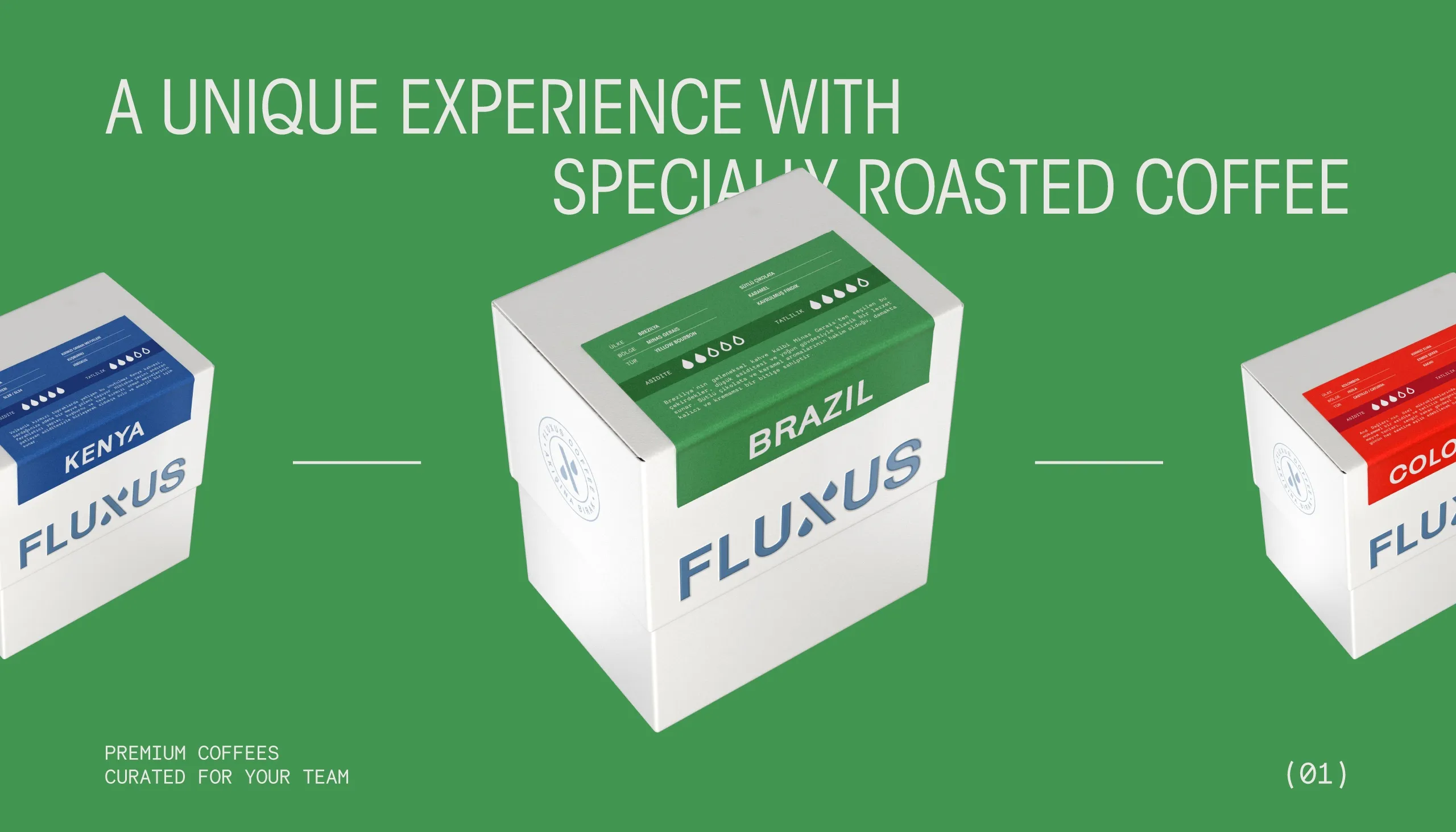
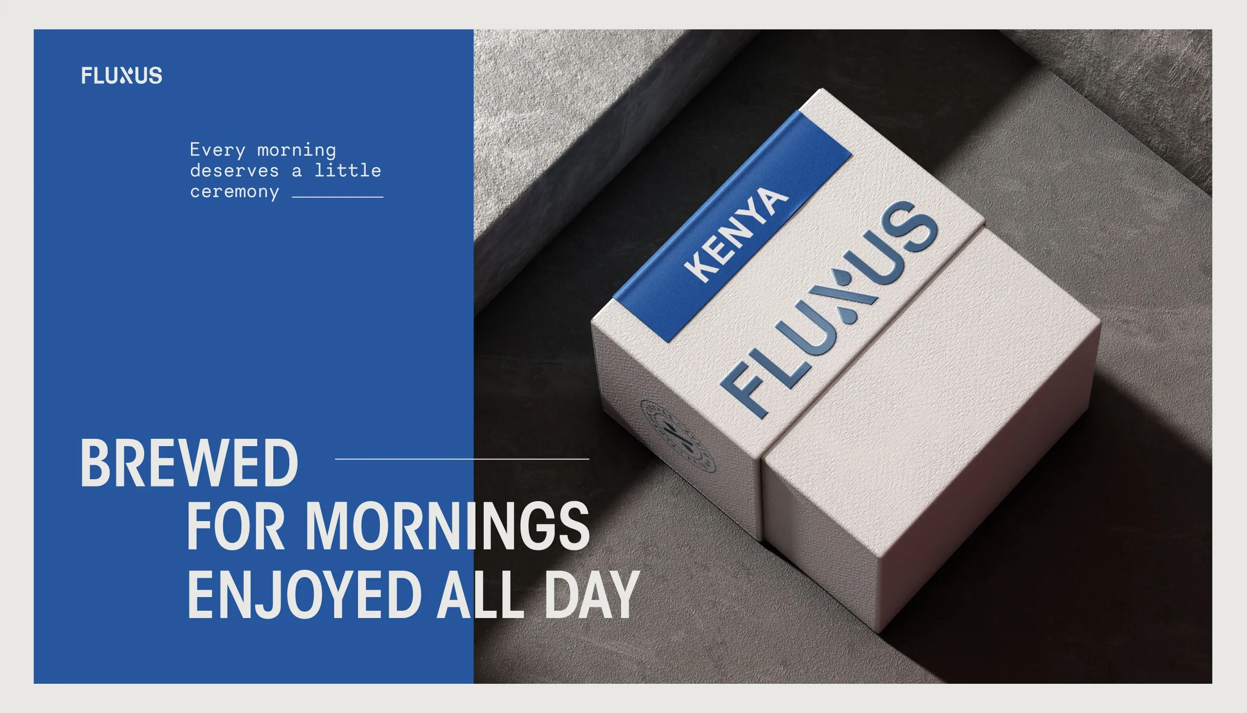
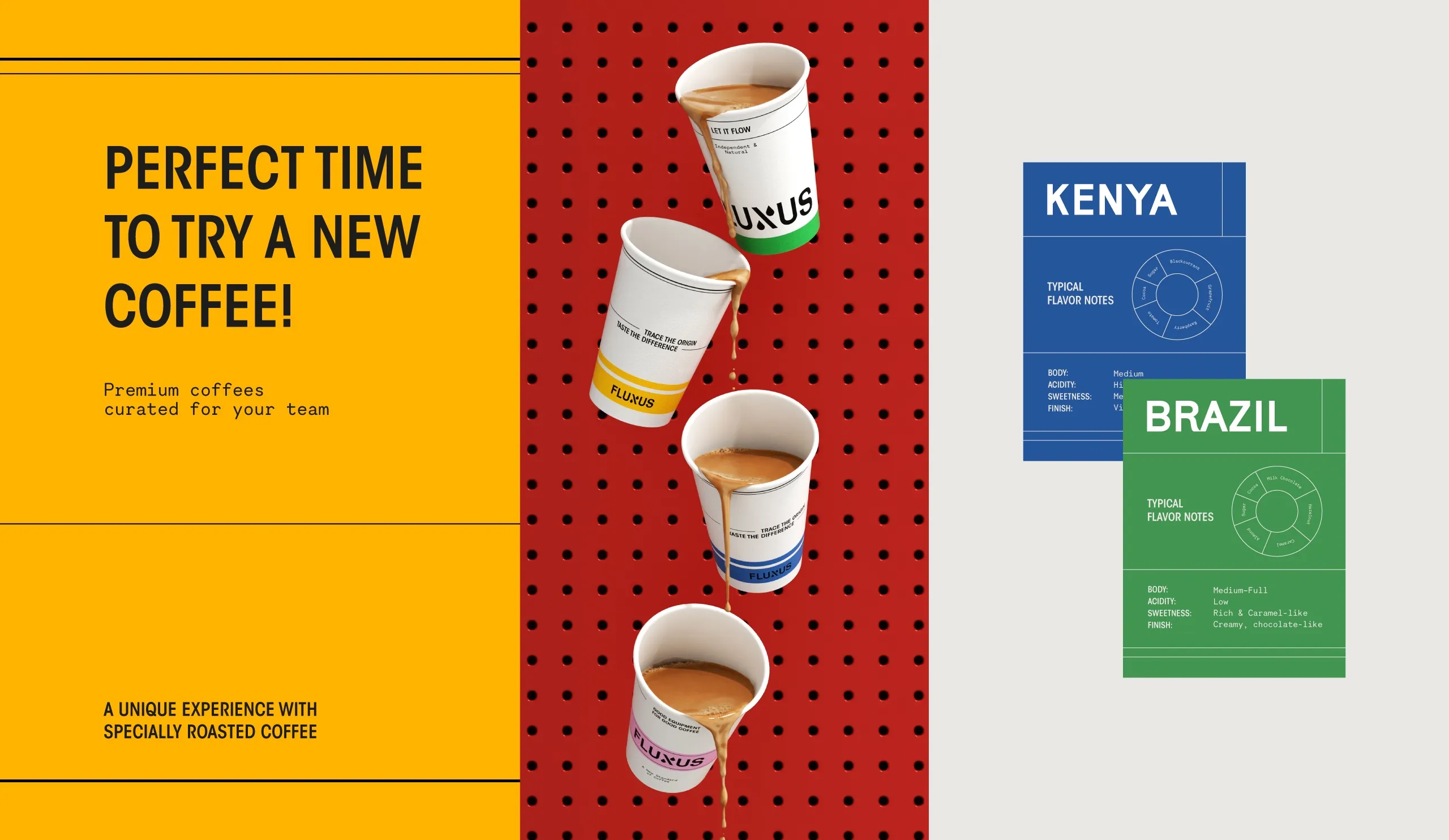
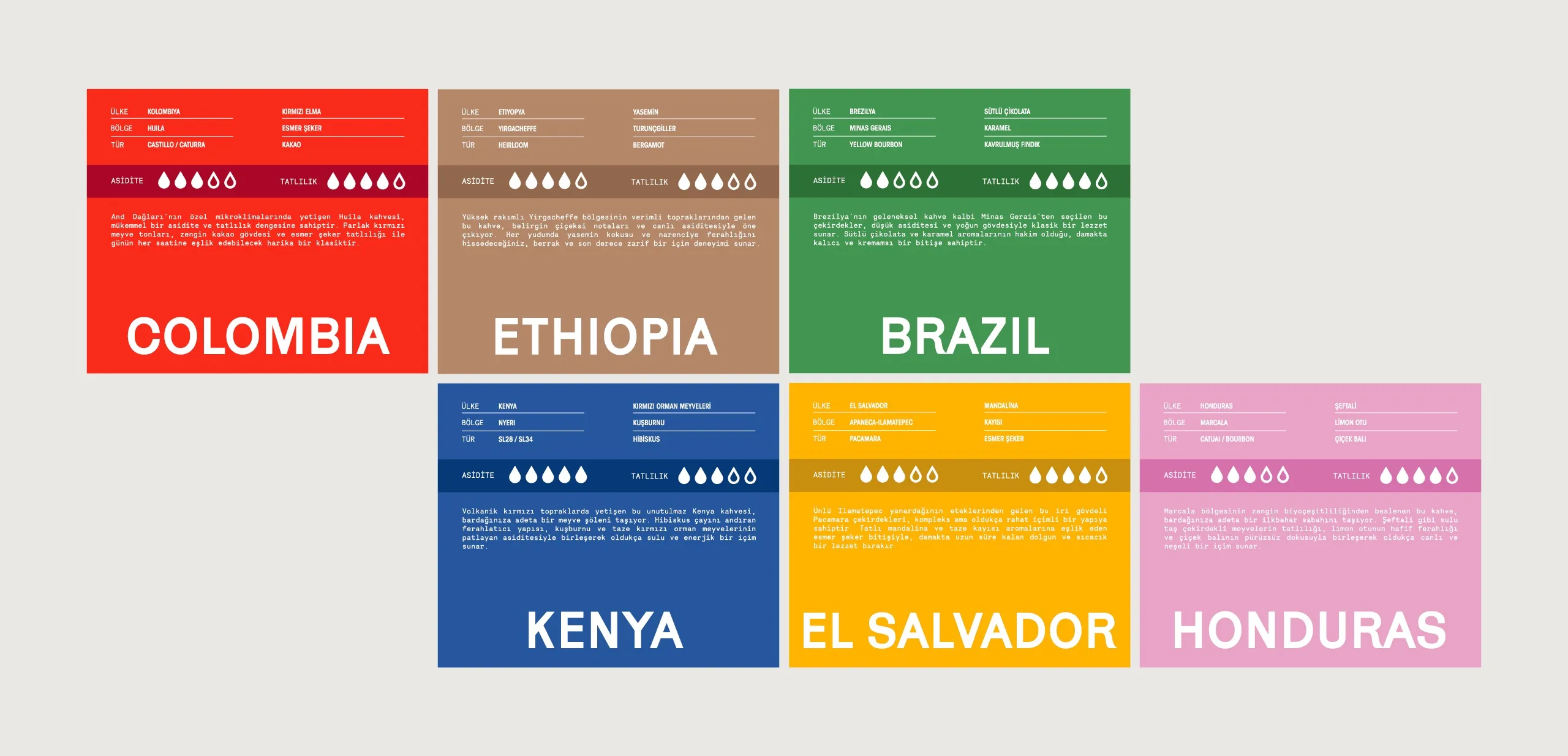
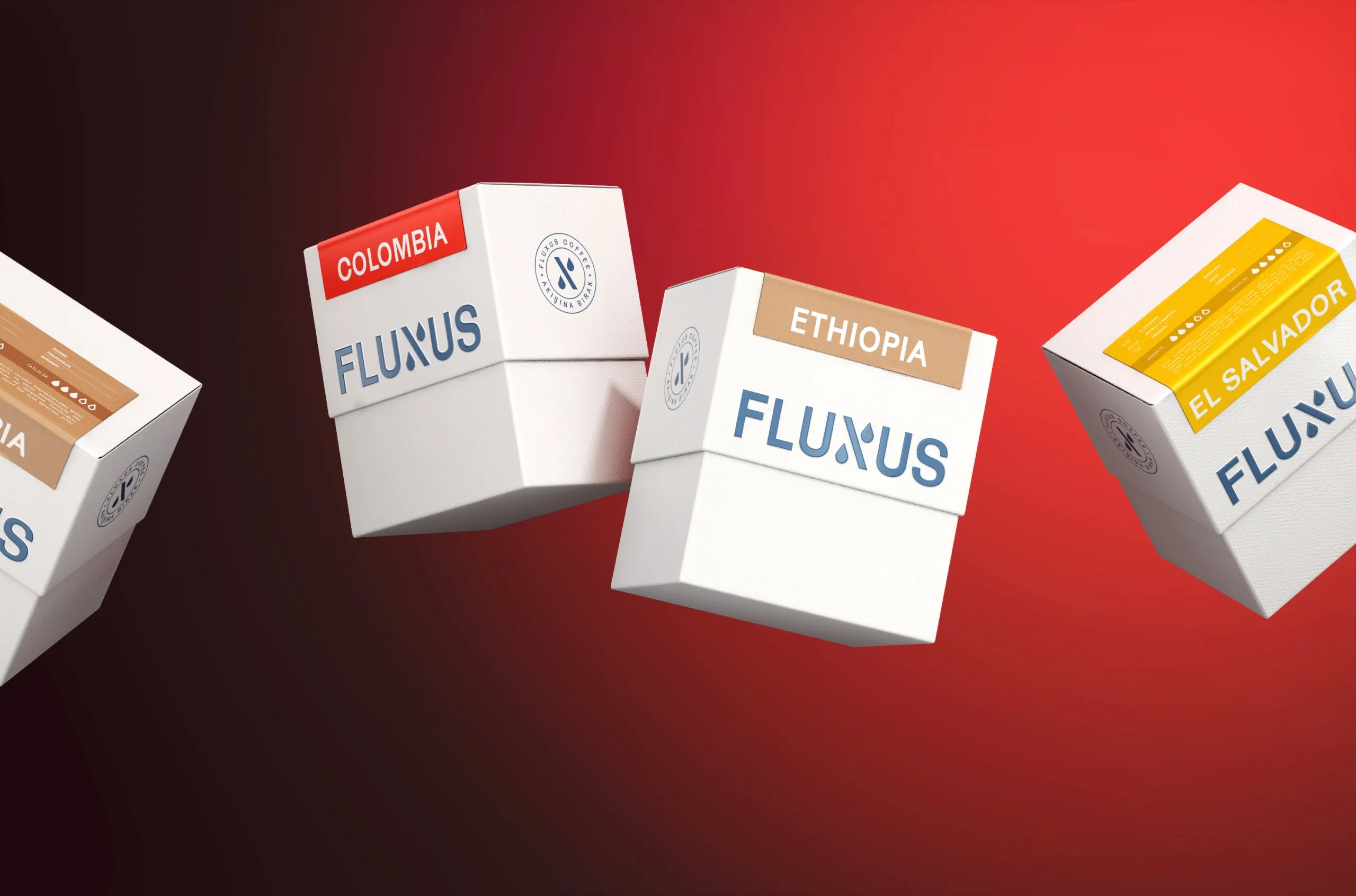
Coffee packaging design is an information problem before it is a visual one. MarkaWorks structured it: origins and roast profiles are communicated in a fixed order, and the typography we chose holds that hierarchy so product names, roast details, and tasting notes stay readable on pack. A restrained colour system separates variants without breaking the range apart, which lets an enthusiast compare two bags and an everyday drinker pick one without comparing anything.
Brand Strategy and Visual Identity
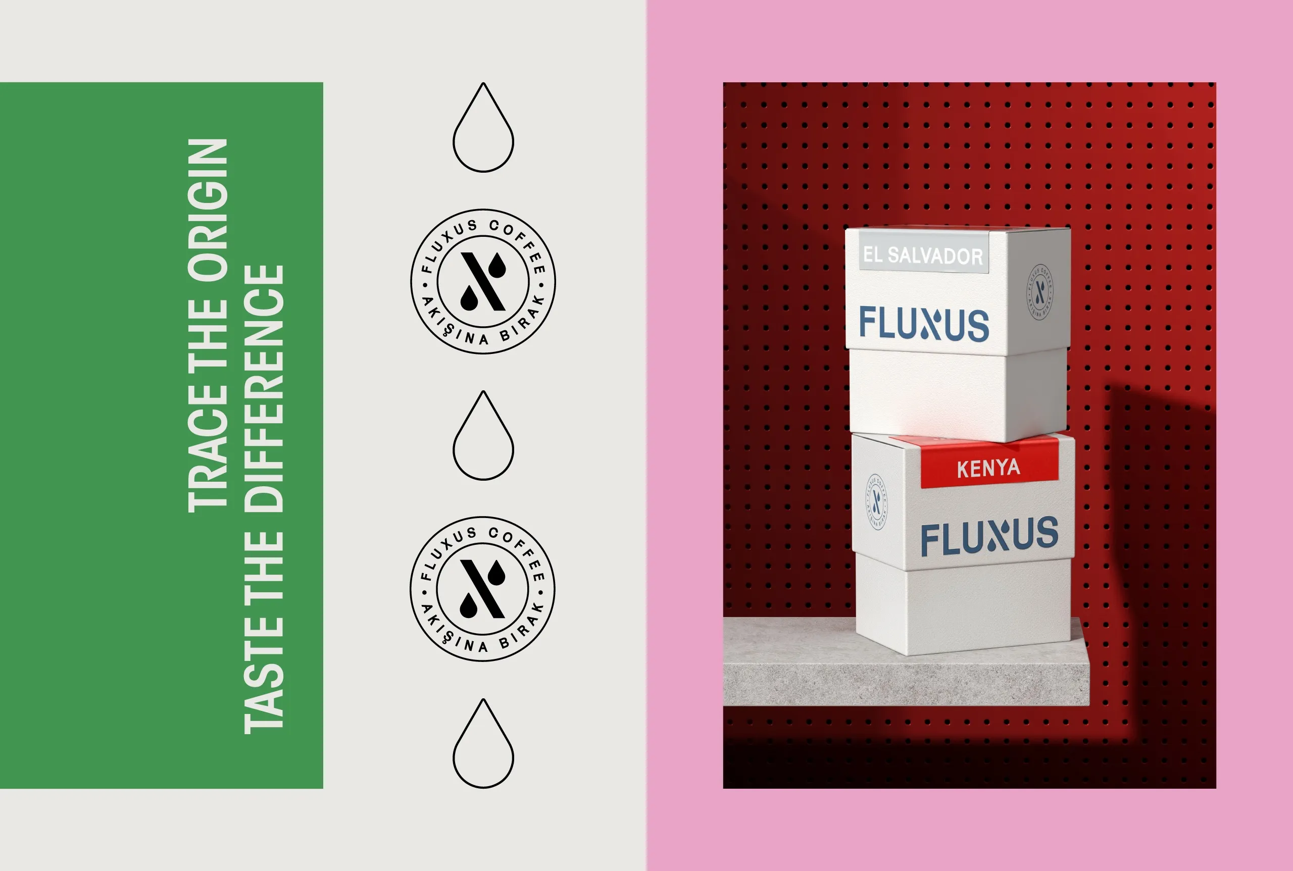
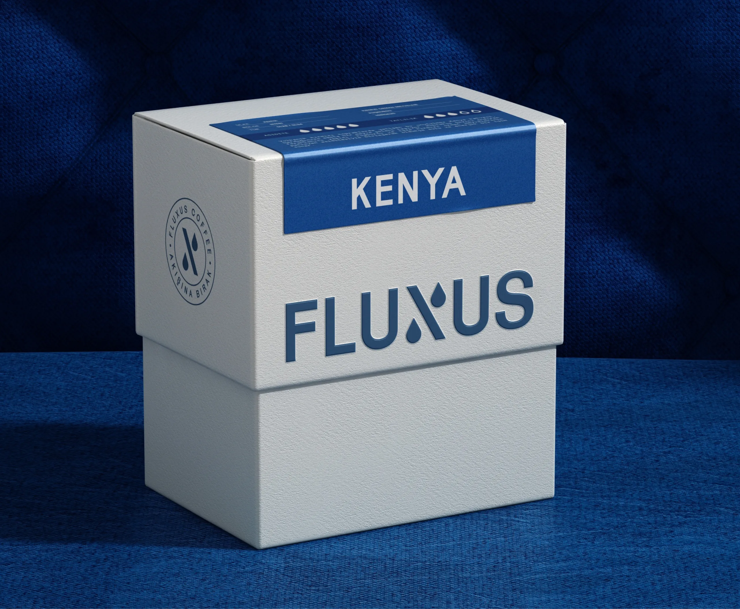
The main work is in the label structure. Fluxus sells coffee by origin, so the label has to answer two questions at once, which coffee is this and whose coffee is this. We rebuilt the structure so each origin reads on its own while the range still holds together as one family. The typographic hierarchy was sharpened to support that reading order, so the eye lands on the origin first and the rest of the information follows in sequence rather than competing for the same moment of attention.
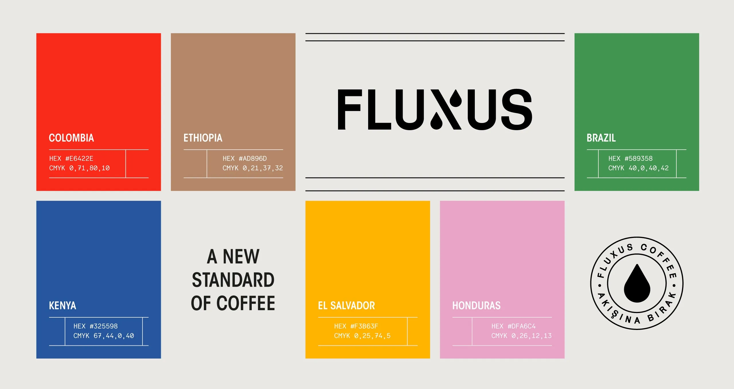
Pattern and color were treated as the second layer of that system. We renewed the pattern approach and rebalanced the palette so that difference between coffees is carried by color and pattern rather than by redrawing the layout each time. That is what makes the range extendable: a new origin enters the system without a new design.
Packaging Design and Product Expression
Range design is where most coffee branding comes apart, because every new origin arrives as a new design problem. Here it arrives as a new entry in a structure that already exists, and that is the difference between a system and a set of labels.
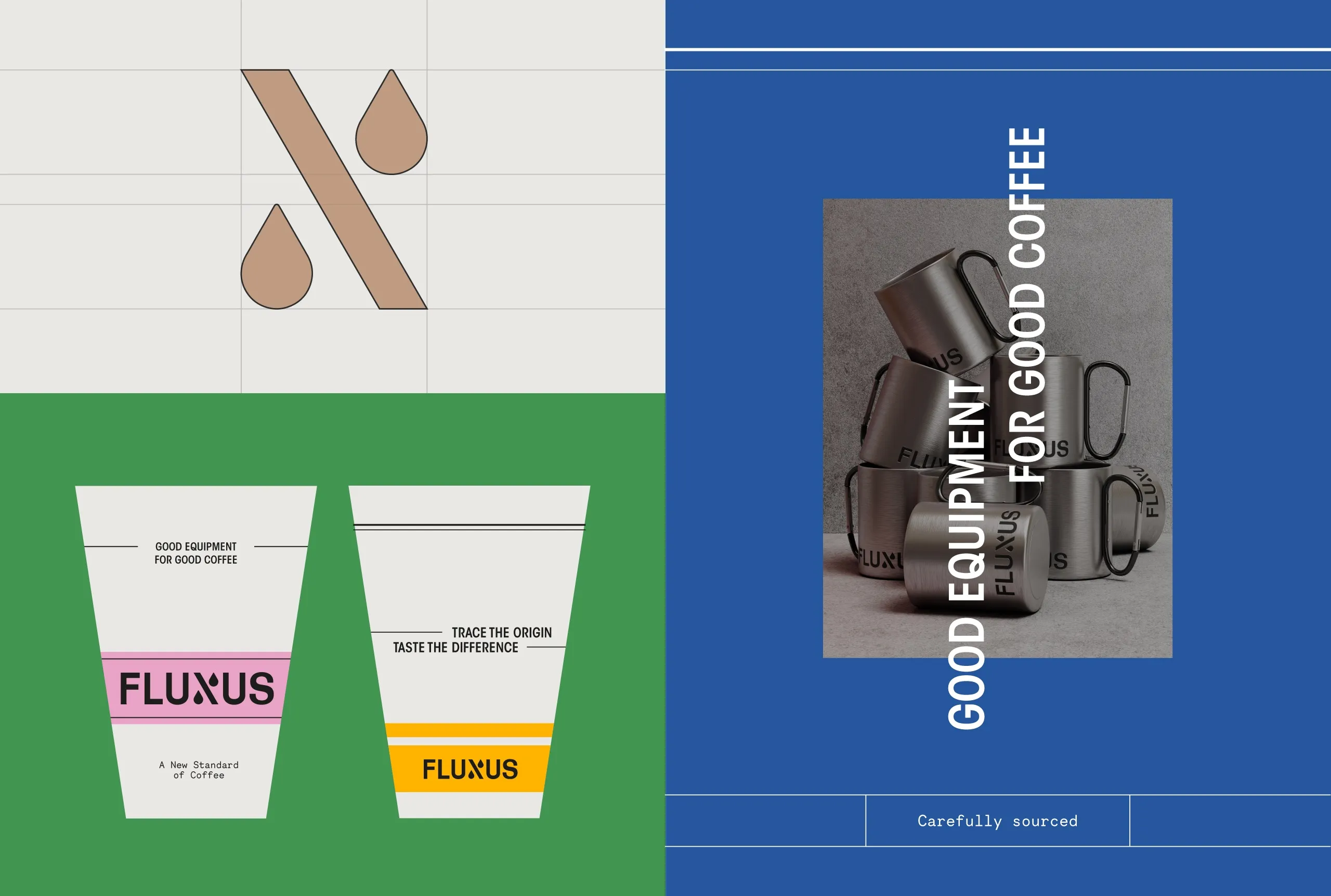
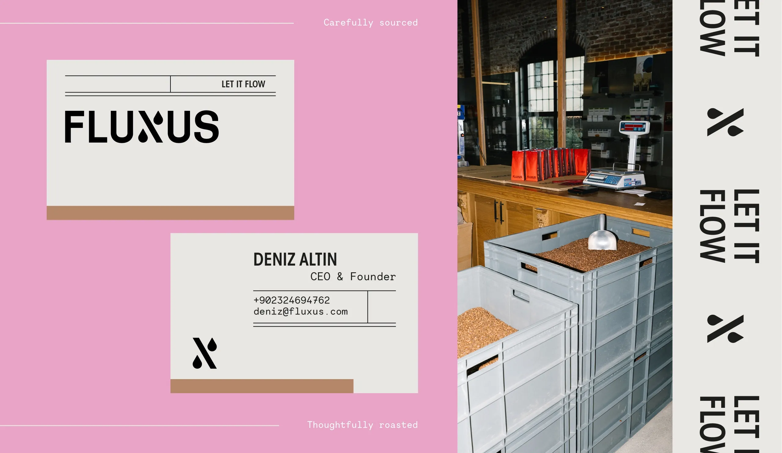
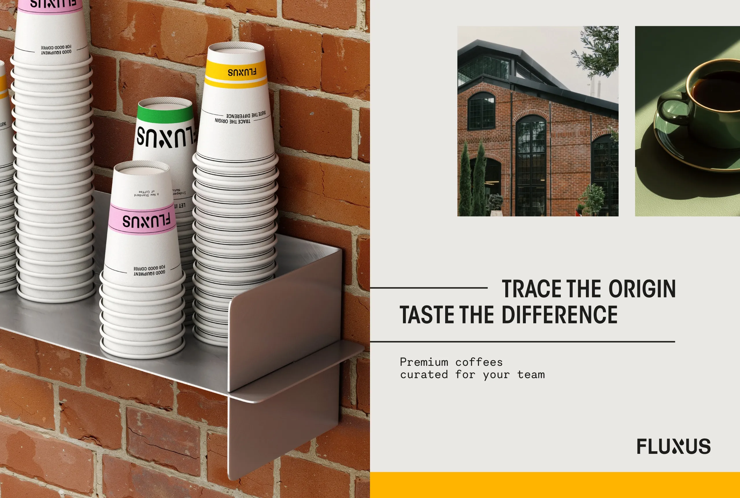
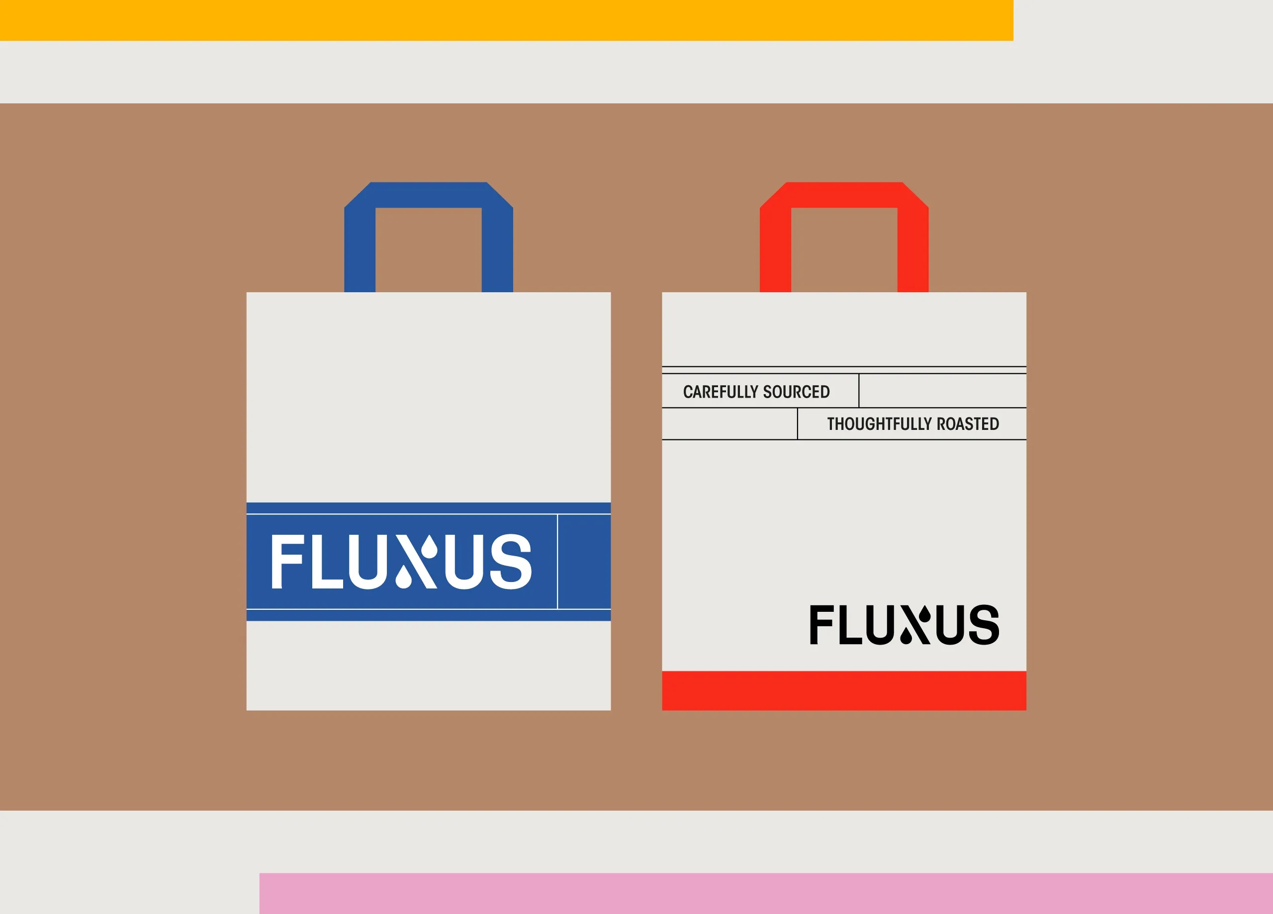
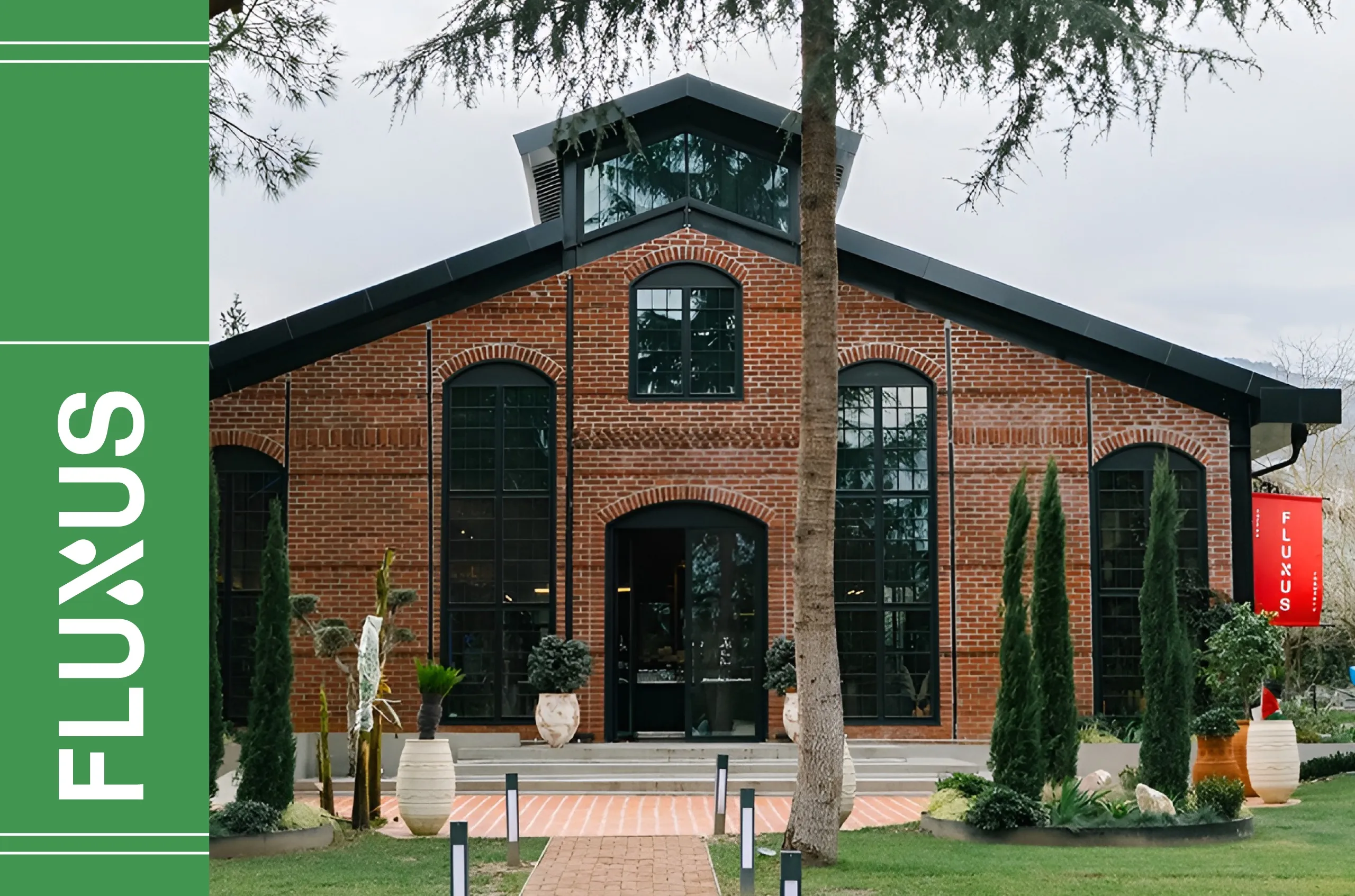
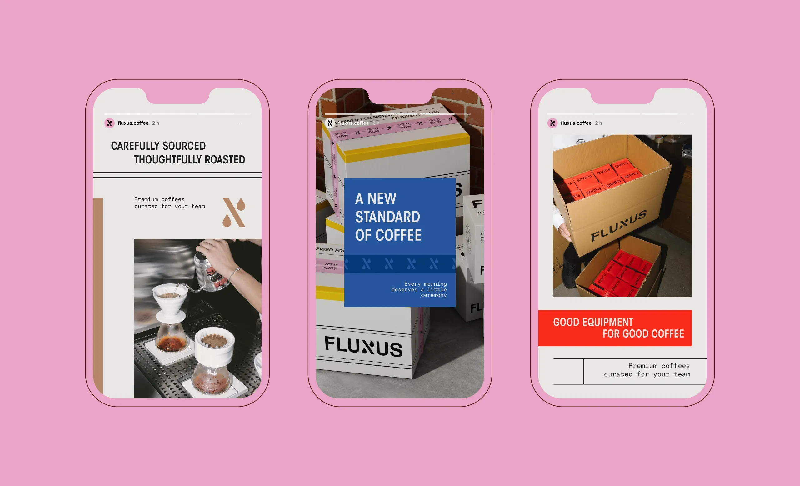
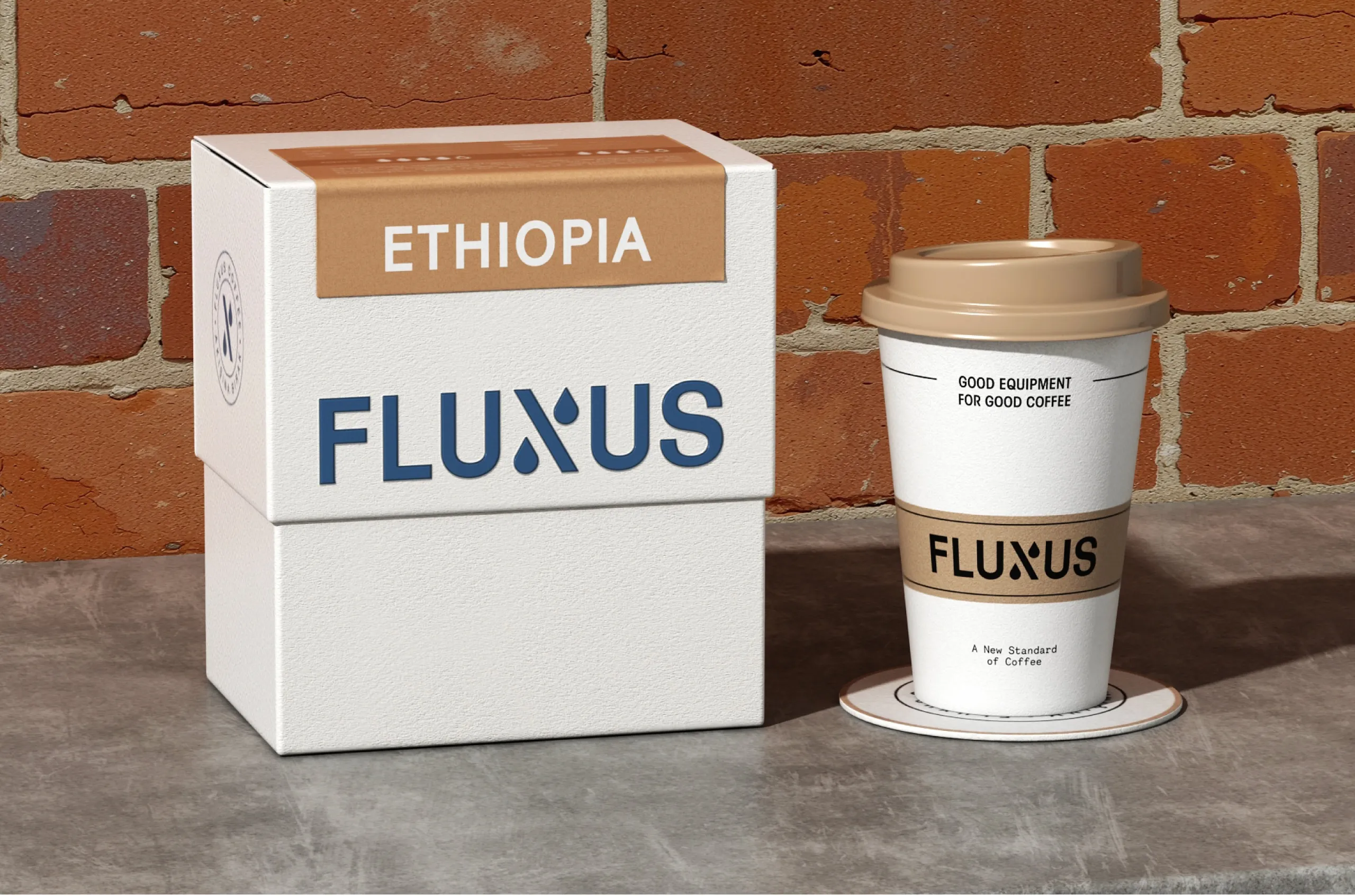
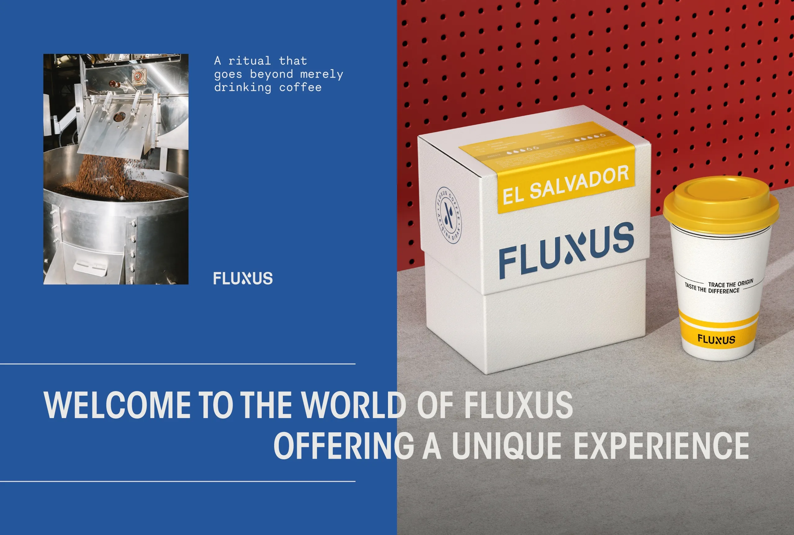
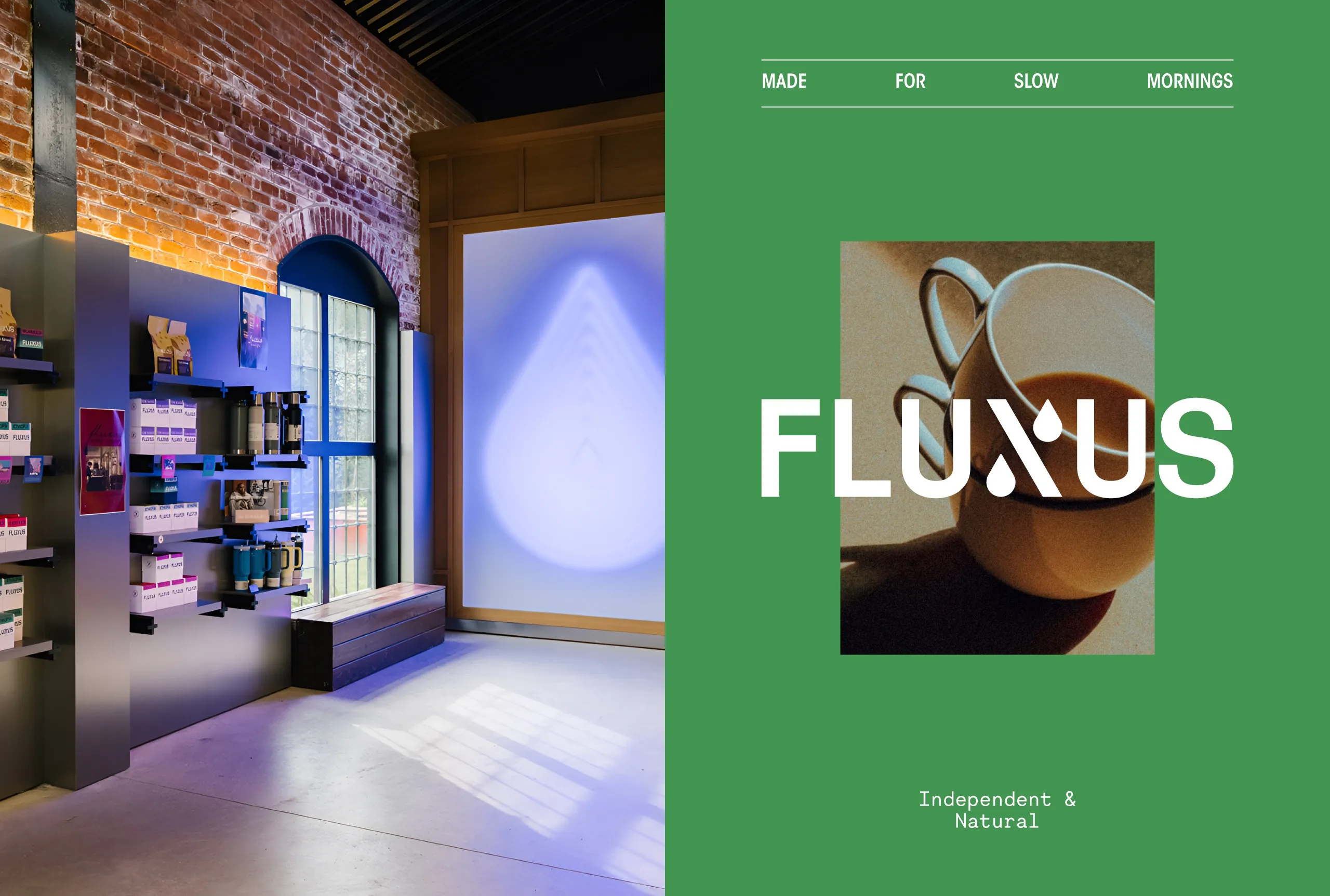
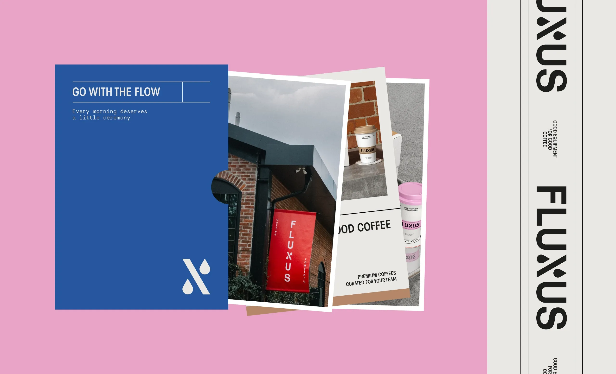
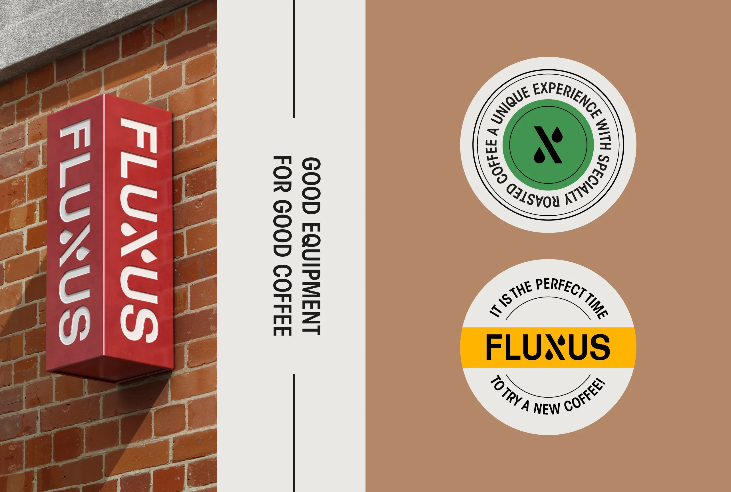
The identity is applied across packaging, cups, signage, and digital communication, and it behaves the same way in each. A cup and a bag are read at different distances and for different lengths of time, so the hierarchy has to survive being shrunk, wrapped, and glanced at rather than studied.
Brand Application and Market Presence
What Fluxus has now is an evolution of what it already had, not a replacement for it. The brand is still recognizable to the people who already knew it, and the system underneath it is flexible enough to keep growing without being redrawn.

Let’s make the work they’ll copy.
Talk to an expert now
Work with a 38 team of the
industry’s top 1% talent.



