
Herschel's Coffee Co.
bold vintage amsterdam coffee
Herschel’s Coffee Co. is an Amsterdam-based purveyor of upscale coffee, blending vintage charm with bold flavor profiles. MARKAWORKS crafted a distinctive visual identity and packaging designed to evoke immediate recognition and trust in every cup.

A Holistic Approach to Coffee Brand Development
Our comprehensive branding strategy for Herschel’s Coffee Co. spanned from conceptual logo design to impactful packaging, all meticulously crafted to resonate with their discerning audience. We focused on translating Herschel’s Coffee Co.’s core values of vintage charm and boldness into tangible visual elements, ensuring a cohesive and compelling brand narrative.
See more coffee and tea branding case studies.
Defining the Essence: Brand Vision & Keywords
The journey with Herschel’s Coffee Co. began by understanding their vision for an Amsterdam-based coffee house. The key keywords identified were Vintage / Upscale / Associative / Bold / Eye-catchy. Our strategy focused on developing a visual language that not only stands out but also builds immediate trust and recognition with consumers, setting the stage for a memorable brand.


Crafting an Iconic Visual Identity
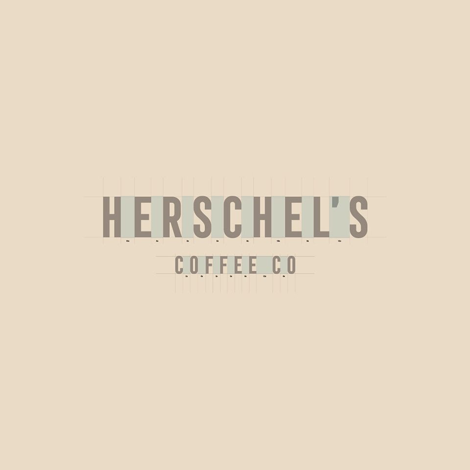
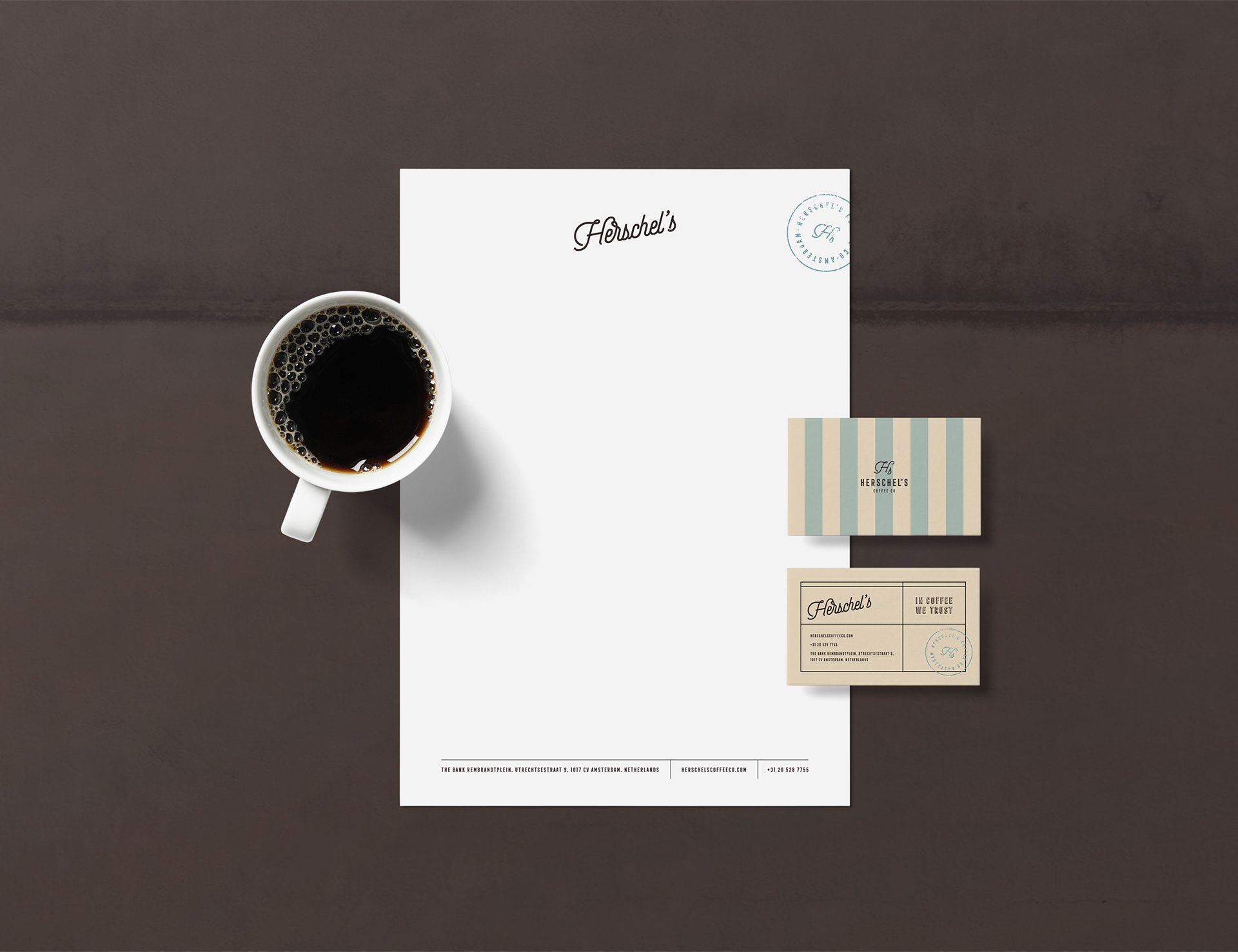
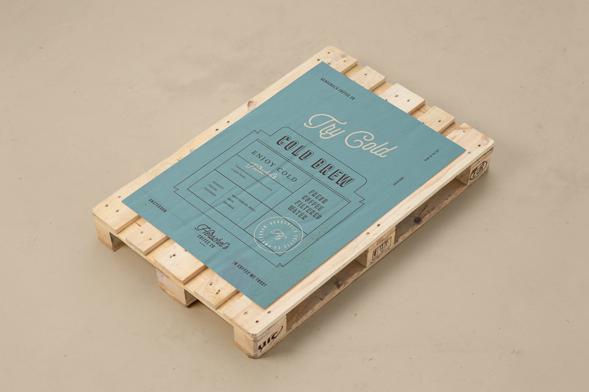
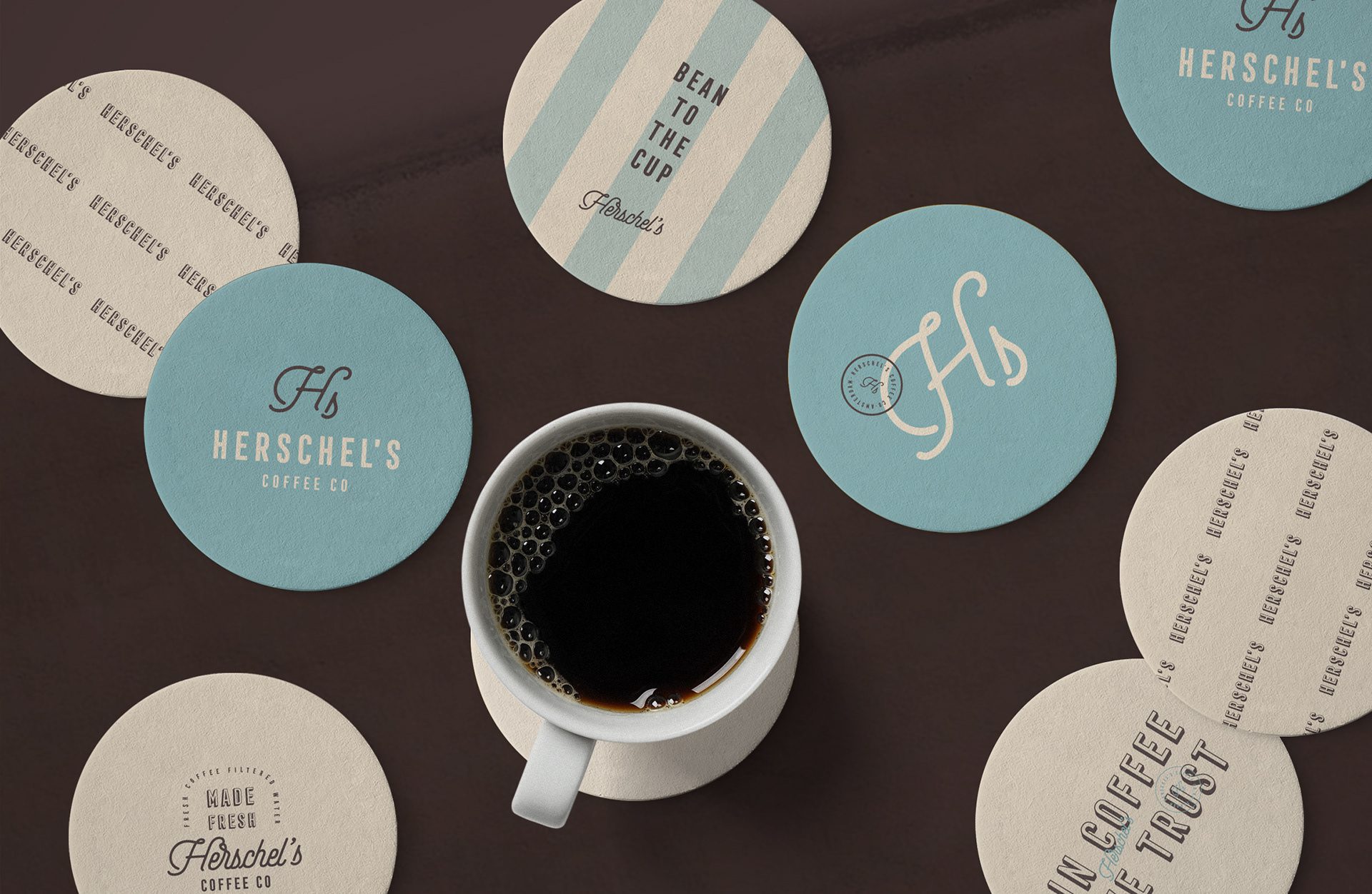
At the heart of the Herschel’s Coffee Co. brand lies a bold primary logotype with a sans serif font and a secondary mark in a script font. In addition, we designed an emblem which can be separately applied to smaller surfaces or together with the primary logo. Every aspect was developed to convey sophistication and a distinct market presence, resonating with the brand’s premium positioning and ethos.
Distinctive Color Palette & Patterns
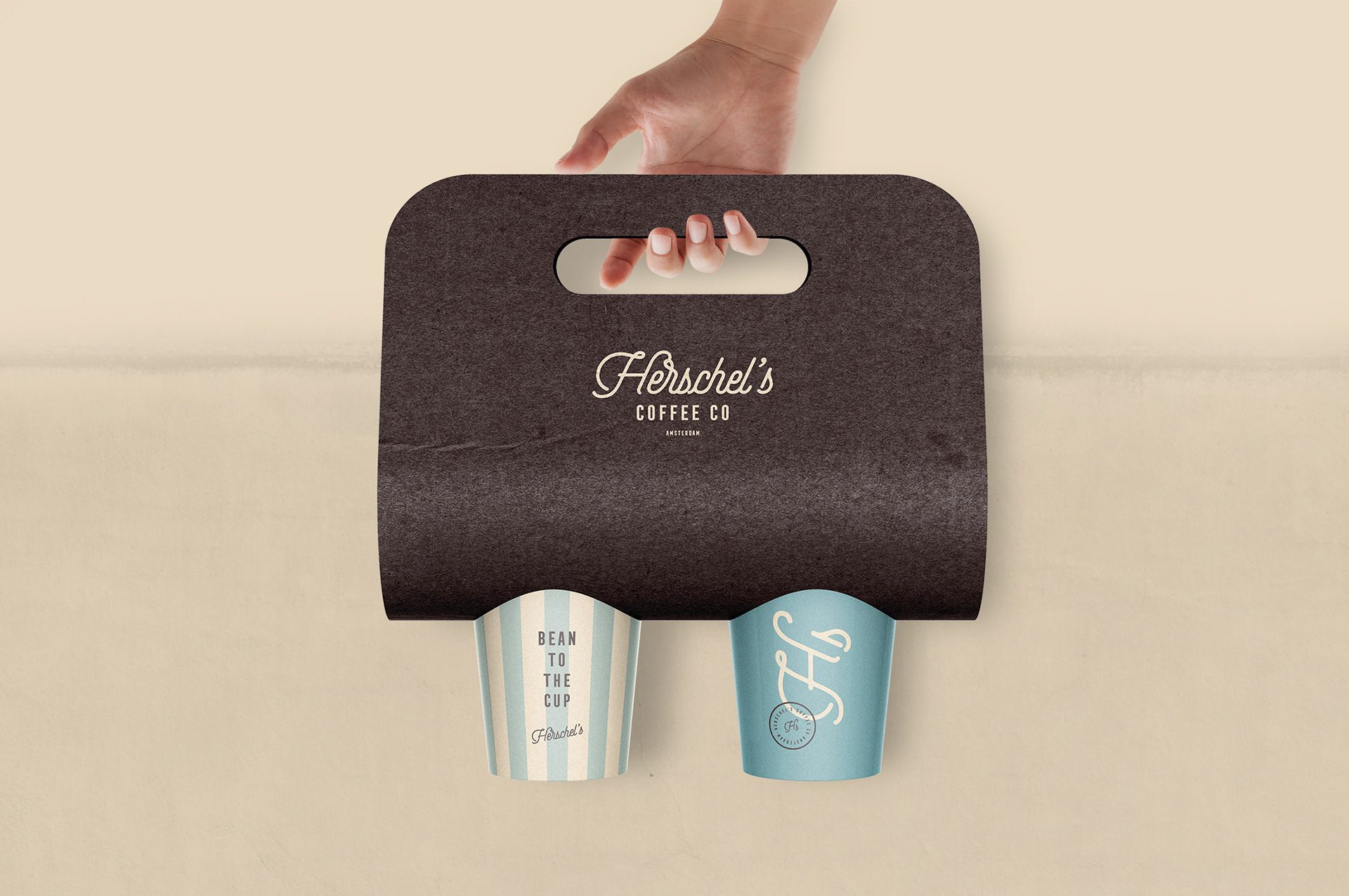
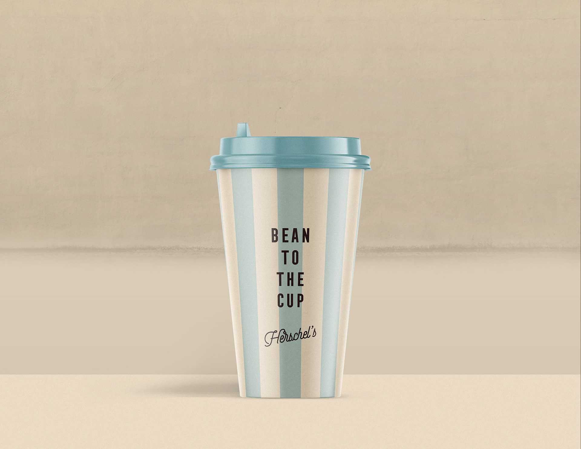
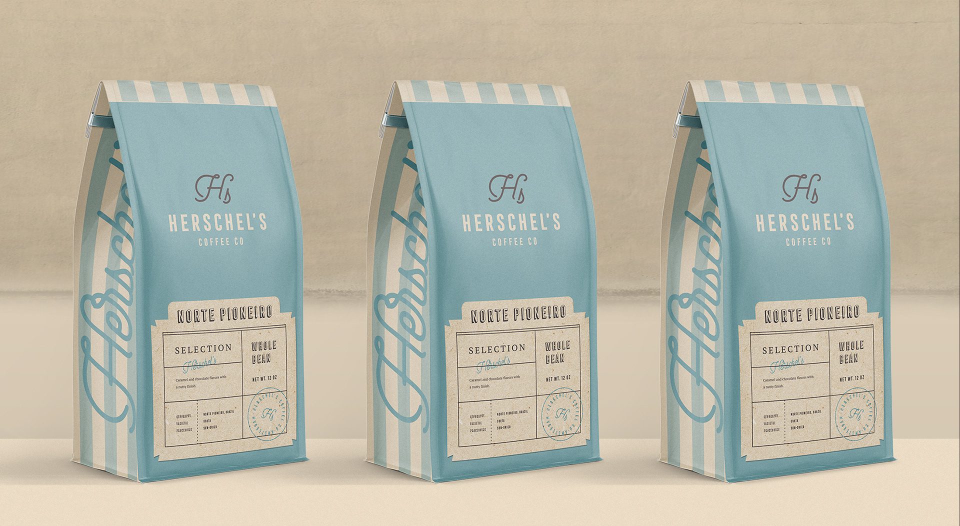
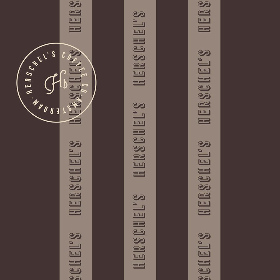
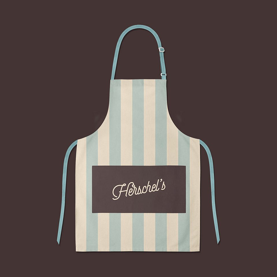
In association with coffee, we selected shades of brown in combination with light blue and old paper-like shades. We designed a striped pattern in light blue and creamy colors for stronger vintage associations. This palette and pattern were used to create a cohesive and visually appealing brand experience.
Innovative Packaging Design
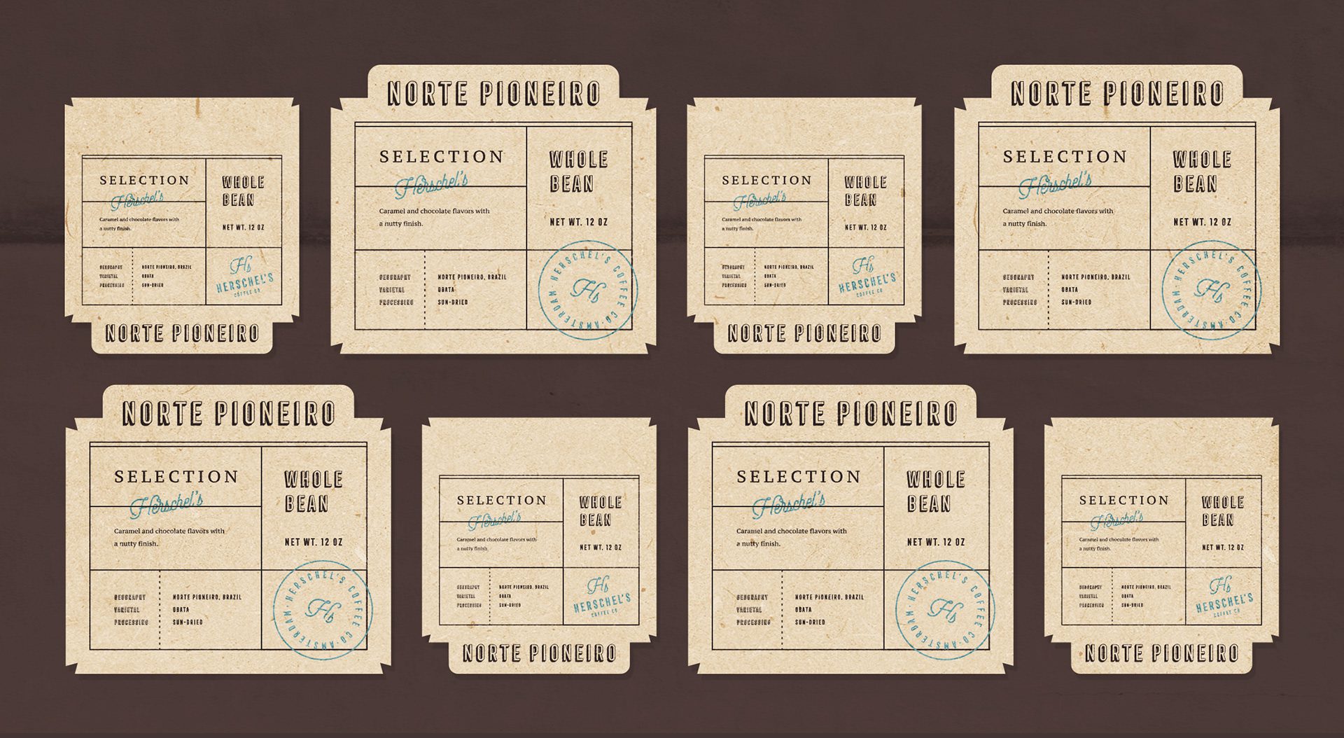
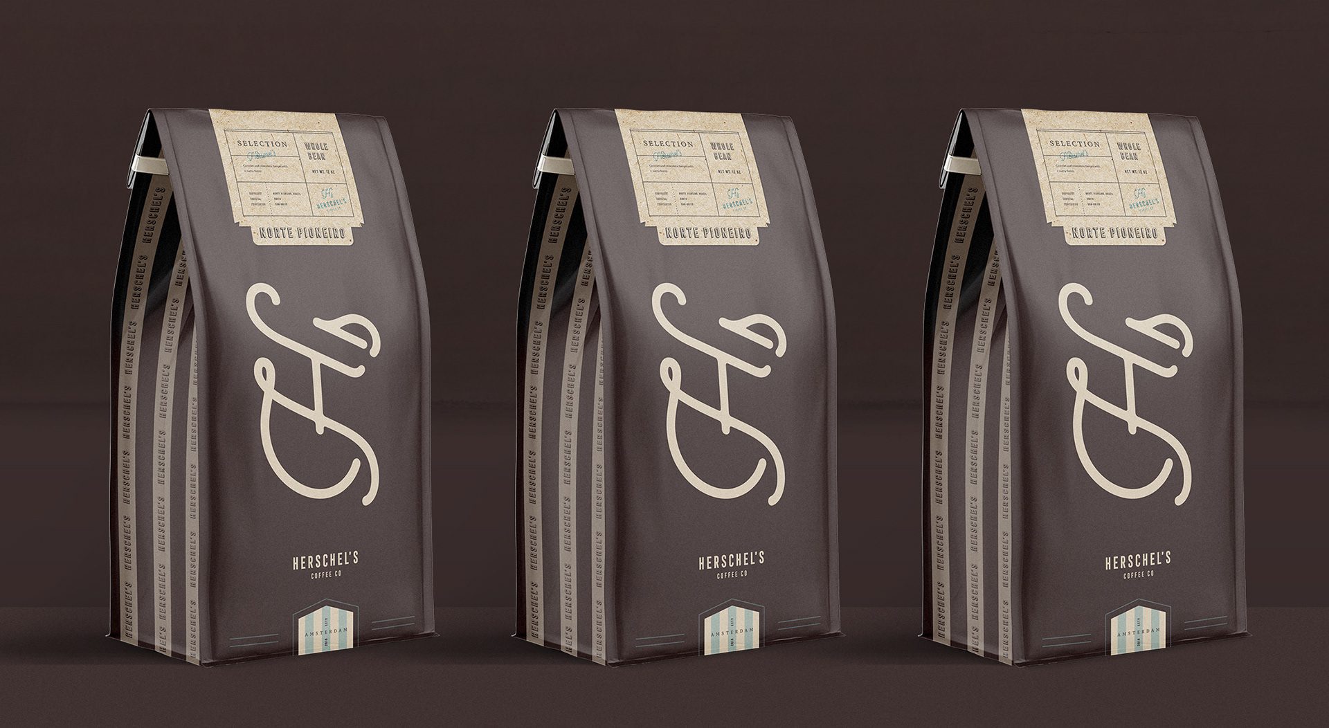
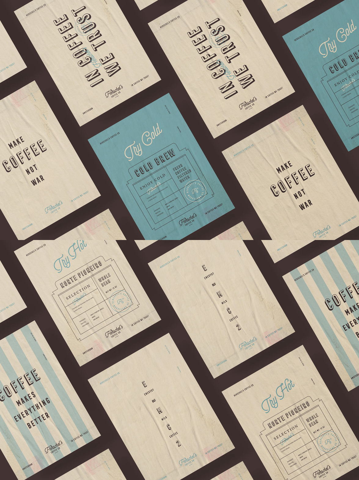
For the packaging, we designed a blue background with striped patterns on the sides. At the same time, we designed a label on vintage textured paper with a bold coffee name and type. We have also included a special Herschel’s stamp, which guarantees the high quality of the product and improves the trustworthiness of the brand. We also created a special limited edition coffee with plain dark brown packaging, with a minimal label on top and an eye-catching emblem at the centre of the packaging. We also designed two different coffee cup designs; one of them is plain and the other is striped patterned. For the contrast of the plain cup design, we used a dark brown cap.

Let’s make the work they’ll copy.
Talk to an expert now
Work with a 38 team of the
industry’s top 1% talent.



