
Sophia's Tea
vibrant fruity herbal infusions
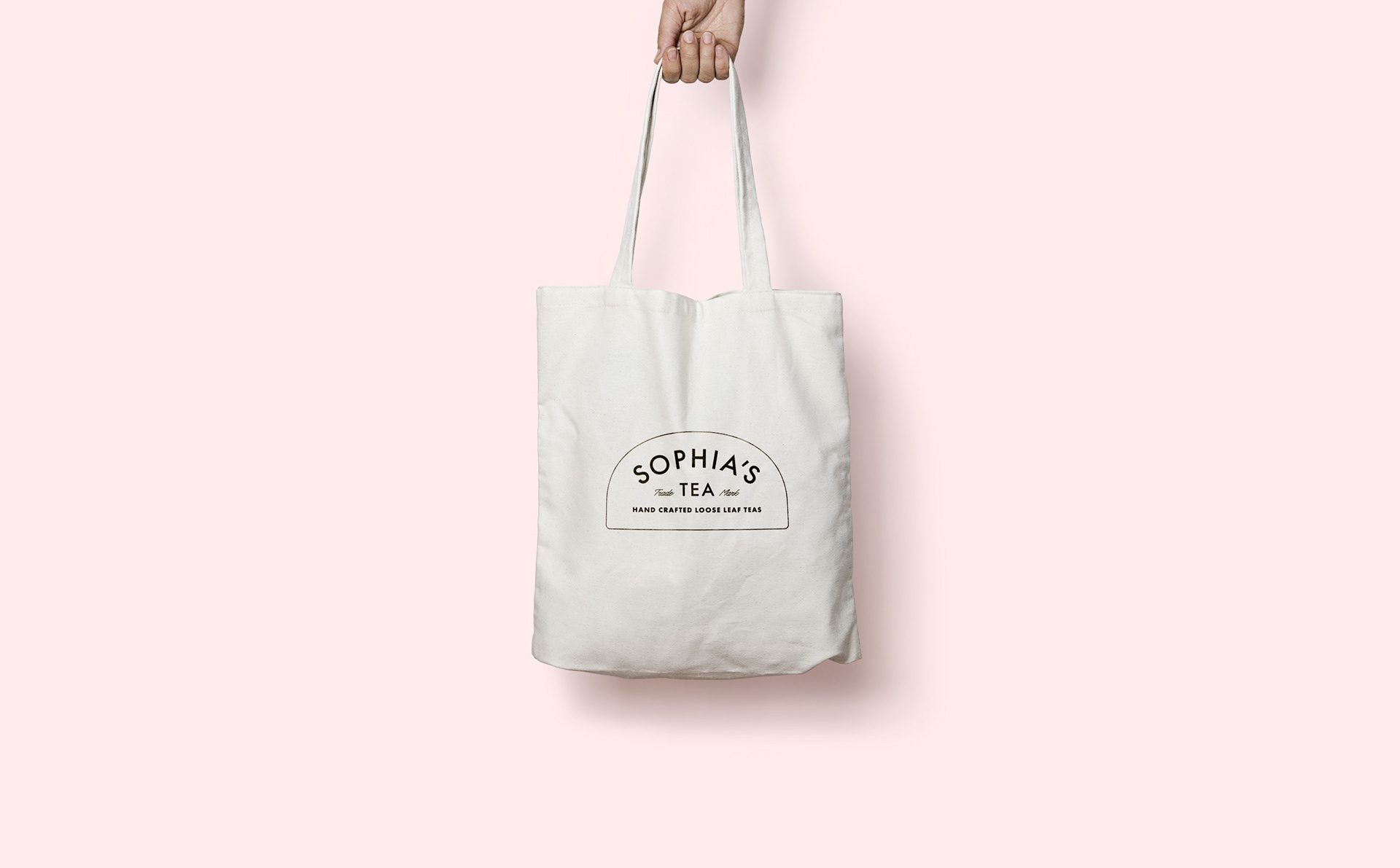
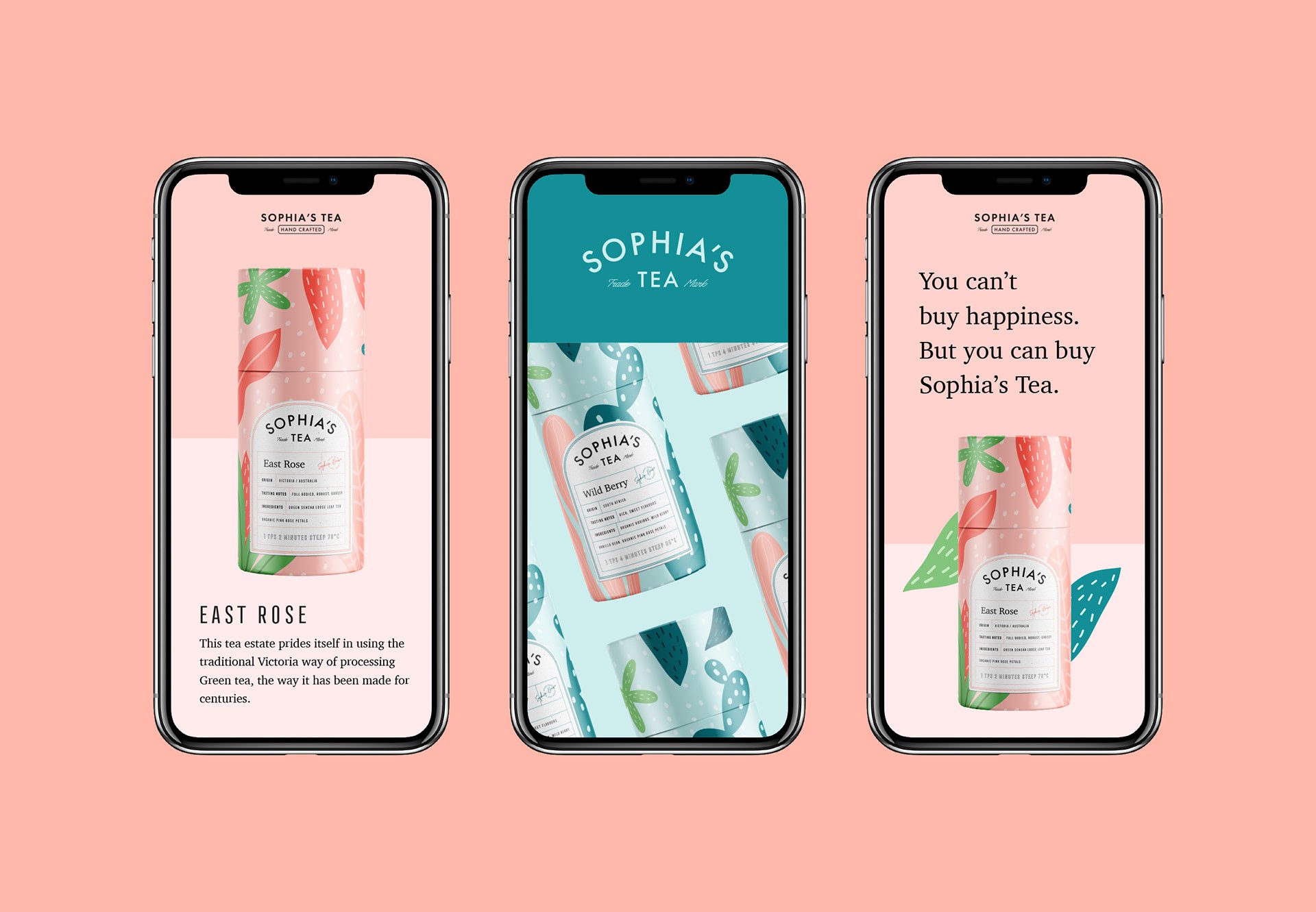
Sophia’s Tea is a vibrant natural herbal tea brand offering a unique array of fruity blends. Crafted with homemade ingredients, each tea is presented with eye-catching, creative packaging that highlights its distinctive flavors and brewing instructions, designed by MARKAWORKS.

Designing a Creative and Unique Brand for Sophia’s Tea
Fruit blends made from homemade ingredients are the range at Sophia’s Tea, a US-based herbal tea brand. Four keywords guided the work, quoted from the brief: “vibrant, eye-catching, creative, unique”. The scope covered logo design, palette, pattern work, and label design.
Our first typographic direction at MarkaWorks was a cursive script, and we dropped it. A script would have matched the homemade story but cost the brand its professional footing, and in a category where a buyer is deciding whether a small producer can be trusted, that footing is worth more than the charm. We chose a sans serif instead, which reads classic and credible, and a set of secondary marks was built for the places a full logotype cannot go.
See more coffee and tea branding case studies.
The Client: Sophia’s Tea
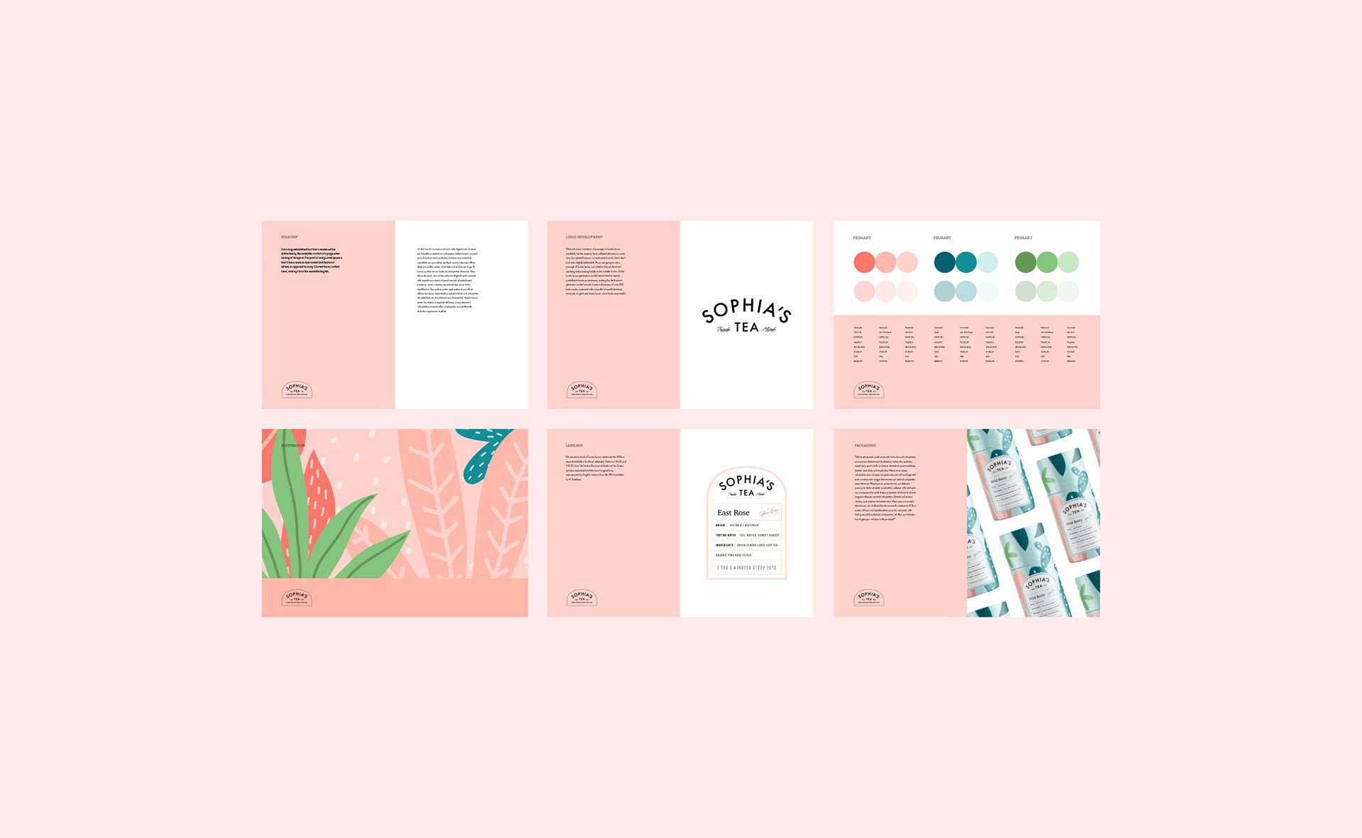
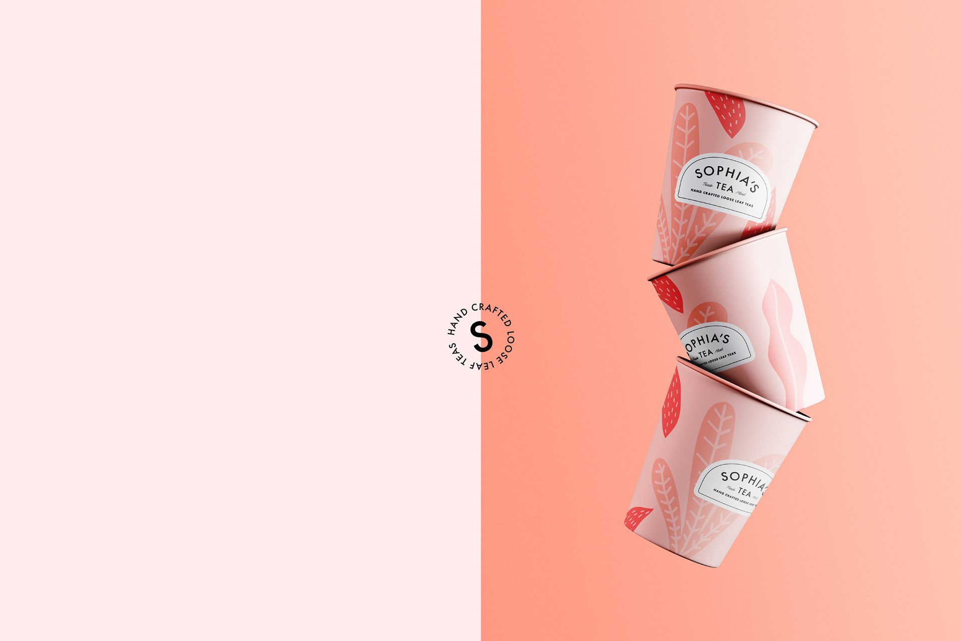
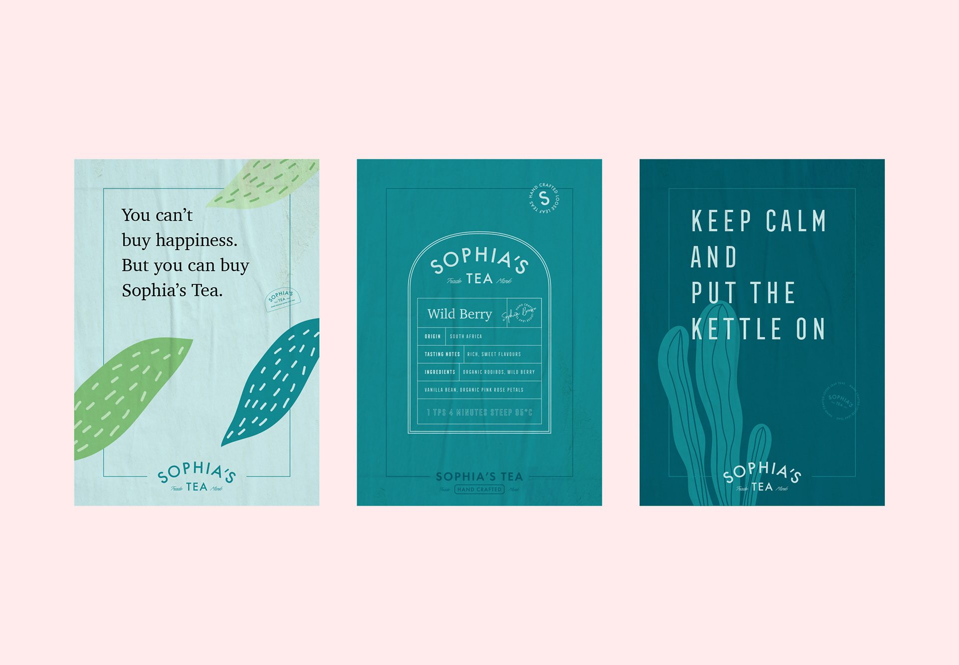
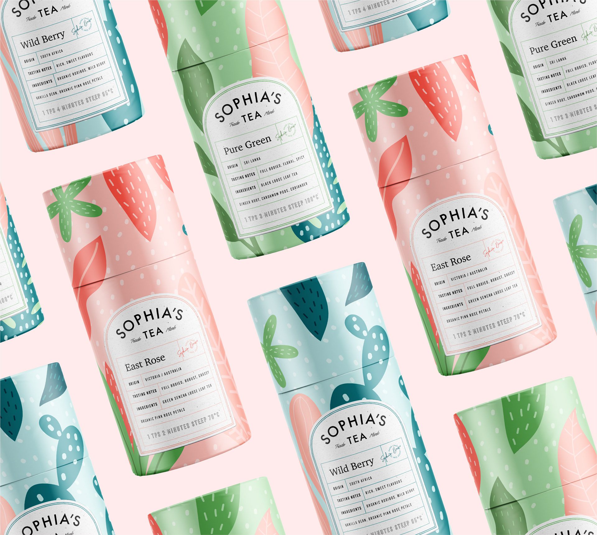
The Sophia’s Tea palette runs on pastels with their brighter counterparts, giving every blend a light version and a saturated one. That doubling is what lets the range stay soft as a family while each flavor still has enough contrast to be found on a shelf.
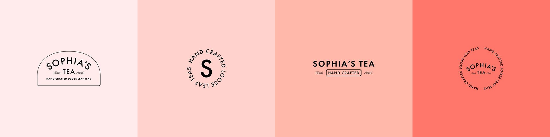

The Keywords: Vibrant / Eye-catchy / Creative / Unique
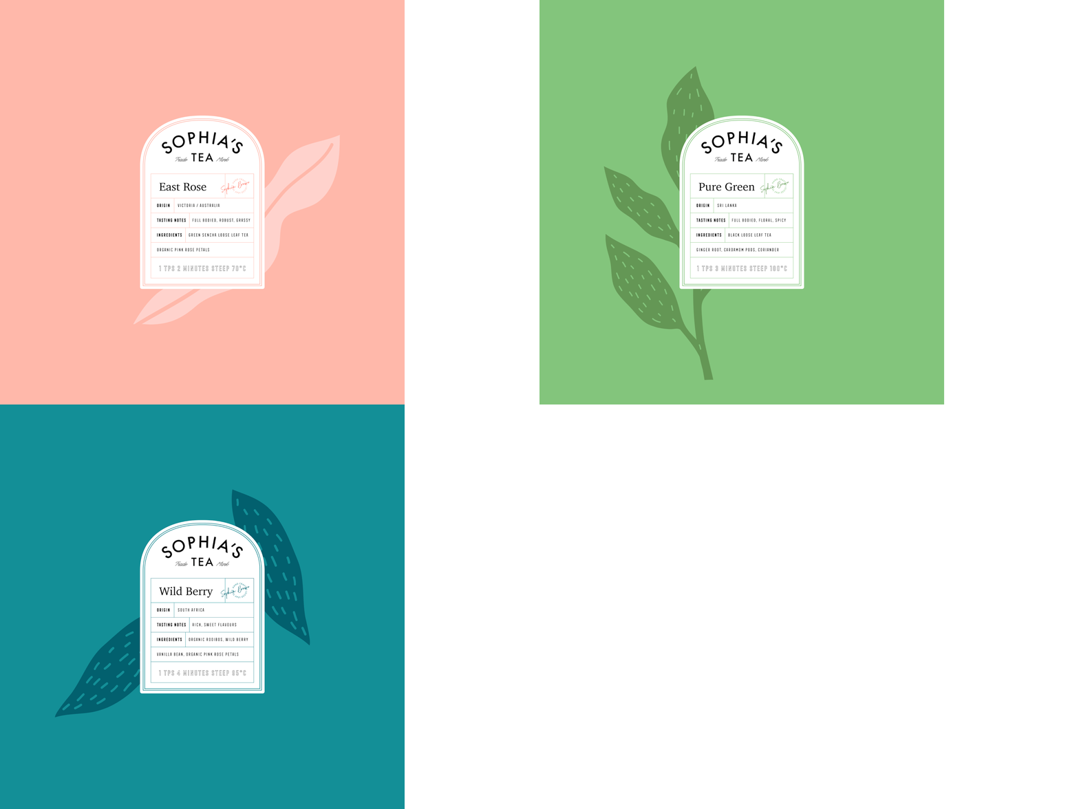
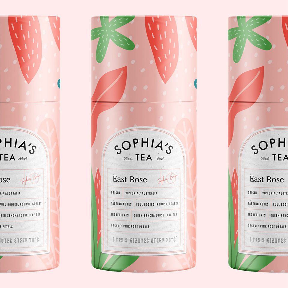
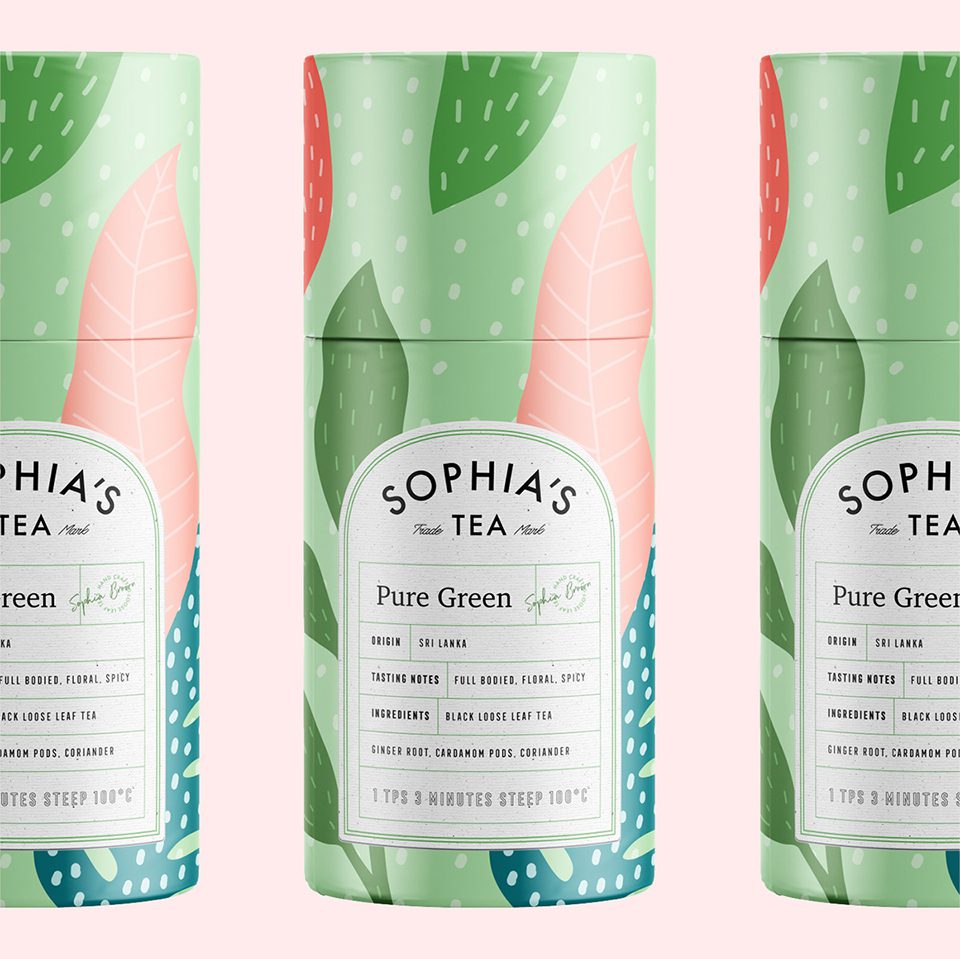
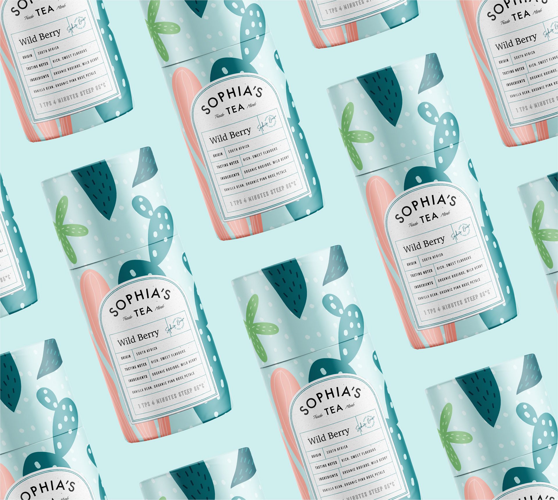
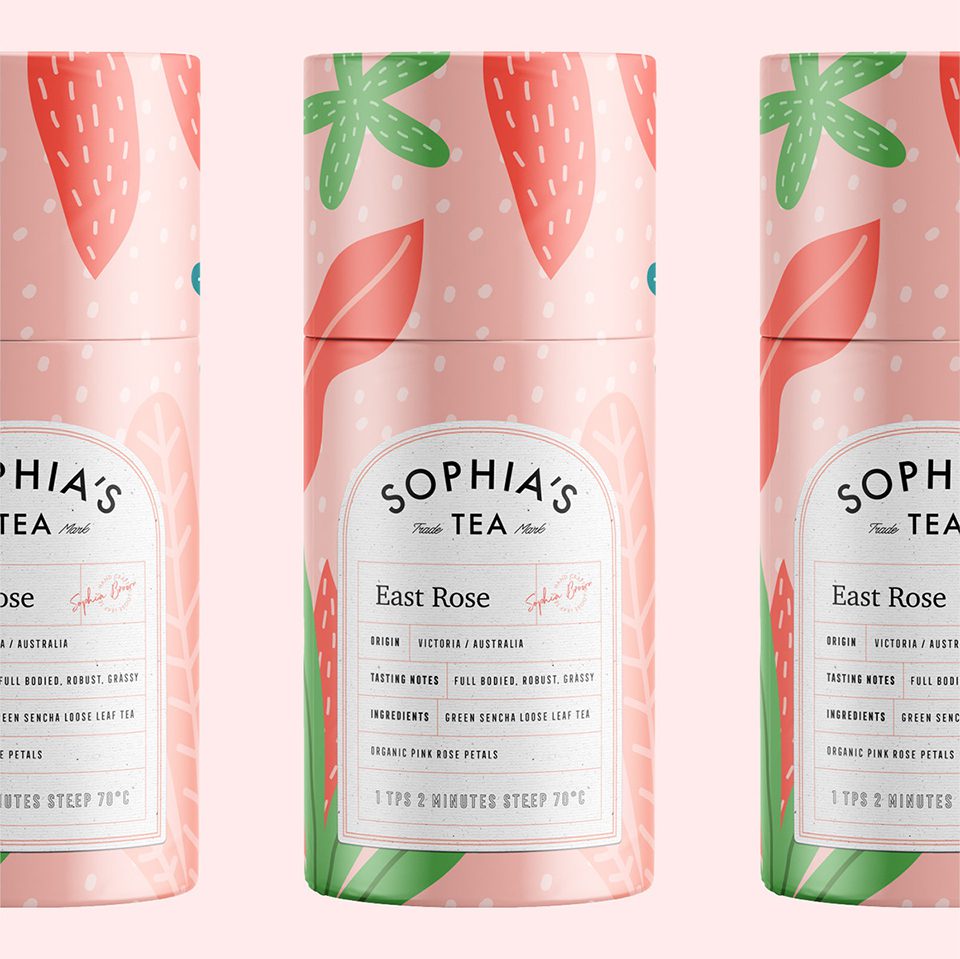
We designed a pattern per flavor, each with its own illustration and color combination. On a tea shelf this is the fastest sorting system available: a buyer looking for one blend among a dozen recognizes the pattern from a distance, then confirms with the name up close.

The Solution: Typography and Color Palette
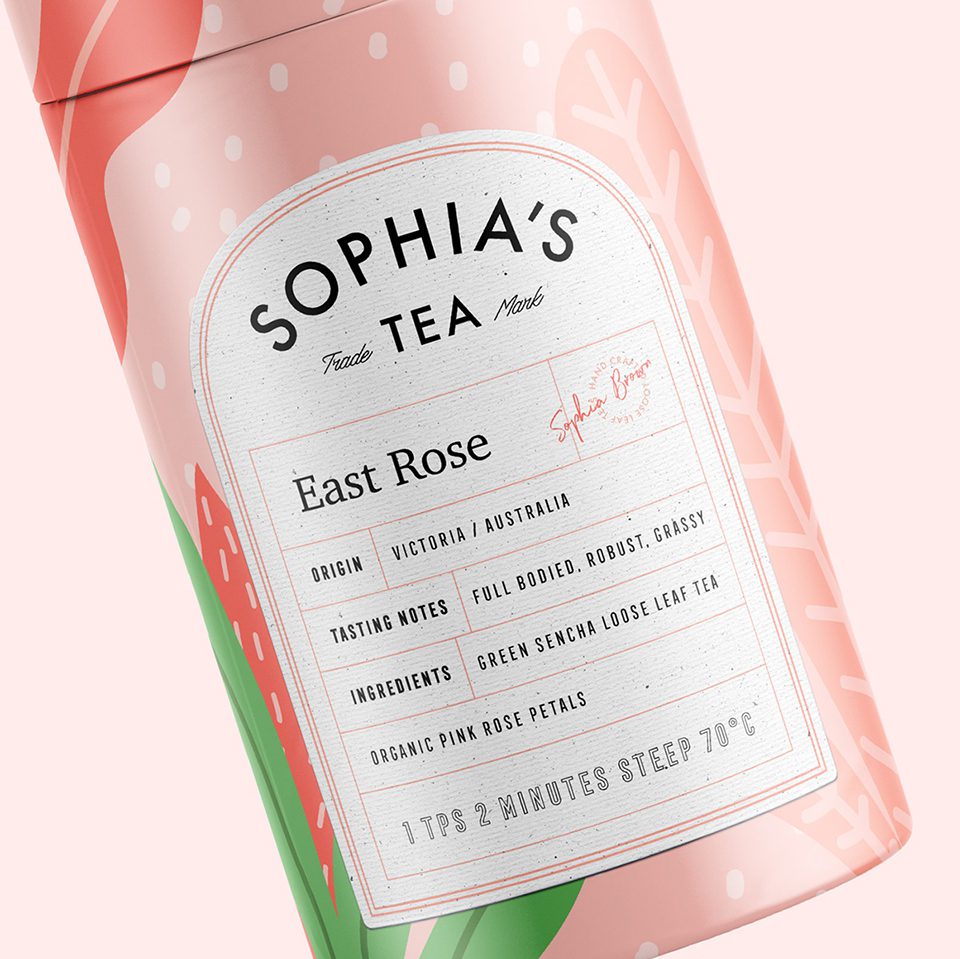
Tea packaging carries an unusual amount of copy for its size, and the label had to fit it. Brewing instructions, flavor description, and origin all compete for the same small panel, so the pattern was kept to the outer area and the text block given a fixed position across the range.


The Solution: Patterns and Packaging Design
The labels carry brewing instructions alongside the flavor information. For herbal blends this is functional, not decorative, since steeping time changes the result more than most buyers expect, and a pack that leaves it out sends the customer to a search engine instead of the kettle.

Let’s make the work they’ll copy.
Talk to an expert now
Work with a 38 team of the
industry’s top 1% talent.



