
YU
Branding, Packaging & Digital Experience by MarkaWorks
YU is a premium organic Japanese tea brand that redefines the tradition of tea through a lens of modern minimal elegance. Designed for the conscious consumer seeking focus and serenity, the brand identity balances the raw authenticity of heritage Matcha and Hojicha with a clean, contemporary aesthetic. MarkaWorks developed a complete brand system (from naming and packaging to art direction) creating a quiet ritual of purity that resonates with today’s wellness-driven lifestyle.


01. Research & Strategy
YU is a premium organic Japanese tea brand covering Matcha and Hojicha. The market it entered was polarised: traditional visuals that read as heritage costume on one side, sterile commercial packaging on the other. YU was positioned between them, as modern naturalism that stays clean and conscious without discarding where the product comes from.
See more coffee and tea branding case studies.


02. Brand Naming & Concept
At MarkaWorks we handled the project from naming through art direction, which is rarer than it sounds and changes how the parts fit. The name YU carries a double meaning in Japanese, pointing at both superiority and connection, and it was chosen to stay short, memorable, and pronounceable across languages. A tea brand selling outside Japan has to survive being said aloud by people who do not speak the language, and a name that fails that test costs recall in every market it enters.


03. Logo Design
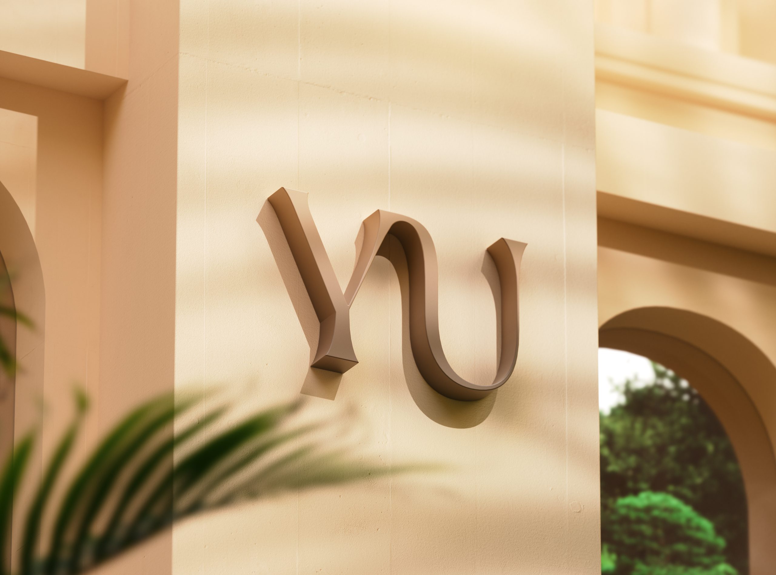
The logotype draws on Japanese calligraphy, balancing precision against flow. The stem of the Y is set to read as grounding and strength while the surrounding forms stay light, so the mark holds the brand’s two claims at once rather than choosing between them.


04. Color System
The insight behind the whole system is that a wellness buyer looks for alignment between what a product is, what it is for, and how it looks. Purity alone does not settle the choice. We built YU as the bridge between the authenticity of the leaf and a contemporary daily ritual.


05. Typography
The packaging and the digital experience were designed as one system rather than as a pack with a website attached, so the same quiet register meets the buyer wherever they arrive first.


06. Packaging Design
Each tea gets its own color family. Earthy beige, golden amber, and soft brown carry the base, and two accents separate the range: a bright green for Matcha and a burnt orange for Hojicha. A buyer who knows which tea they want finds it by color before reading a word, and the range still reads as one brand.


07. Photography & Art Direction
Typography holds the same double duty. A serif carries trust and Japanese minimal refinement, and a supporting sans serif handles the smaller sizes on packaging and screen. The split is a role division rather than a claim about which face reads faster: the serif sets the register, the sans covers the places where the serif’s detail would be wasted. That contrast, heritage against modern clarity, is what gives the system its rhythm.


08. Digital Experience
Language matches. The tone is calm and grounded, and the messaging speaks about performance through purity rather than through claims. The outcome is a brand that treats minimalism as intention rather than absence: composed, sensory, and consistent from pack to screen.


09. Tone & Voice
YU’s tone of voice is calm, grounded, and gently empowering. Messaging focuses on performance through purity, communicating wellness without exaggeration. Taglines like “Boost your energy naturally” express strength through softness authentic, not aspirational.

10. Outcome
YU redefines what minimalism means in the wellness category. It’s not cold or distant it’s intentional, soulful, and composed. Through consistent visual and verbal harmony, YU positions itself as more than tea it’s a quiet ritual of balance, clarity, and modern purity. The result is a brand system that feels timeless, sensory, and alive.

Let’s make the work they’ll copy.
Talk to an expert now
Work with a 38 team of the
industry’s top 1% talent.



