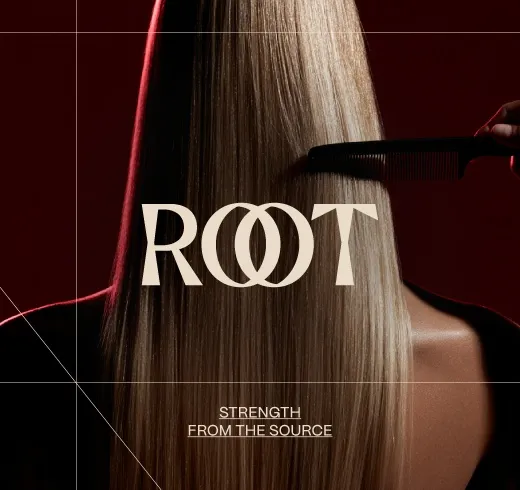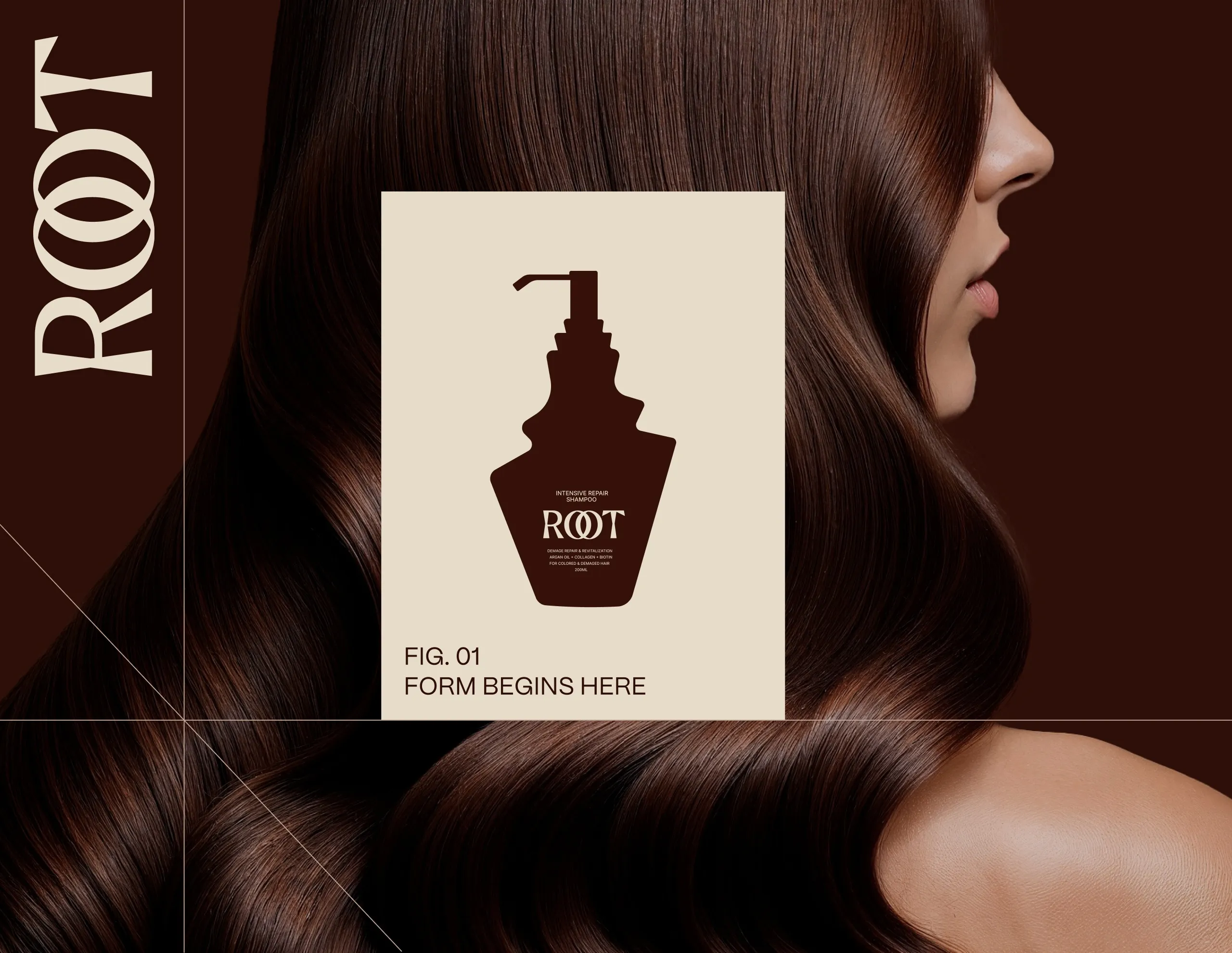
Root Haircare UI
Hair Care E-Commerce Website Design
The Architecture of Hair
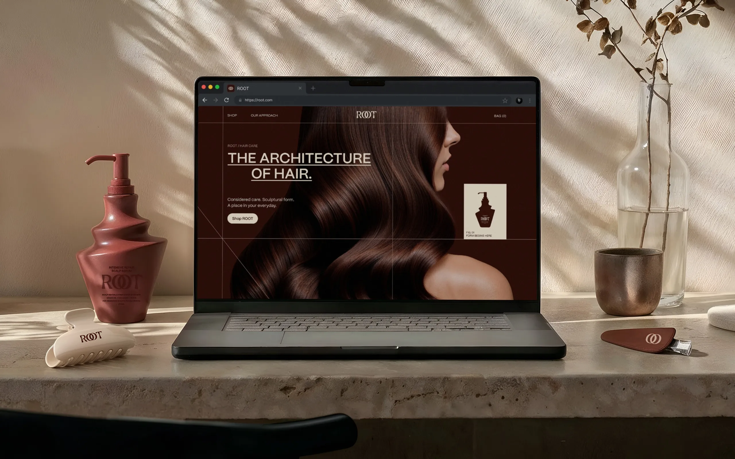
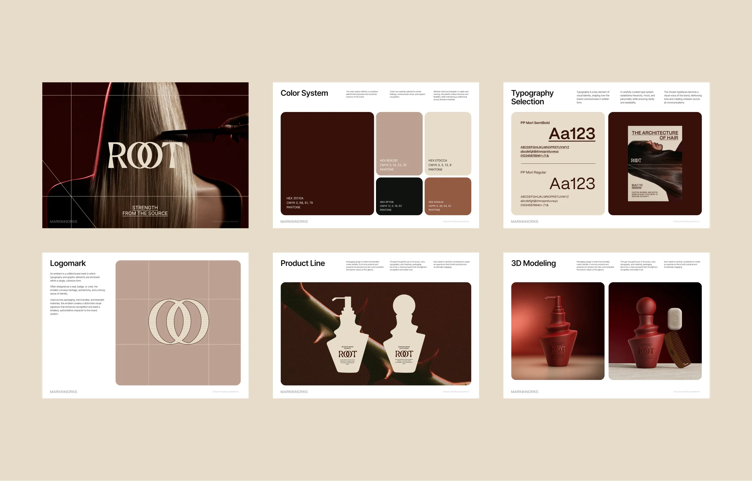
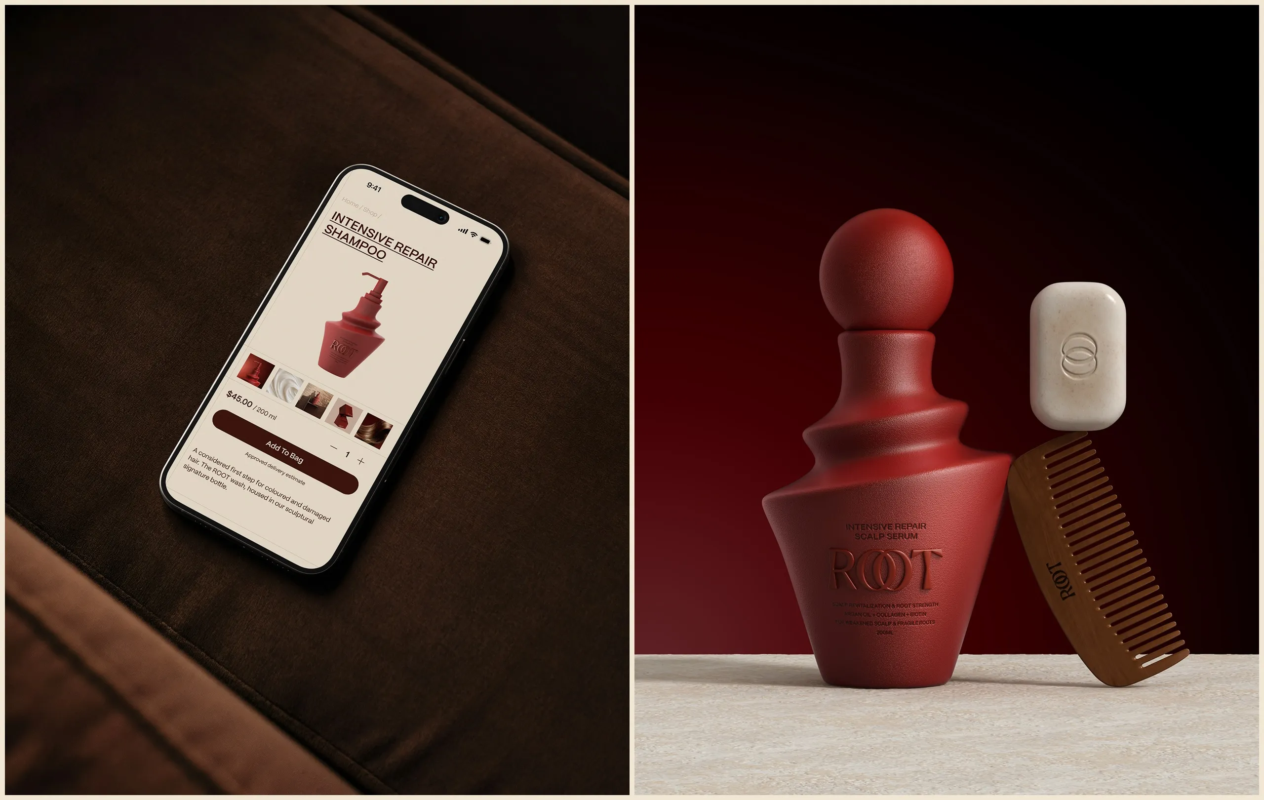
MarkaWorks designed the digital experience and e-commerce interface for ROOT, translating the brand’s sculptural visual language into a responsive system built around product discovery, storytelling and conversion.
The Challenge
ROOT already had a distinctive visual identity and unconventional product forms. The challenge was to carry that character into digital without turning the website into a static brand presentation. The interface needed to communicate the products clearly, support an e-commerce journey and preserve the sense of depth, restraint and materiality established by the brand.
The Solution
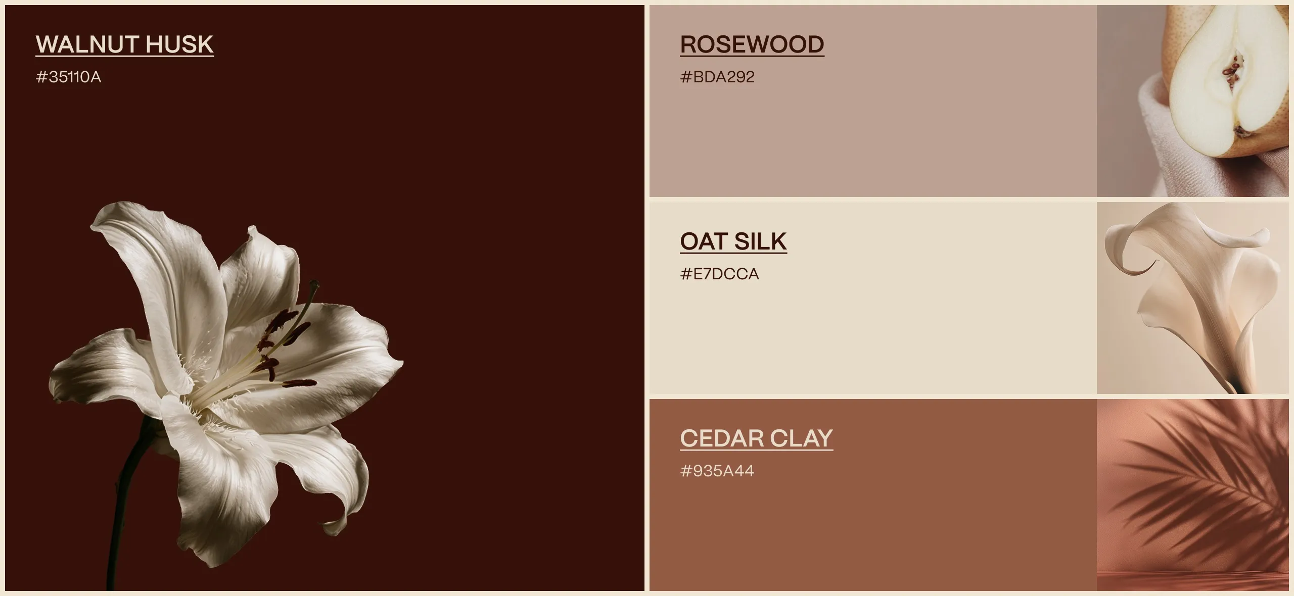
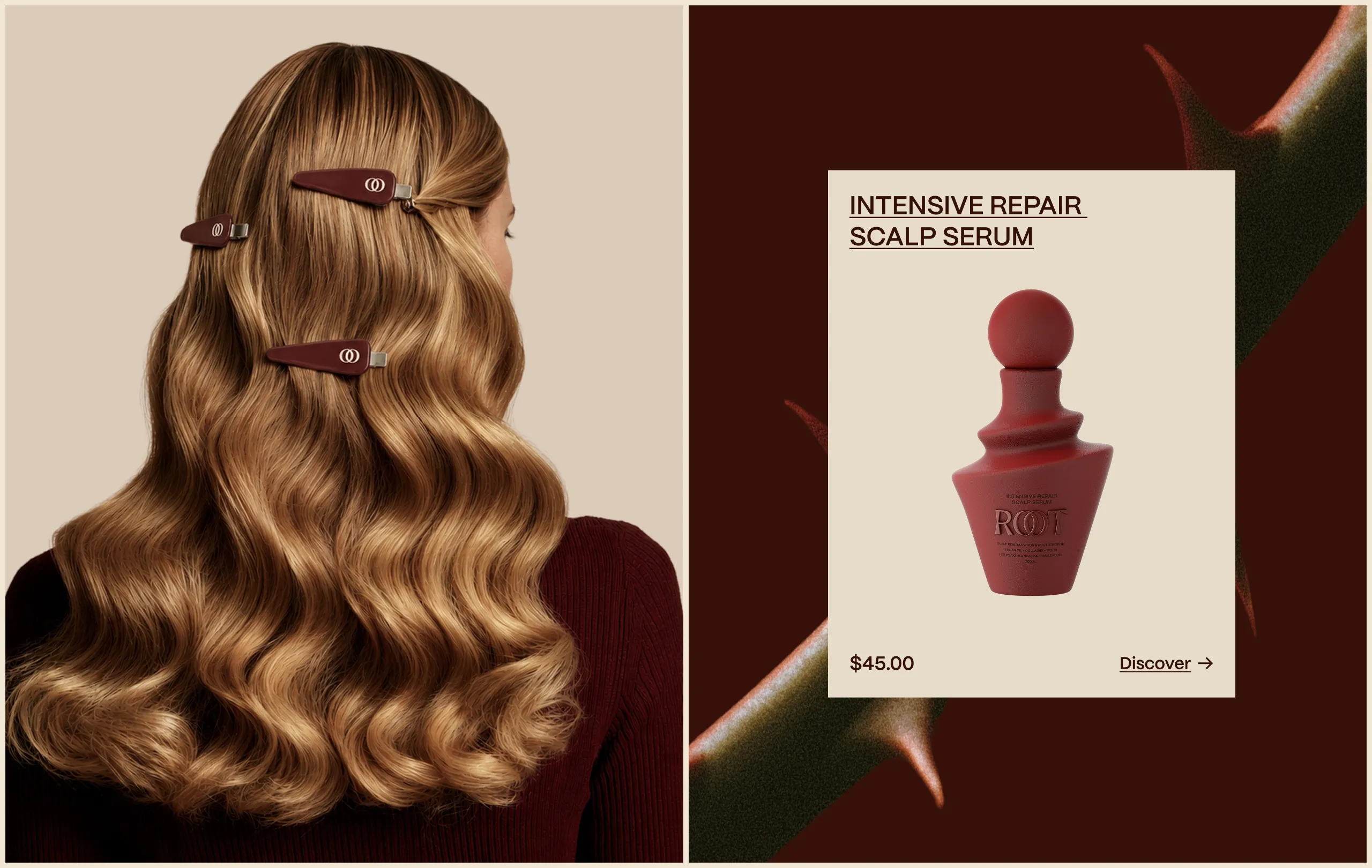
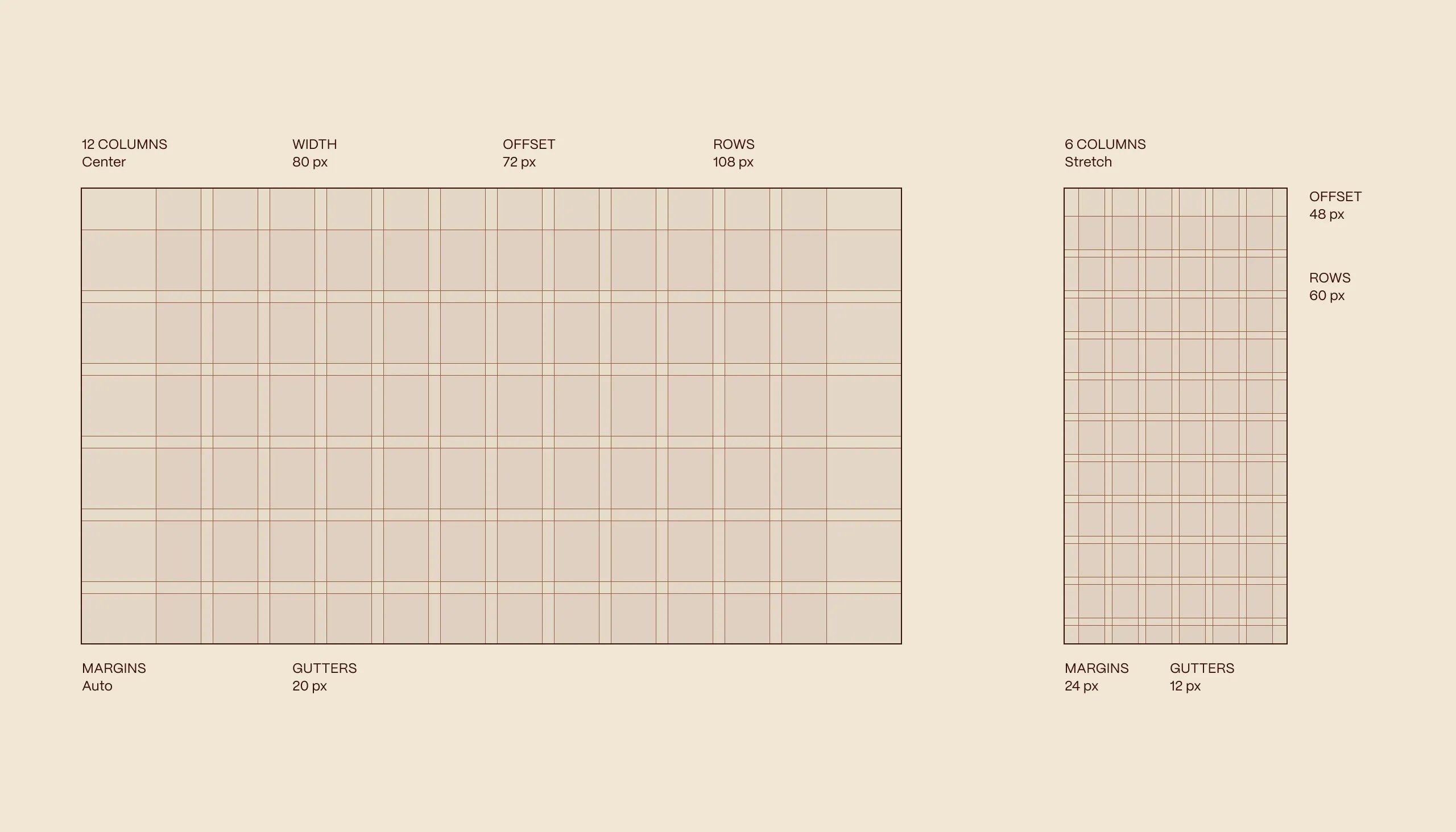
“The Architecture of Hair” became the guiding idea for the digital experience. A structured grid, oversized editorial typography and controlled use of imagery create a system that feels precise without becoming clinical. Deep walnut tones and warm neutrals provide continuity with the physical brand, while generous negative space gives the products room to behave almost like objects within a gallery.
The Process
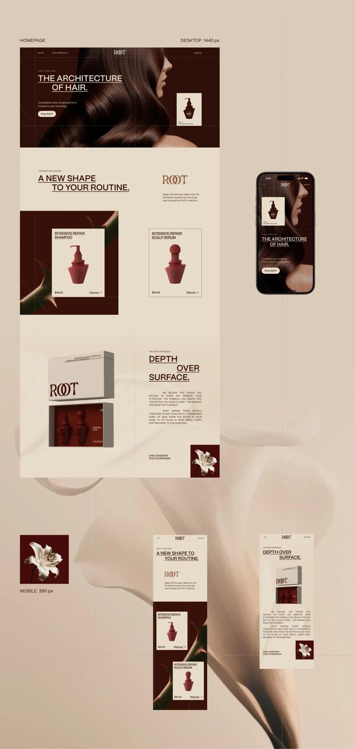
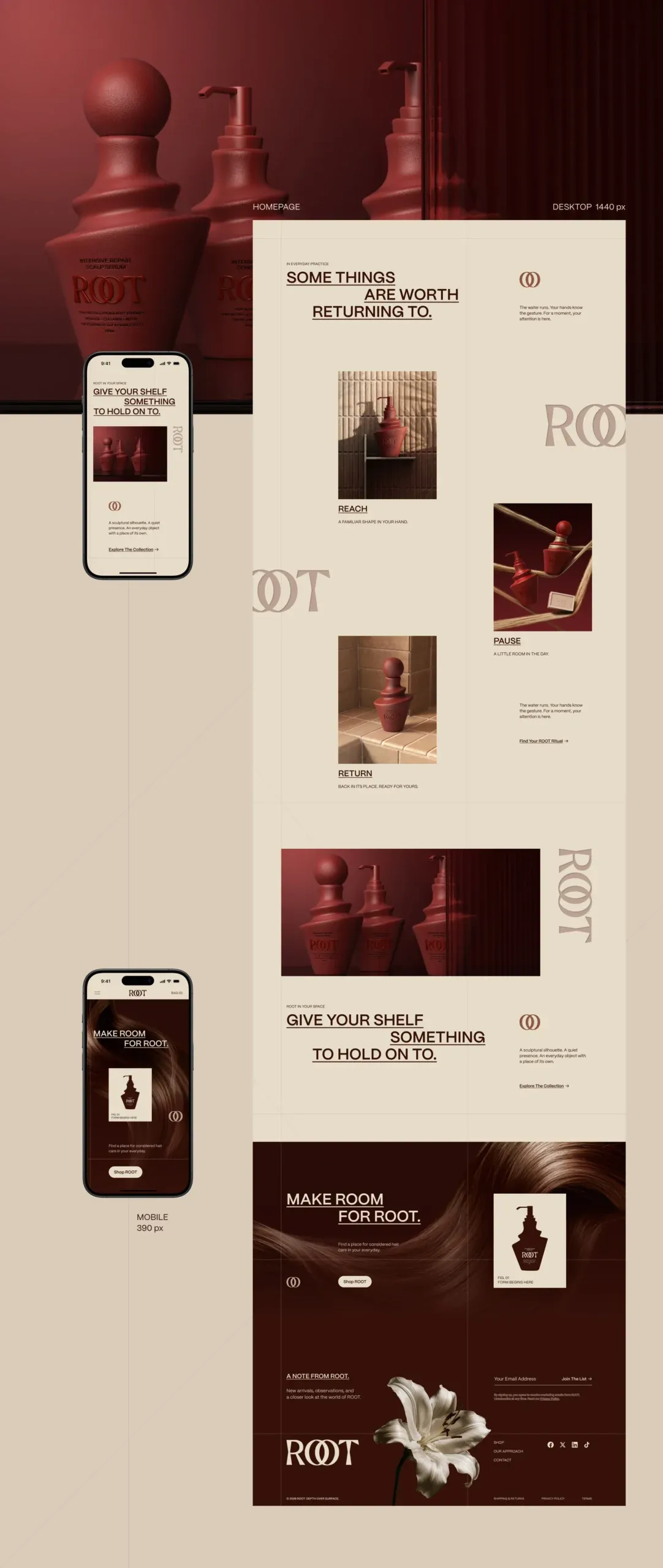
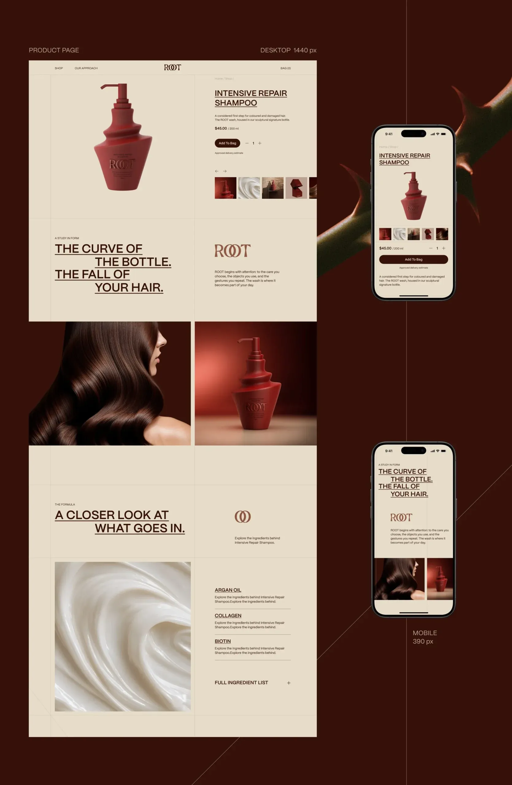
The website was built around a modular responsive grid, allowing the same visual logic to move consistently between desktop and mobile. Product imagery, campaign photography and editorial content are arranged in alternating scales to create rhythm while maintaining a clear reading hierarchy.
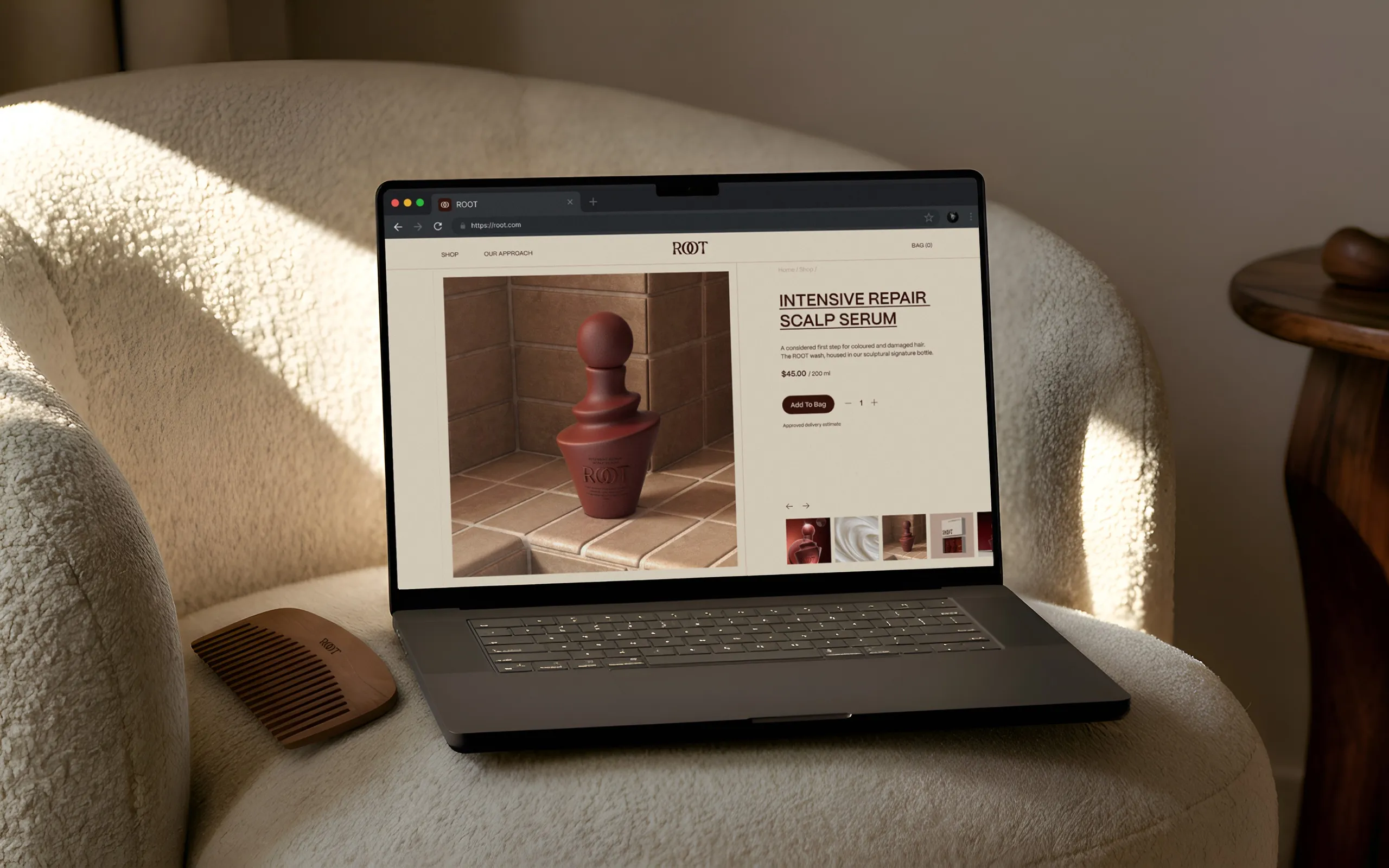
The homepage combines brand storytelling with direct access to the product range, moving from campaign-led hero sections into individual products, the ROOT philosophy and supporting editorial content. Product pages shift the focus toward usability: product information, pricing, imagery, ingredients and purchase actions are organised into a simplified structure without losing the expressive quality of the wider brand.
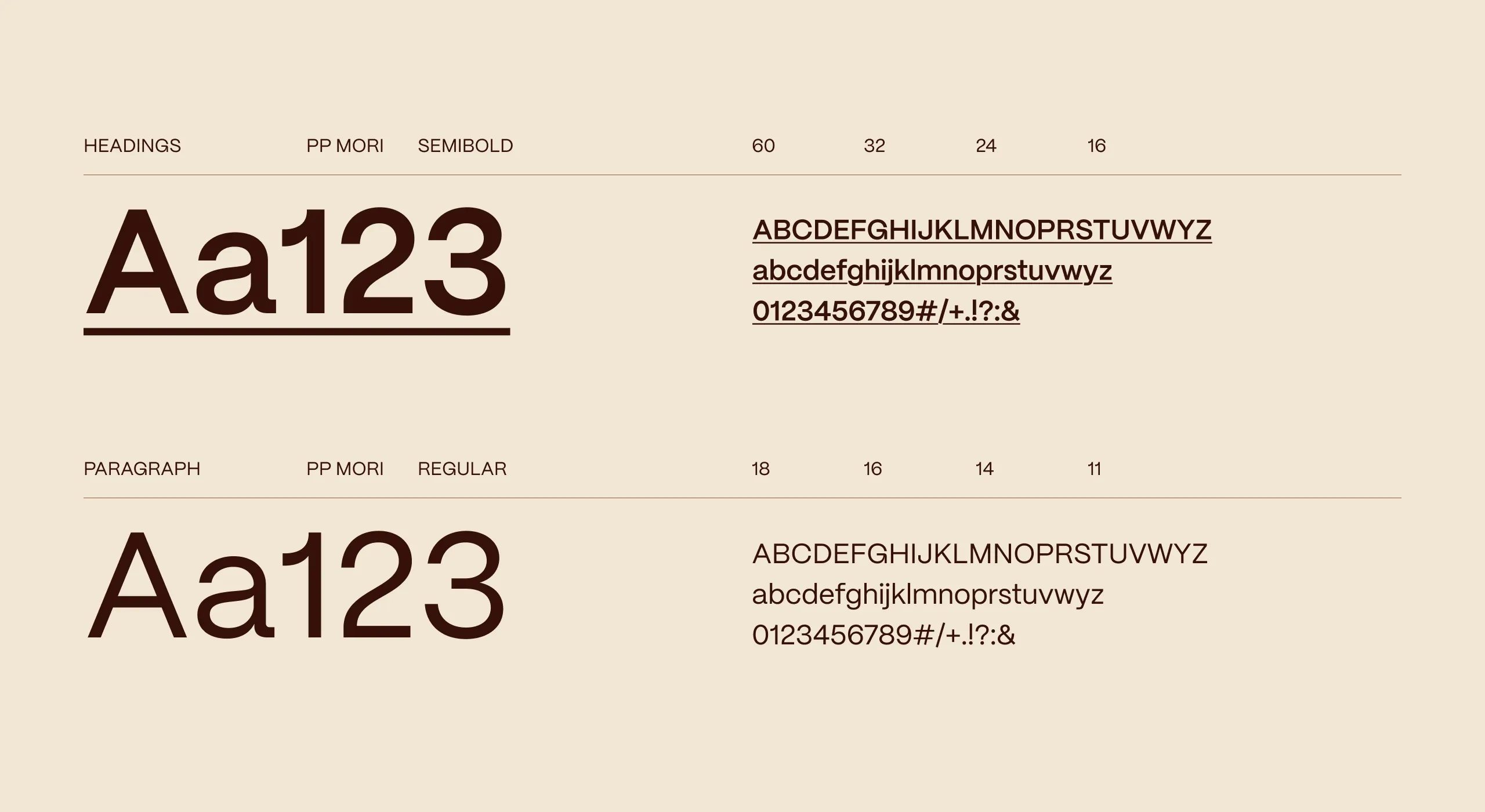
Typography plays a functional role throughout the interface. PP Mori creates continuity between headlines, navigation and product information, while underlines, fine rules and the grid itself become recurring navigational cues. The system was developed responsively rather than simply reduced for mobile, restructuring content and hierarchy to preserve clarity on smaller screens.
The Outcome
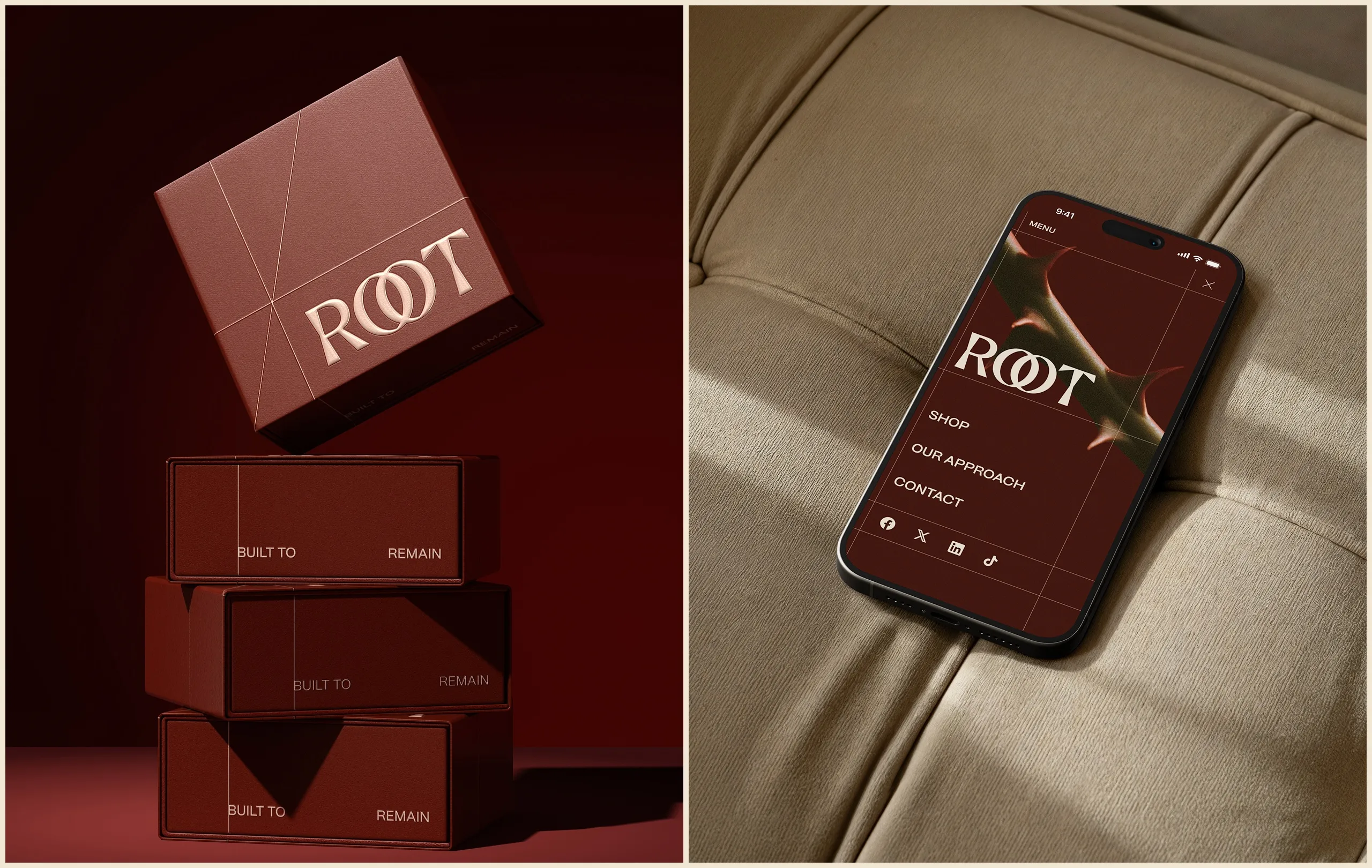
The ROOT digital experience extends the identity from packaging into a complete commerce environment. The result is a website that balances editorial storytelling with product usability, giving the brand a consistent digital presence while creating a scalable framework for new products, campaigns and future content.

Let’s make the work they’ll copy.
Talk to an expert now
Work with a 38 team of the
industry’s top 1% talent.