
Awelly Branding & UI Design
vitality for evolving women
Awelly, by MARKAWORKS, is a comprehensive wellness brand designed to empower middle-aged women. It offers tailored solutions and scientifically driven products, fostering vitality and well-being through a supportive and trustworthy approach.
Visual Identity
Typography was chosen to sit between elegance and approachability, ensuring a premium yet relatable presence. The logotype subtly references growth and renewal, supporting the brand’s long term wellness philosophy.
Awelly had to stay calm on screen without going flat, and reassurance is easy to flatten. MarkaWorks carried the brand’s supportive character into the interface with structured layouts, generous spacing and one consistent visual language, so people are guided rather than pushed. We kept the tone of voice warm and informative inside the product itself, because a brand that reads as a reliable partner on the pack cannot read as a form on the site.
See more web and digital design case studies.
Packaging
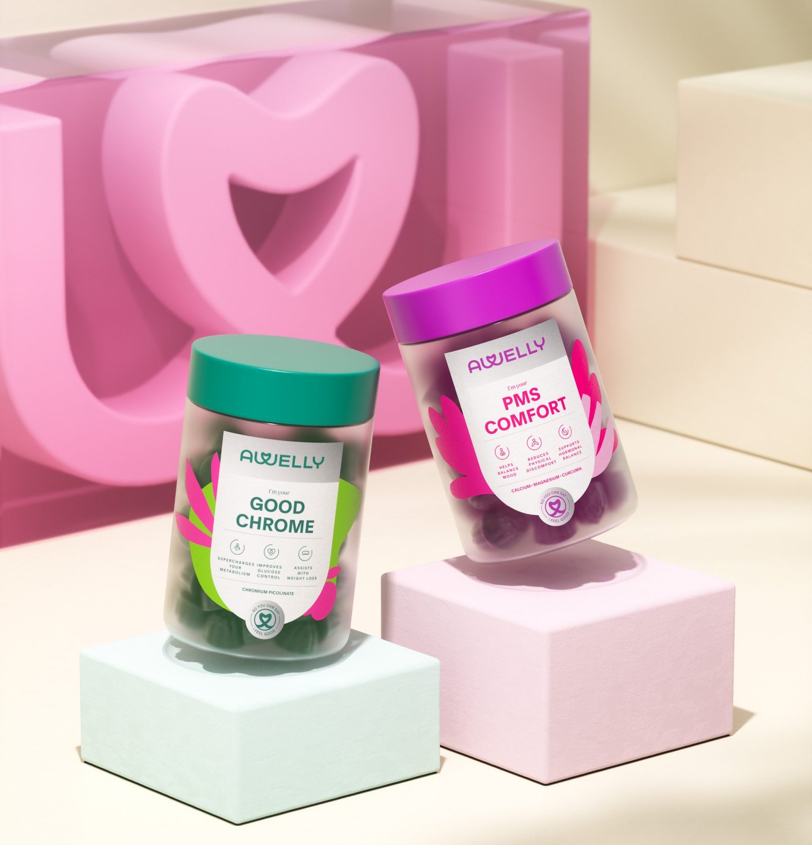
Packaging was developed to communicate clarity and confidence. Clean layouts, clear hierarchy, and restrained use of color allow information to remain accessible and easy to understand. Each product feels cohesive within the system while maintaining its own identity. The overall packaging experience reinforces trust and everyday usability.


Digital Presence
The digital presence translates the brand’s calm and supportive character into a clear and intuitive experience. Structured layouts, generous spacing, and consistent visual language guide users with ease. The tone of voice remains warm and informative, positioning Awelly as a reliable partner in everyday wellness.


Outcome
The result is a cohesive and scalable brand system designed to grow with its audience. Awelly stands as a refined and dependable wellness brand, communicating care, confidence, and scientific credibility across every touchpoint.
A Cohesive Brand for Lasting Impact
The result is a cohesive brand identity that not only reflects Awelly’s commitment to empowering women but also positions it as a trusted leader in the wellness industry. We’re proud to have contributed to a brand that truly understands and uplifts its audience.

Let’s make the work they’ll copy.
Talk to an expert now
Work with a 38 team of the
industry’s top 1% talent.



