SOLANKI UI
Real Estate Brand Identity & Digital Experience
SOLANKI is a Dubai-based real estate developer focused on creating spaces that blend architectural excellence, long-term value, and contemporary living.
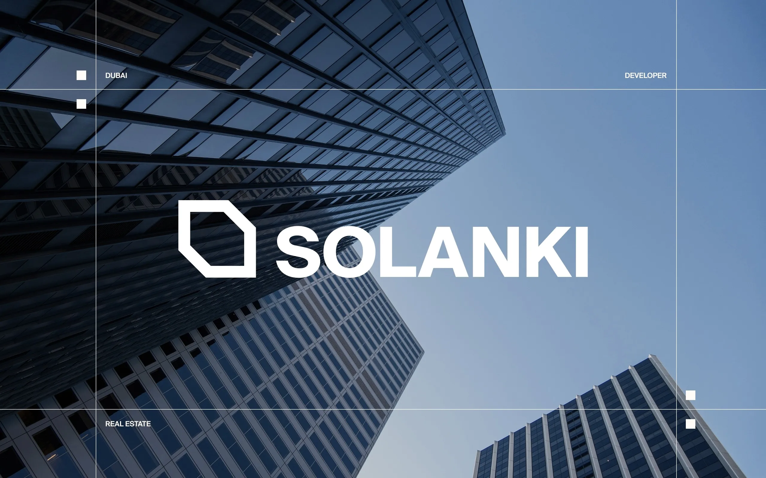
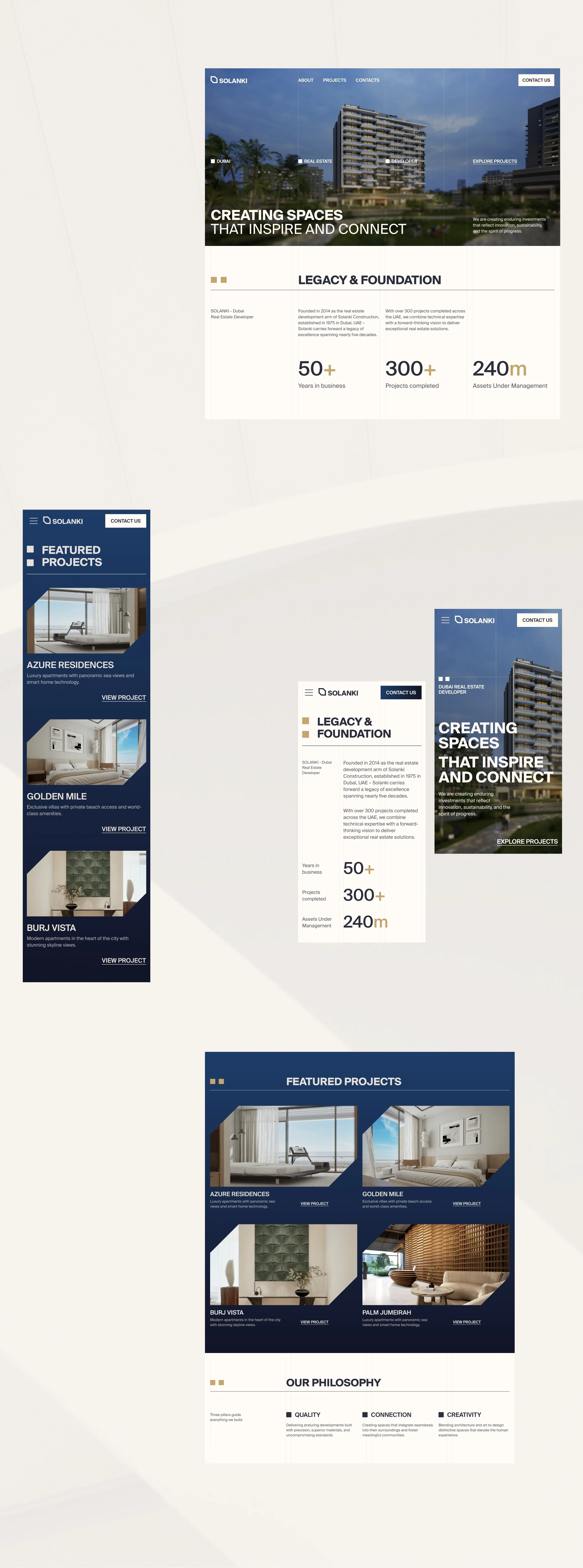
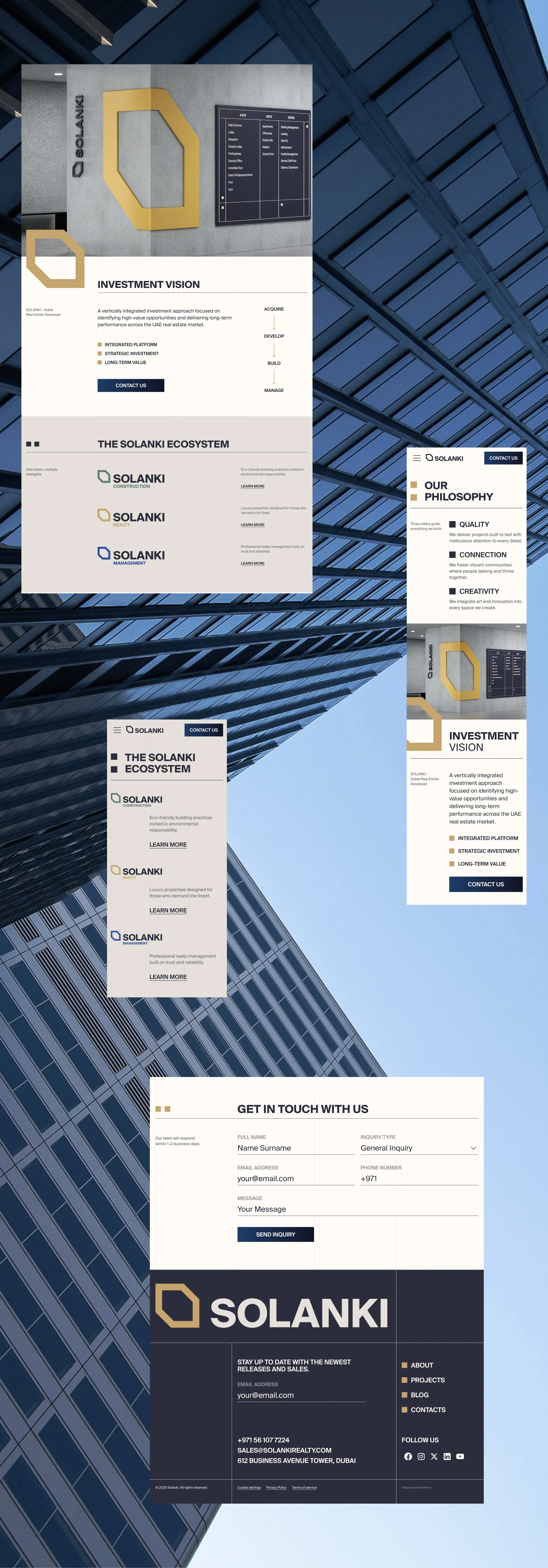
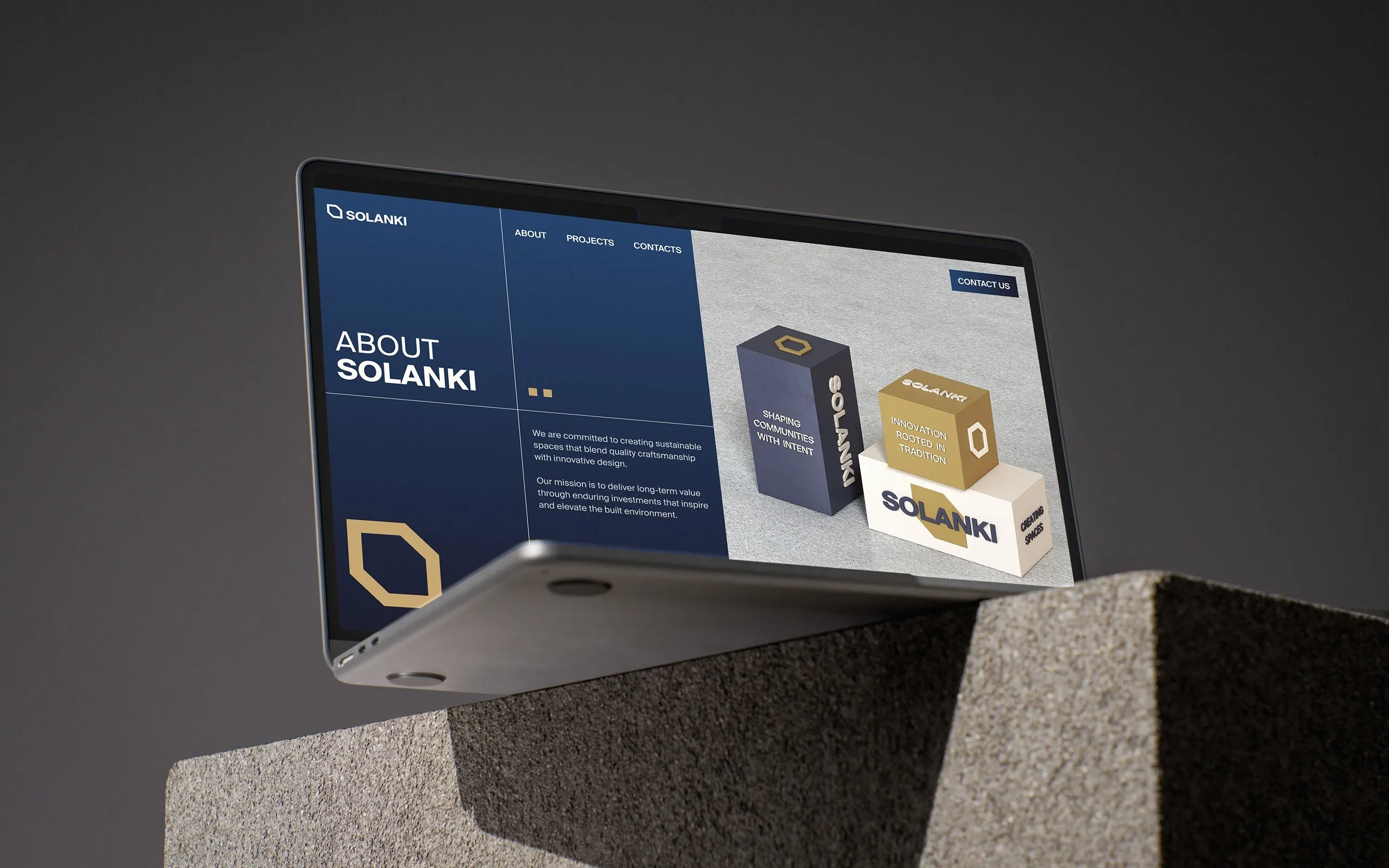
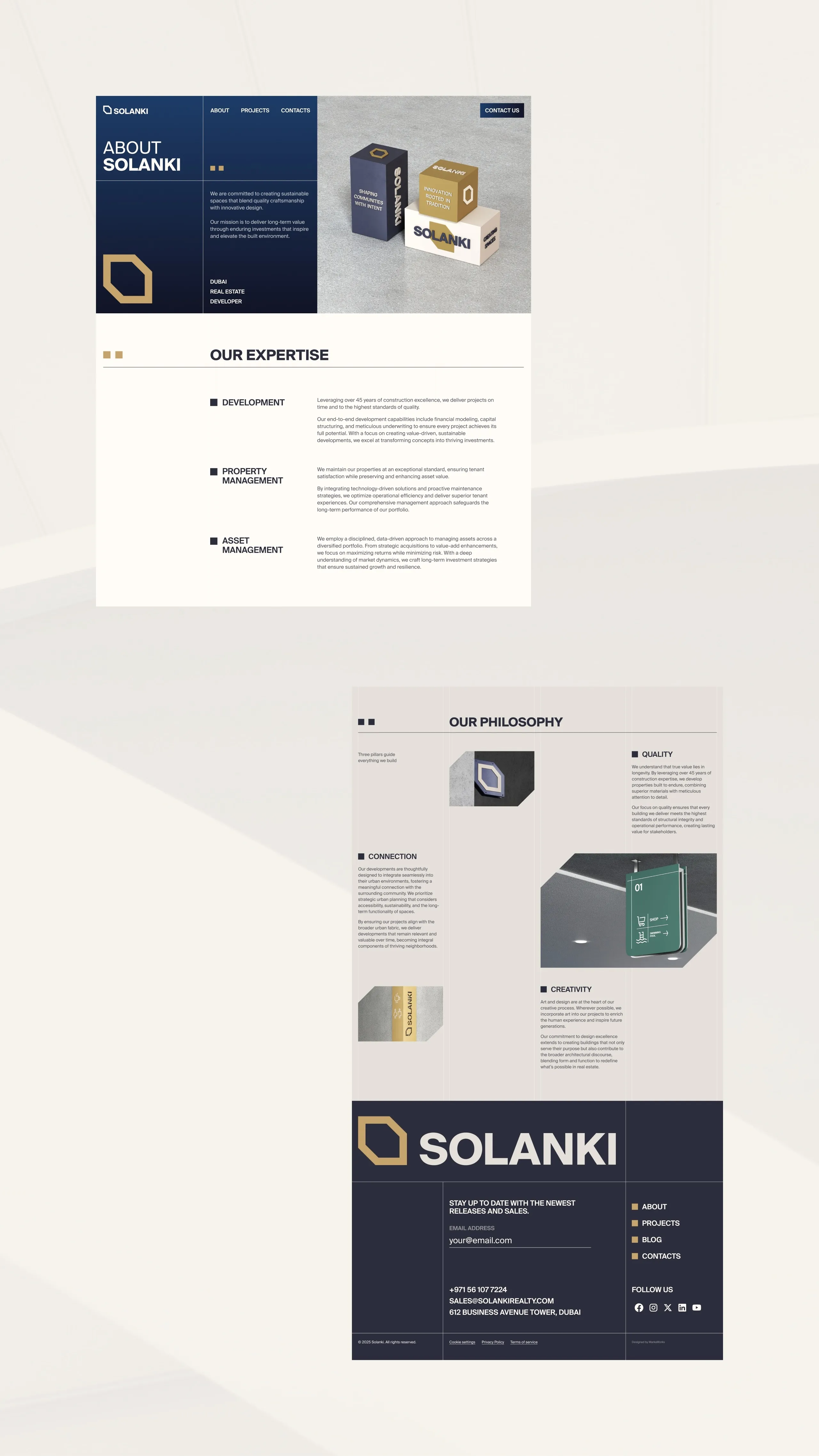
SOLANKI is judged online long before anyone visits a building, so the site had to carry the same authority as the identity. MarkaWorks built the experience on a structured grid and spacious layouts, with deep navy holding authority and warm gold marking investment value. Editorial layouts and architectural imagery do the arguing, and the information hierarchy we set keeps projects, company heritage and investment opportunities separable rather than stacked. Responsive web design holds that order at every width.
SOLANKI: Real Estate Brand Identity & Digital Experience
SOLANKI is a Dubai-based real estate developer focused on creating spaces that blend architectural excellence, long-term value, and contemporary living.
The challenge was to build a visual identity that reflects trust, permanence, and sophistication while remaining modern enough to appeal to a new generation of investors and homeowners.
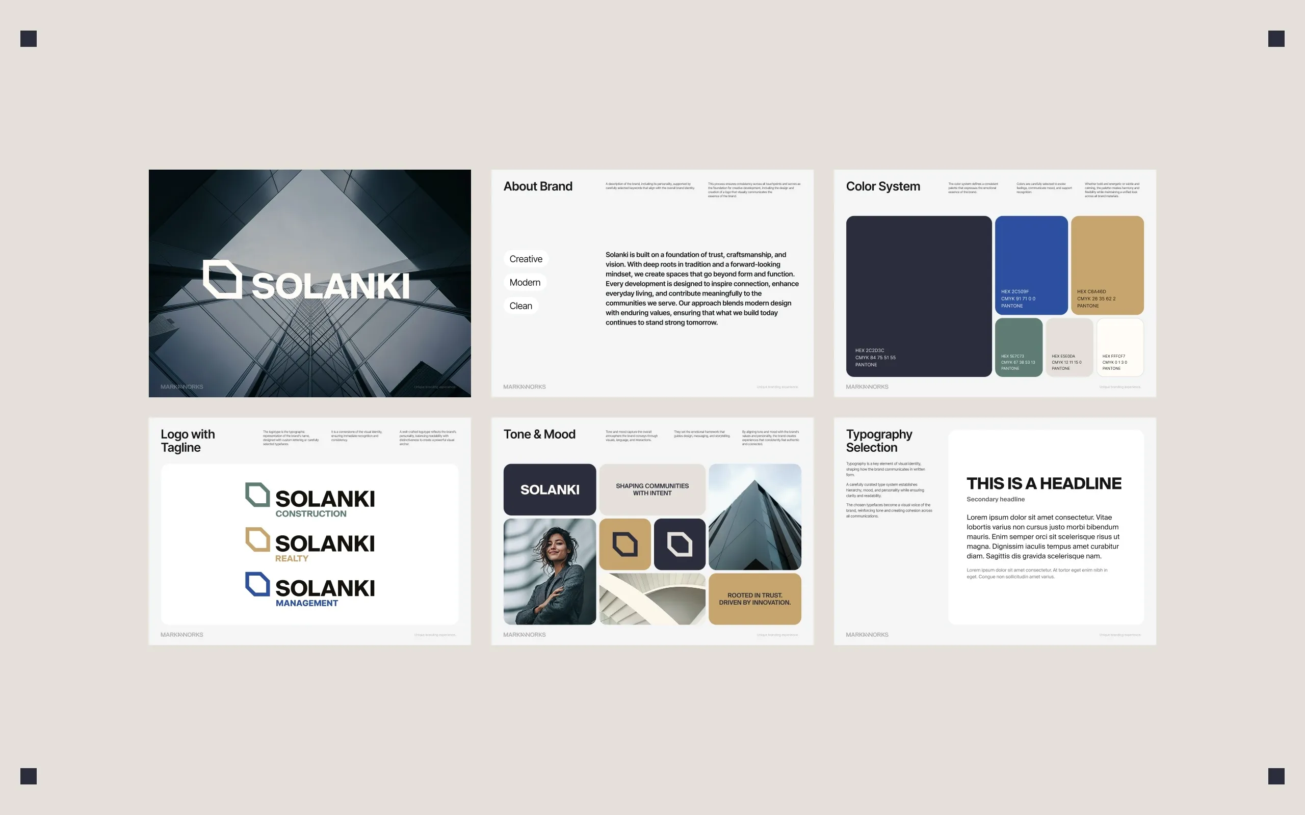
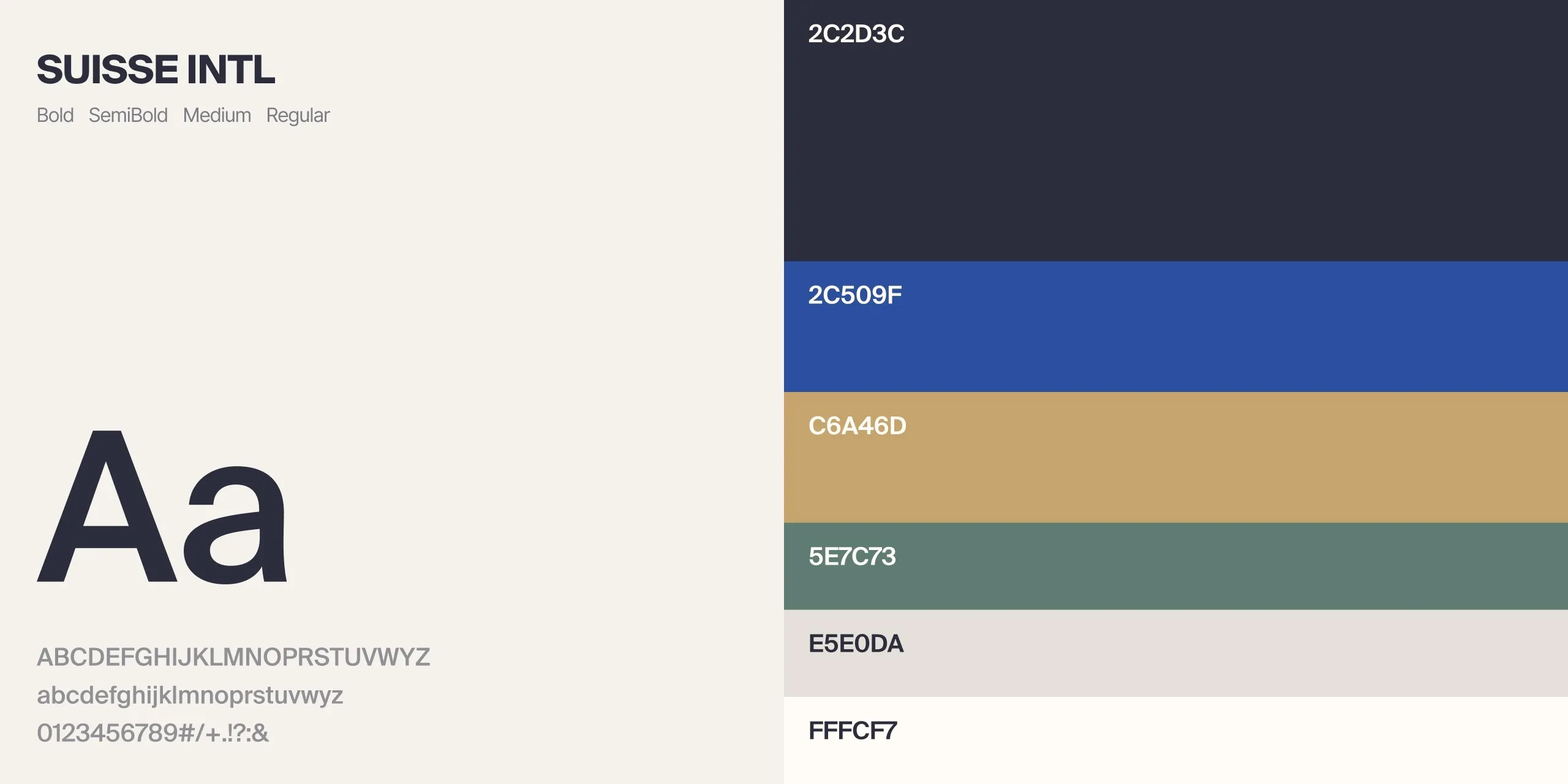
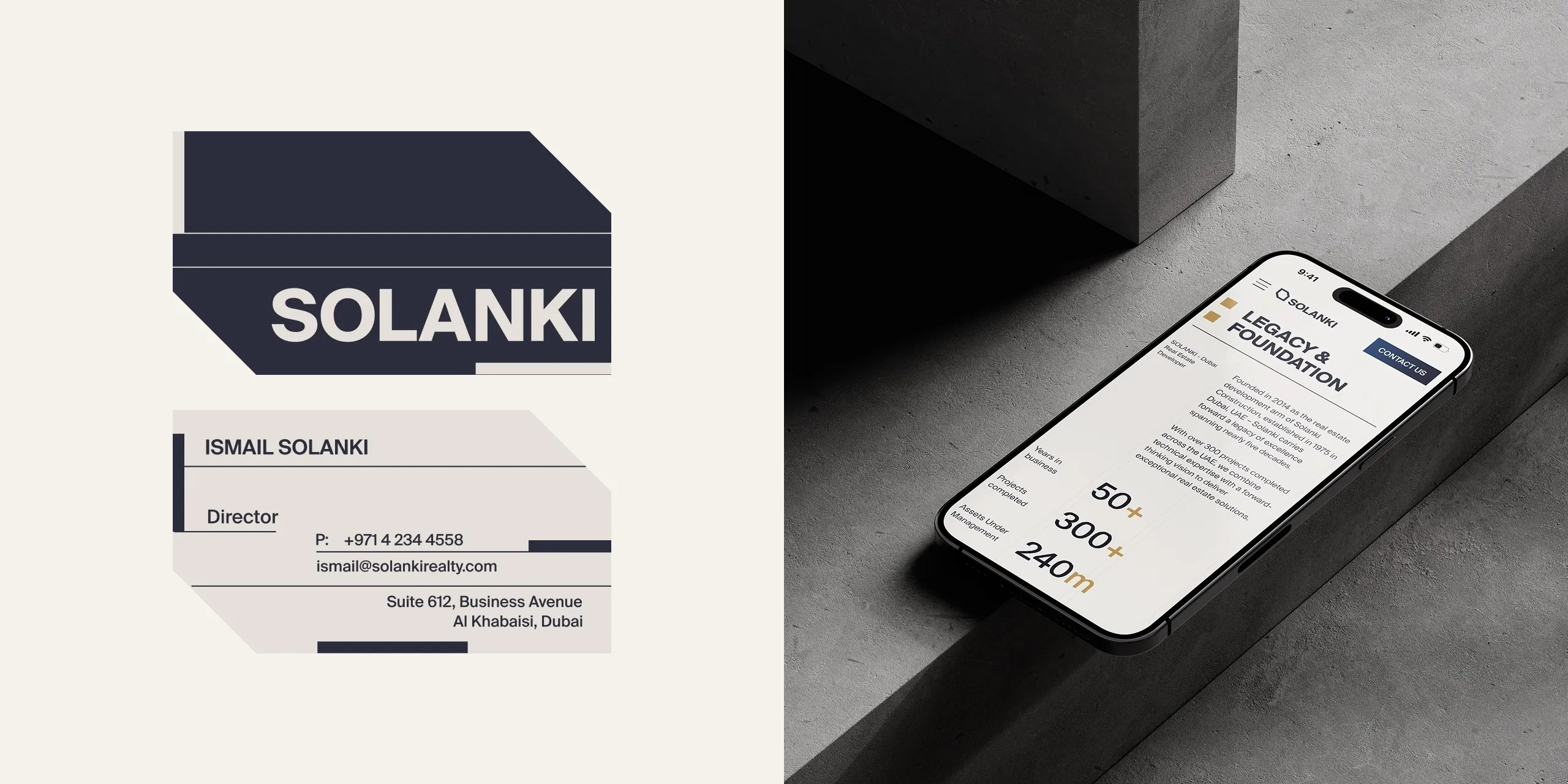
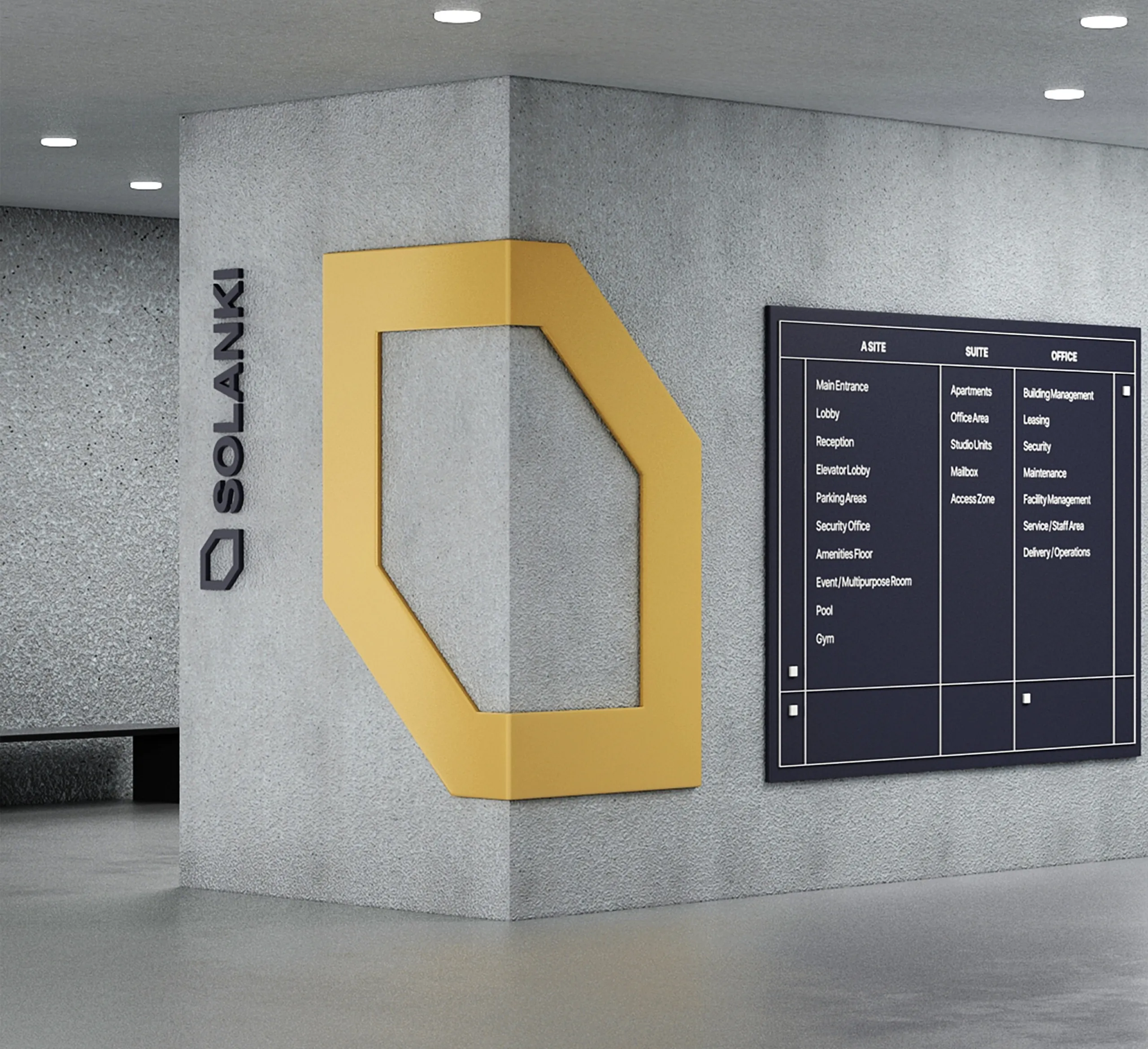
The identity system is built around a custom geometric symbol inspired by architectural forms, structural precision, and the concept of continuous growth. Combined with a refined typographic system and a carefully curated color palette, the brand communicates confidence, stability, and premium positioning across every touchpoint.
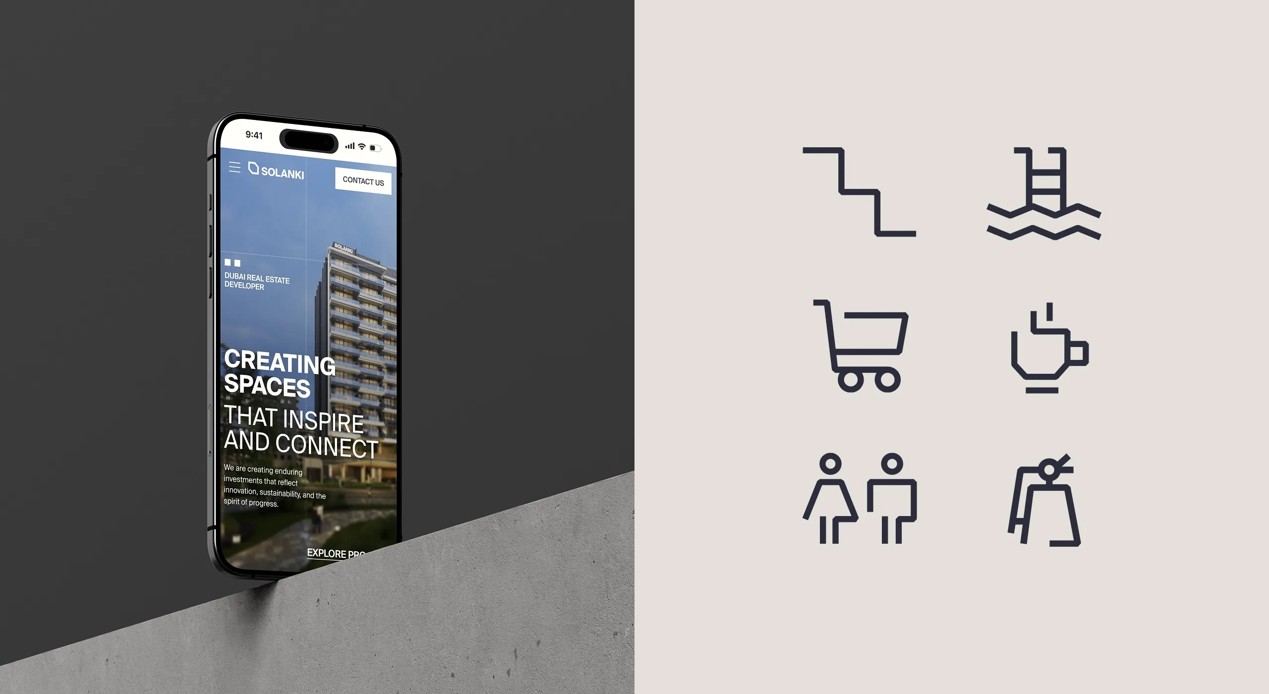
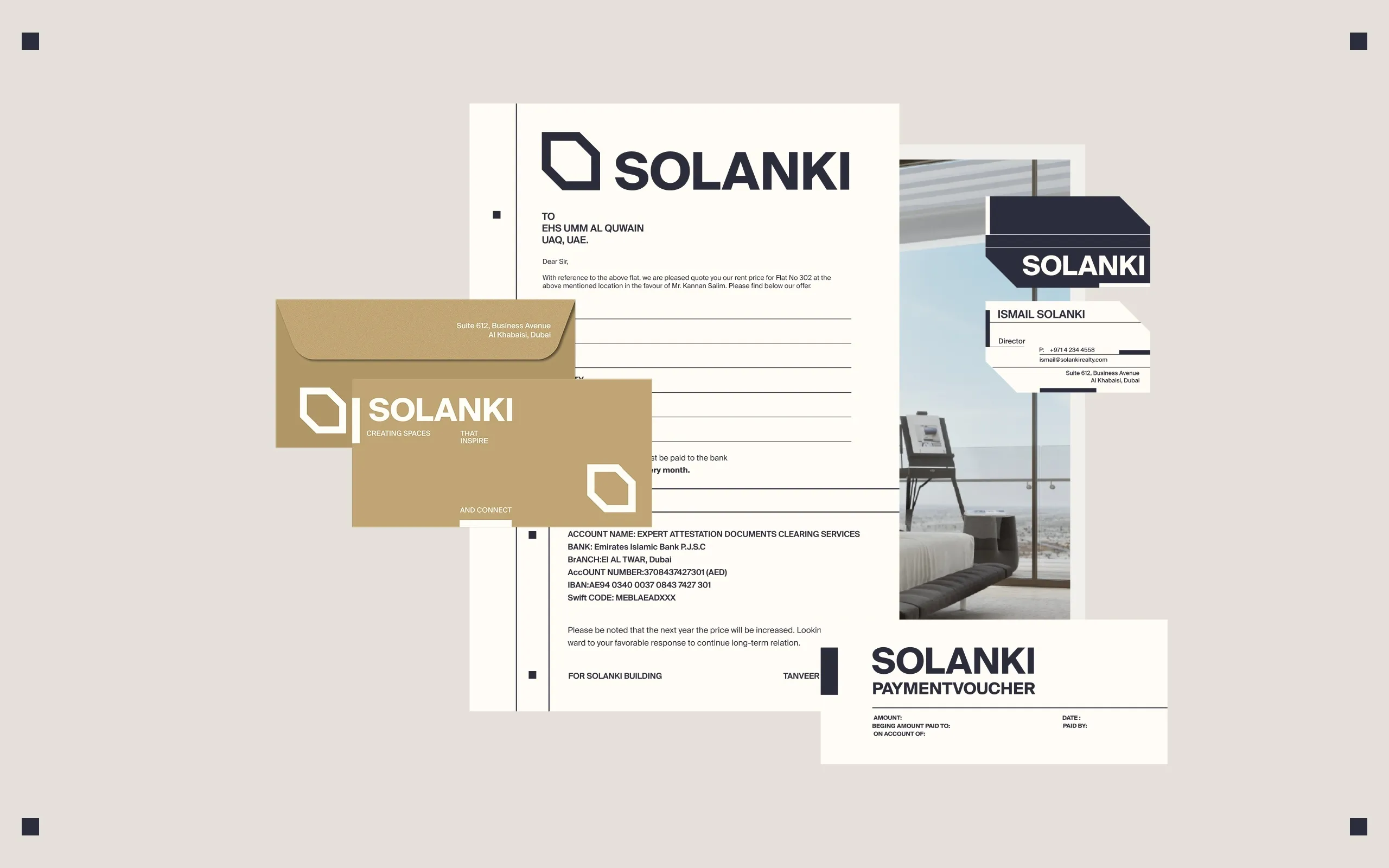
The visual language extends beyond the logo into a complete ecosystem that includes brand identity, digital experience, signage, stationery, marketing materials, environmental graphics, and responsive web design.
A structured grid system, spacious layouts, and a restrained color palette create a balance between corporate credibility and contemporary elegance. Deep navy tones establish trust and authority, while warm gold accents introduce a sense of prestige and investment value.
The website experience was designed with the same philosophy, combining editorial-inspired layouts, architectural imagery, and a highly organized information hierarchy to showcase projects, company heritage, and investment opportunities in a clear and engaging way.
The result is a timeless identity system that positions SOLANKI as a forward-thinking real estate developer while honoring the values of craftsmanship, legacy, and long-term vision.
See more web and digital design case studies.

Let’s make the work they’ll copy.
Talk to an expert now
Work with a 38 team of the
industry’s top 1% talent.