Birtz
women’s wellness brand
Birtz is a Luxembourg-based wellness brand focused on women’s reproductive health. The challenge was to create a brand identity and digital presence that could balance clinical credibility with feminine warmth — offering trust, empathy, and empowerment in every touchpoint.
Client & Challenge
Birtz is a Luxembourg-based wellness and nutrition brand focused on women’s reproductive health, covering fertility, hormonal balance, and menopause. The brief we received at MarkaWorks stated the design problem plainly: build an identity and digital presence that balances clinical credibility with feminine warmth, and do it without the cliches of wellness branding.
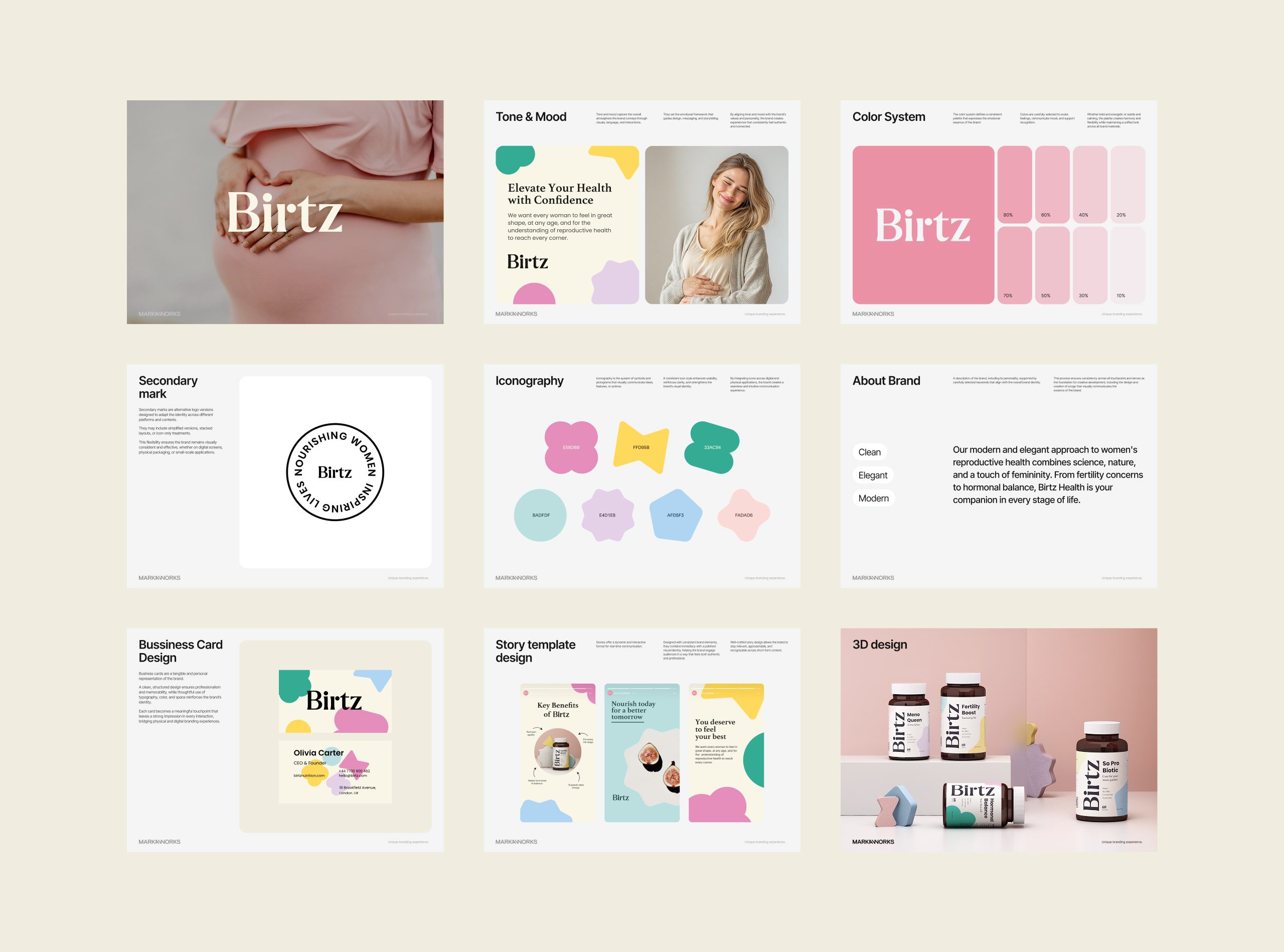
We began with an in-depth workshop on the emotional and functional dimensions of the brand. Its core insight shaped everything after it: the women this brand serves are looking for understanding as much as solutions, so the brand has to speak to confidence, not just to symptoms. Strategic pillars drawn from that workshop set the tone of voice and the visual behavior together.
Brand Strategy
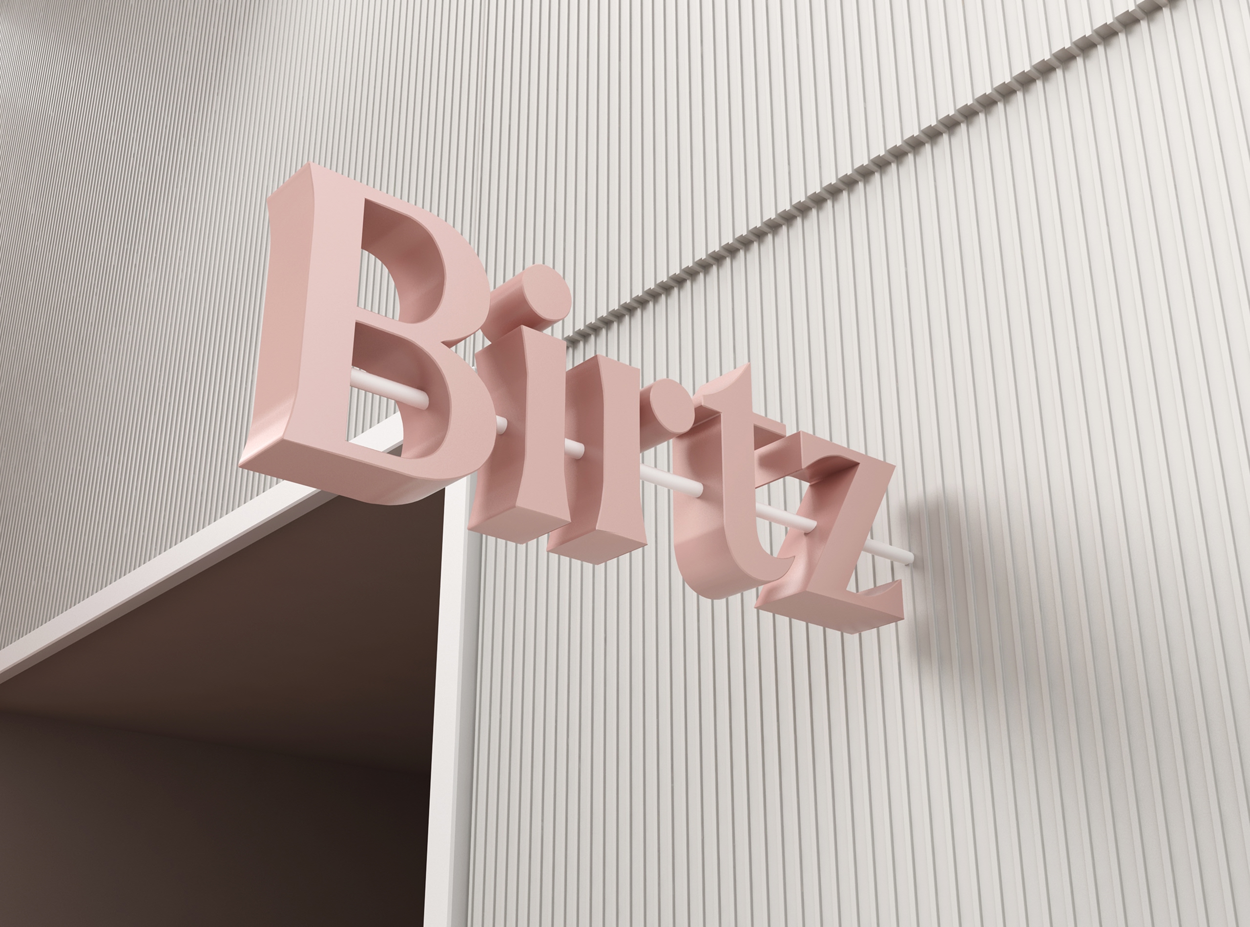
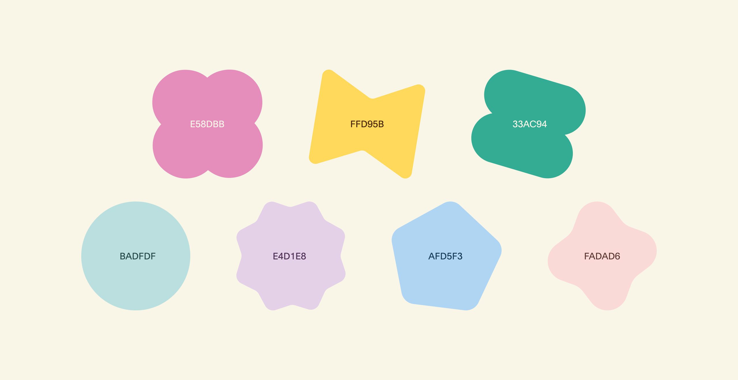
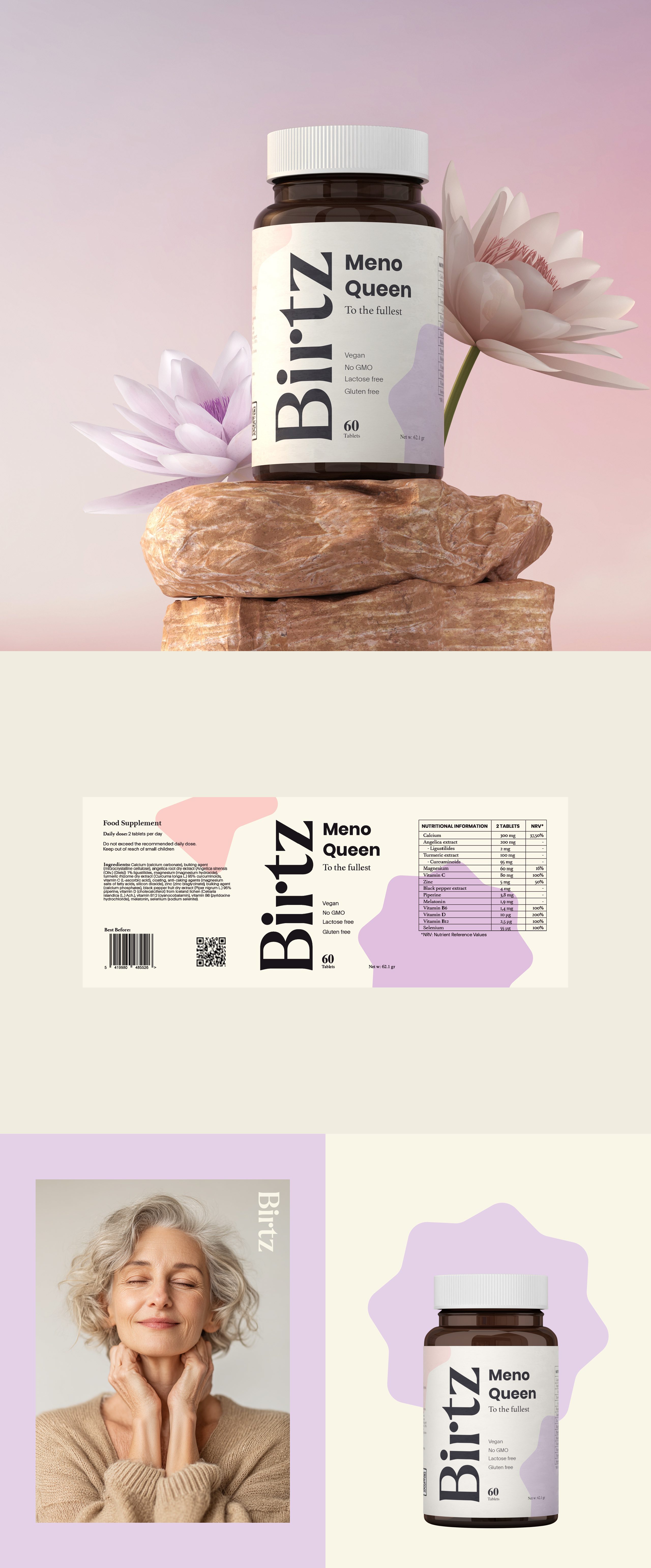
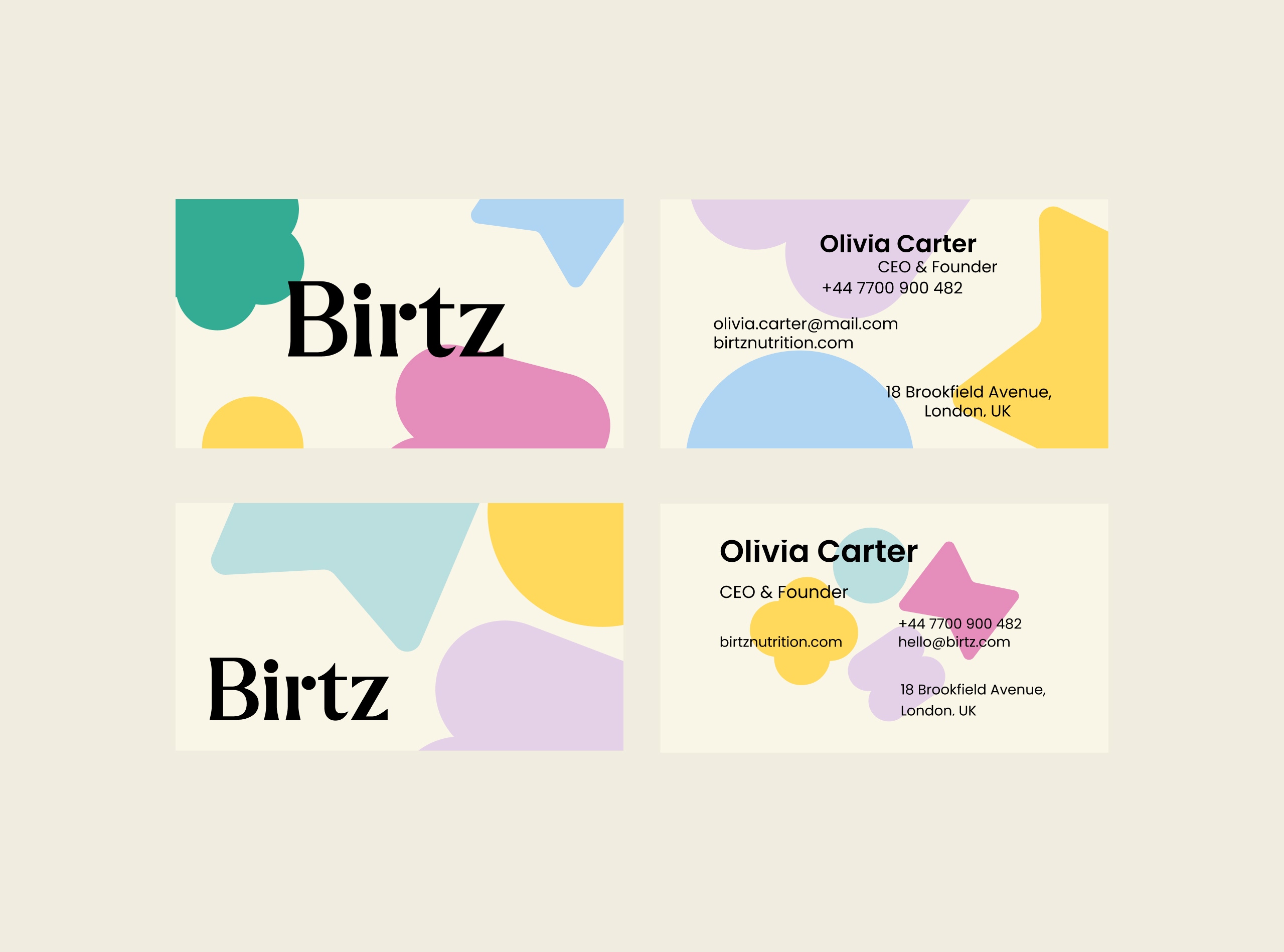
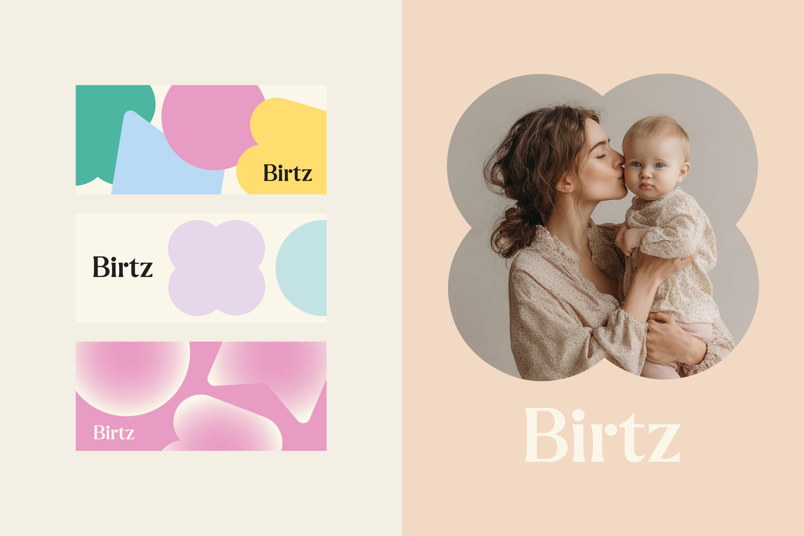
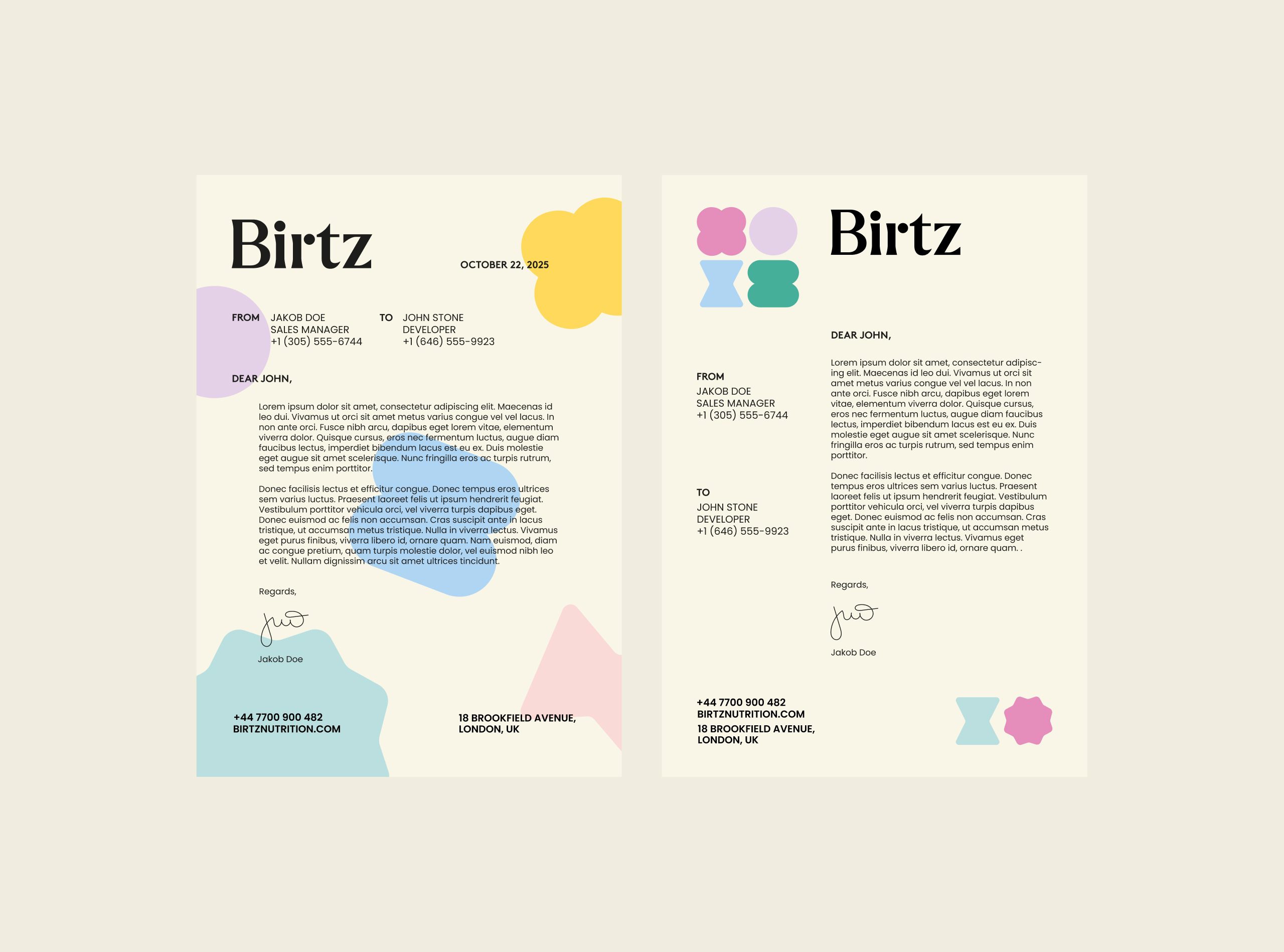
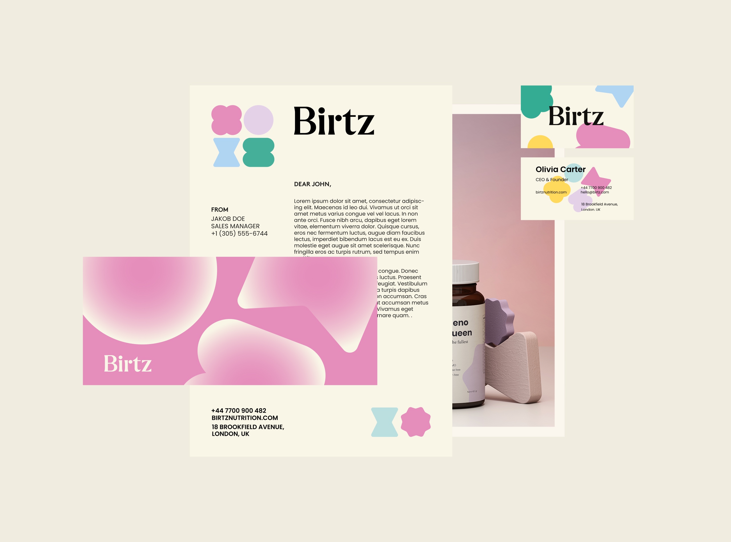
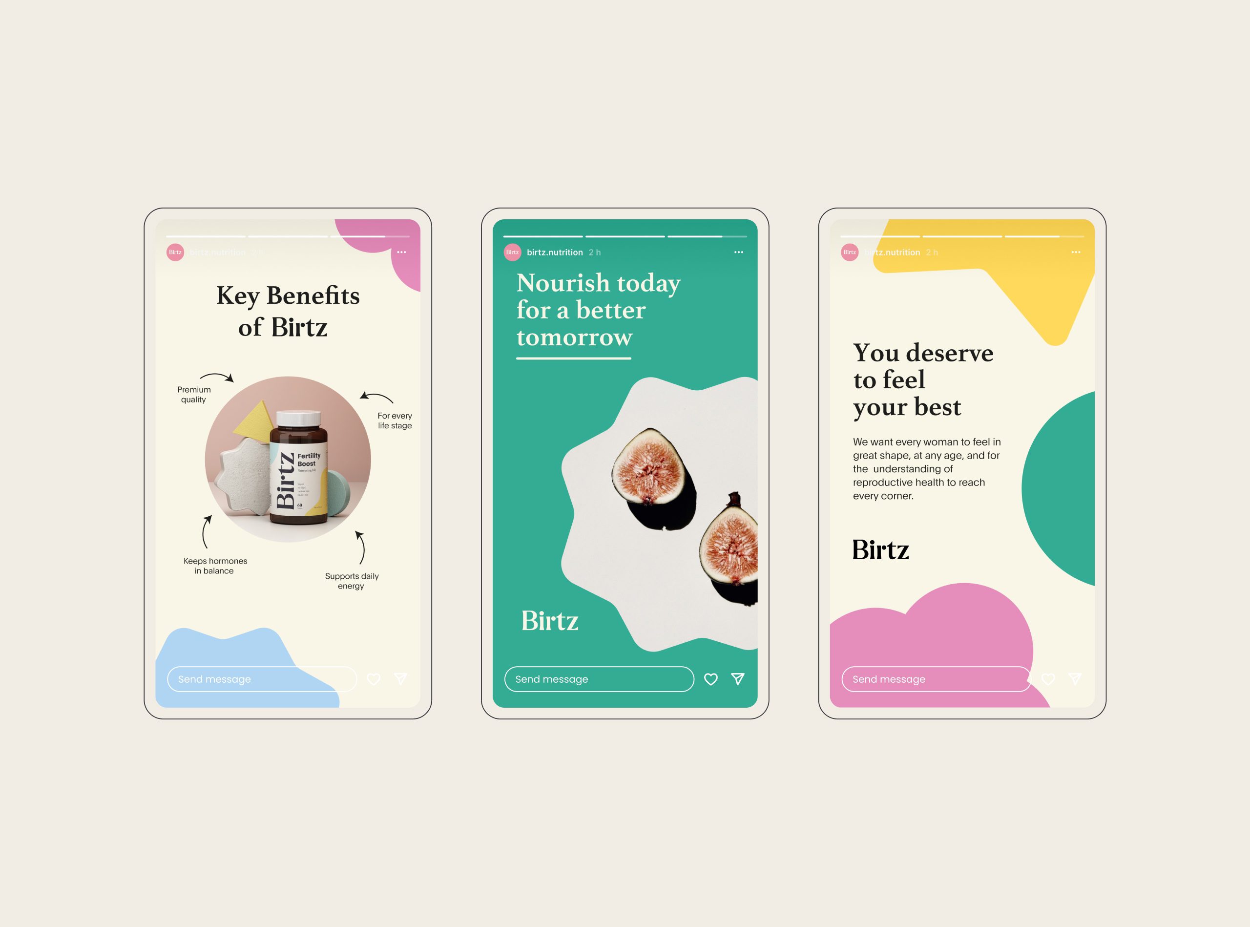
The logotype is a modern serif with soft, confident letterforms, authority without hardness. A secondary mark carries the line “Nourishing women, inspiring lives,” working as both a seal of trust and a statement of purpose. Pastel tones are combined with earthy neutrals, and the custom iconography is drawn from organic shapes, a graphic shorthand for life and growth.
Visual Identity
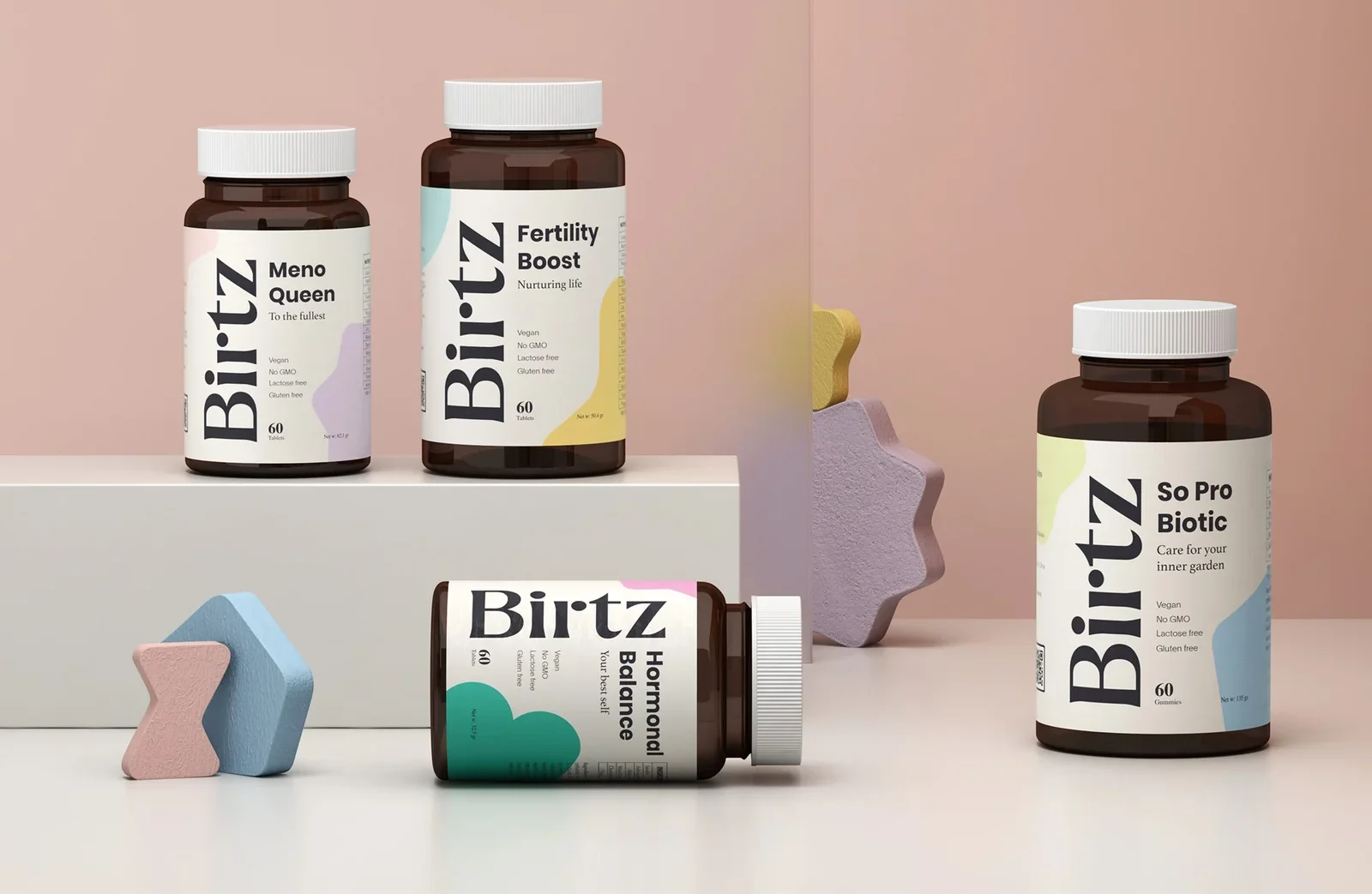
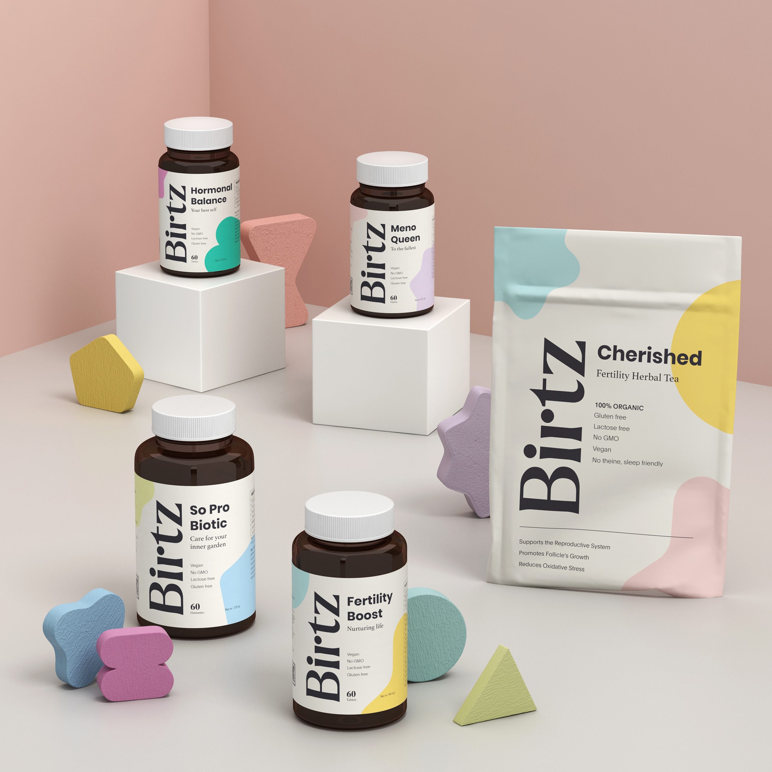
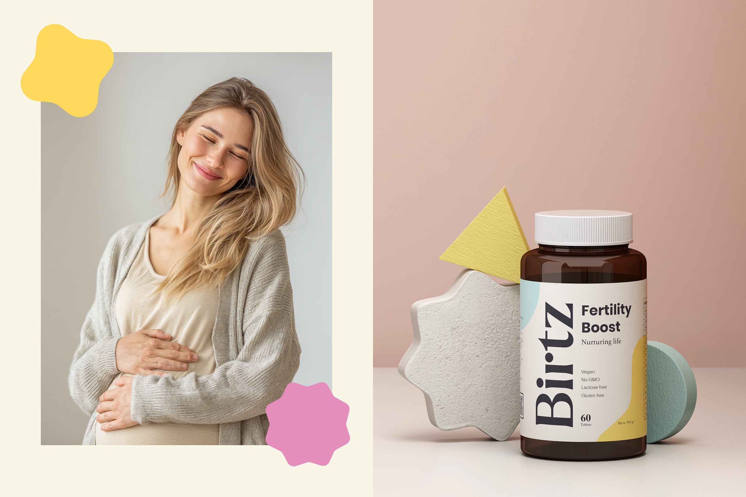
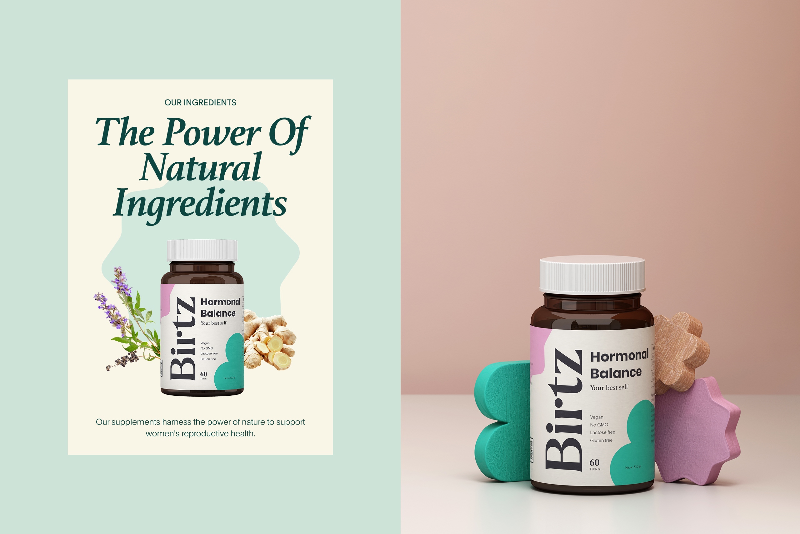
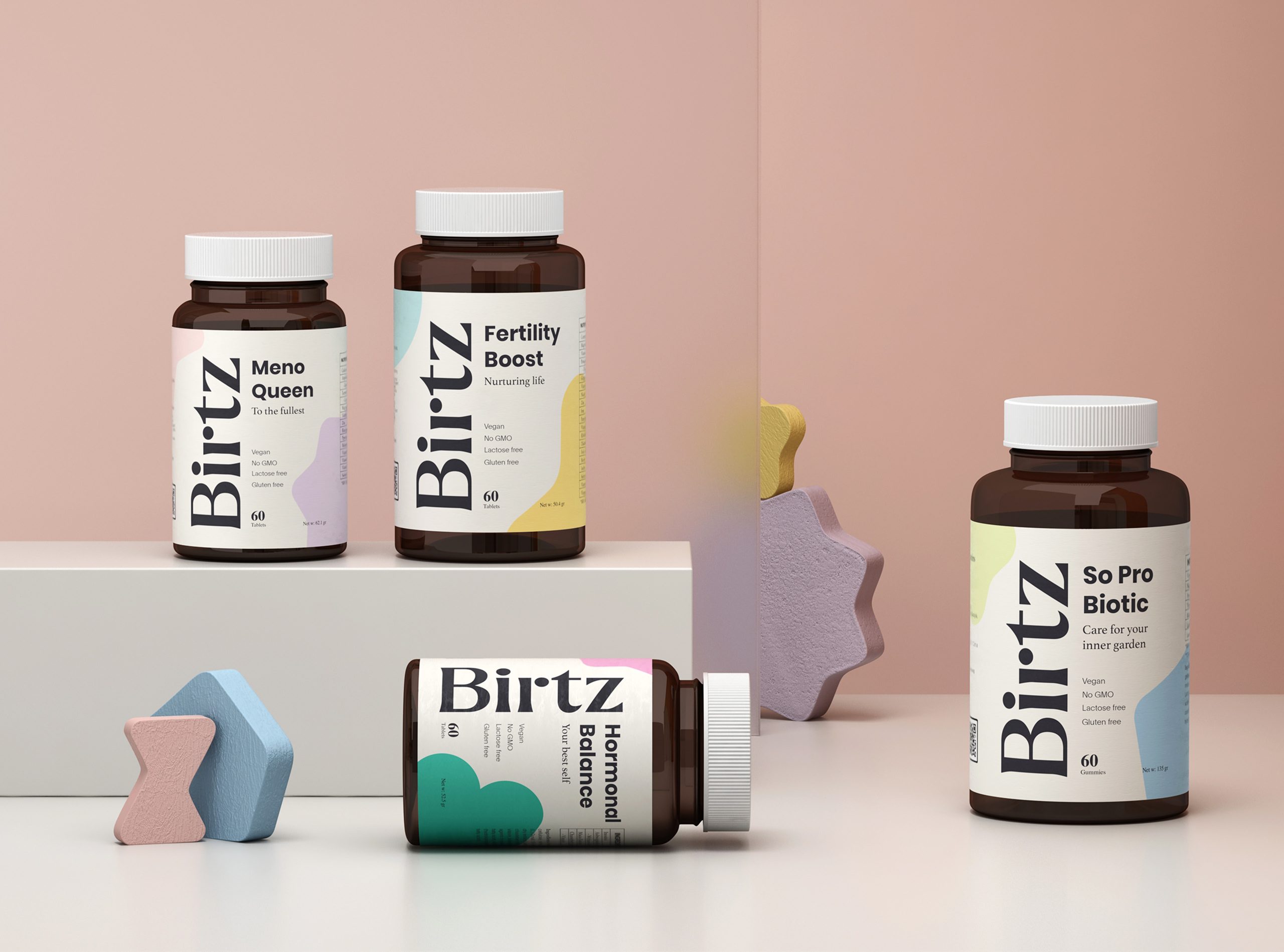
On the packaging, the system is deliberately simple and educational. A vertical logotype creates instant shelf recognition, and a color-coded system lets a customer navigate to her specific need without reading every label. We handled the product visualization in 3D, and the minimal compositions and soft lighting there position Birtz as premium but approachable, and honest about its materials.
Design System & Applications
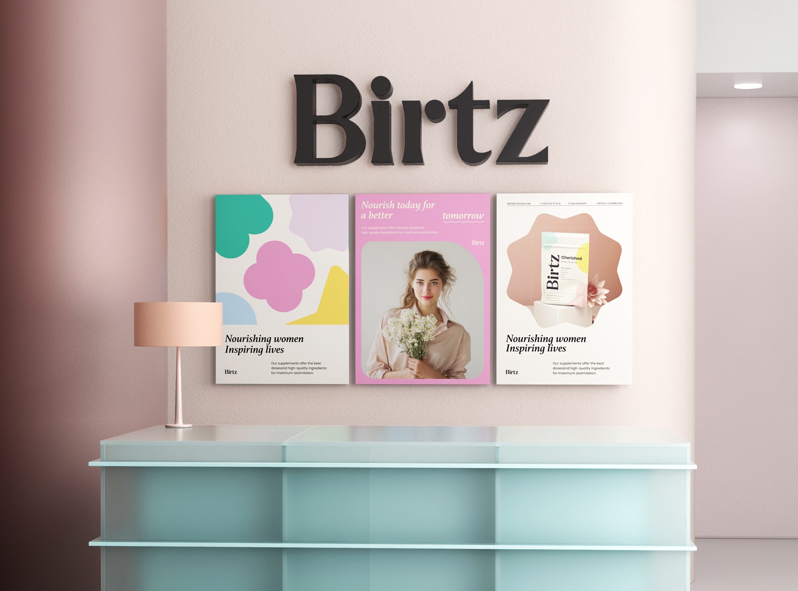
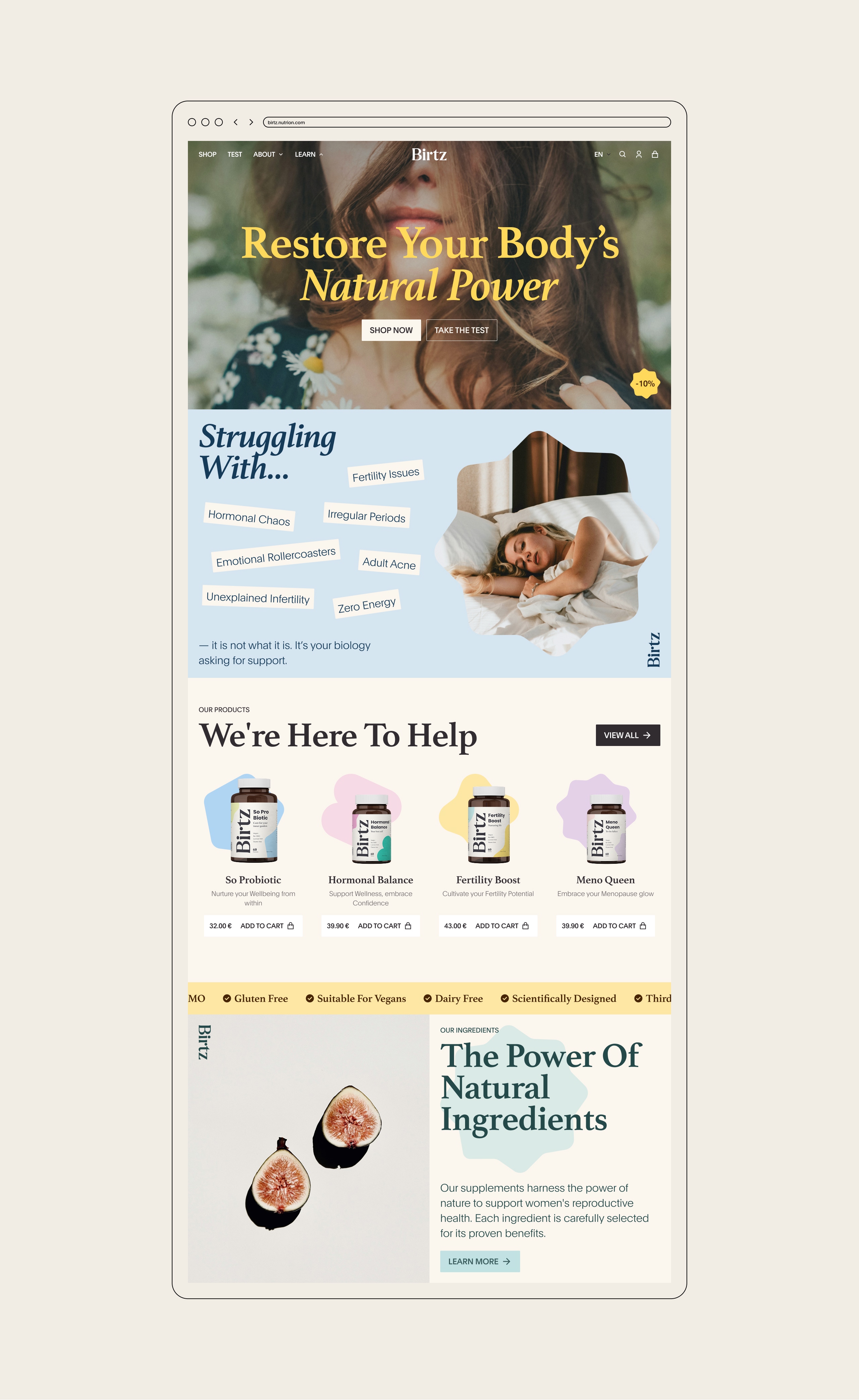
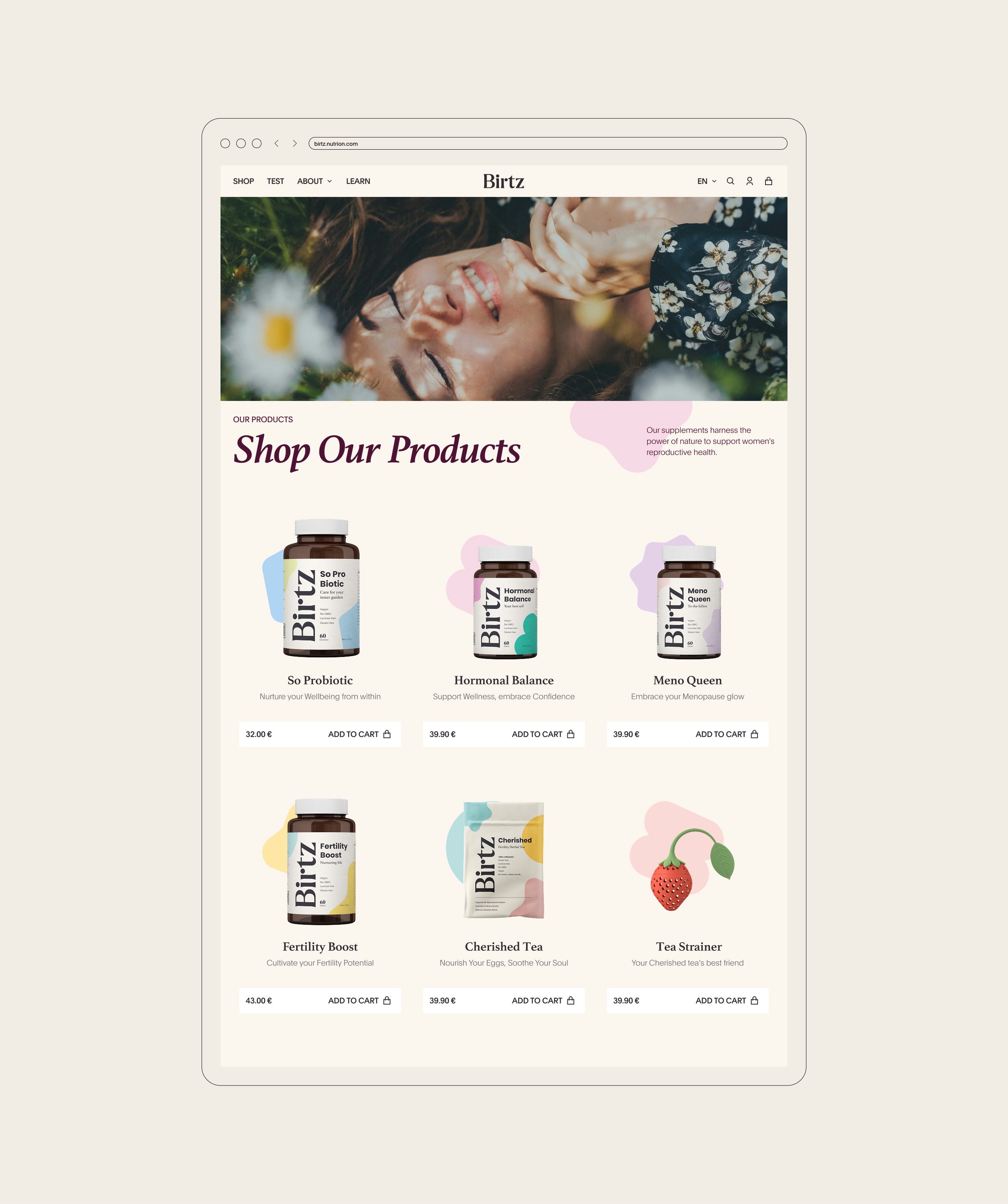
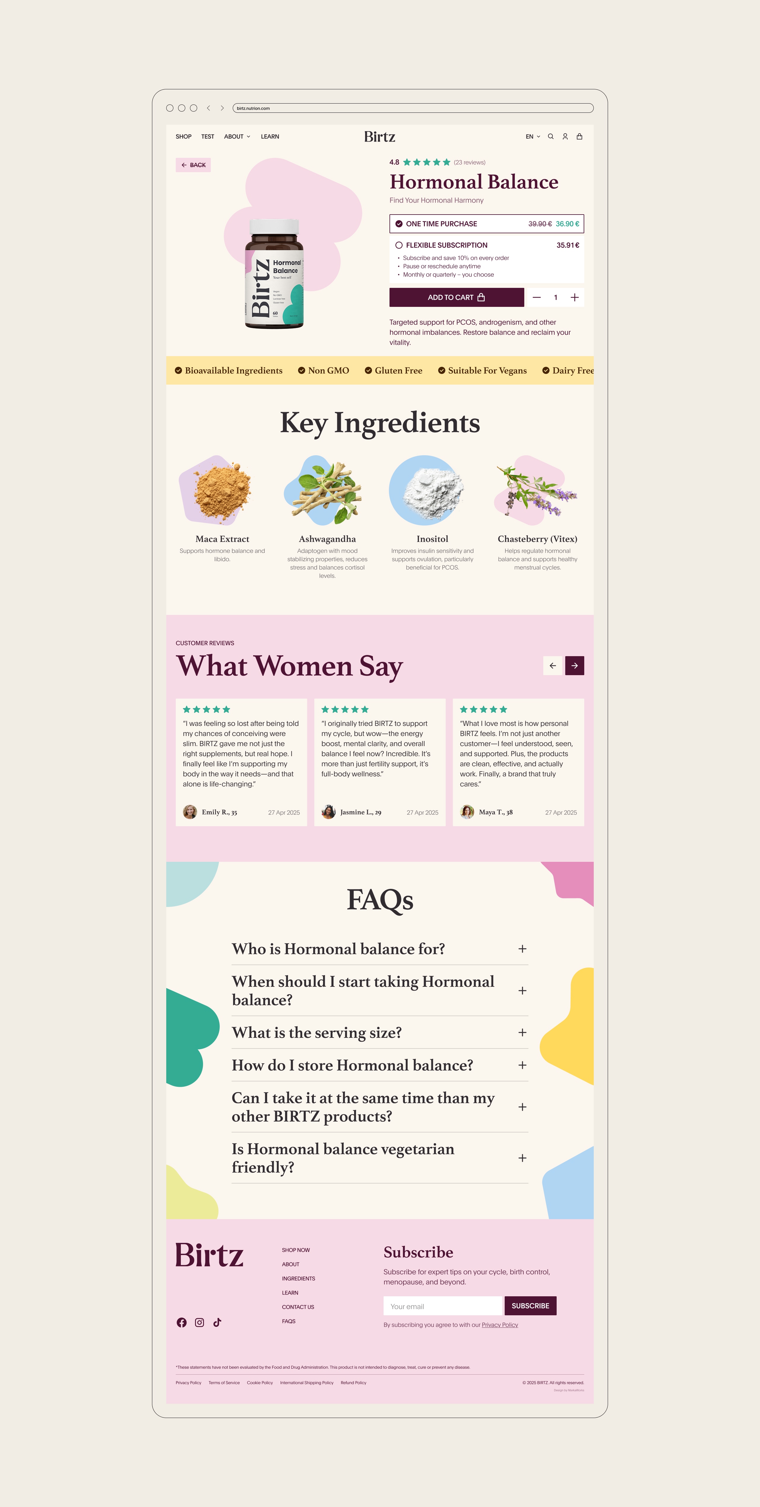
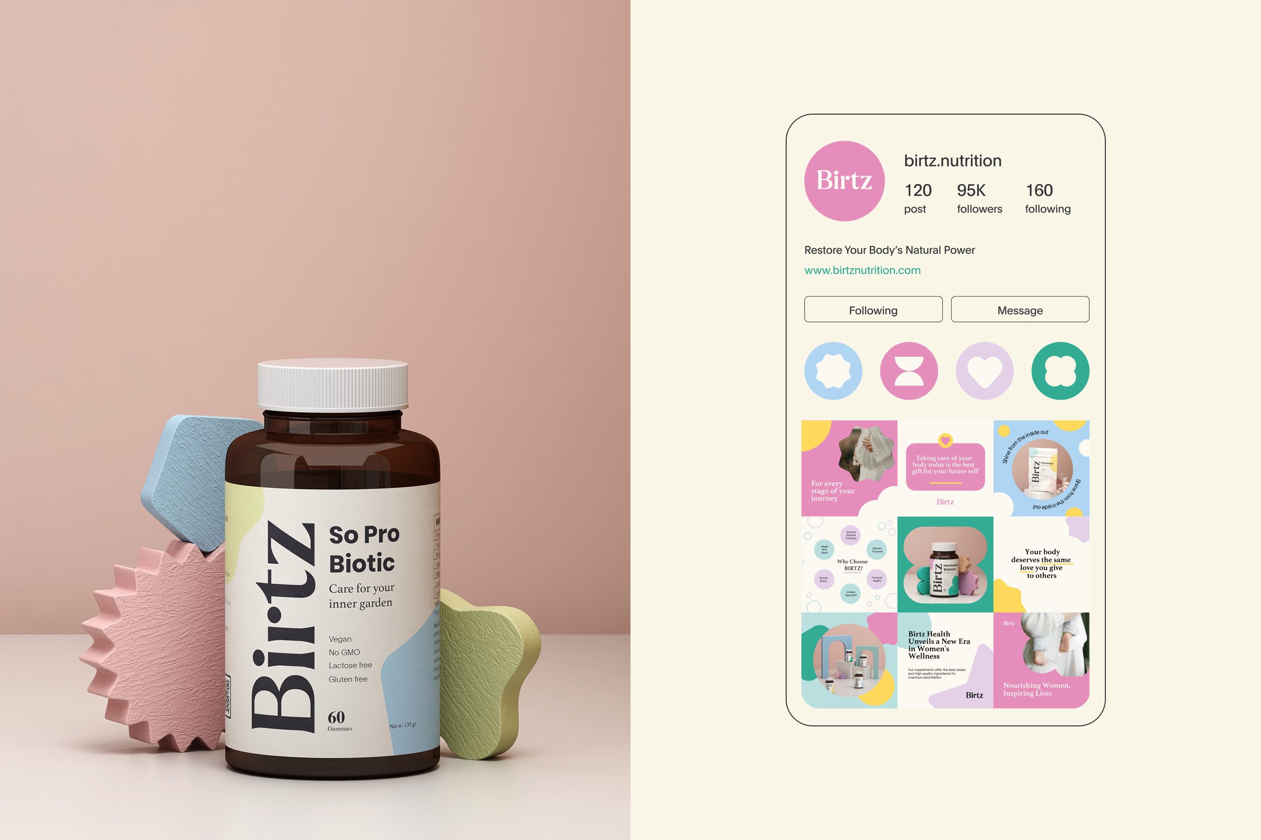
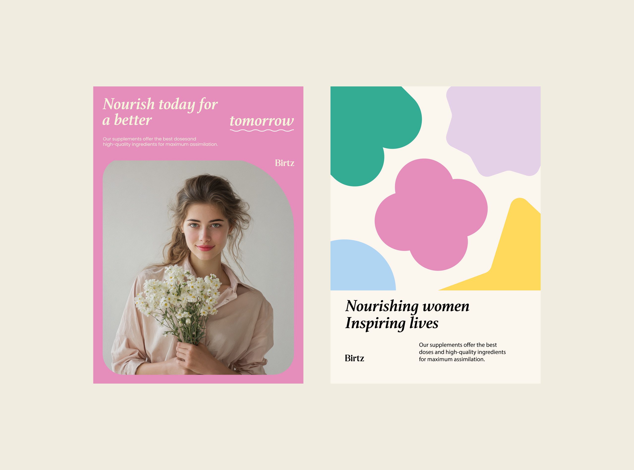
The website and its e-commerce flow follow the same principles: soft interface details and organic forms over a structured hierarchy, so the science stays approachable. Campaign layouts pair photography of real emotion, confidence, relief, serenity, with editorial typography and generous whitespace. The brand’s own copy lines, “Nourish today for a better tomorrow” and “You deserve to feel your best,” show the intended register: emotional truth backed by clinical assurance.
Tone & Messaging
Color-coding does a second job in this category. A woman moving from fertility to hormonal balance is not buying a new brand, she is moving inside one, and a range that looks identical across those stages makes her check every label. Separating the stages by color lets the shelf answer the question the copy would otherwise have to.
Result
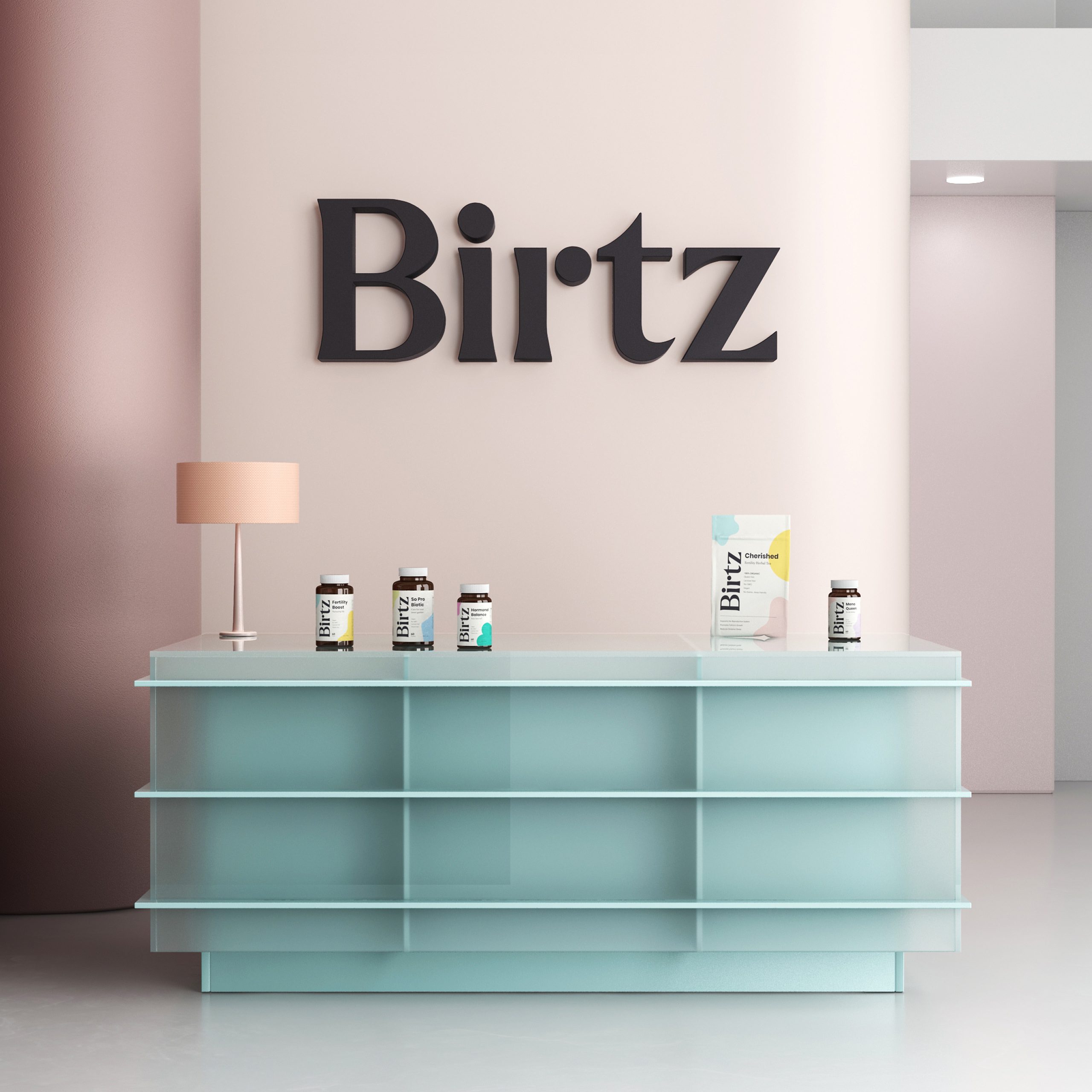
What was delivered scales across packaging and digital, and it is built to age well: the identity leans on typography, color logic, and iconography rather than on trend-driven effects.

Let’s make the work they’ll copy.
Talk to an expert now
Work with a 38 team of the
industry’s top 1% talent.



