MUUM UI
web experience case study
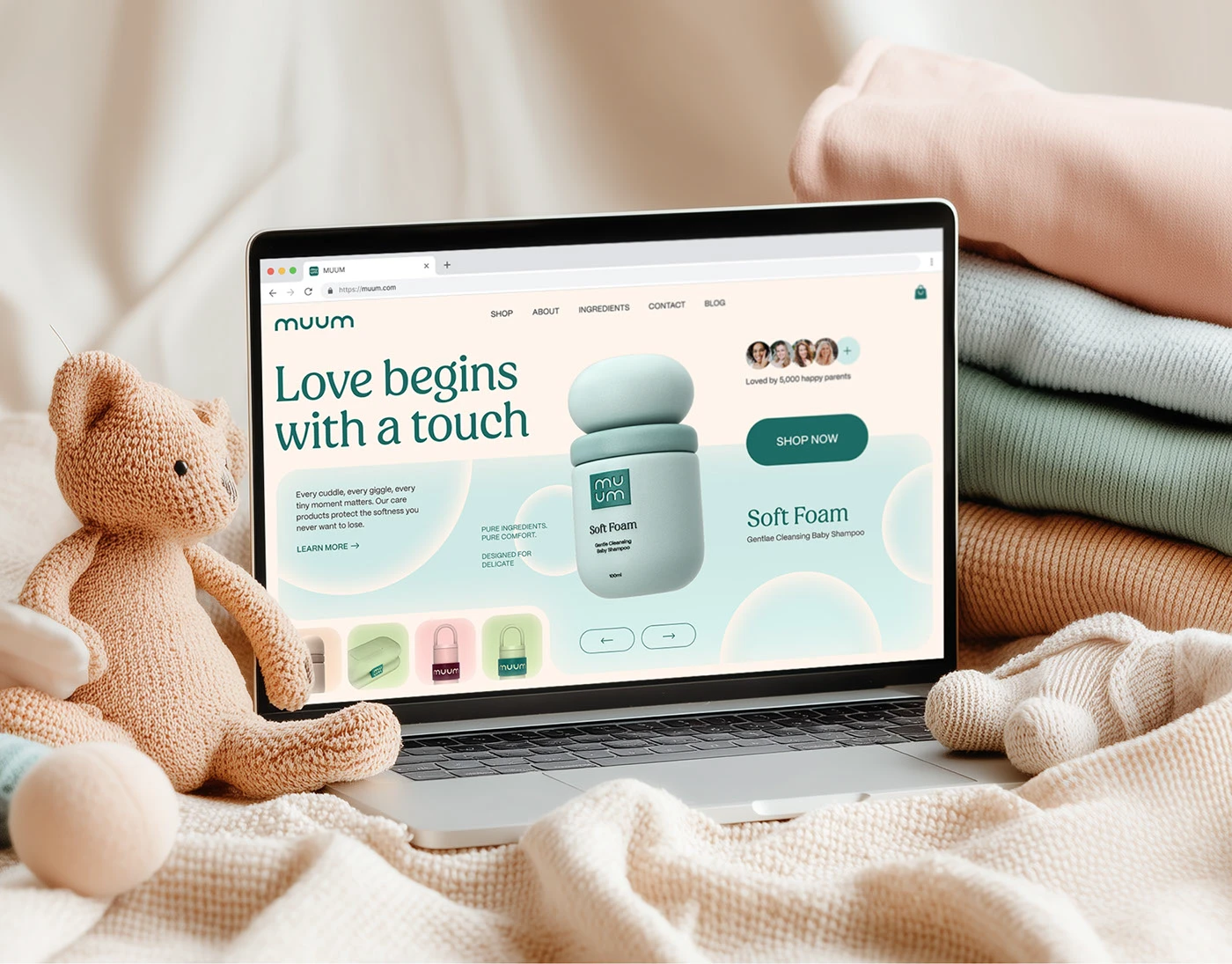
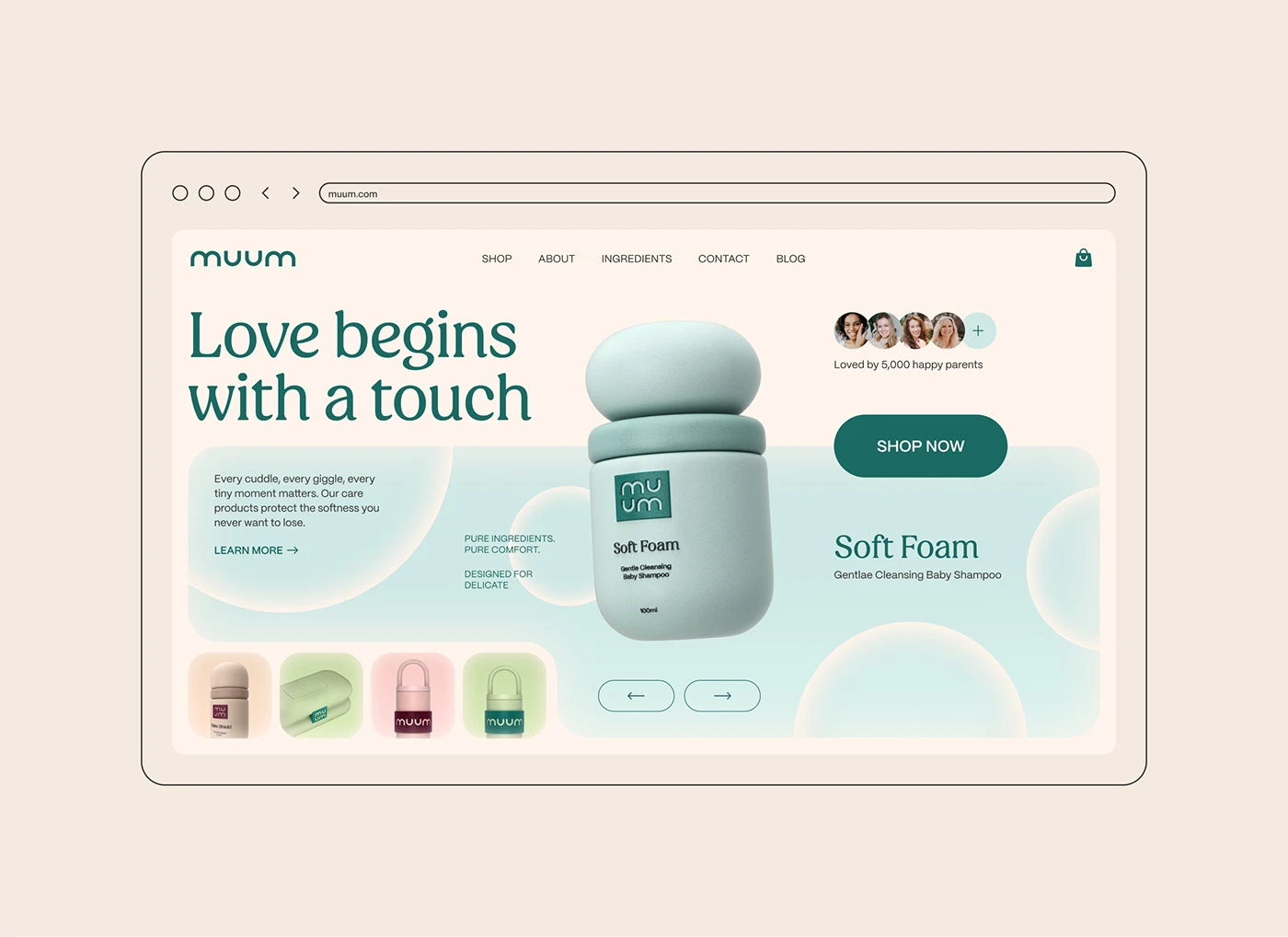
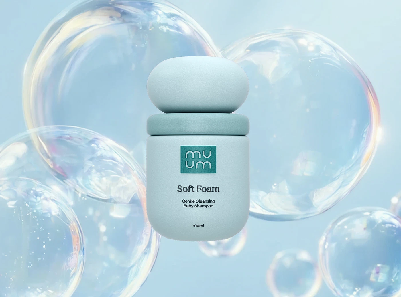
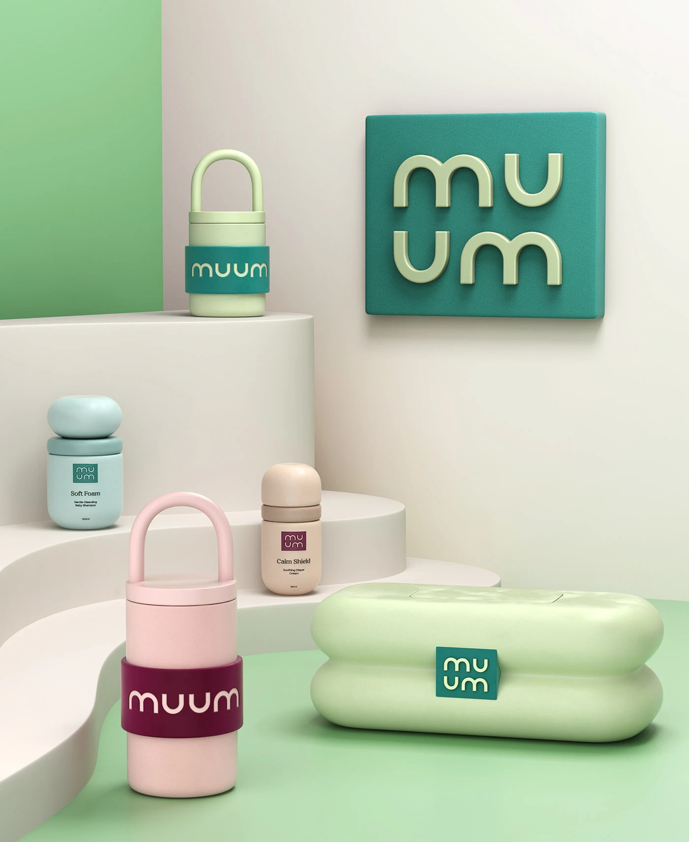
MUUM is a baby-care brand rooted in comfort, gentleness, and trust. Our task was to transform this emotional brand world into a high-performance, intuitive, and clear digital experience. The core idea: soft brand → structured, confident digital journey.
02: Emotion-Driven UX Design
MUUM is a baby care brand built on comfort and trust, and this project was the digital side of it: turning a soft brand world into a structured shopping experience without losing what made it soft.
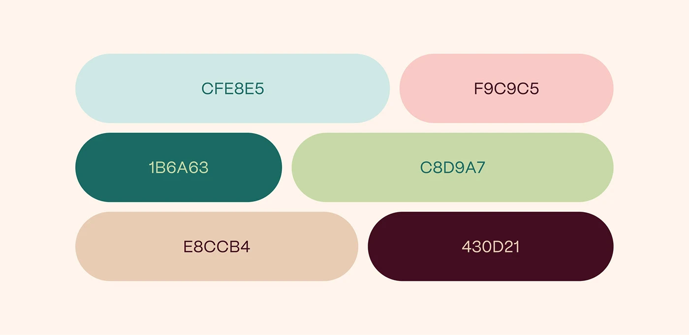
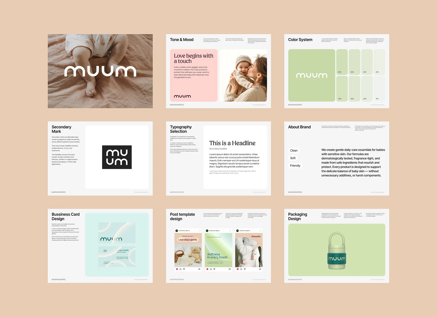
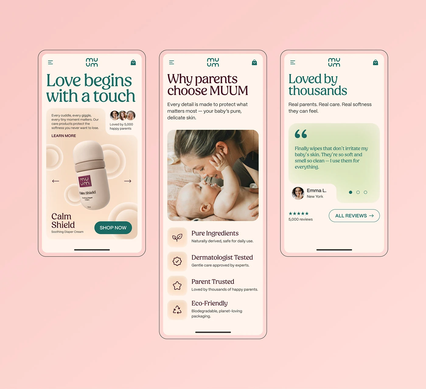
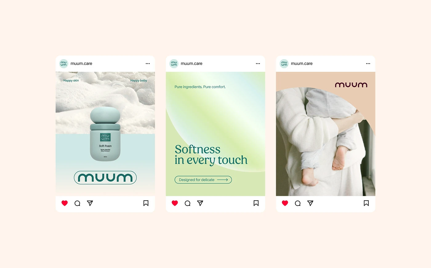
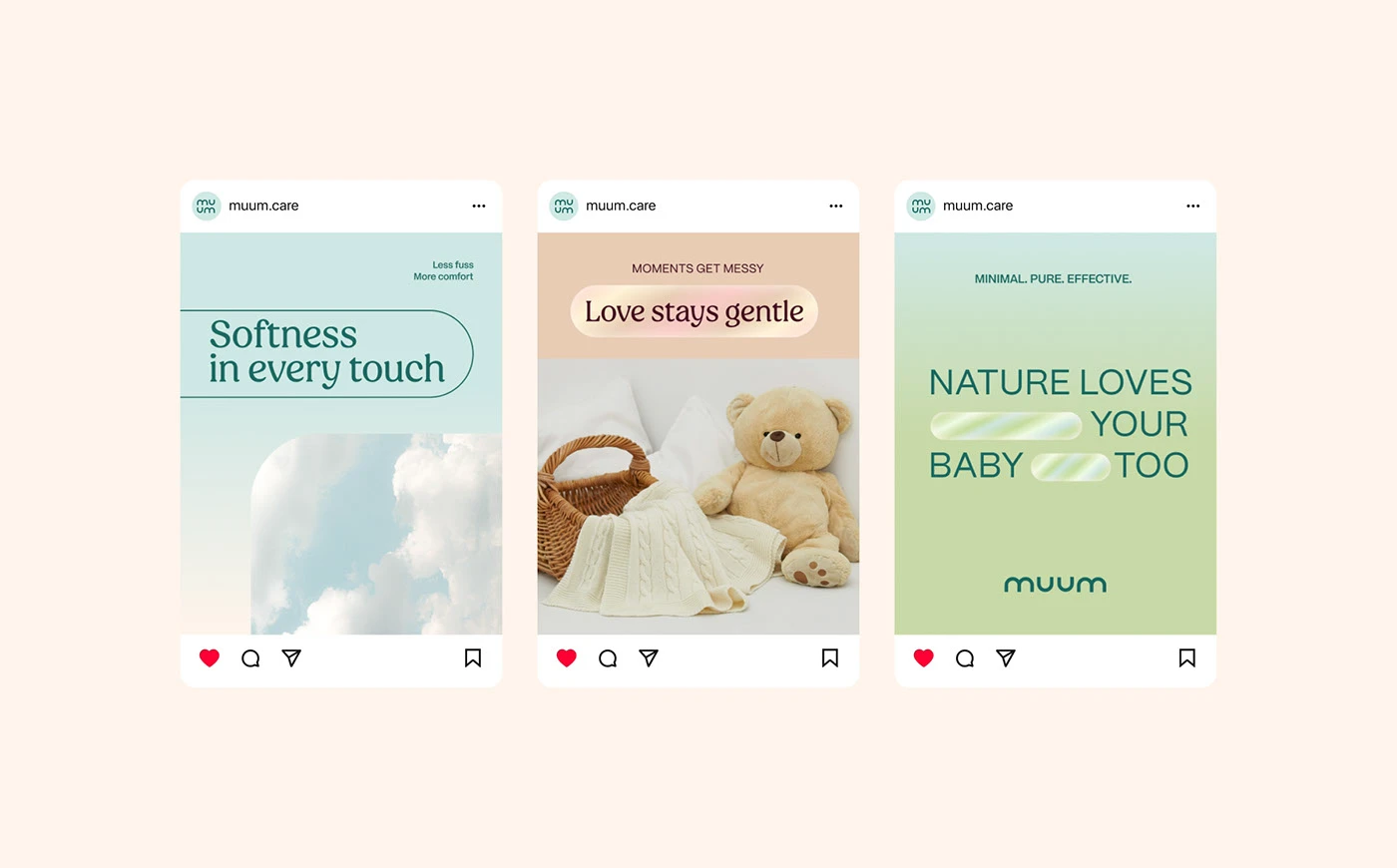
At MarkaWorks we built the interface language to carry that tenderness. Warm gradient transitions, calm layouts with room to breathe, a serif paired with a rounded sans, and photography of real parent and baby moments rather than stock imagery. The pairing choice matters: a serif alone would read as formal, a rounded sans alone as childish, and the combination lands where the brand needed to be.
See more web and digital design case studies.
03: Decision Simplicity & Clarity
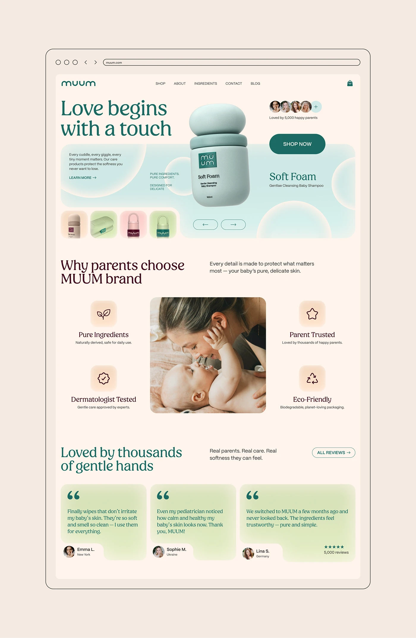
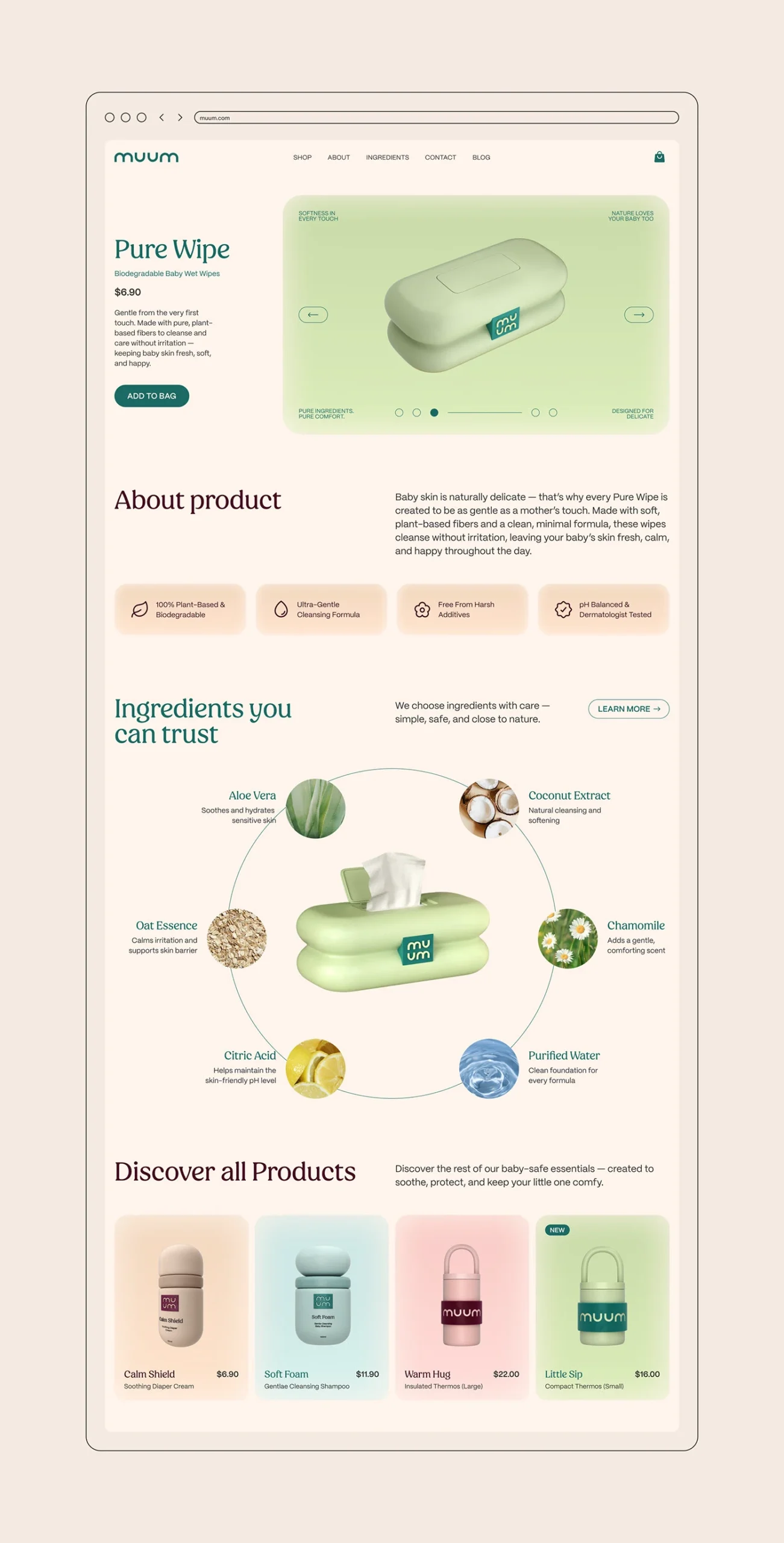
Clarity drove every MUUM flow decision. New parents are not browsing, they are deciding under time pressure and often with one hand occupied. Benefits appear at first glance, ingredient blocks are shown plainly, the story runs in a straight line, and the path from discovery to purchase was shortened rather than decorated. Calls to action are present without shouting.
04: Conversion-Focused E-Commerce Architecture
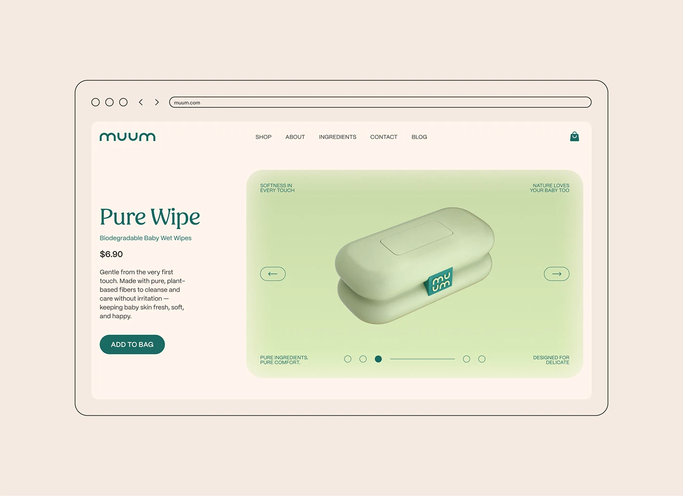
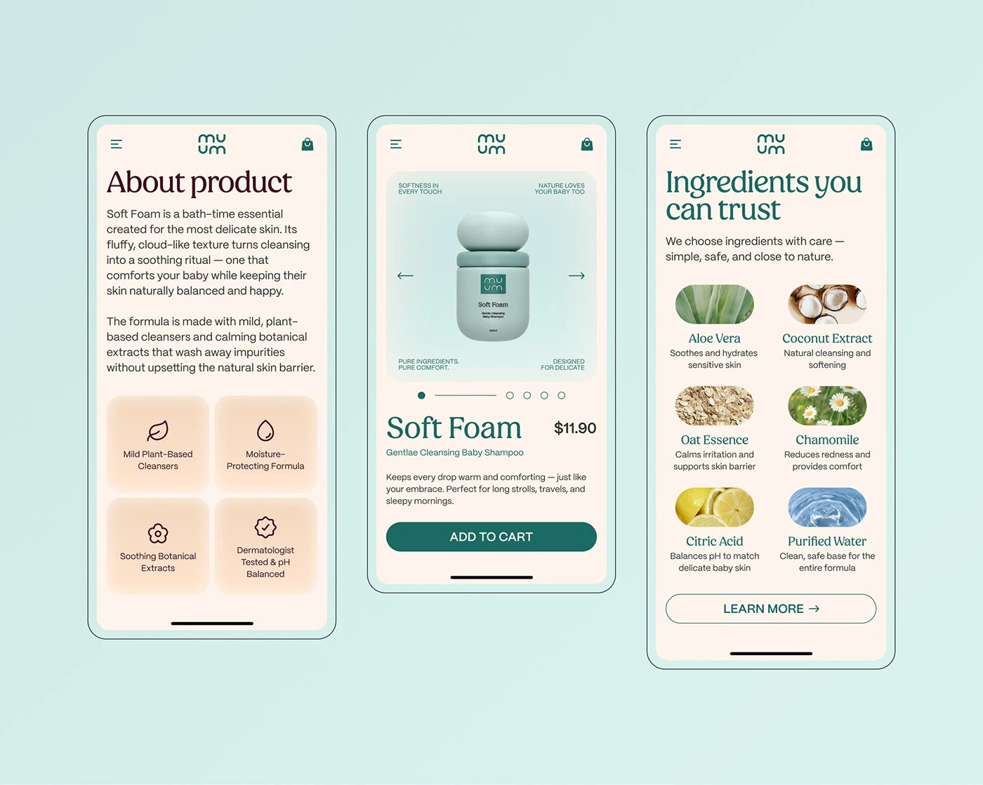
The commerce architecture follows behavioral reasoning. The structure is mobile-first and arranged for one-handed use. Product cards use consistent spacing rules, ingredient comparison zones sit where the question gets asked, and product pages are built so a scroll answers the next question rather than raising one.
05: A Scalable Digital System
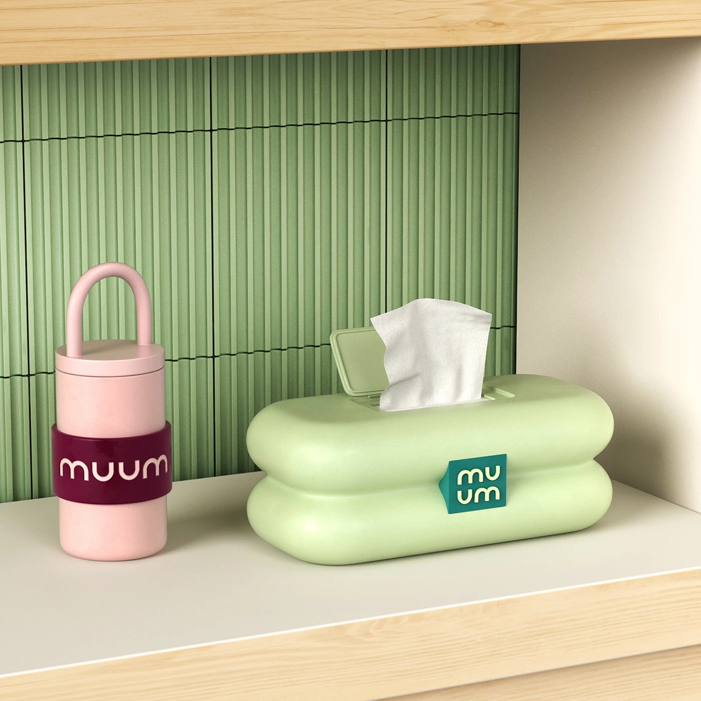
Underneath it, we built a modular UI system: a responsive component library, fixed color and spacing rules, ingredient-aligned iconography, and restrained micro-interactions. That system is what lets the brand add products later without the interface drifting away from the identity it started with.

Let’s make the work they’ll copy.
Talk to an expert now
Work with a 38 team of the
industry’s top 1% talent.