
BARS UI
UI & Digital Experience Design
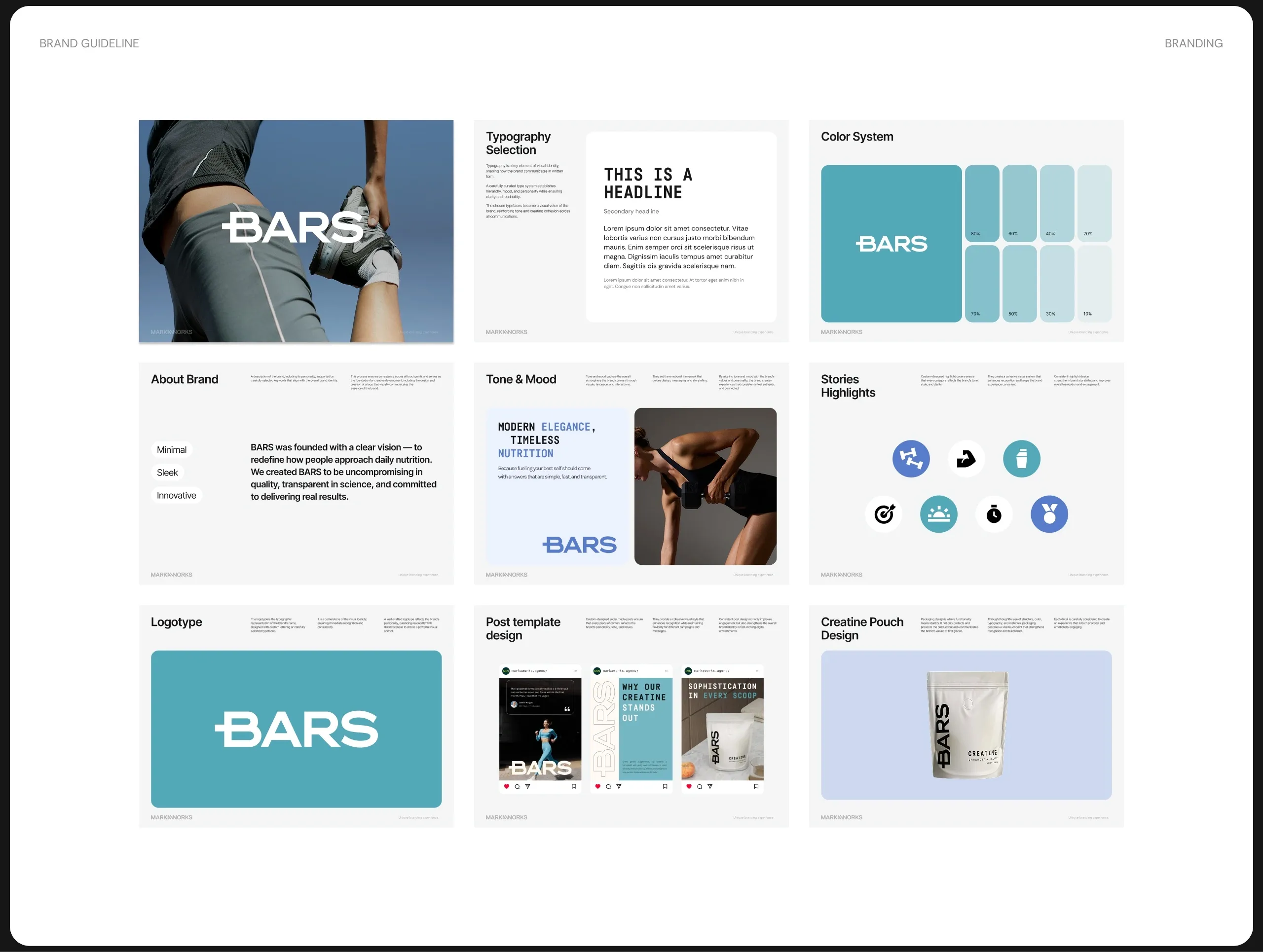
For BARS, the goal was to design a digital experience that reflects precision, trust, and modern performance, without visual noise or exaggerated claims.

BARS: UI & Digital Experience Design
BARS came to MarkaWorks with a product philosophy that was easy to state and hard to design: precision, trust, and modern performance, with no visual noise and no exaggerated claims. The brand identity had already been built on those terms. The site had to behave the same way, which is why we treat branding and website design as one job rather than two.
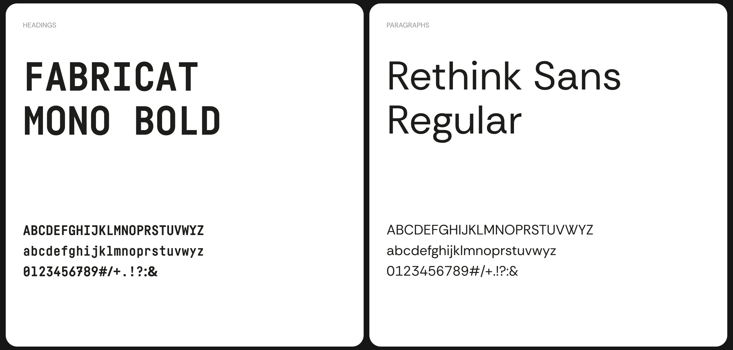
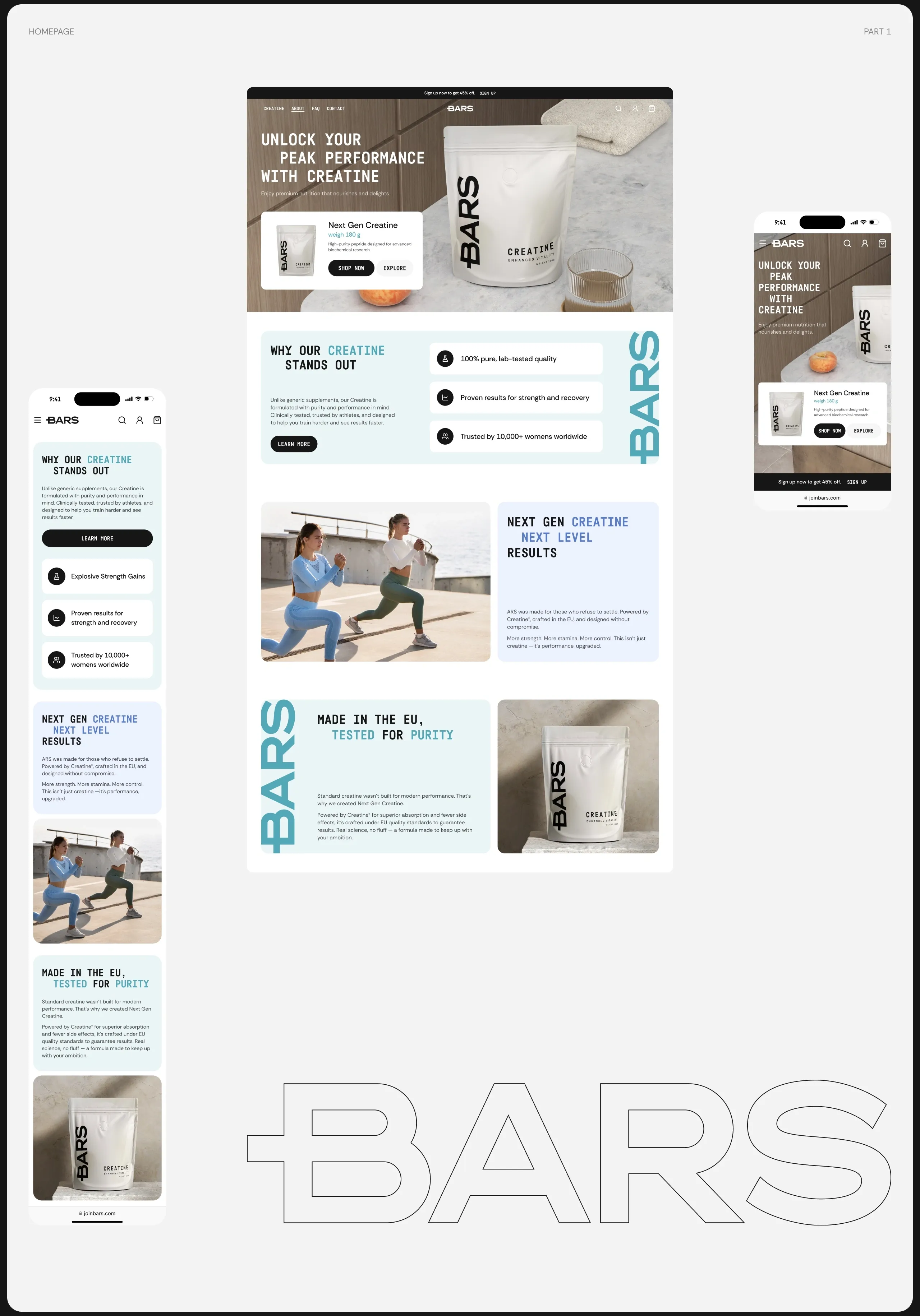
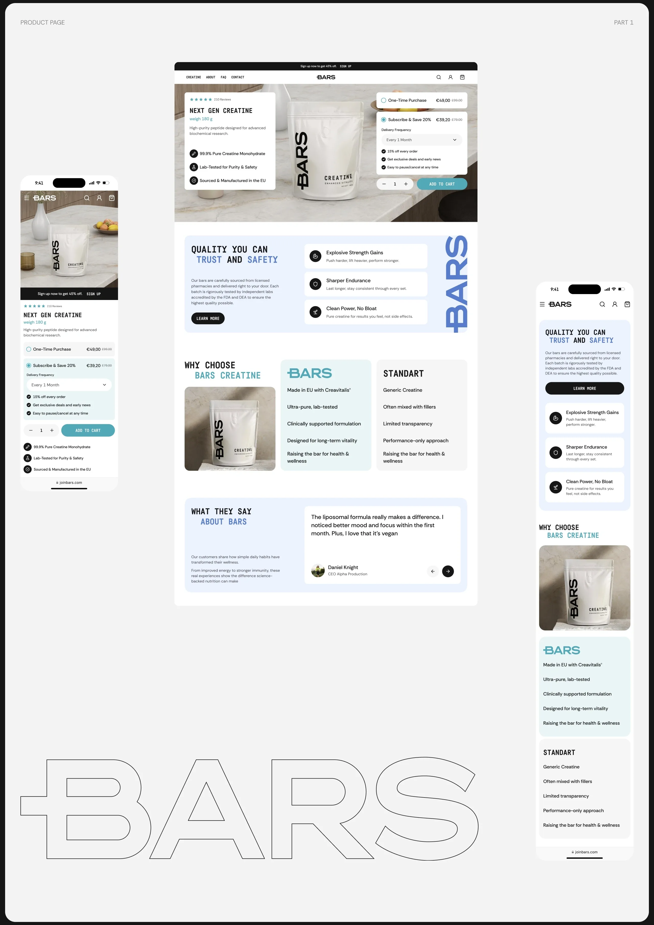
The interface is built on clarity and restraint. Typography, spacing, and hierarchy are structured to move someone through the product story in a fixed order, so each screen answers one question before raising the next. Every interaction is intentional: nothing moves for the sake of movement, and nothing asks for attention it has not earned.
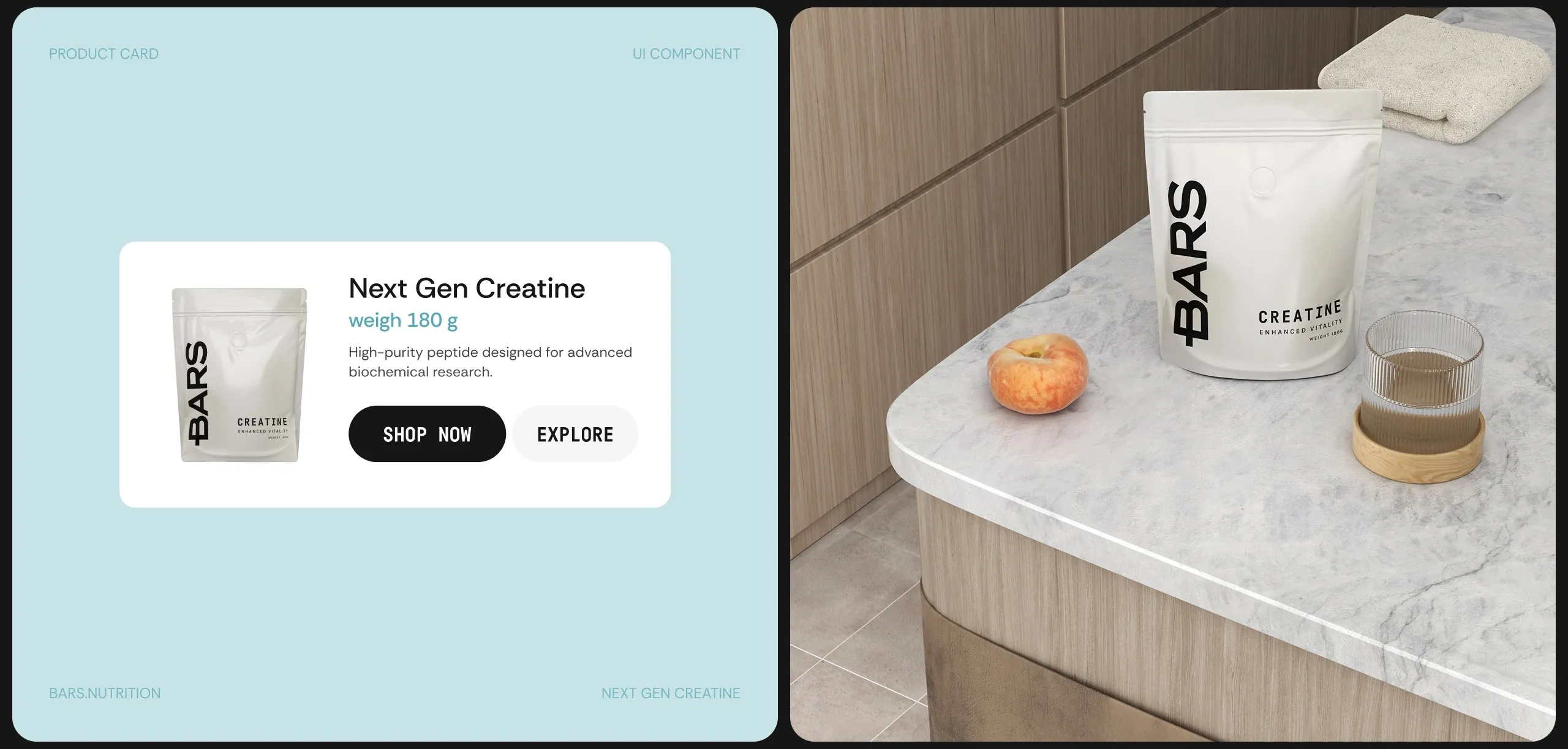
Color follows the same rule. The palette is calm and functional, and it is there to keep the product and the content in the foreground rather than to decorate the page. Soft contrasts and generous white space carry most of the structural work, which is what lets subtle interface components do their job without becoming ornament.
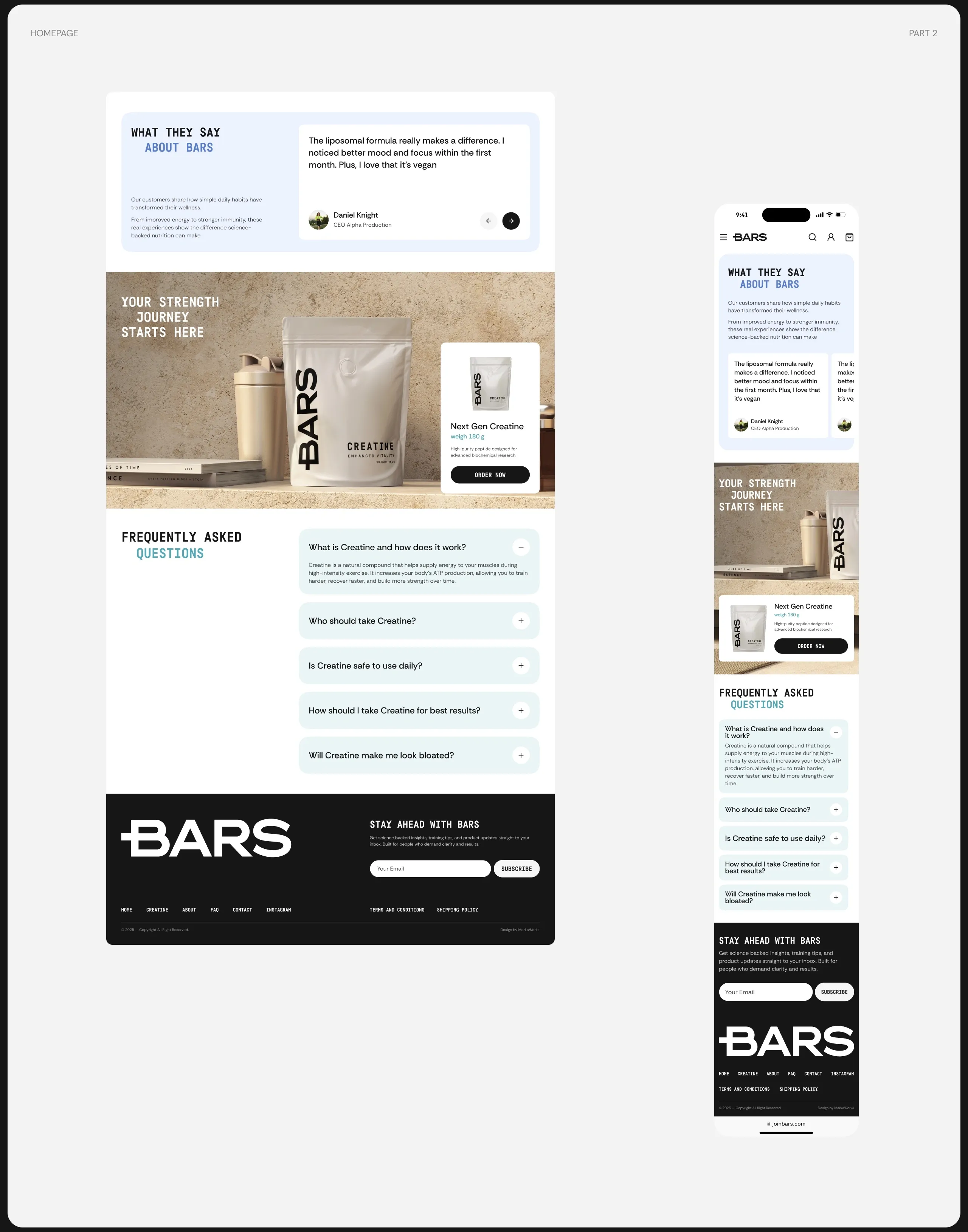
The flow from homepage to product page is designed to be uninterrupted across desktop and mobile. A purchase path that changes character between devices makes a brand feel less reliable than it is, so the same hierarchy, the same spacing logic, and the same restraint hold in both.
Accessibility belongs in the same sentence as the rest of it. A calm palette and generous spacing are accessibility decisions before they are aesthetic ones, and treating them that way removes the usual trade off between a site that looks composed and a site that can actually be used. Contrast, target size, and reading order were settled at the structural stage rather than corrected afterwards.
The product story is also sequenced rather than displayed. Someone landing on the homepage and someone arriving directly at a product page need the same information, but not in the same order, and the hierarchy holds in both directions because it was built around what the reader needs next rather than around what the page has to show.
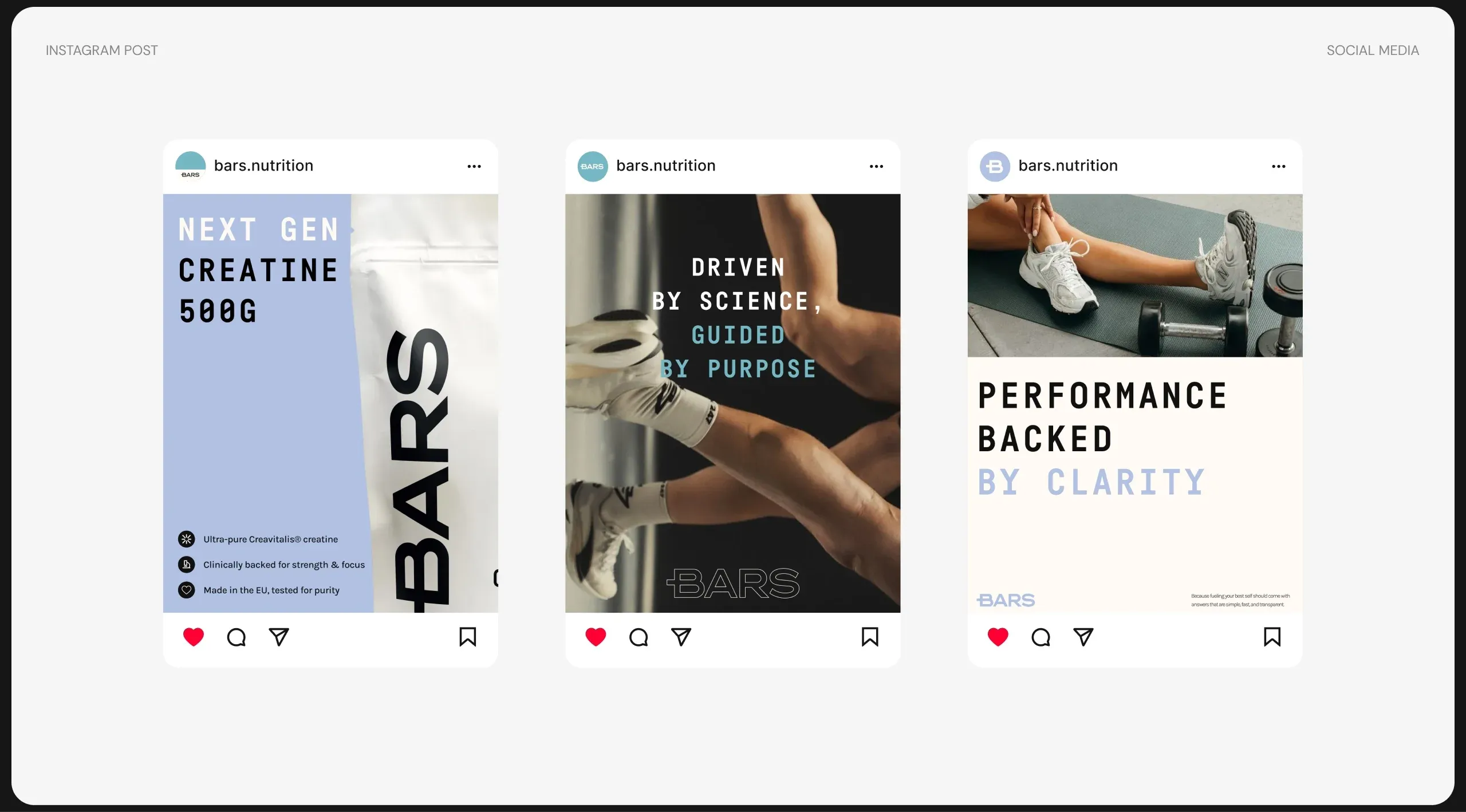
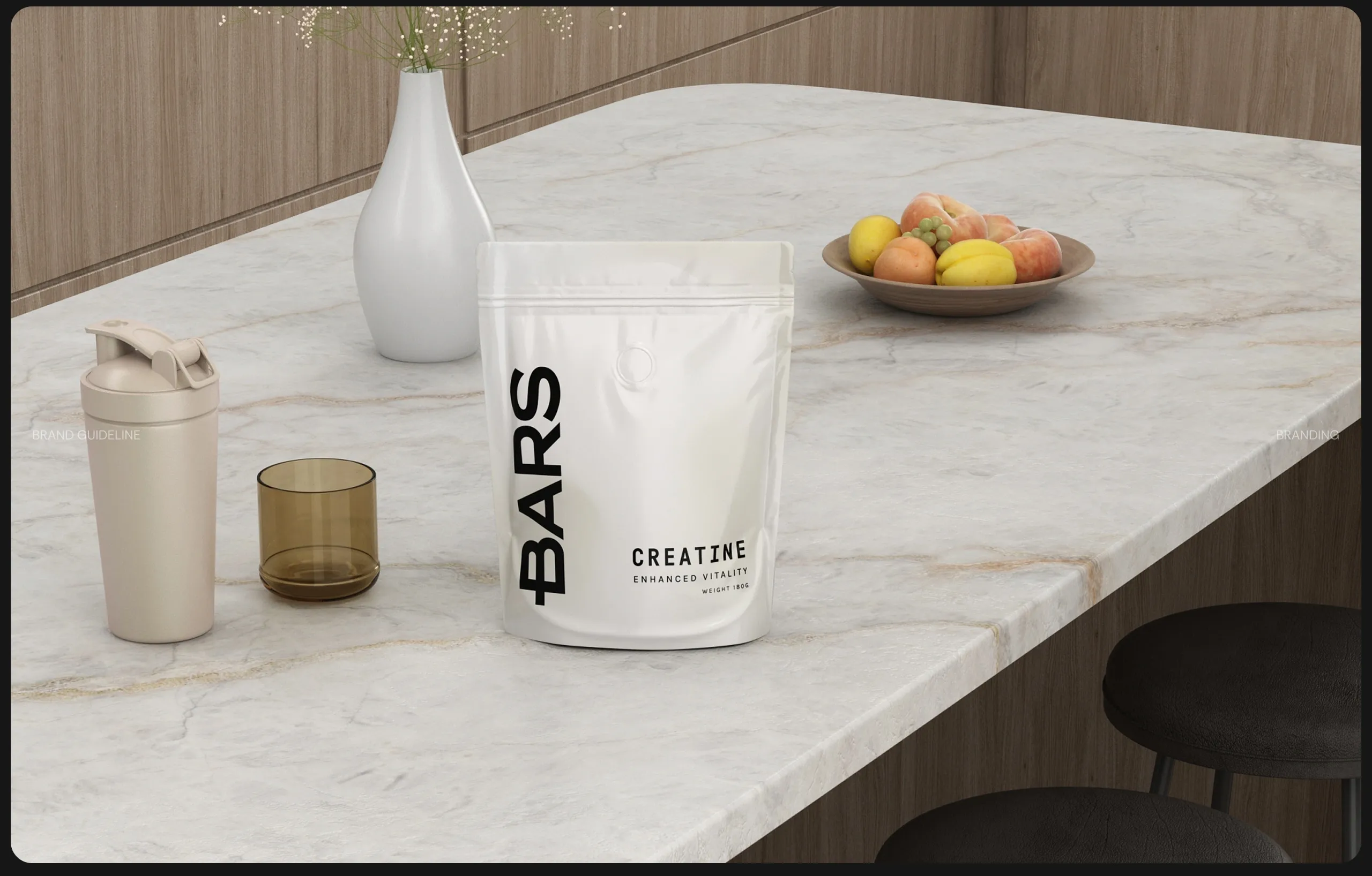
What the interface is really doing is translation. A brand that refuses exaggerated claims cannot use an interface that shouts, and a brand built on precision cannot afford a site that improvises. Transparency is the design constraint here rather than the finishing touch, and the result is a digital language that reads as the same brand a customer met on the pack.
See more web and digital design and nutrition and wellness branding case studies.




Let’s make the work they’ll copy.
Talk to an expert now
Work with a 38 team of the
industry’s top 1% talent.



