Bloomy Wellness
joyful family wellness essentials
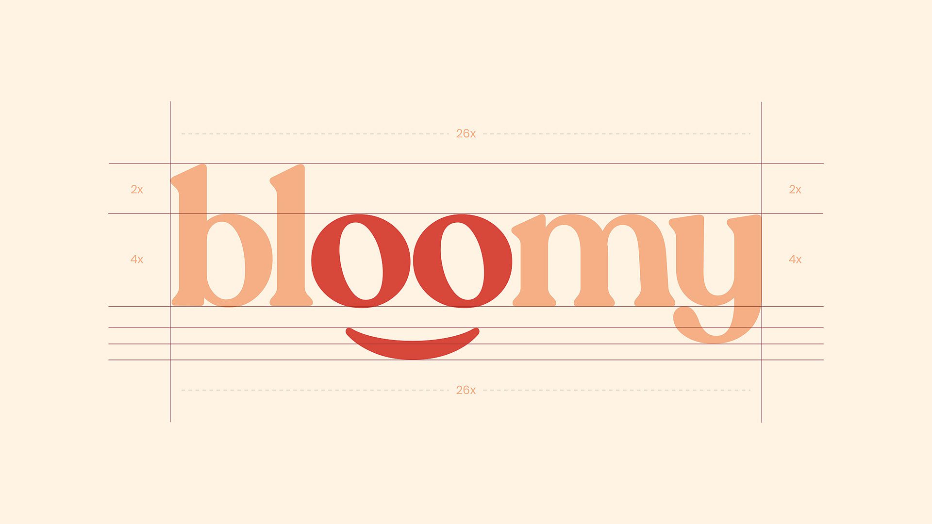
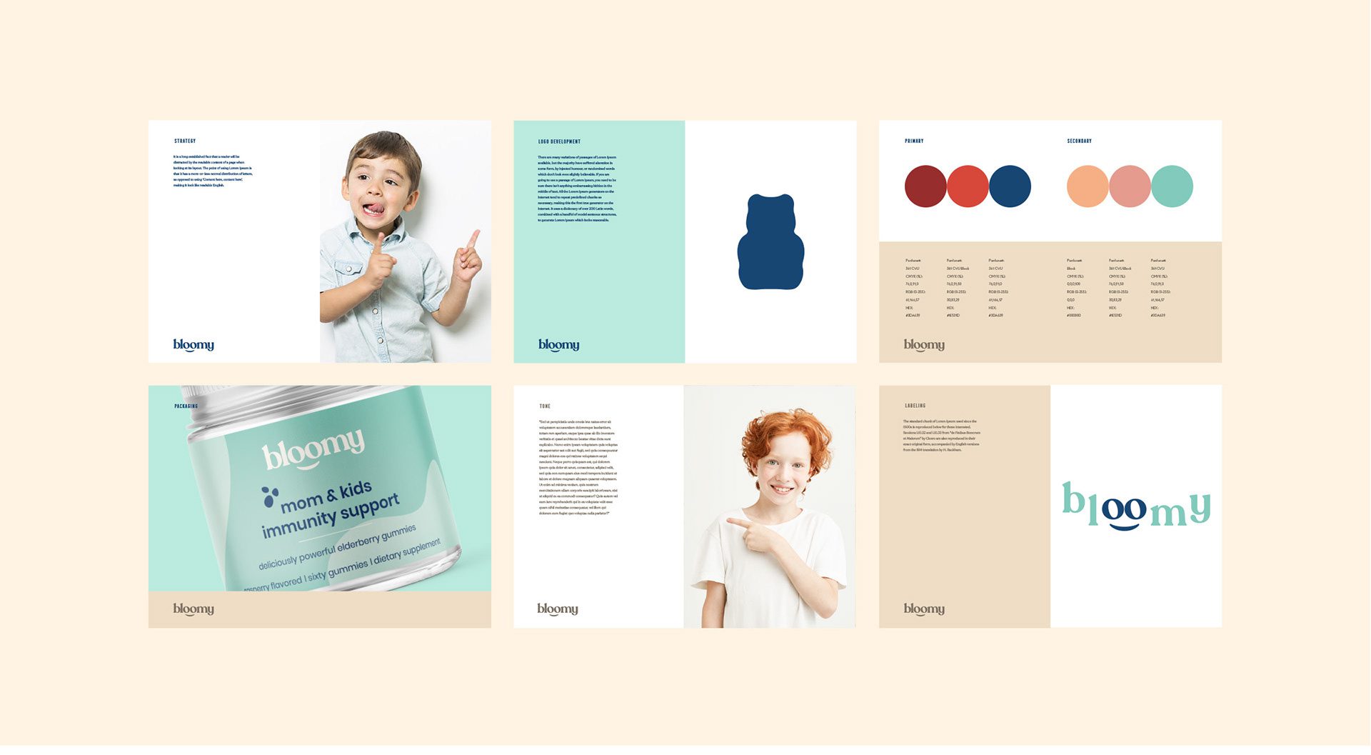
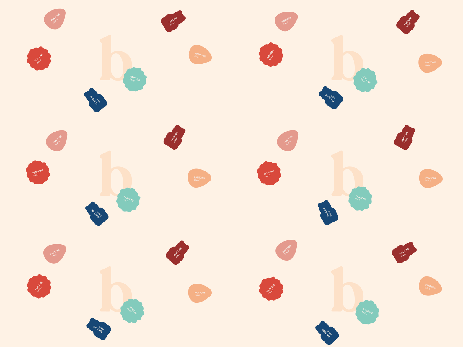
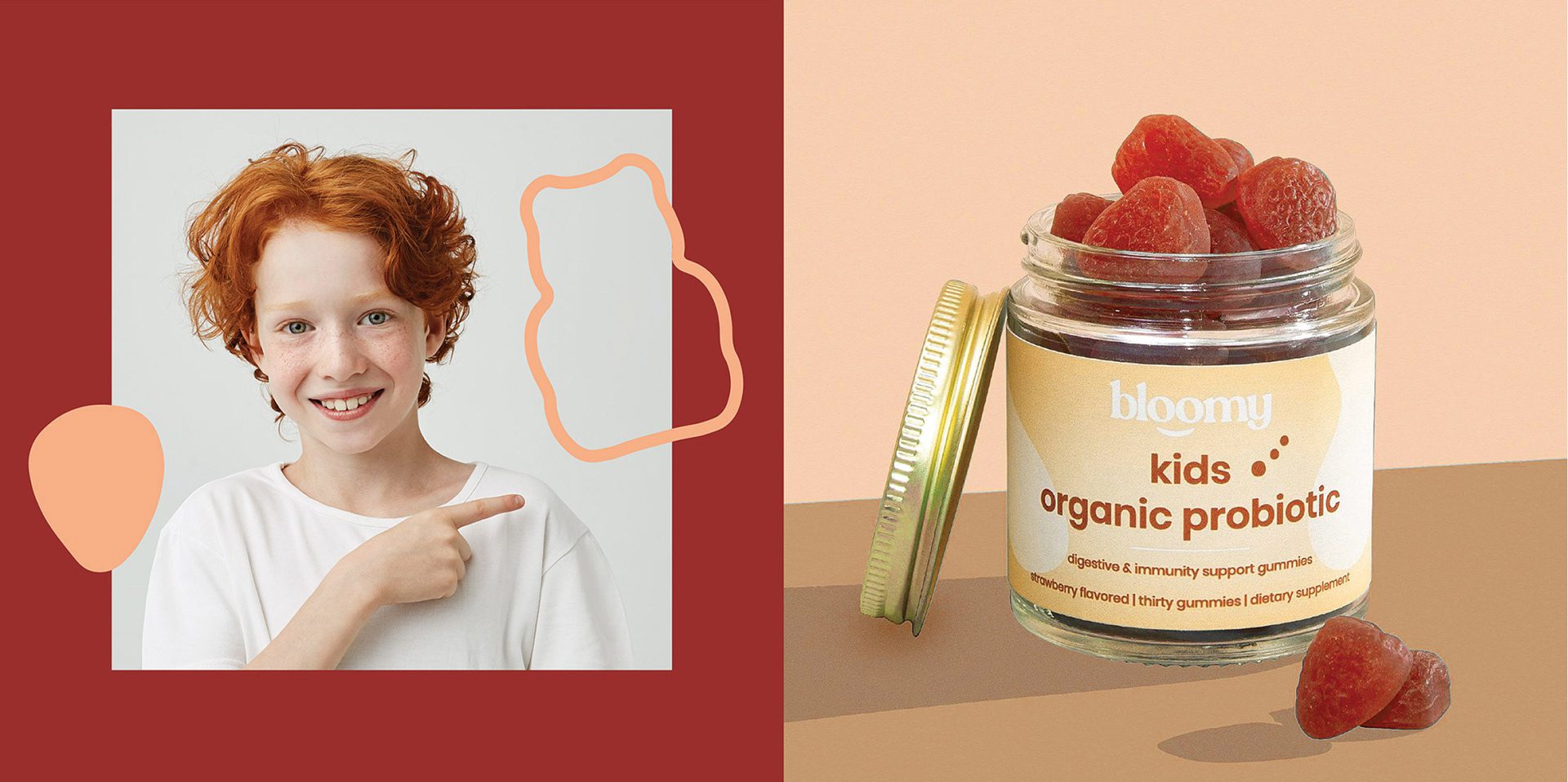
Bloomy Wellness, brought to life by MARKAWORKS, is a delightful brand designed to bring joy and care to mothers and children. Its sympathetic and cute identity, featuring playful “o” emblems, is complemented by vibrant, pastel packaging that clearly highlights each product, making wellness accessible and fun for the whole family.

Designing for Target Audiences: Mothers and Children
Two audiences had to be served at once in Bloomy Wellness, a family wellness brand we designed at MarkaWorks: the mothers who buy the products and the children who use them. That double audience set the design problem, an identity warm enough for a child and clear enough for a parent reading a label.
See more nutrition and wellness branding case studies.
The Bloomy Brand Identity: Sympathetic and Cute
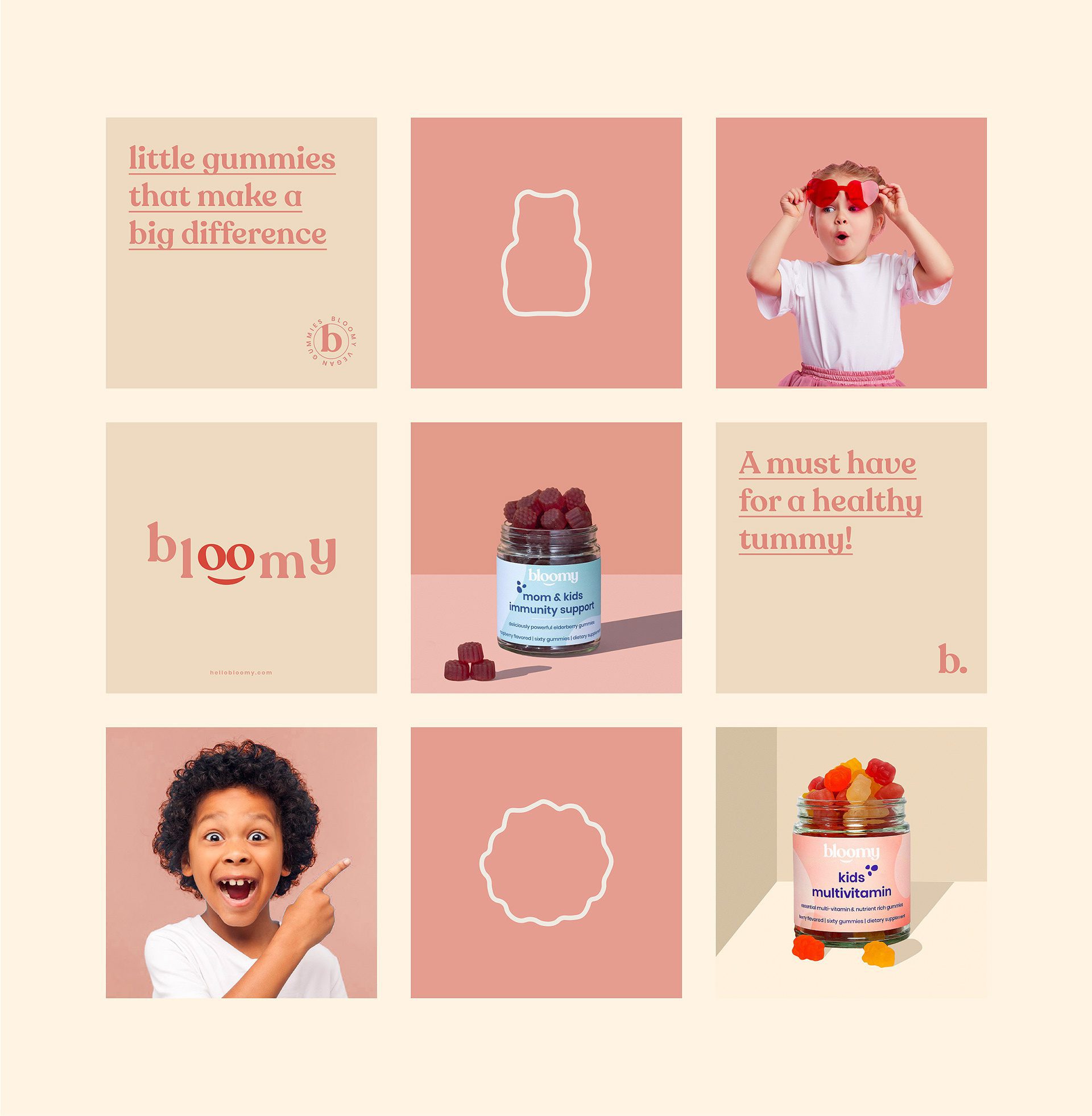
That question is answered through the brand’s own name. We turned both letters “o” in Bloomy into playful emblems, and the emblem is integrated into the logo rather than sitting beside it, so the friendly character is built into the wordmark itself. The stated goal for the identity was to read as sympathetic and approachable, and the “o” device is what carries it.
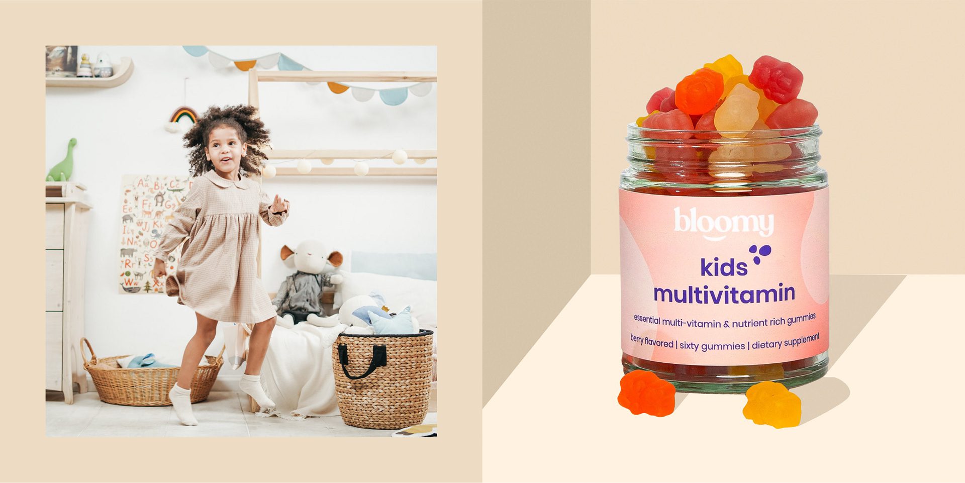
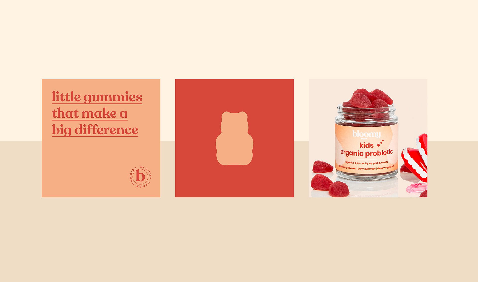
Packaging Design: Energetic Atmosphere and Clear Product Names
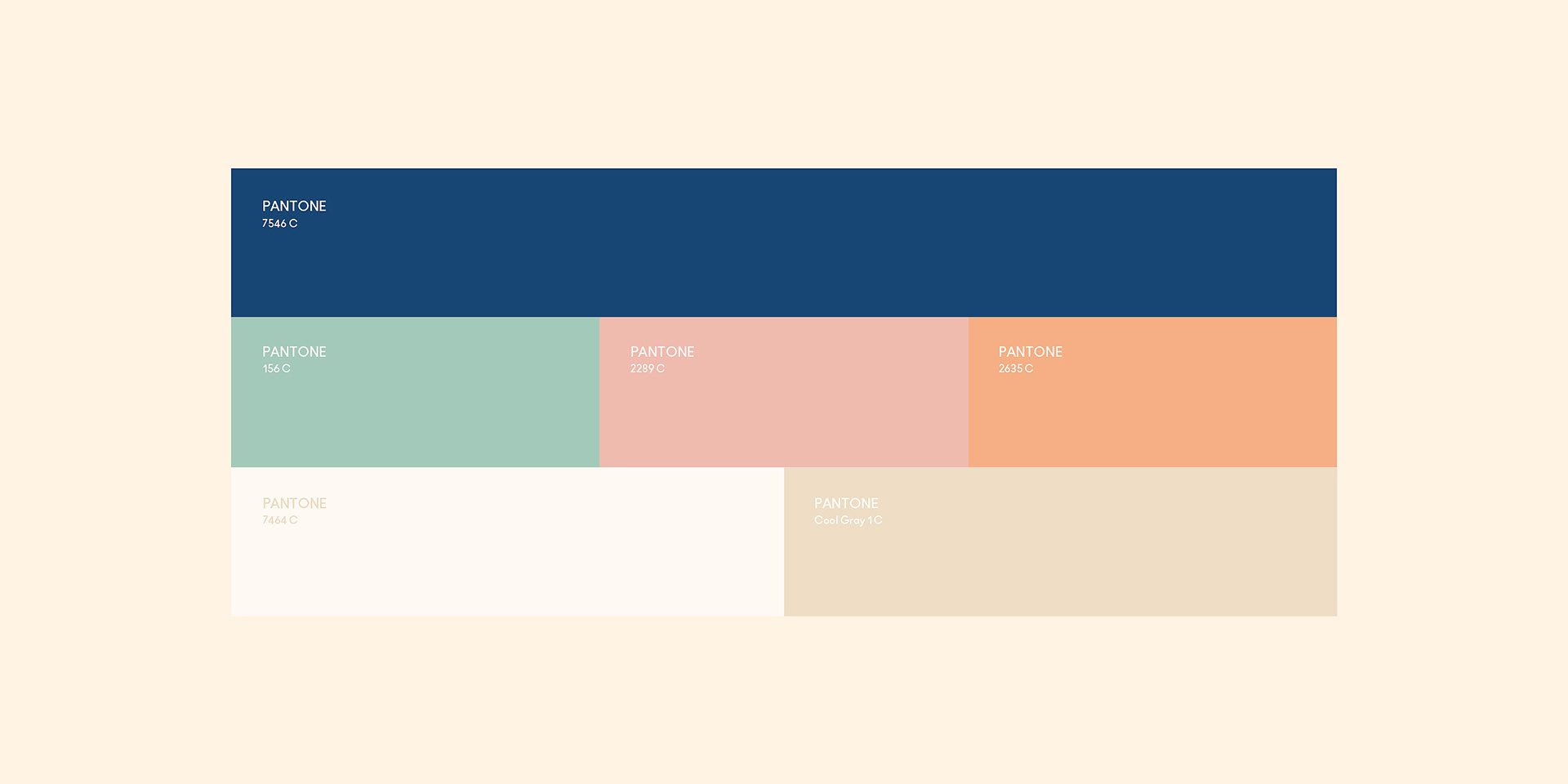
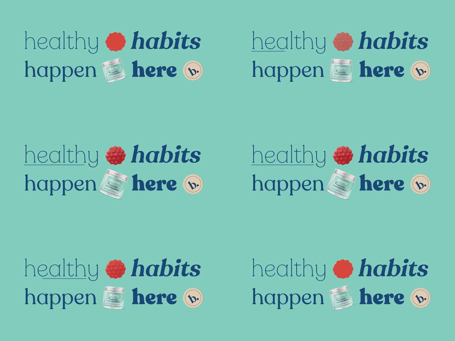
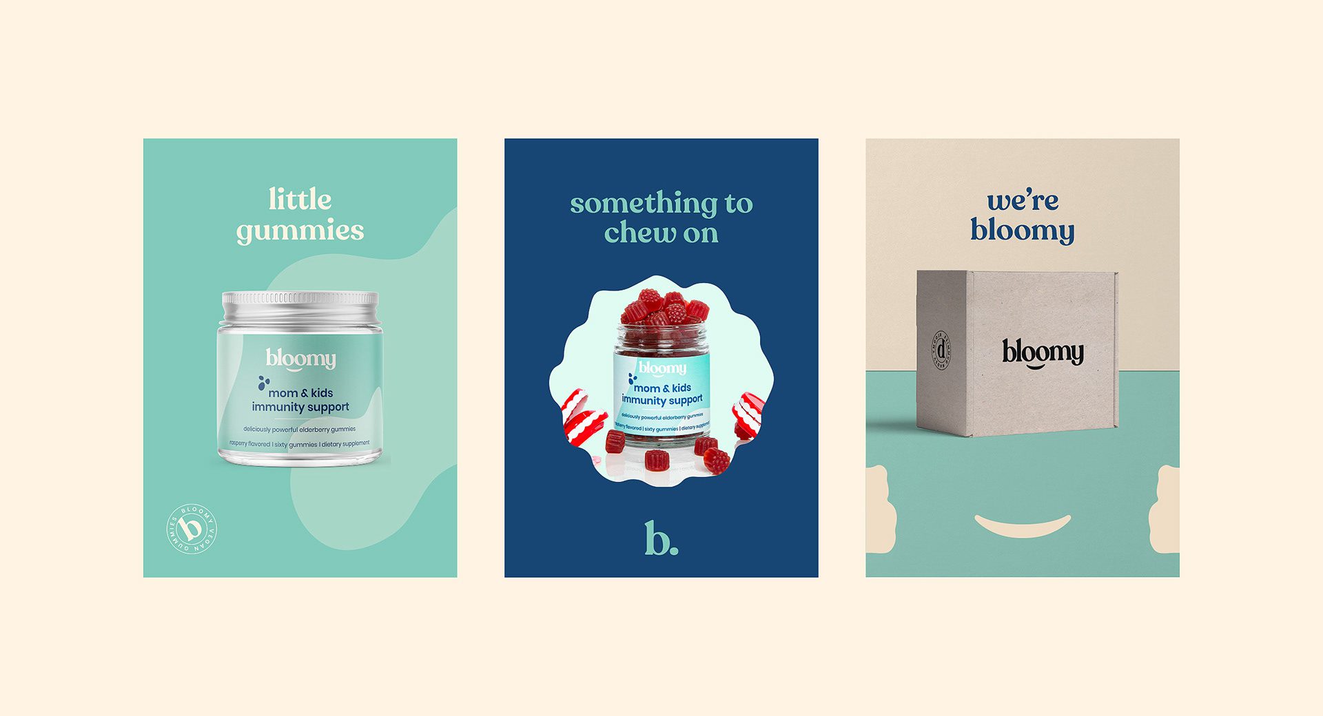
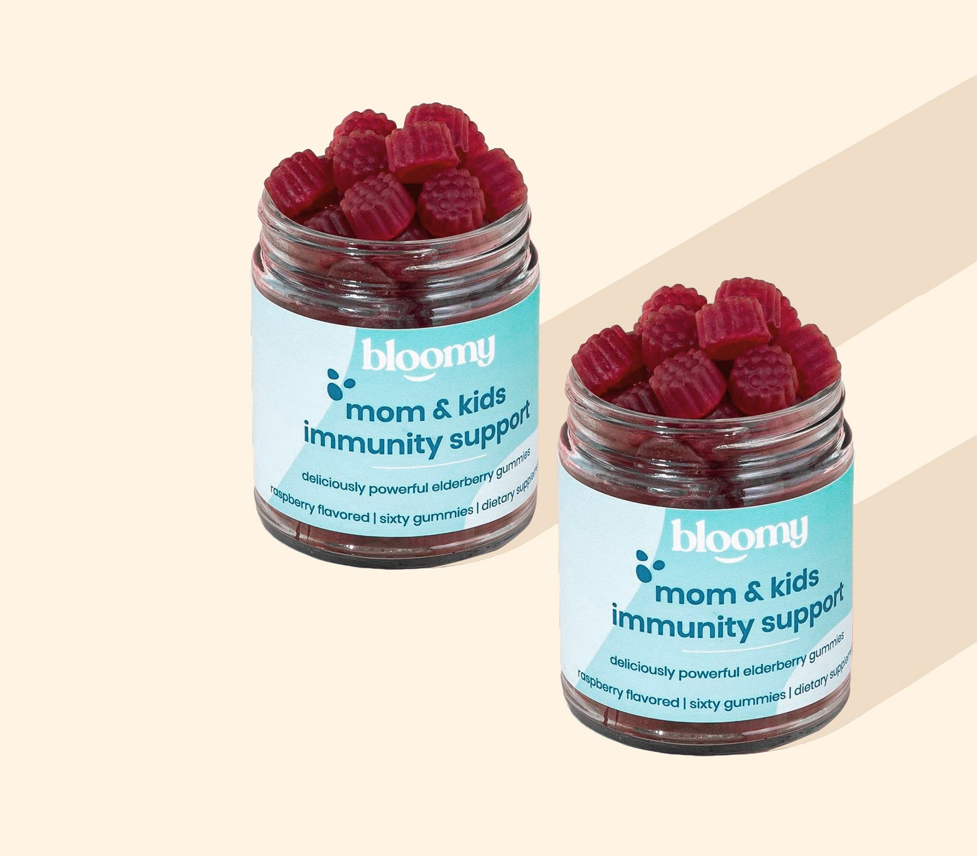
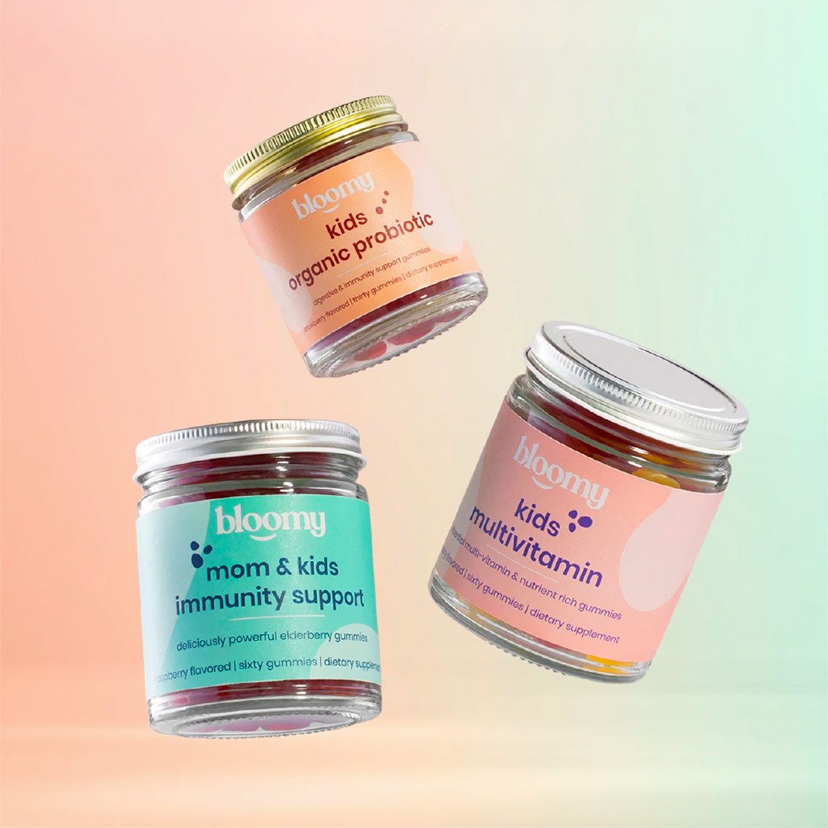
Packaging covers three products, each with its own color palette drawn from a shared pastel range. Pastel tones keep the family feeling consistent while the palettes separate the products from each other on the shelf. One deliberate decision runs through all three packs: the product names are set to be at least as prominent as the brand, so a parent knows exactly what each product is without decoding the branding. Product names are placed to stay clear of the identity elements rather than compete with them. On a three-product range this matters more than it sounds: if each name shouts, the shelf reads as three brands and the identity holding them together disappears.
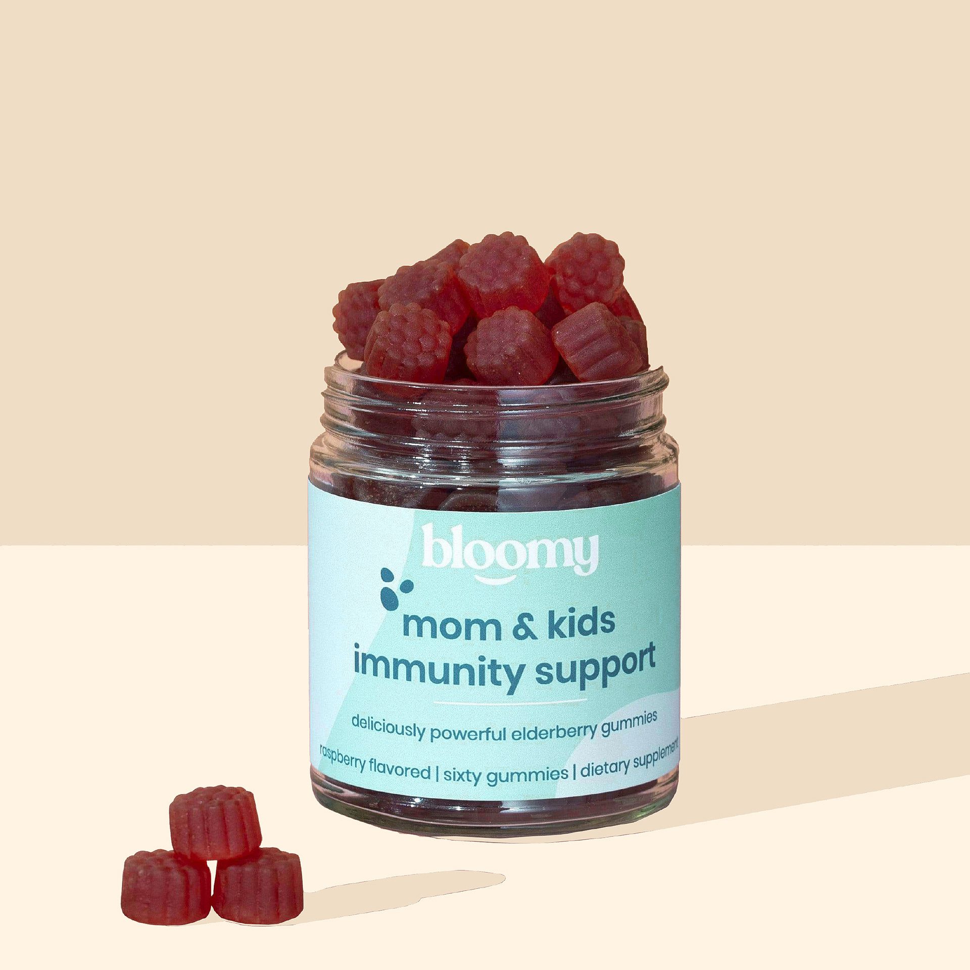
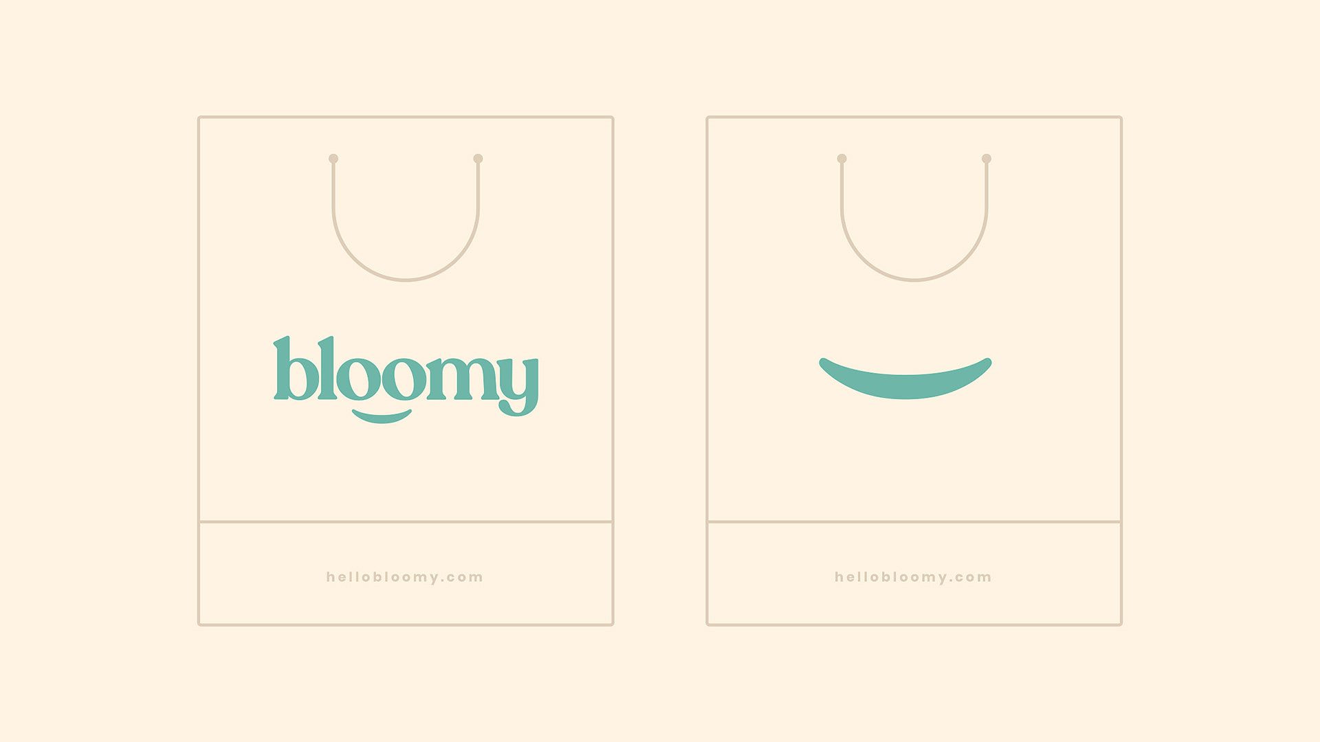
Client & Objective Recap
The project scope, in plain terms: a wordmark with an integrated emblem, a three-product packaging system differentiated by color, and a naming layout that keeps wellness products legible for the people who actually buy them.



Let’s make the work they’ll copy.
Talk to an expert now
Work with a 38 team of the
industry’s top 1% talent.



