Elevated
health supplement brand
Elevated is a health supplement brand focused on modern wellness consumers seeking trusted, science-backed health solutions. Developed by MarkaWorks, the brand bridges science and lifestyle through a visual and verbal system that feels clean, confident, and human.

Research & Strategy
Elevated is a health supplement brand built for wellness consumers who want products backed by science and presented without noise. At MarkaWorks we designed the brand identity and the packaging system together, starting from a market and audience study rather than from visual references.
That study set the design problem. Most competitors in the supplement aisle lean one of two ways: sterile and clinical, or loudly lifestyle-driven. Elevated needed to hold the middle, credible enough to feel pharmaceutical, warm enough to live in a daily routine. We wrote the strategy down as three pillars before any visual work began: clinical and trustworthy, taking precision cues from pharmaceutical design and softening them; balanced and energizing, built on controlled color gradients and minimal structure; scalable and modern, so the same system works across packaging, print, and digital.
See more nutrition and wellness branding case studies.


Visual Identity
The custom logotype we drew answers the first pillar directly. It is geometric and precise, but the forms are rounded and the setting is lowercase, which keeps the authority without the coldness. The “e” monogram gives the brand a compact mark for small surfaces, caps, seals, favicons, where a full logotype cannot live.


Packaging Design
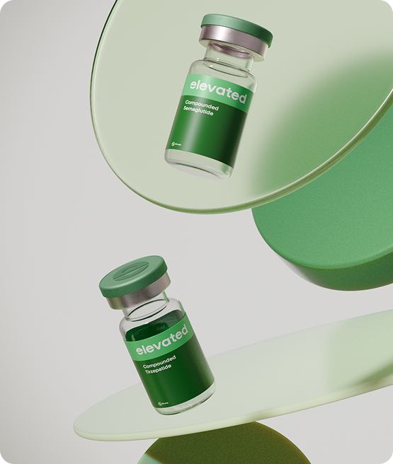
Packaging carries the second pillar. Labels are minimal, caps carry a subtle metallic finish, and the layered transparency of each vial and container lets the product itself become part of the design. In supplement packaging this restraint is a working decision, not a style preference: the label has to earn trust at arm’s length, and clutter is the fastest way to lose it.
There is a regulatory reason the labels stay this quiet. A US supplement pack carries a fixed block of required statements and a facts panel with its own rules for size and ruling, and none of it can be moved or shrunk to make room. The design budget is whatever is left, so it gets spent on proportion and finish rather than on ornament.


Digital Presence
That same logic runs through the brand’s digital side. The website and e-commerce flow are built around trust signals and product education, so the buyer meets the same calm, clinical-but-warm voice on screen that the pack establishes on the shelf.


What our clients say
“High quality work”
Our experience with MarkaWorks has been excellent. From the start, their team guided us through every step with the right mix of creativity and professionalism. What stood out most was their genuine care for our success and the attention to detail they brought to every stage. They didn’t just deliver high-quality work; they elevated our brand and helped us stand out in our industry.


Let’s make the work they’ll copy.
Talk to an expert now
Work with a 38 team of the
industry’s top 1% talent.