Hermanos Brewing Co.
austin’s classic modern brew
Hermanos Brewing Co. is a new Austin-born beer brand that masterfully blends classic brewing heritage with a vibrant, modern energy. Its distinct identity, brought to life by MARKAWORKS, offers a memorable and refreshing drinking experience for craft beer enthusiasts.

A Fusion of Classic and Modern for Hermanos Brewing Co.
Hermanos Brewing Co. is an Austin, Texas beer brand that entered the market as a newcomer. The brief set four keywords that pulled in two directions: classic and modern, energetic and soft. A new brewery has to look like it has been doing this for a while, and it has to look like a reason to switch.
The Client & Keywords
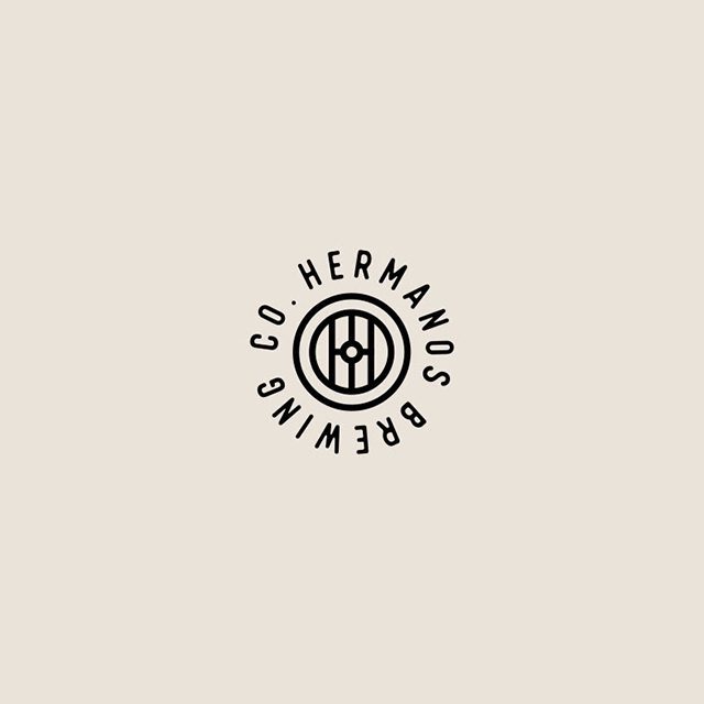
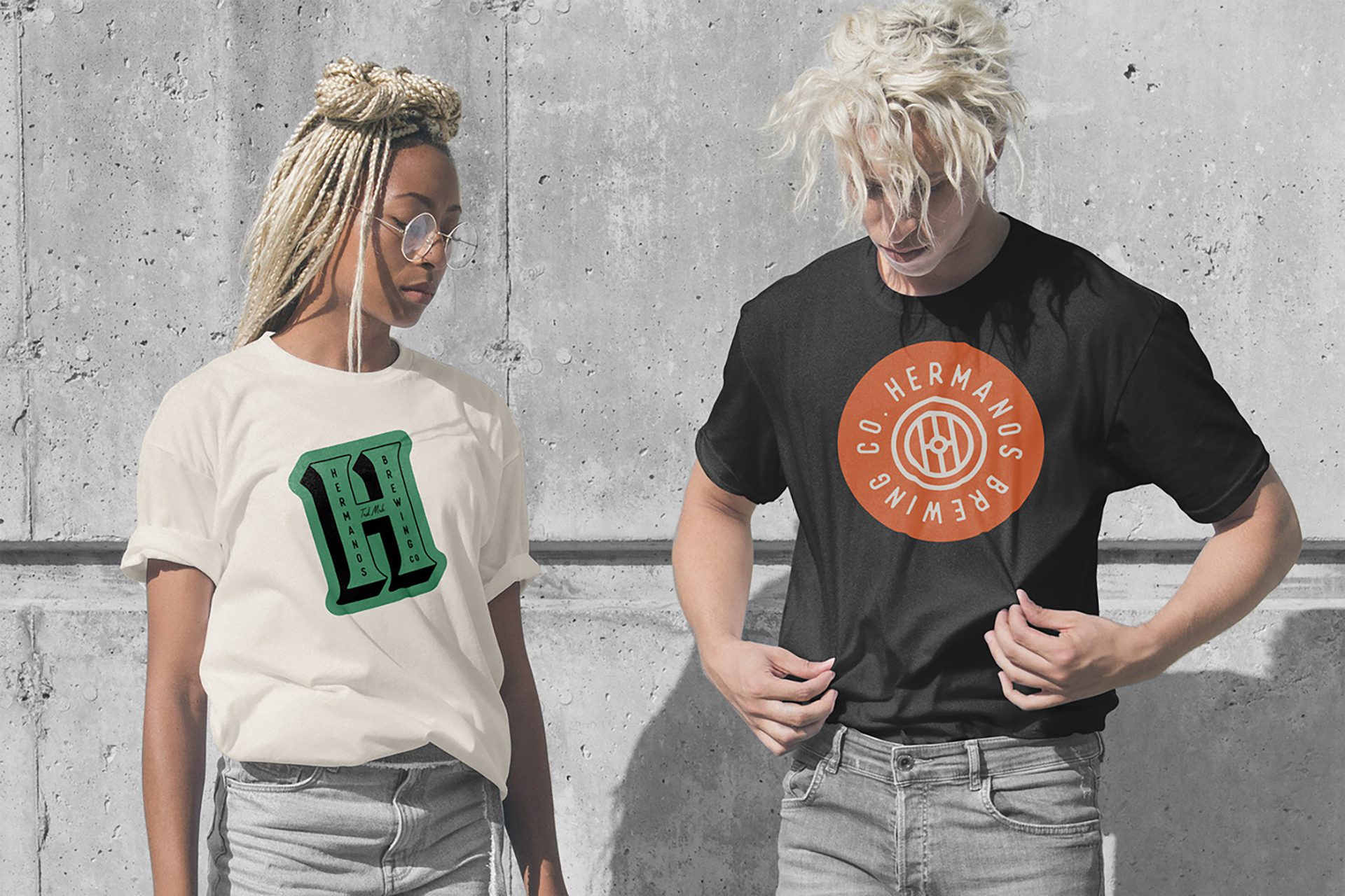
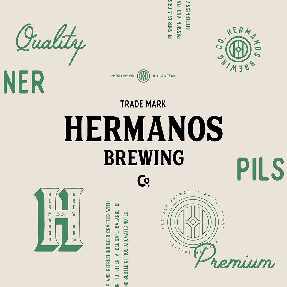
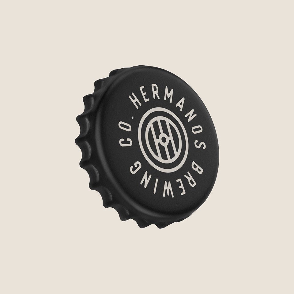
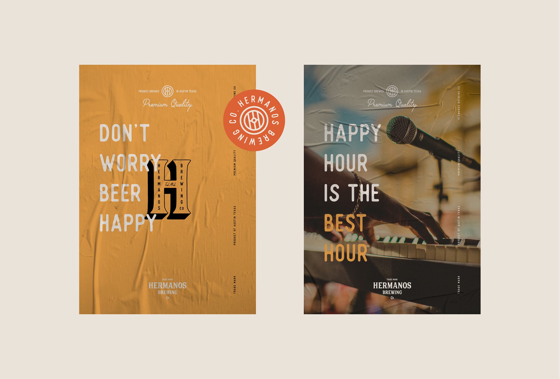
At MarkaWorks we resolved that in the logotype. The type is classic and bold with a highlight band, and the mark carries one detail that does the category work: in “Co” the letter o is drawn as a degree sign. It reads as temperature, which is the one variable every brewer talks about, so the product type is communicated before the label is read. Alongside it, we designed an abstract emblem to survive off the bottle, on shirts and merchandise, where a full logotype would not.
The Solution: Logo and Mark Design
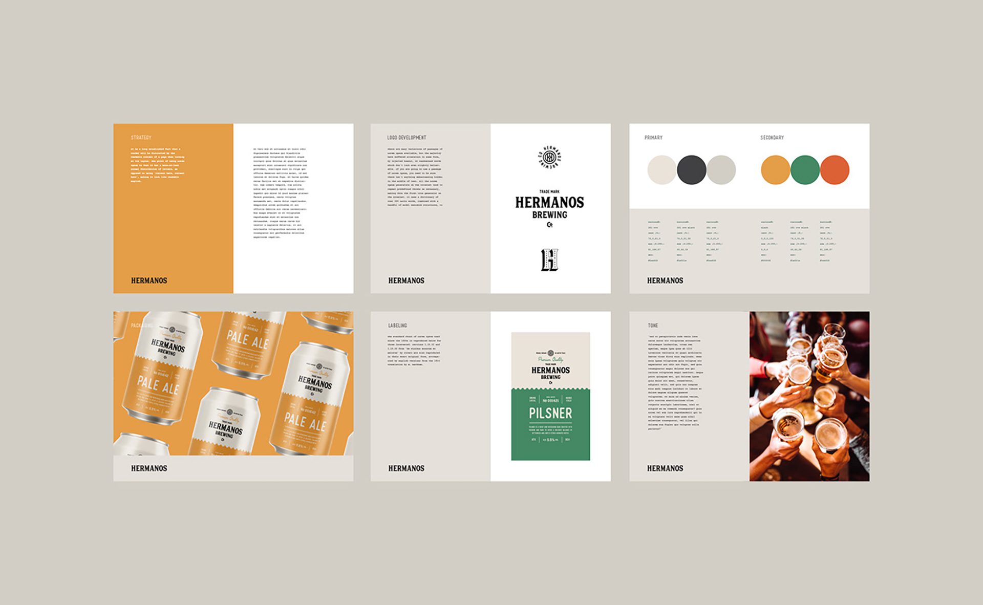
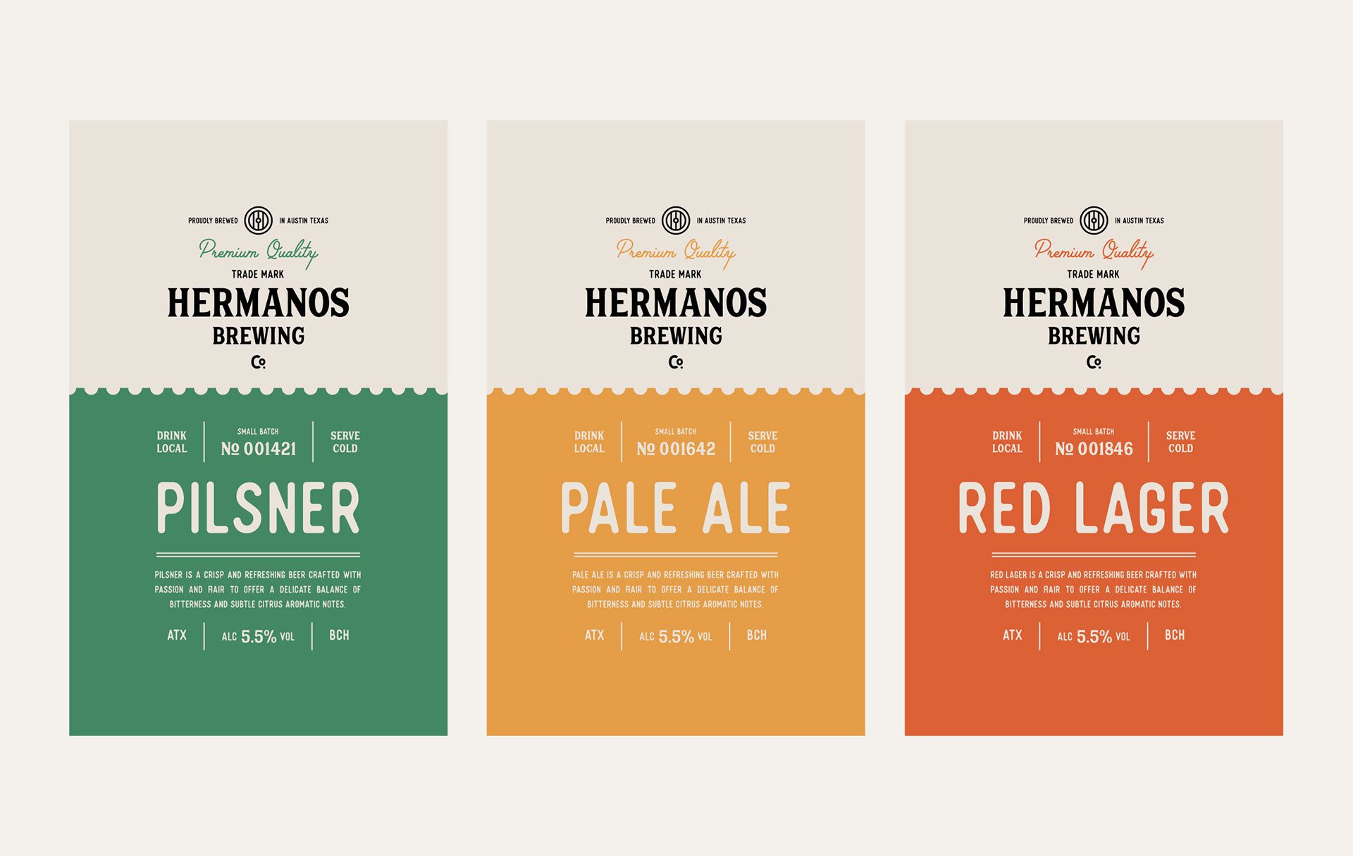
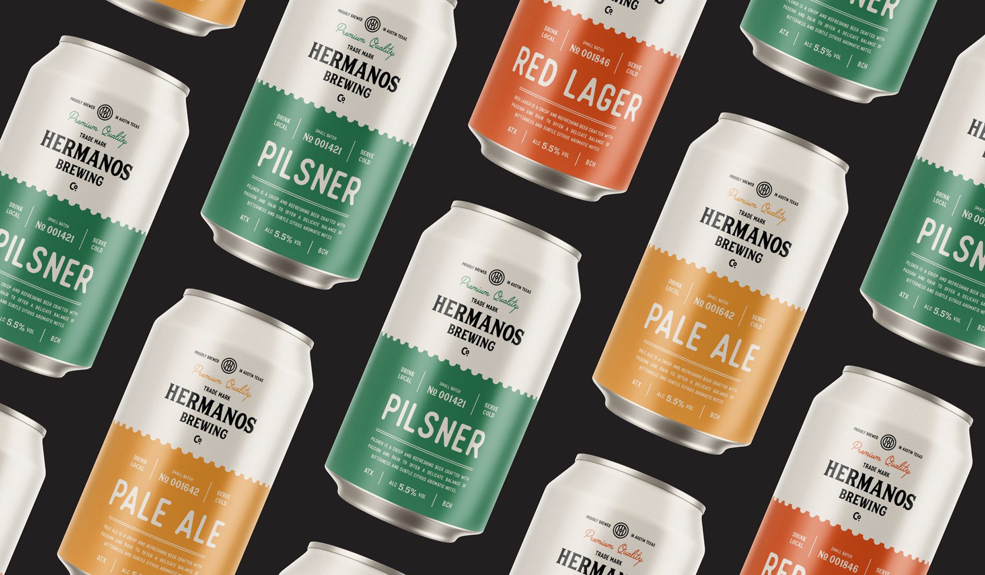
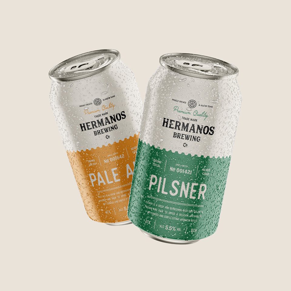
We split the Hermanos color into two systems rather than one. Neutral greys and black hold the classic register. A second set of soft, saturated tones is assigned so each brewing type owns its own color. On a cooler shelf, where bottles sit shoulder to shoulder and labels are read at an angle, this is what separates one beer from the next before the name registers.

Color Palette and Typography
Typography follows the same split logic: a serif paired with a sans, which keeps the modern surface without giving up the traditional foundation.
Product Labeling and Alcohol Percentage
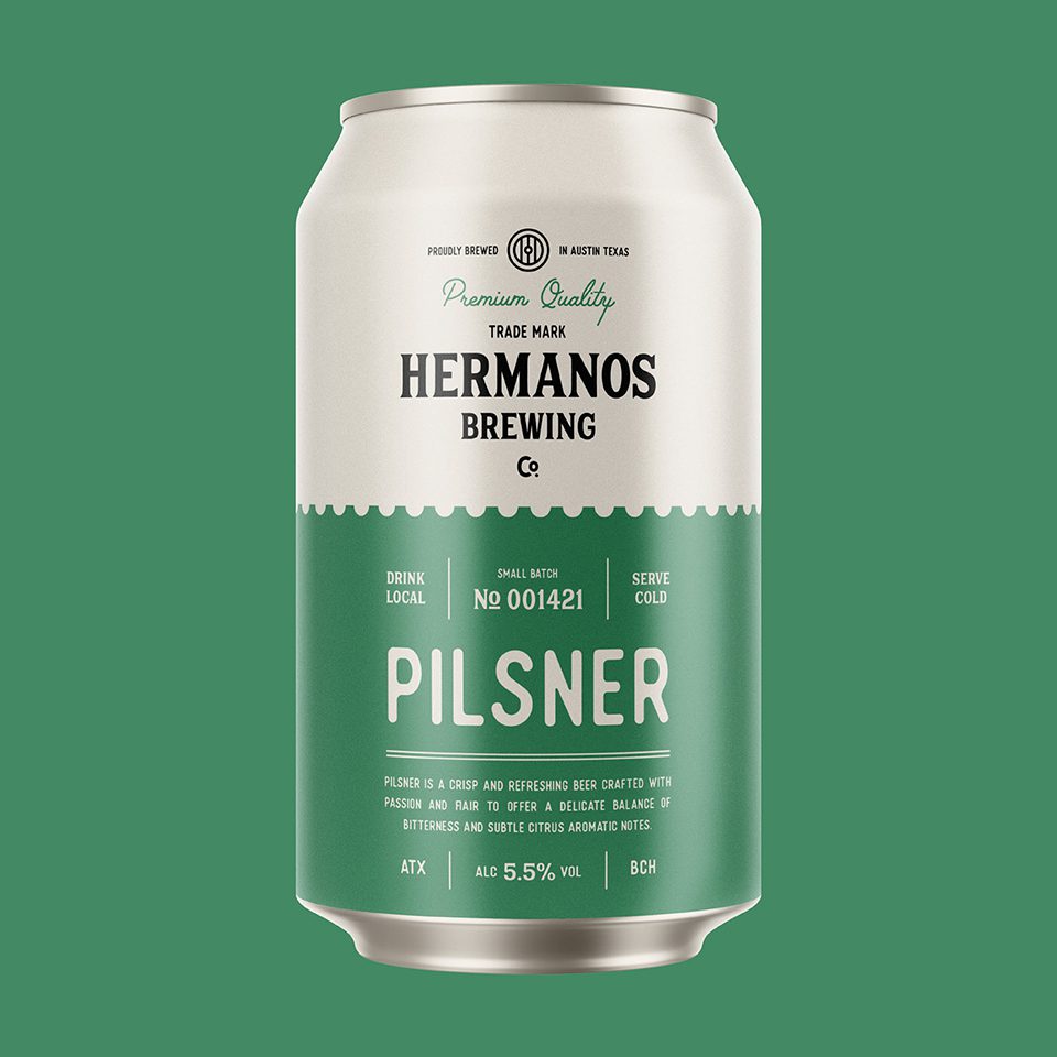
The label divides on the same principle. Light grey areas carry the logo, the emblem, and the “Premium Quality” line. The colored area carries the information specific to each brewing type, including the alcohol percentage. That separation matters in beer, where the strength figure is both a legal requirement and one of the first things a buyer looks for, and burying it inside decorative artwork costs a sale.

3D Treatment and Product Presentation
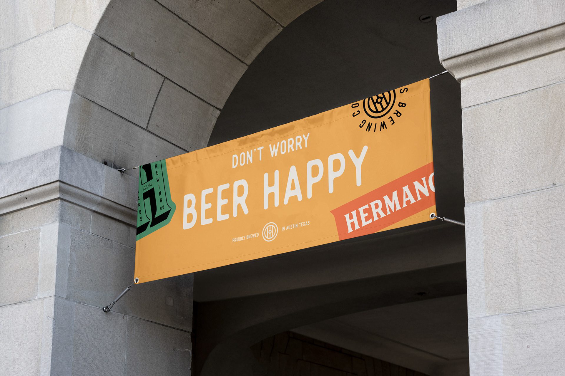
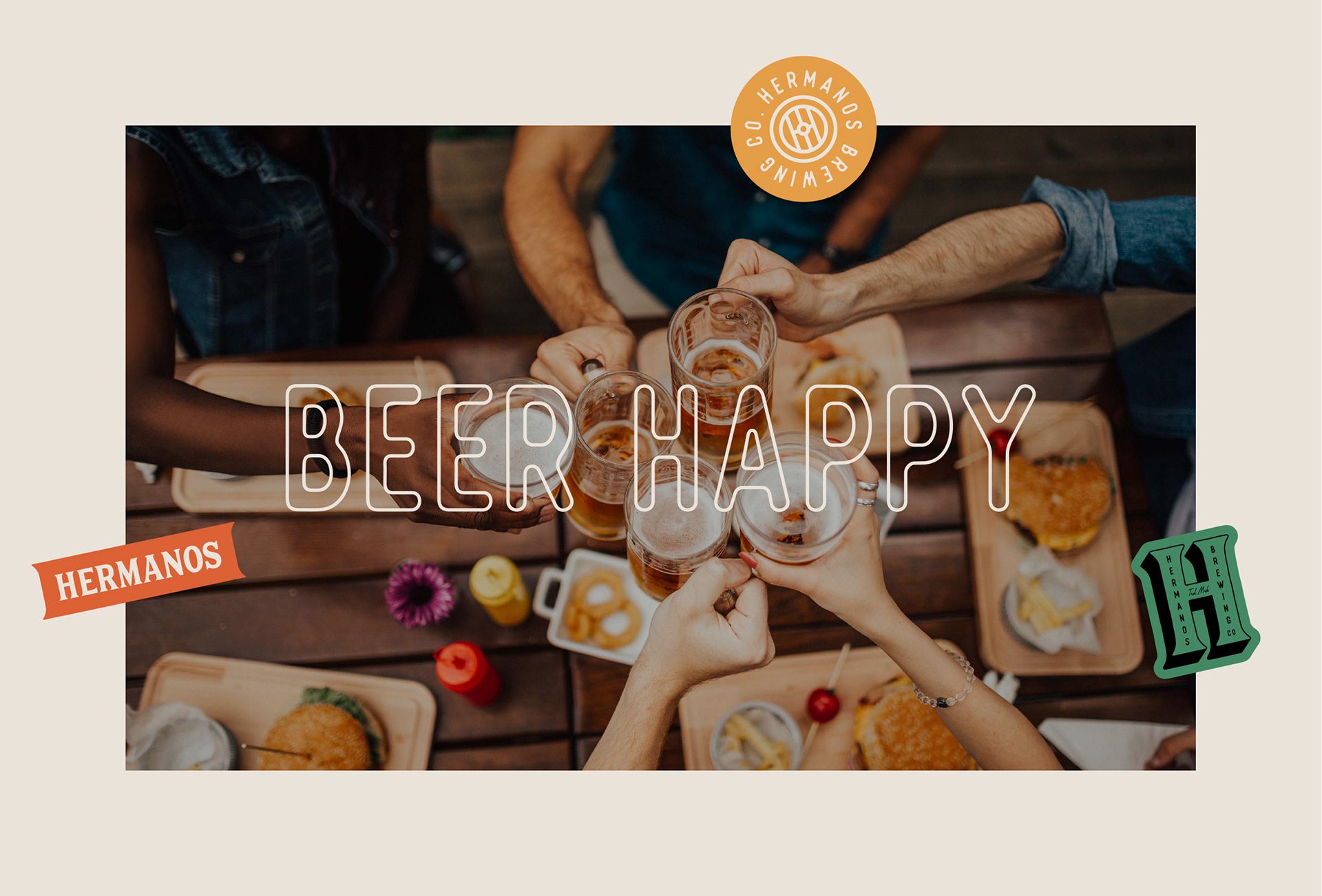
We have also given the emblem and abstract mark the 3D typeface treatment, allowing them to pop off t-shirts and other products. For a professional product presentation, we included 3D product designs.

Let’s make the work they’ll copy.
Talk to an expert now
Work with a 22 team of the
industry’s top 1% talent.