The Morald Whiskey Co.
Designing a Timeless and Refined Whiskey Identity
Morald Whiskey Co. is a premium whiskey brand rooted in craftsmanship, heritage, and quiet sophistication. Each bottle reflects a deep respect for tradition, patience, and the art of distillation. The brand was shaped to feel enduring and confident, allowing the quality of the spirit to speak without excess.

MarkaWorks
Craftsmanship and patience are what The Morald Whiskey Co. sells, and the brief said so plainly. The design brief was unusually clear about what it did not want: no ornament, no heritage pastiche, nothing that performs age instead of showing it.
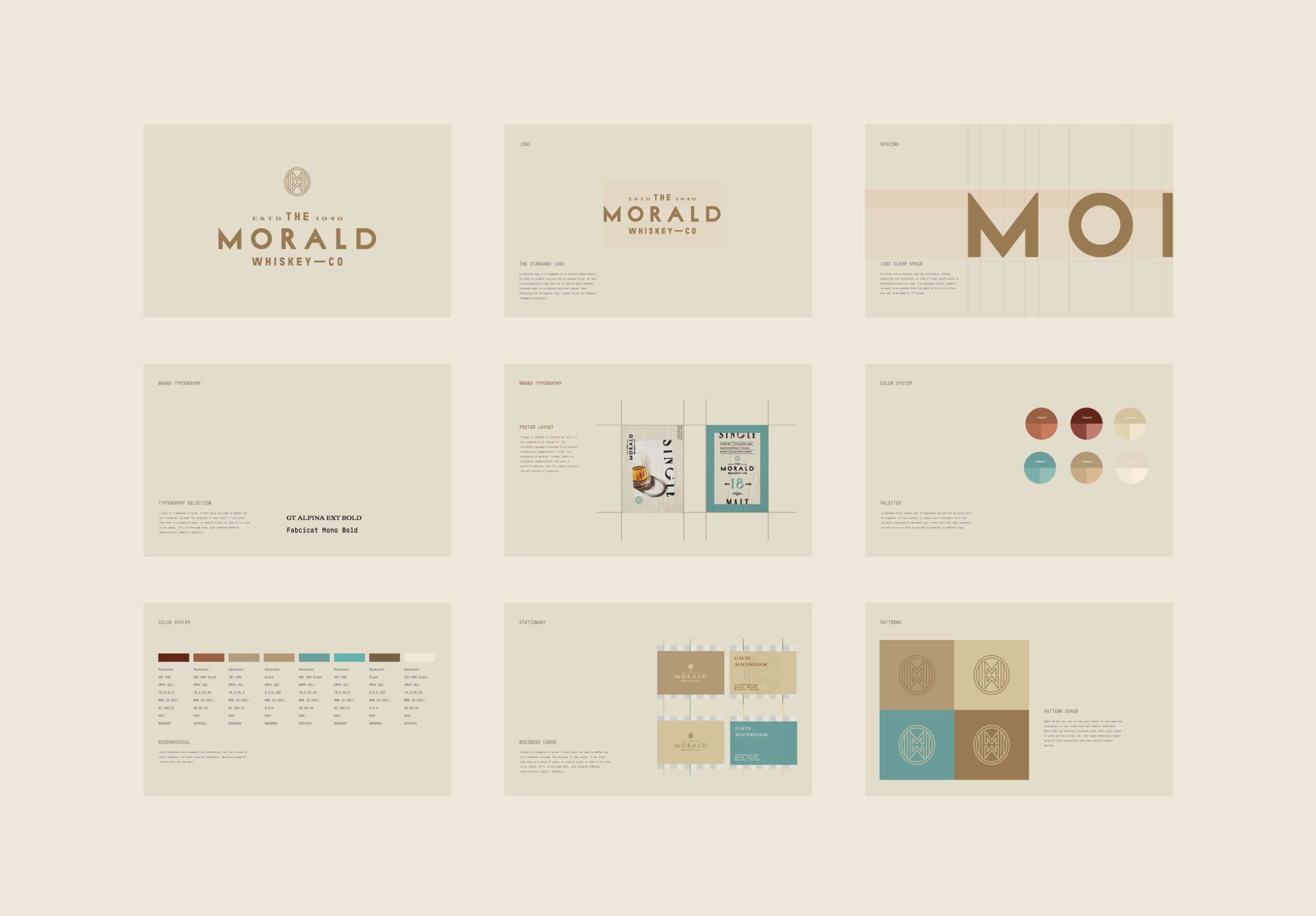
At MarkaWorks we built the brand identity around restraint and proportion. The argument behind the strategy is that in spirits, most of the visual vocabulary for quality has been used so heavily that it no longer signals anything. Crests, serif flourishes, and distressed textures appear on bottles at every price point, so they stopped separating one from another. What still reads as considered is spacing, balance, and the confidence to leave a label mostly empty.
Brand Strategy
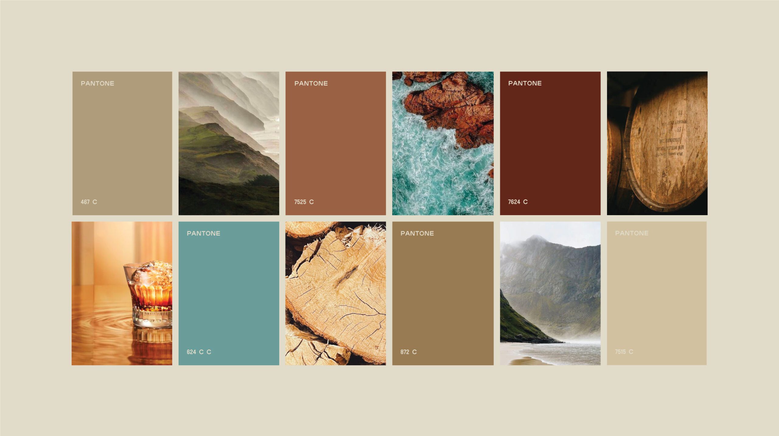
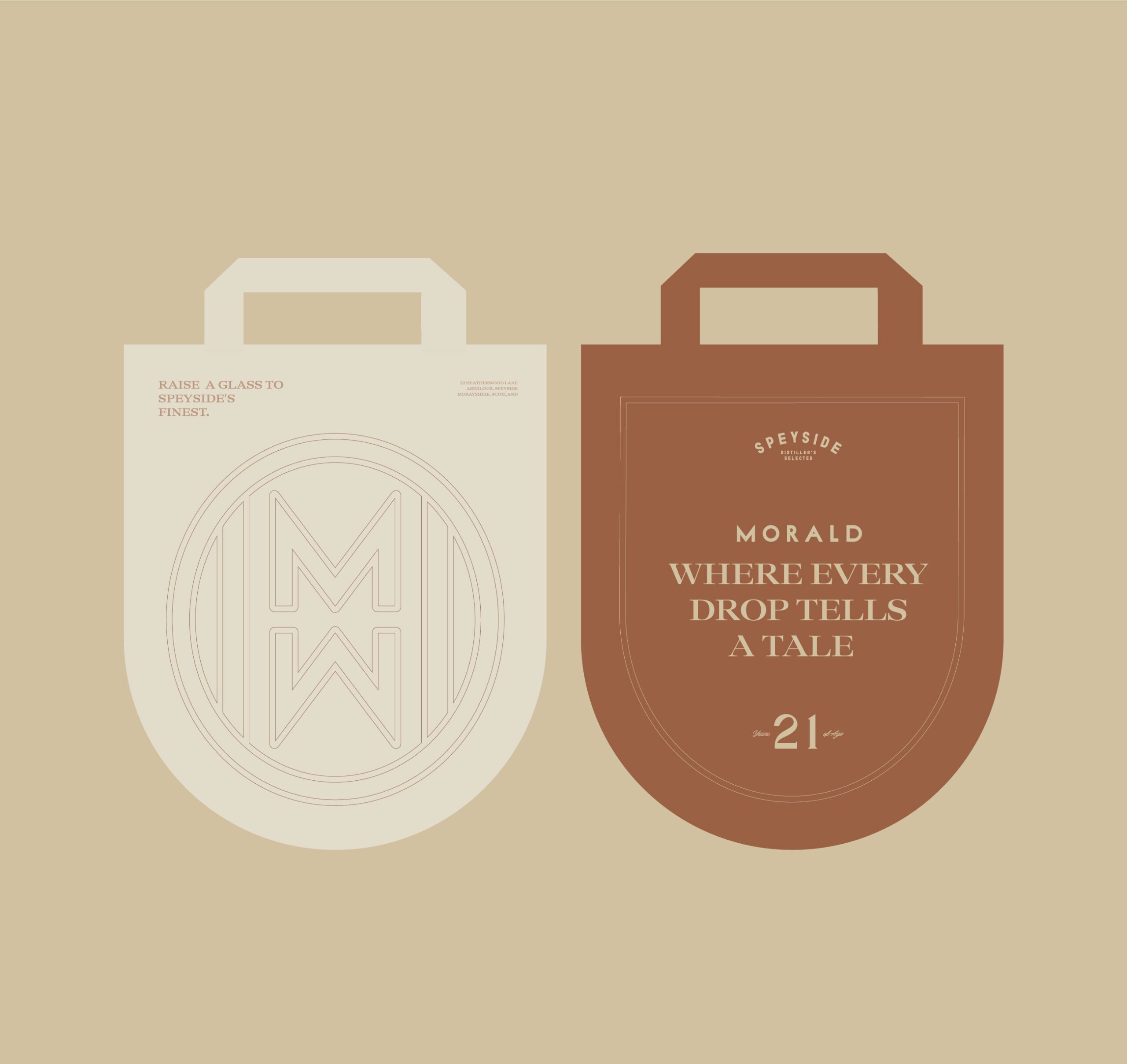
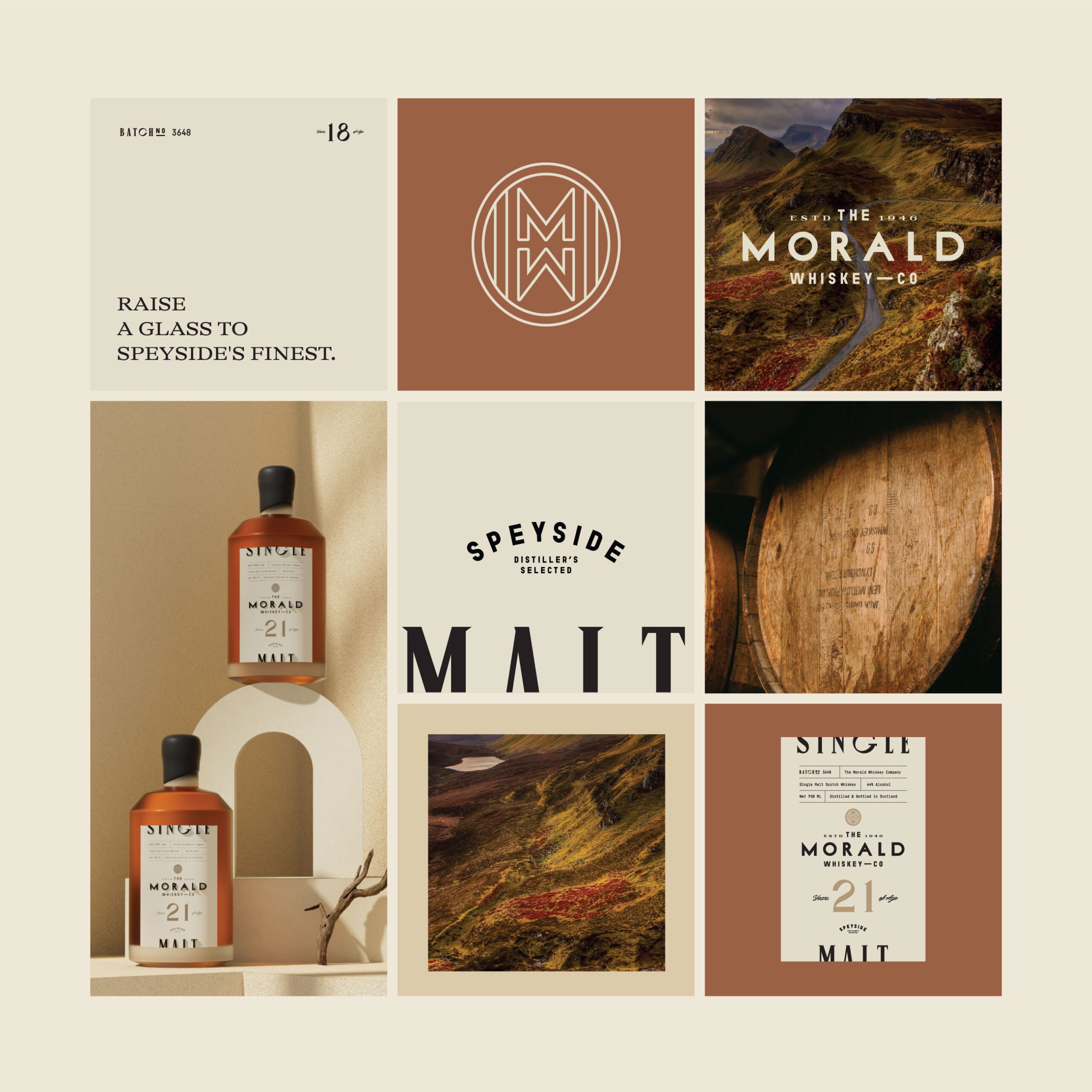
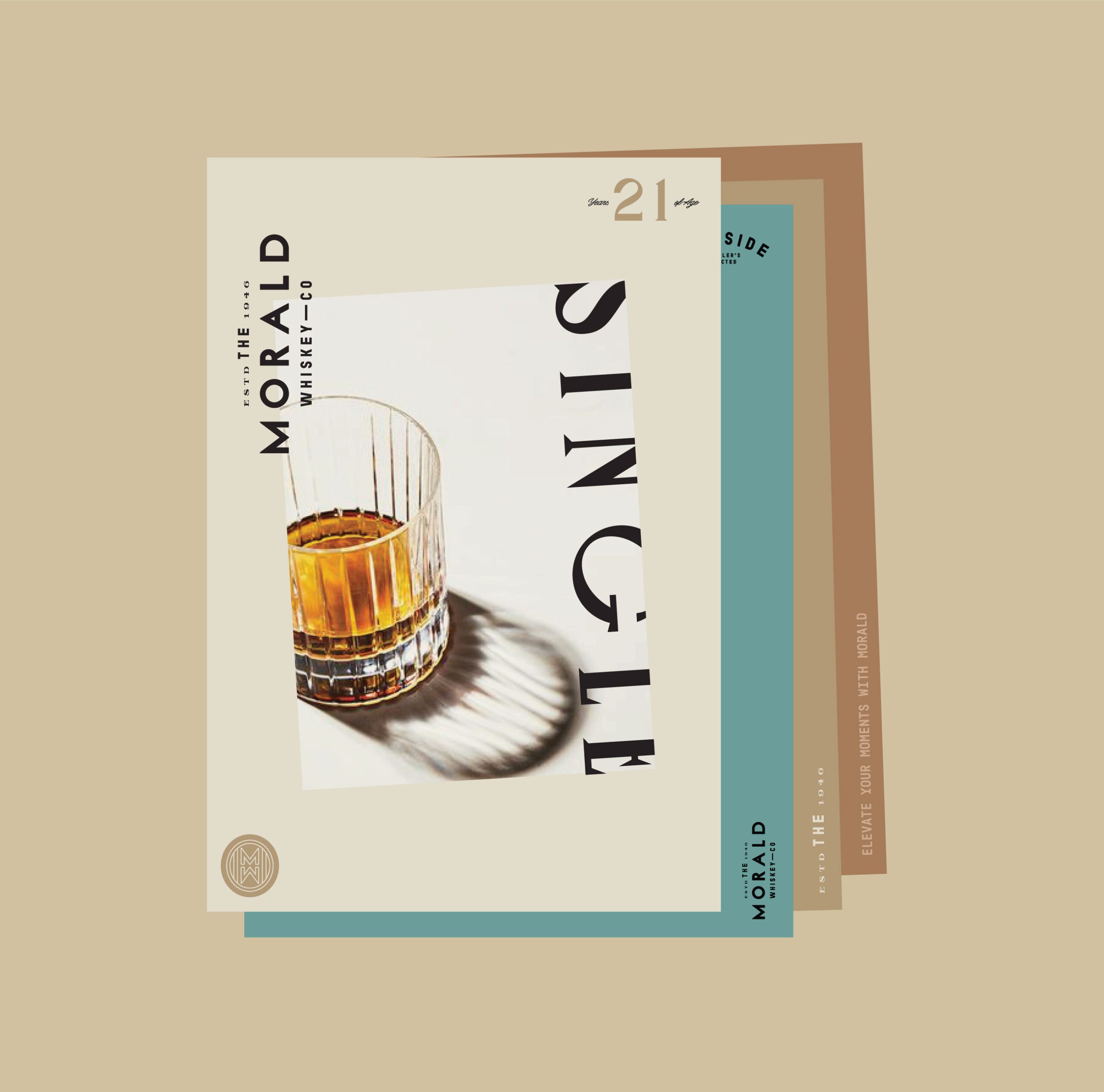
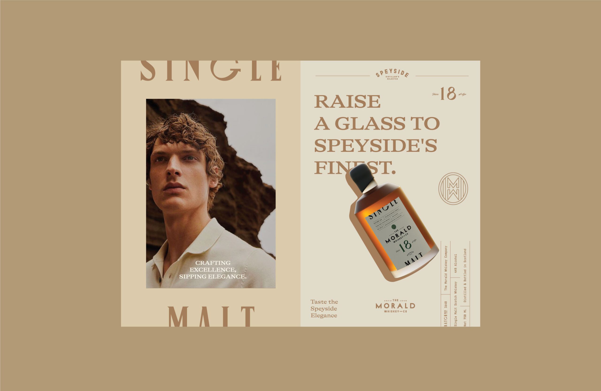
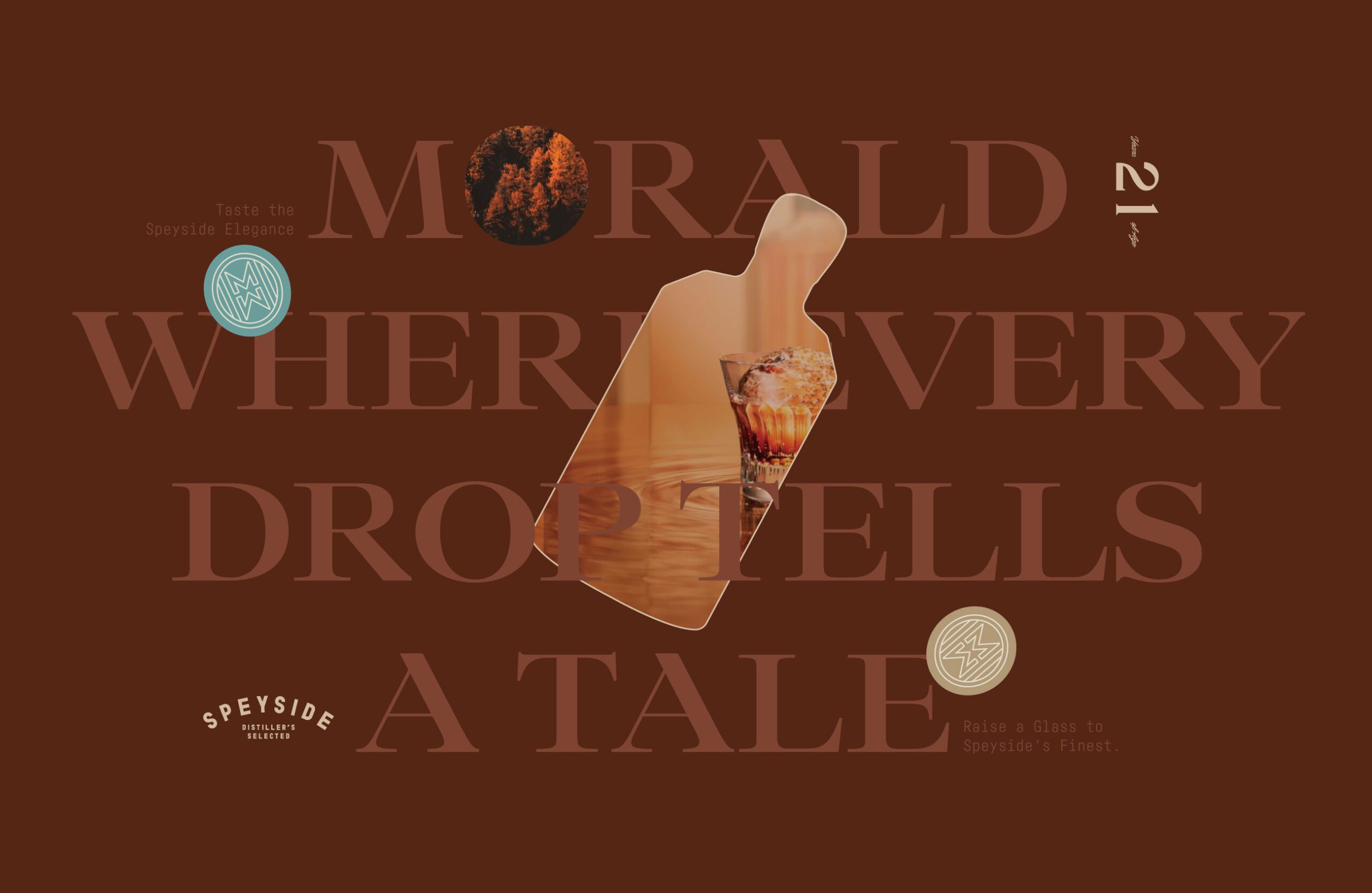
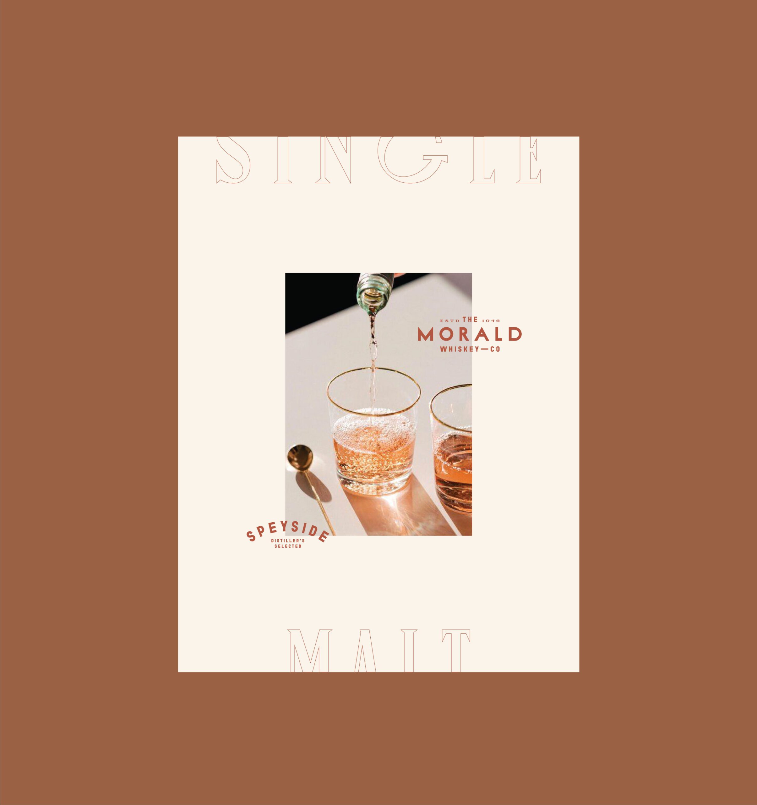
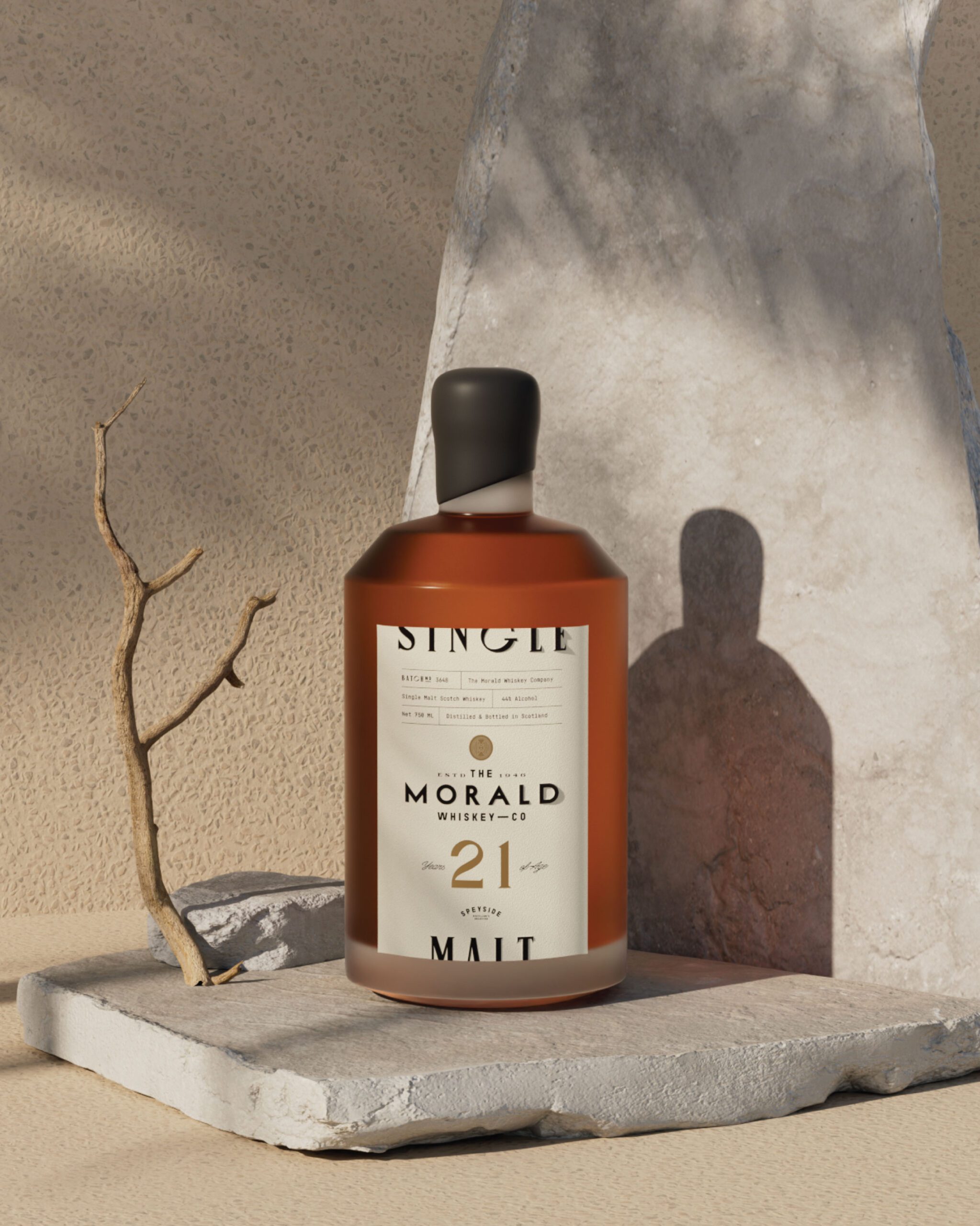
Warm, earthy tones drawn from natural stone, aged wood, and landscape carry the palette. Those references point at the aging process and the place the whiskey comes from without illustrating either, which keeps the pack from becoming a picture of a story rather than a container for a product.
Visual Identity
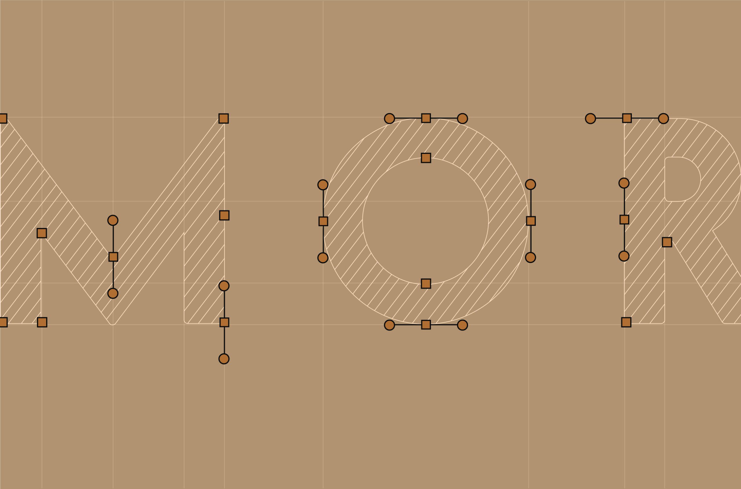
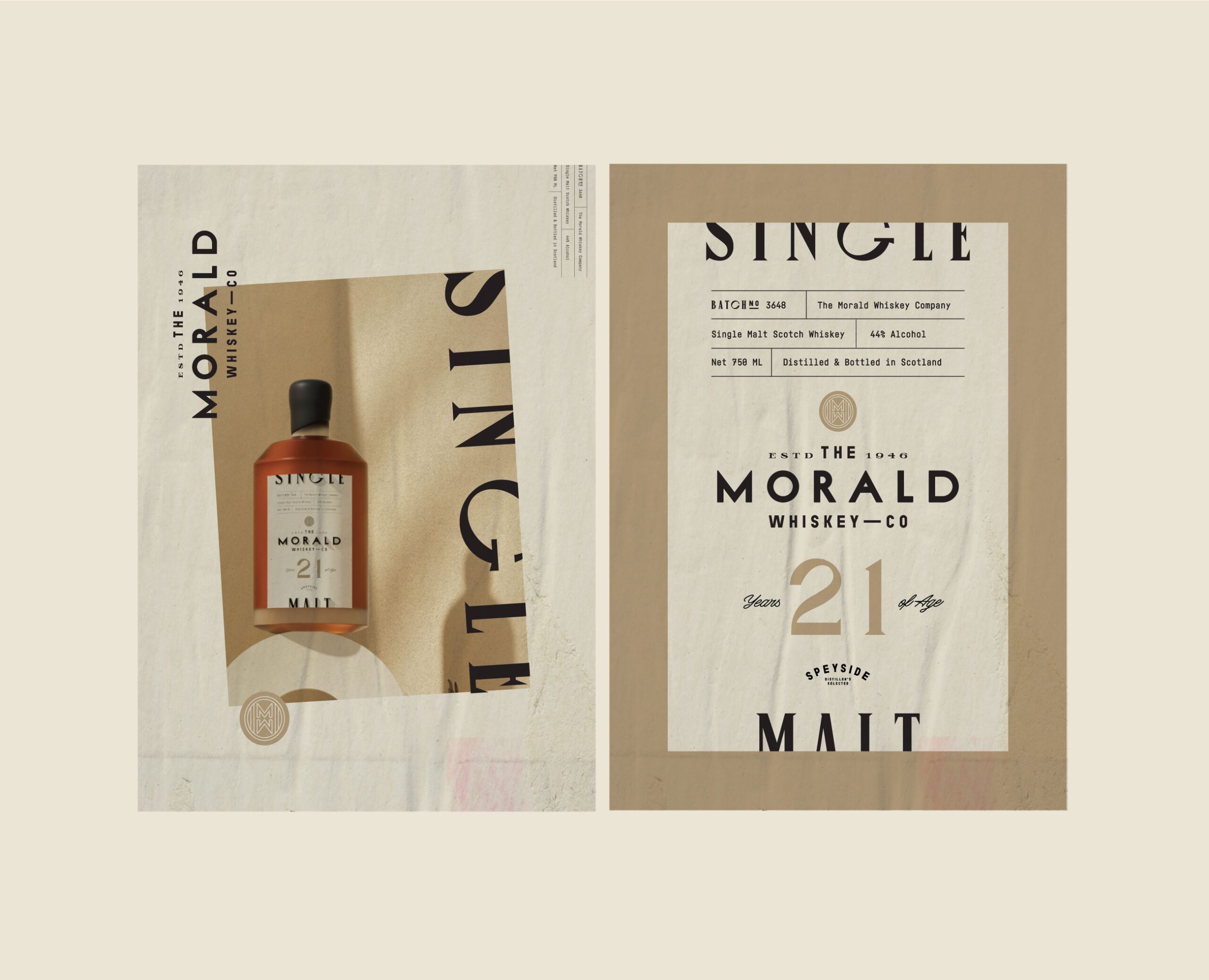
Typography is classic and composed, set to balance strength against refinement. We worked the hierarchy and spacing deliberately, because on a bottle the type is doing nearly all the work: the label area is small, and anything competing with the brand name costs legibility at exactly the distance where the choice gets made.
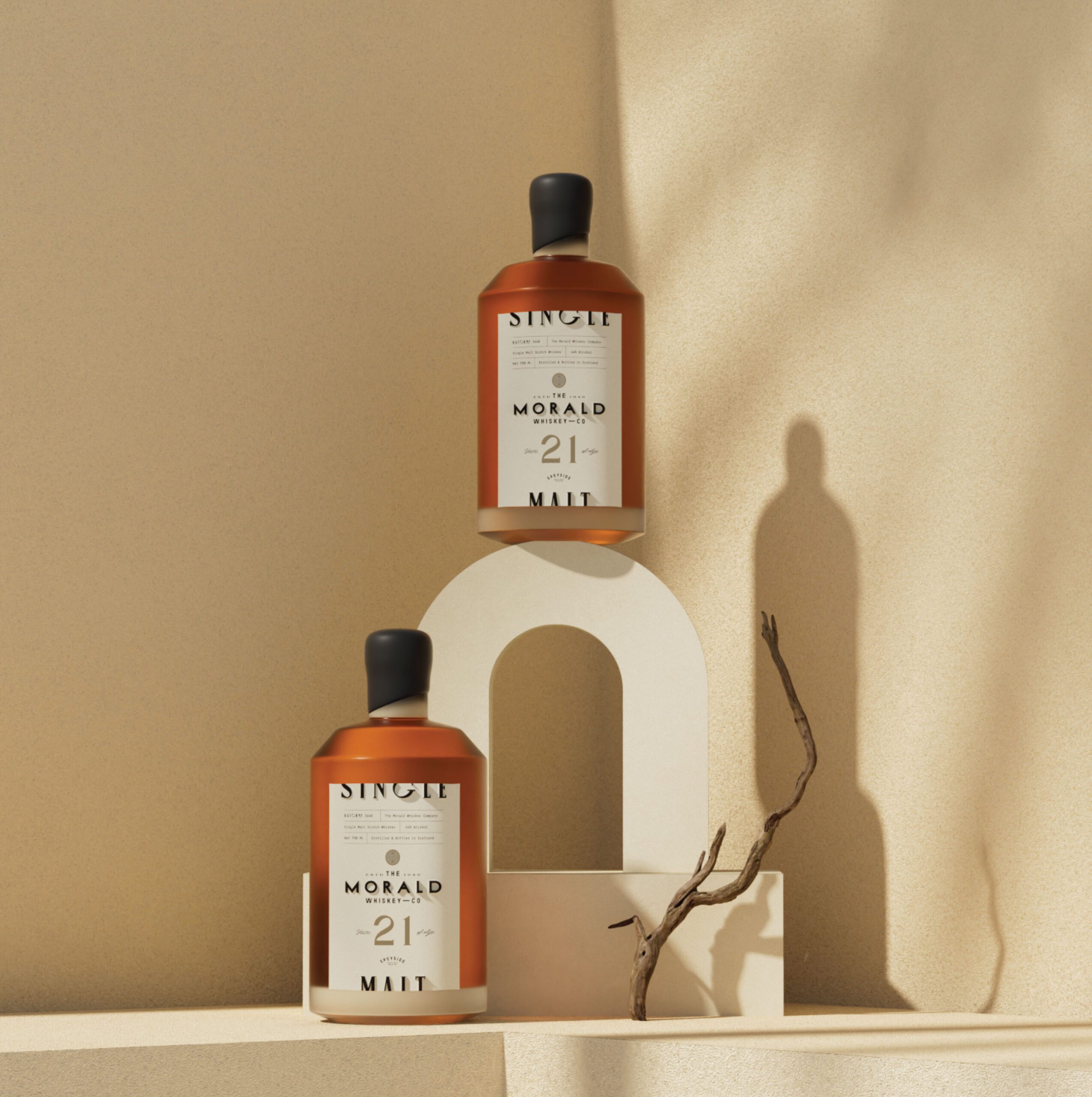
Packaging Design
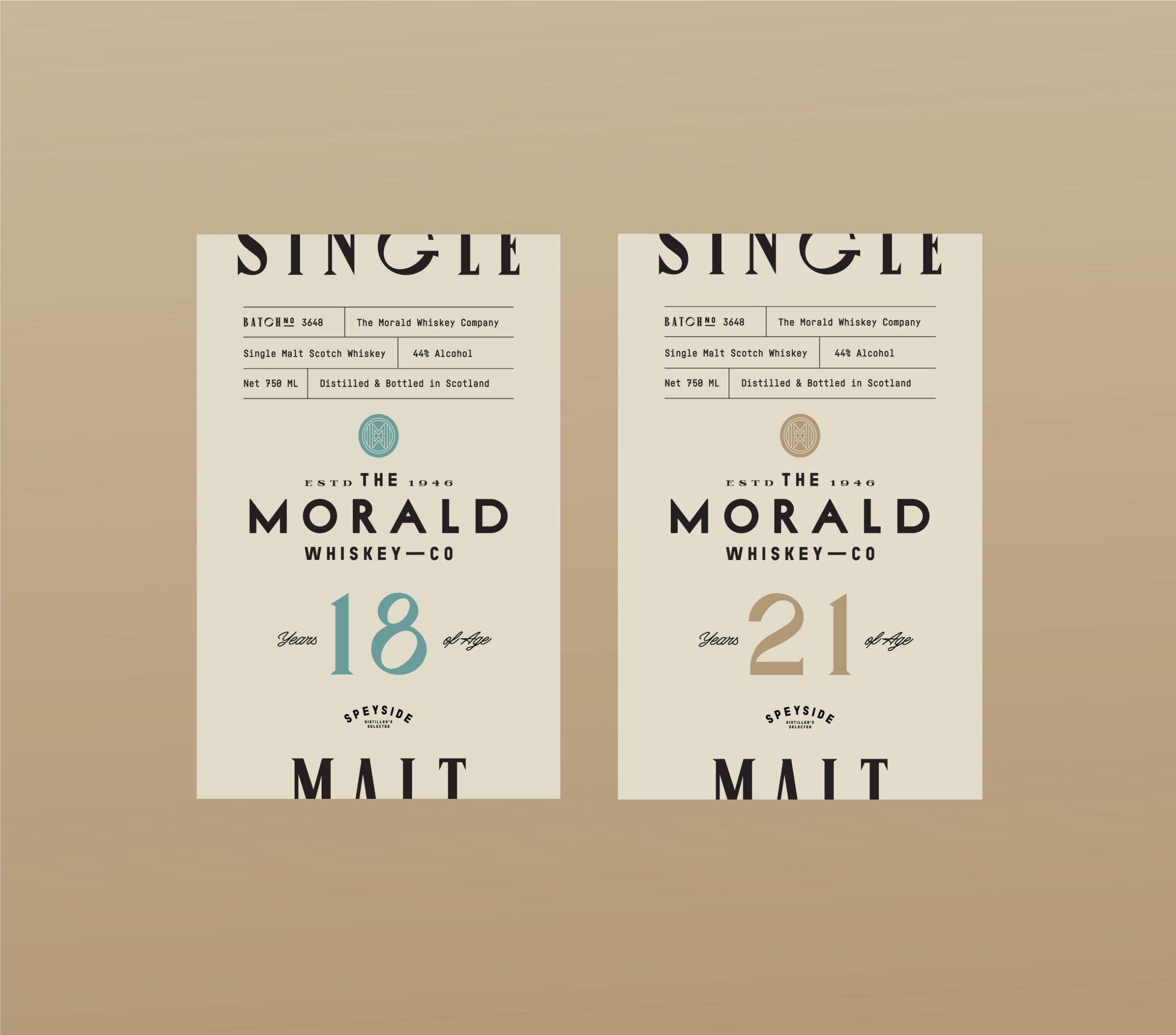
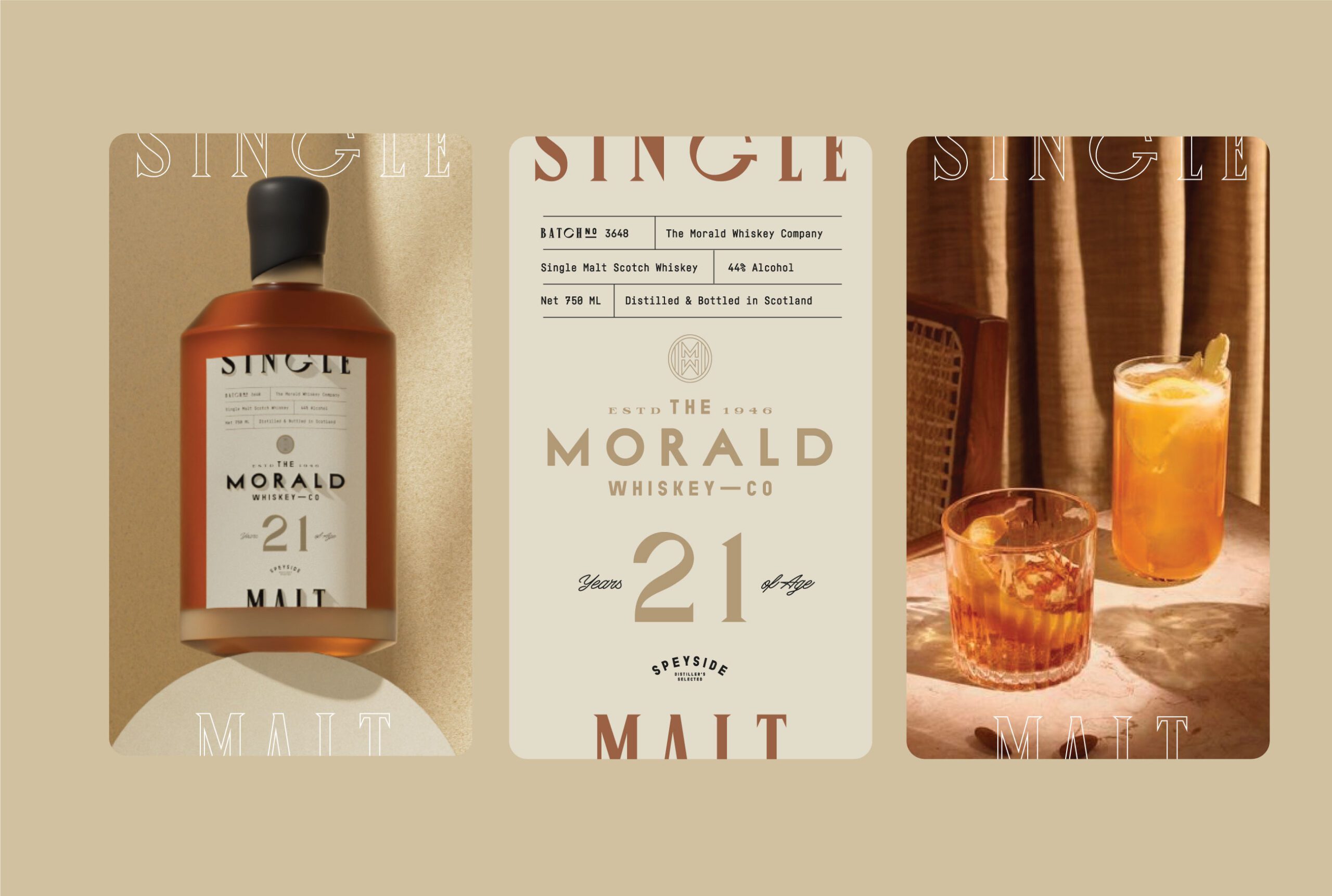
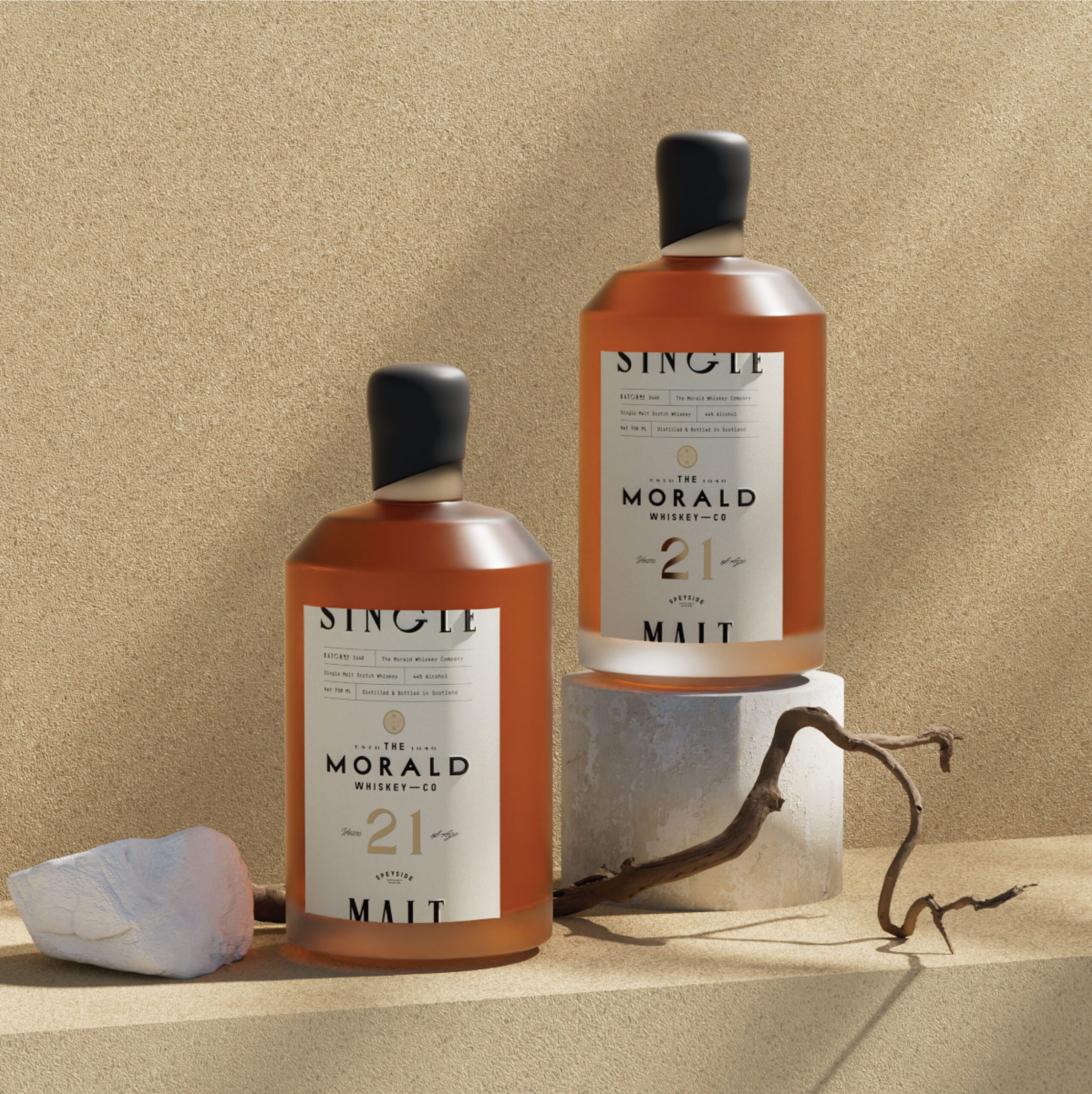
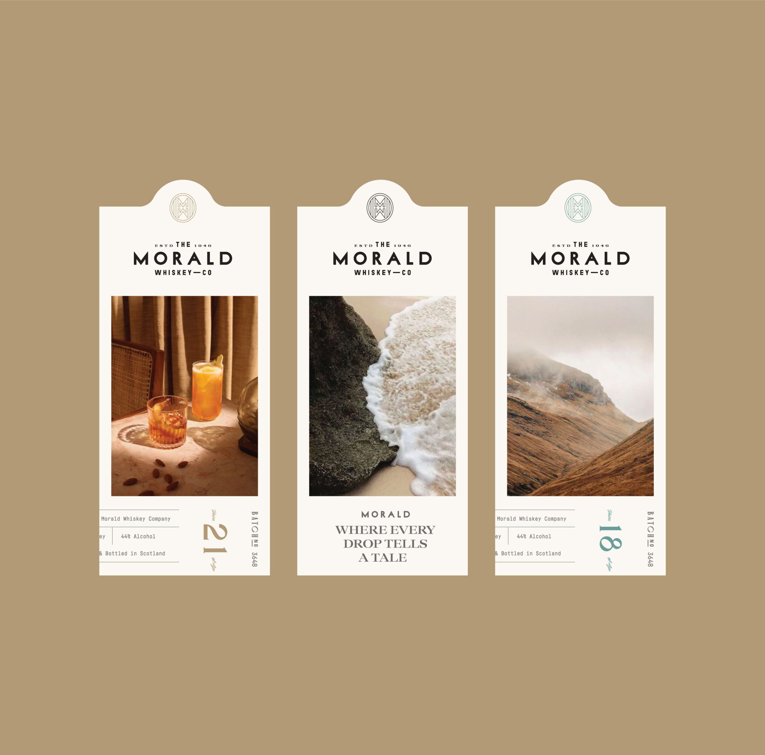
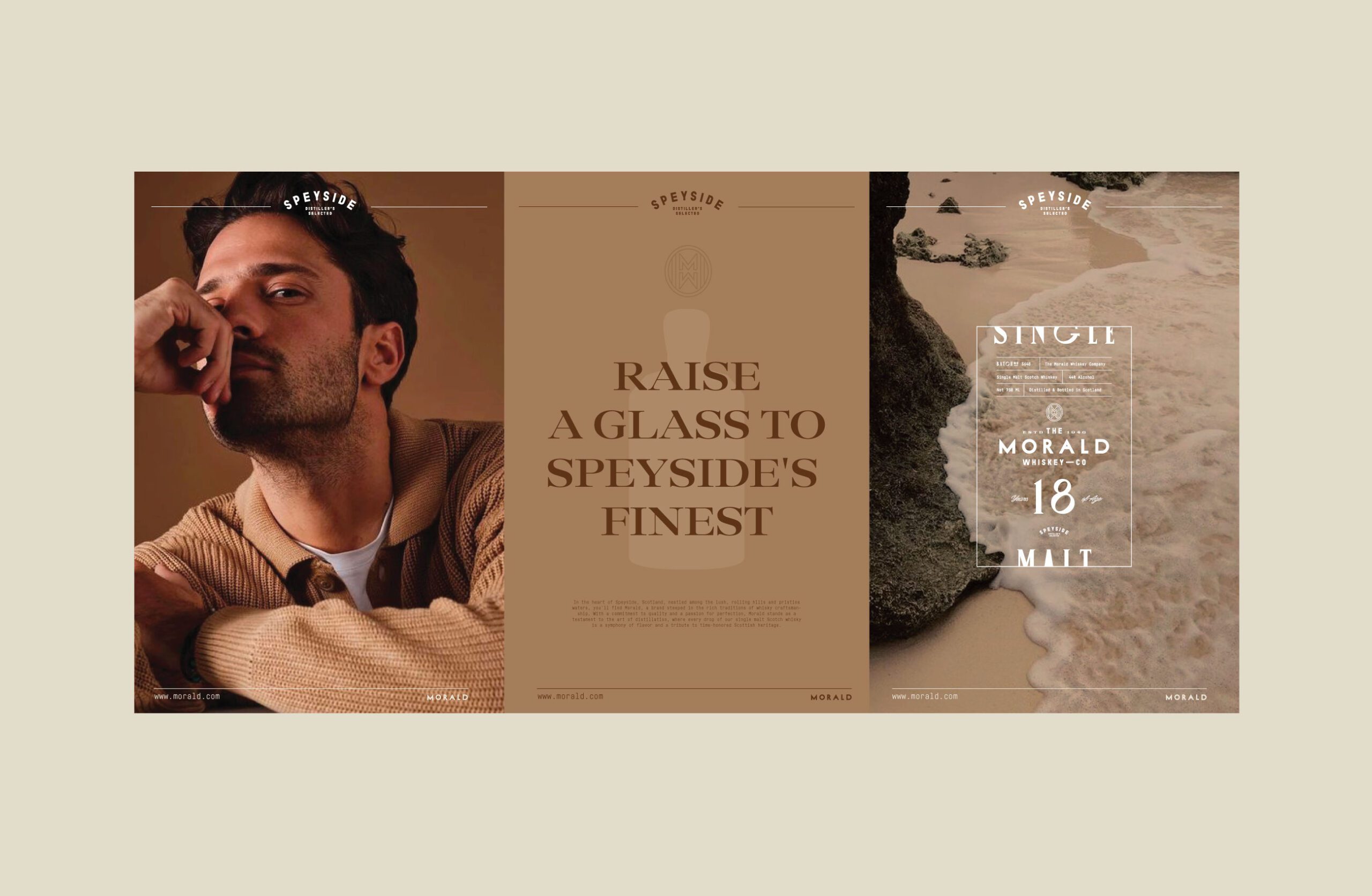
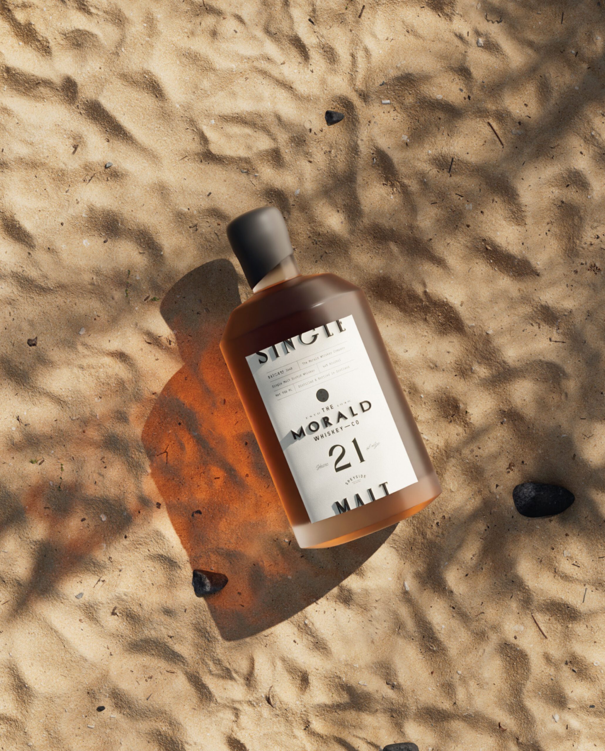
Labels leave out decoration and let texture, type, and proportion carry the character. The result is a bottle that holds its presence on a shelf by being the quietest thing on it.

Let’s make the work they’ll copy.
Talk to an expert now
Work with a 38 team of the
industry’s top 1% talent.