La Palma Coffee
Designing a Timeless and Nature Inspired Coffee Brand
La Palma is a coffee brand rooted in a deep appreciation for nature, origin, and everyday rituals. Inspired by the calm presence of palm trees and sun washed landscapes, the brand offers a coffee experience that feels grounded, effortless, and enduring. La Palma was designed to celebrate simplicity, quality, and the quiet pleasure of a well brewed cup.
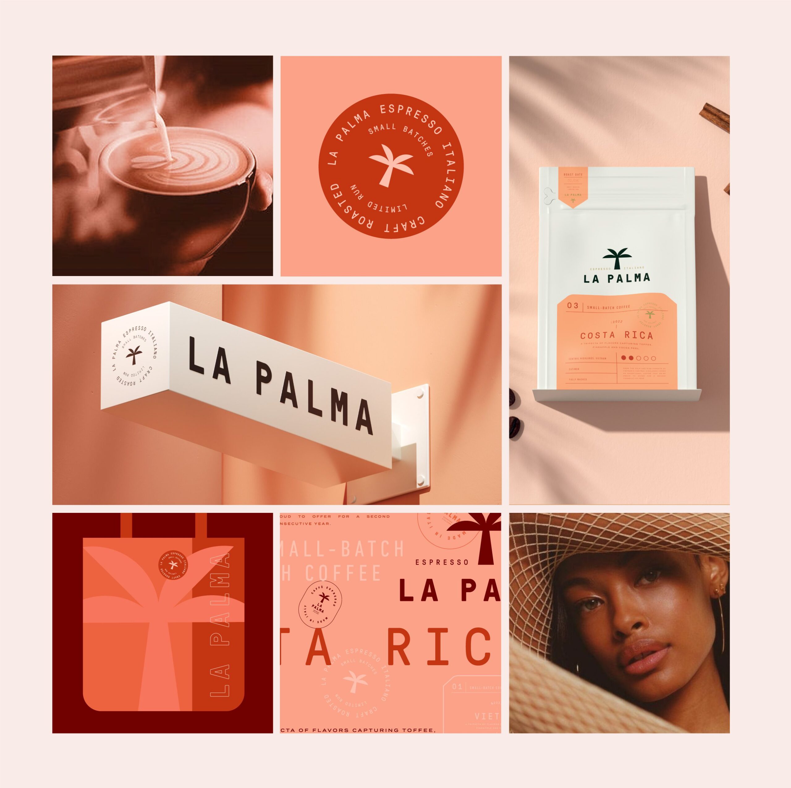
MarkaWorks developed a holistic brand identity that translates natural inspiration into a clear and distinctive visual language.
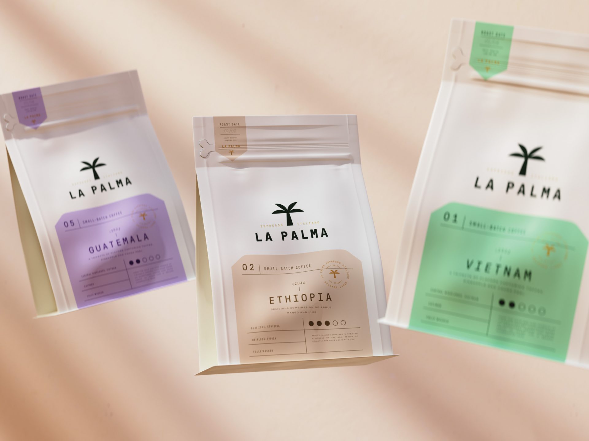
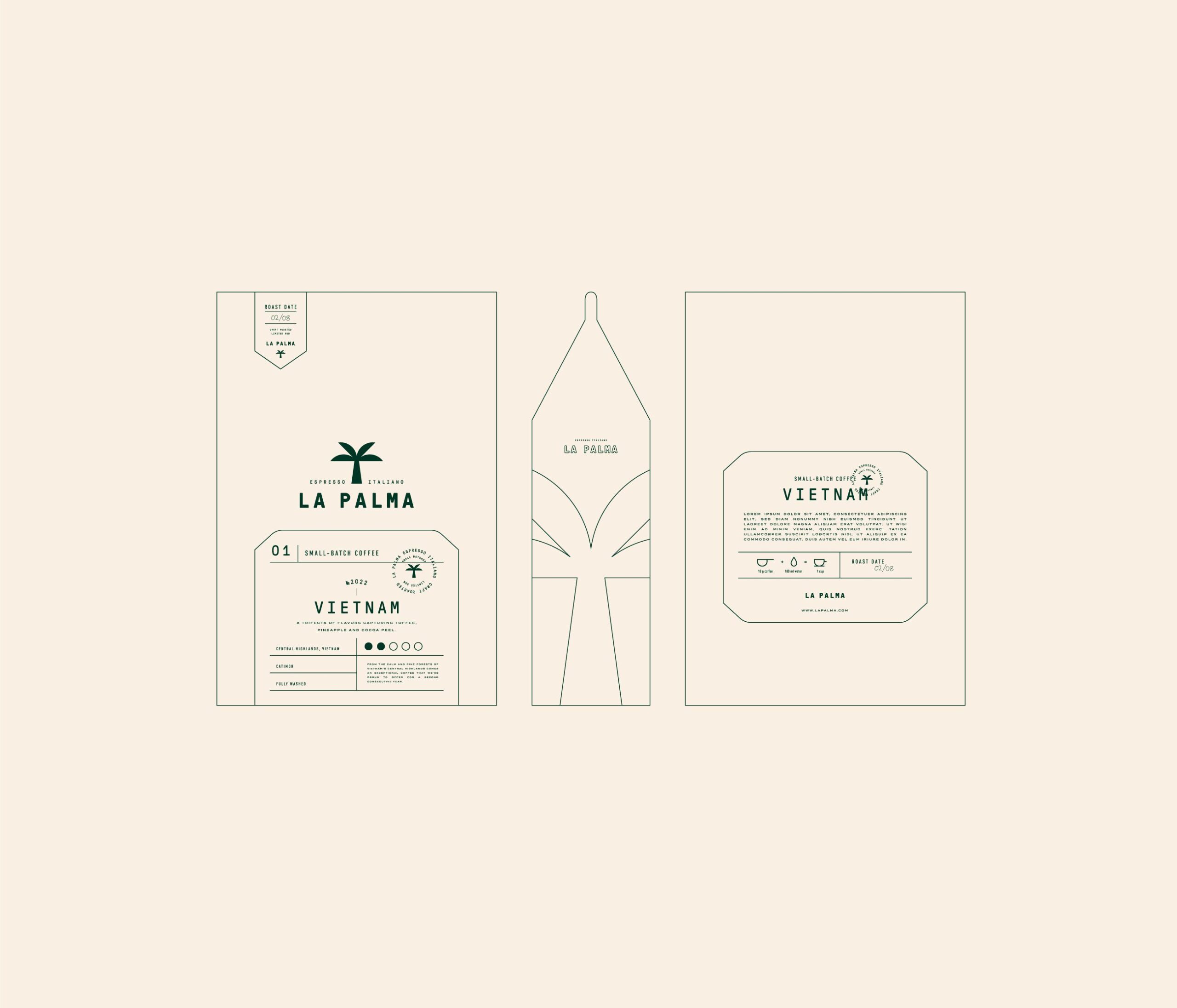
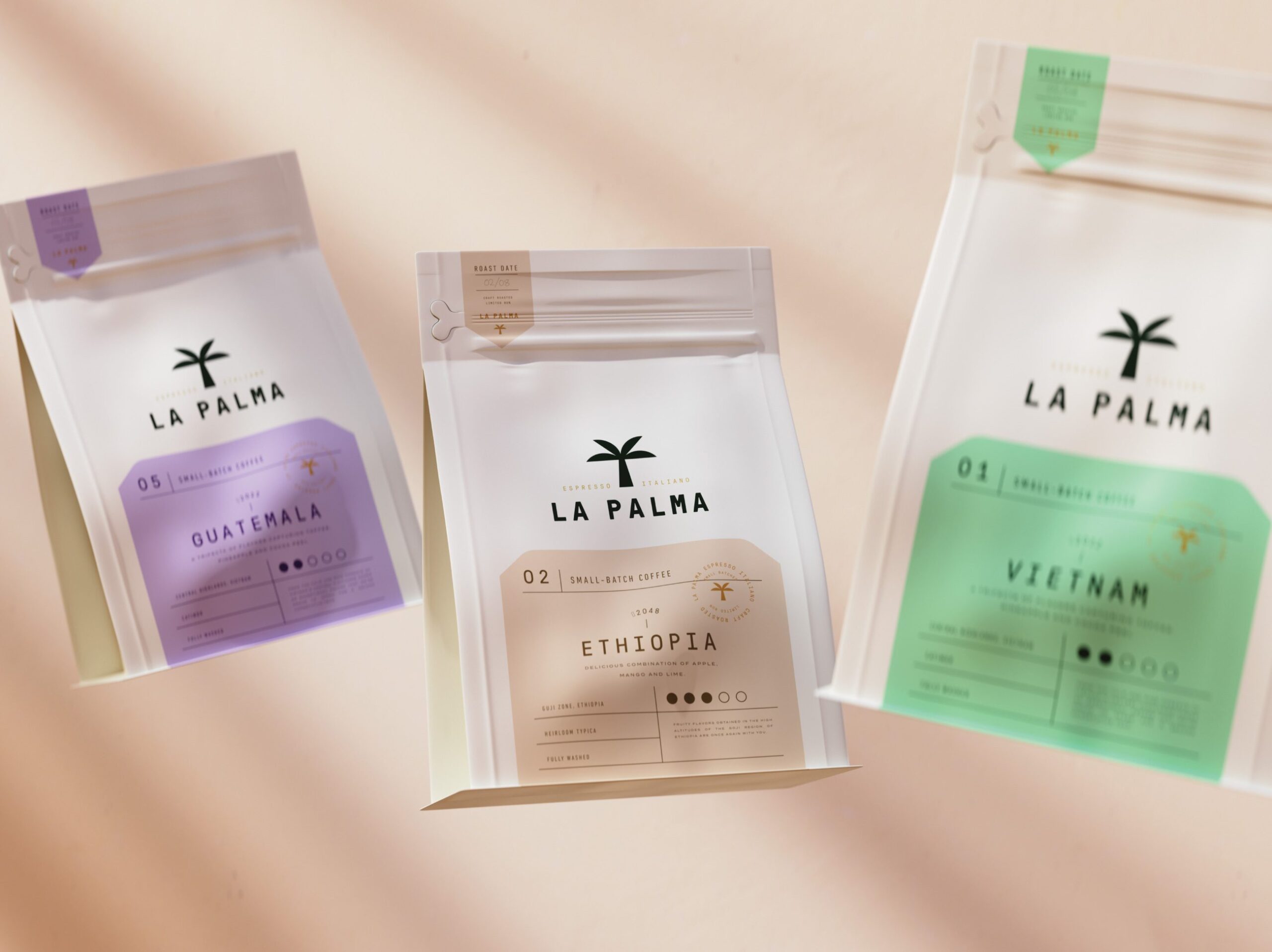
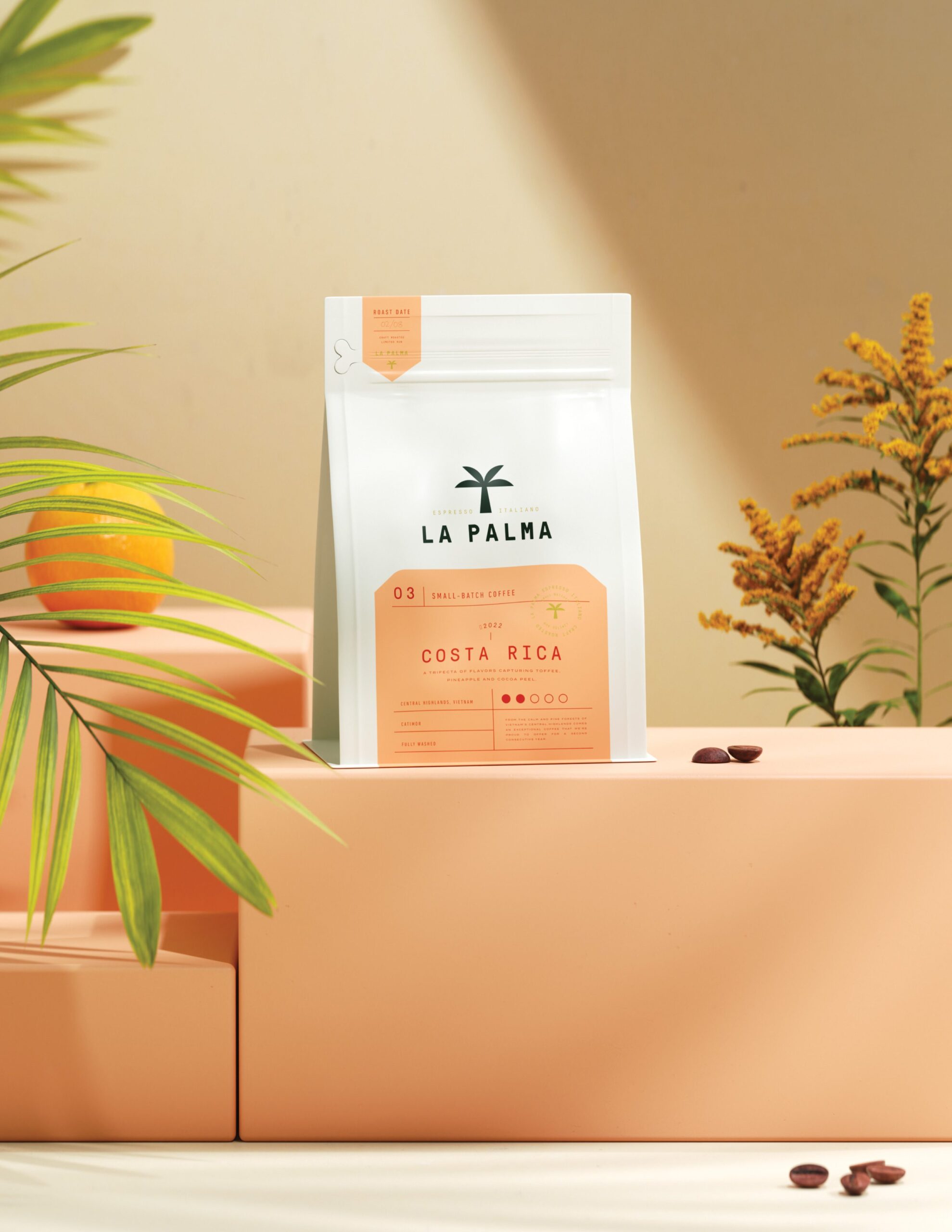
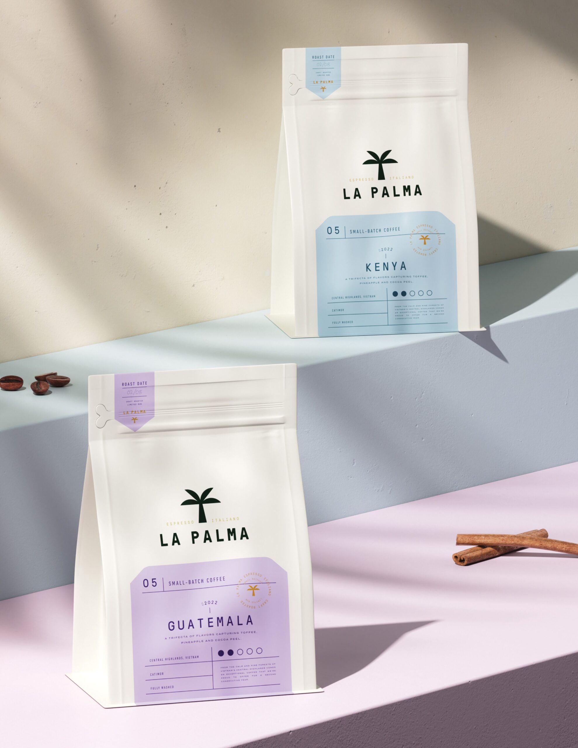
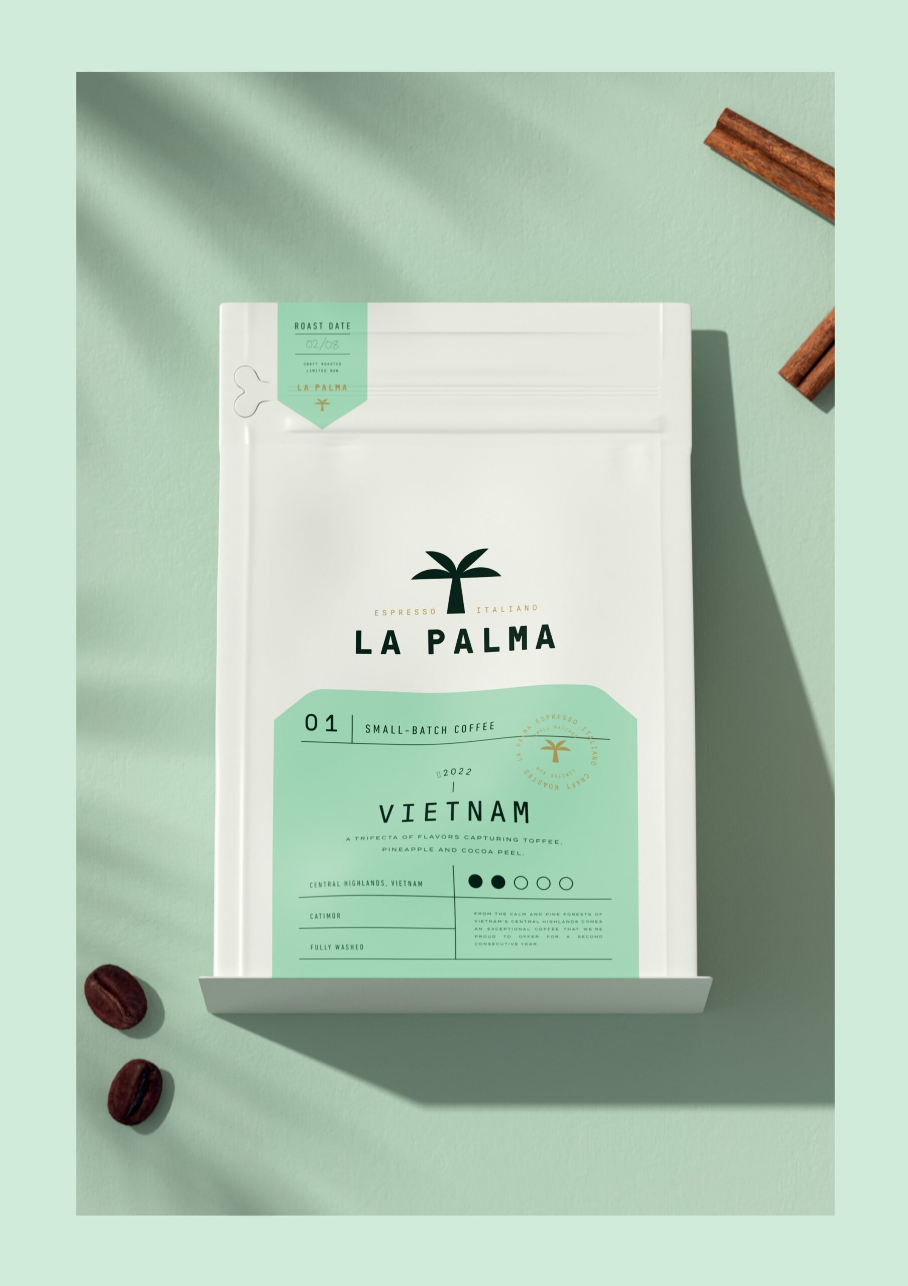
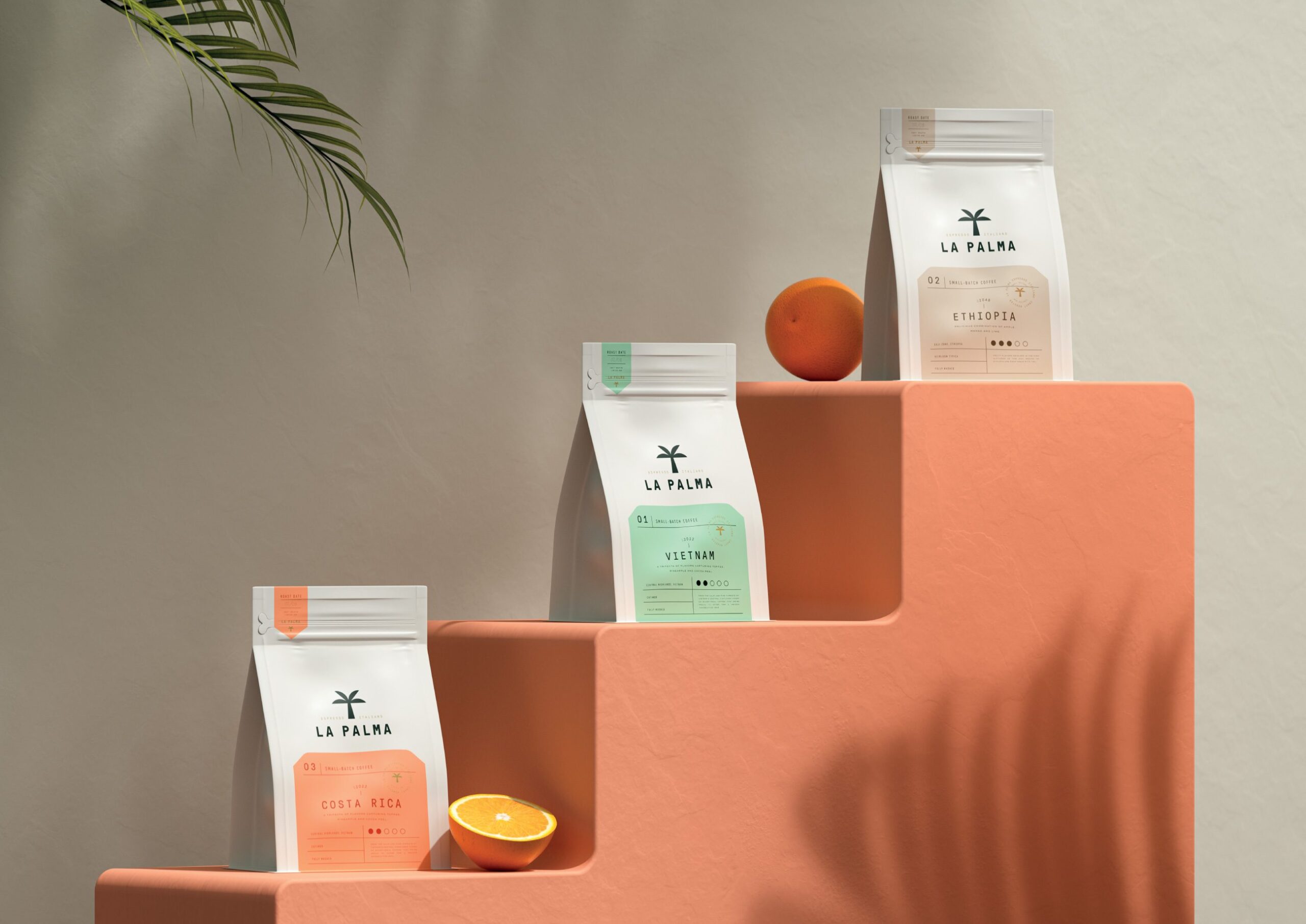
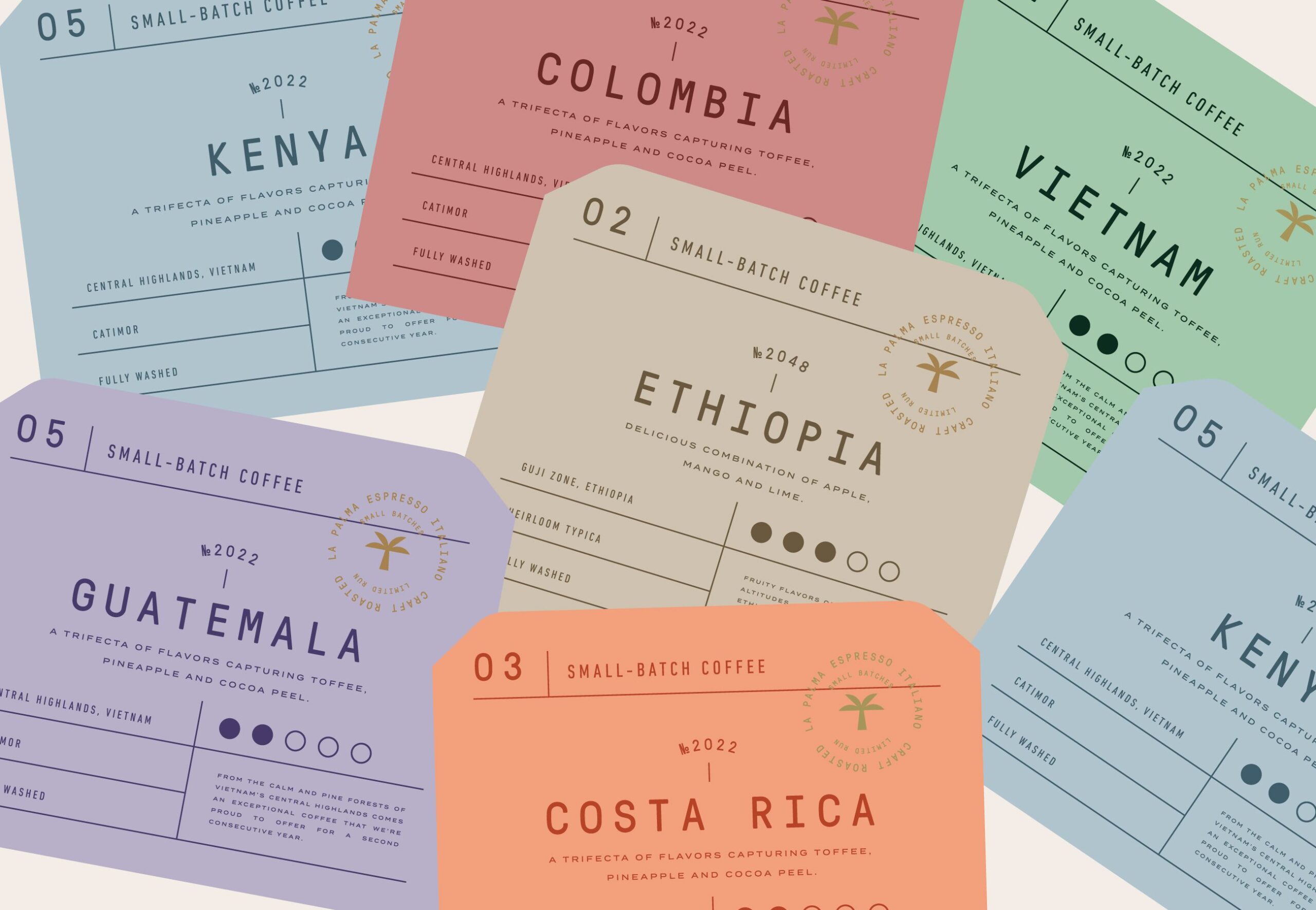
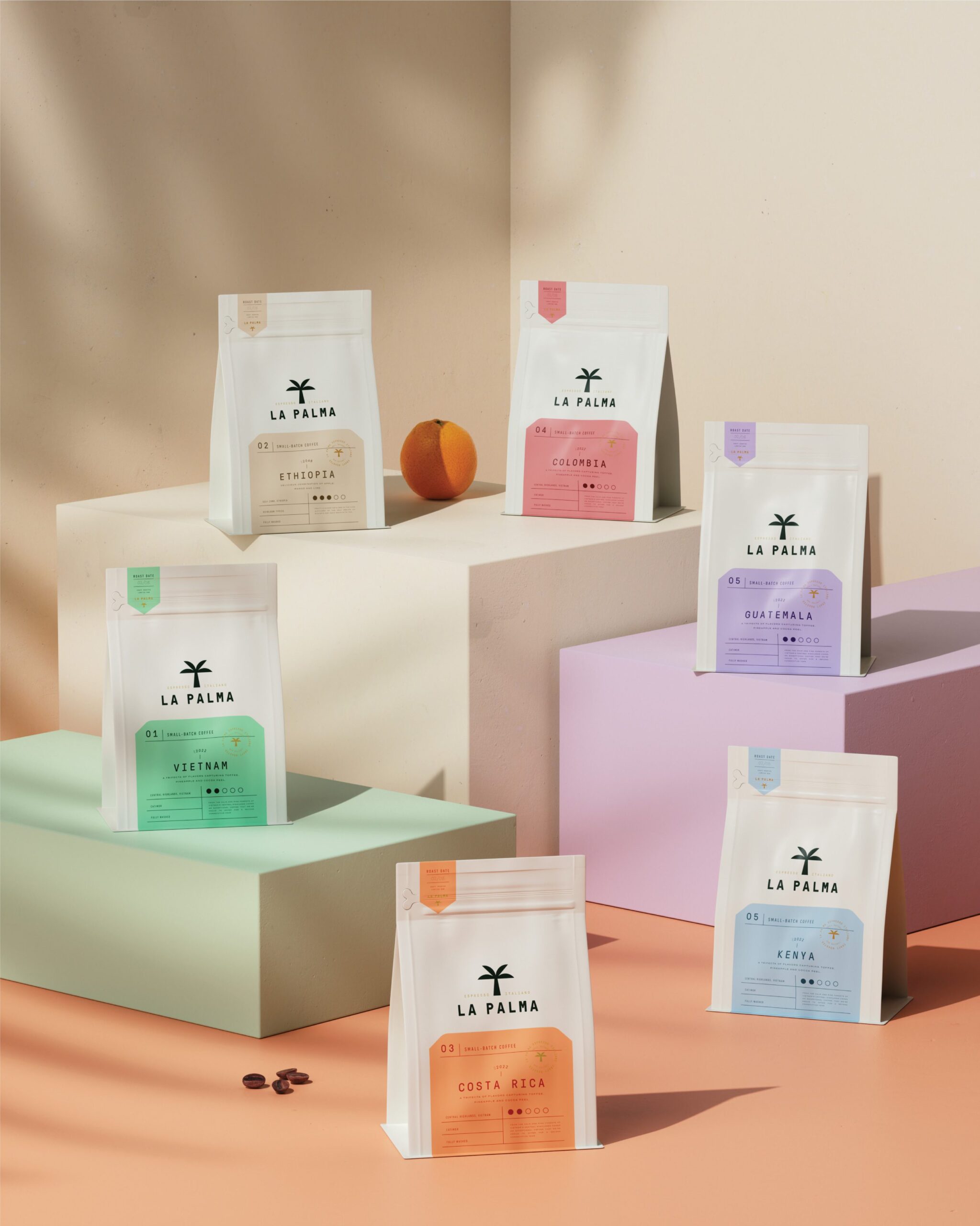
On shelf, this coffee packaging design identifies itself twice. The palm symbol we drew signs the brand, and the transparent material shows the coffee itself, so the pack makes its case before any text is read. Behind that, MarkaWorks ordered the information hierarchy for the way people actually choose coffee: origin, roast, then tasting notes. Variants are separated by subtle shifts within the palette of soft greens, warm sands, and muted earth tones rather than by new layouts, which keeps the range legible as one family.
See more coffee and tea branding case studies.

Brand Direction
La Palma’s philosophy centers on slowing down and reconnecting with the moment. The brand positions coffee not as a trend, but as a timeless companion to daily life. Each product reflects care in sourcing, roasting, and presentation, emphasizing consistency and authenticity over excess.
The brand speaks to individuals who value atmosphere, craftsmanship, and thoughtful details, offering coffee as a lifestyle ritual rather than a commodity.

Visual Identity
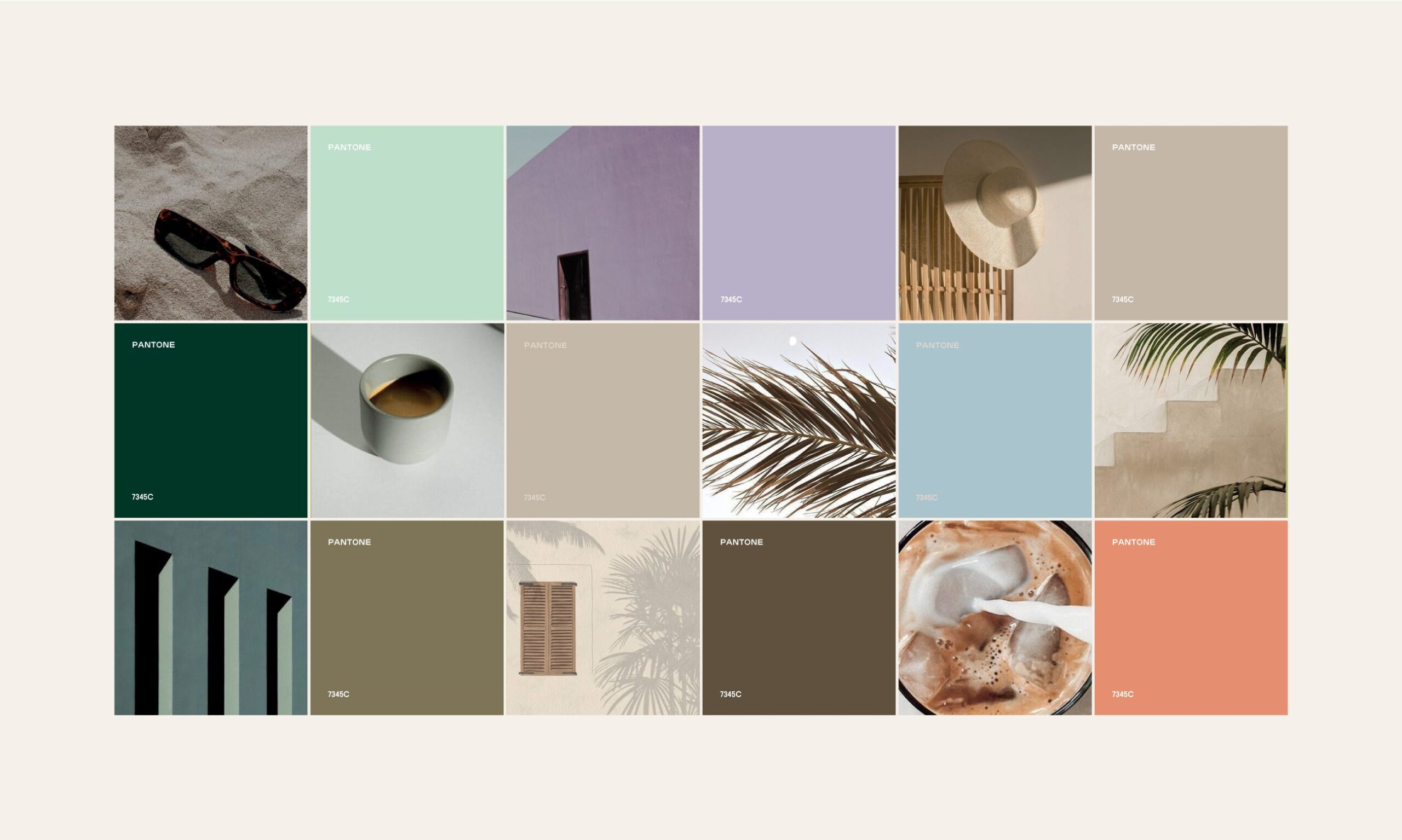
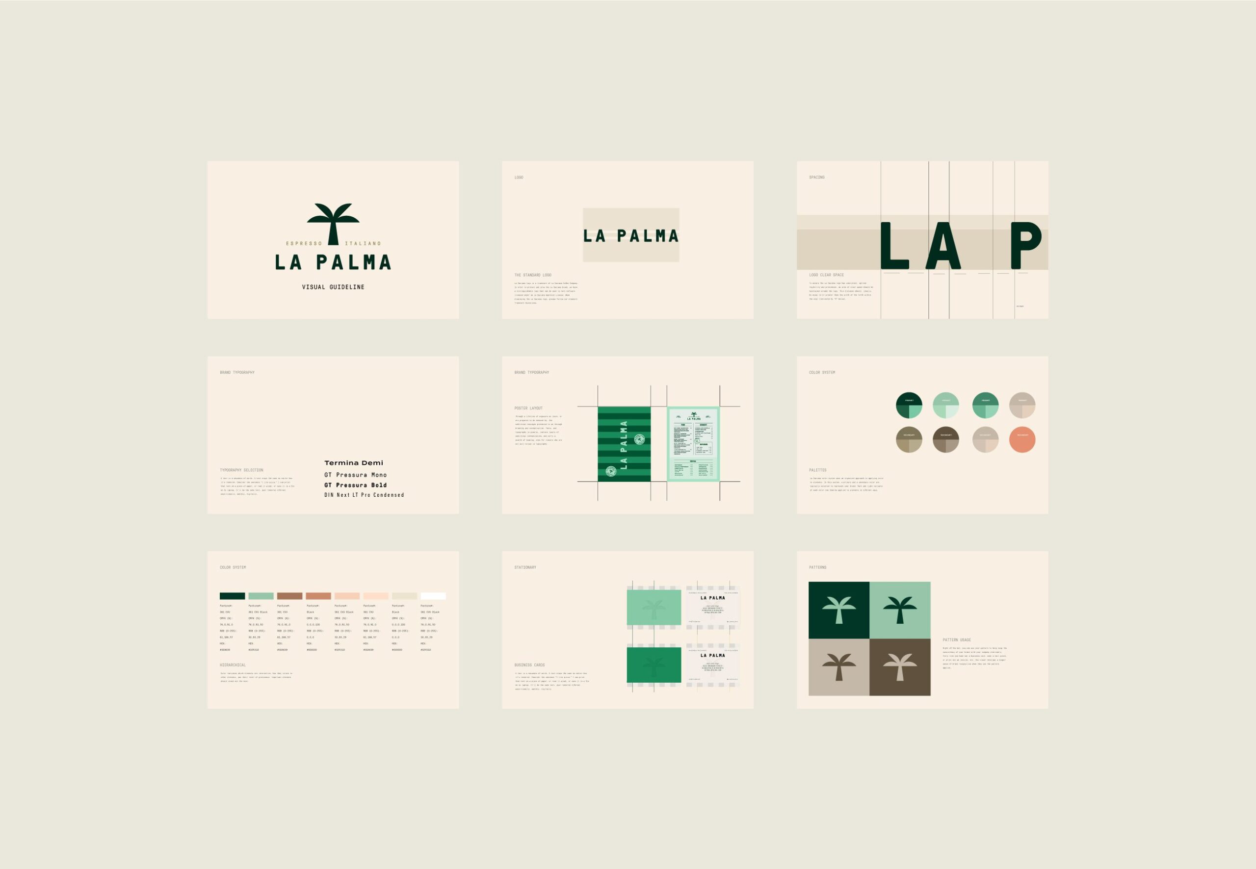
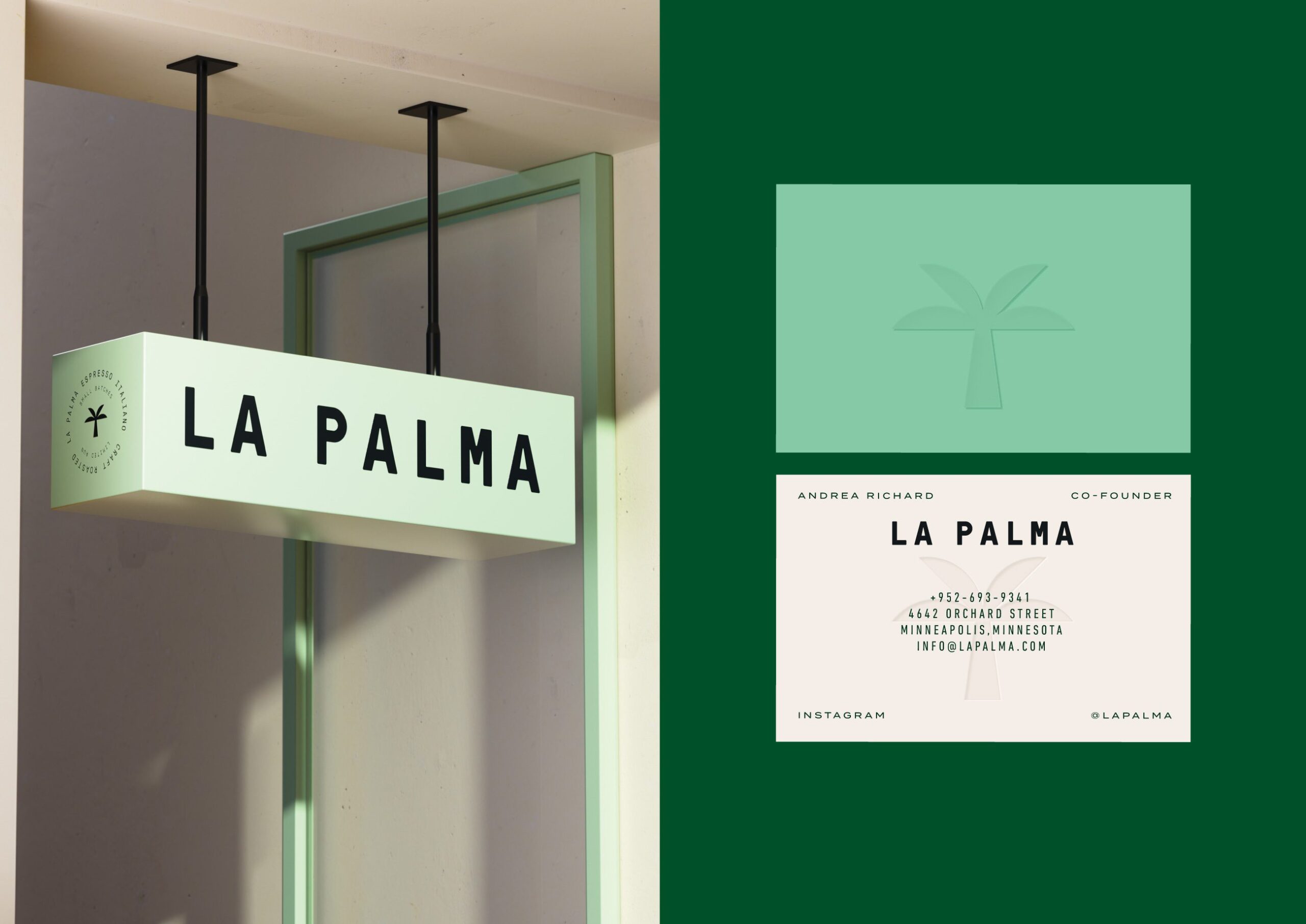
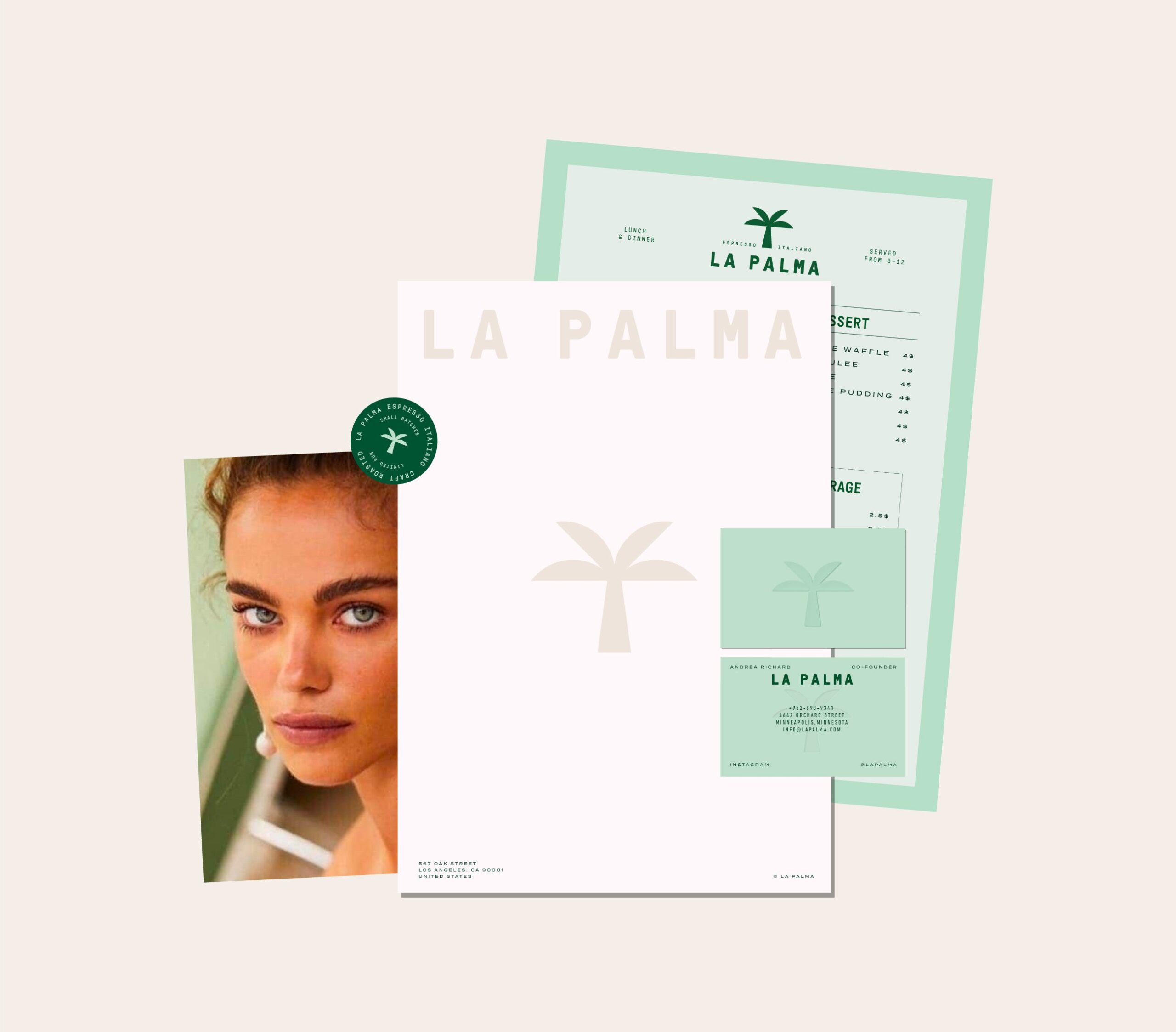
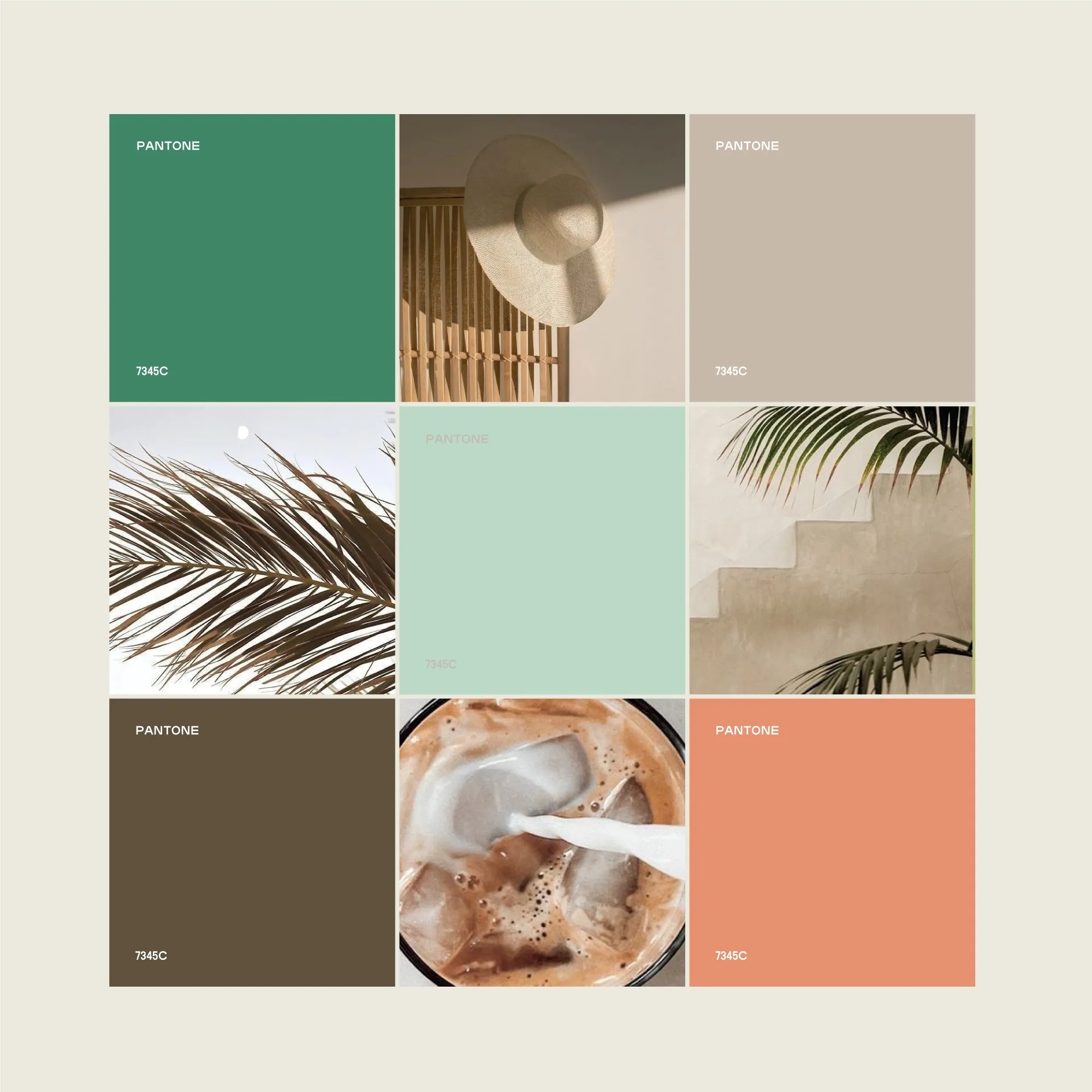
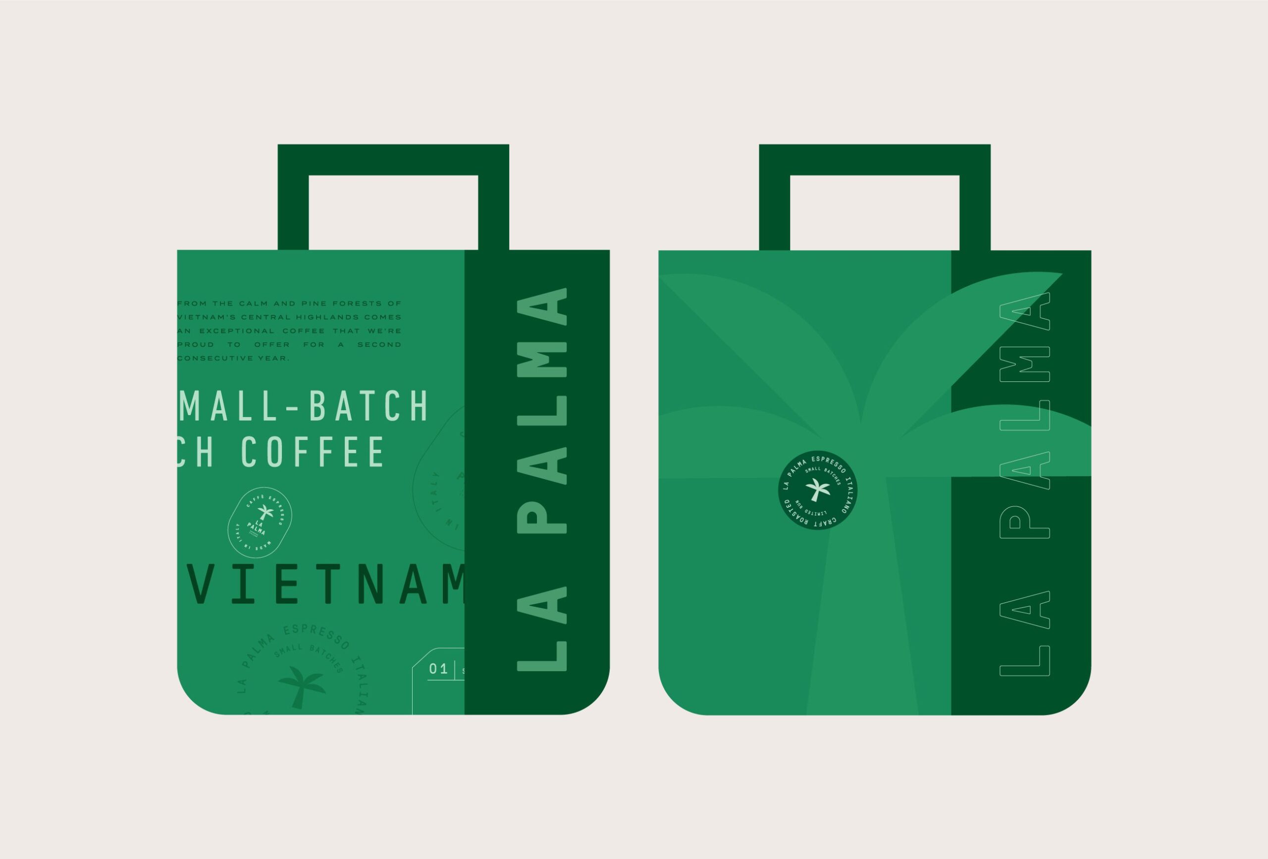
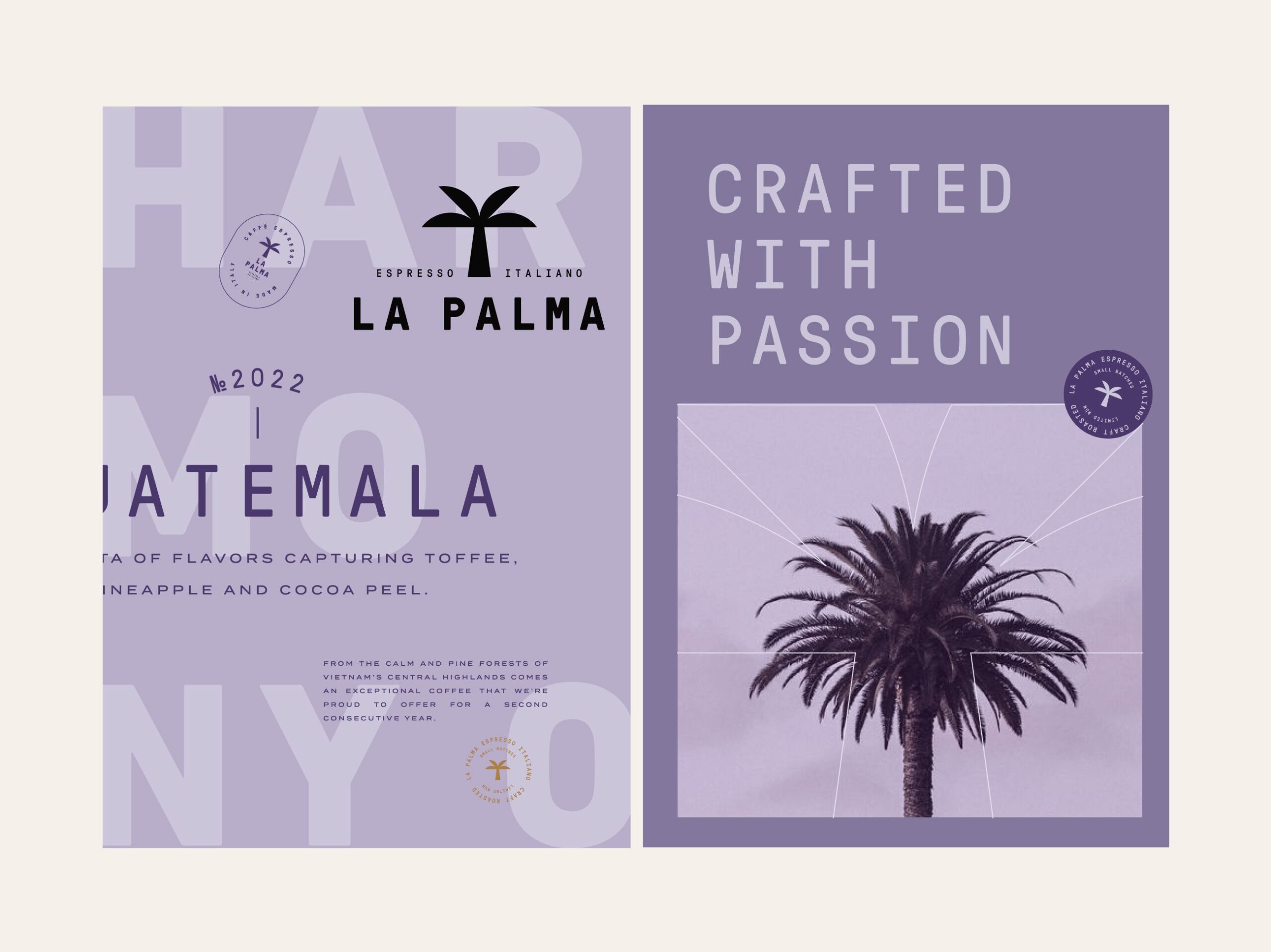
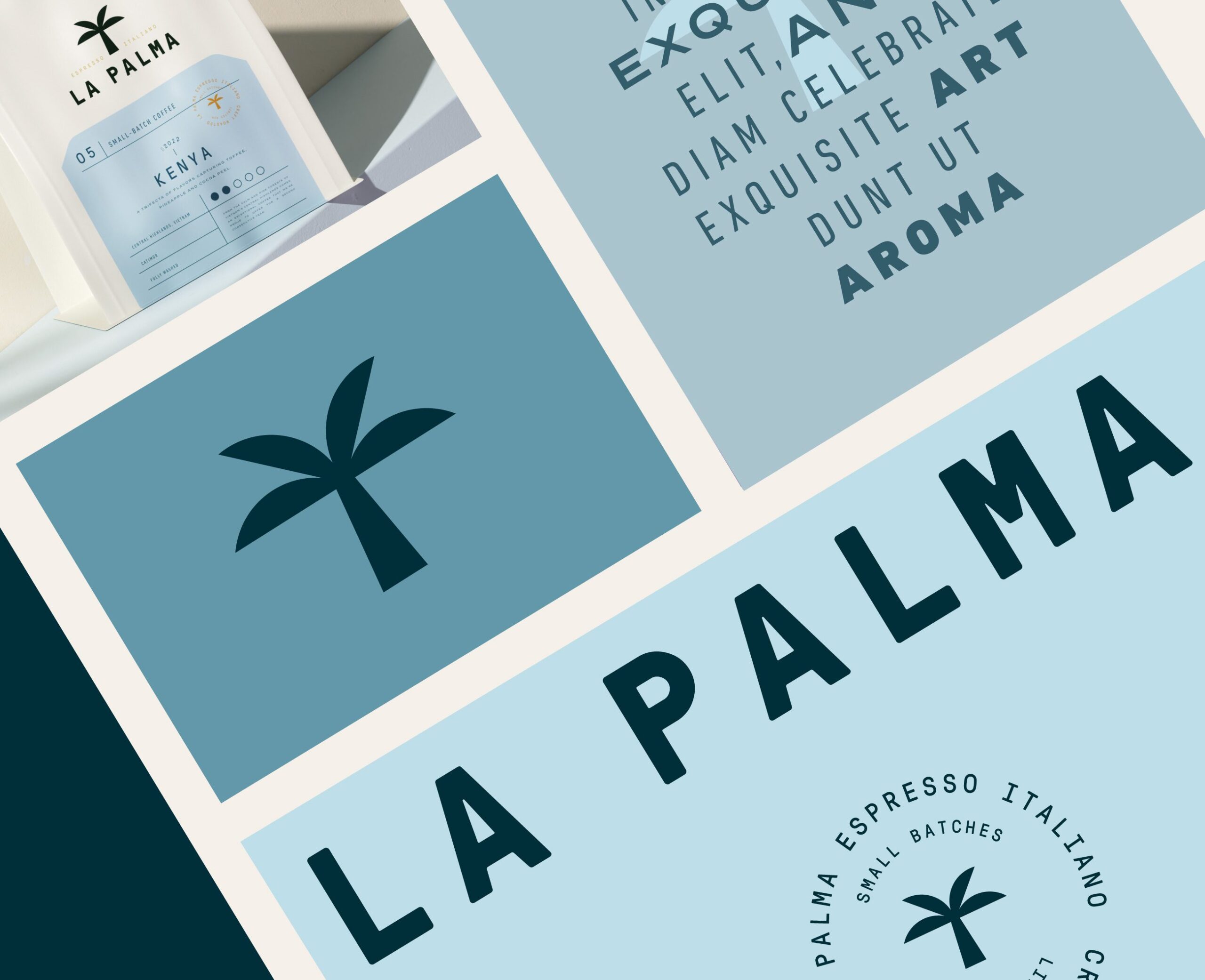
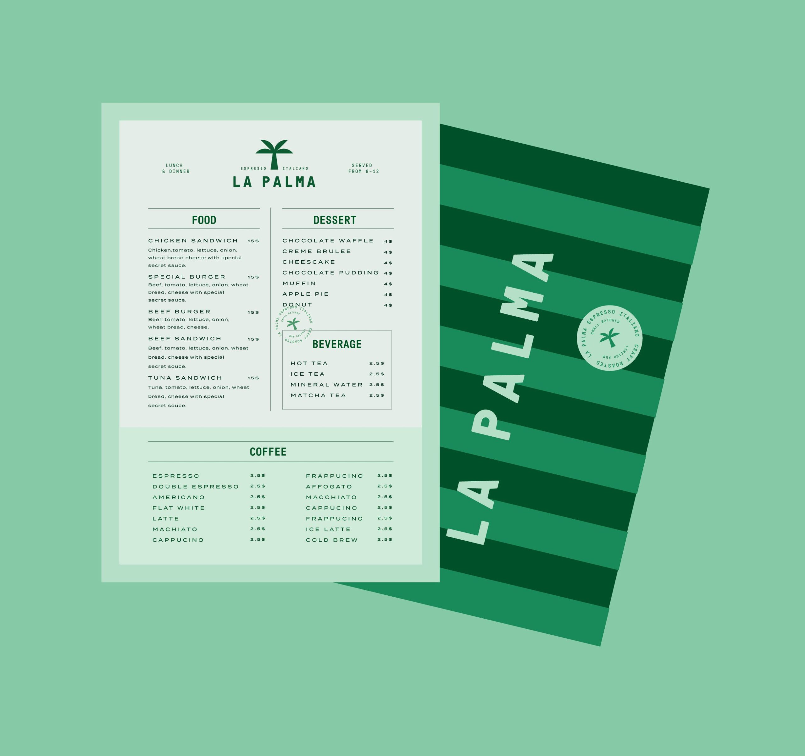
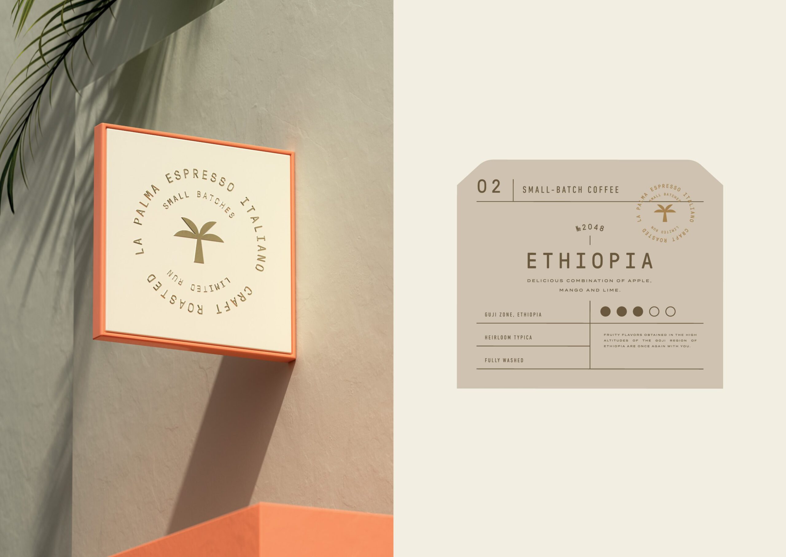
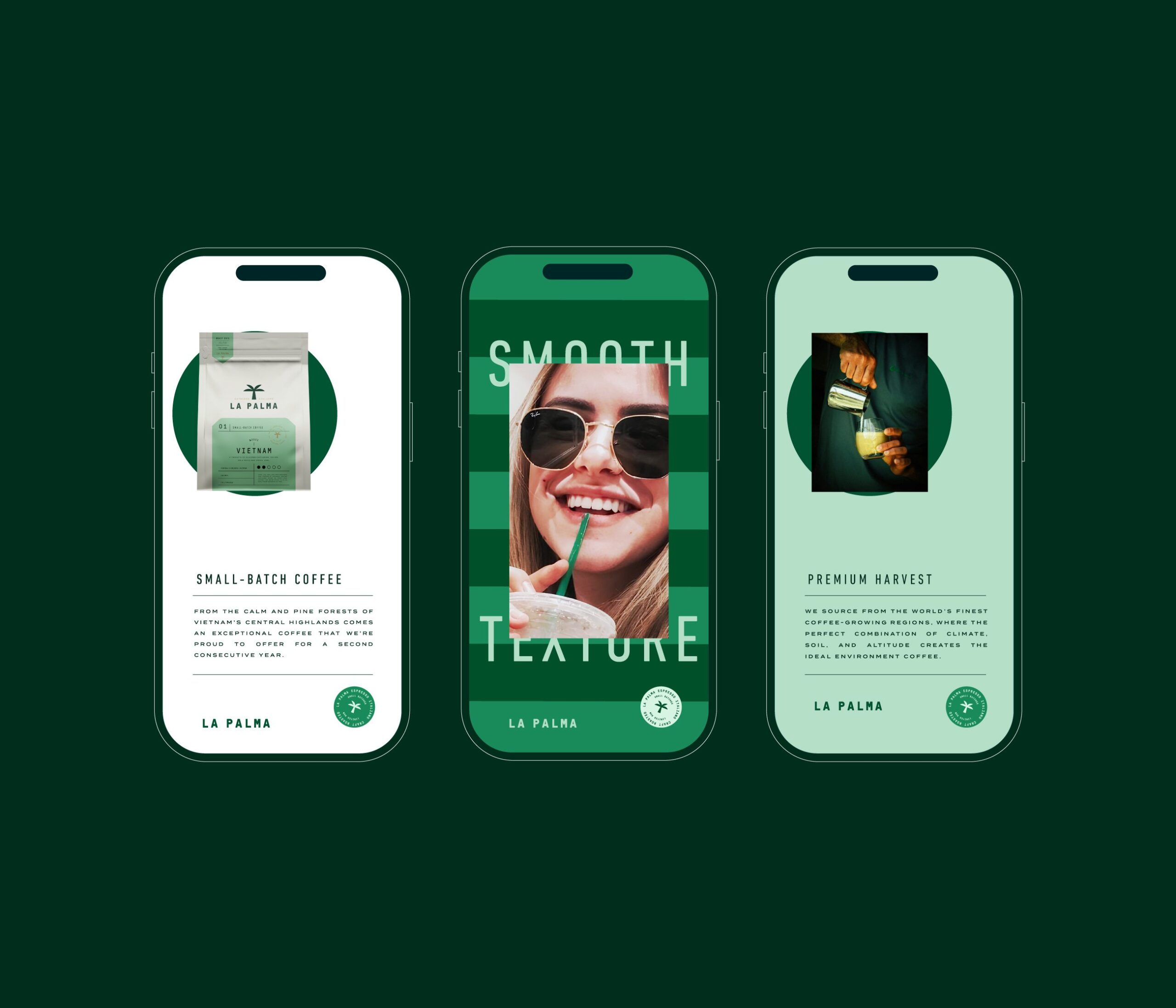
The visual identity draws directly from nature and architectural calm. A restrained color palette of soft greens, warm sands, muted earth tones, and gentle pastels reflects palm leaves, stone surfaces, sunlight, and shadow. These tones create a relaxed and balanced visual rhythm across all touchpoints.
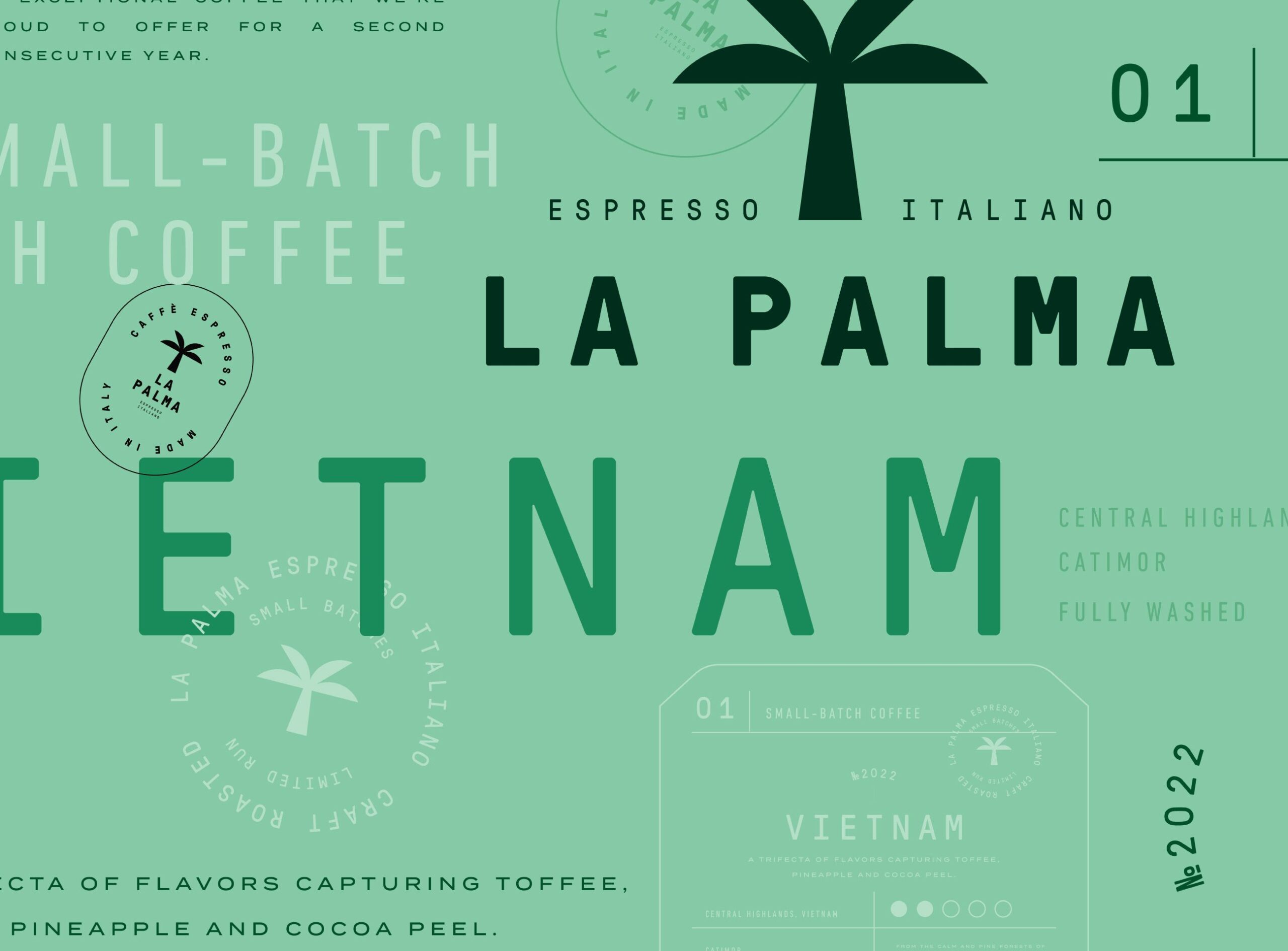
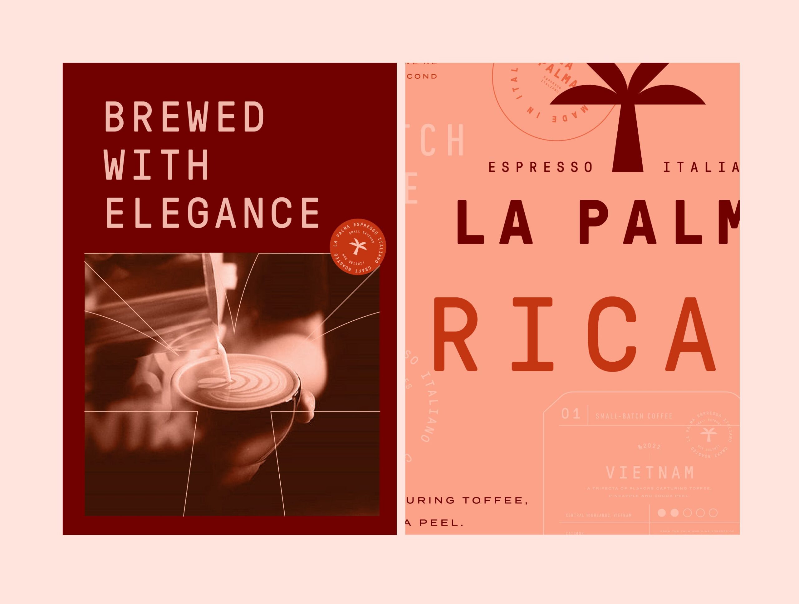
Typography is clean and confident, designed for clarity and longevity. The logotype feels modern yet timeless, supported by generous spacing and disciplined layouts that allow the brand to breathe.
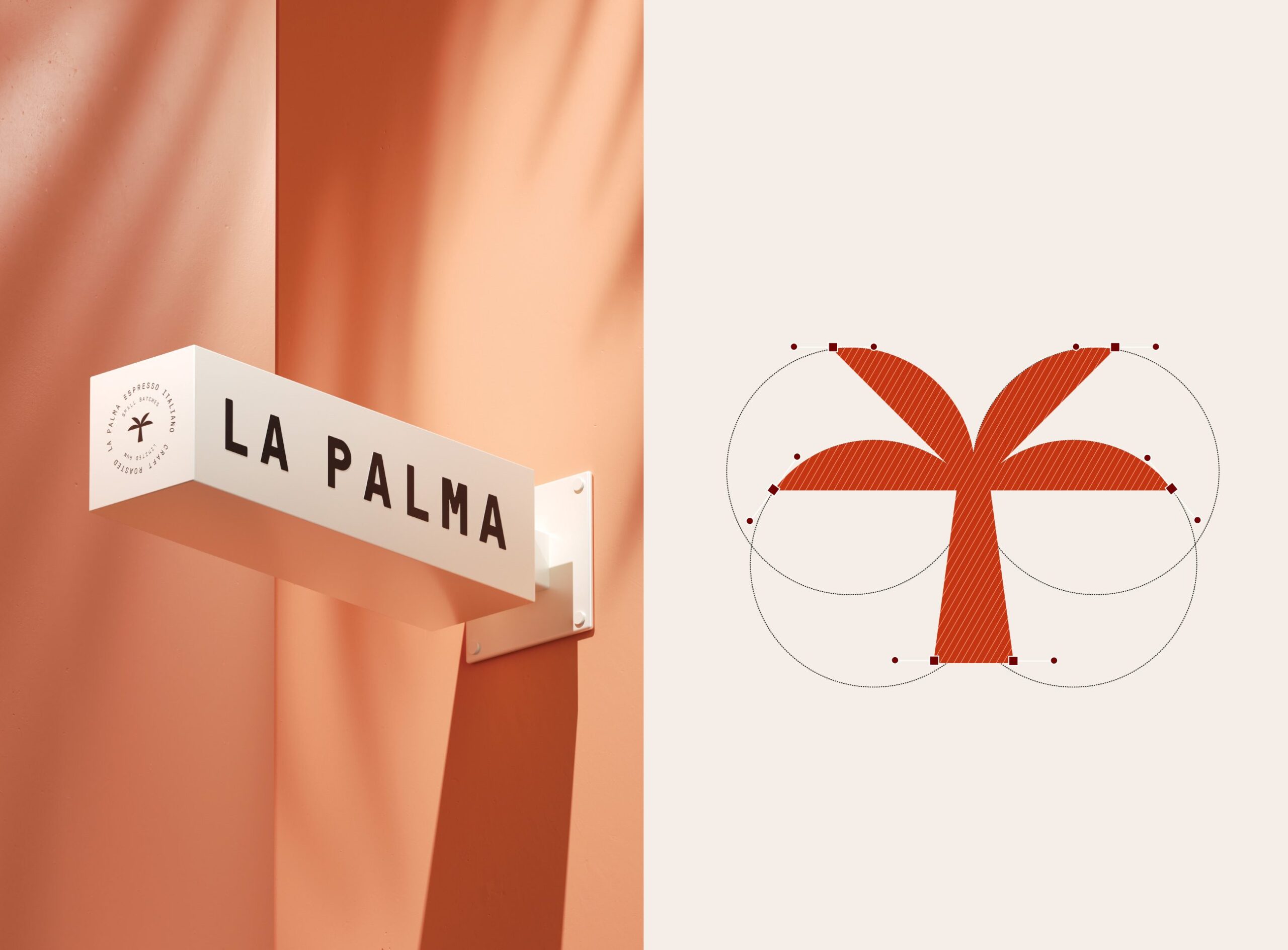
The palm symbol acts as a quiet signature throughout the system, reinforcing the brand’s connection to nature and place.
Packaging Design
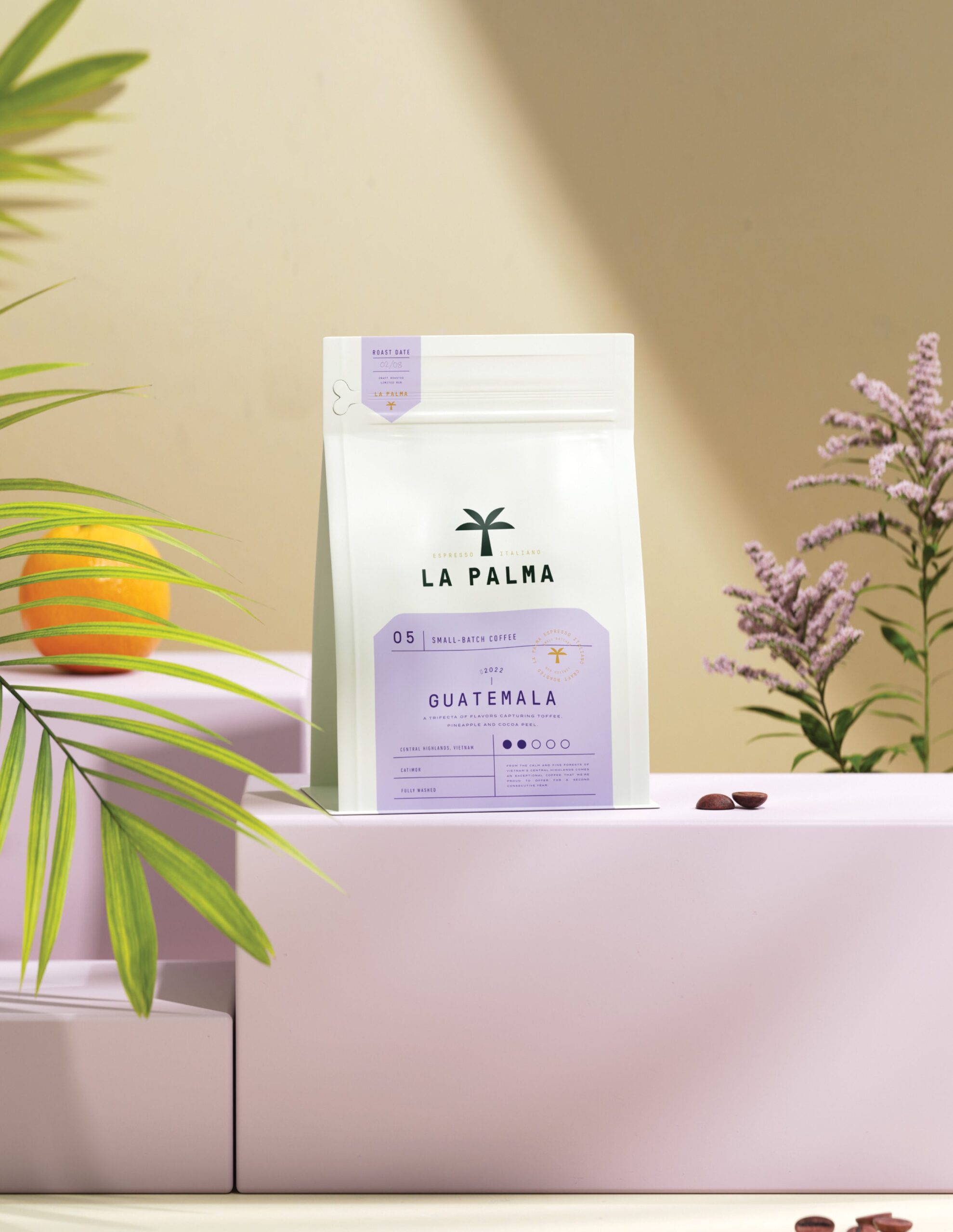
Packaging was designed to feel light, clean, and intuitive. Transparent materials and soft color blocks allow the coffee inside to remain visible, reinforcing honesty and freshness. Clear information hierarchy helps communicate origin, roast, and tasting notes with ease.
Each variant is distinguished through subtle color shifts while maintaining a cohesive family system. The result is packaging that feels contemporary, calm, and instantly recognizable.

Let’s make the work they’ll copy.
Talk to an expert now
Work with a 38 team of the
industry’s top 1% talent.



