
Charlie's Cafe Bakery
bold bakery, simple sophistication
Charlie’s Cafe & Bakery, brought to life by MARKAWORKS, is a brand built on classic strength and bold simplicity. Its clean logotype and monochromatic palette create an unmistakably noticeable presence, promising a sophisticated yet straightforward experience for every visitor.

Crafting a Classic, Bold, and Noticeable Brand
To set Charlie’s Cafe & Bakery apart from their local competitors, we developed a clean, simple, and affirmative brand identity that is both minimal and noticeable.
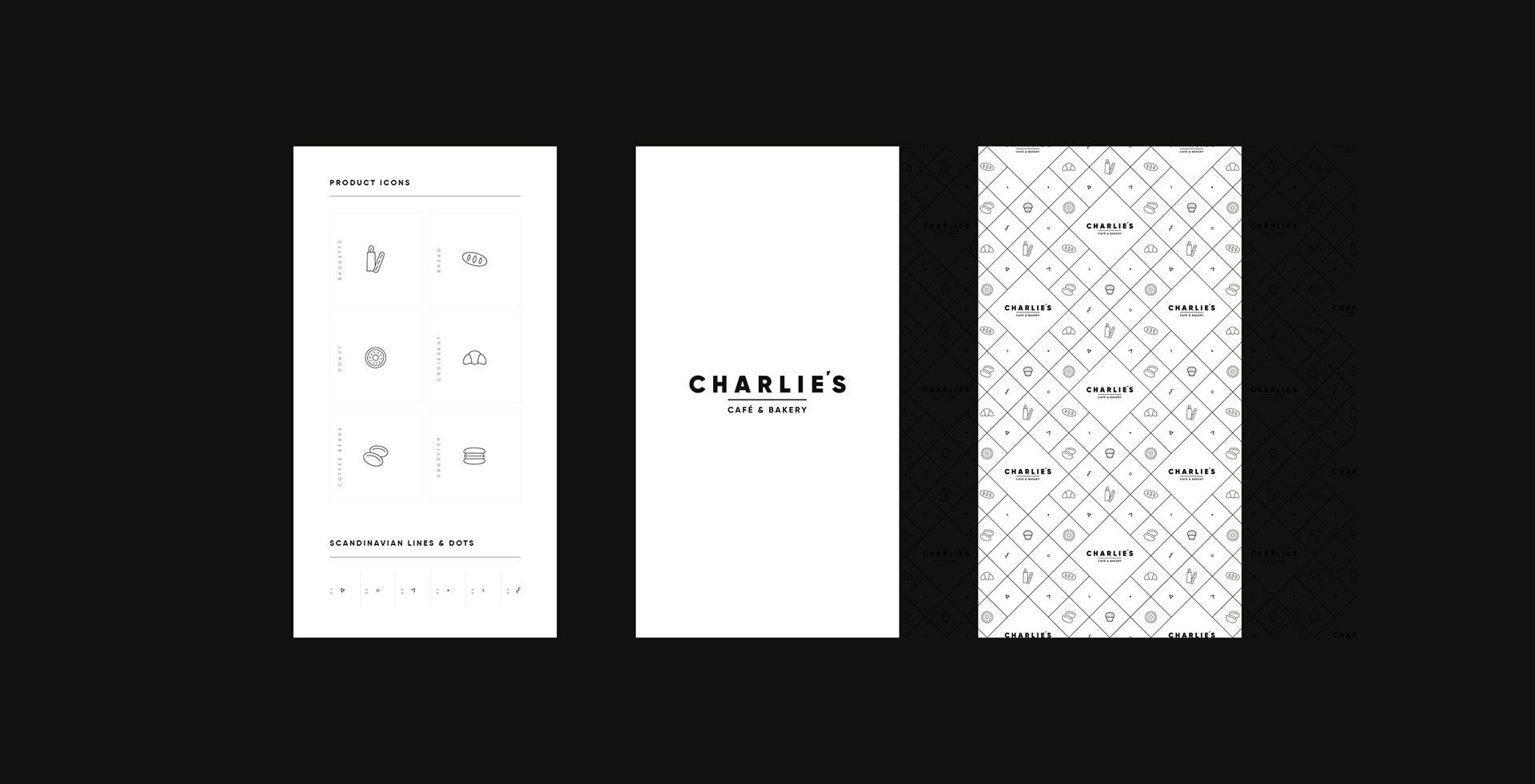
The restraint in this cafe branding is the strategy, not a shortage of ideas, and it has to hold for a cafe and a bakery at once. A bold monospaced logotype with a single underline, a palette held to black and white, and a pattern built from the product icons MarkaWorks drew: three elements, and nothing else competing with them. Monospaced letterforms give the name an even, deliberate rhythm, and the underline we added fixes it as a mark rather than a word. On a counter crowded with signage, a brand that says one thing clearly is the one that gets read.
See more coffee and tea branding case studies.
The Keywords: Classic / Bold / Affirmative / Minimal / Noticeable
These keywords guided our design process, ensuring the brand communicated strength, clarity, and a unique presence in the market.
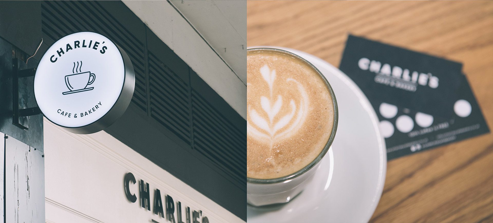
The Solution: A Unique Logotype and Colour Palette
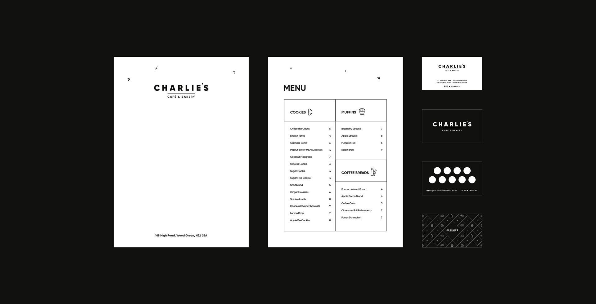
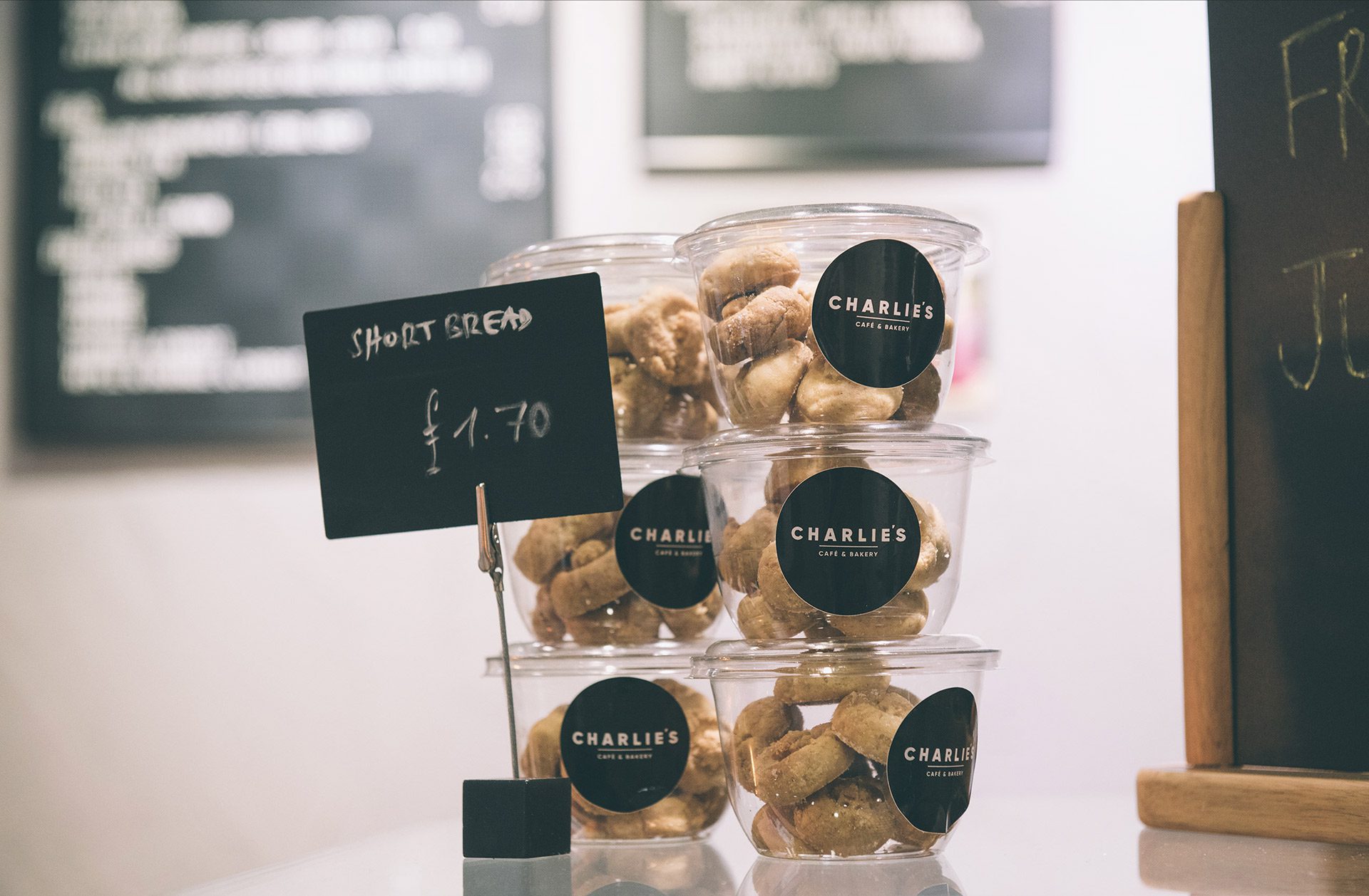
To set the brand apart from their local competitors, we decided to go with a clean and simple concept. We used a bold and monospaced font with underlining to create a unique and noticeable logotype. To keep concept clean and simple we used only black and white colour for the colour palette. At the same time, the combination of these colours gives a sophisticated and prestigious feel.

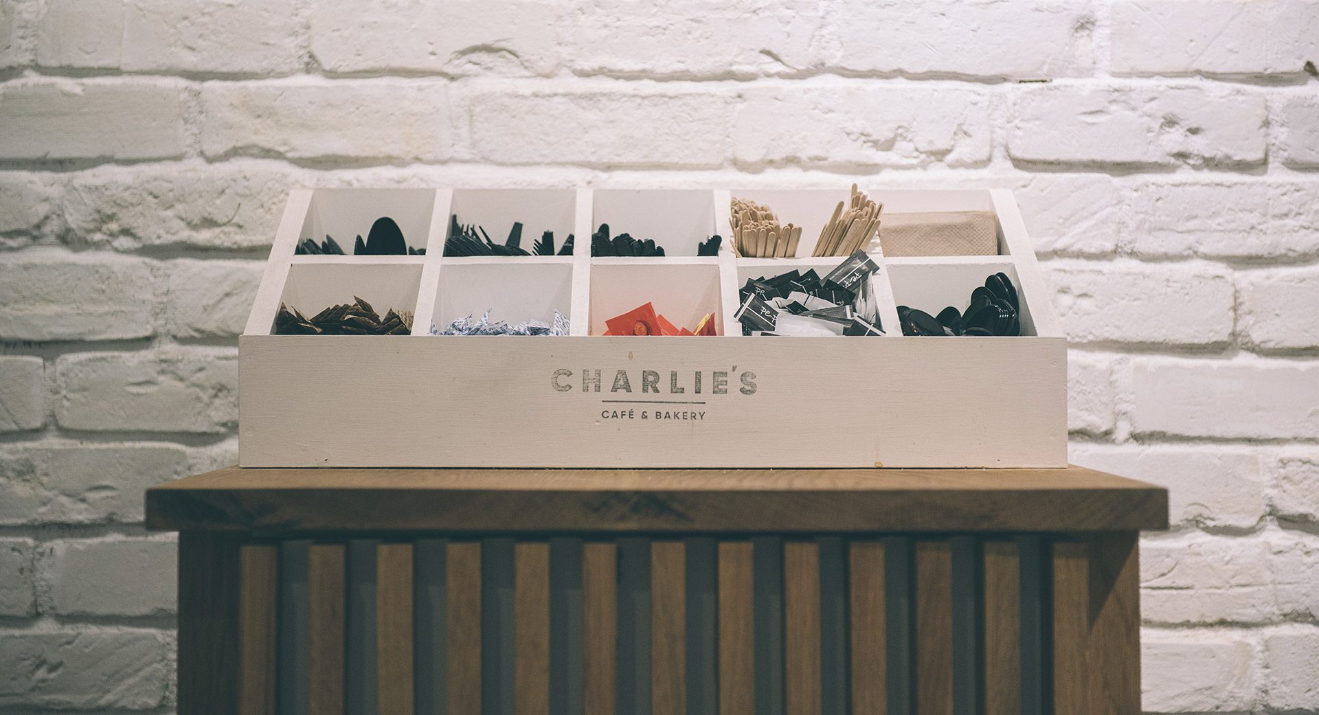
Branding Pattern Design
We have also designed a pattern out of product icons we have created for multiple purposes.

Let’s make the work they’ll copy.
Talk to an expert now
Work with a 38 team of the
industry’s top 1% talent.



