
Drop Co. Coffee Roasters
baltimore’s bold cold brew
Drop Co. Coffee Roasters offers a bold, timeless brand identity designed to capture the vibrant spirit of Baltimore’s coffee scene. MARKAWORKS crafted a modern look with a striking colour palette and distinctive typography, perfect for their signature cold brew and the urban explorer.

A Bold and Timeless Brand Identity for Drop Co.
Our approach to Drop Co. Coffee Roasters focused on creating a modern and professional brand identity that reflects their unique offerings and target audience. We incorporated bold typography, a vibrant colour palette, and distinctive design elements to ensure a memorable and impactful presence.
See more coffee and tea branding case studies.
The Client & Their Vision
Drop Co. is a coffee house based in Baltimore, Maryland. They also offer a cold brew coffee in a glass bottle, so their customers can grab a cold coffee and continue their walk in the hot weather while enjoying their coffee.
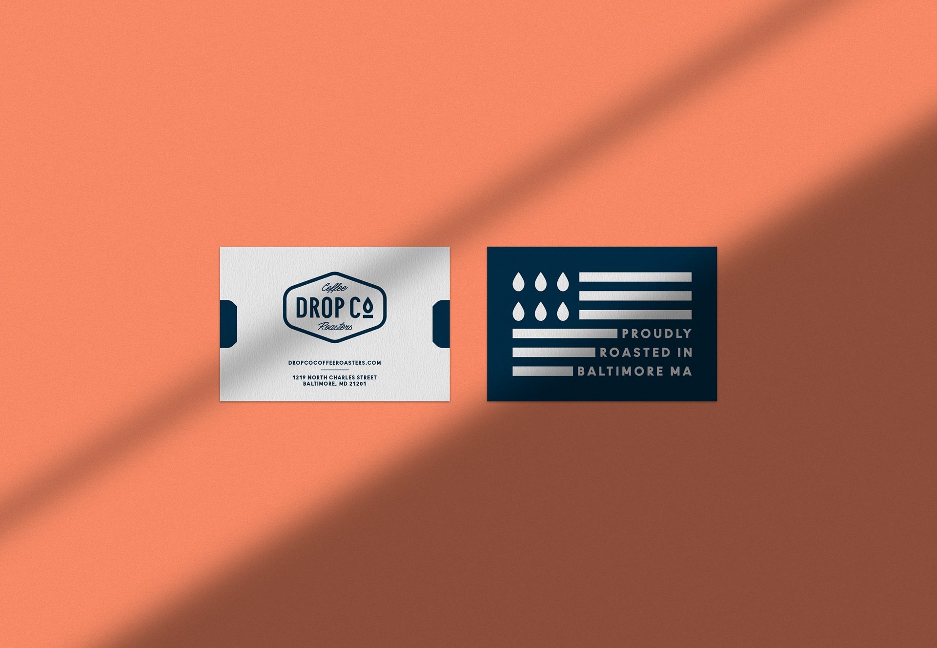


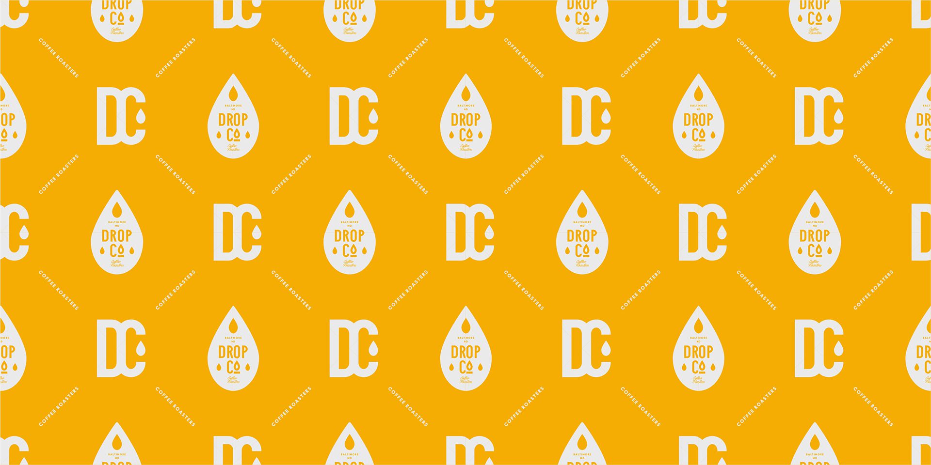

Keywords: Modern / Colourful / Associative / Bold
These keywords guided our design process, ensuring that the final brand identity was contemporary, visually engaging, and communicated a strong, memorable message.
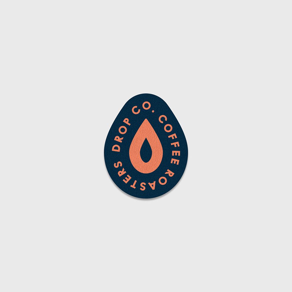
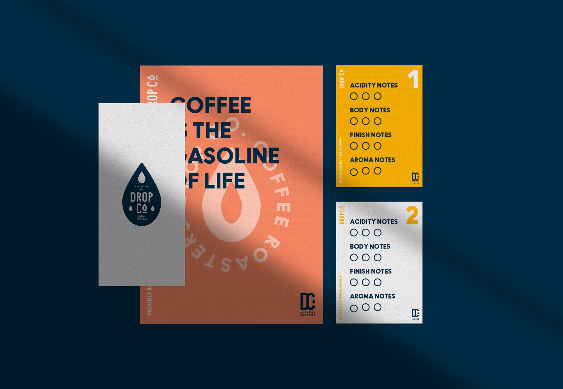
The Solution: Logo Design & Typography
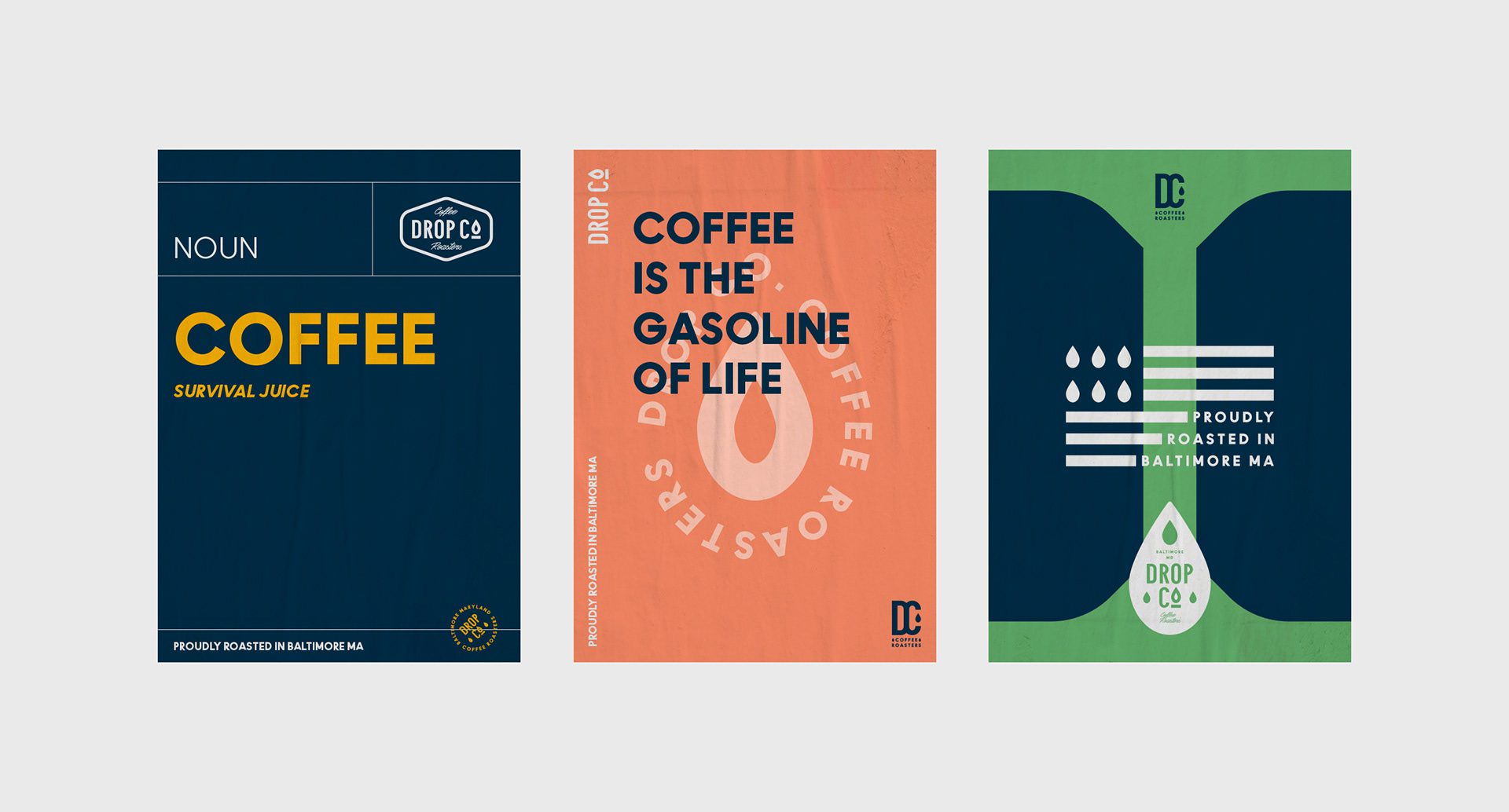
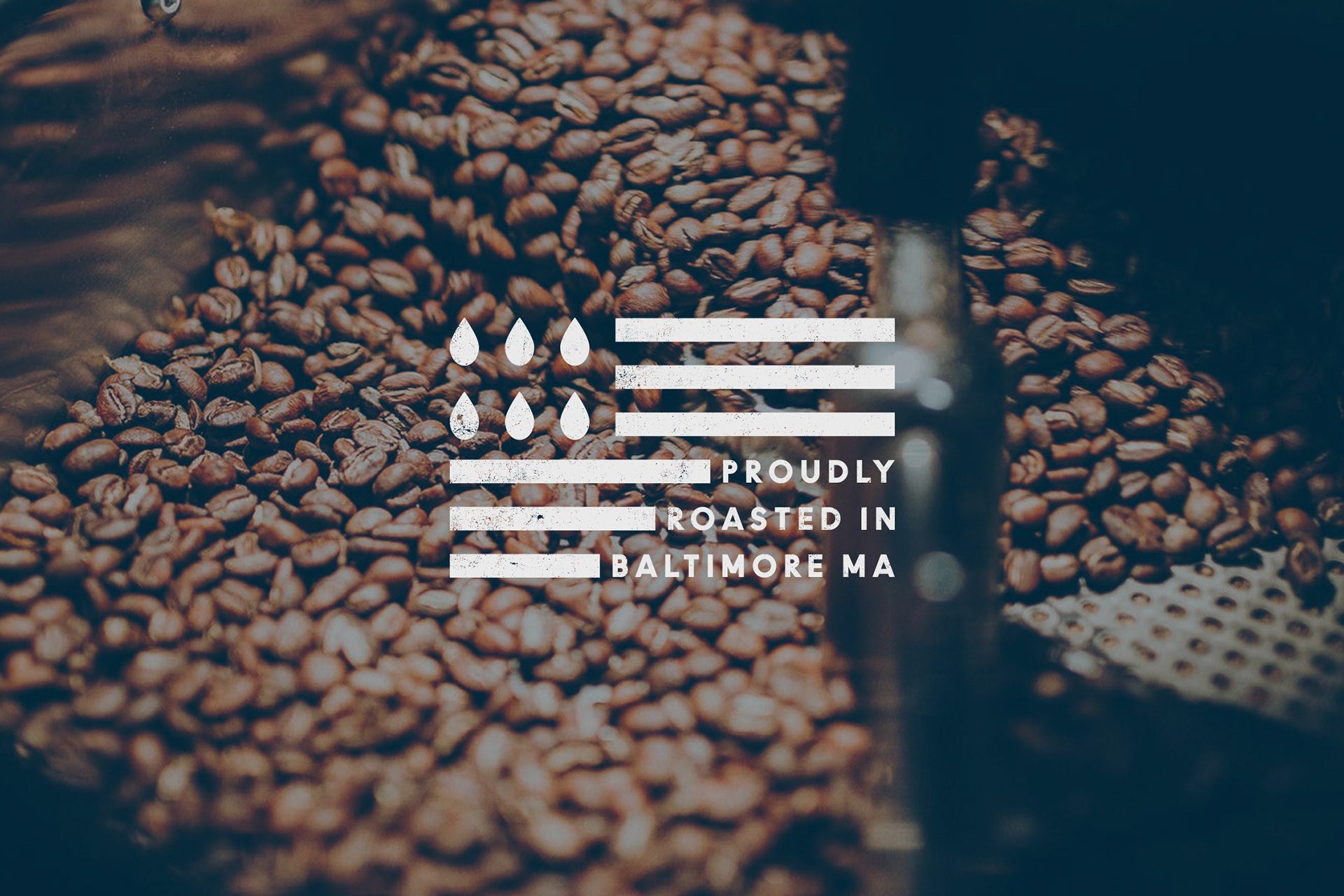
We prepared a modern and professional logo design, including a drop as a part of the highlight. We picked sans serif to give the classic look; we chose it to create a timeless feel. At the same time, we included the “Coffee Roasters” in a script font. To create a remarkable look, we have also created the secondary marks and monogram.
Colour Palette & Brand Association
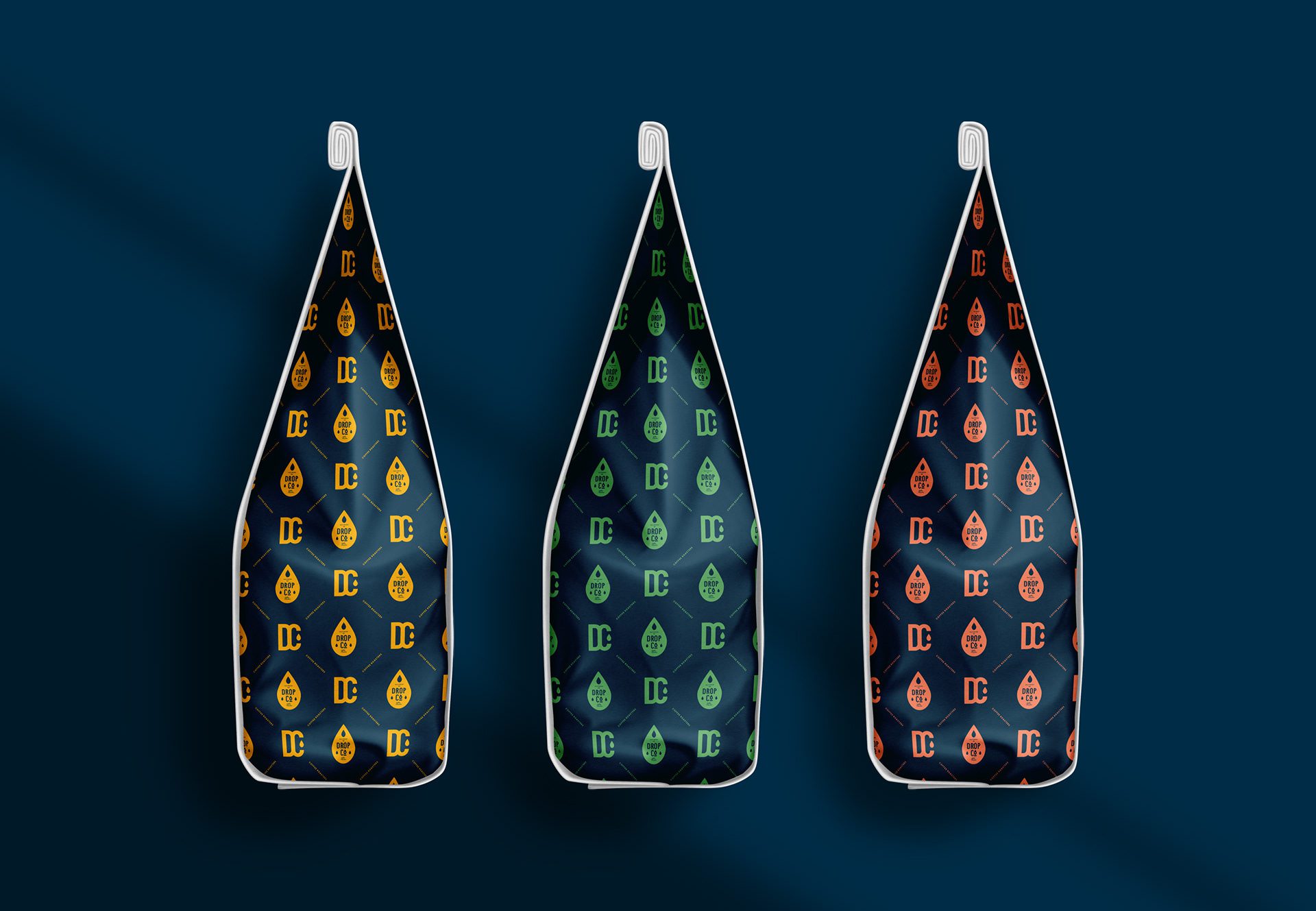
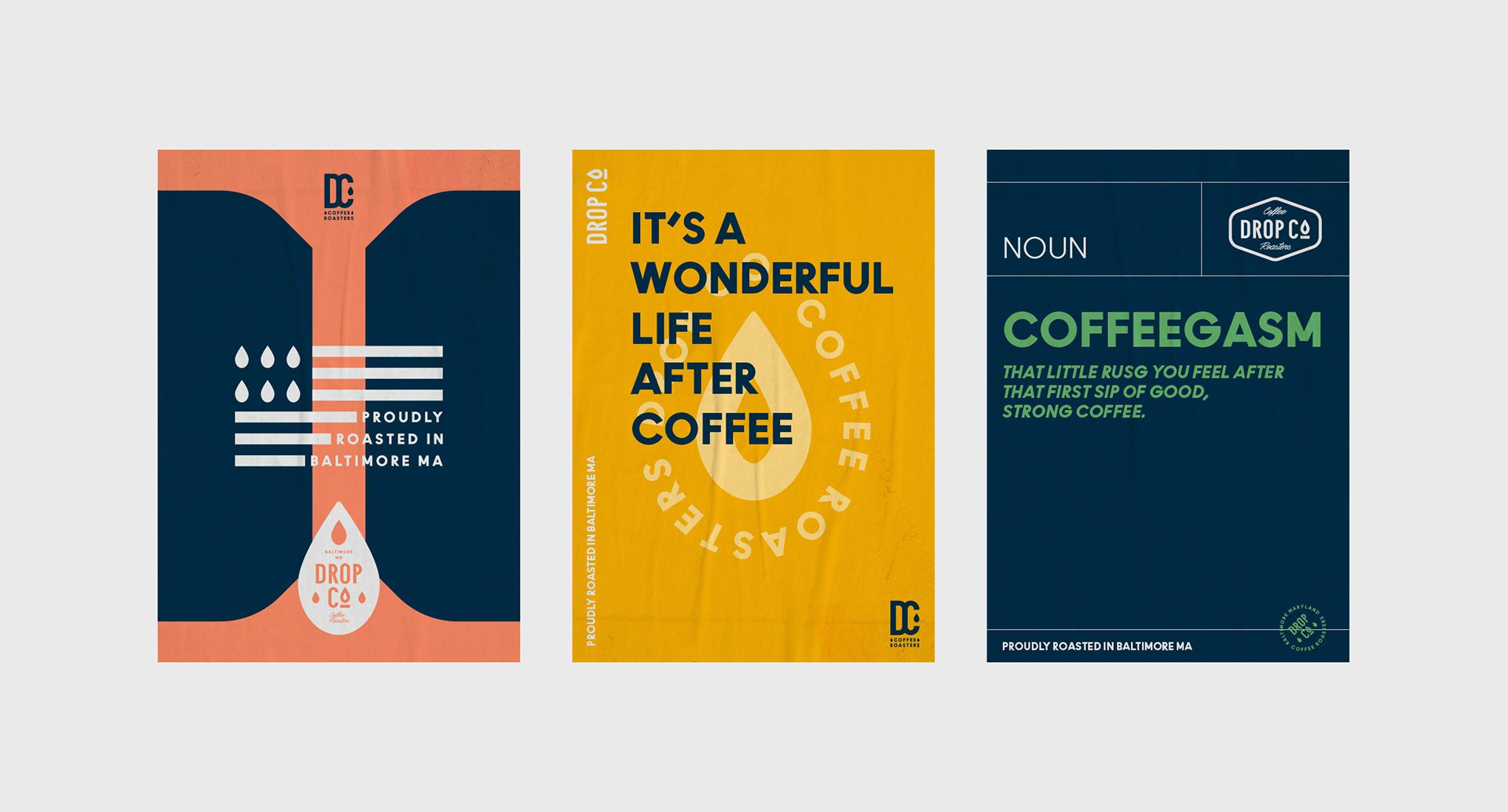
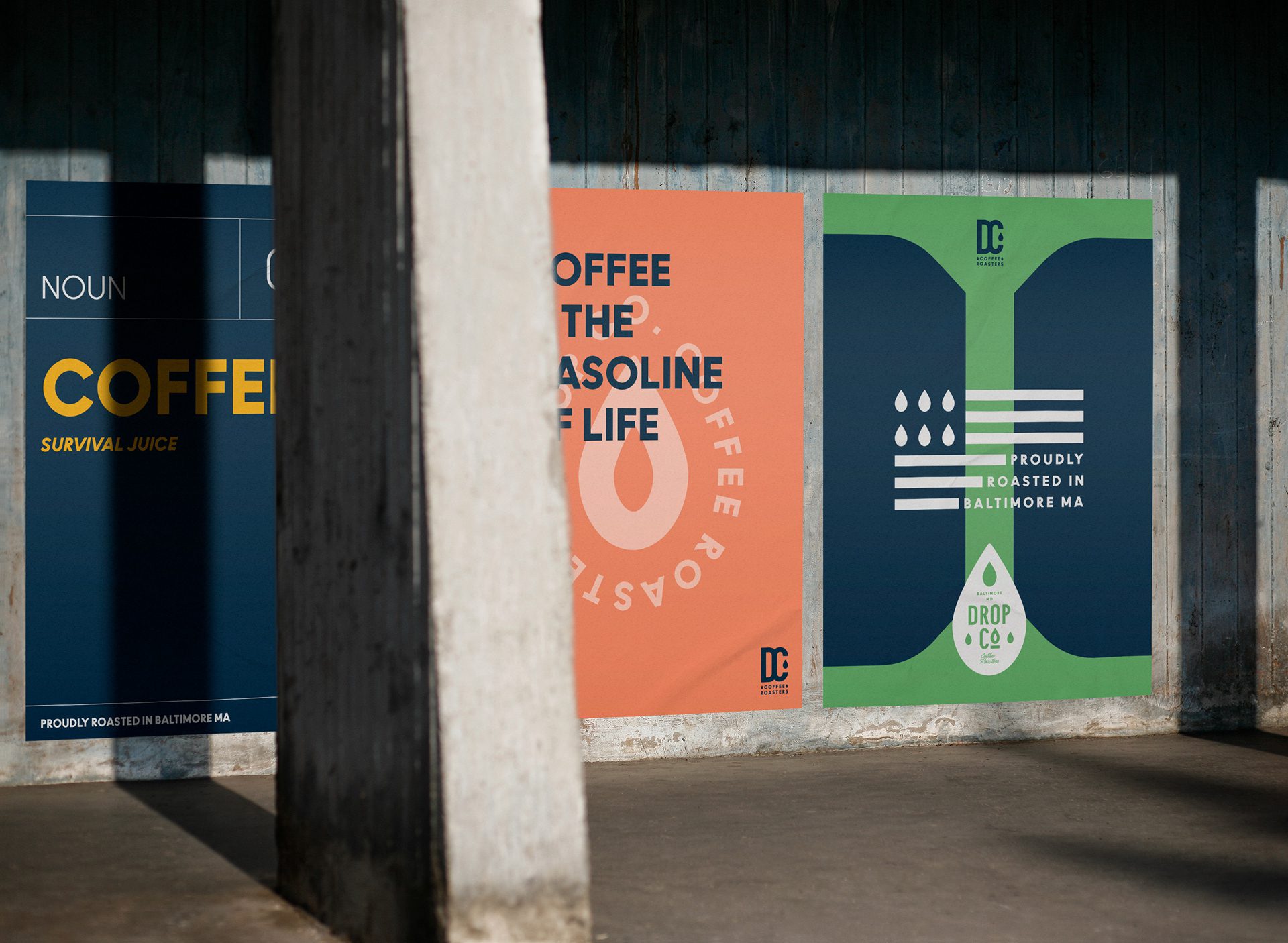
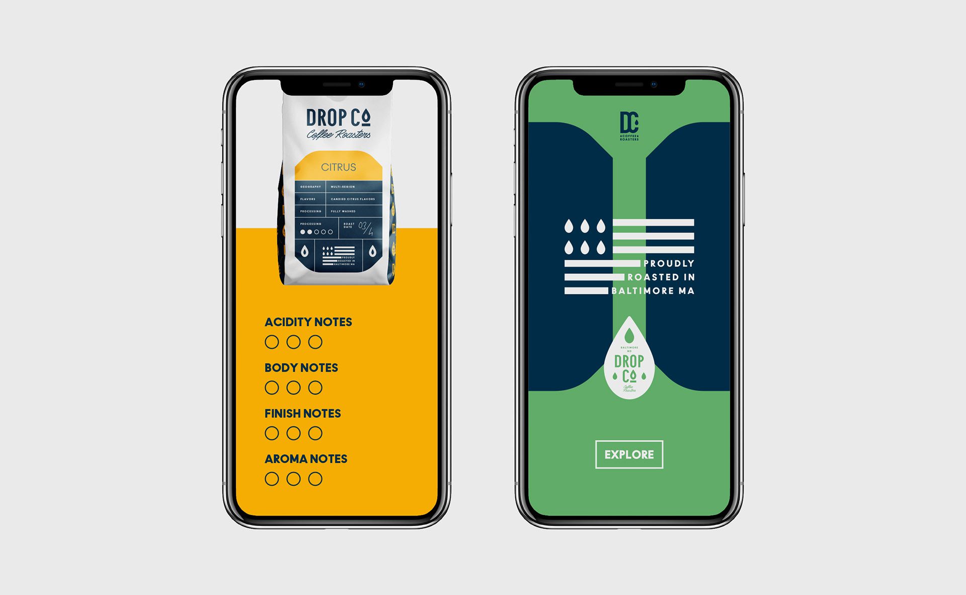
The colour palette consists of the vibrant blue, as it gives a professional look, and the set of soft green, peach and yellow colours. Each colour is assigned to different flavours and their associations. As a main background, we selected a whitish colour, which in combination with blue gives not only a professional look, but prestige feel as well.

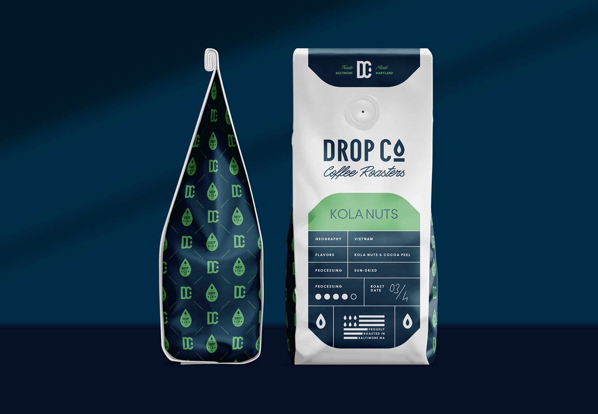
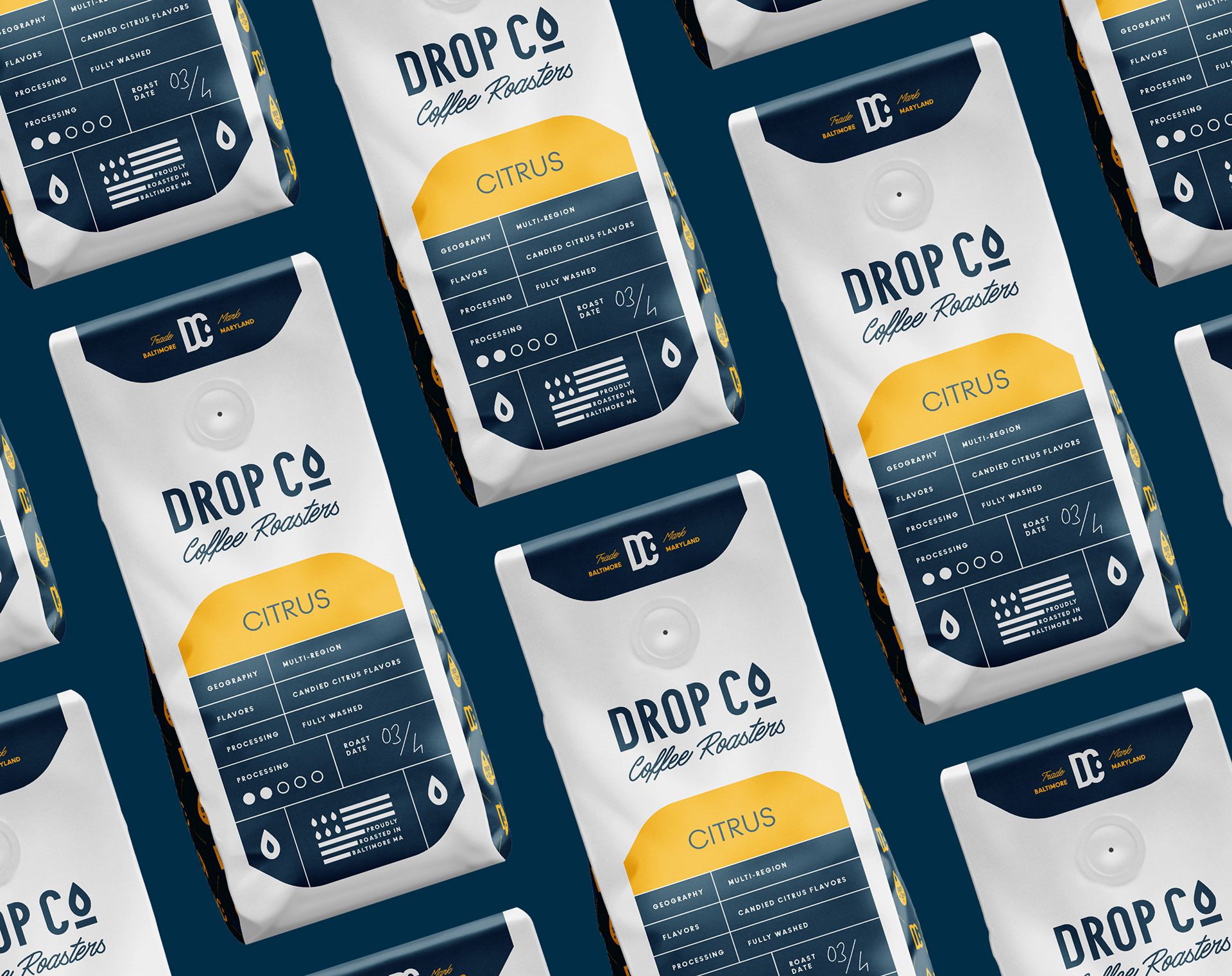
Packaging Design: Classic Style with a Modern Twist
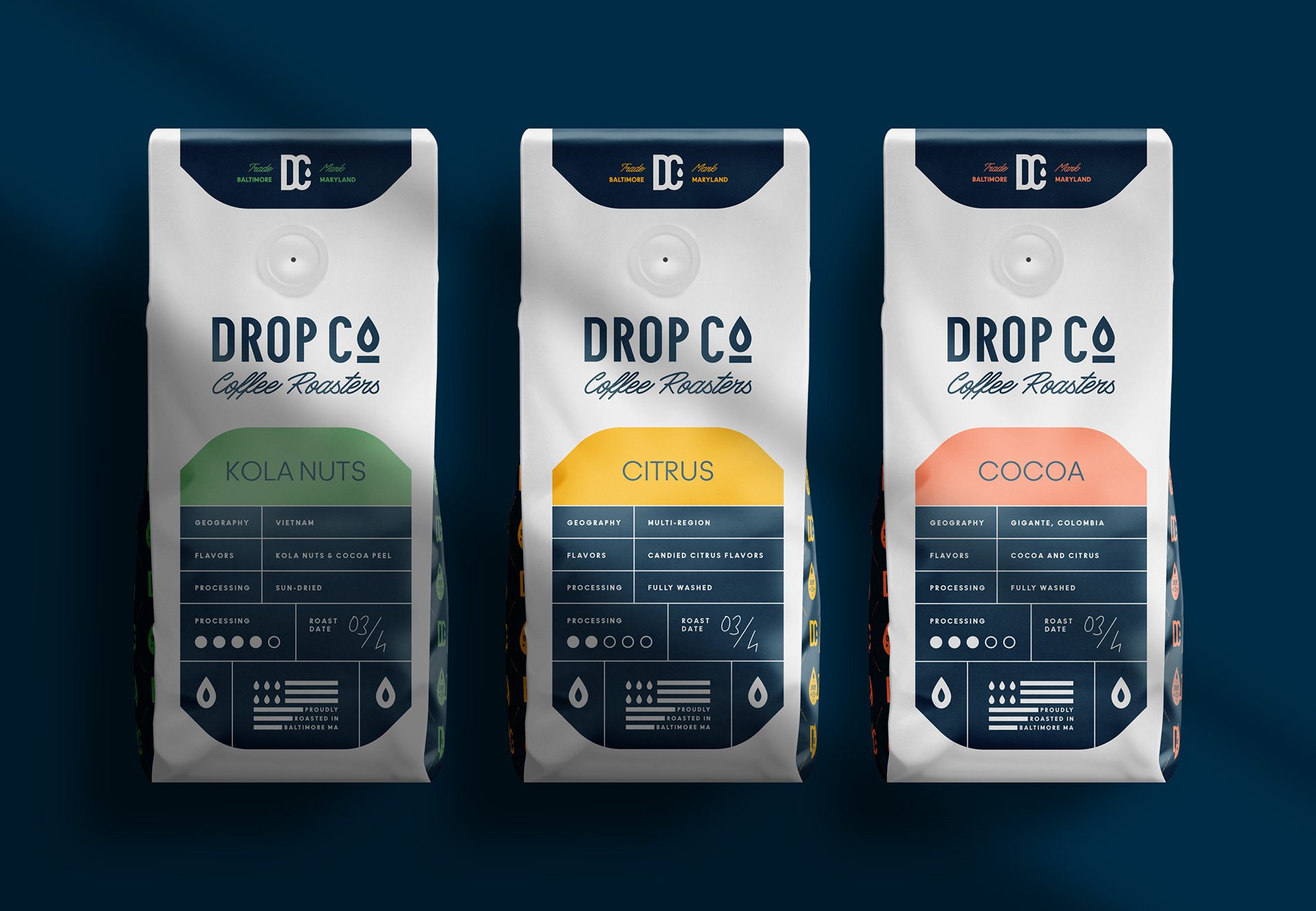
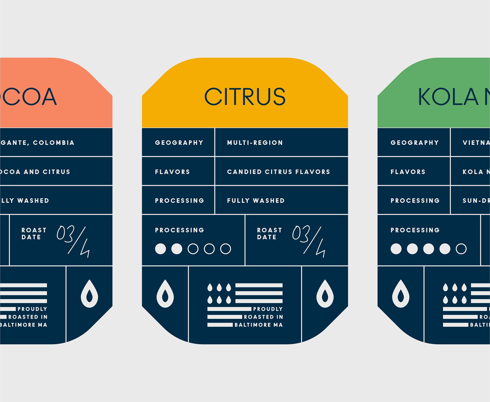
The packaging we designed is made in classic style, with a white background and a blue label. The flavour part is separated by its own special colour box. The logo was placed right above the label, and at the top part of the packaging, we placed the monogram. As for the layout, we placed the main information such as processing, geography, processing and flavours.
Cold Brew Coffee Label Design
We have also designed the label for the cold brew coffee in a glass bottle, which is fully covered with the special flavour colour and has a simple design. We placed the logotype’s half on the label and the other half on the bottle itself for the impression of energy fulfilment.
Additional Deliverables
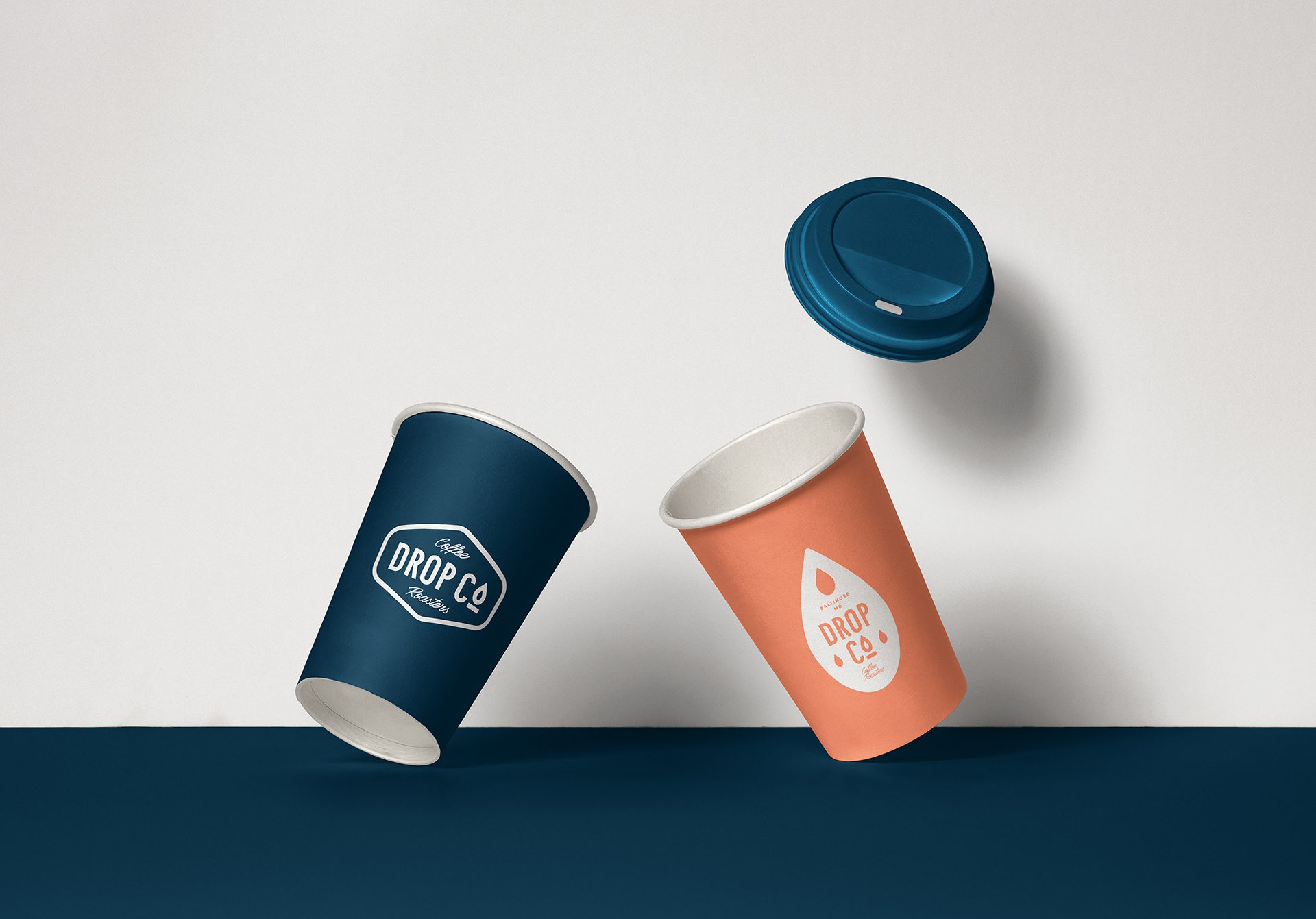
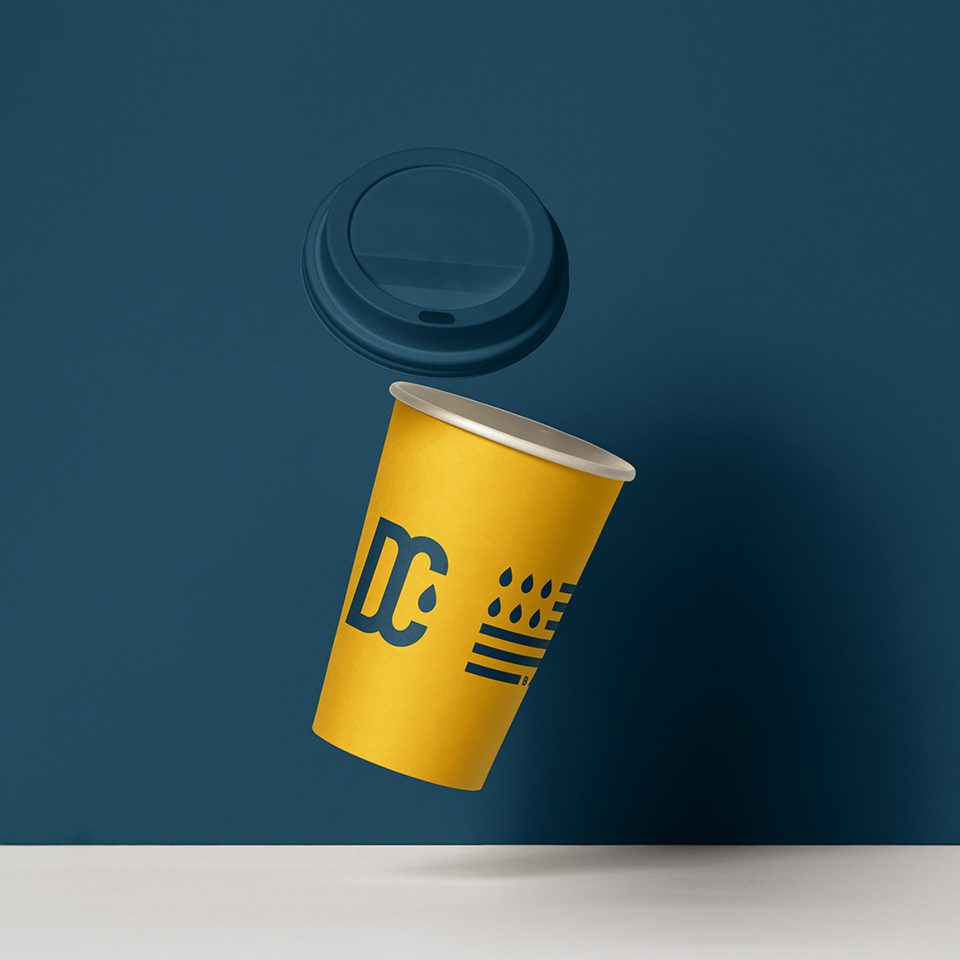
In addition, we created coffee cup designs, 3D models, and social media content.

Let’s make the work they’ll copy.
Talk to an expert now
Work with a 38 team of the
industry’s top 1% talent.



