Drypt
Specialty Coffee Brand Identity & Visual System
Drypt was created for a specialty coffee brand that believes great coffee is built on consistency, quality, and everyday rituals.
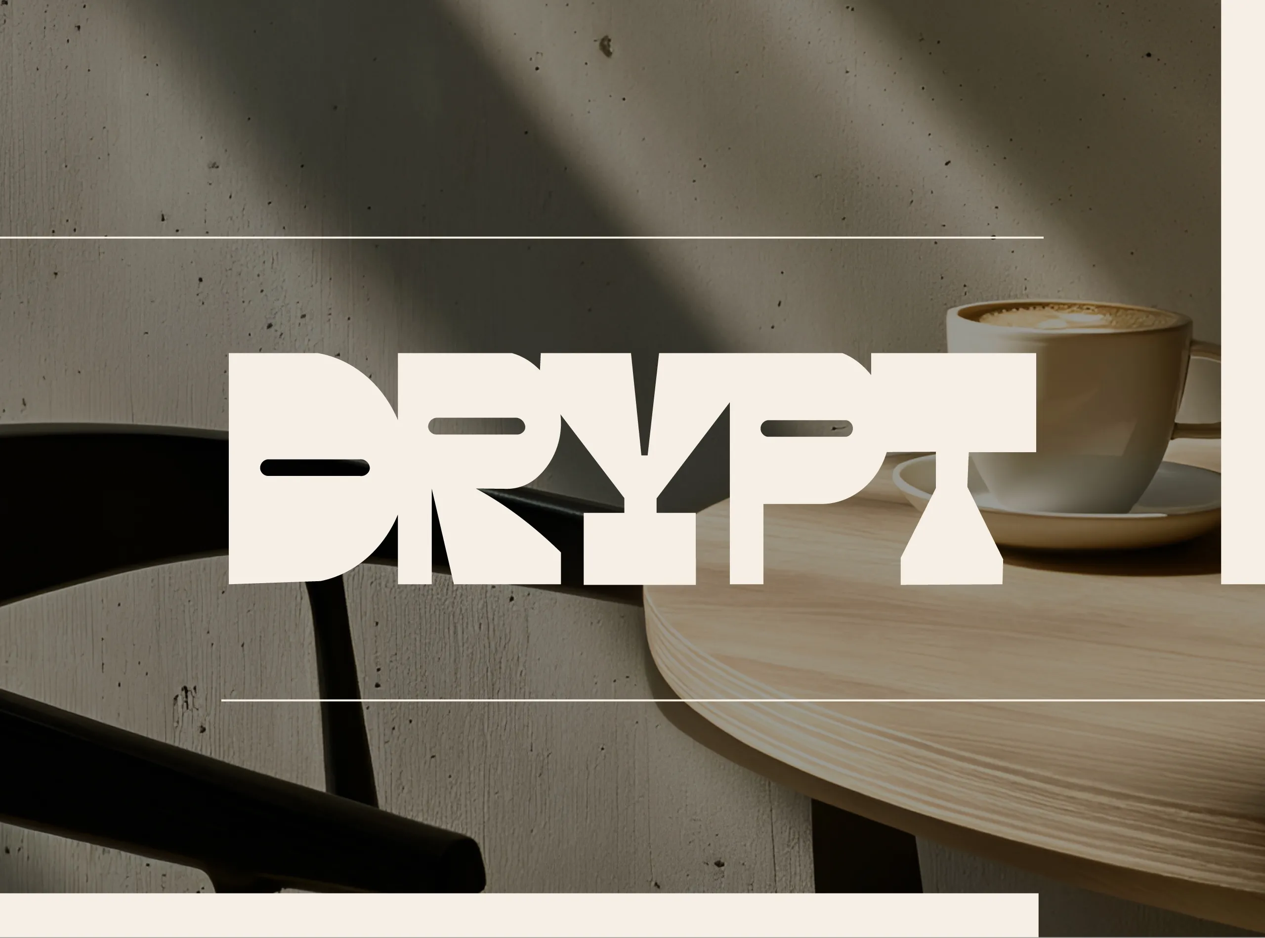
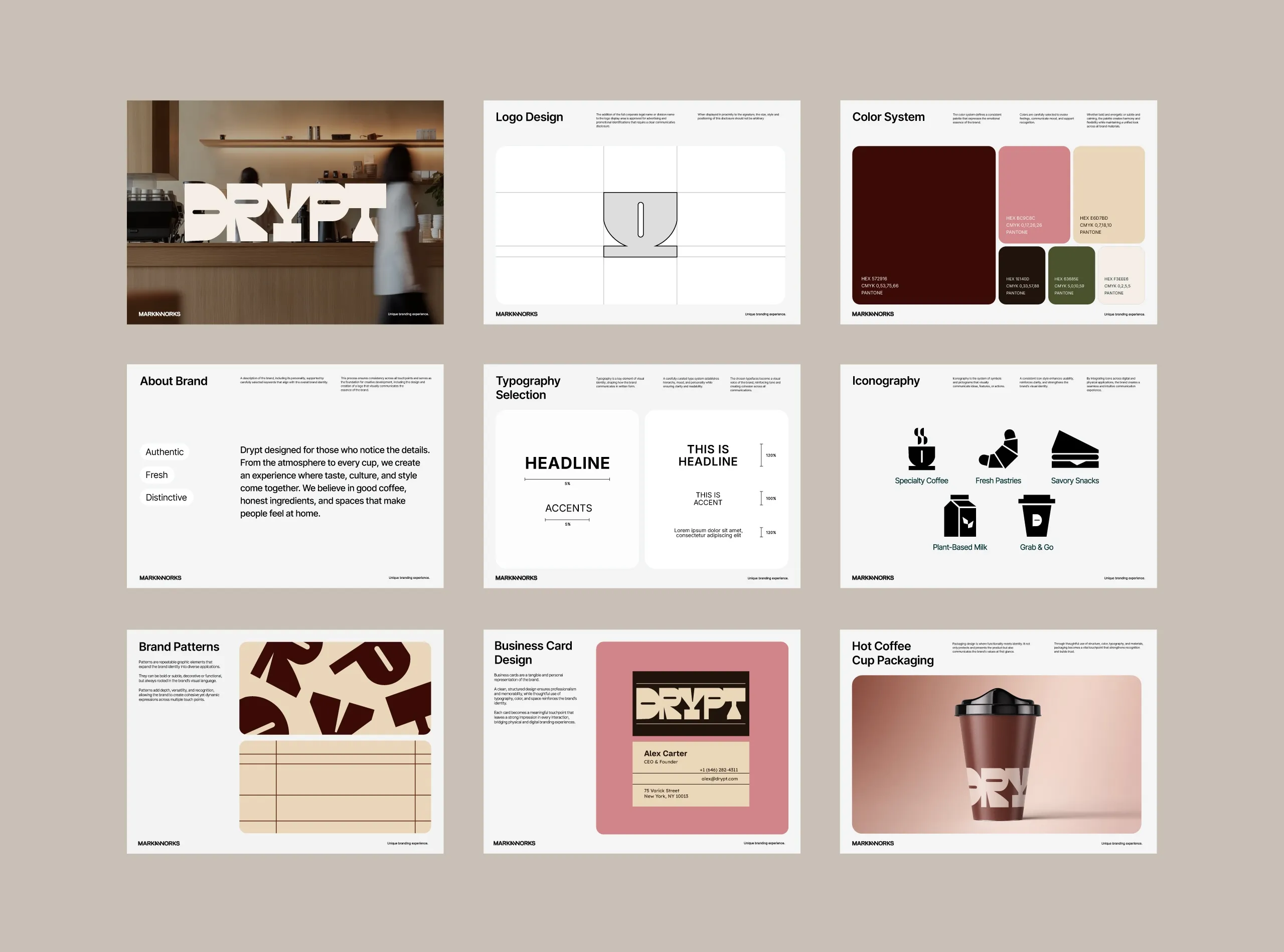
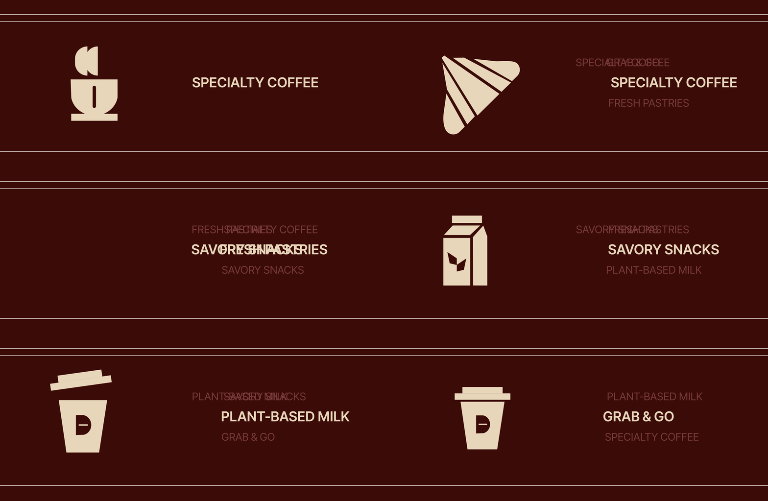
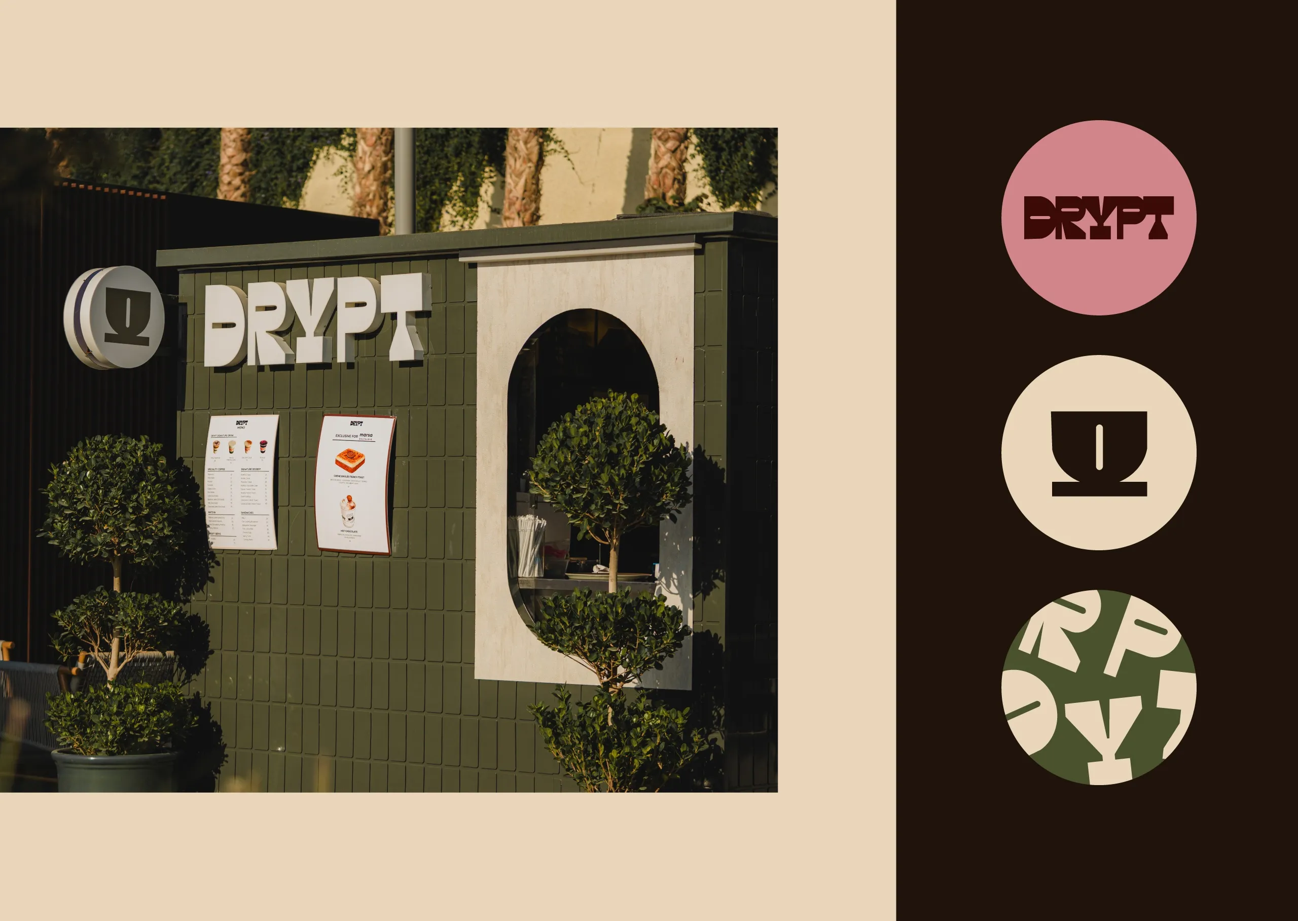
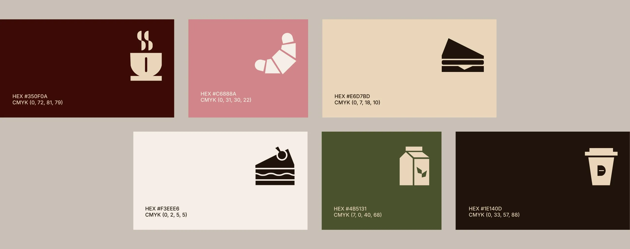
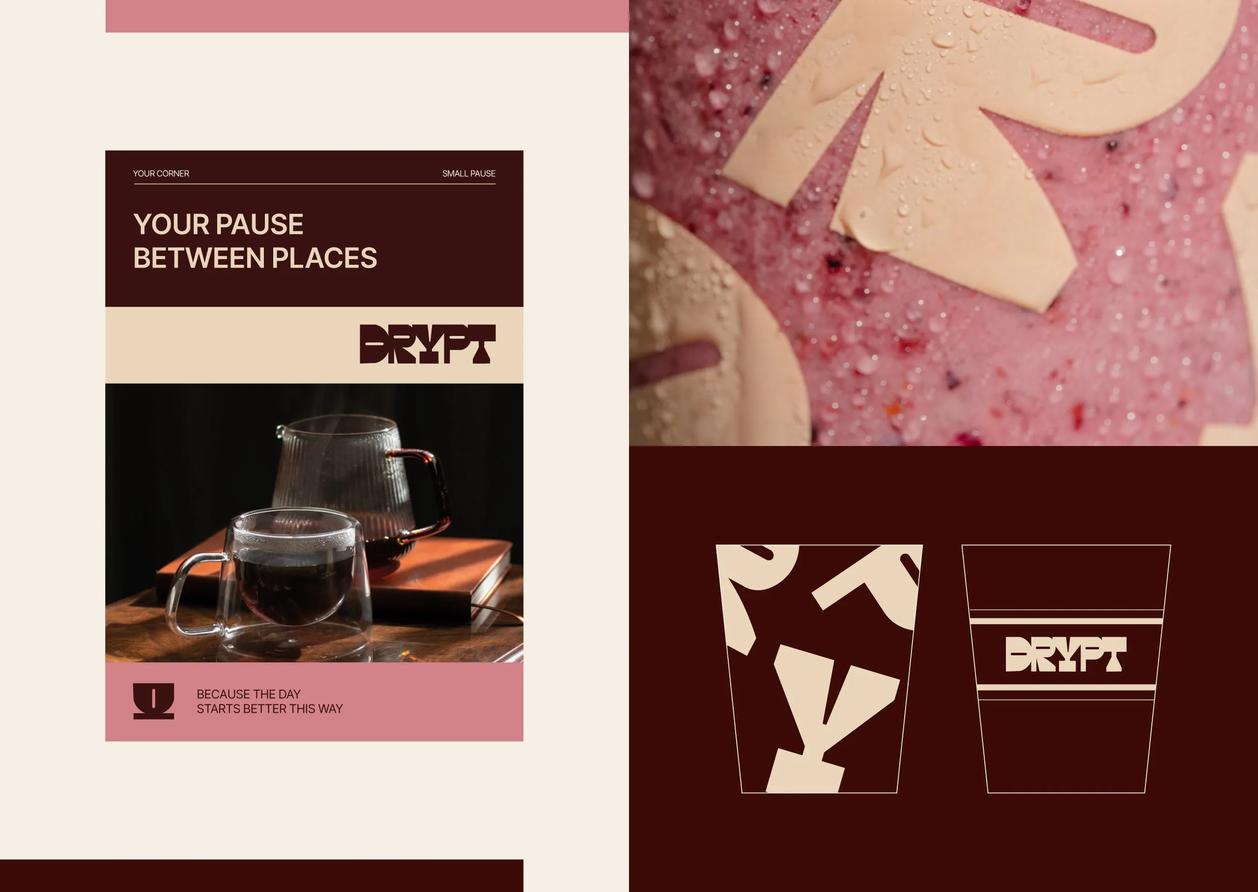
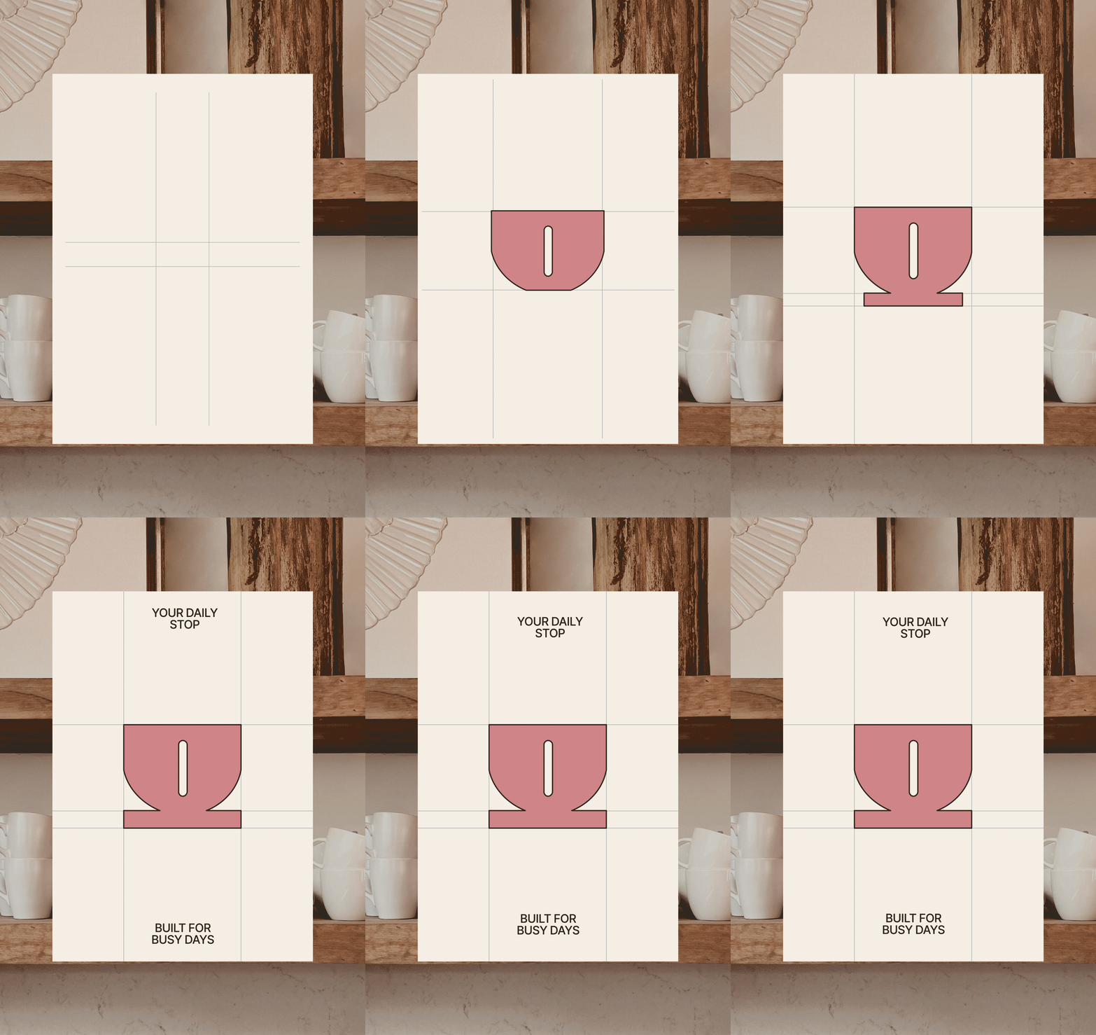
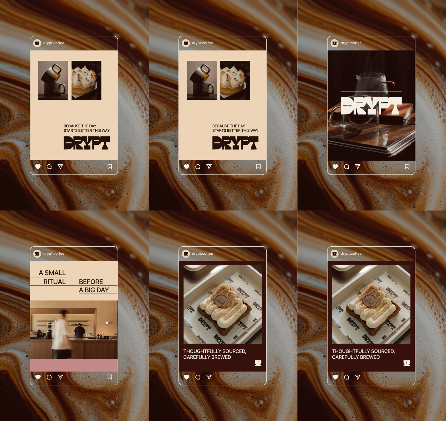
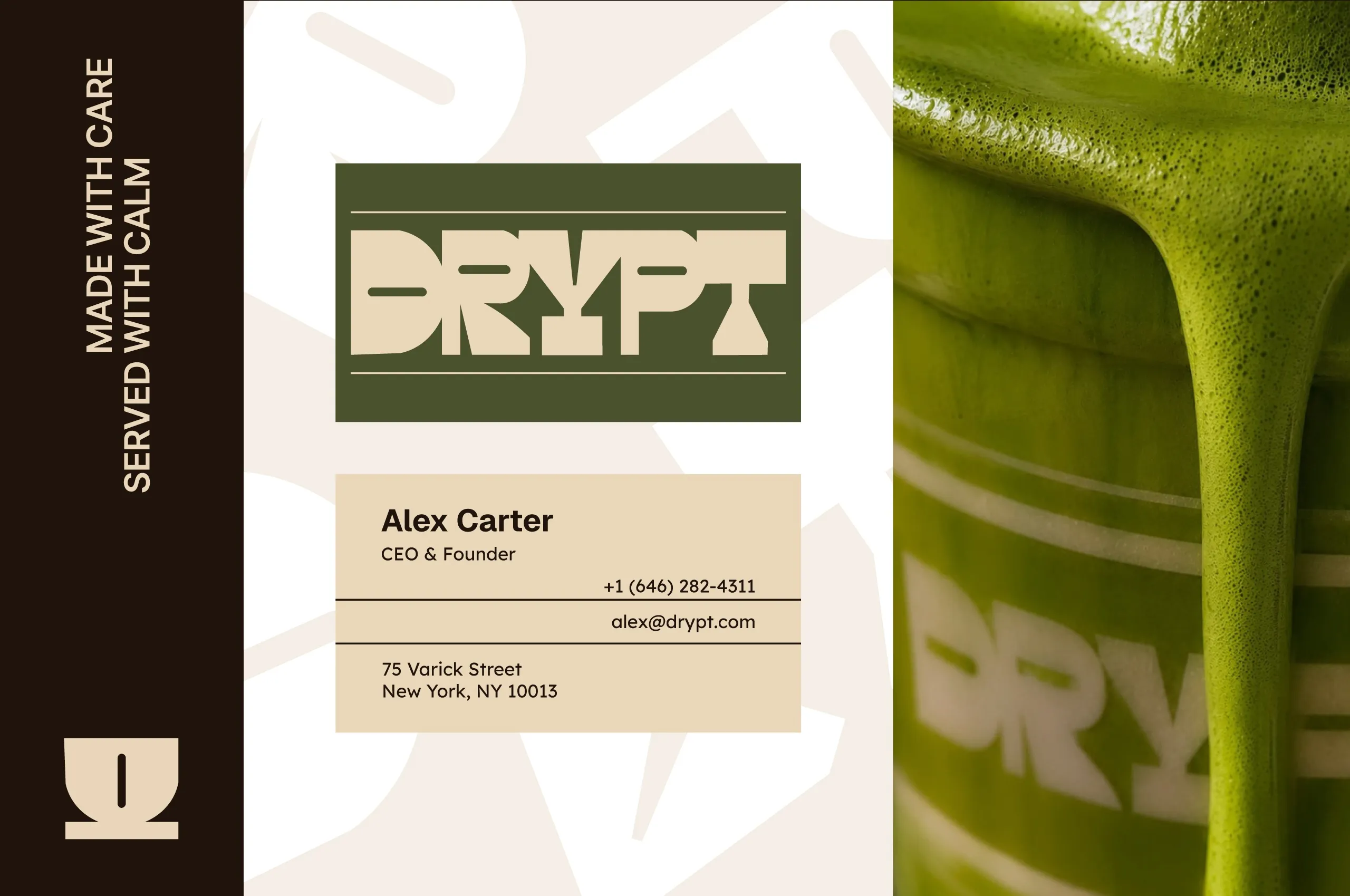
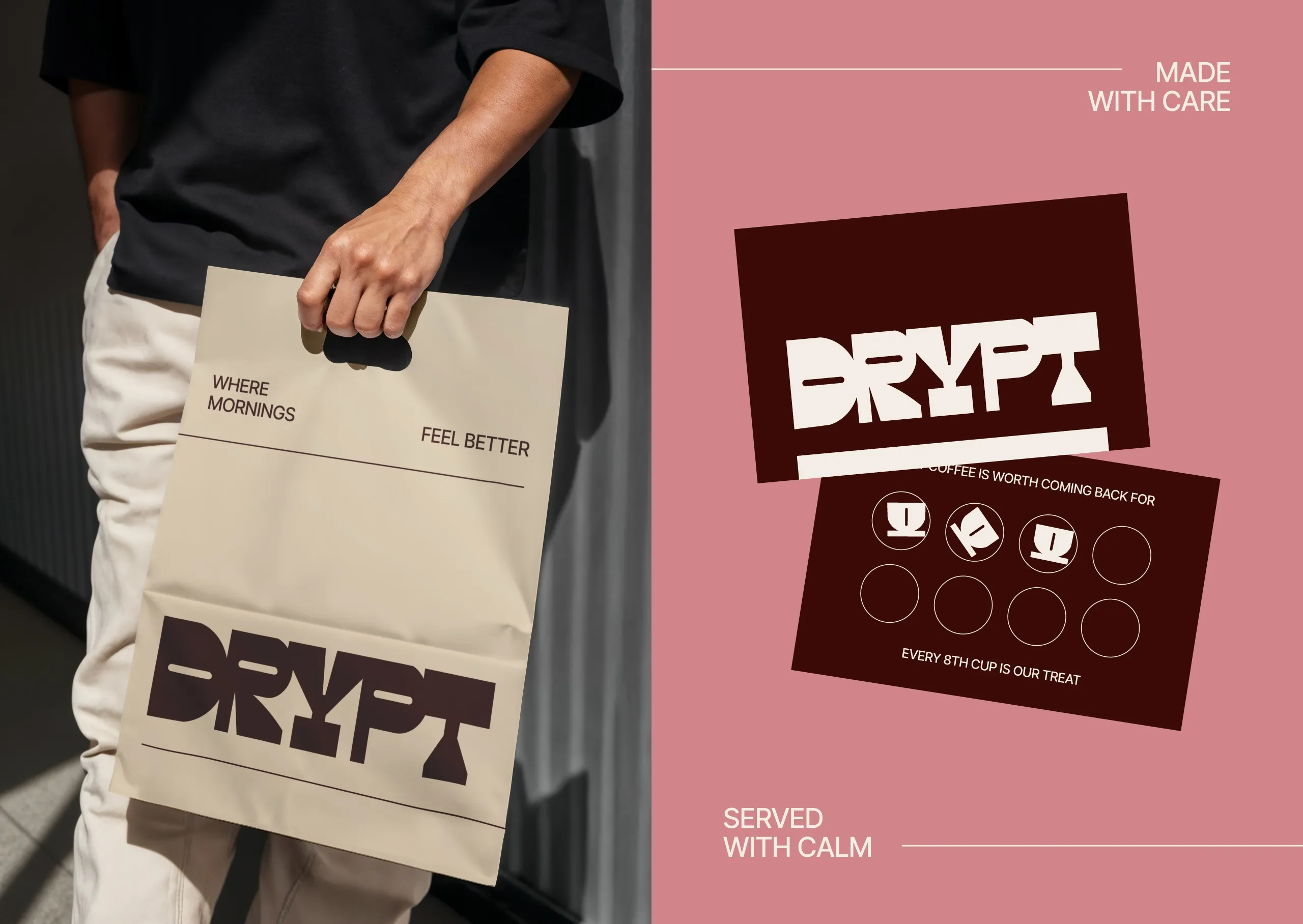
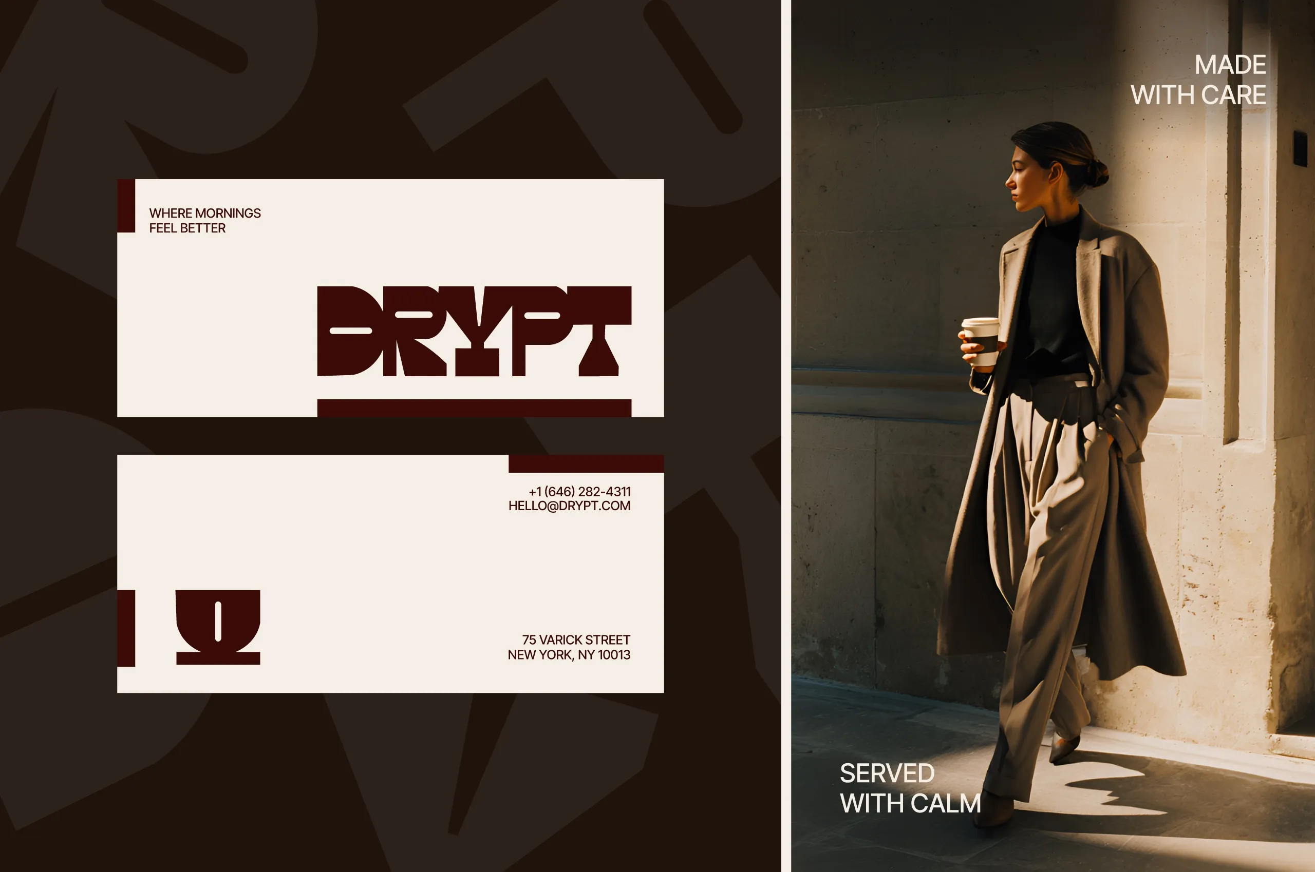
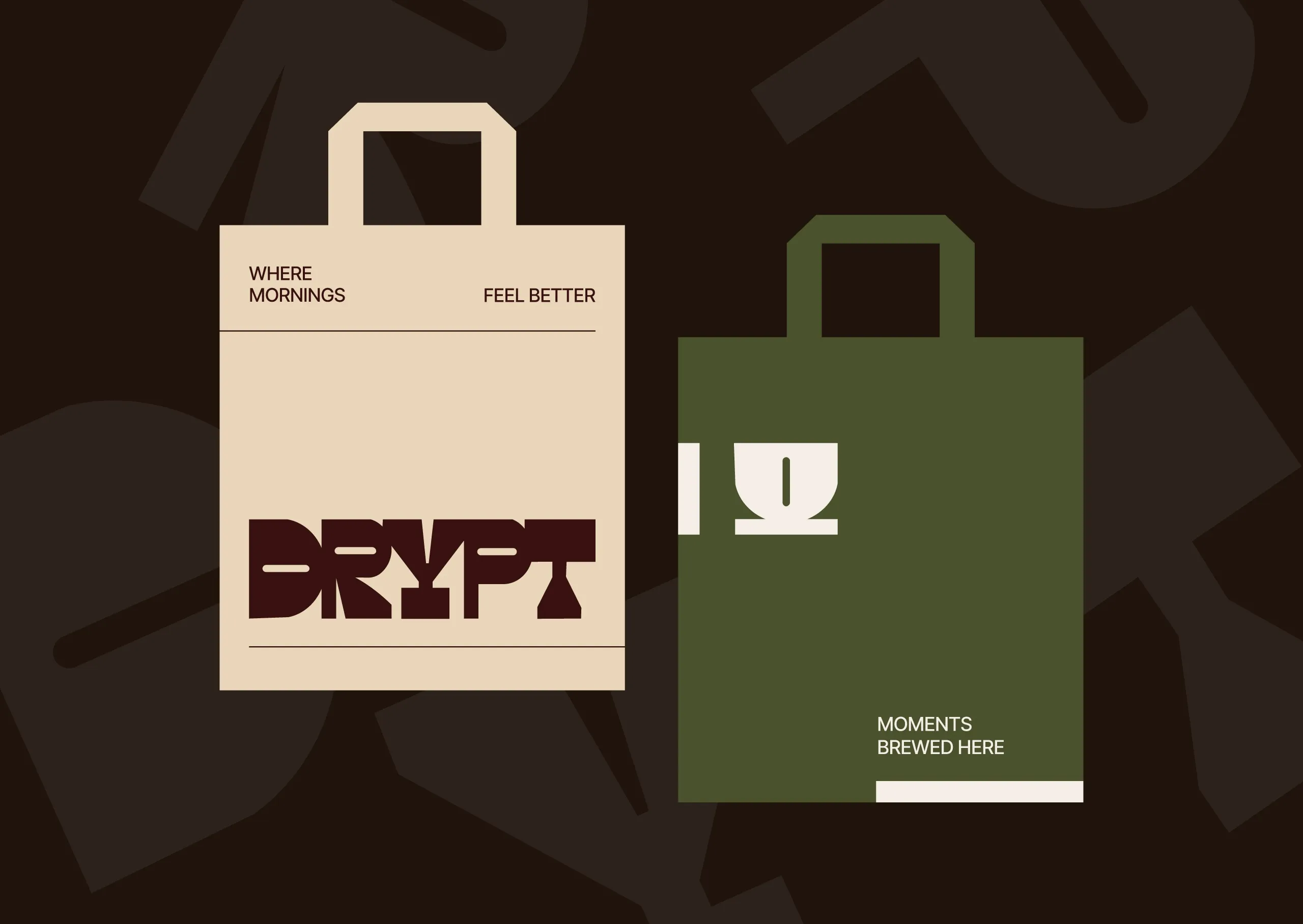
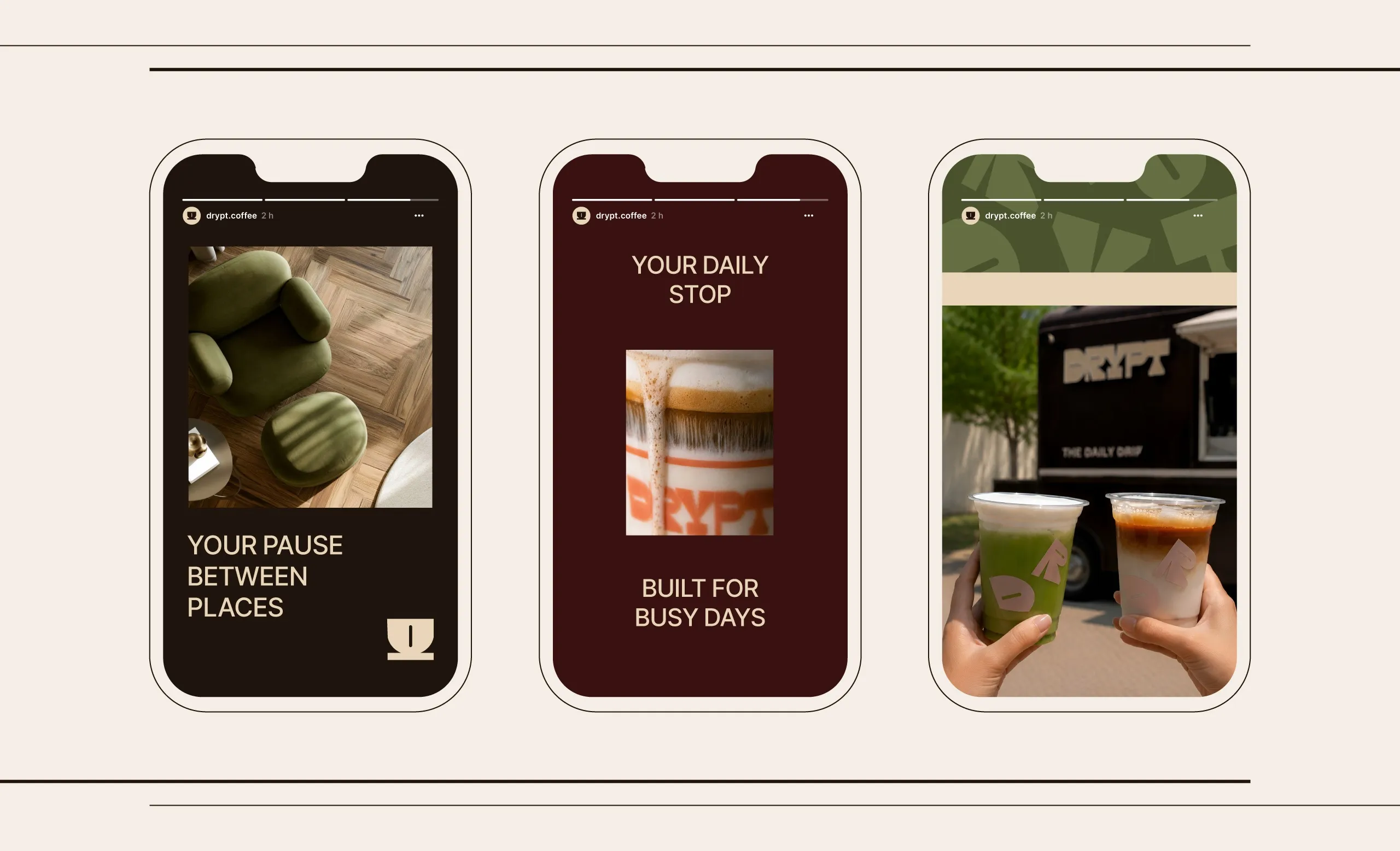
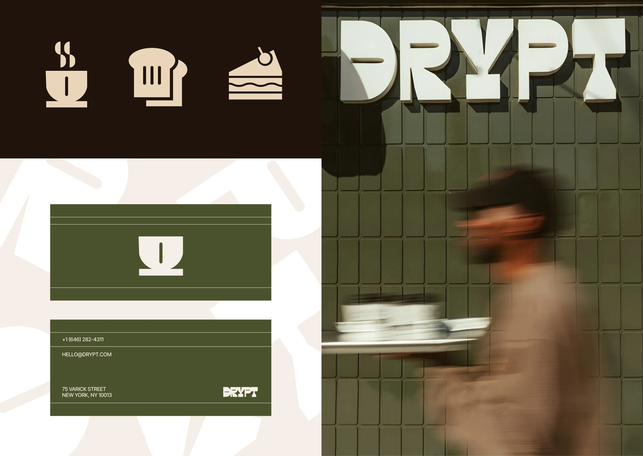
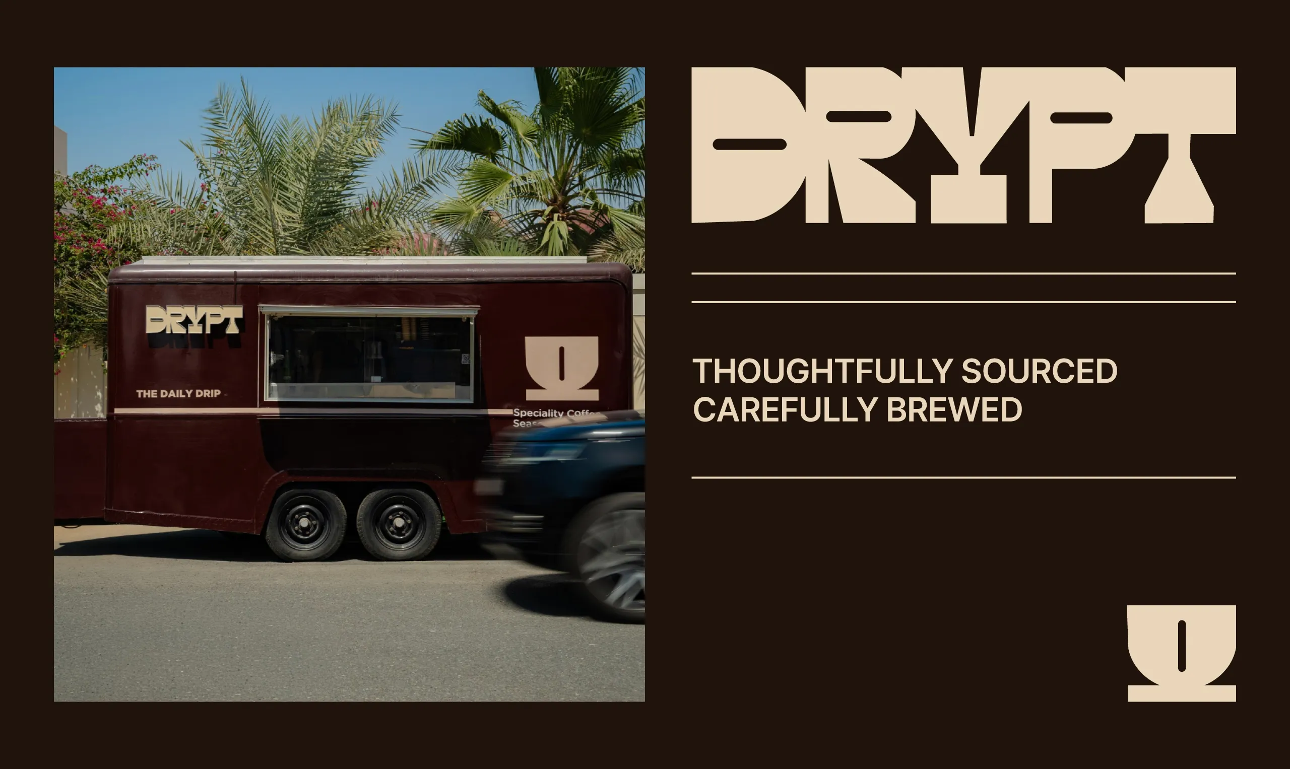
What holds this coffee branding together is the emblem, and Drypt is a specialty roaster, so the mark carries a category that is crowded with sameness. MarkaWorks designed it to be the brand’s most recognizable asset, and its bold geometric construction is what lets it survive scale: the same mark works cut into signage, printed small on a bag, stitched into merchandise, and cropped for a profile picture. The icon set, the graphic patterns, and the palette described above we built around it as a system rather than as separate assets, which is what keeps every touchpoint recognizably Drypt.
Drypt was created for a specialty coffee brand that believes great coffee is built on consistency, quality, and everyday rituals. Rather than following familiar café aesthetics, the goal was to create an identity with a stronger presence, one that feels memorable, approachable, and timeless.
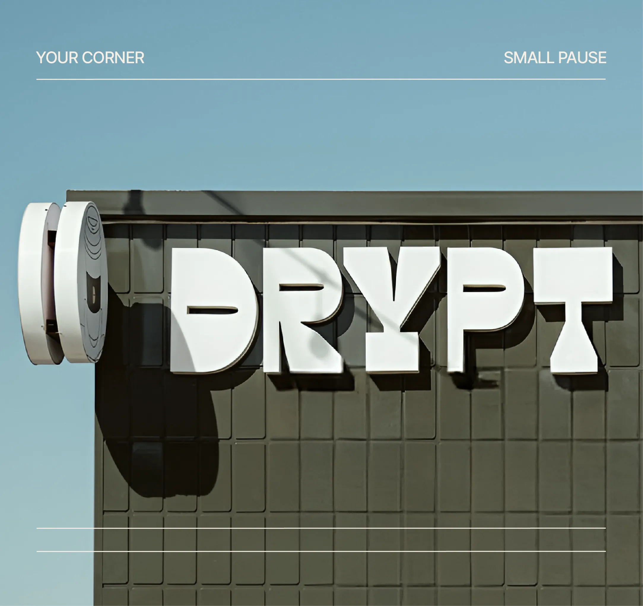
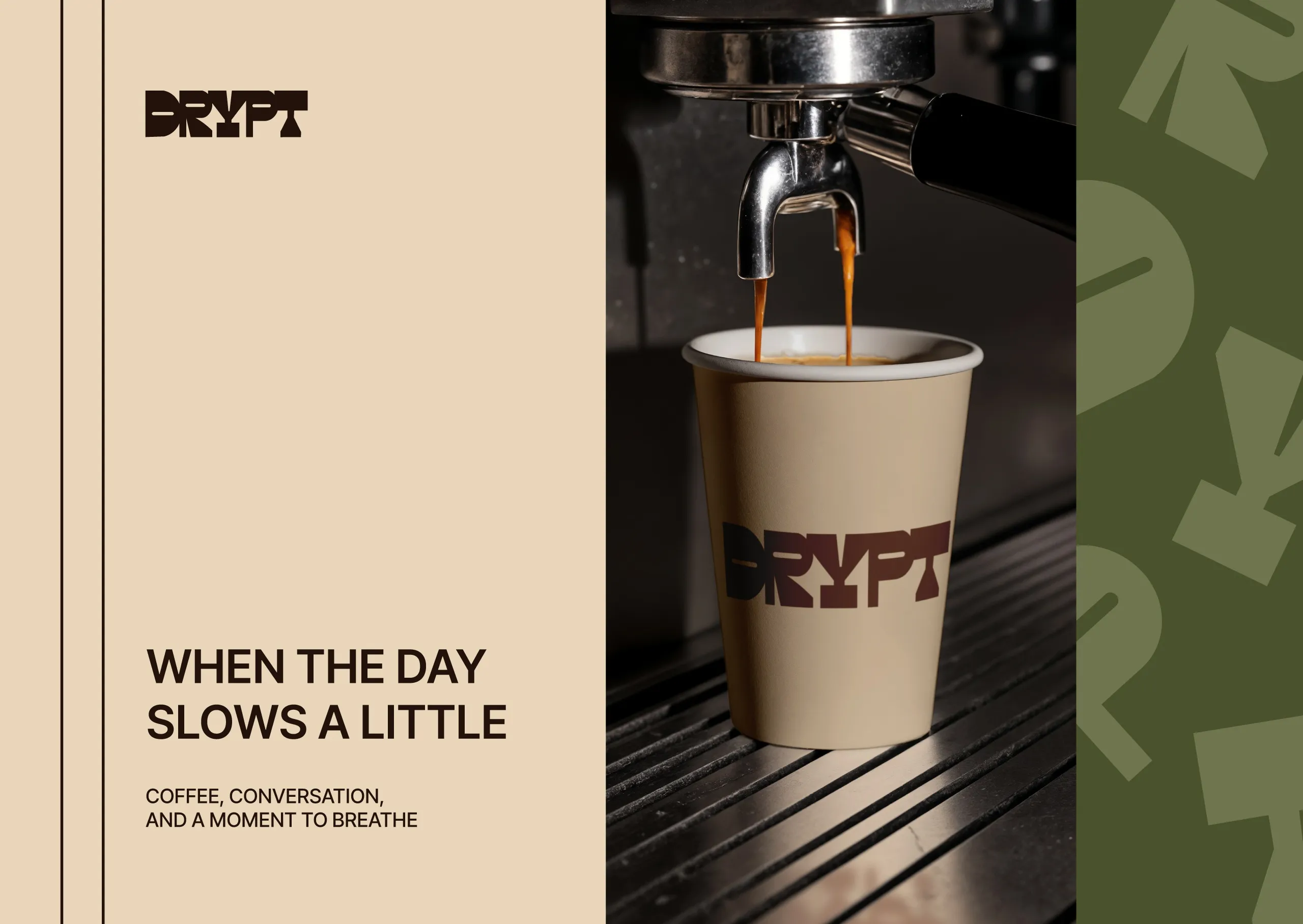
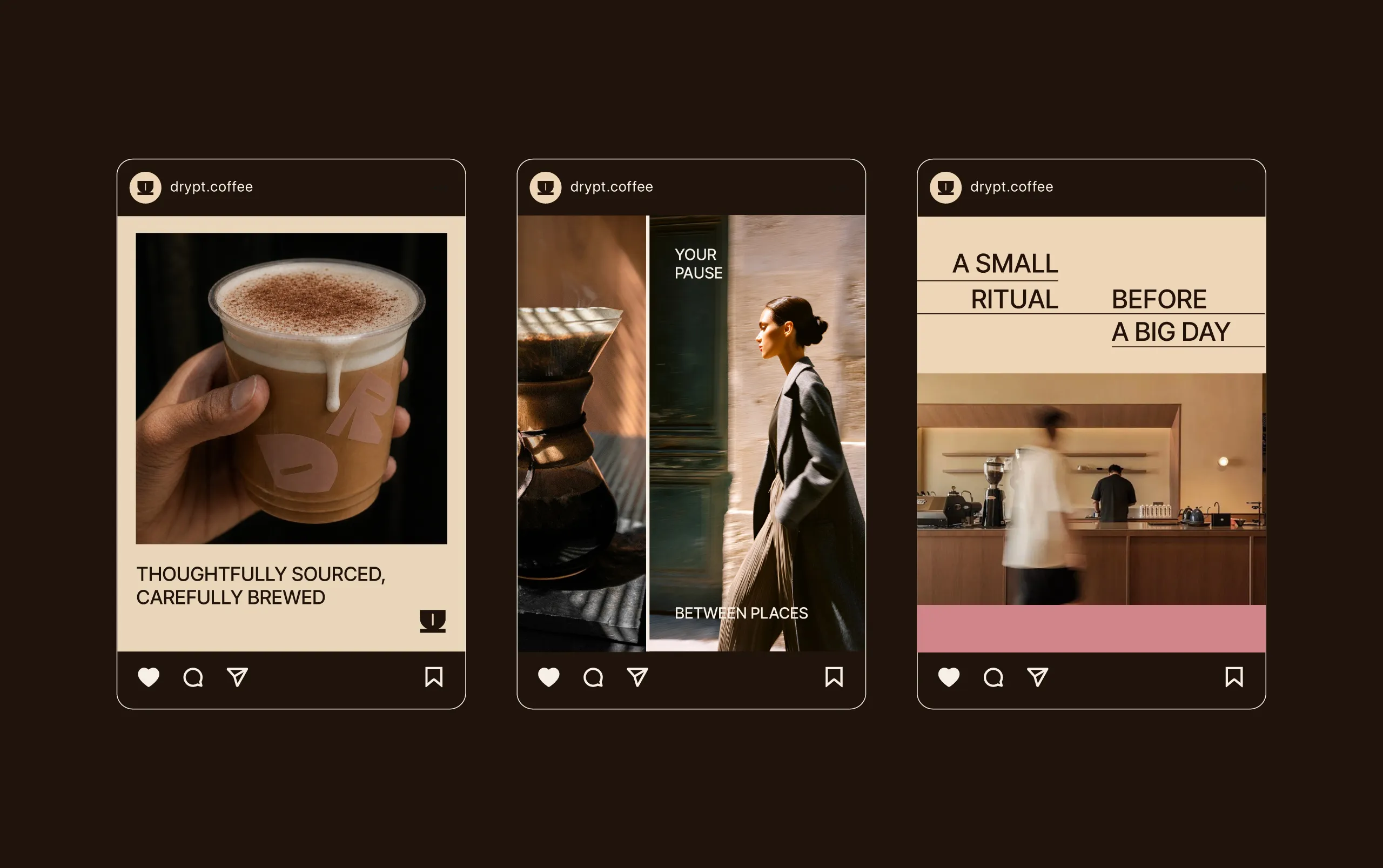
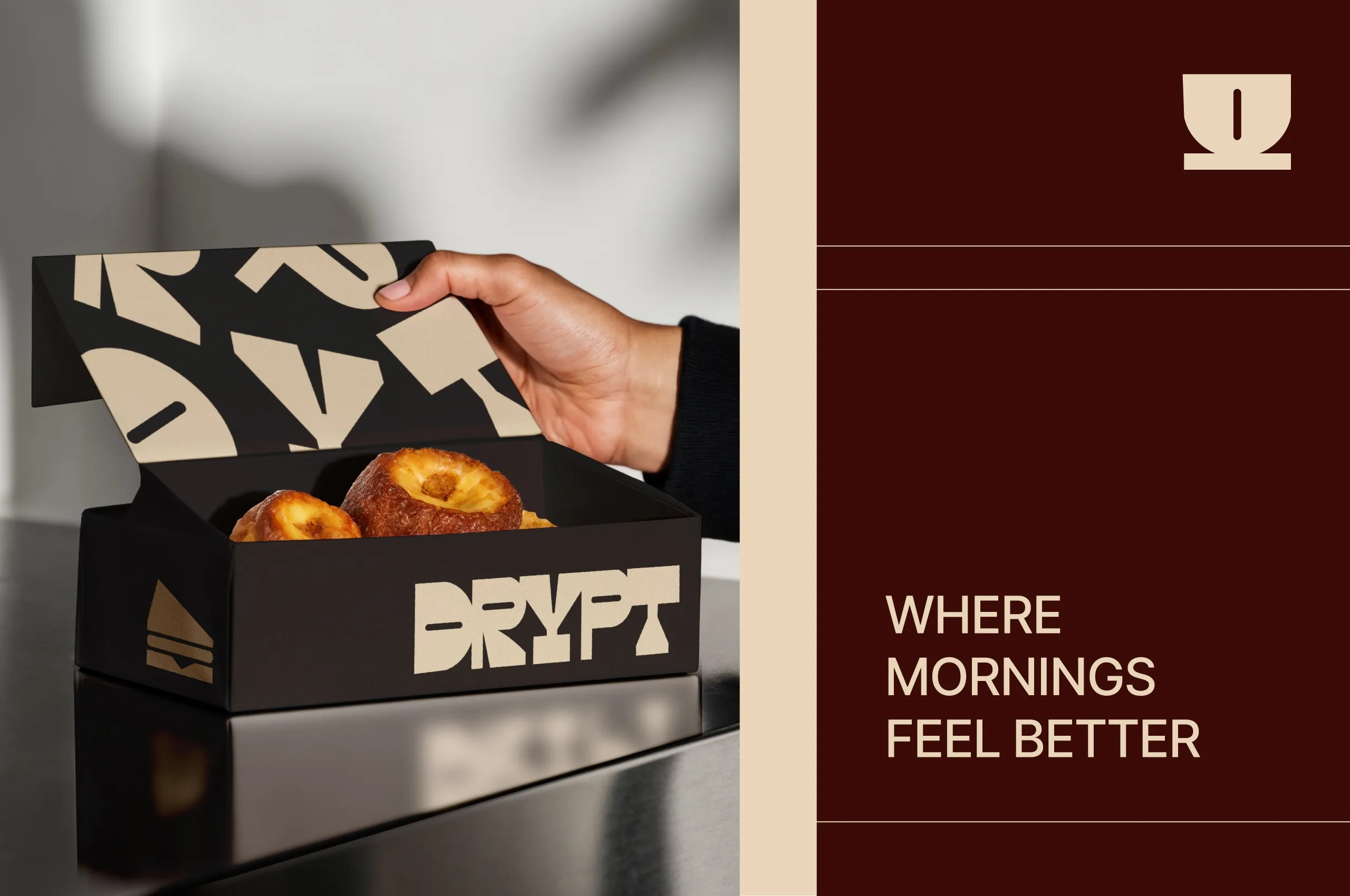
At the core of the identity is a custom emblem designed to become the brand’s most recognizable asset. Its bold, geometric construction gives Drypt a distinctive voice while remaining highly adaptable across signage, packaging, merchandise, and digital communication.
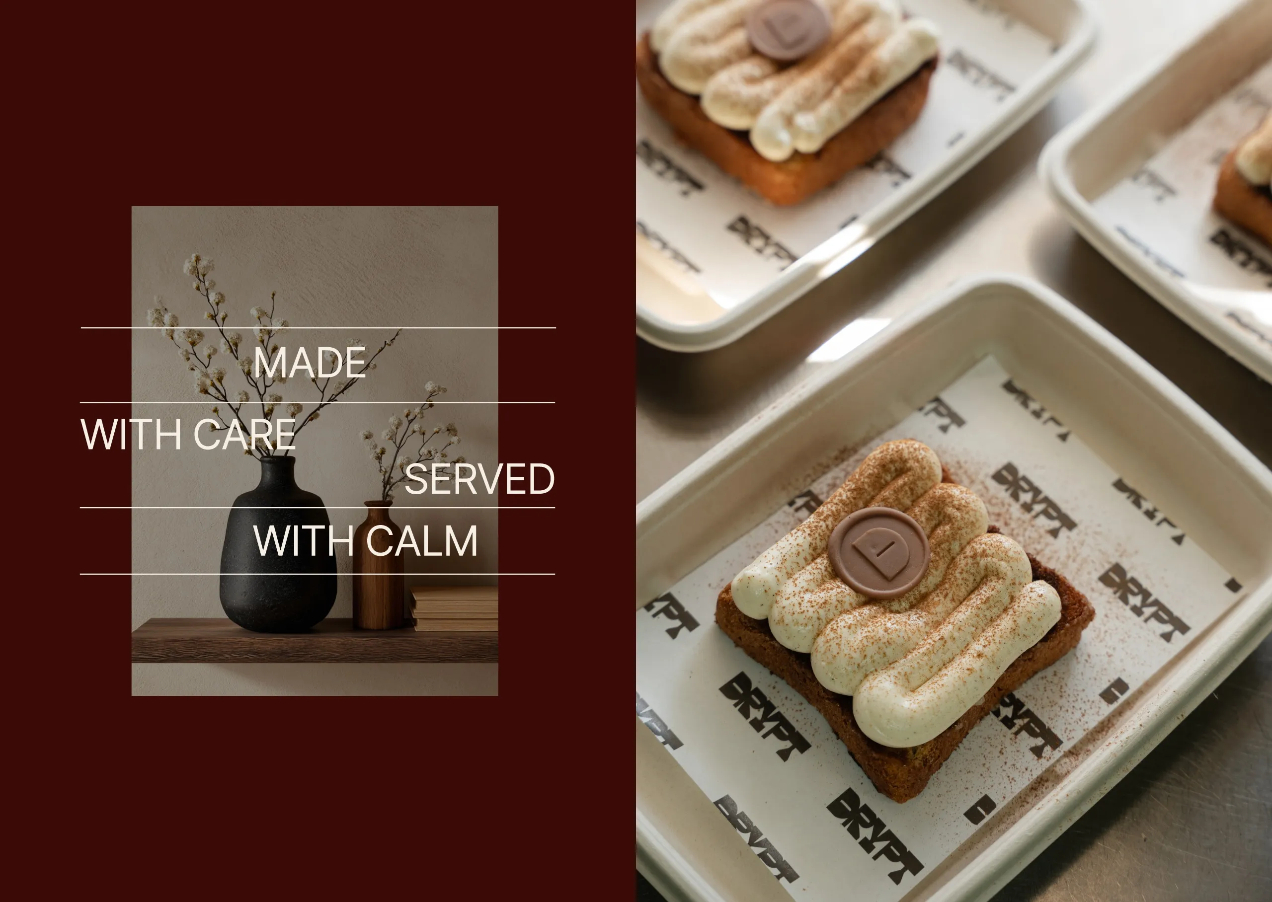
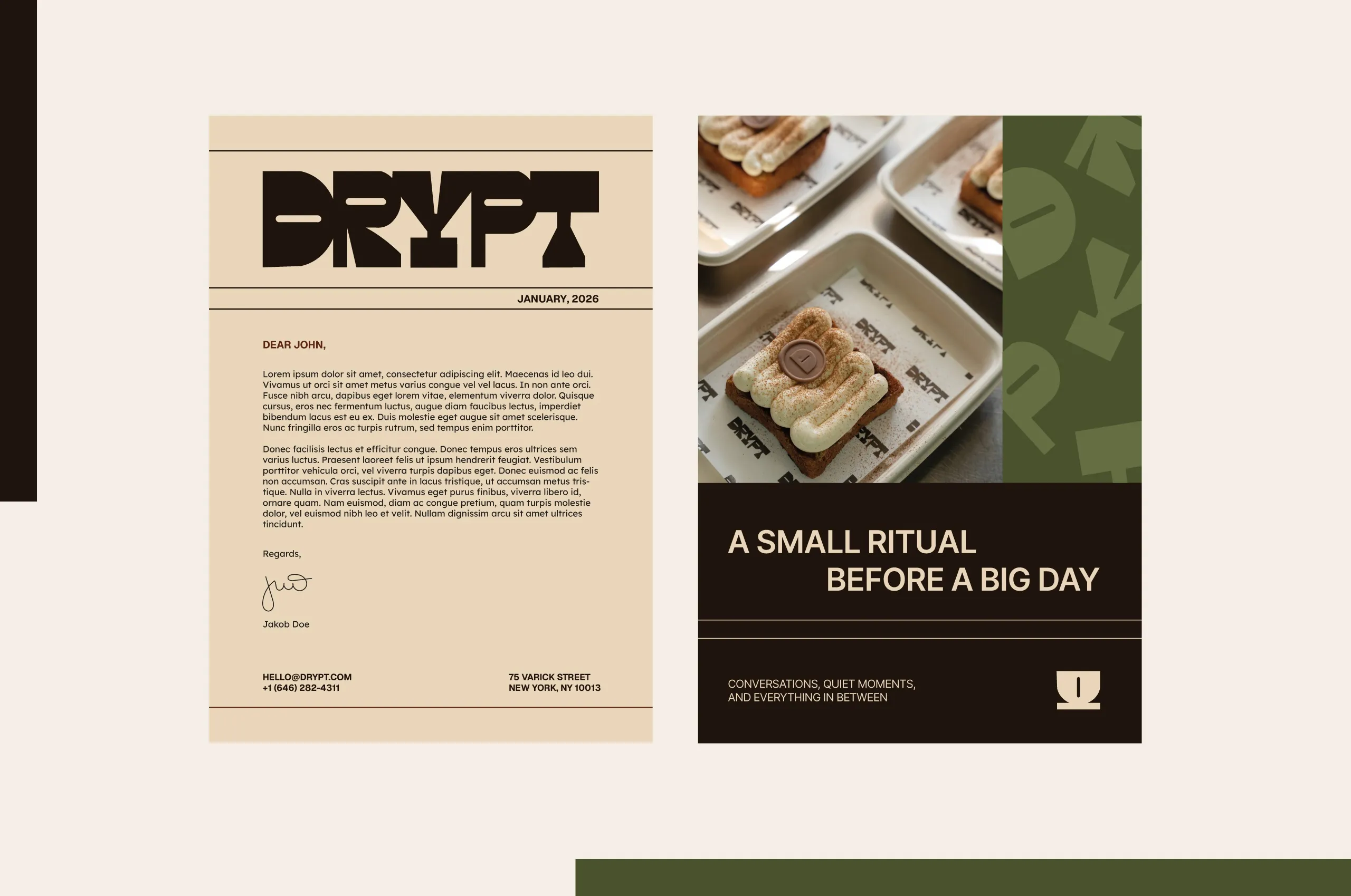
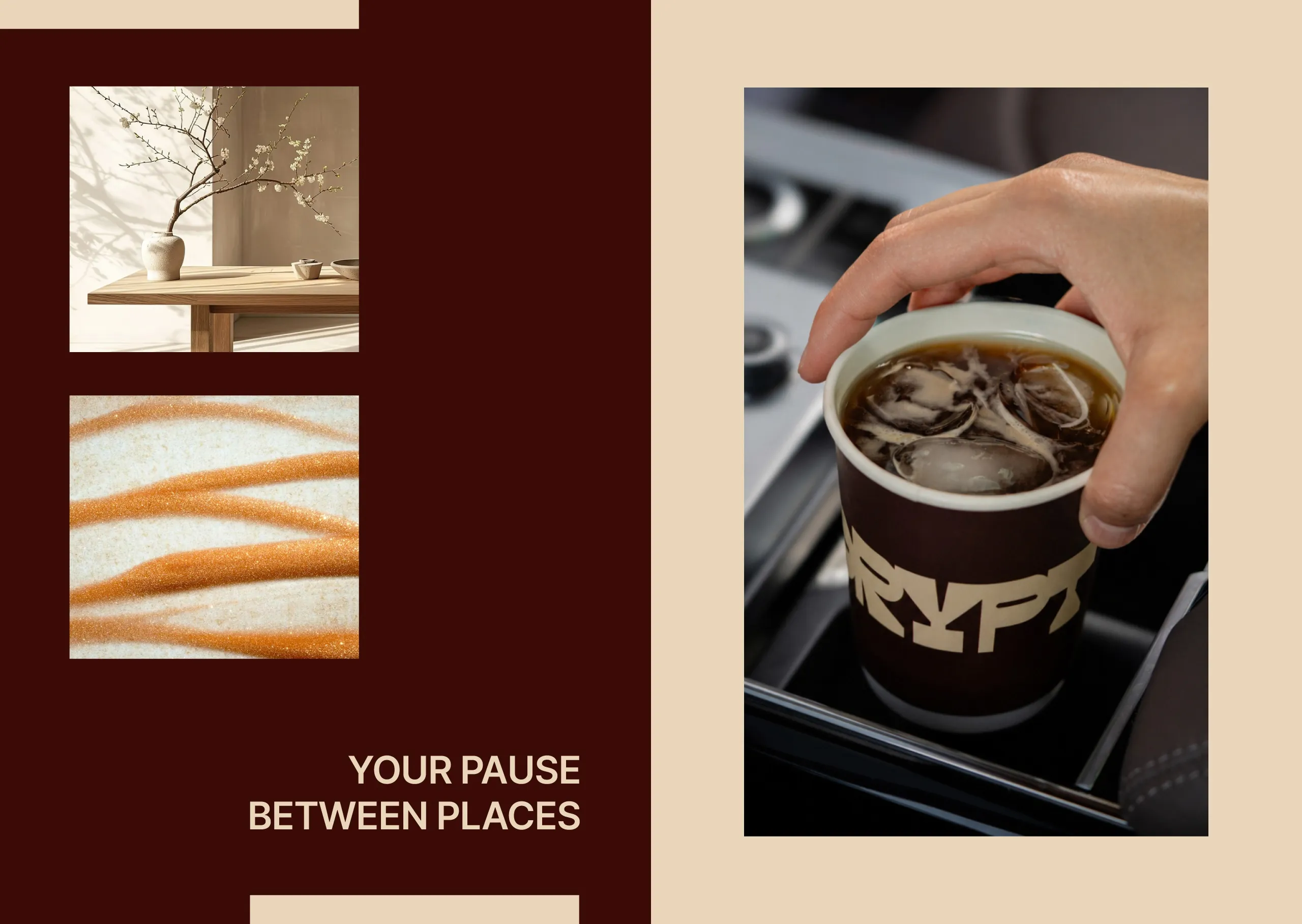
To support the logo, we developed a cohesive visual system consisting of a simplified icon set, custom graphic patterns, and a carefully balanced color palette. Warm neutrals, deep coffee tones, muted greens, and soft accent colors reflect the ingredients, atmosphere, and pace associated with specialty coffee culture without relying on clichés.
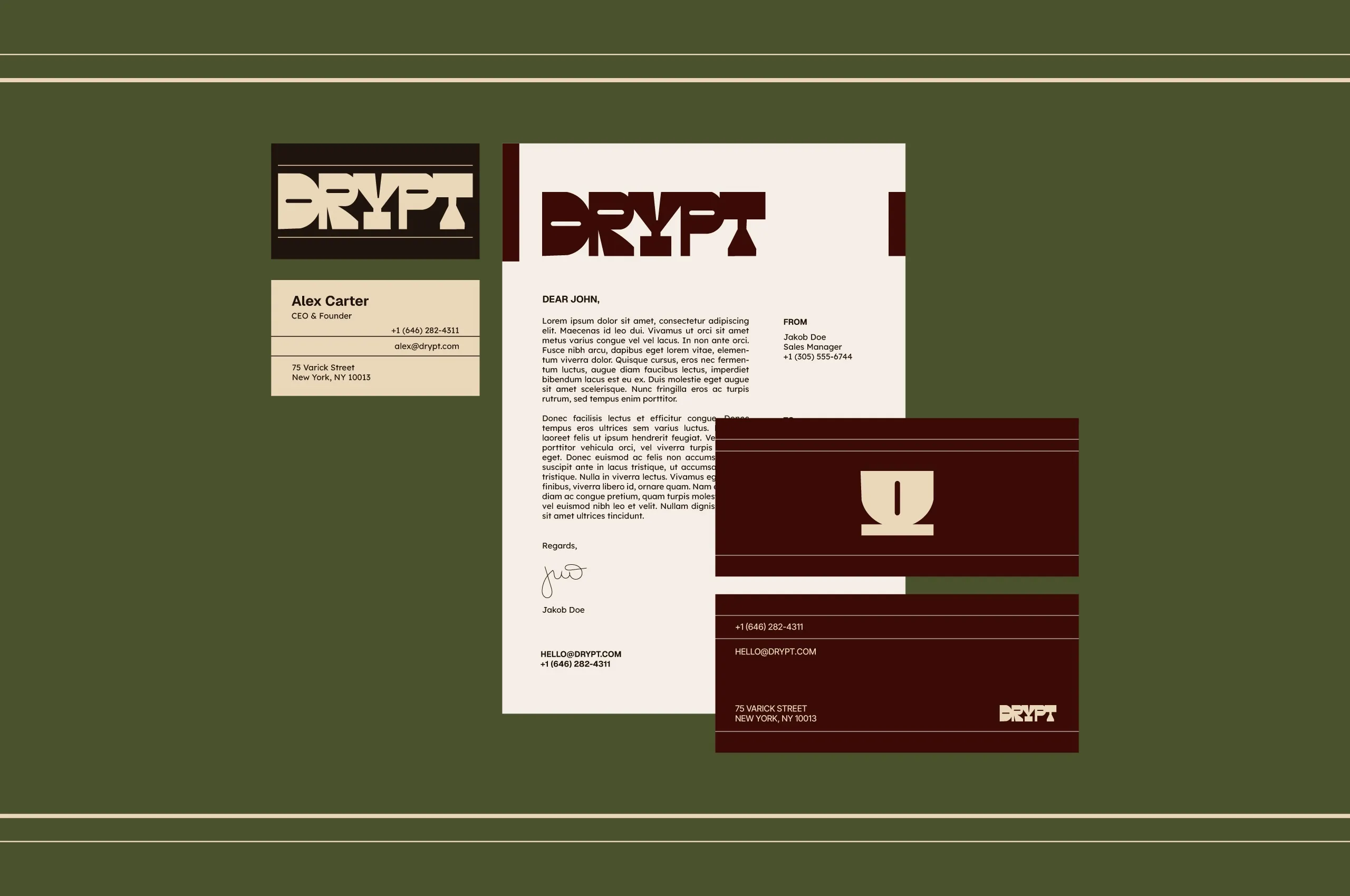
Every element was designed to work as part of a flexible system rather than as standalone graphics, allowing the brand to remain consistent across every customer touchpoint while leaving enough room for future growth.
The result is a visual identity that feels bold without being loud, contemporary without chasing trends, and distinctive enough to be recognized long before the first sip.
See more coffee and tea branding case studies.

Let’s make the work they’ll copy.
Talk to an expert now
Work with a 38 team of the
industry’s top 1% talent.



