Arc Co Coffee Roastery
Specialty Coffee Branding & Packaging Design
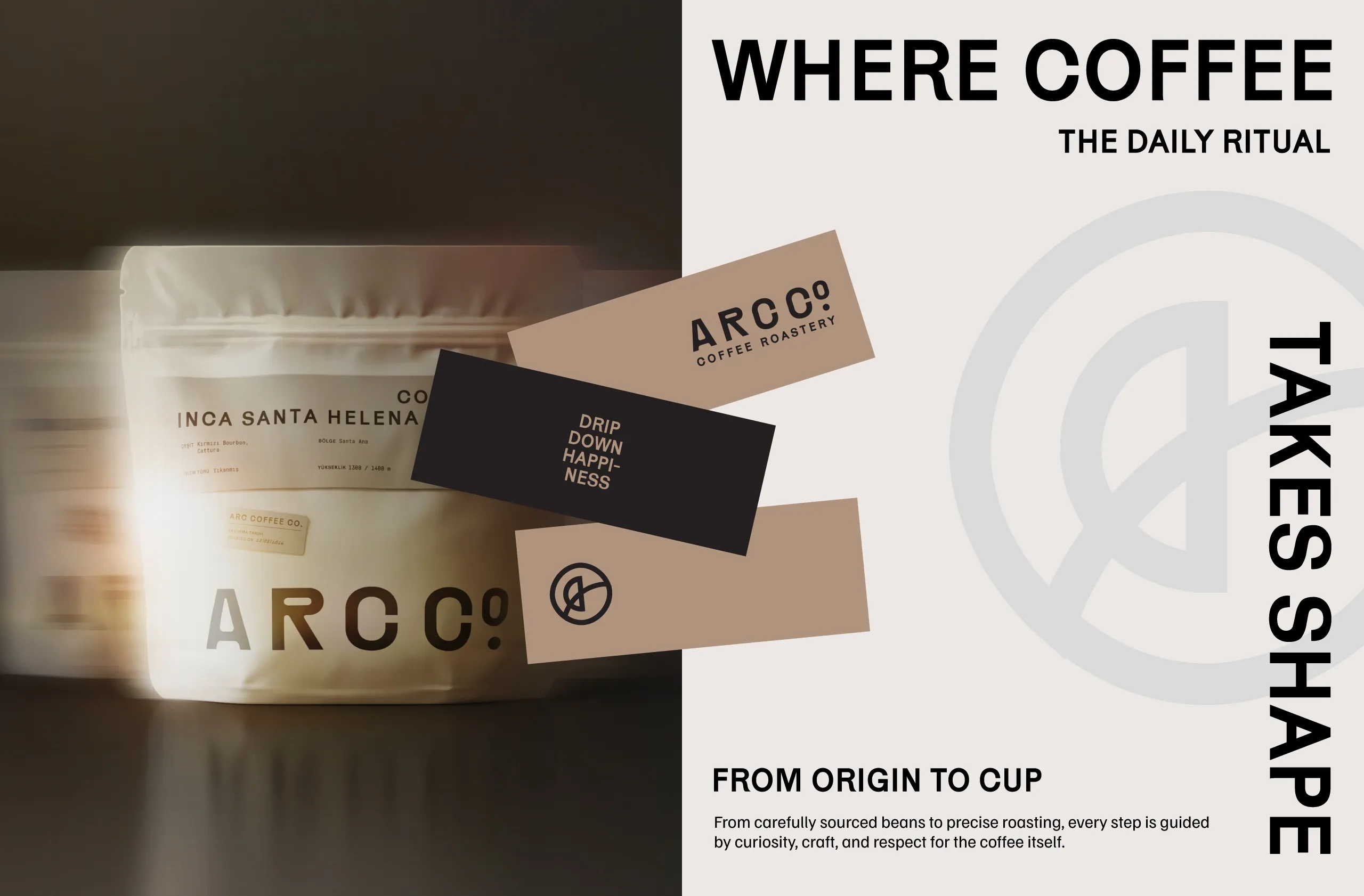
From Origin to Cup.
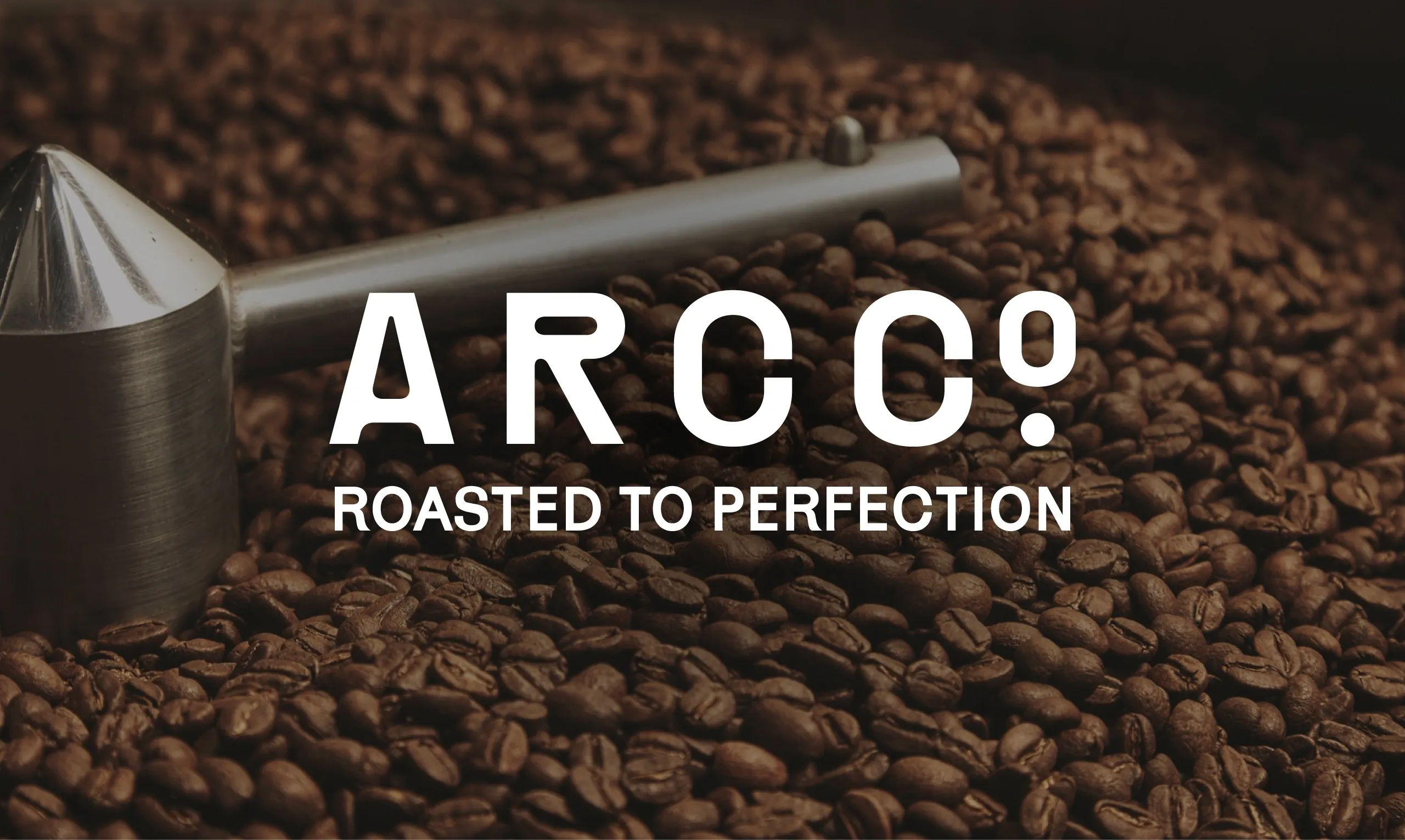
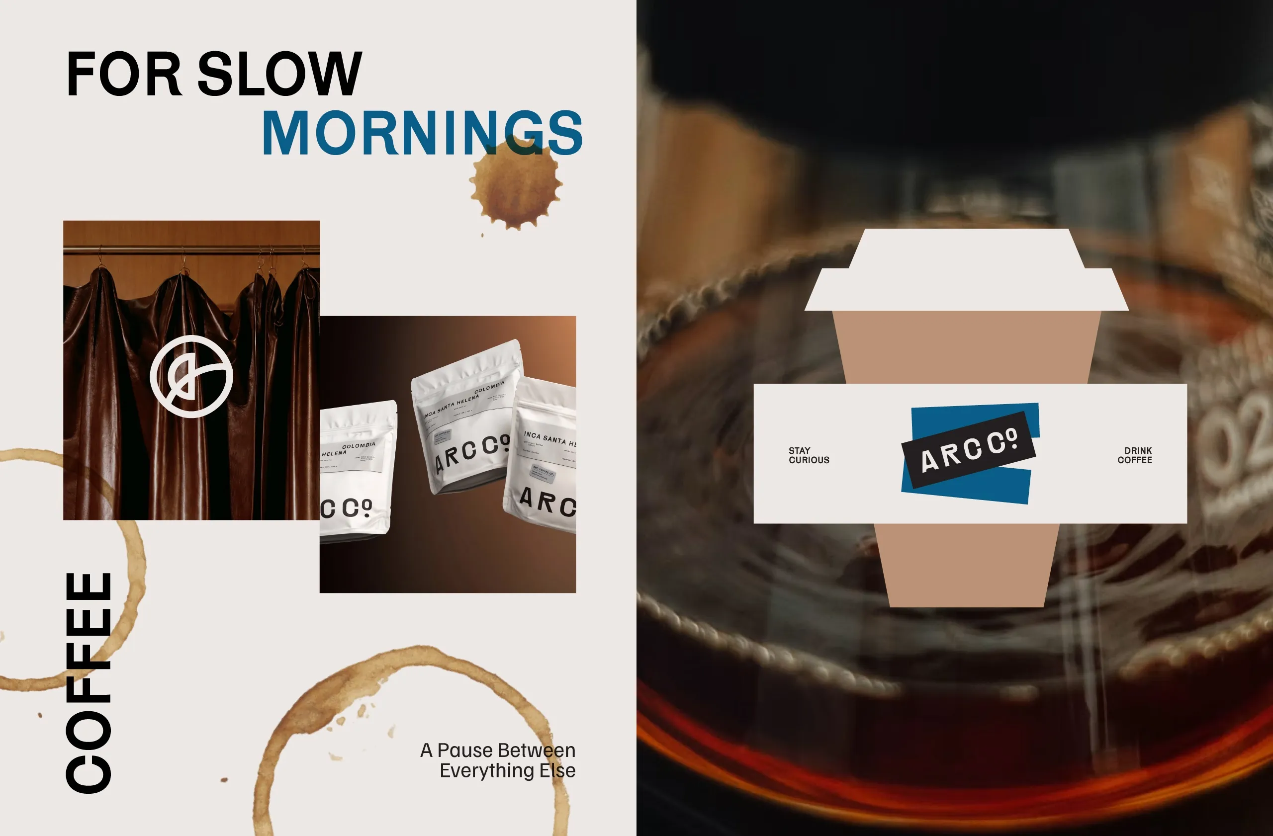
MarkaWorks developed the brand identity, packaging and art direction for ARCO Coffee Roastery, a specialty coffee brand built around sourcing, roasting precision and the individual character of each origin.
The Challenge
ARC CO needed to communicate craft and expertise without adopting the overly rustic or overly technical language common in specialty coffee. The identity also had to accommodate coffees from different origins, processes and flavour profiles while keeping the range clear, consistent and easy to navigate.
The Solution
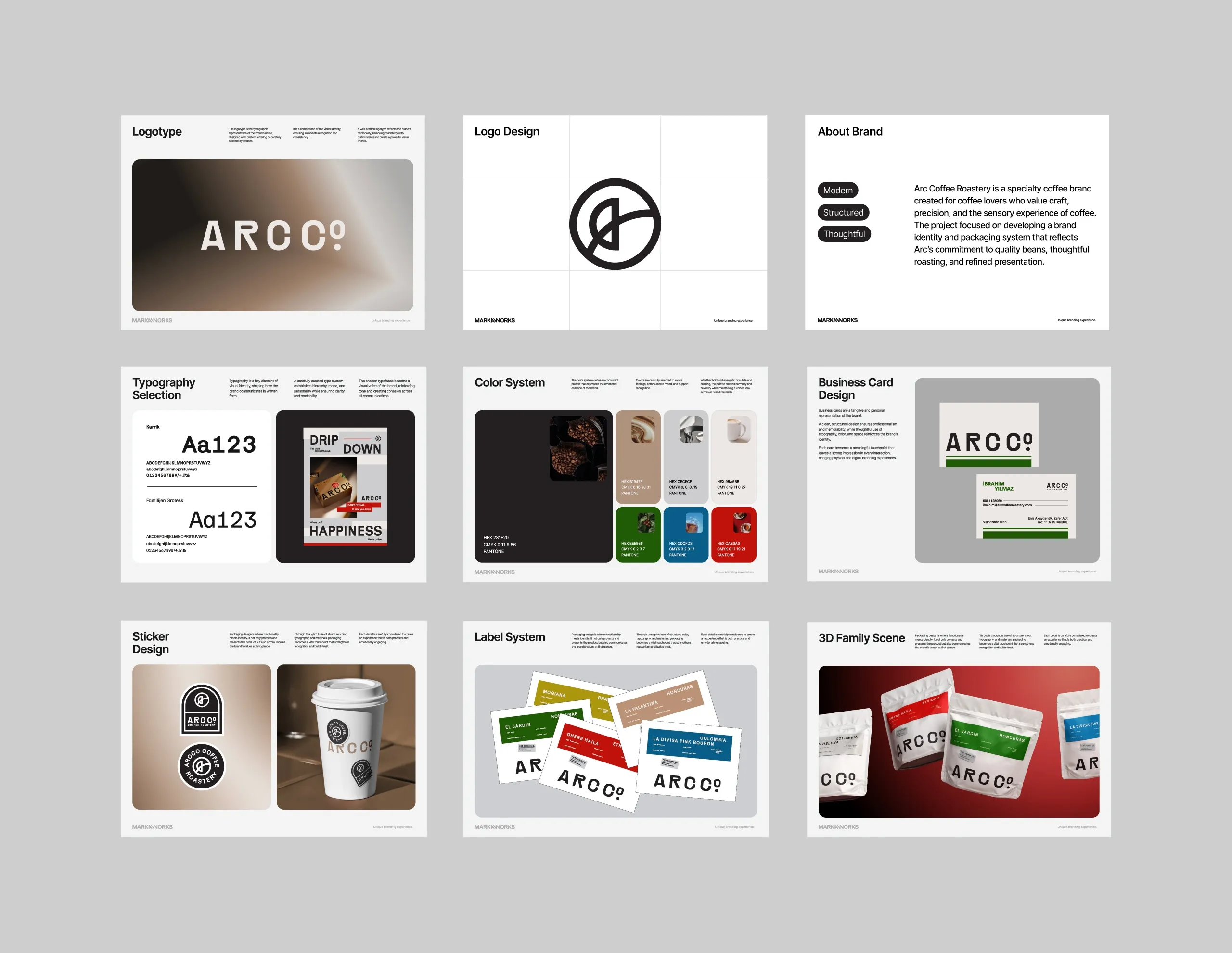
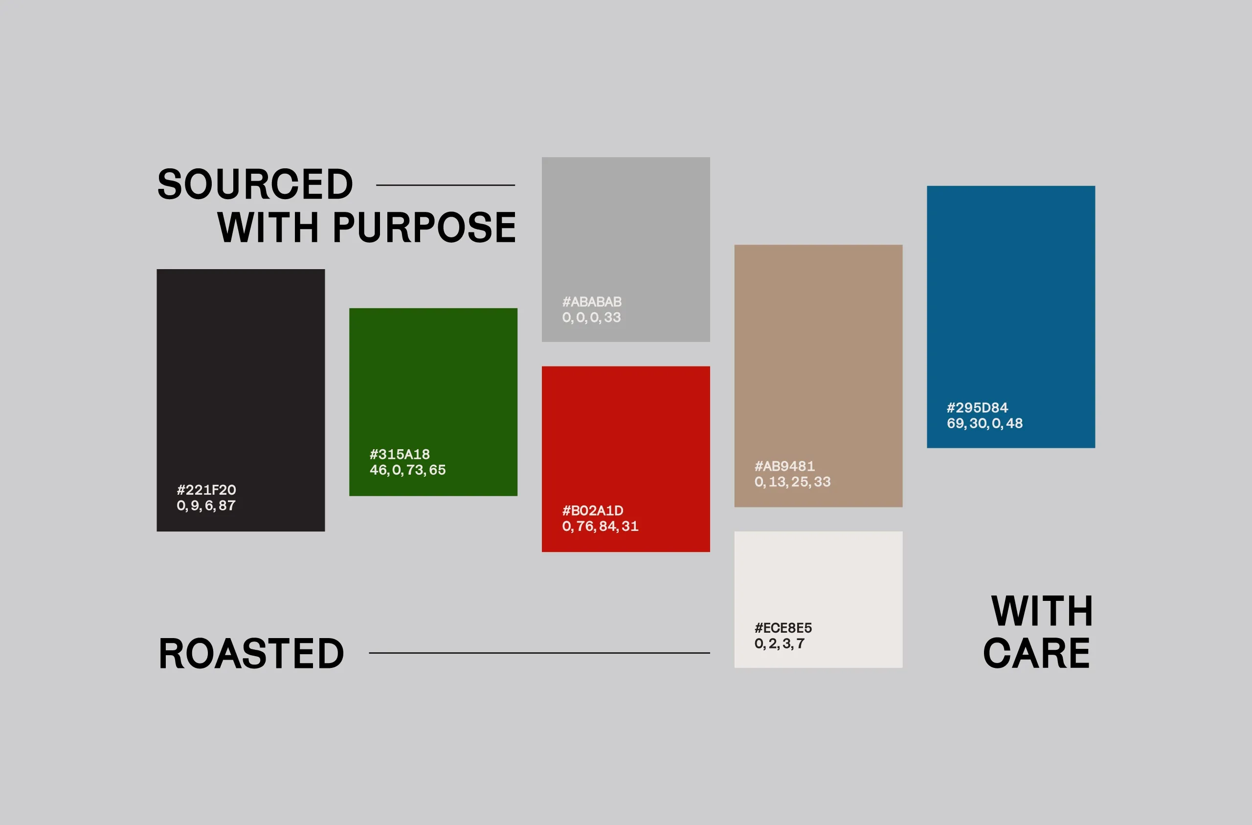
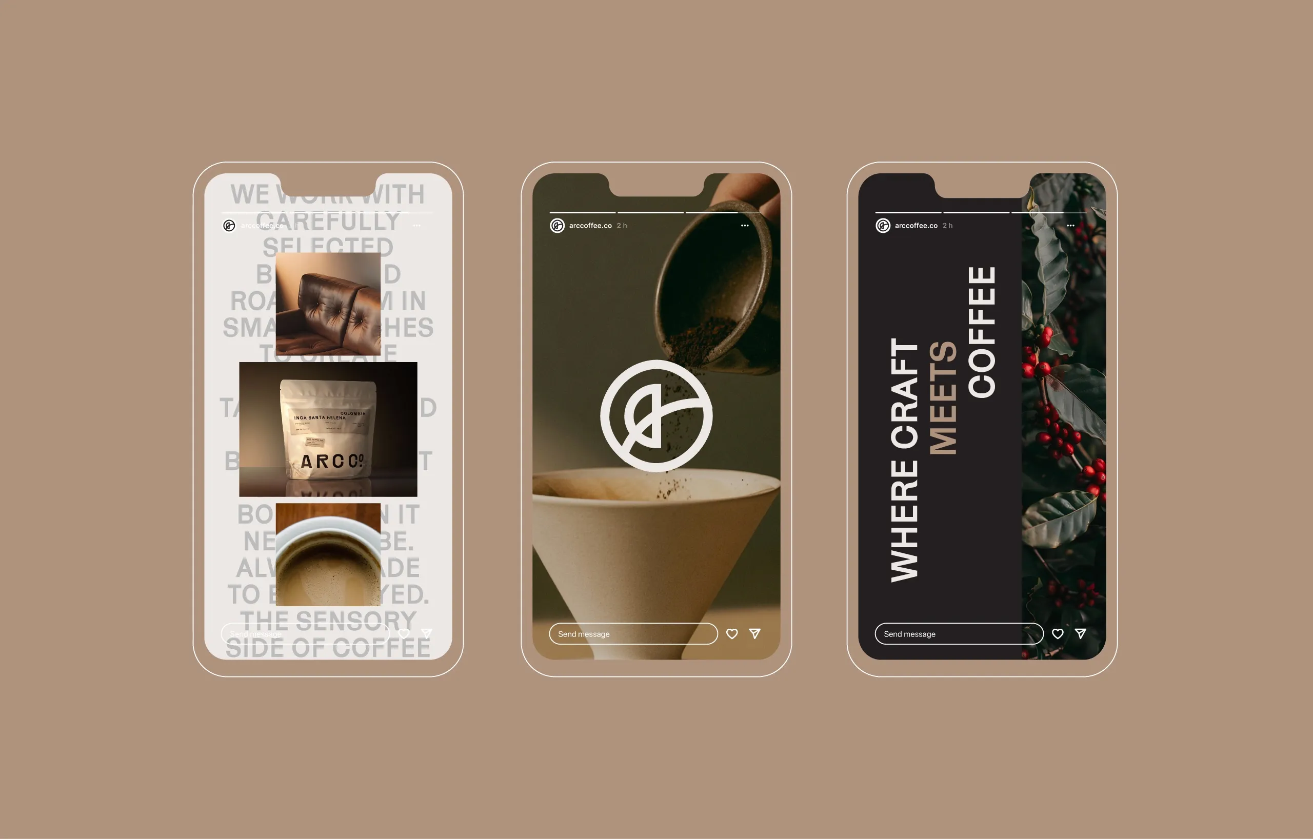
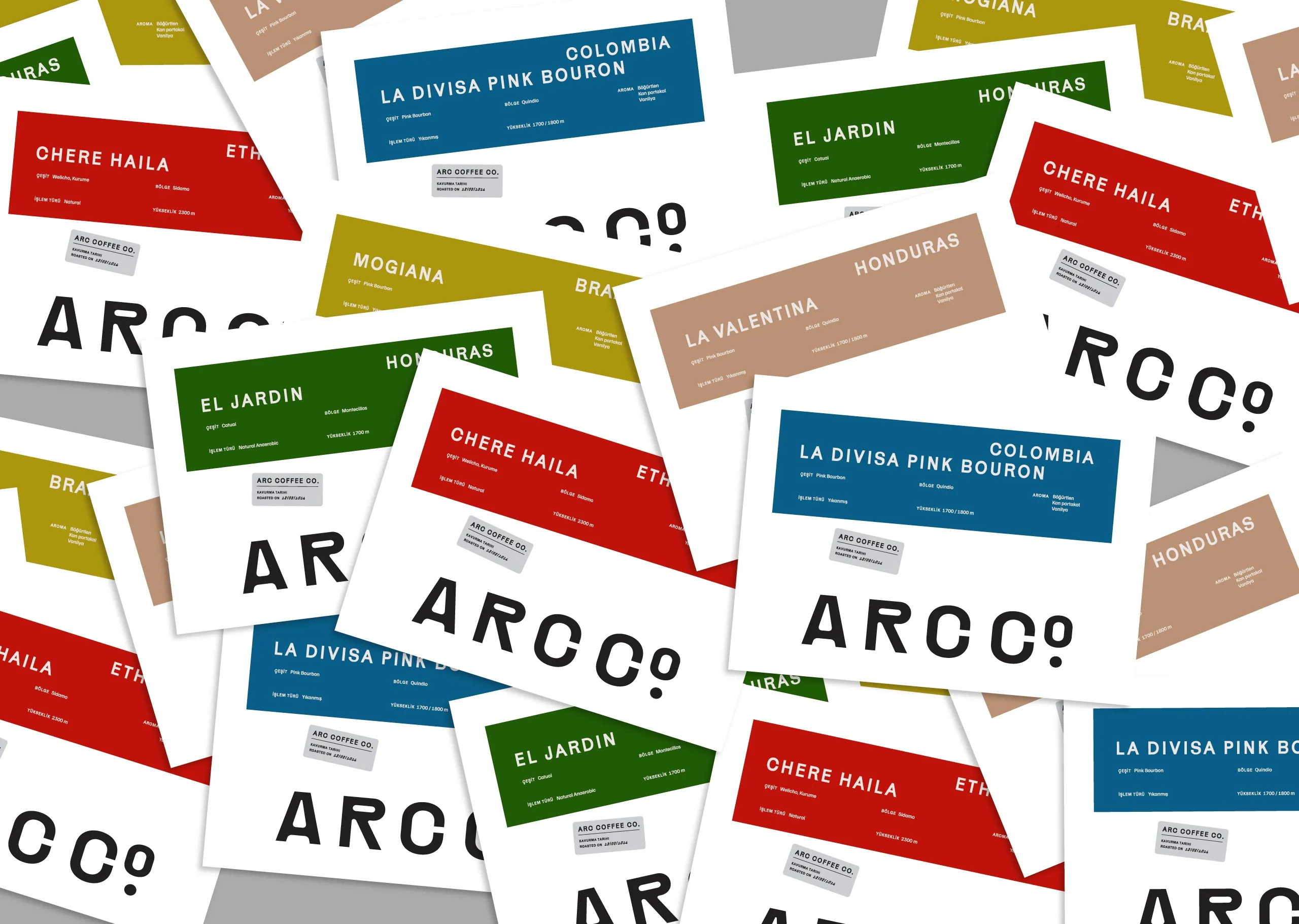
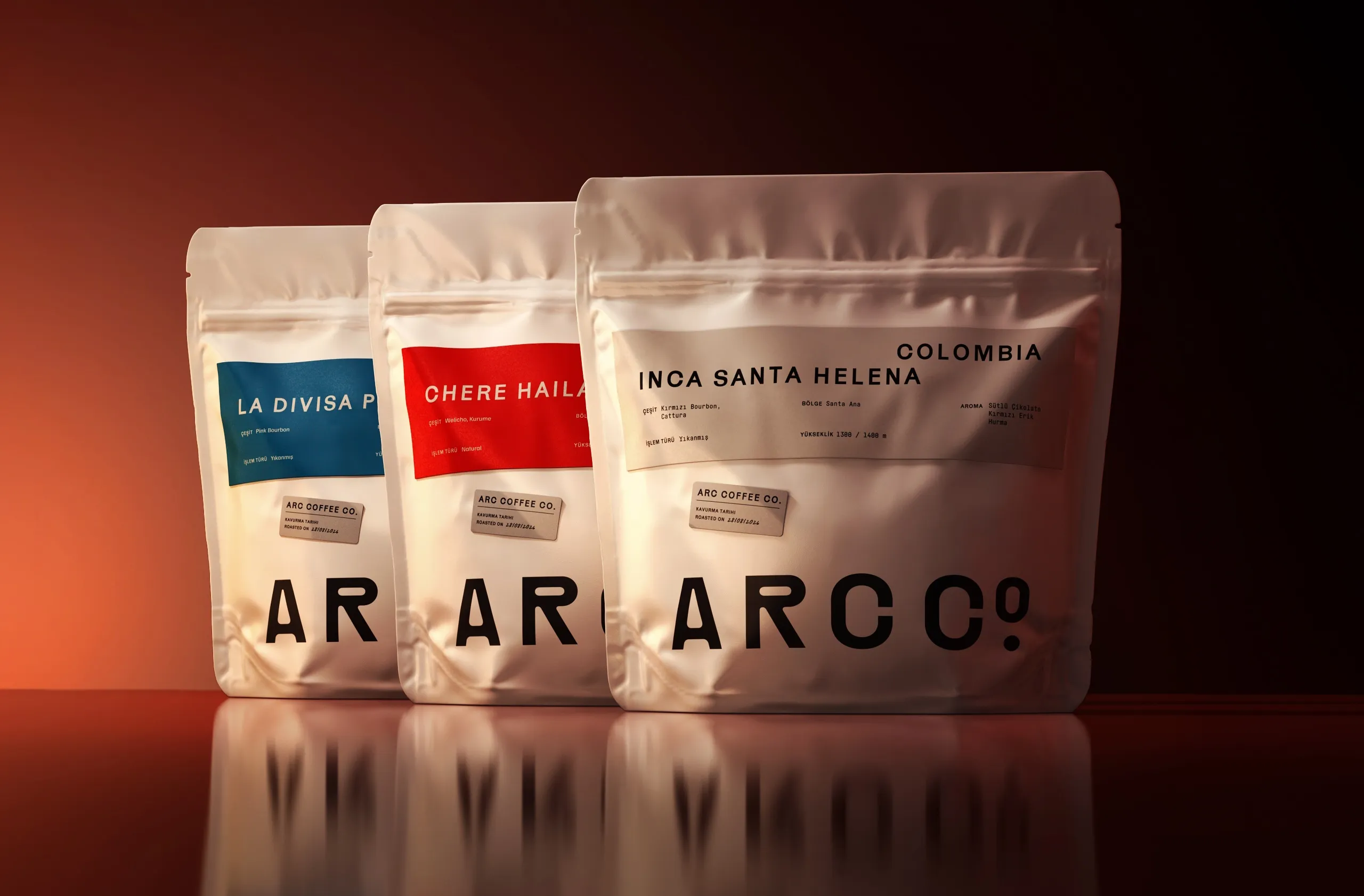
"From Origin to Cup" became the central idea behind the system. A custom geometric wordmark, circular monogram and structured typographic language create a precise but approachable identity. A restrained neutral base keeps the brand cohesive, while origin-specific colours introduce distinction across the coffee range. The visual language balances the discipline of roasting with the sensory and ritualistic side of coffee.
The Process
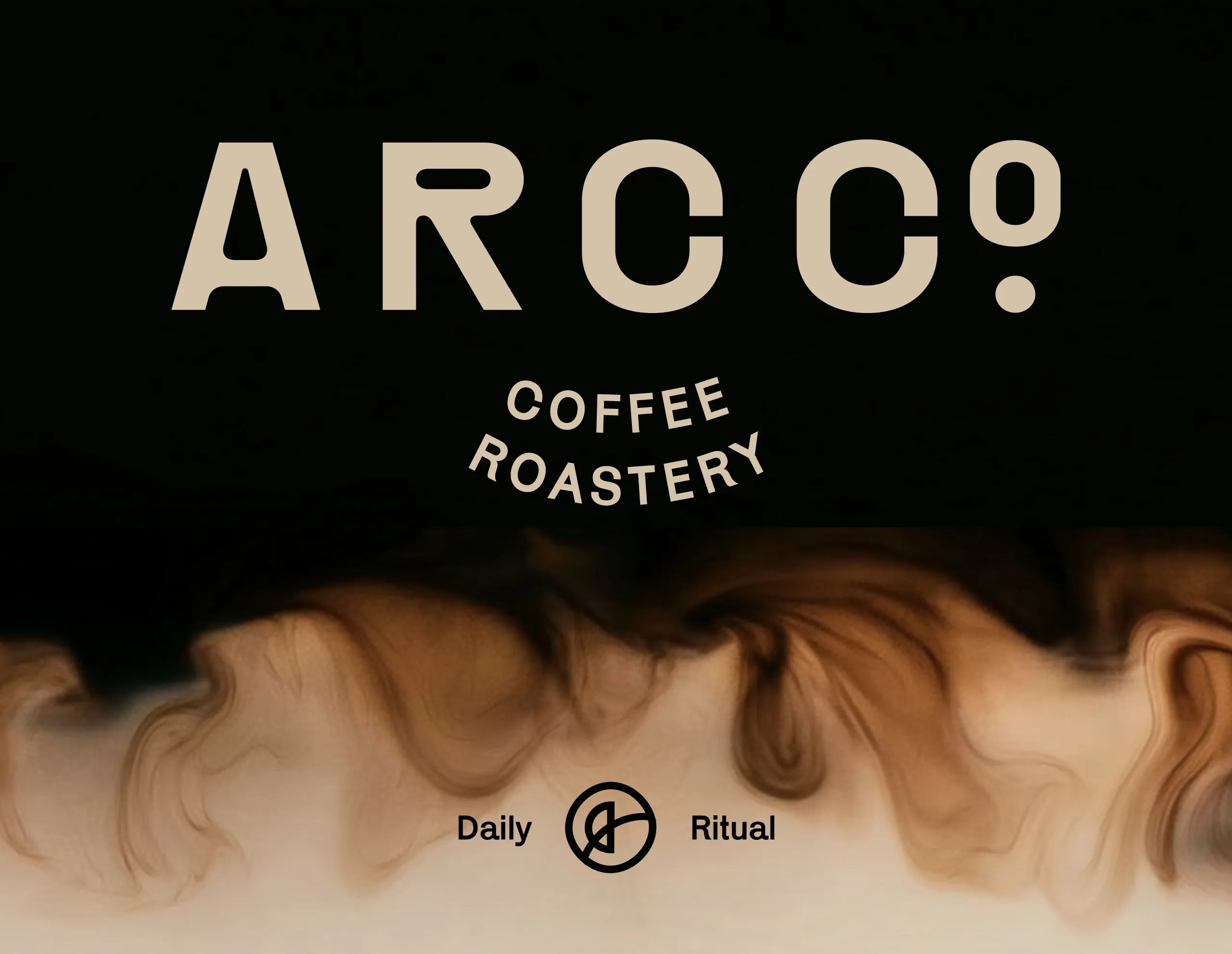
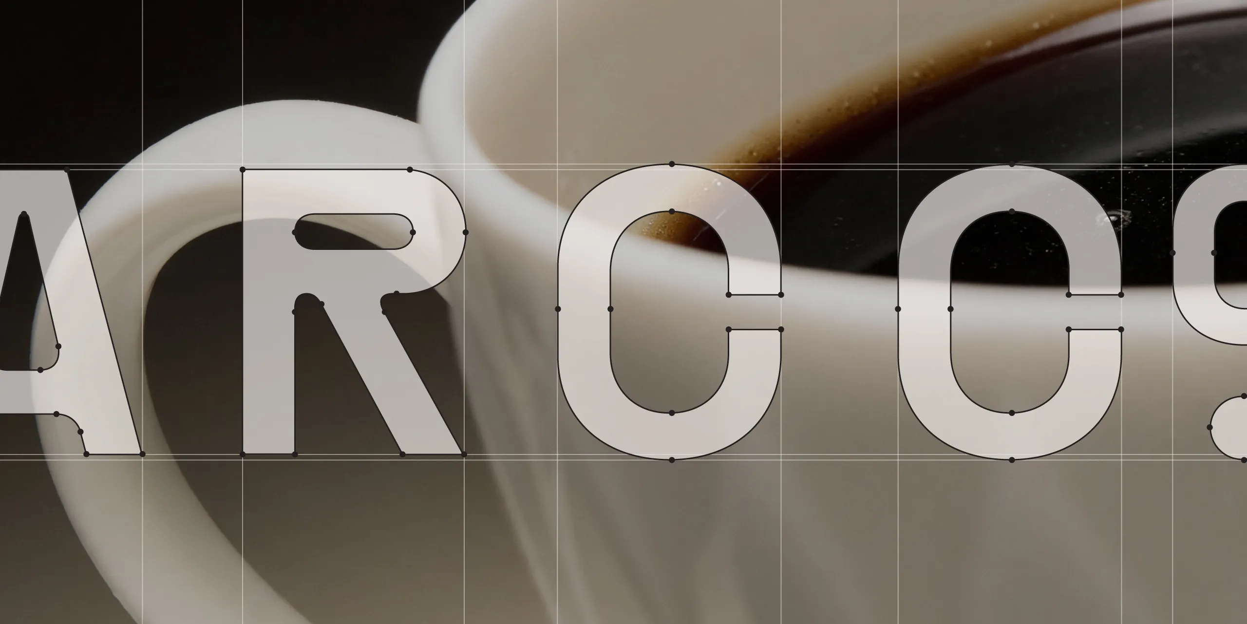
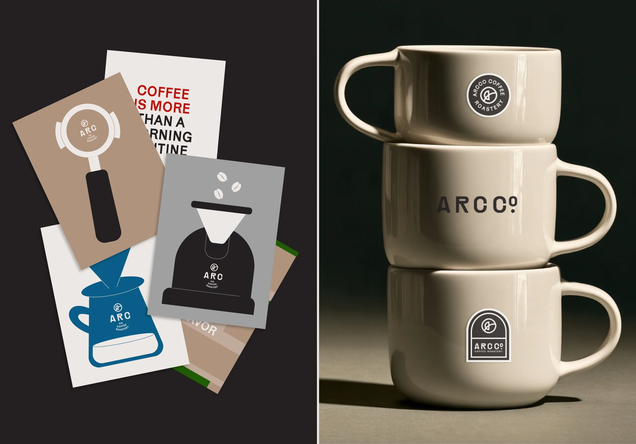
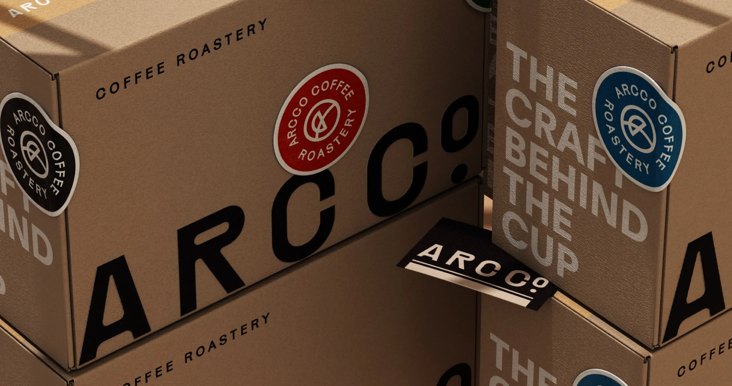
The ARC CO wordmark was developed with custom letterforms and distinctive internal cuts, giving the name a recognisable silhouette while retaining clarity across packaging and digital applications. The circular monogram condenses the same geometry into a compact mark for cups, stickers, merchandise and smaller touchpoints.
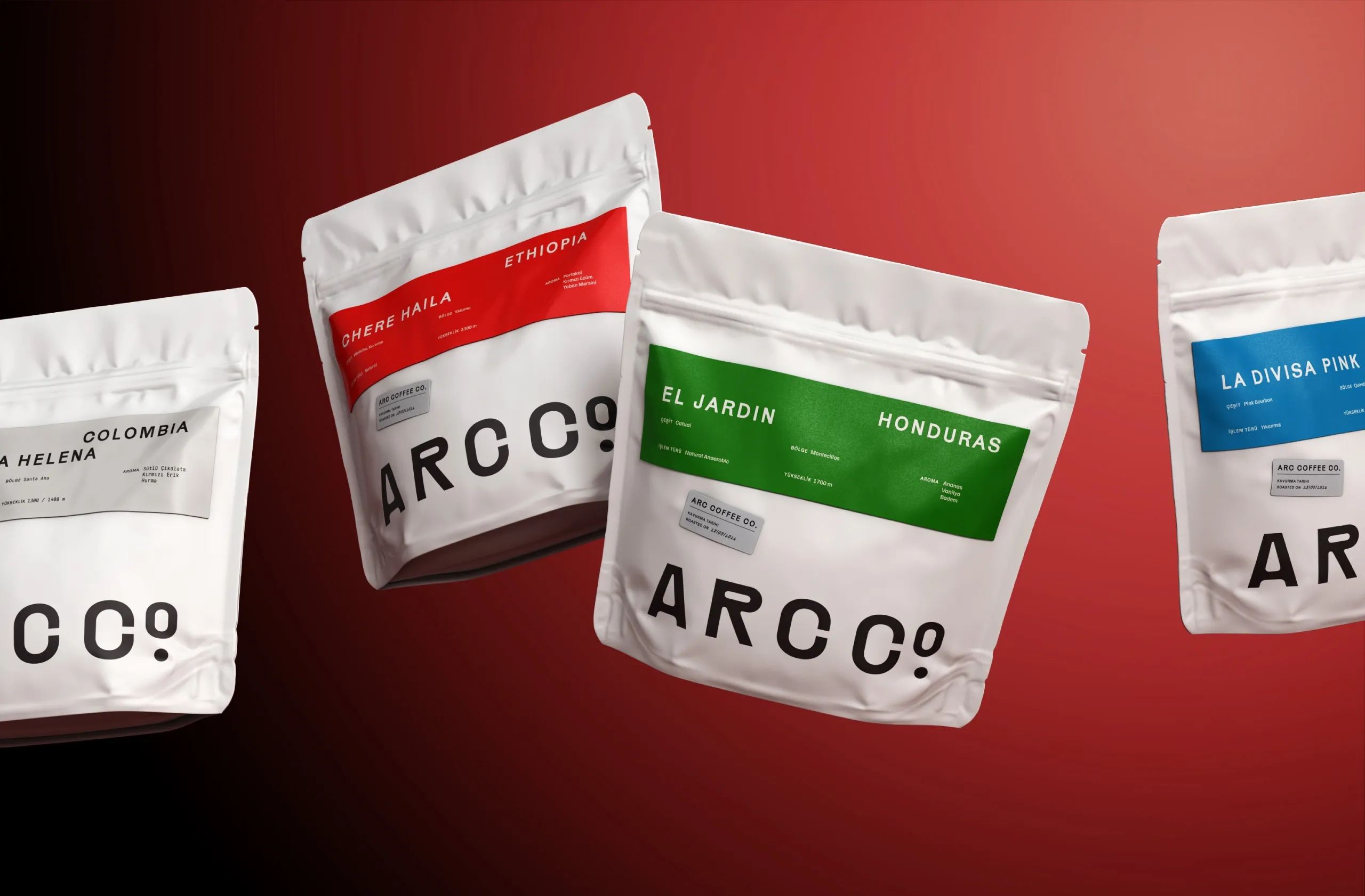
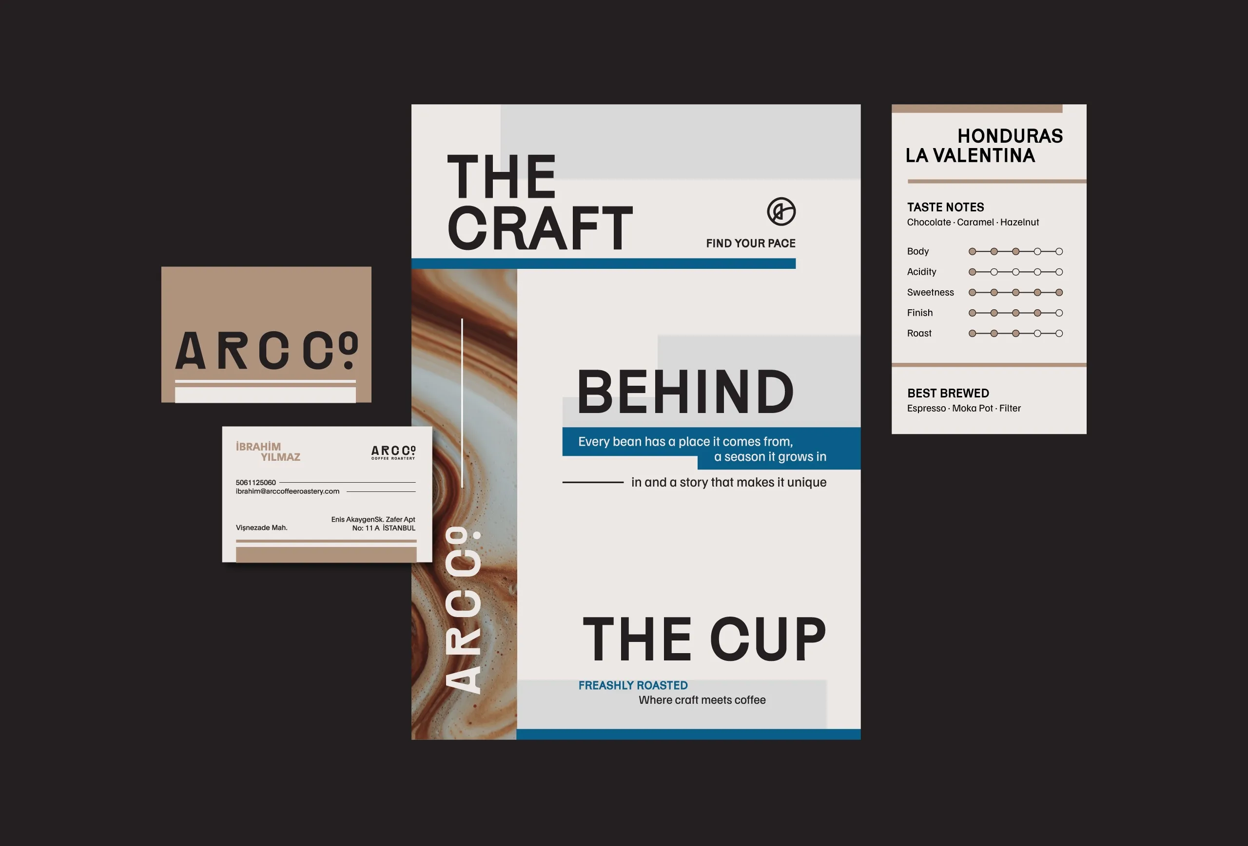
Packaging follows a modular information system. Coffee name, country, variety, process, altitude and tasting information are organised into clearly defined zones, while colour is used to differentiate origins without changing the underlying structure. This creates a repeatable system that can grow with seasonal releases and new coffees.
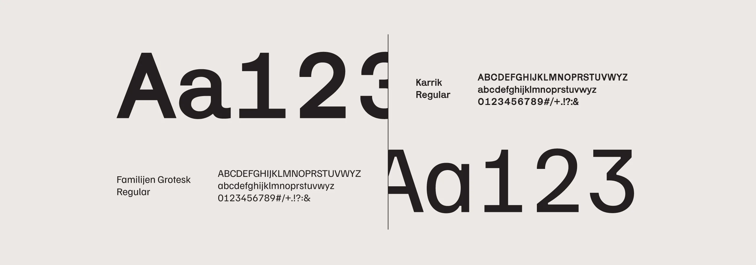
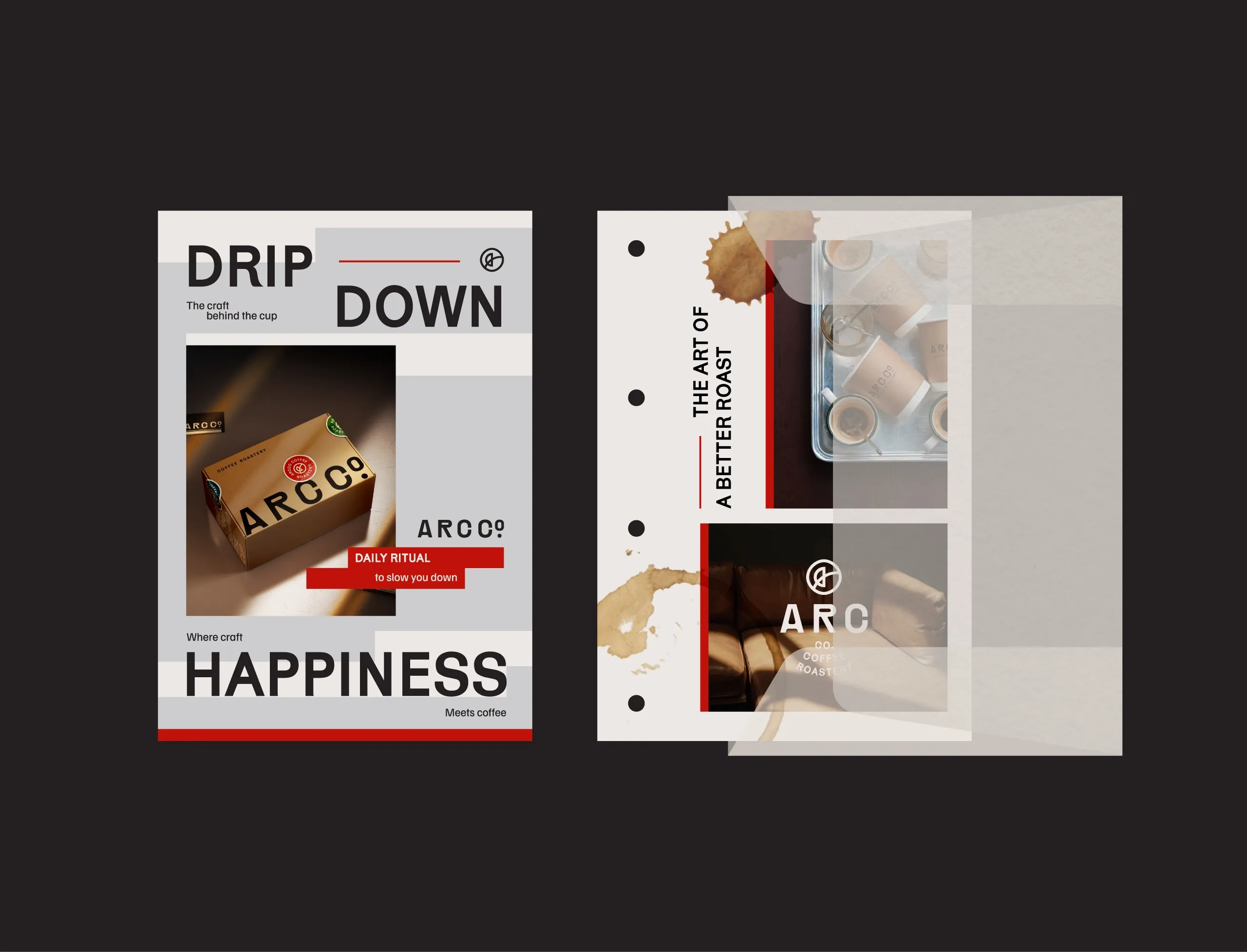
Typography and layout reinforce the same sense of precision. Large-scale type, structured grids and technical product information are combined with warmer photography, coffee stains and tactile imagery to prevent the system from feeling clinical. Art direction focuses on the journey from green bean to roast and finally to cup, connecting sourcing, process and everyday ritual within one visual language.
The Outcome
ARC CO brings together specialty coffee expertise and contemporary design in a flexible identity built for growth. The system makes a diverse coffee range easier to understand while giving the brand a consistent presence across packaging, wholesale materials, cups, shipping boxes and digital communication.

Let’s make the work they’ll copy.
Talk to an expert now
Work with a 38 team of the
industry’s top 1% talent.