Azha
Specialty Coffee Branding & Packaging Design
Born of Starlight and Sand

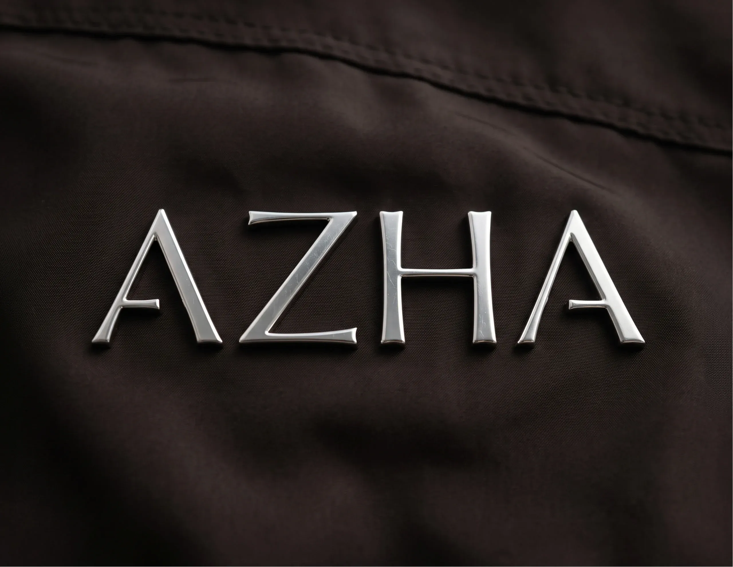
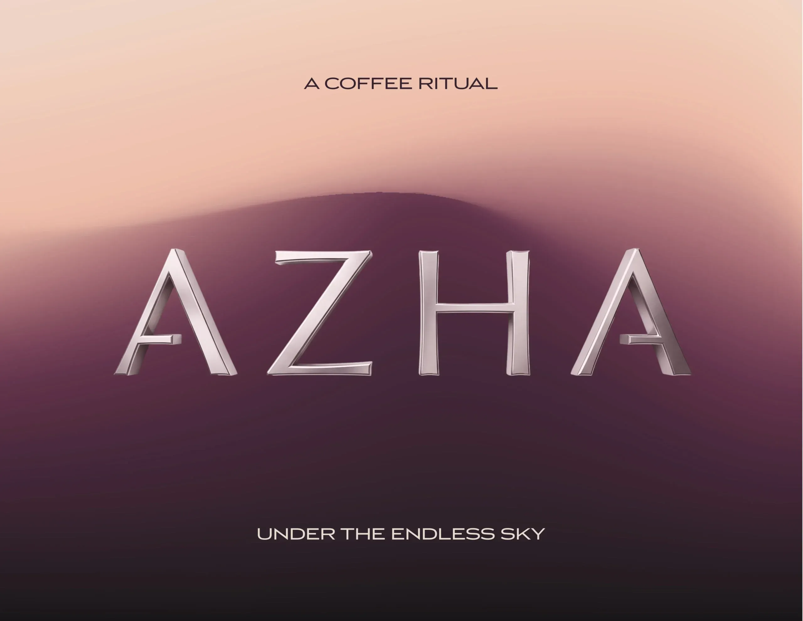
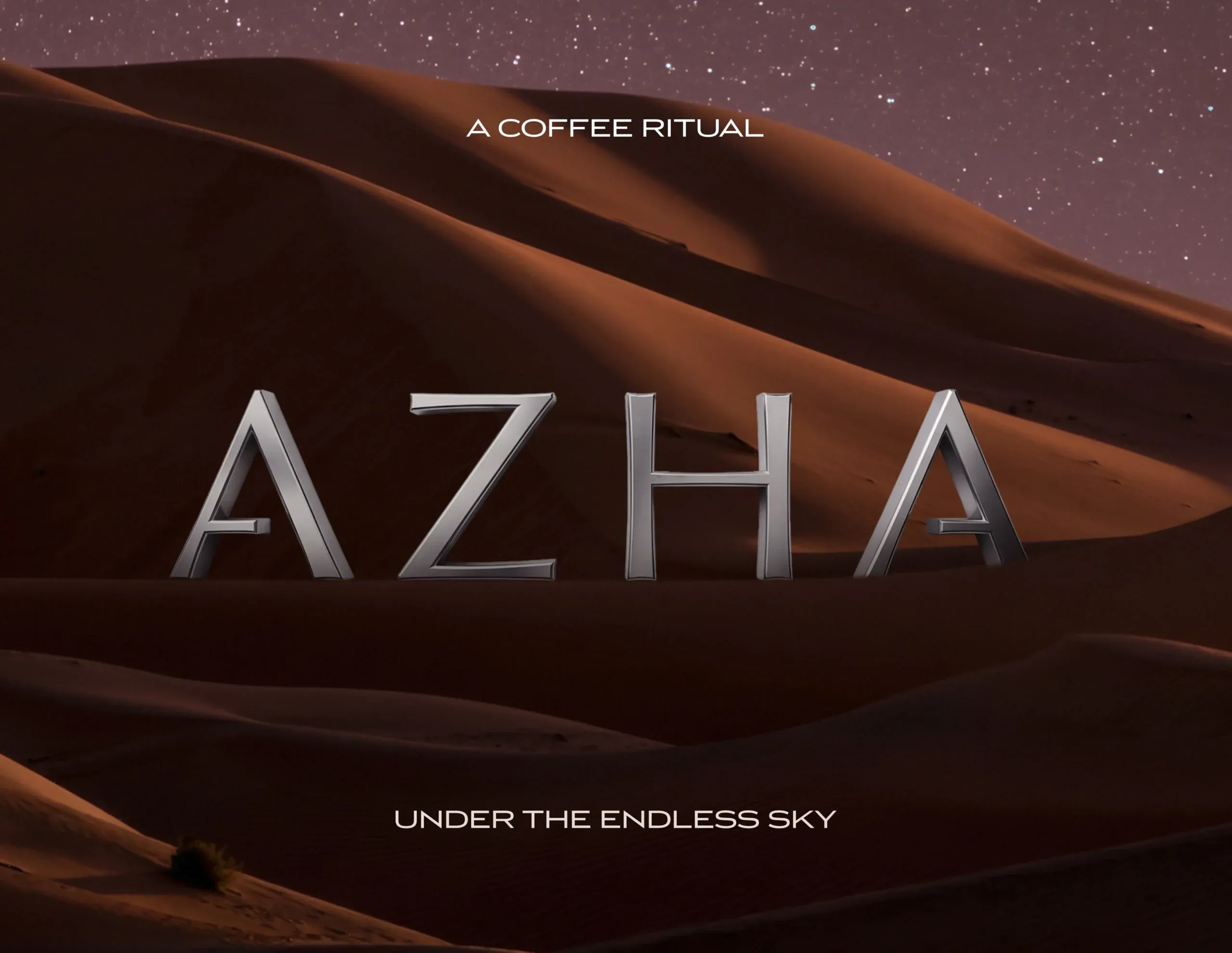
MarkaWorks developed the brand identity, packaging and art direction for AZHA Coffee, a specialty coffee brand from Qatar, building its visual world around the relationship between desert landscapes, starlight and the ritual of coffee.
The Challenge
AZHA needed to feel premium and distinctive without relying on the familiar visual codes of luxury coffee. The brand also had to accommodate coffees from different origins while creating a strong emotional connection to its own geography and culture.
The Solution
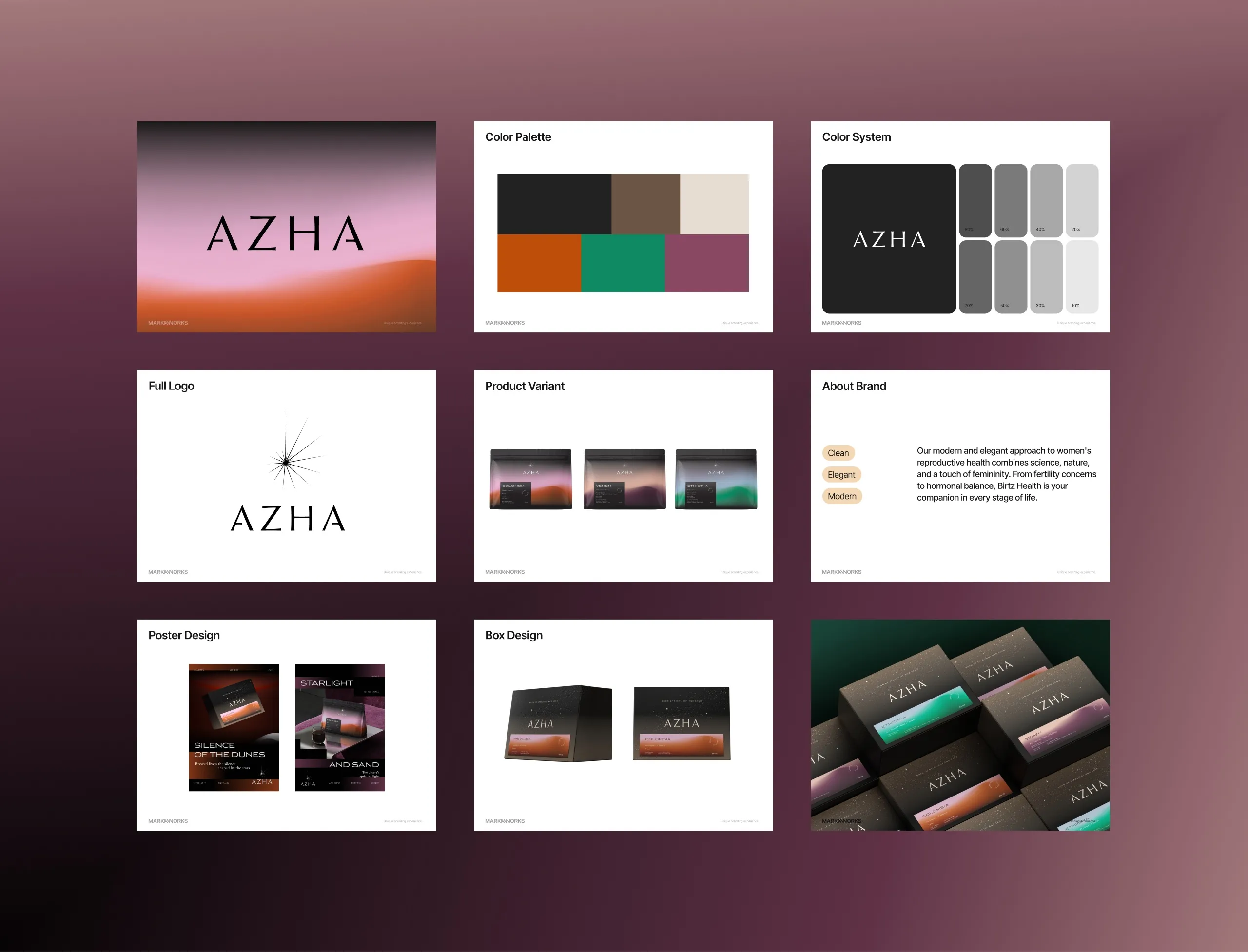
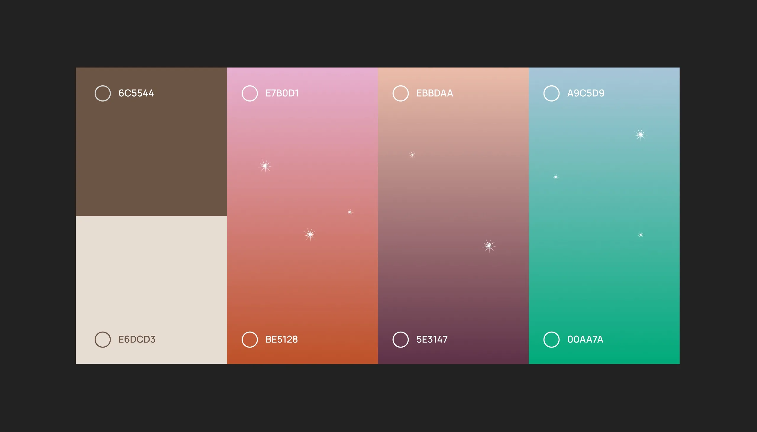
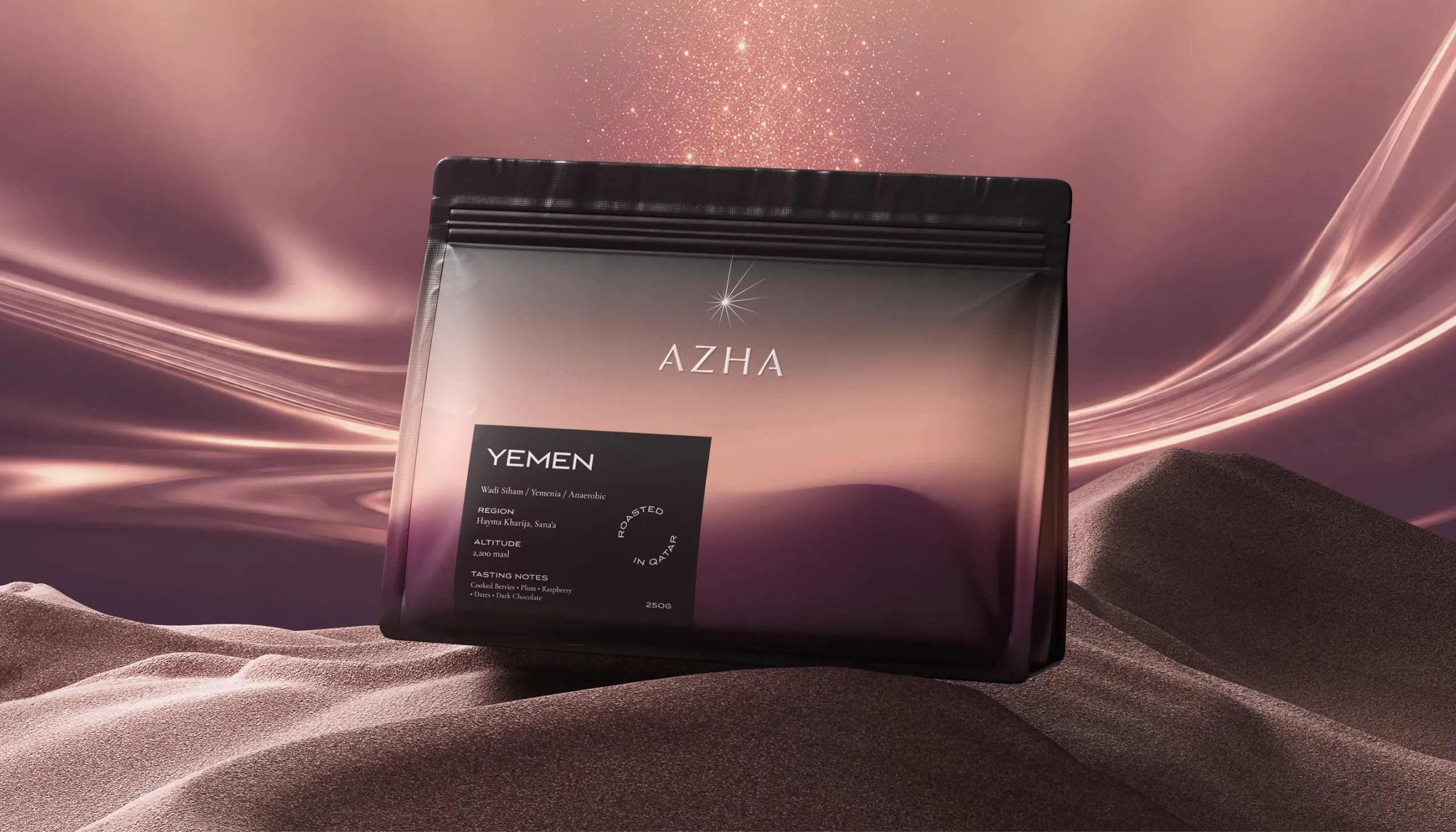
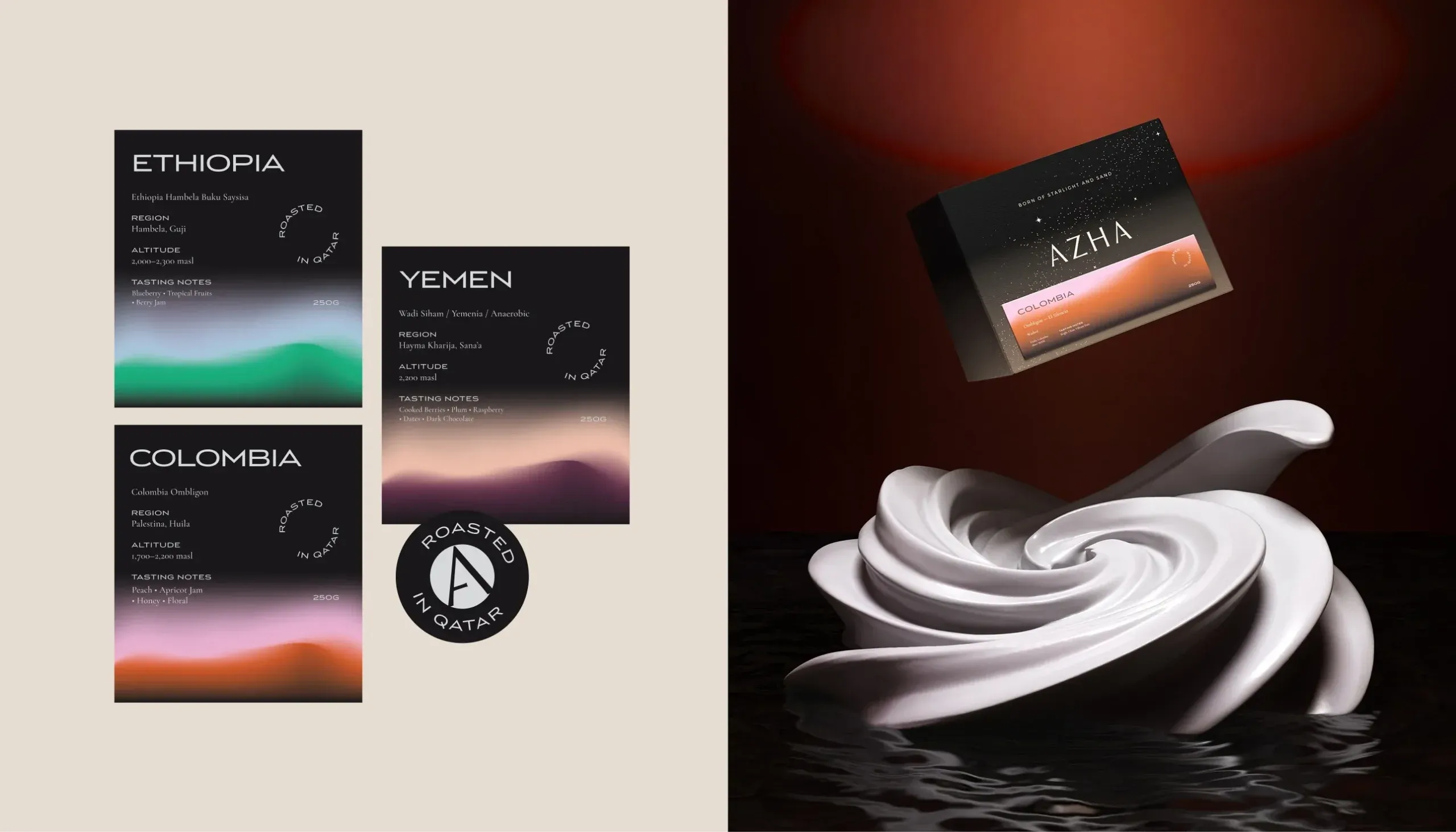
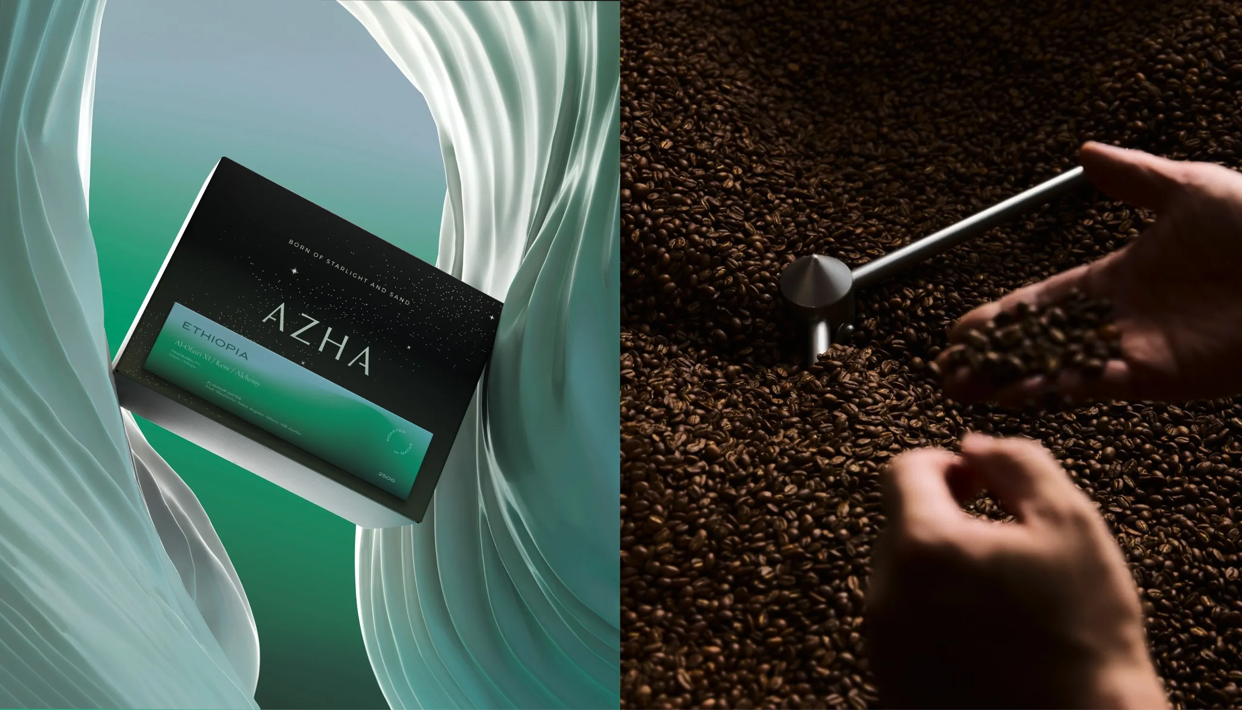
“Born of Starlight and Sand” became the central idea behind the identity. The visual system combines the stillness of the desert with the luminosity of the night sky. A refined wordmark, star-inspired symbol and atmospheric gradients create a language that feels both terrestrial and celestial. Dark neutrals provide structure, while shifting tones of orange, violet and green distinguish origins and flavour profiles.
The Process
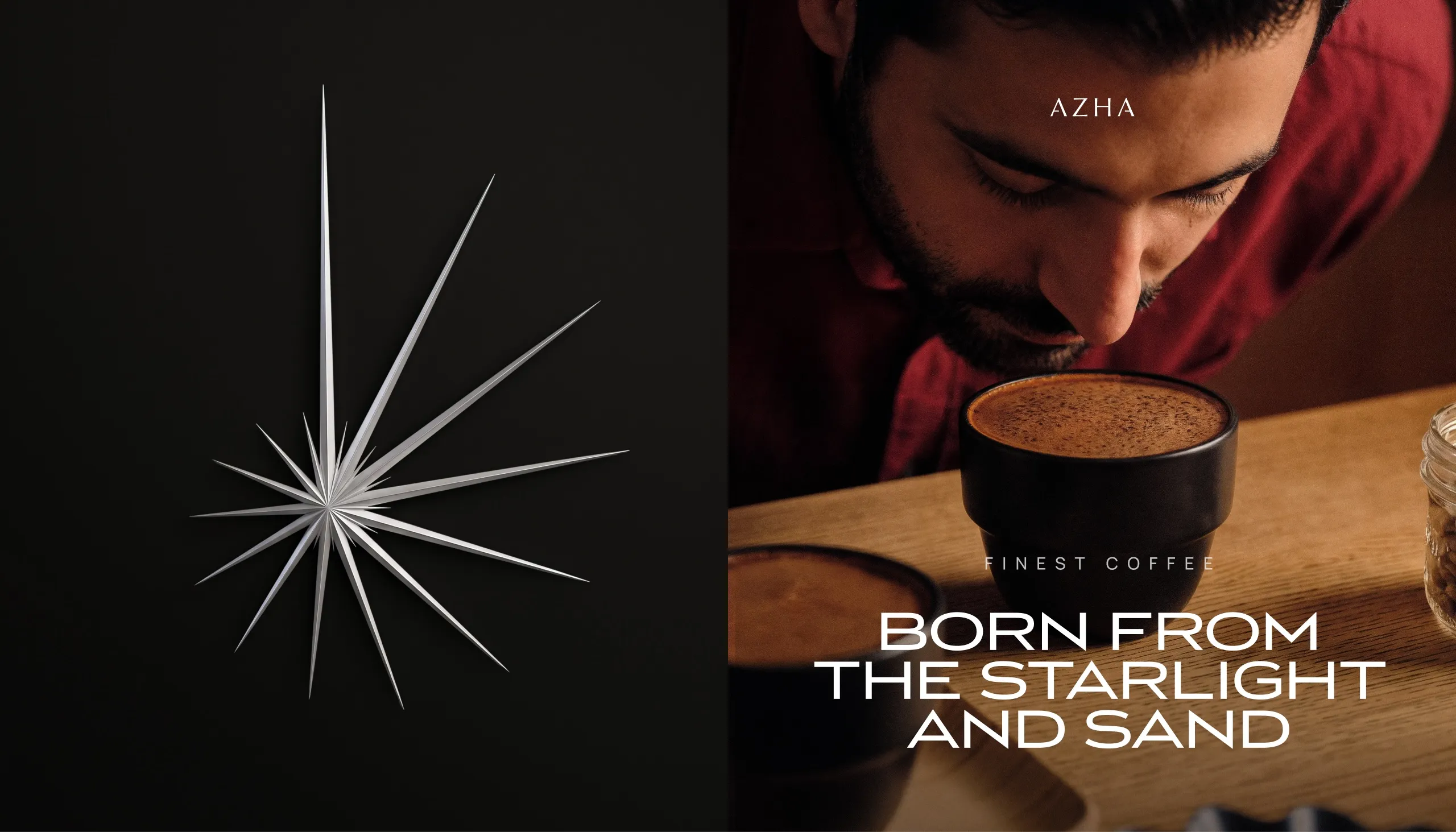
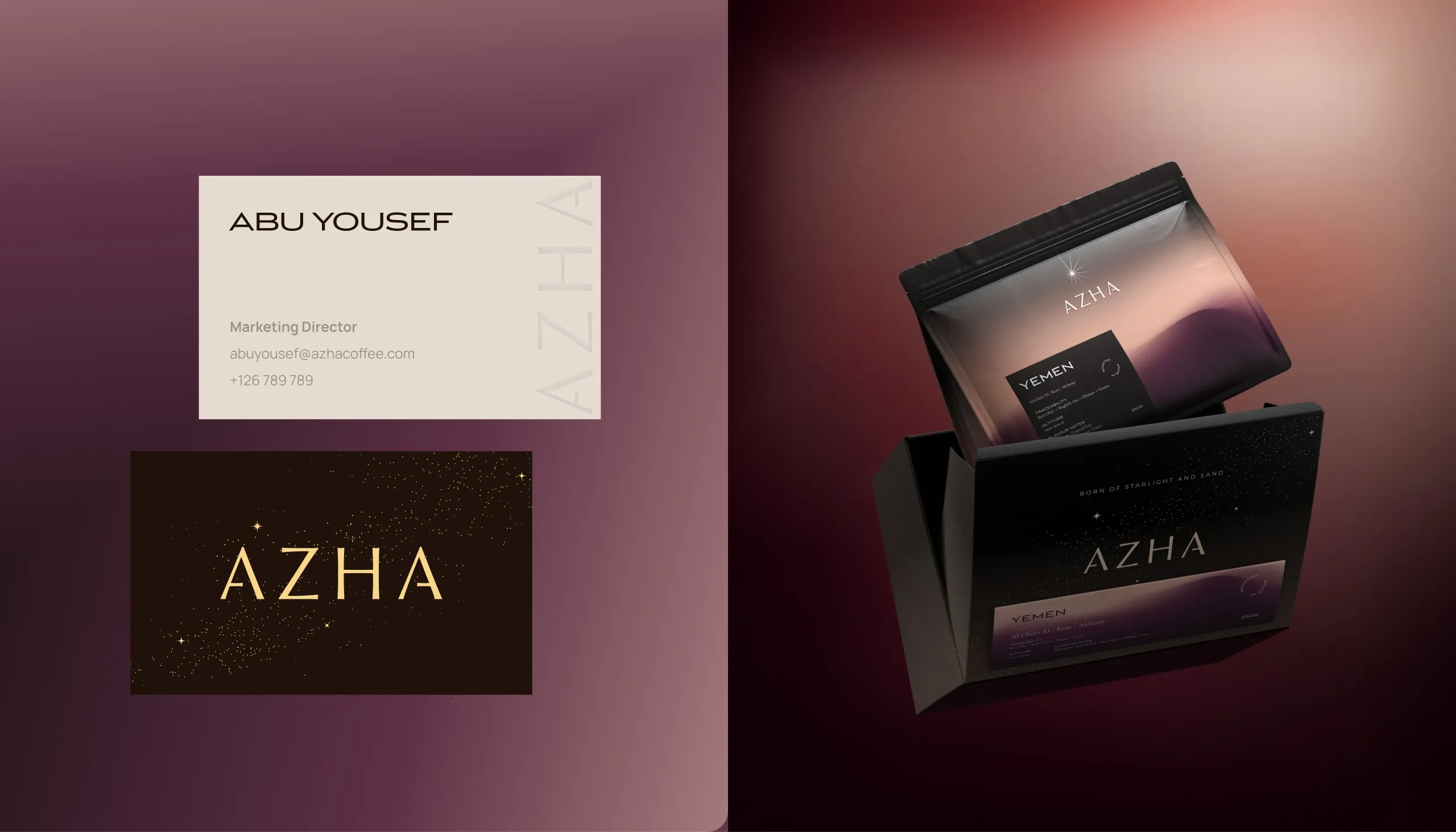
The AZHA wordmark was designed with wide spacing and restrained geometry to create a quiet, elevated presence. Its accompanying star symbol introduces a more expressive layer, connecting the brand to navigation, night skies and the idea of orientation.
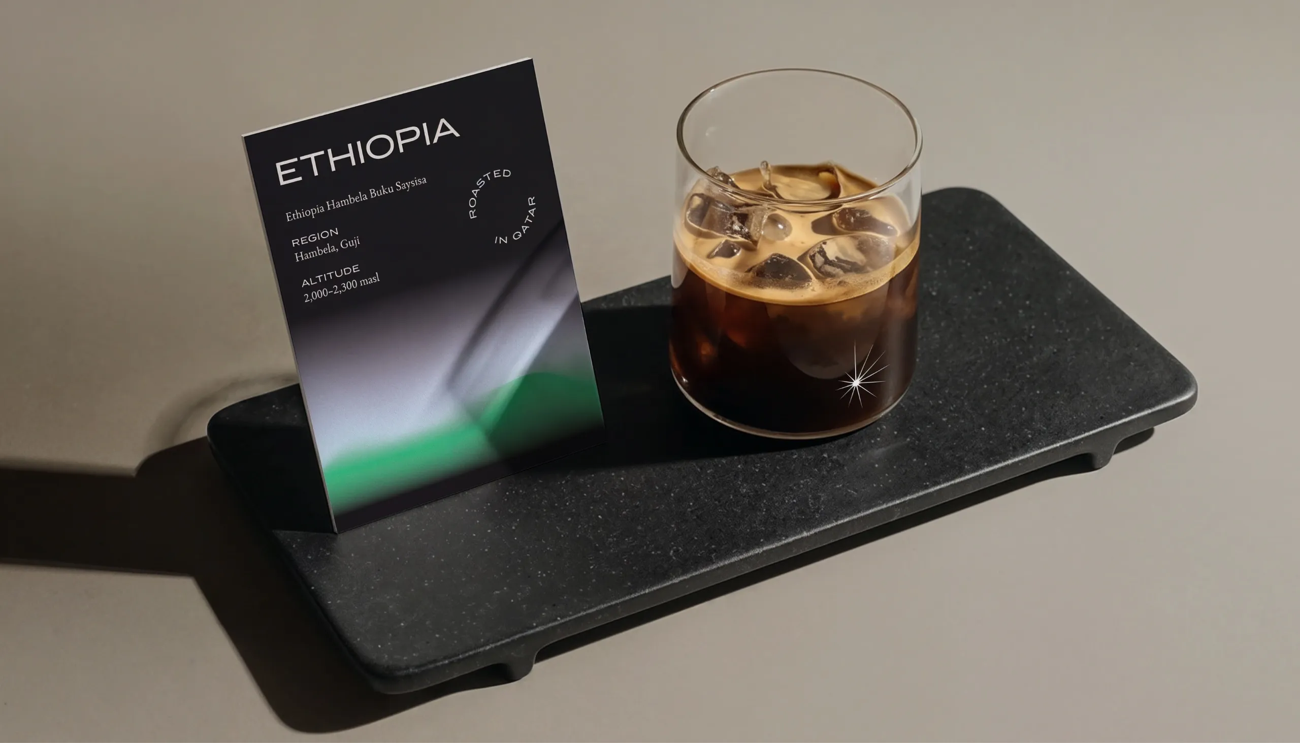
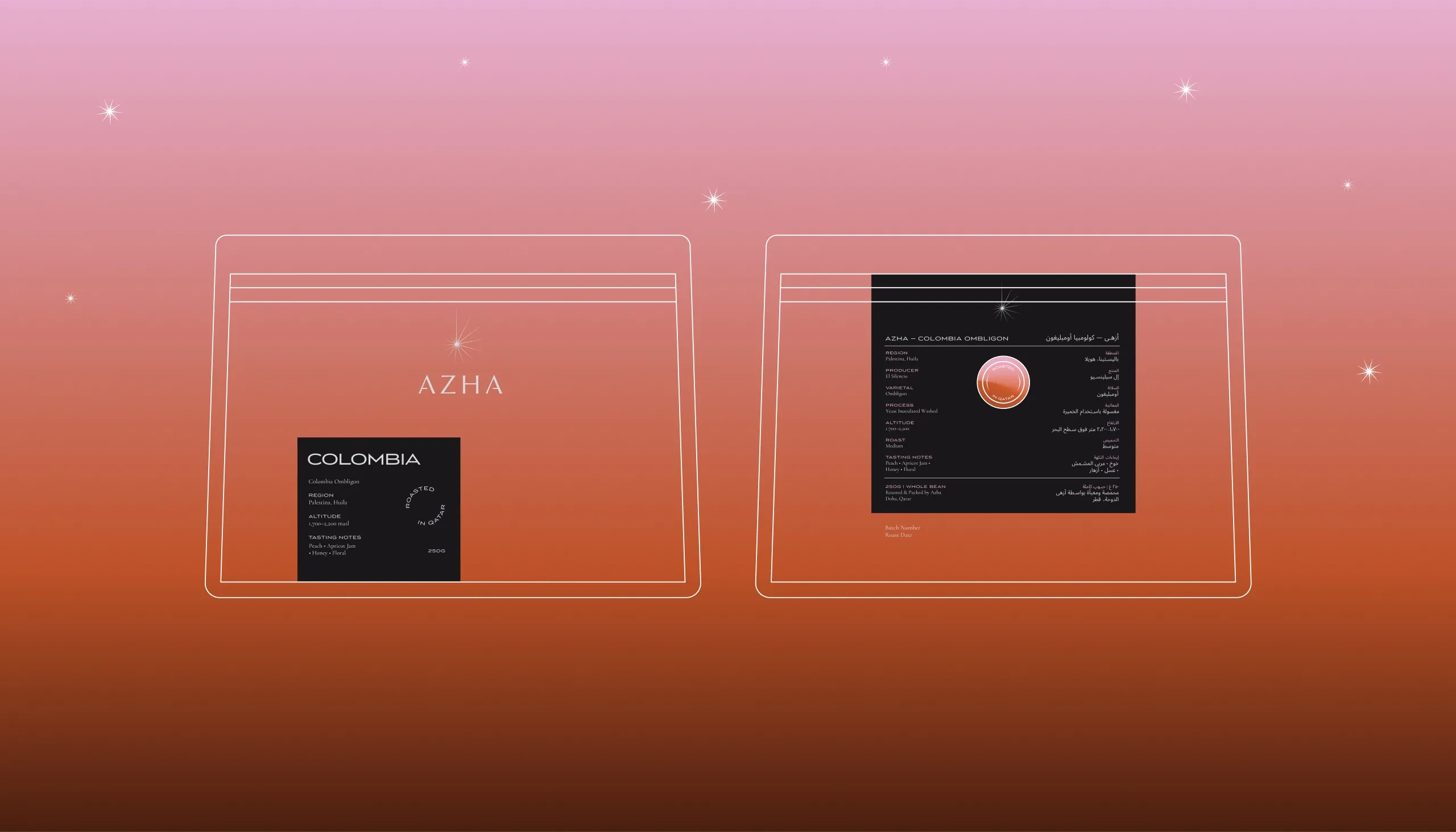
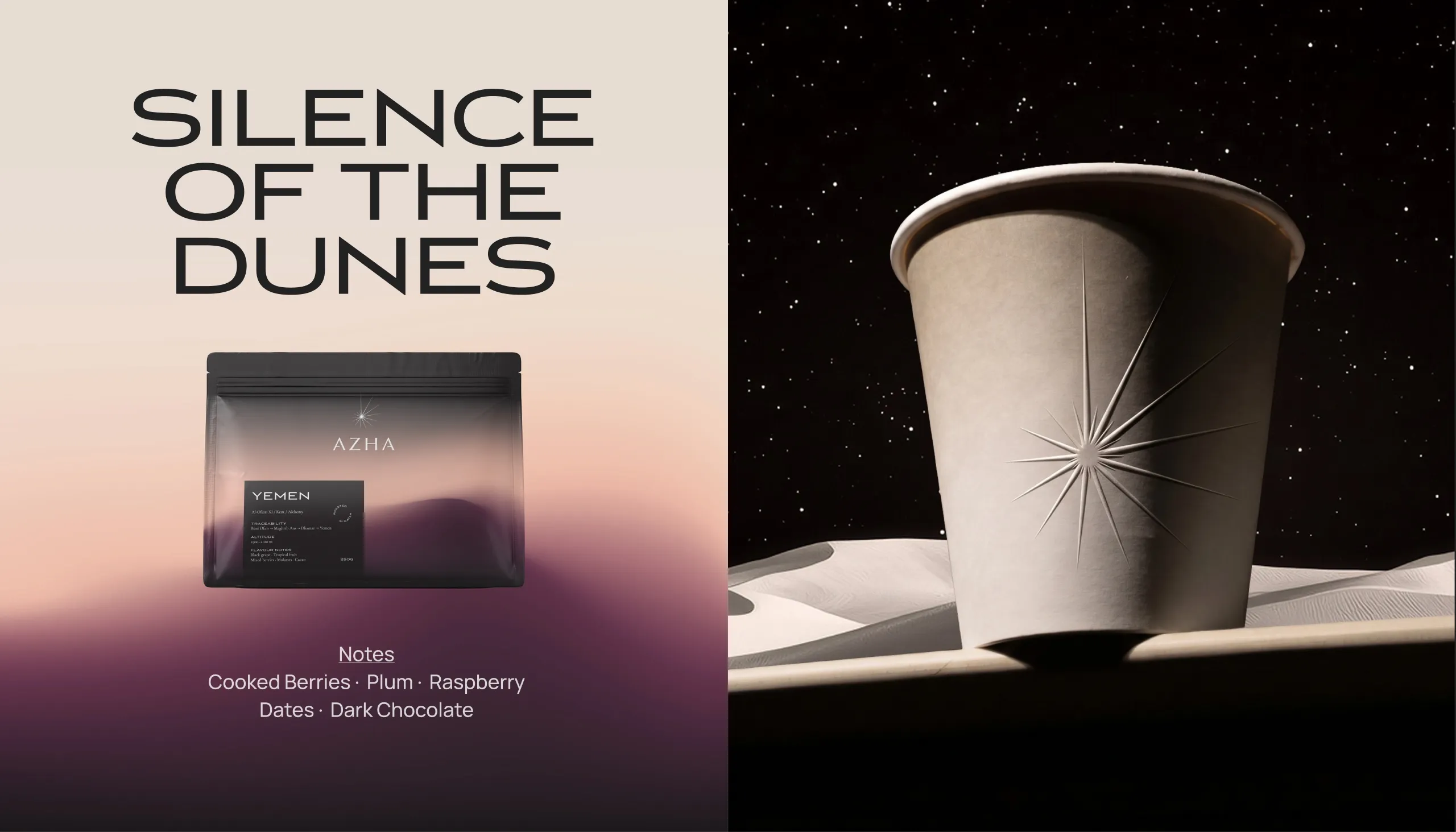
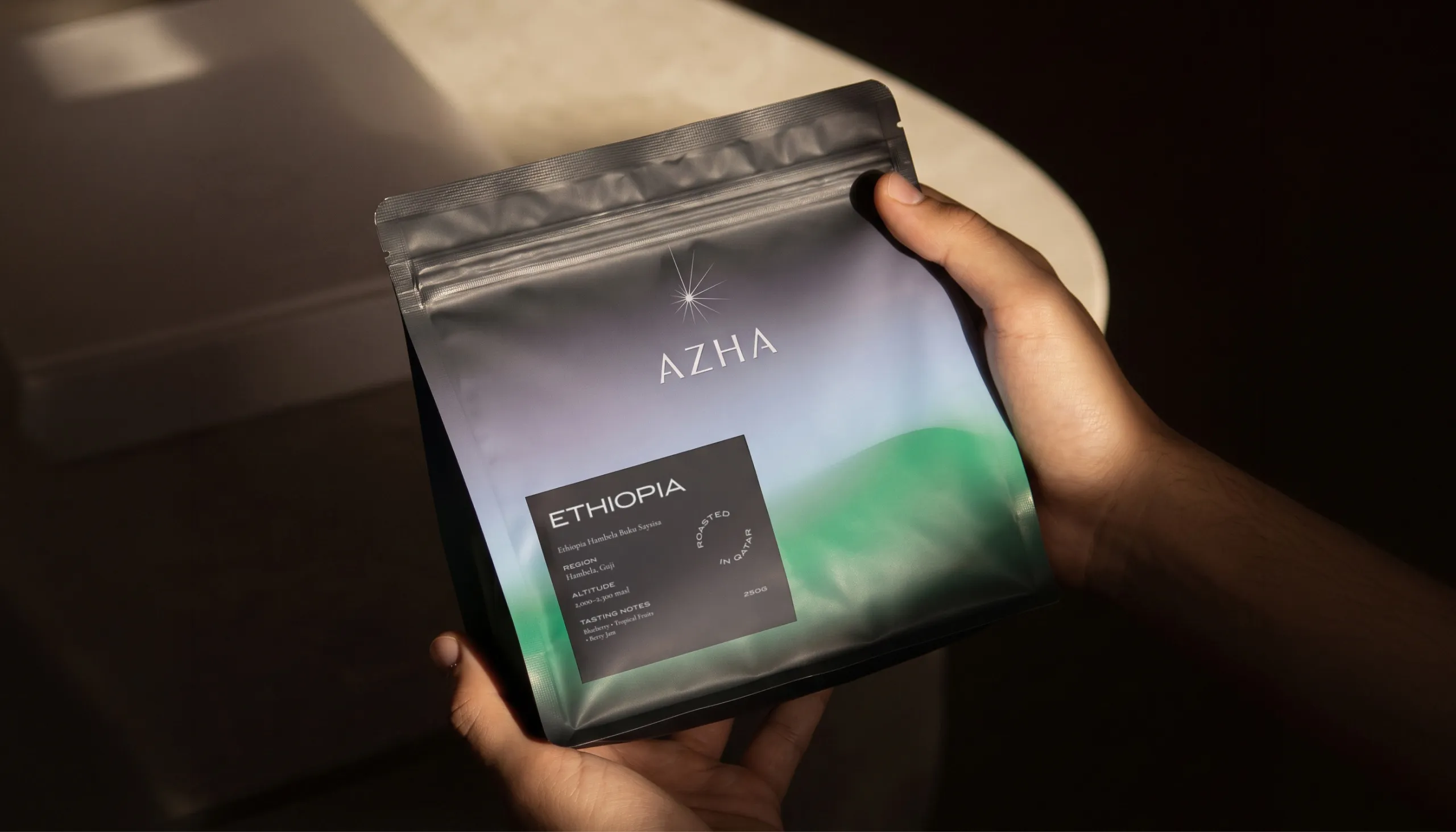
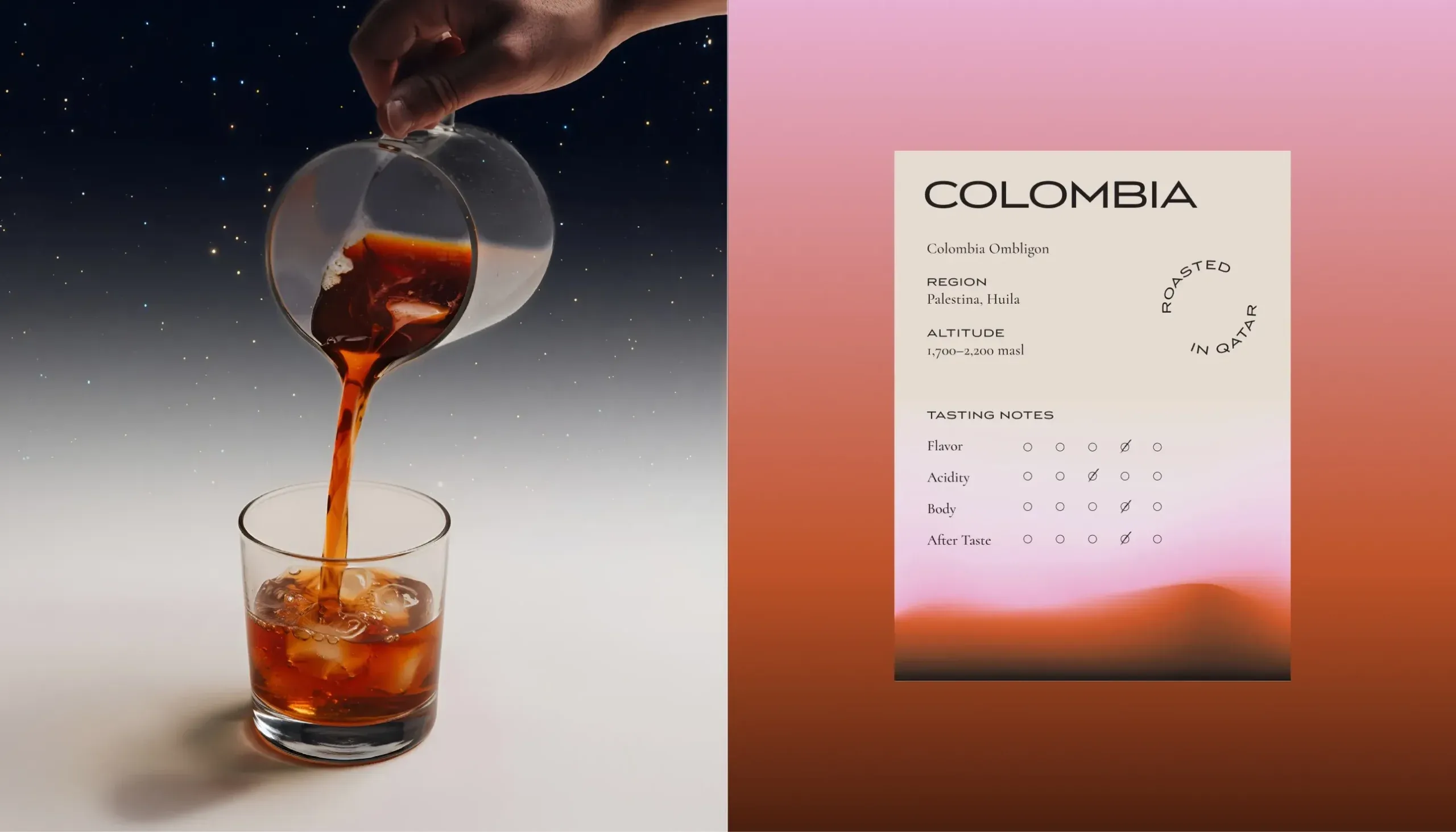
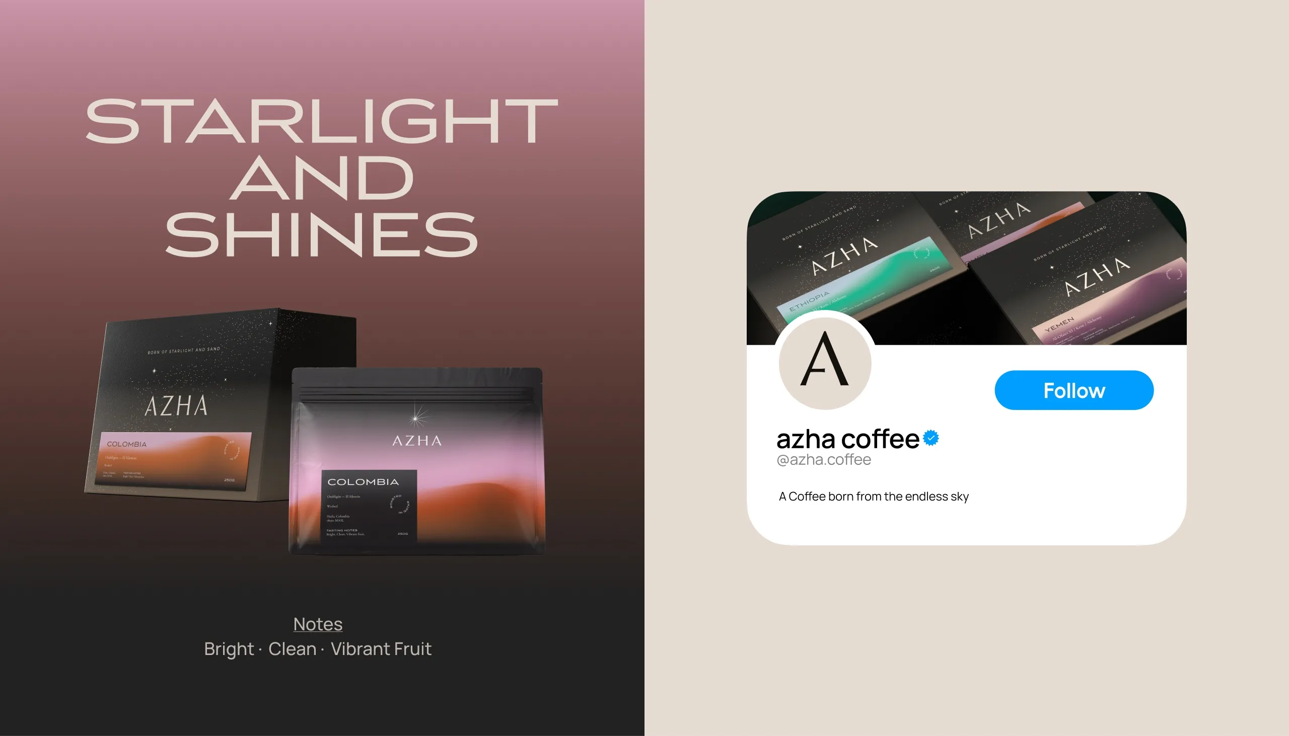
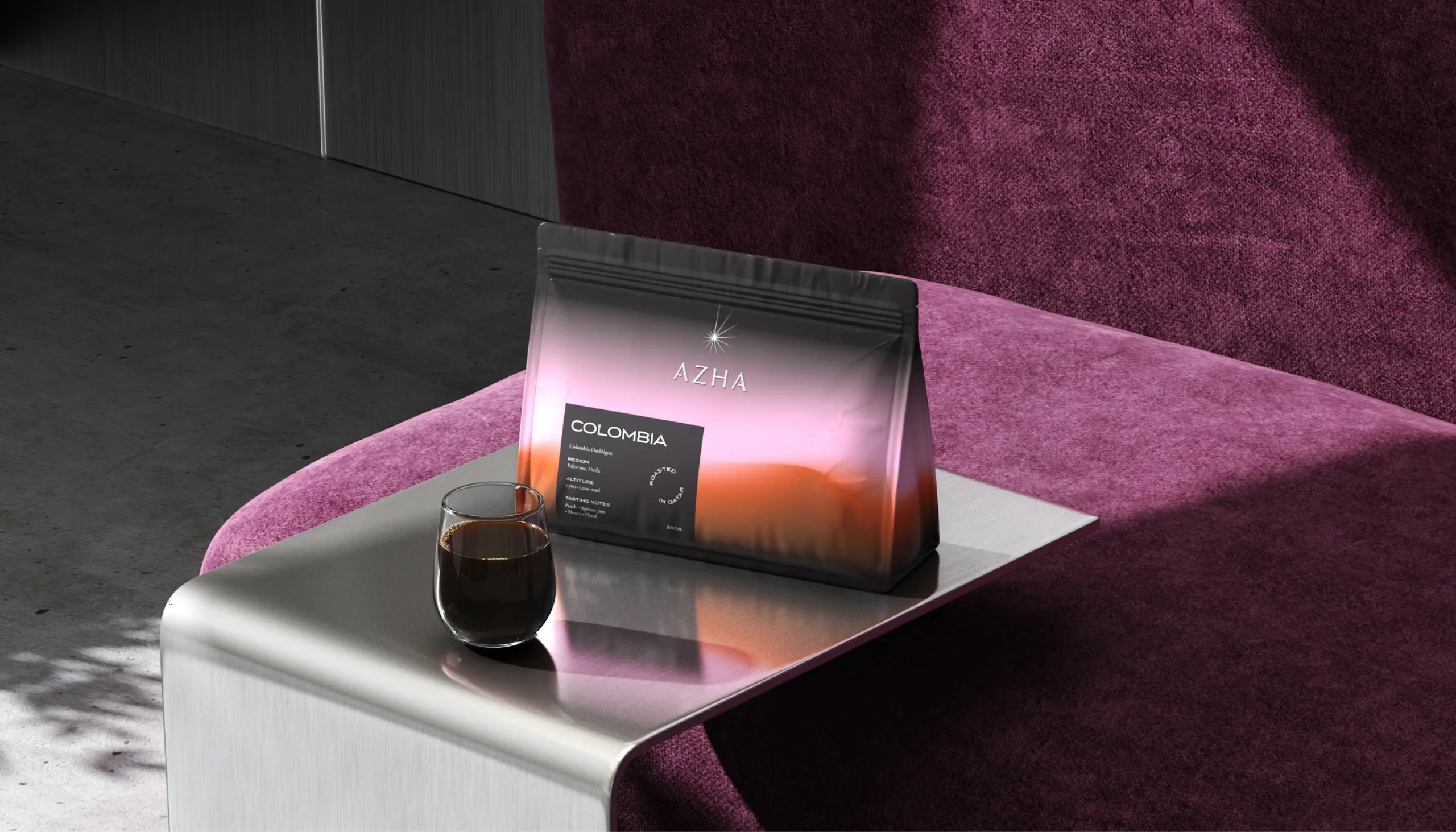
Packaging uses translucent gradient fields inspired by changing desert light. Each coffee origin receives its own colour atmosphere while retaining the same underlying structure, allowing Colombia, Yemen and Ethiopia to feel individual without breaking the system. Product information is kept precise and minimal, balancing origin, altitude, tasting notes and roast details with a more emotional visual language.
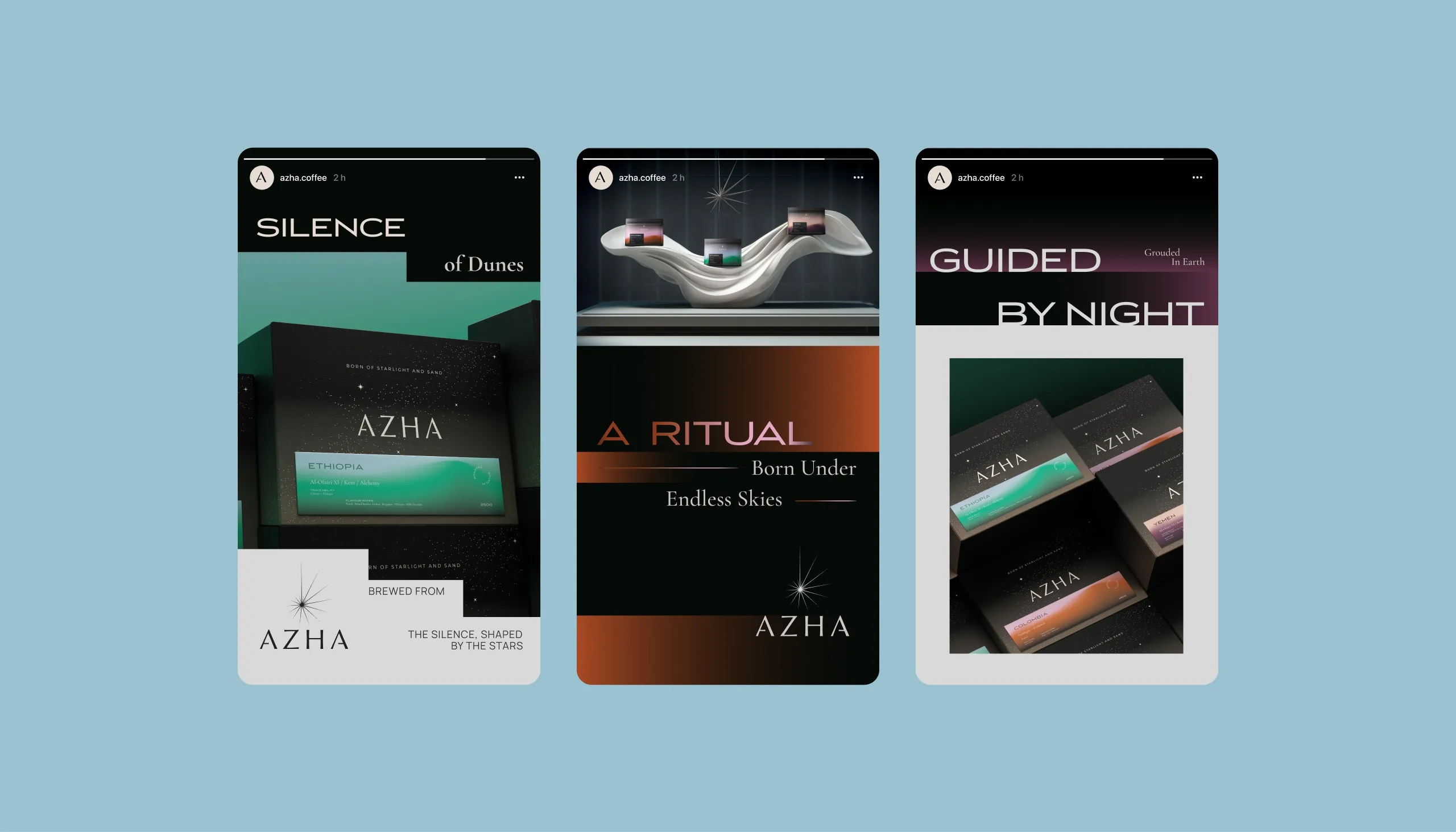
The wider art direction extends this contrast between precision and atmosphere. Dunes, starlight, sculptural forms and soft luminous transitions create a world that feels less like conventional coffee packaging and more like a ritual shaped by place. Campaign lines such as “Silence of the Dunes”, “Guided by Night” and “A Ritual Born Under the Endless Sky” reinforce the connection between origin, environment and experience.
The Outcome
AZHA transforms specialty coffee into a more immersive brand experience, connecting product, place and ritual through one coherent visual system. The identity gives each origin a distinct presence while maintaining a strong overall character across packaging, retail, social media and future product extensions.
See more coffee and tea branding case studies.




Let’s make the work they’ll copy.
Talk to an expert now
Work with a 38 team of the
industry’s top 1% talent.