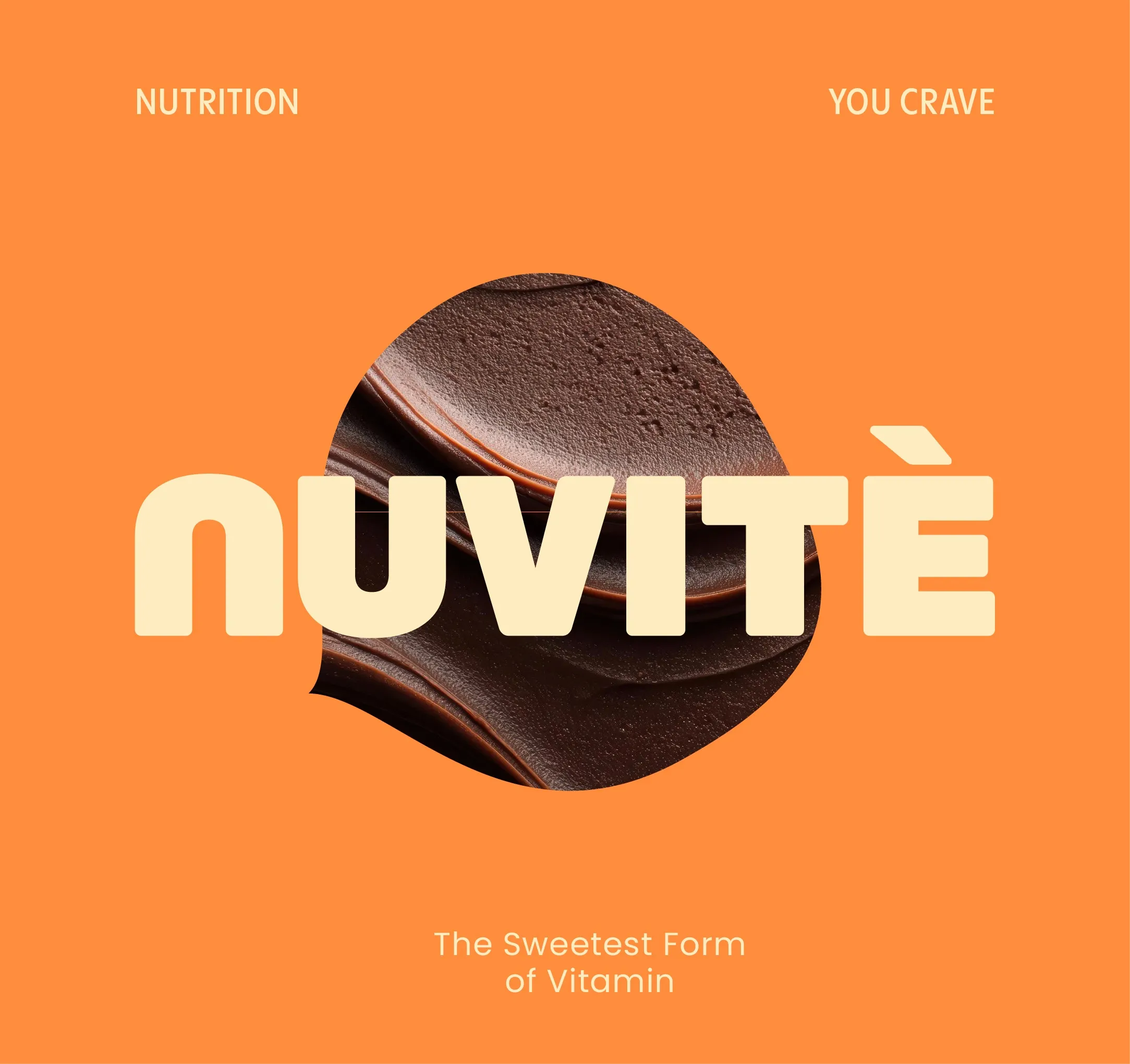
NUVITÉ
Functional Chocolate Brand Identity & Visual System
NUVITÉ brings together the pleasure of chocolate and the purpose of daily nutrition.
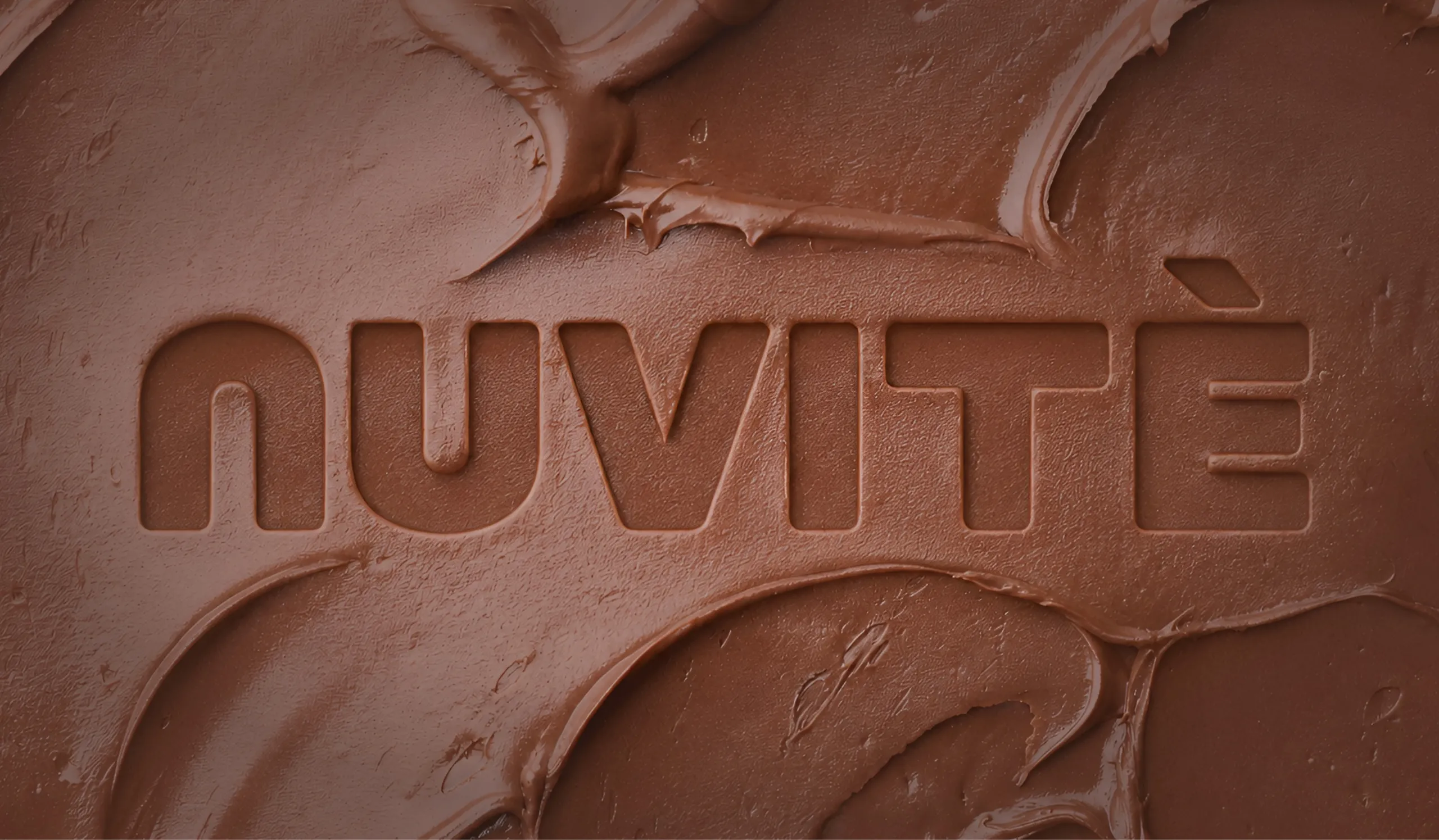
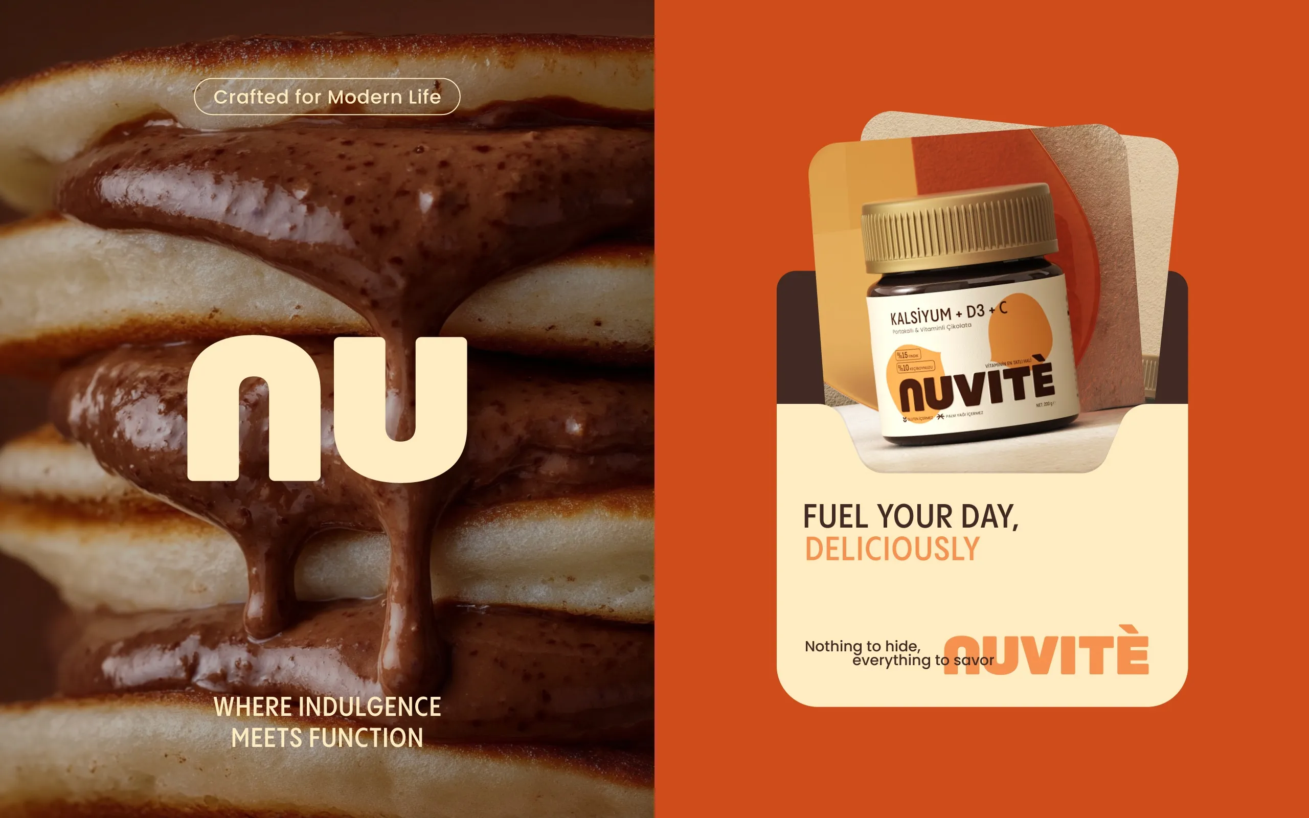
NUVITÉ sits in an awkward place on purpose, and MarkaWorks kept it there. It is chocolate, so it has to be appetizing, and it is functional, so it has to be credible. Those two demands usually pull a pack in opposite directions, and most brands in this space resolve the tension by looking clinical. We went the other way.
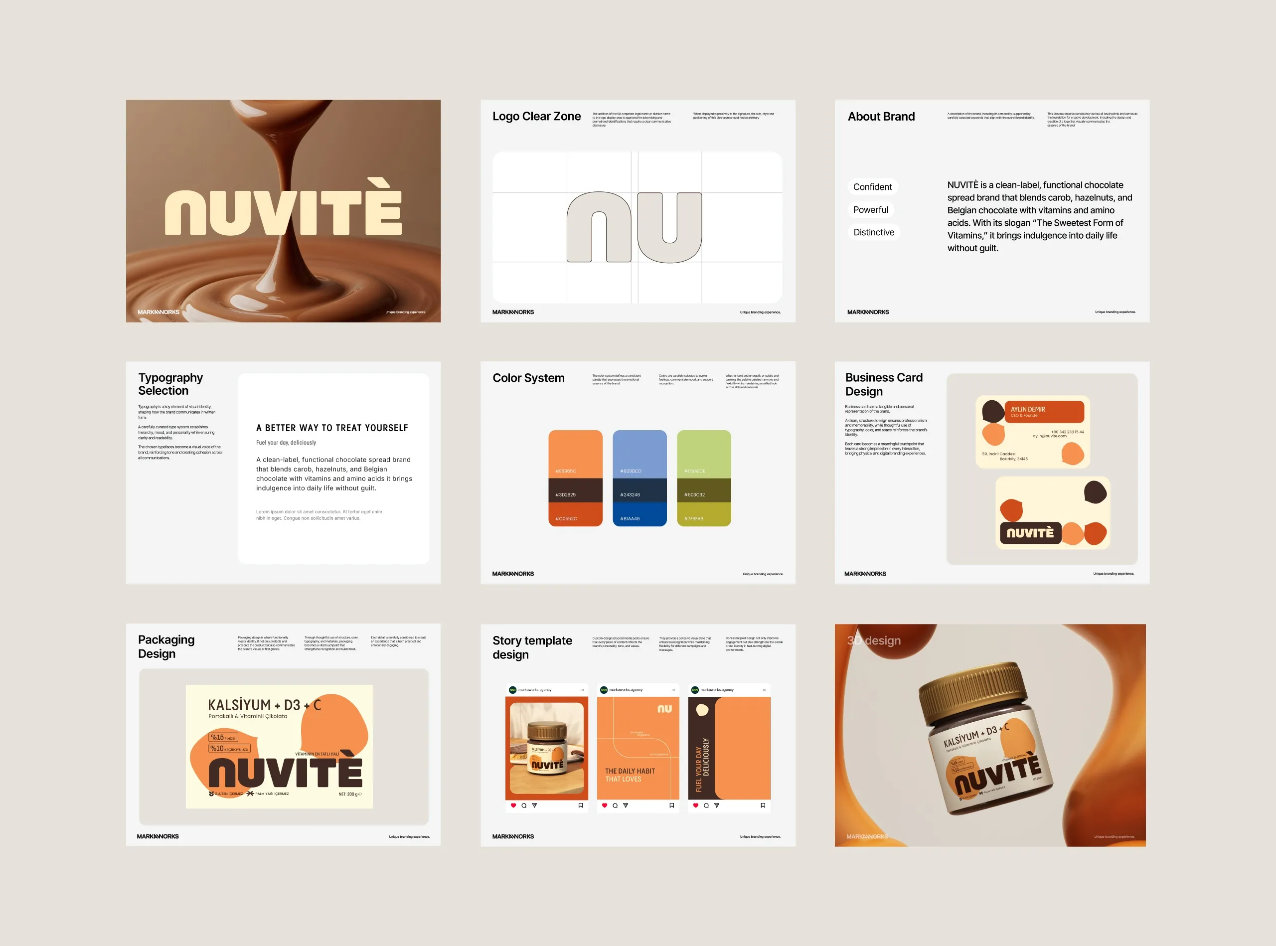
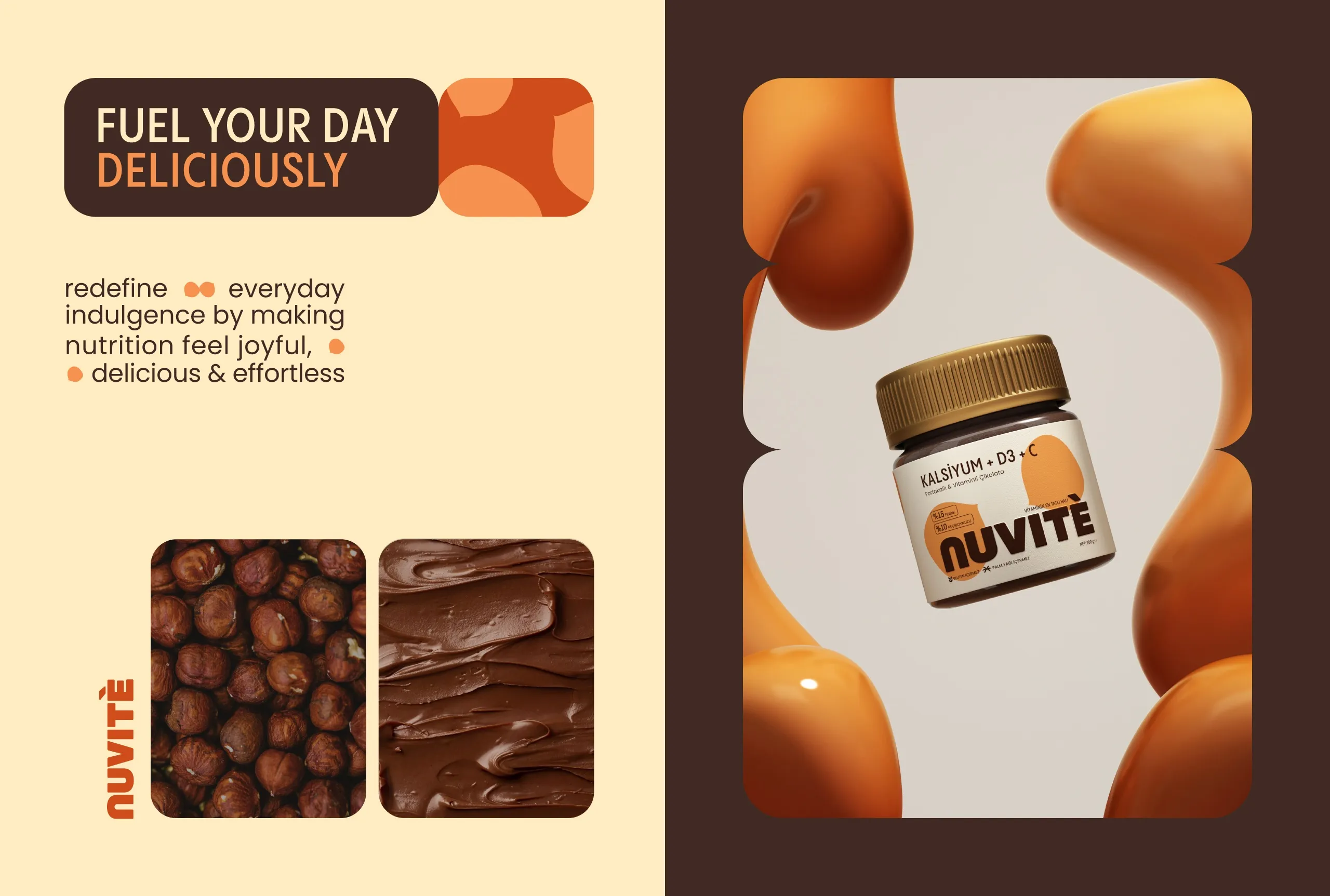
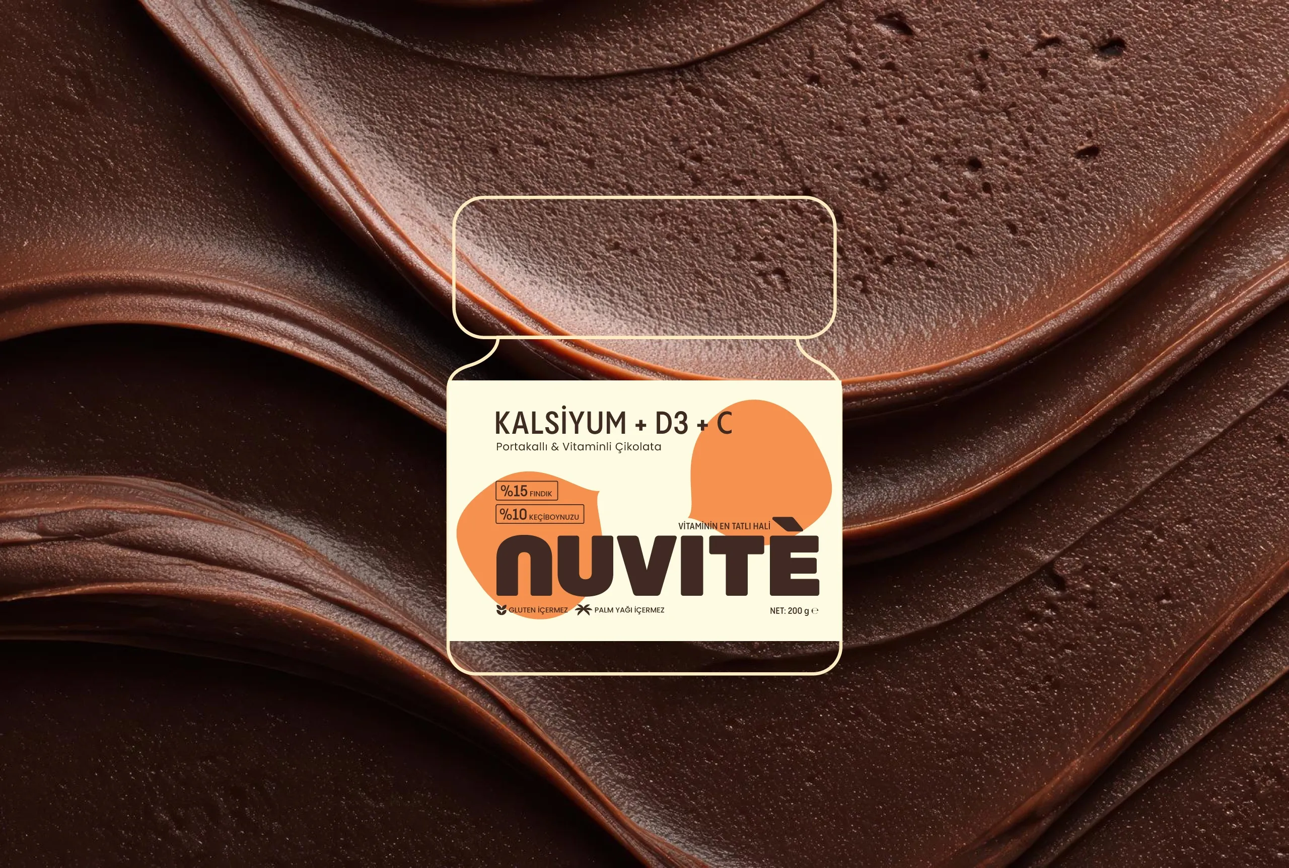
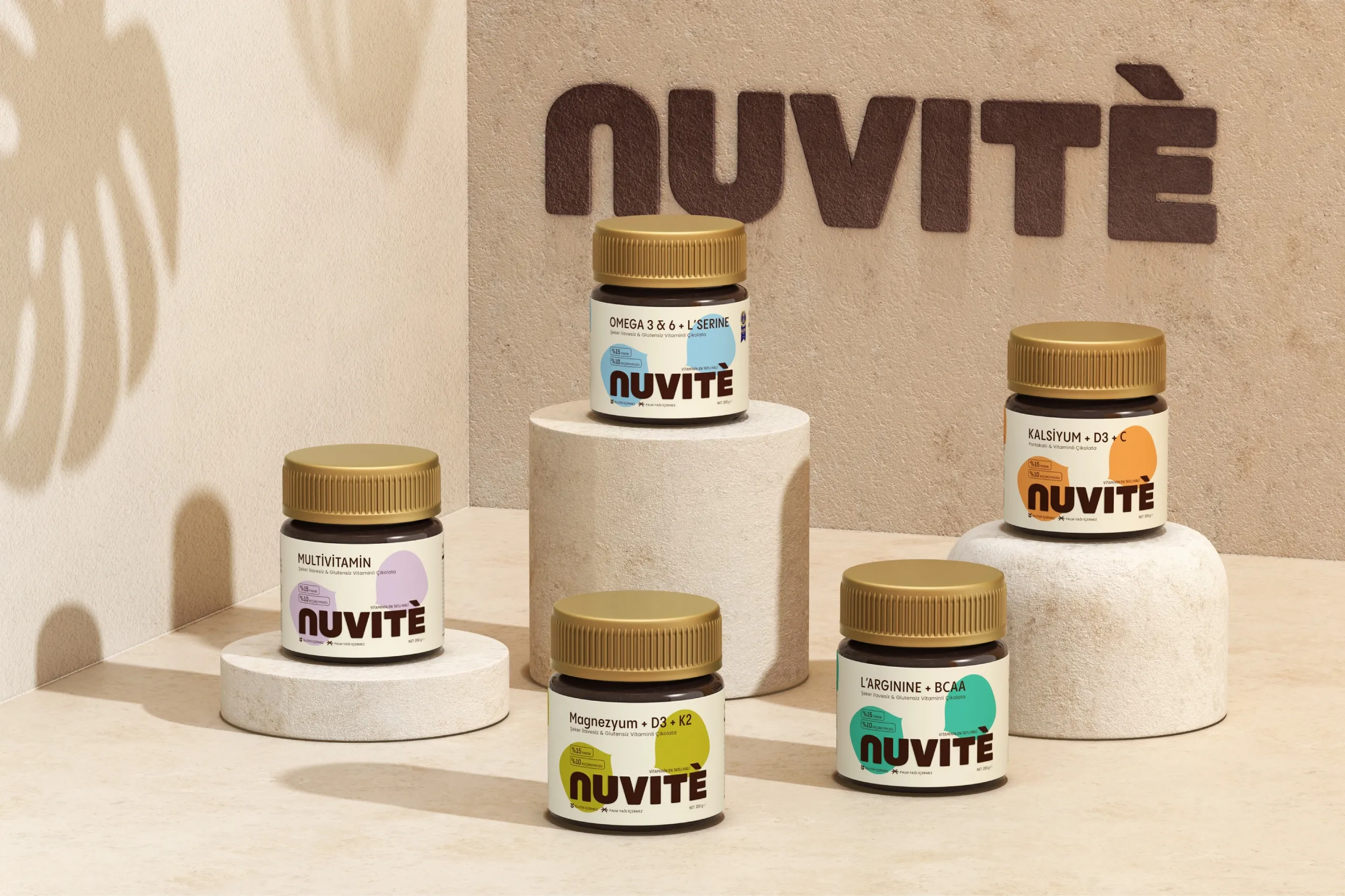
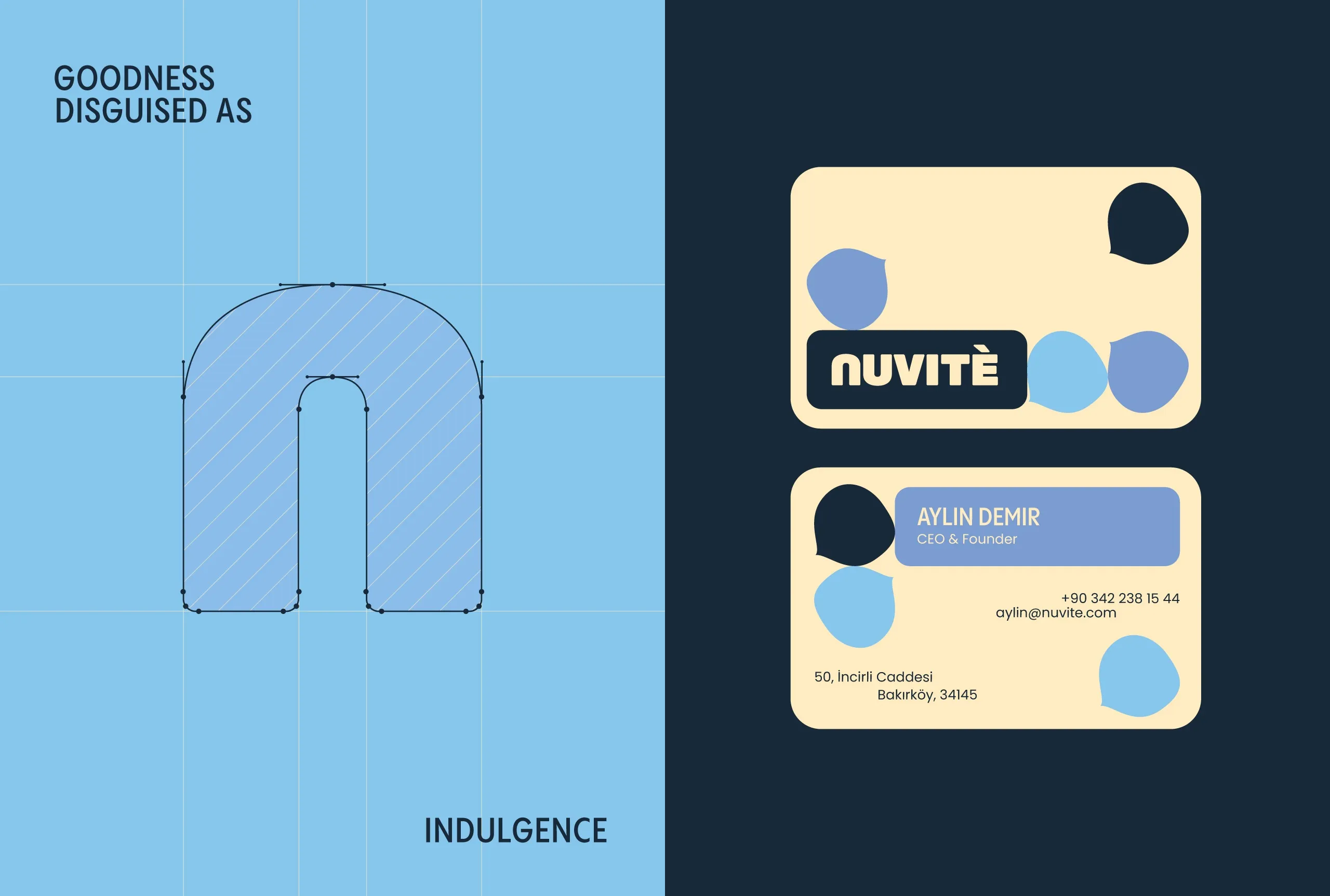
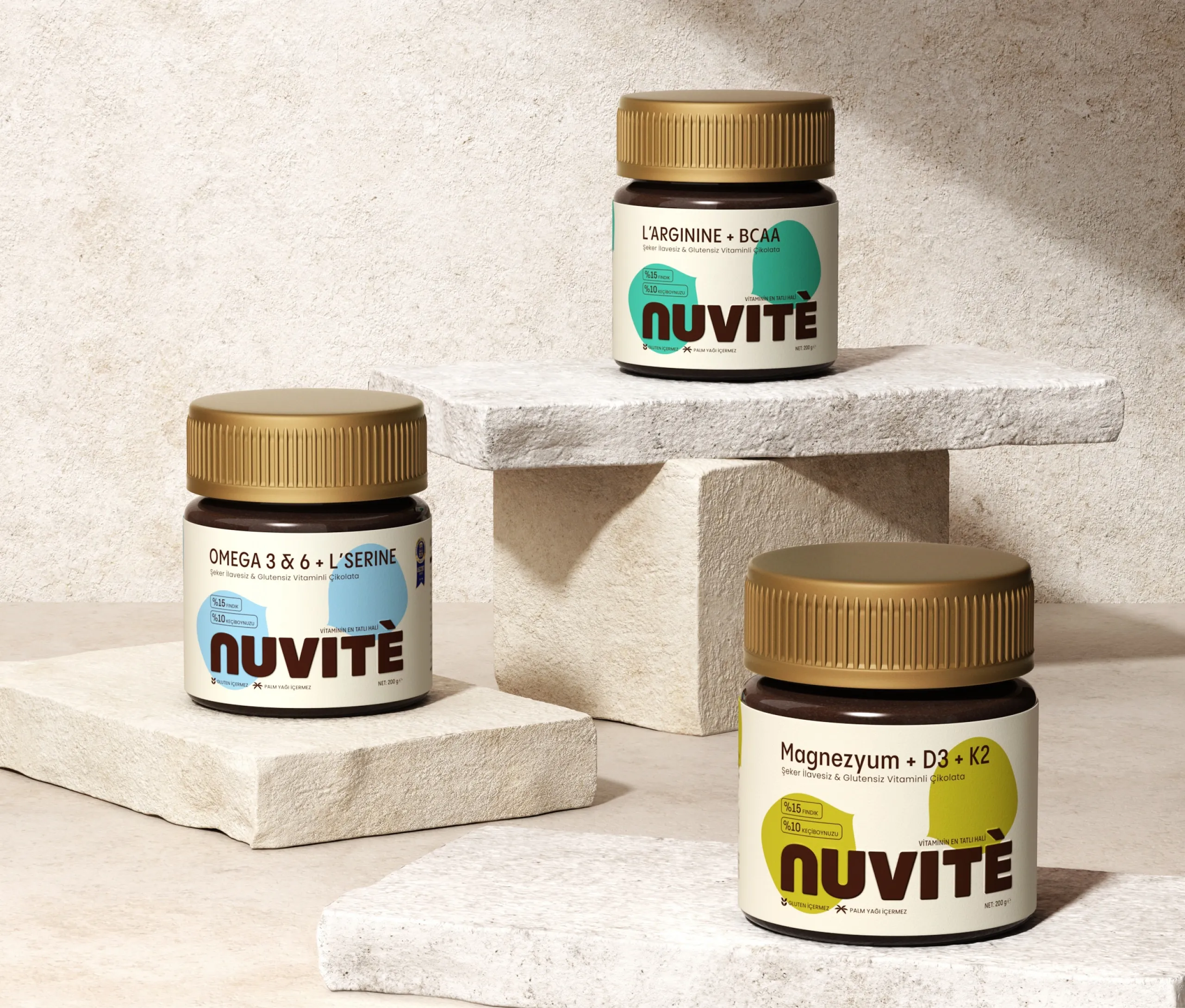
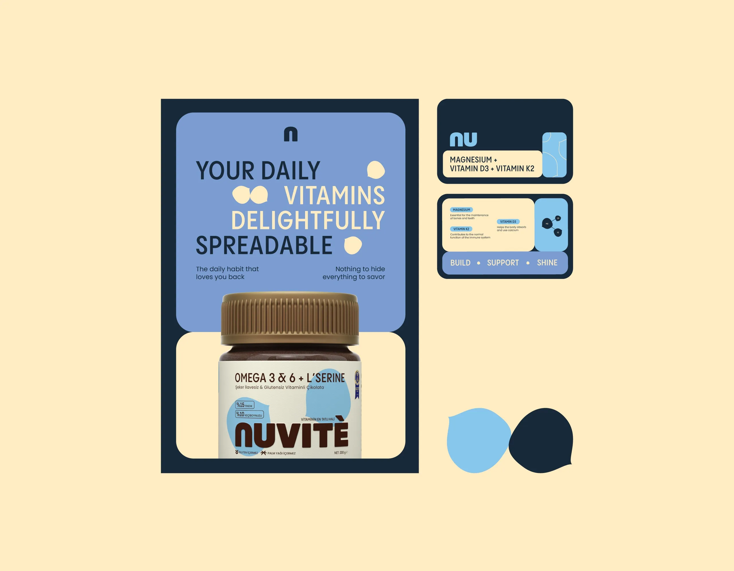
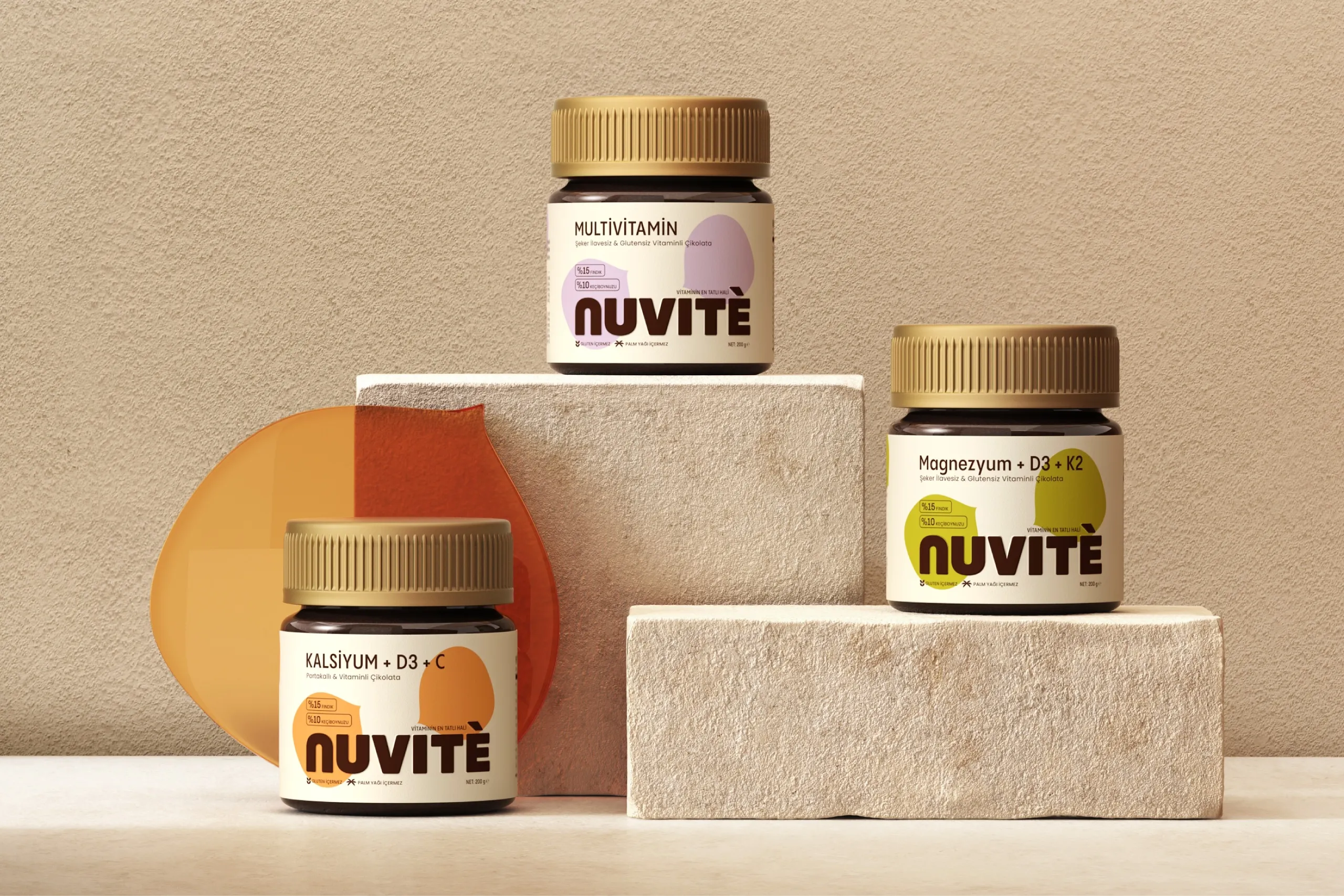
The identity is built to be bold and flexible rather than careful. Rounded typography sets the tone: it reads as approachable before it reads as anything else, which is what keeps the functional side from tipping into a pharmacy aesthetic. Warm chocolate tones do the appetite work, and playful organic forms carry the movement, so the brand world feels contemporary without borrowing the visual language of nutrition products.
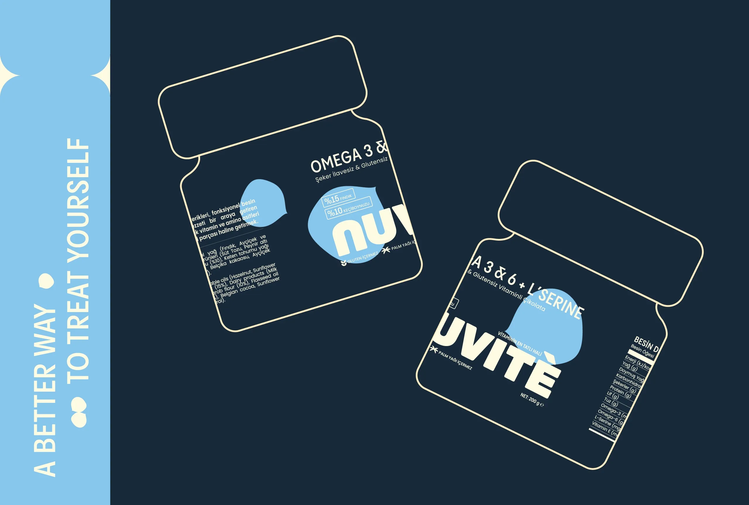
There is a discipline behind the playfulness. Organic forms are easy to let run, and a system built on them drifts unless something fixes it, so the typographic structure is the constant and the forms move inside it. That is what keeps the brand from looking different on every pack while still reading as playful on each one.
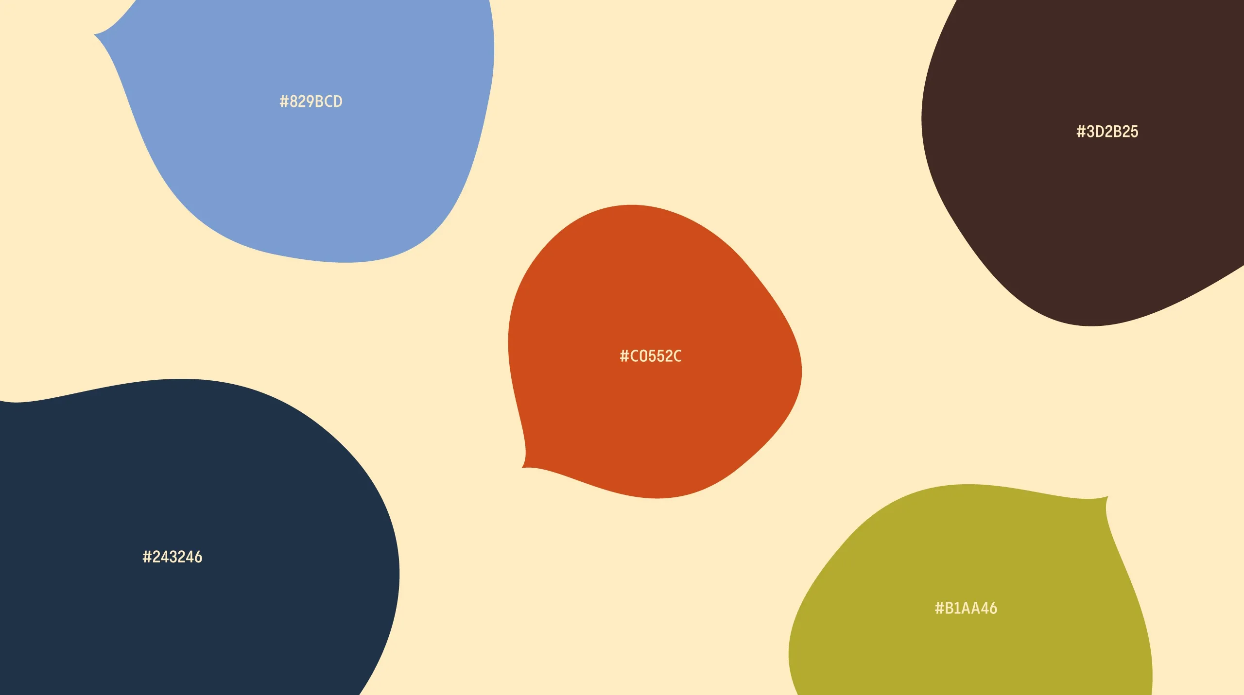
Color is the variable inside the system. Each product carries its own color personality while the structure around it stays fixed, which means the range can grow without a new design decision each time and a shopper can tell two products apart at a glance while still reading them as one family. That is the whole point of chocolate packaging design at range level: difference where it helps the choice, sameness everywhere else.
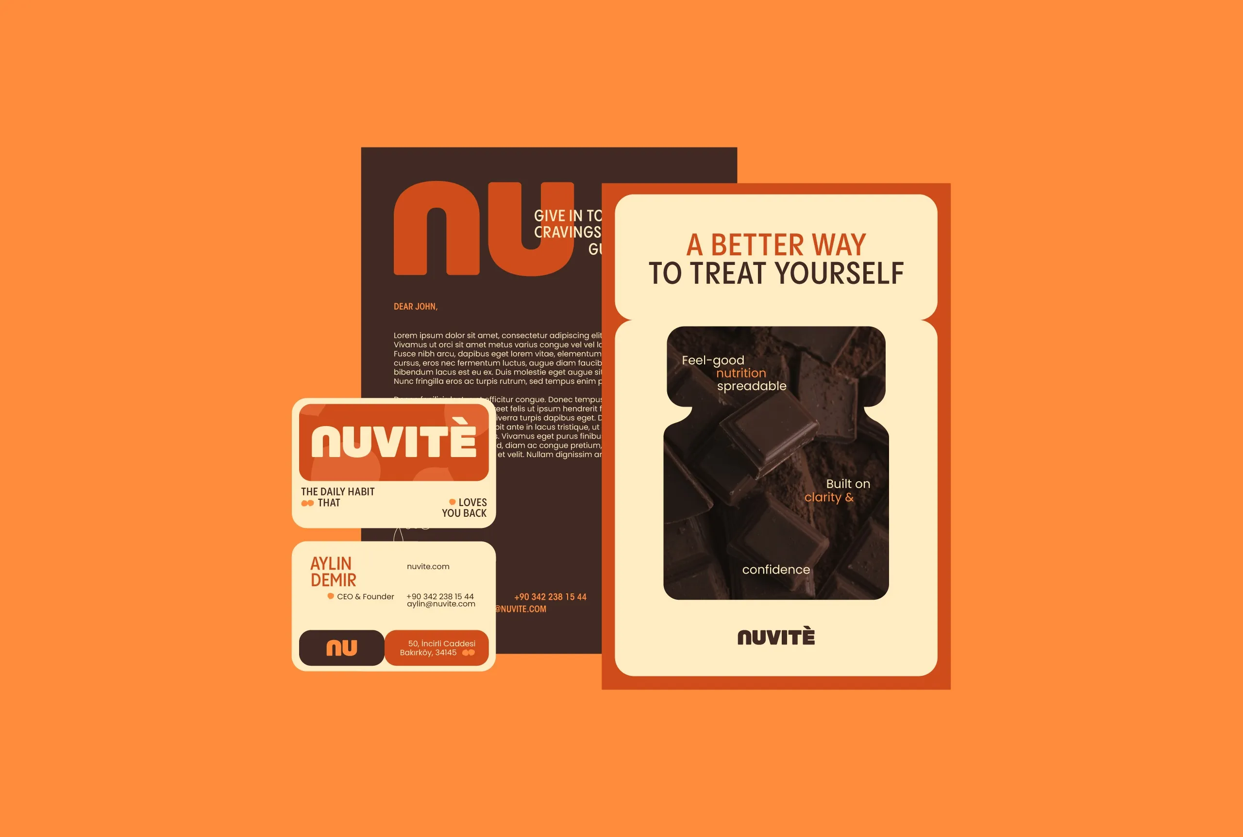
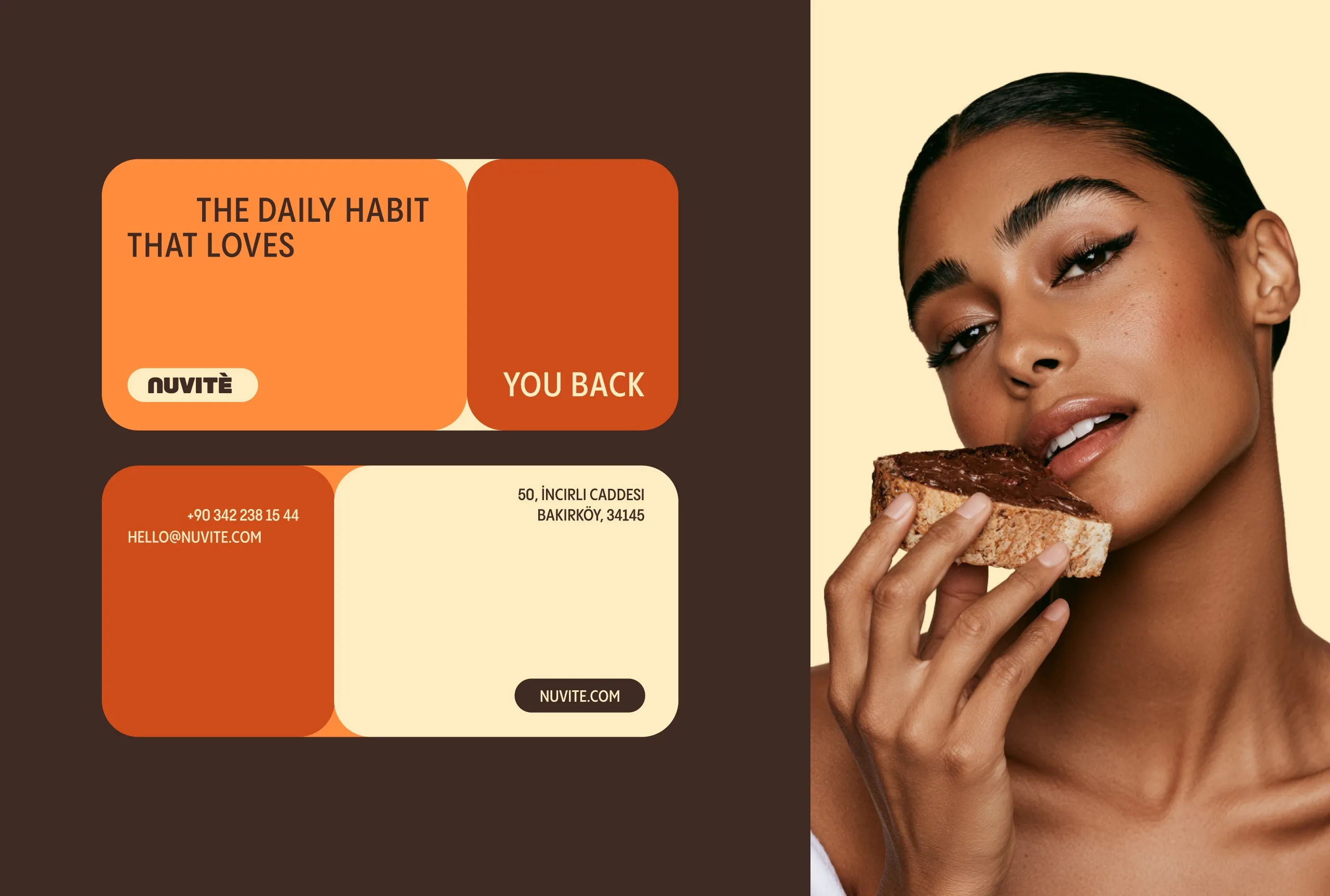
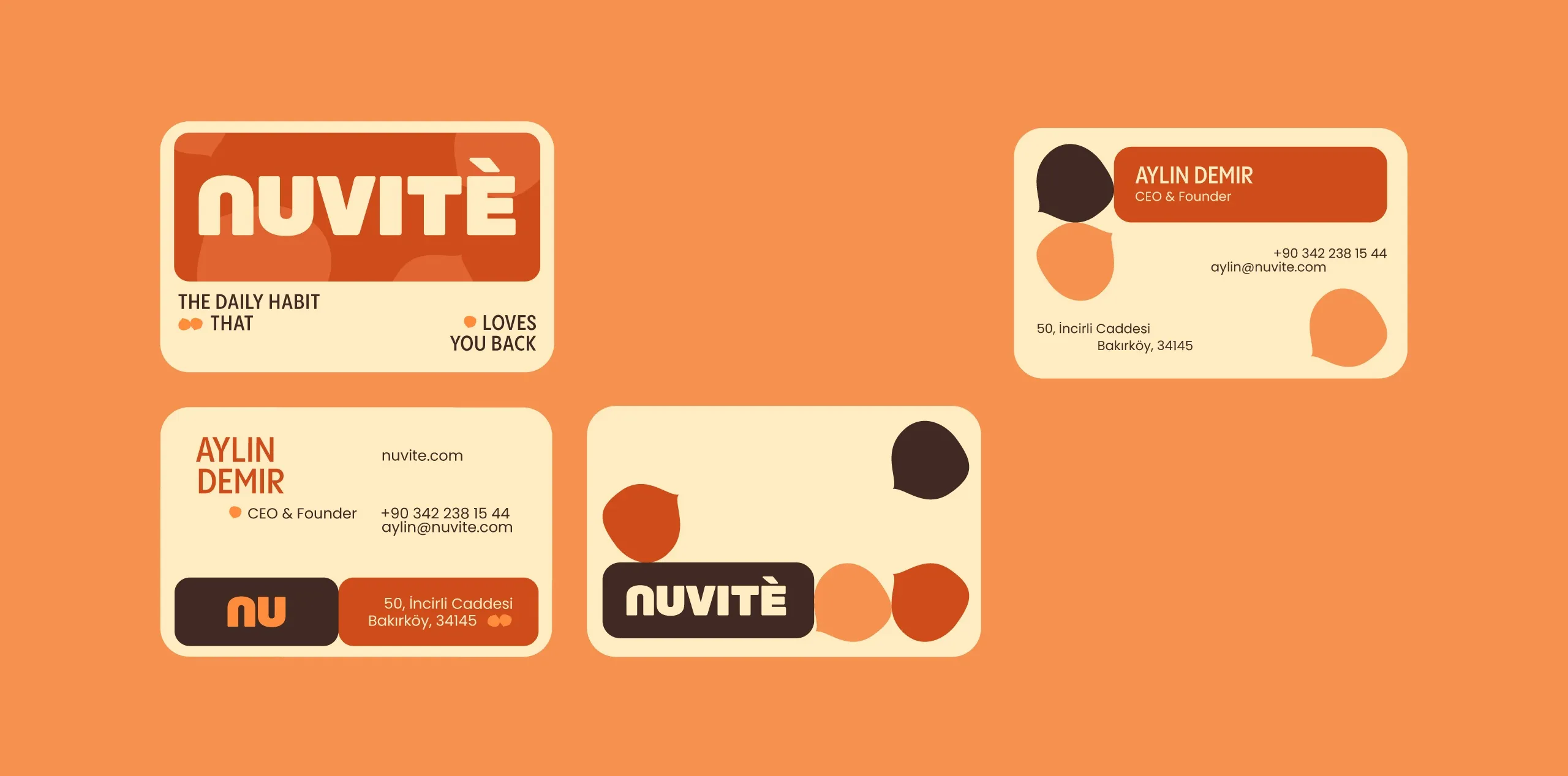
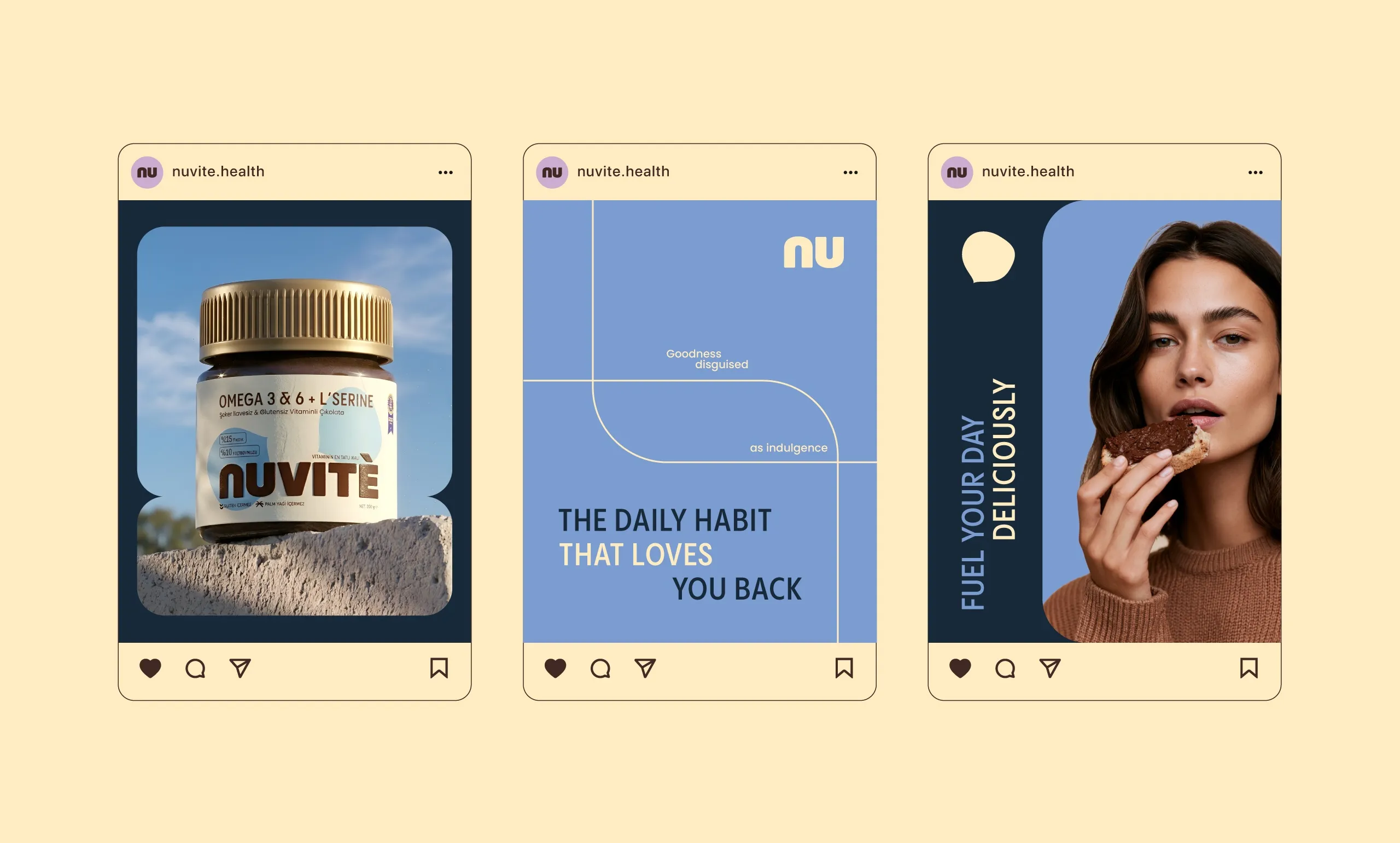
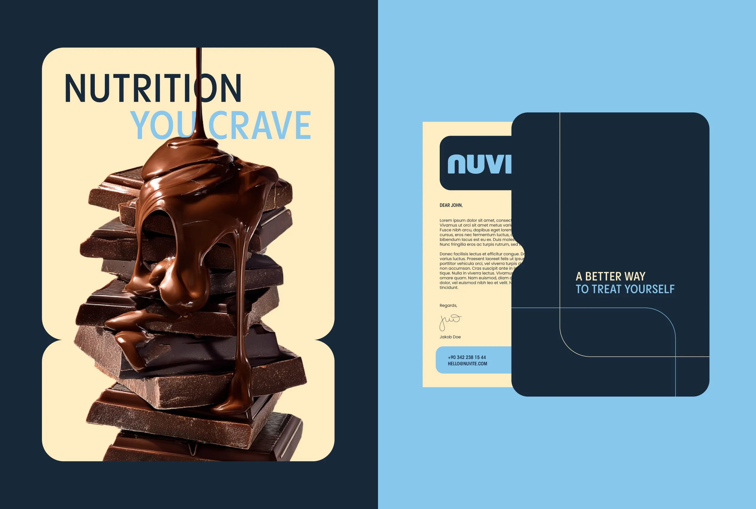
The system was not built for the pack alone. It extends across packaging, stationery, social media, and campaign imagery, and it holds its character in each because the rules that make it work are structural rather than decorative. A rounded letterform and a warm tone behave the same way on a wrapper and in a campaign frame; a decorative flourish would not.
Stationery and campaign imagery were treated as part of the same range rather than as support material. A brand that changes register between the shelf and the feed asks the viewer to recognize it twice, and the rounded letterform and warm tone are consistent enough to stop that happening without the applications looking repetitive.
What NUVITÉ ends up with is a functional food brand that does not announce its function. The everyday nutrition part is present in the product and in the naming, and the design lets it stay there instead of turning the pack into a label about itself.
See more food and drink branding case studies.

Let’s make the work they’ll copy.
Talk to an expert now
Work with a 38 team of the
industry’s top 1% talent.



