Biregime London
Biregime London Brand Identity and Packaging Design
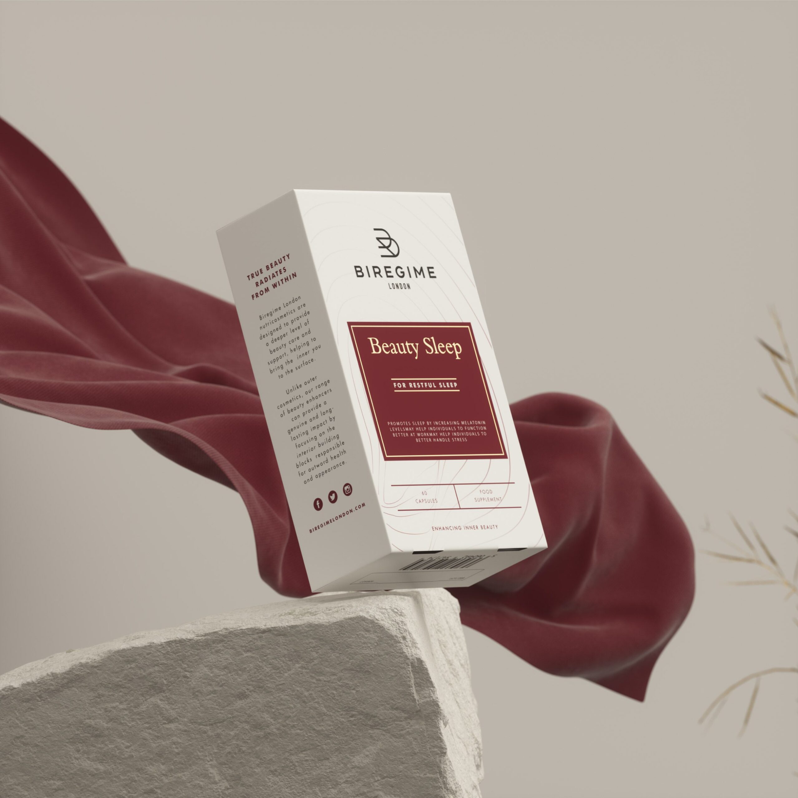
Biregime London is a beauty and personal care brand developed with a focus on premium presentation and clear product communication. The project involved defining a brand identity and packaging system that elevates the product range while supporting user understanding of category and function.

The design work prioritised a visual language that communicates quality and purpose, balancing product expression with structured presentation across packaging and related brand applications.
Navigation is the real job in cosmetics packaging design, because a range is chosen from rather than read. MarkaWorks used purposeful typography and distinctive graphic cues to move the eye through the range, and a controlled colour system to separate variants while keeping the family intact. We use graphic elements to organise information instead of decorating it, which is what allows product details to stay legible on pack without the layout becoming a list.
Brand Strategy and Visual Identity
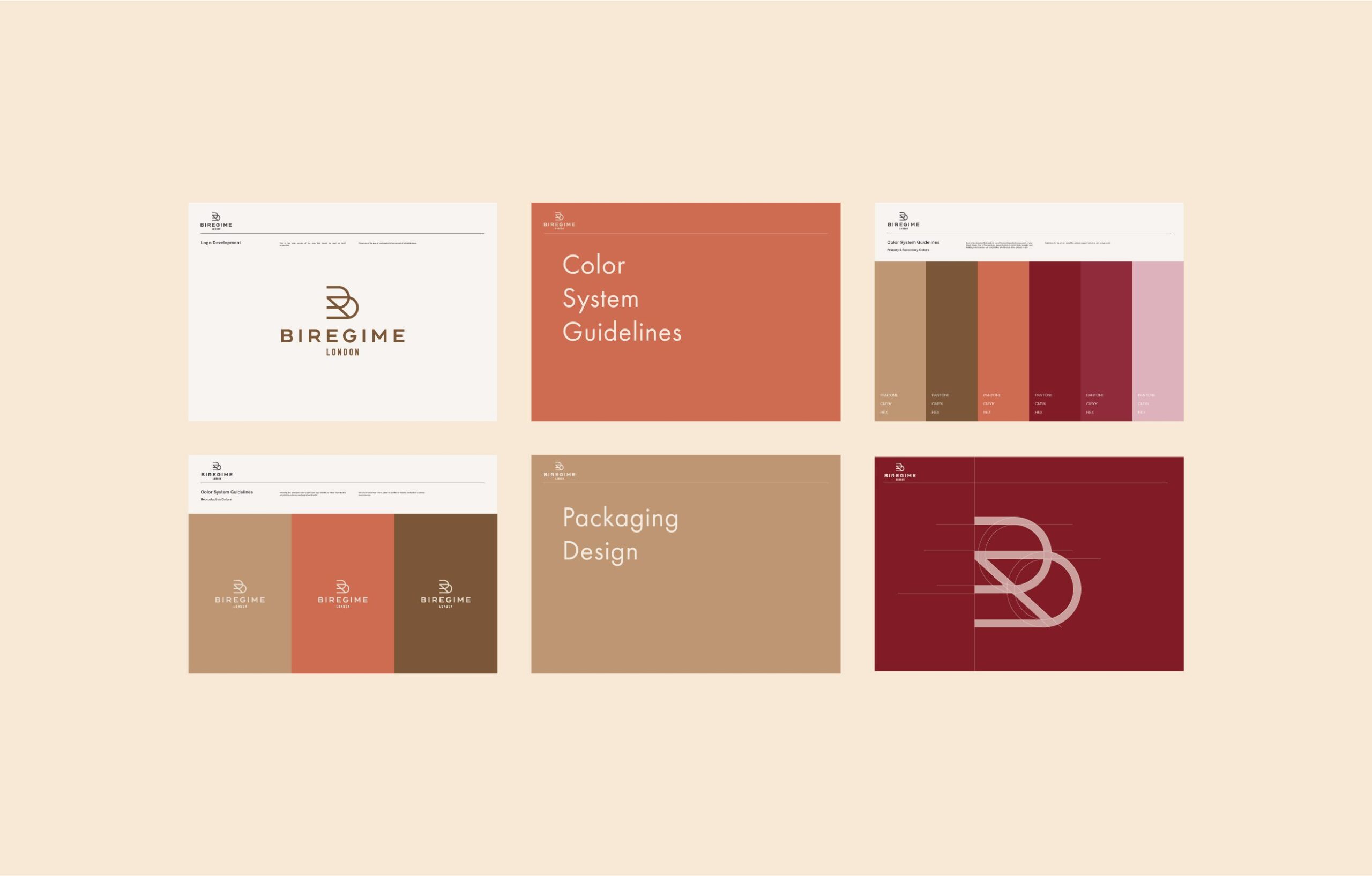
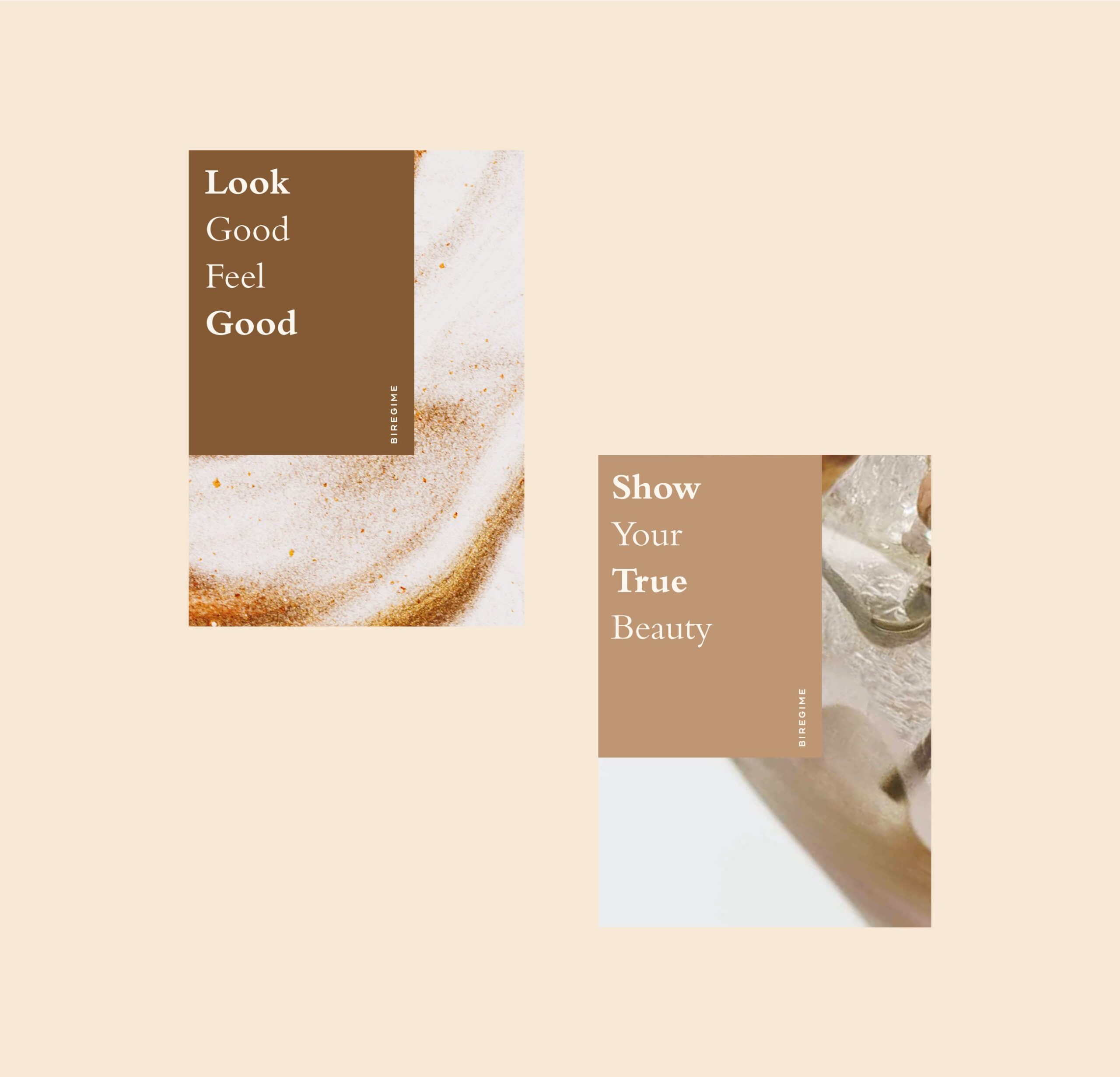
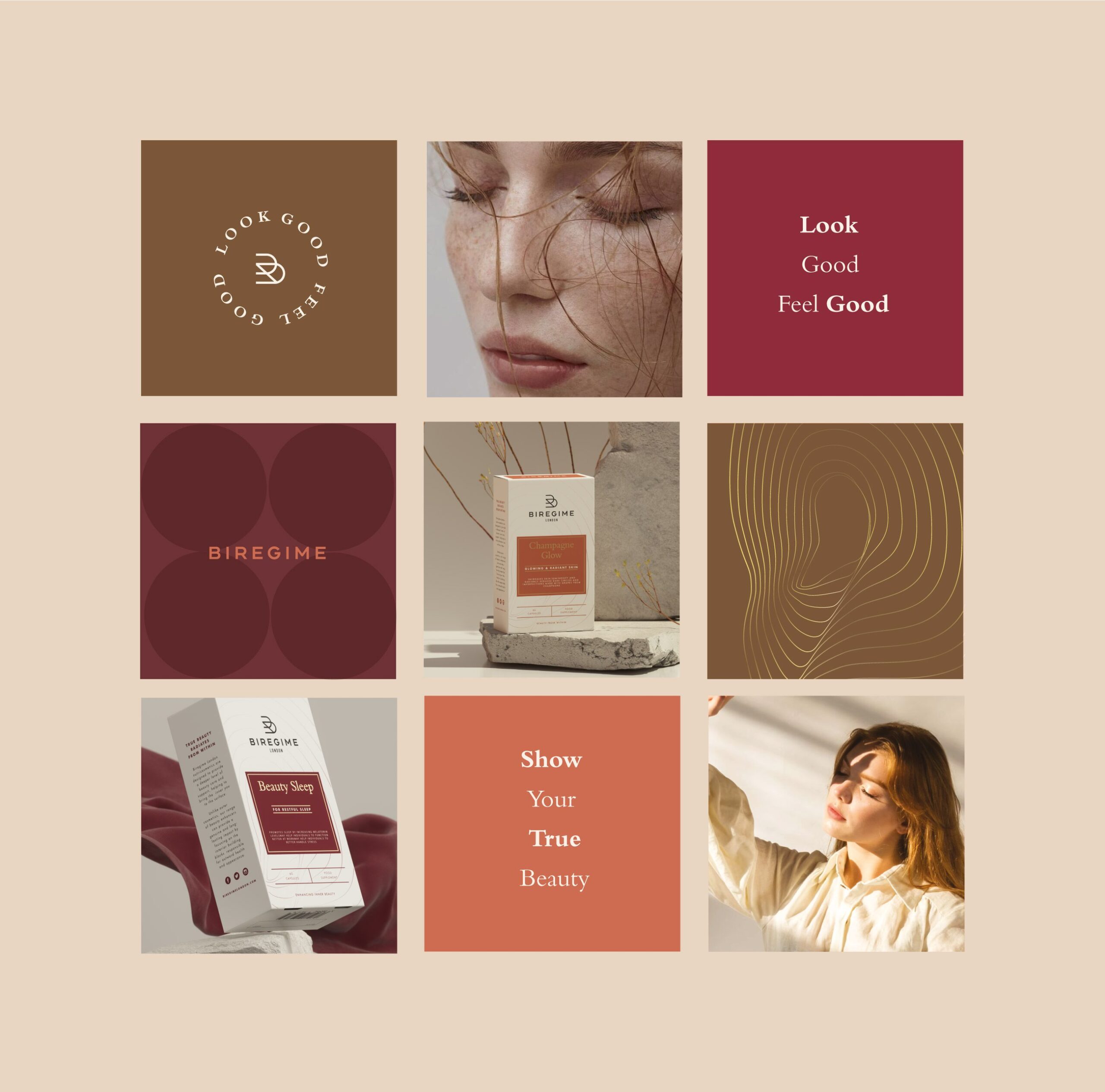
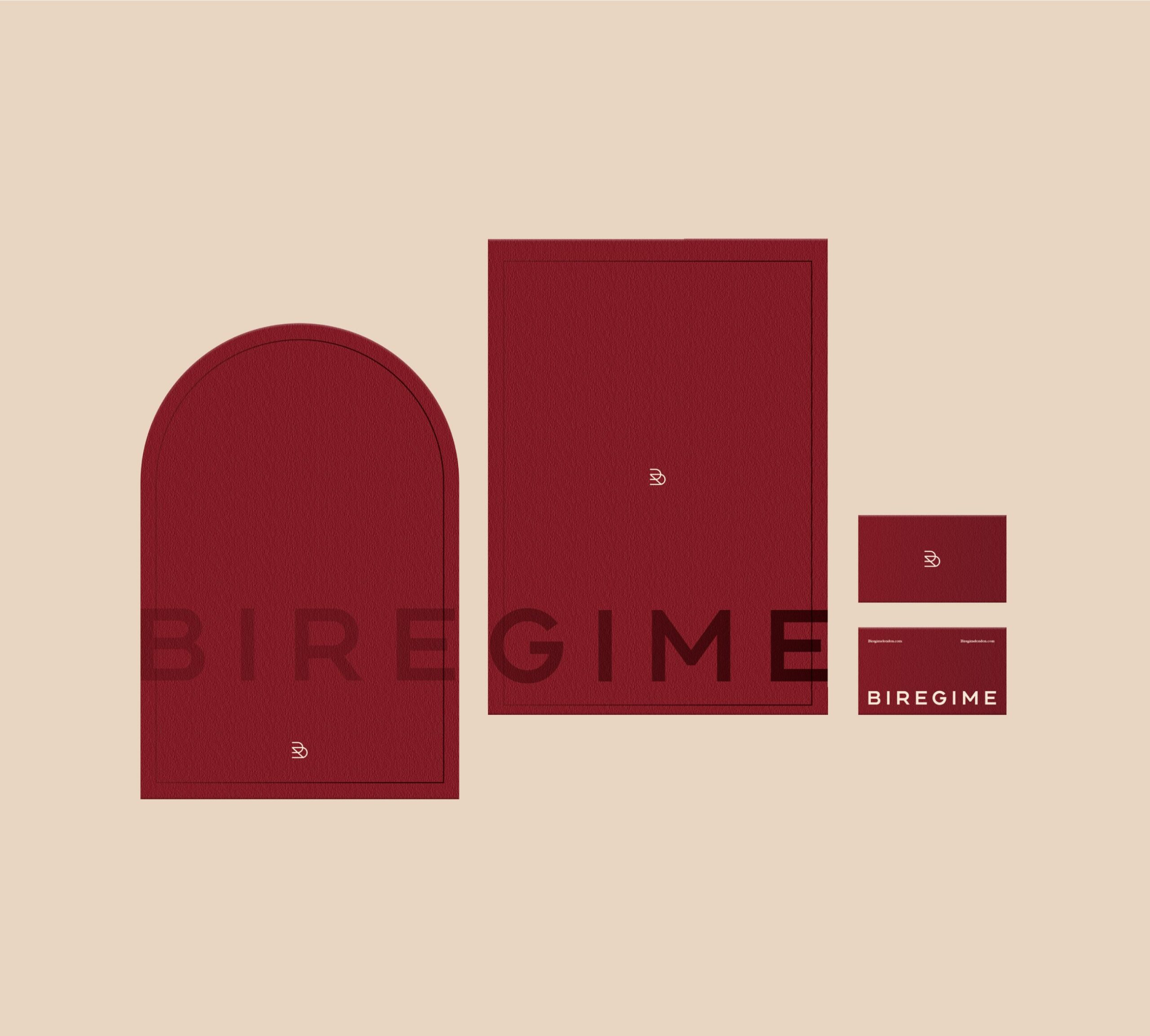
The visual identity for Biregime London was created to support clarity and presence within the beauty category. The design language combines purposeful typography, considered layout, and distinctive graphic cues to help consumers navigate the product range.
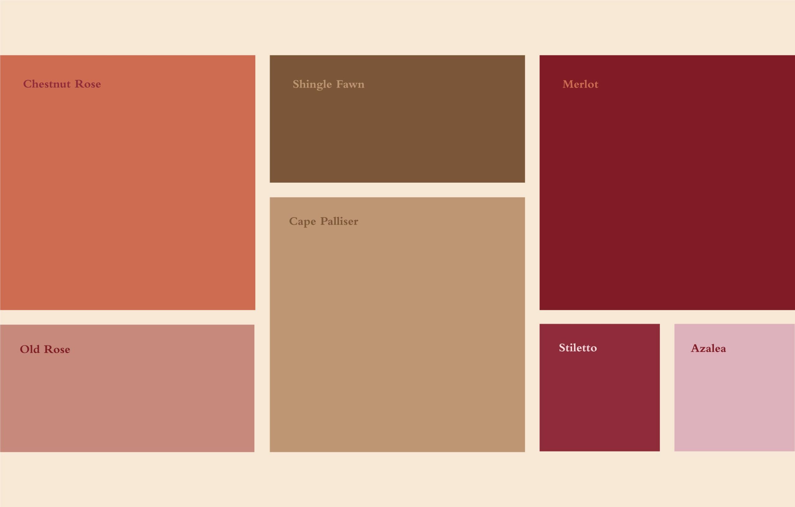
Typography choices were made to support hierarchy and readability, allowing key product details to be presented clearly on pack and in supporting brand materials. A controlled colour system supports variant differentiation while maintaining unity across the range.
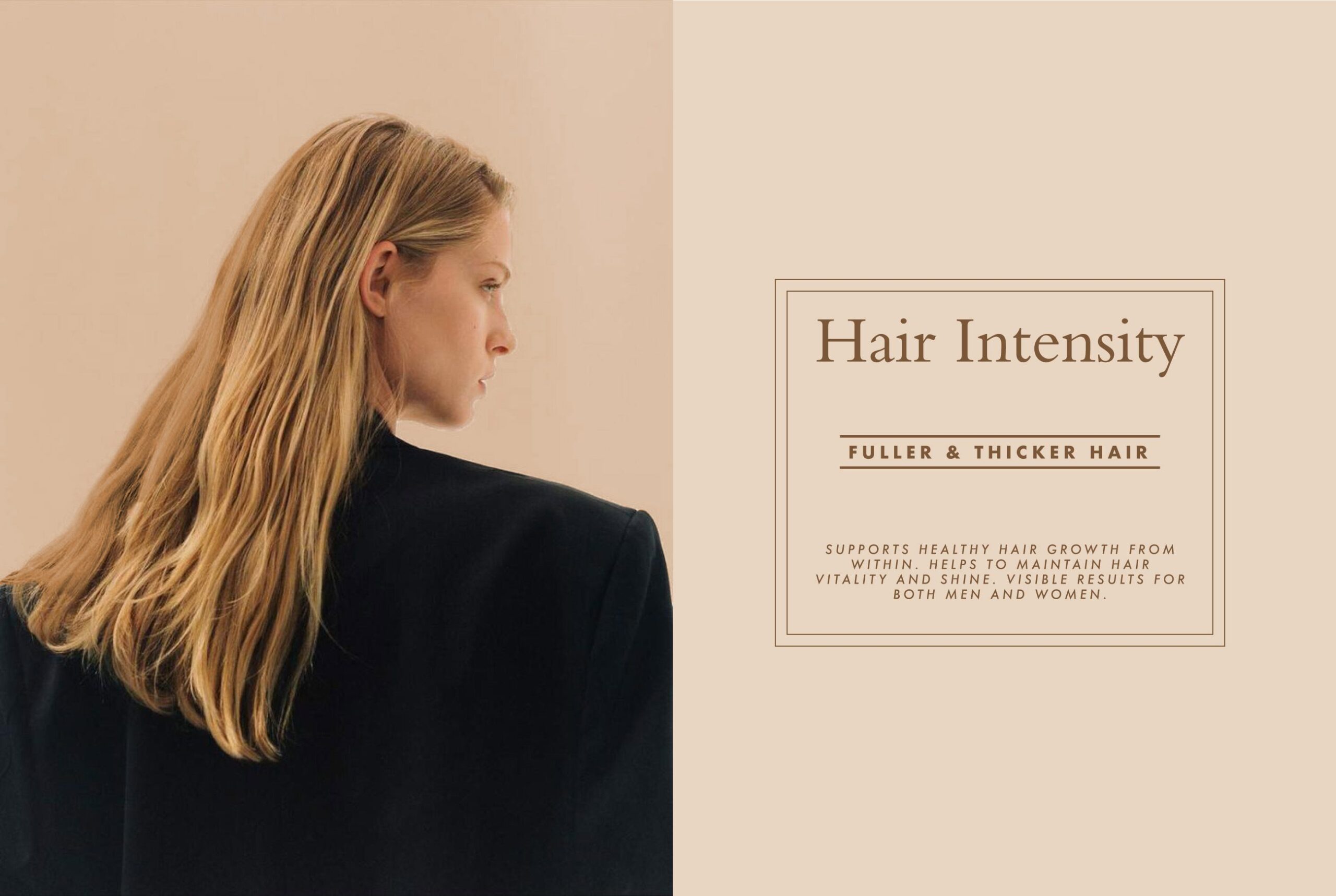
Graphic elements help organise information and reinforce the brand’s visual consistency without unnecessary embellishment. This approach ensures that the visual identity serves both communication and recognisability.
Packaging Design and Product System
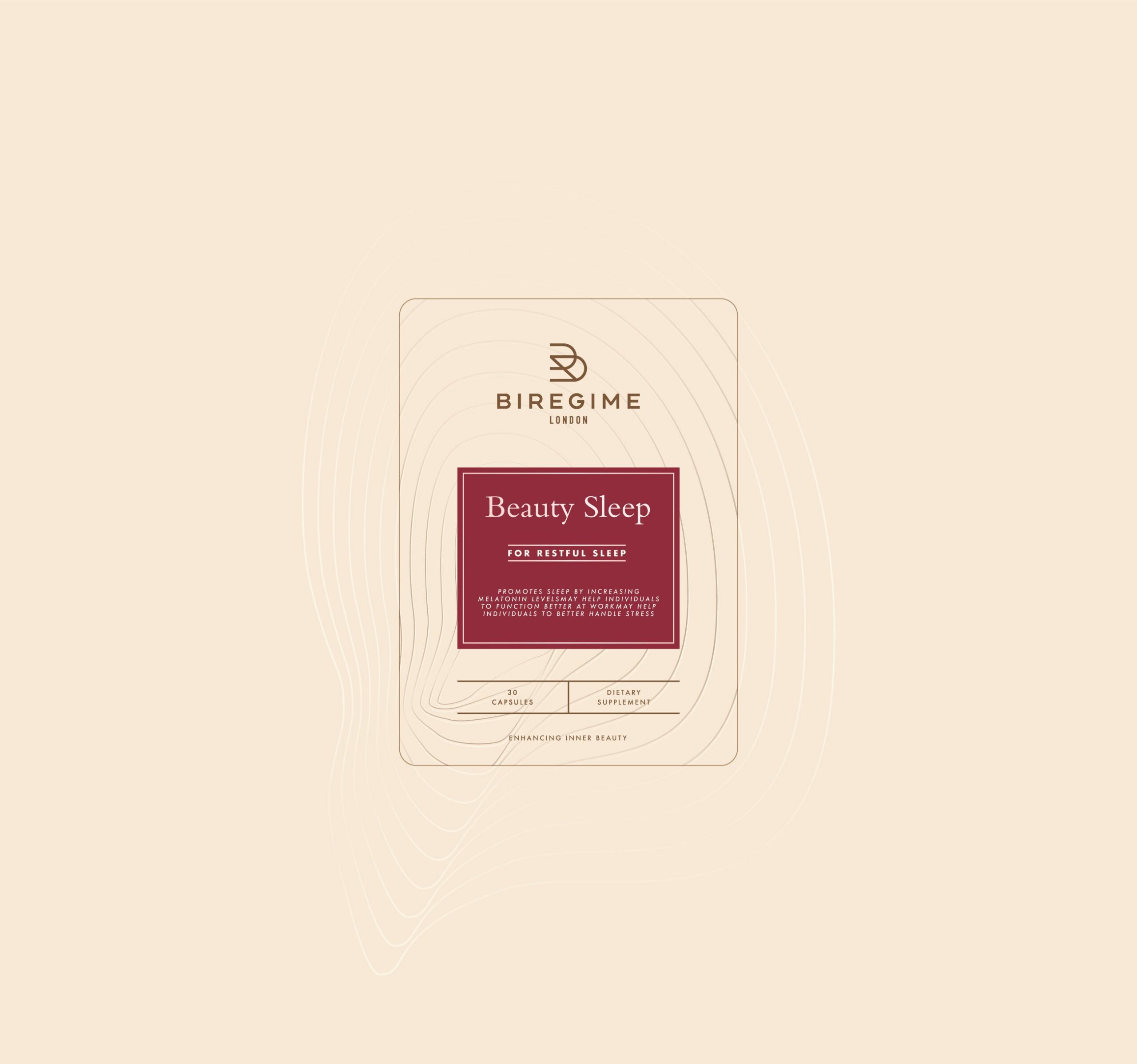
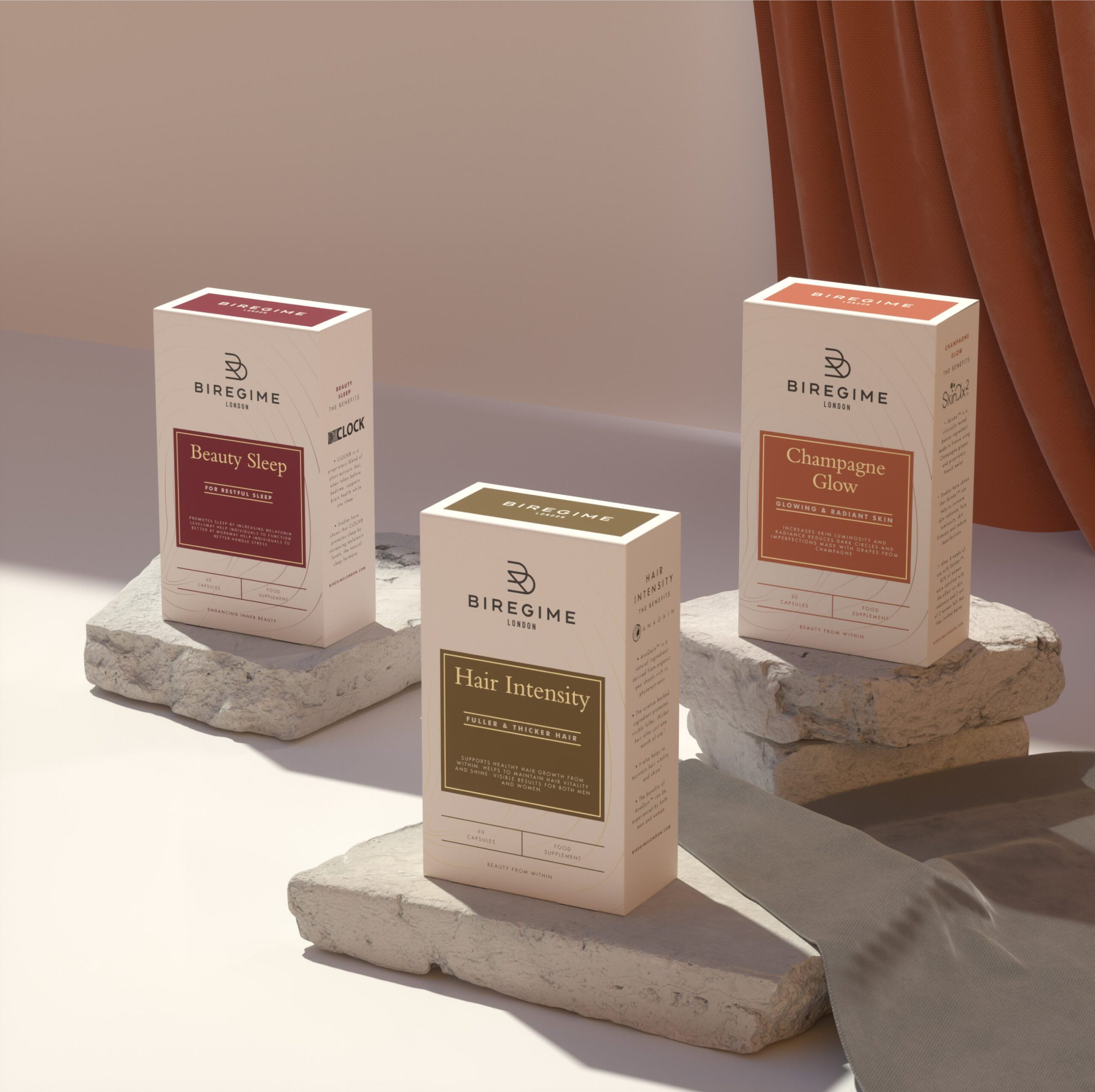
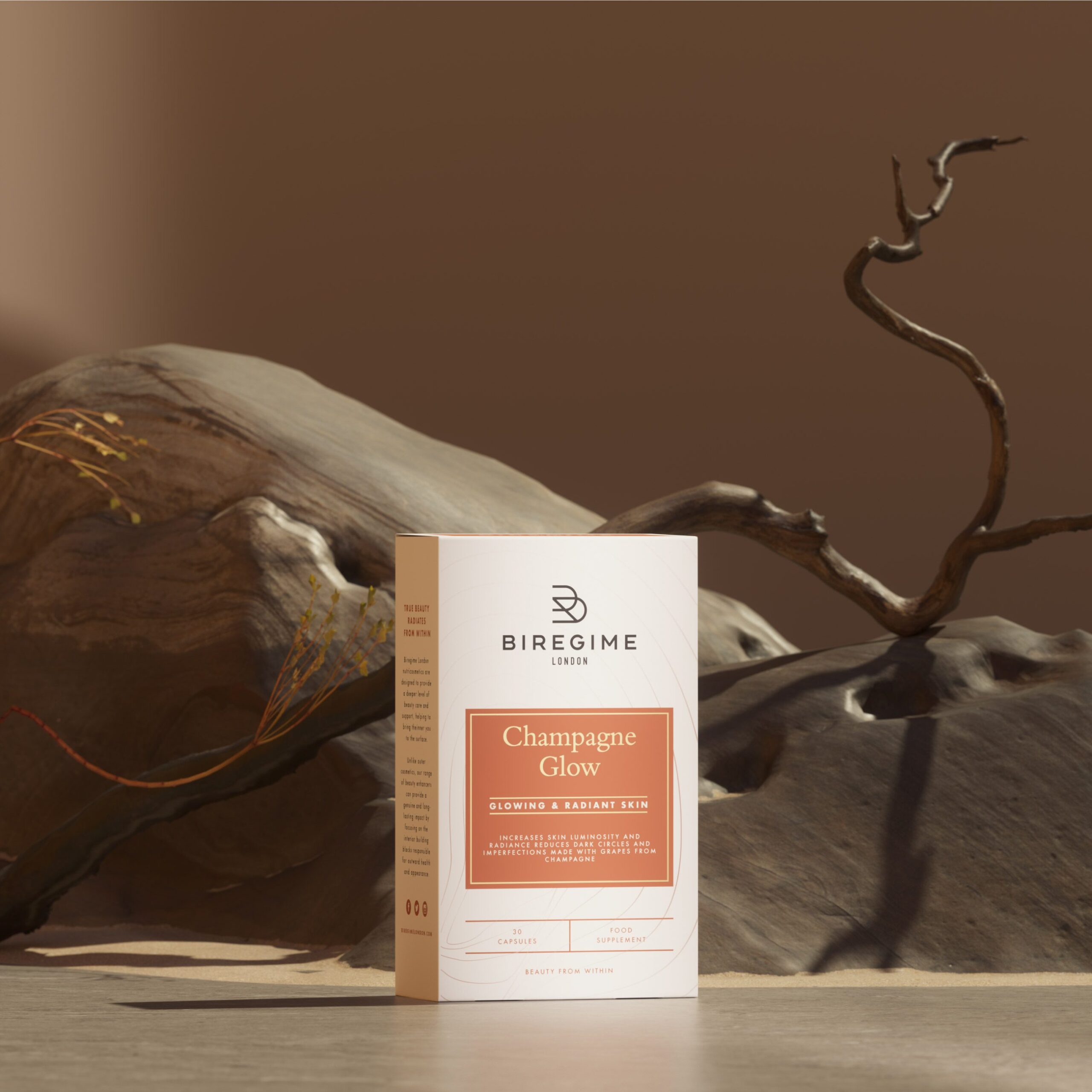
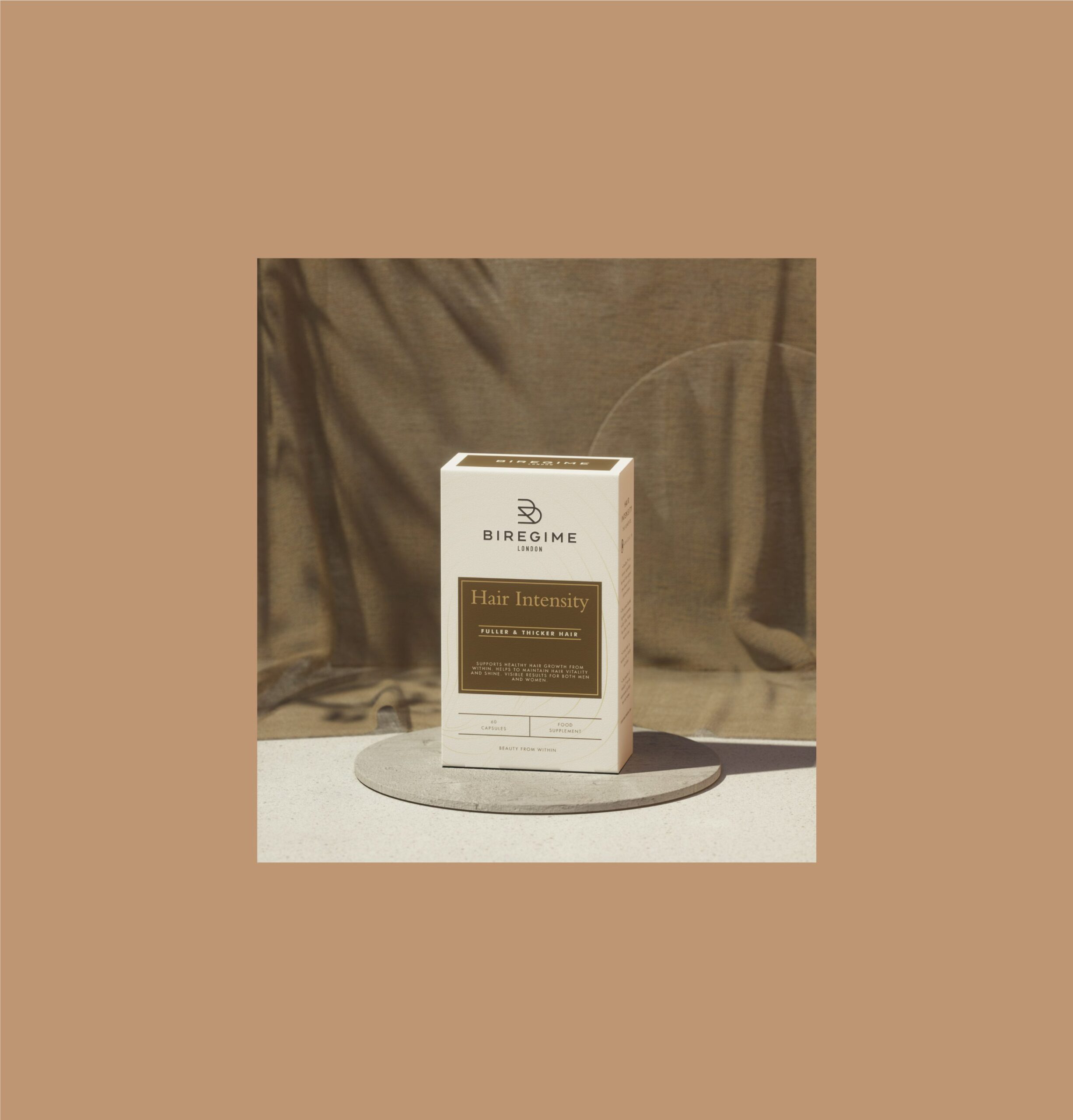
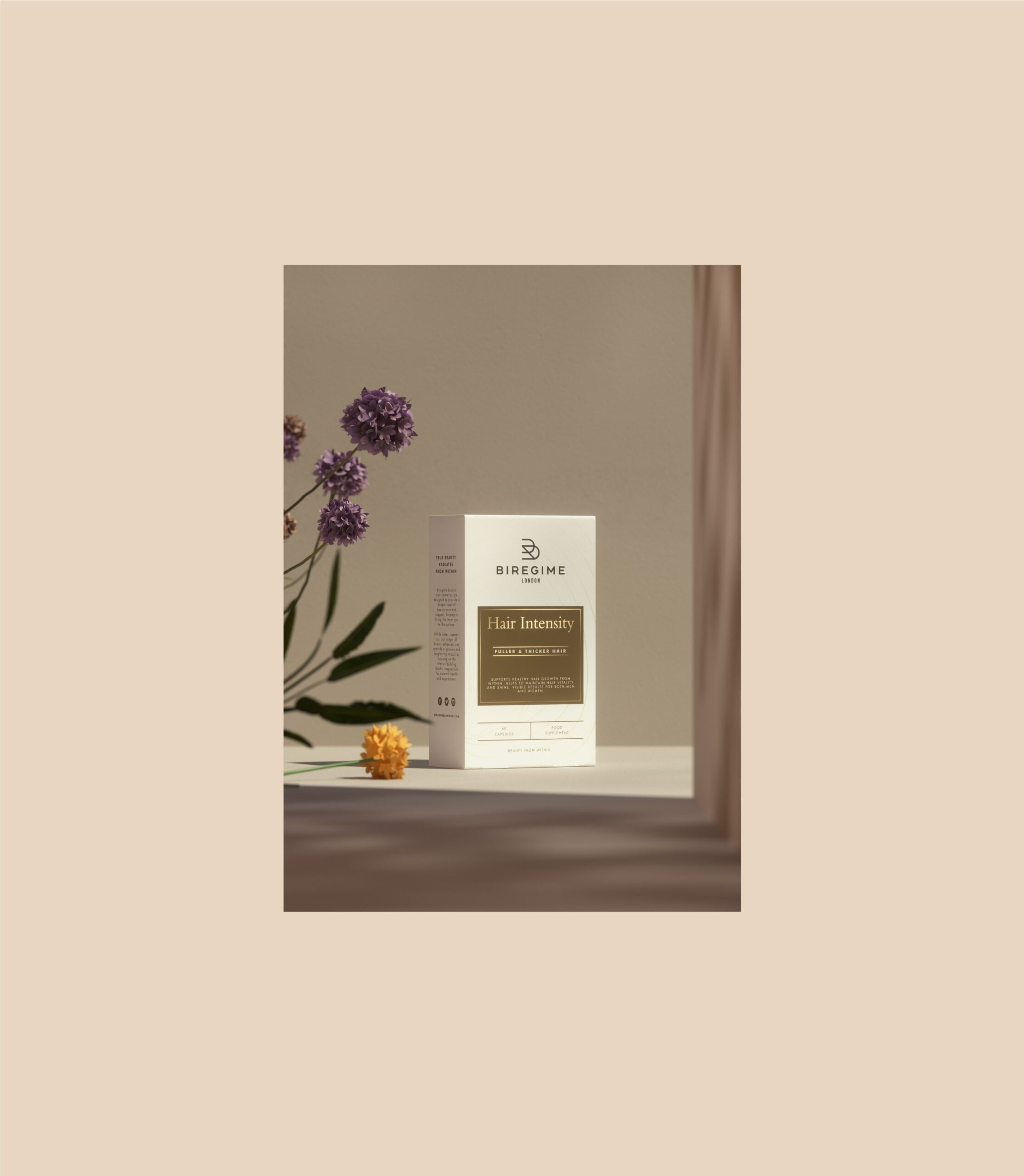
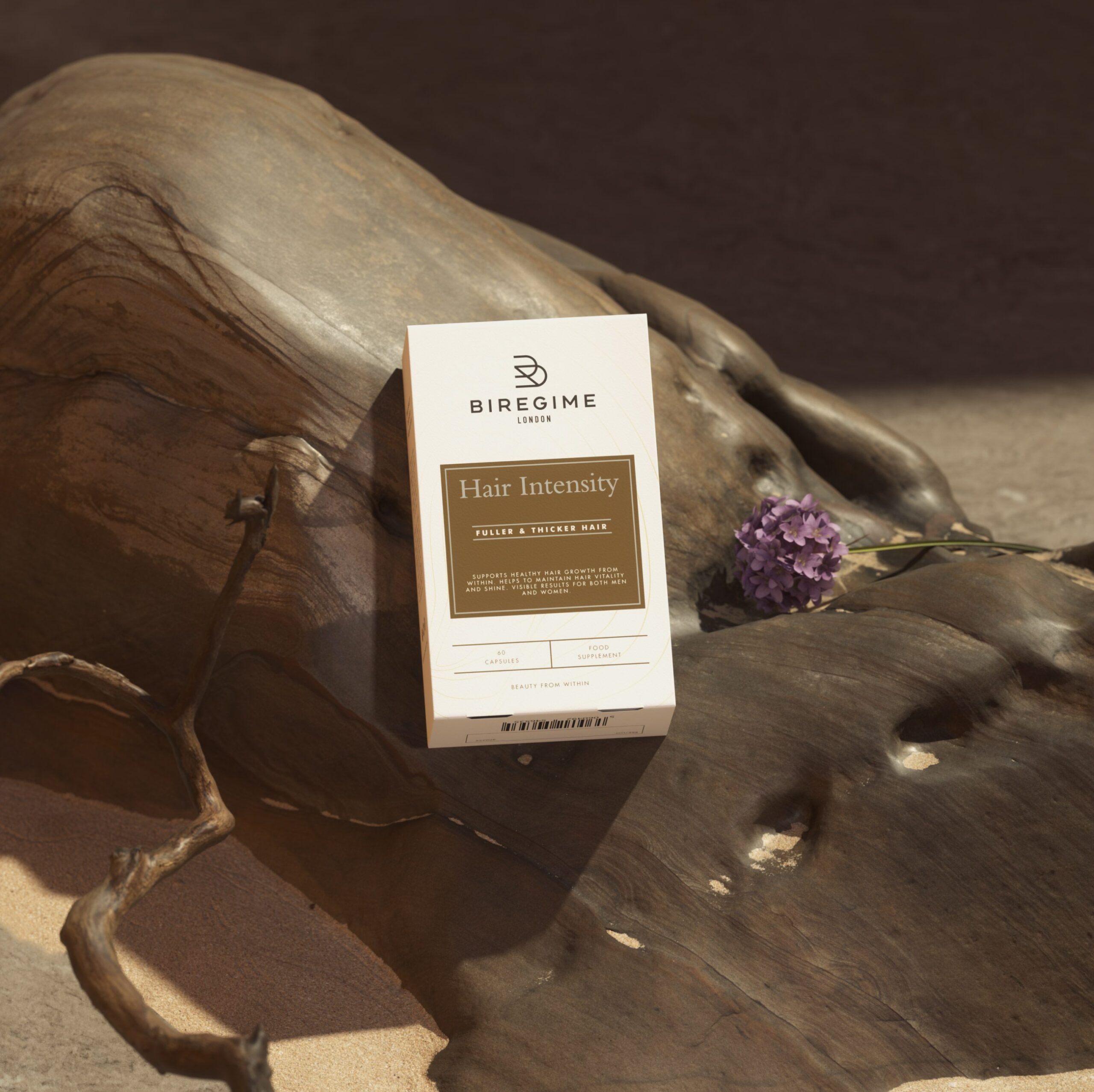
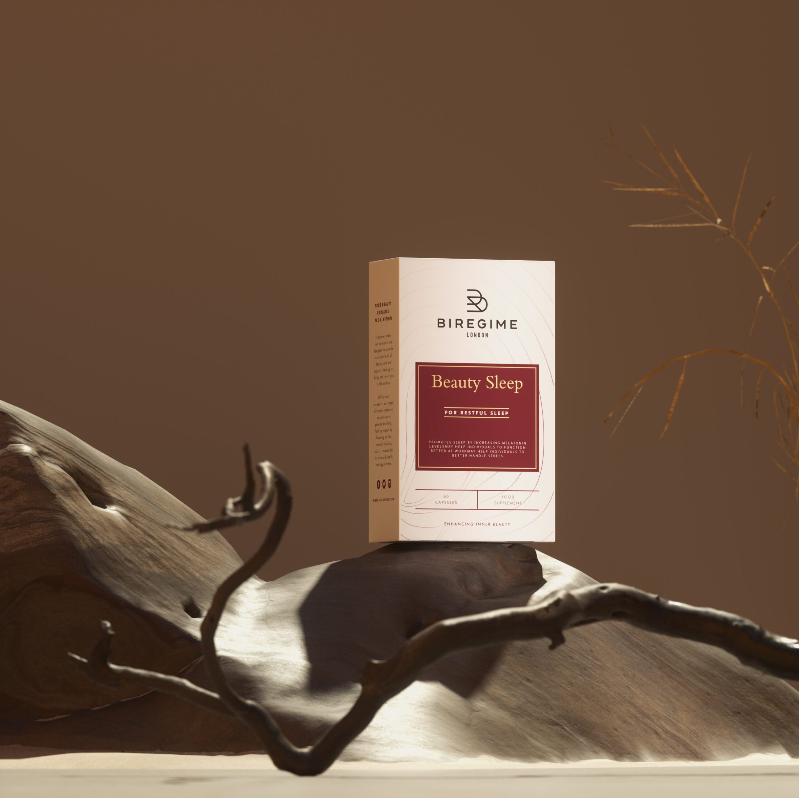
Packaging design for Biregime London was developed to present product attributes in a structured and accessible format. Label layouts guide attention to essential product information, including category and function, while supporting broader brand recognition.
Each product variant is distinguished through specific visual cues within the shared design system, enabling consumers to understand differences at a glance without compromising brand coherence.
Material and finishing choices align with expectations for beauty and personal care products, supporting both visual presence and physical interaction with packaging.
Brand Environment and Consumer Interaction
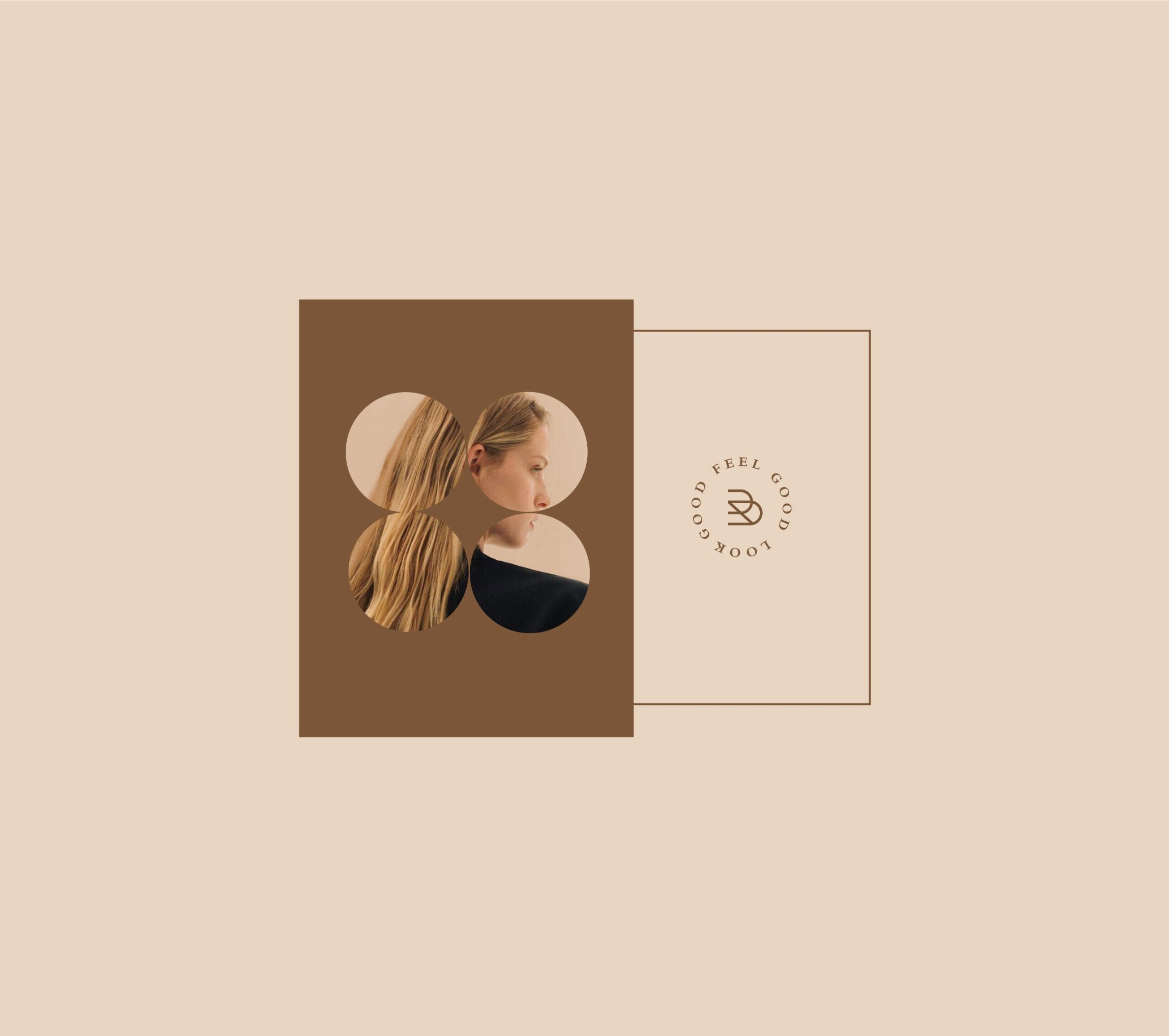
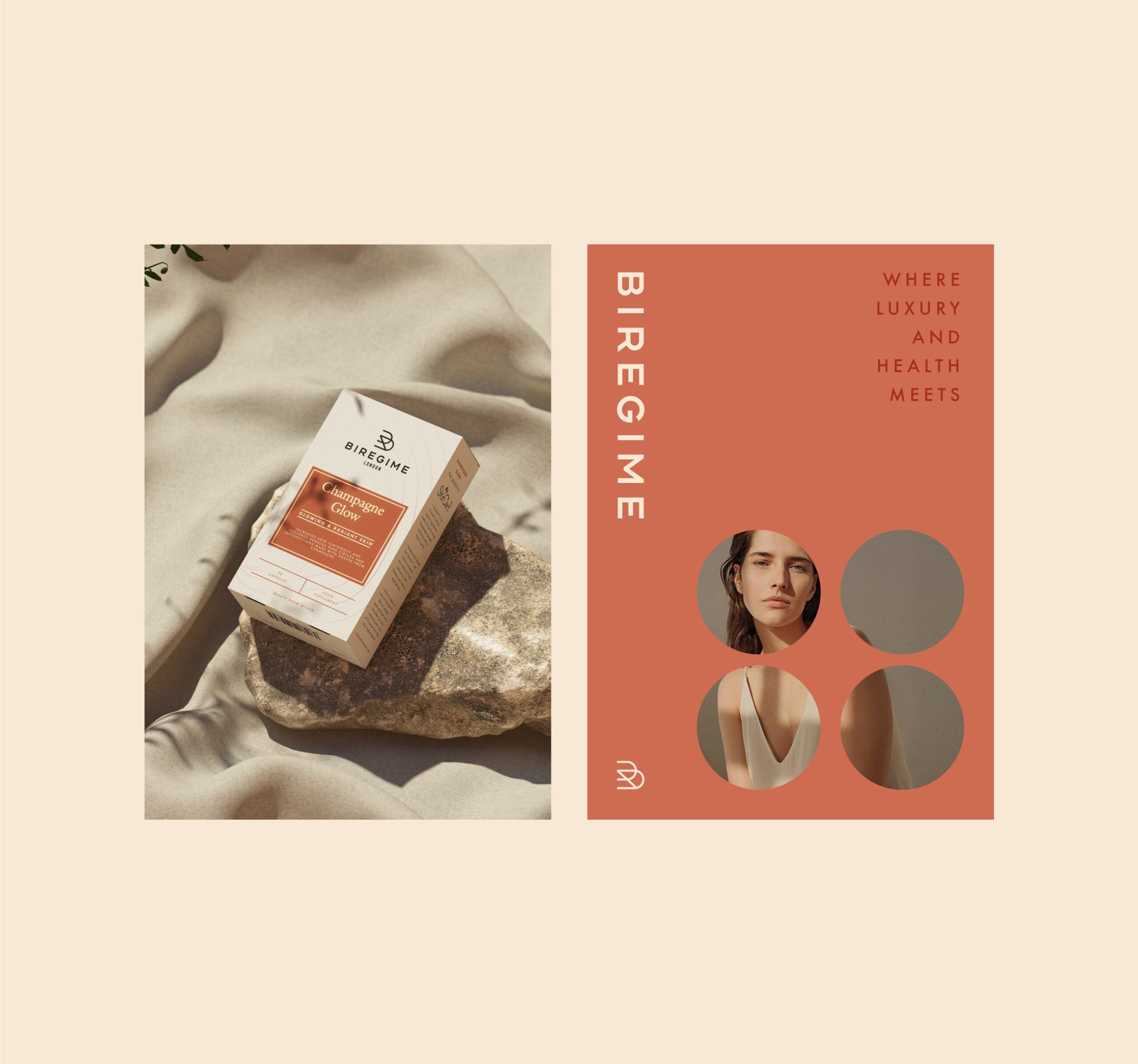
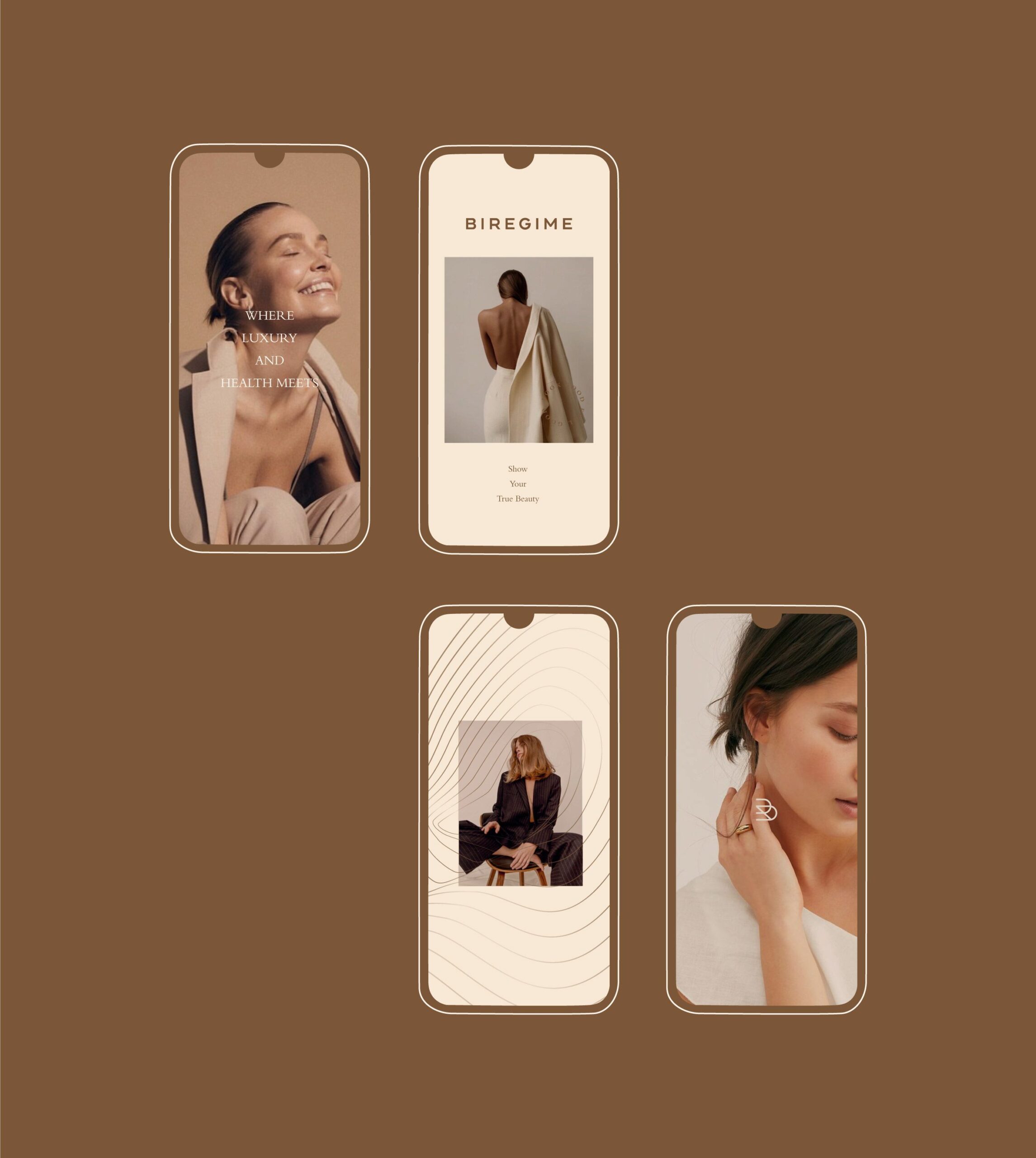
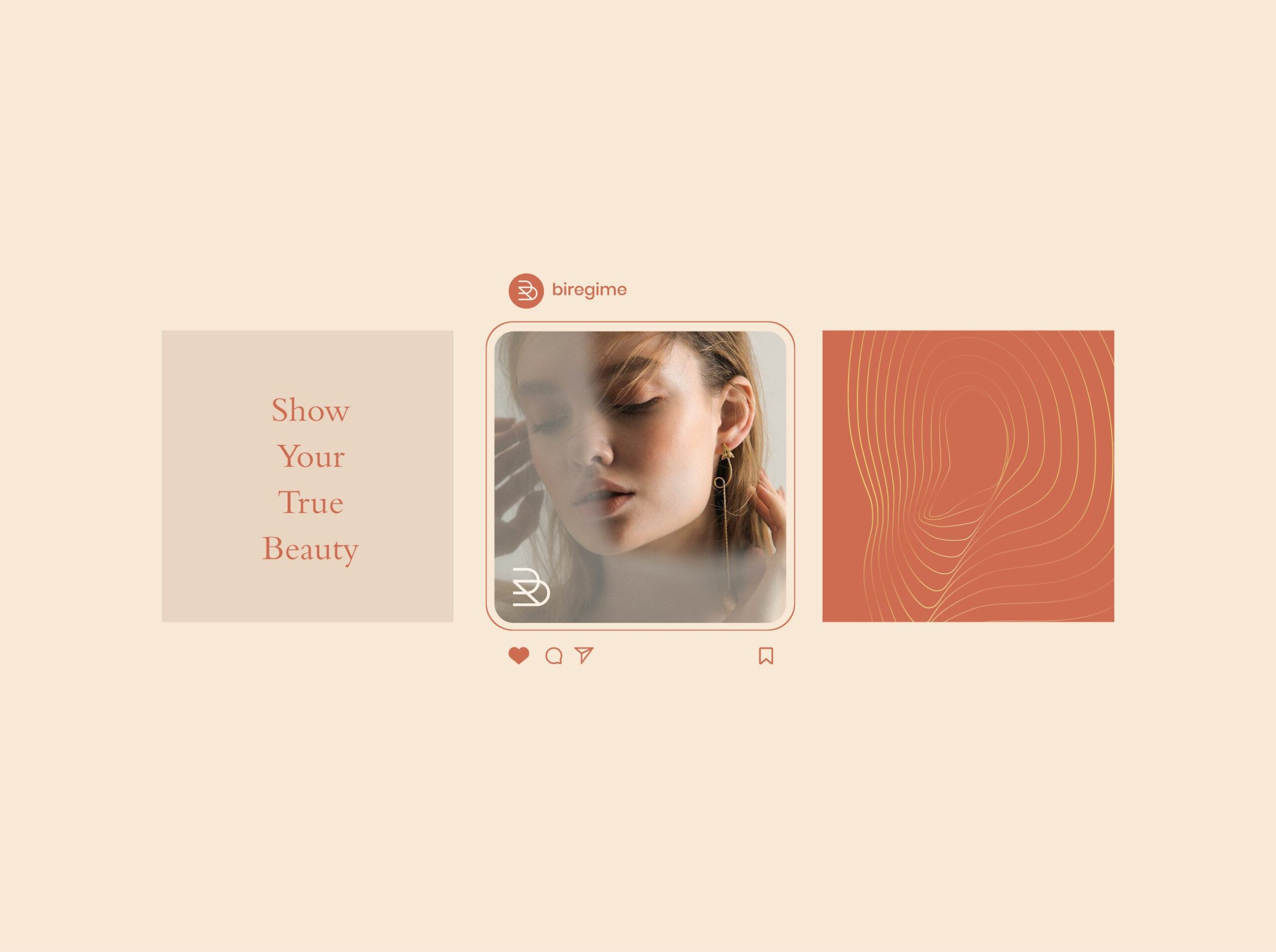
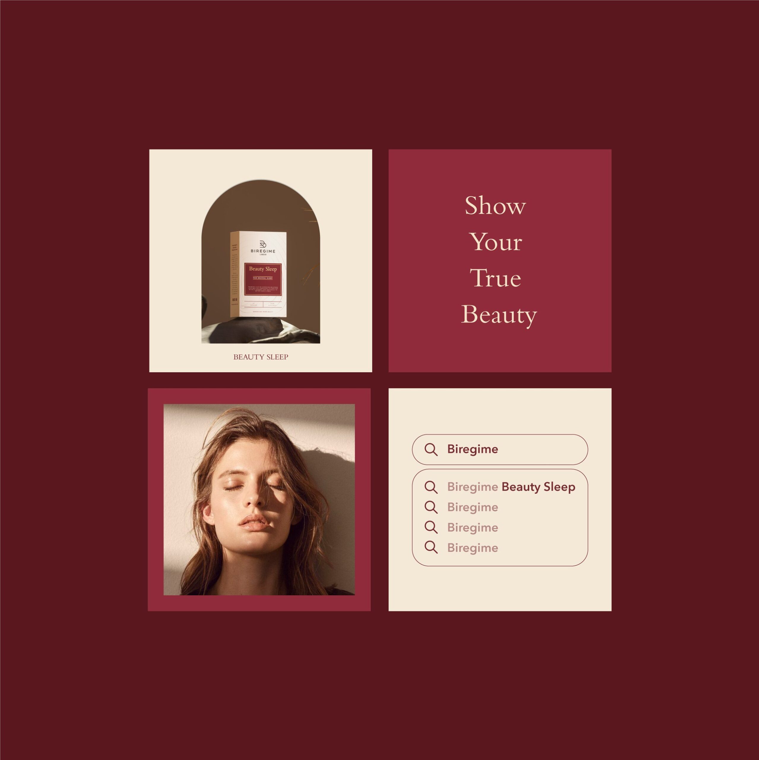
The Biregime London identity translates across physical and digital environments with consistency. Visual assets for online use reflect the same structuring principles found in packaging, supporting consumer engagement across channels.
Through this design system, Biregime London presents itself as a beauty and personal care brand with an identity that values clear presentation, product distinction, and a unified visual approach. The system supports stronger shelf presence, easier consumer navigation, and a consistent brand experience across touchpoints.


Let’s make the work they’ll copy.
Talk to an expert now
Work with a 38 team of the
industry’s top 1% talent.