HappyMynd
effortless clarity for your mind
HappyMynd by MARKAWORKS is a mental wellness brand that simplifies and inspires clarity. Through a holistic branding approach, it fosters a positive and accessible experience, making mental well-being feel effortless and attainable.

A Holistic Approach to Mental Wellness Branding
Our comprehensive branding strategy for HappyMynd focused on translating the essence of mental clarity into a tangible and inspiring visual experience, ensuring every touchpoint resonated with simplicity and optimism.
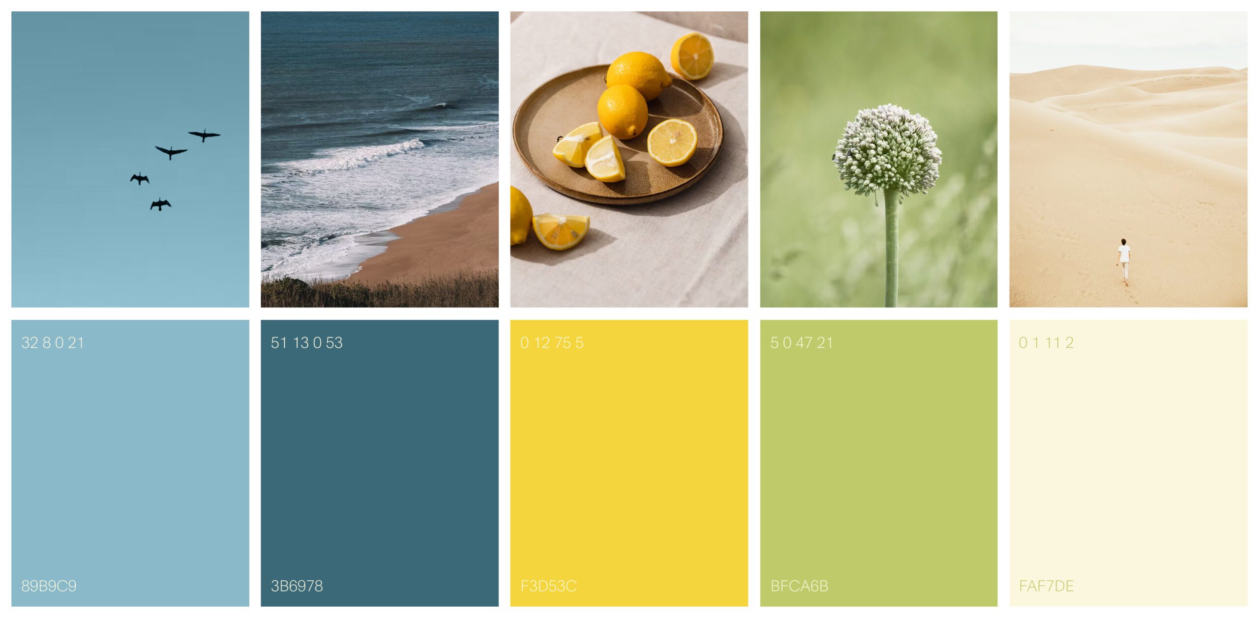
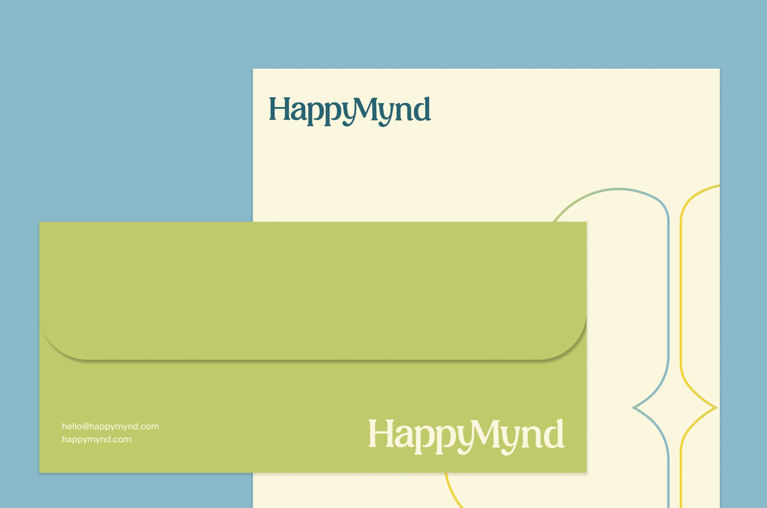
Warmth was the whole problem in this brand identity design. A category that leans on scientific language reads as cold, and the fix had to add warmth without spending the credibility. The palette MarkaWorks chose sets that balance in color, and the typography we paired with it carries the same balance in form: the letterforms stay timeless and approachable, and their curves are what bring a human register into a technical subject. Neither decision softens what the brand does; both make it easier to approach.
Design Approach
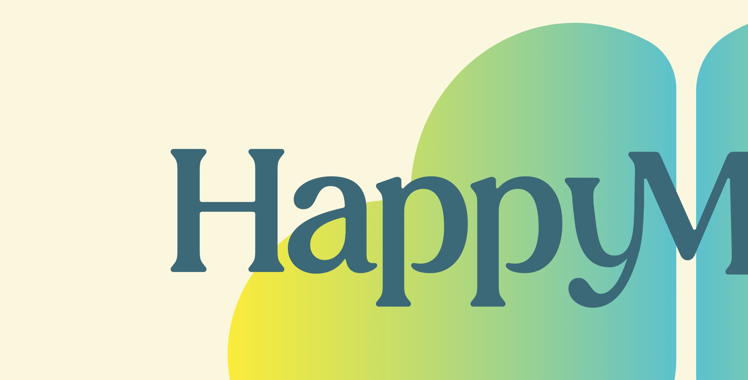
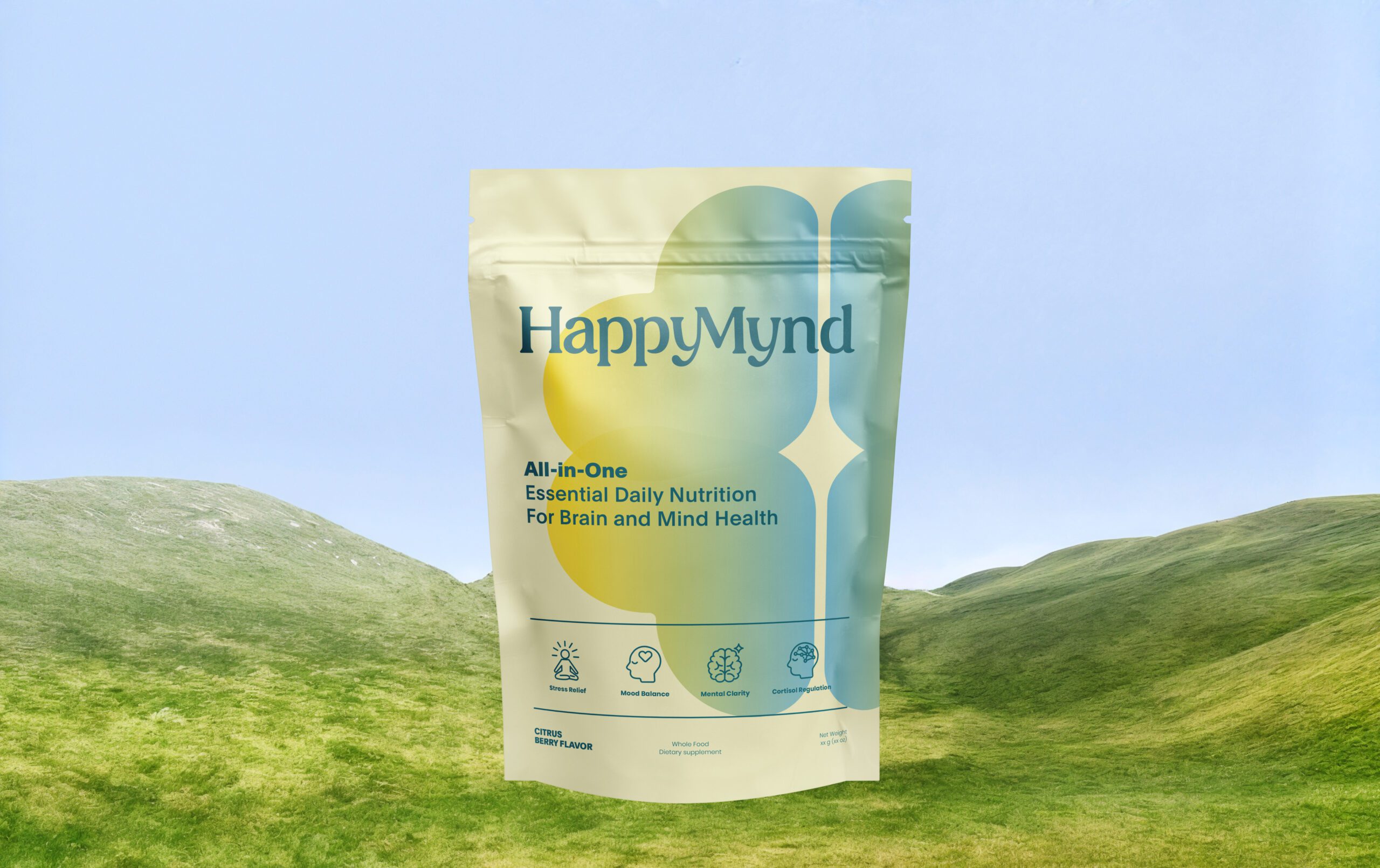
We chose a soft yet vibrant color palette inspired by nature – fresh blues, warm yellows, and calming greens – to reflect balance, energy, and clarity. The typography was carefully selected to feel timeless yet approachable, with subtle curves that bring human warmth into a science-driven category.
Identity System
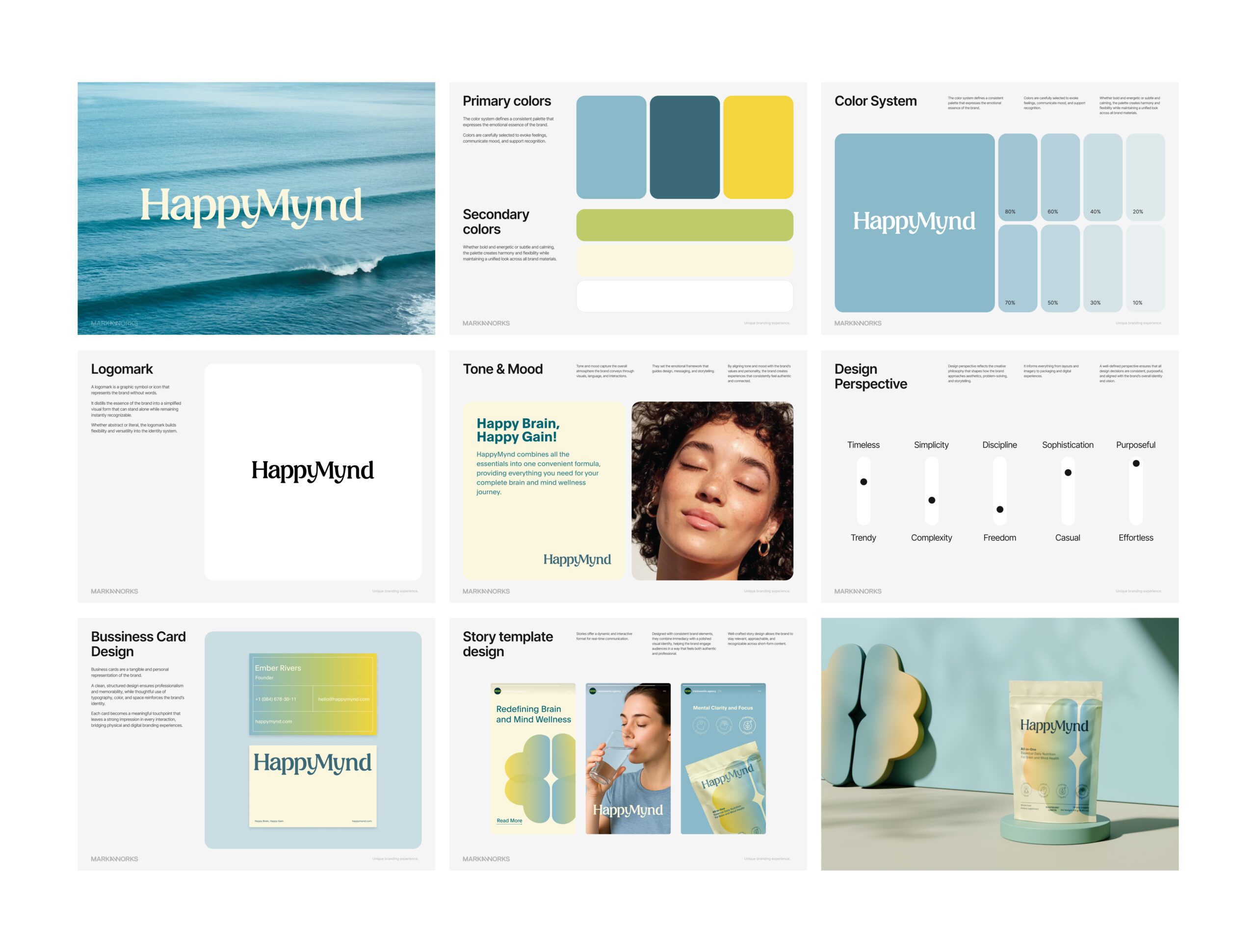
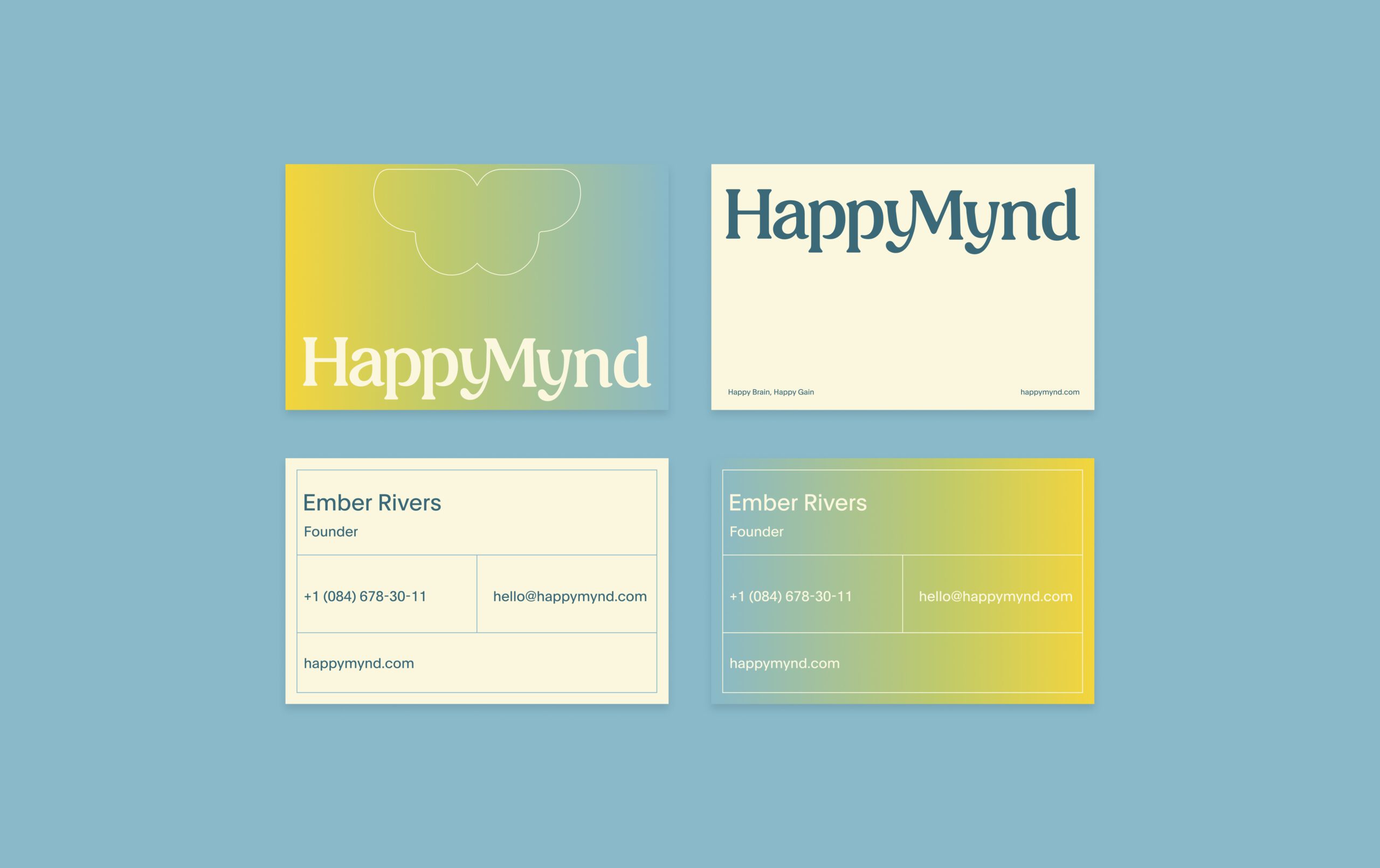
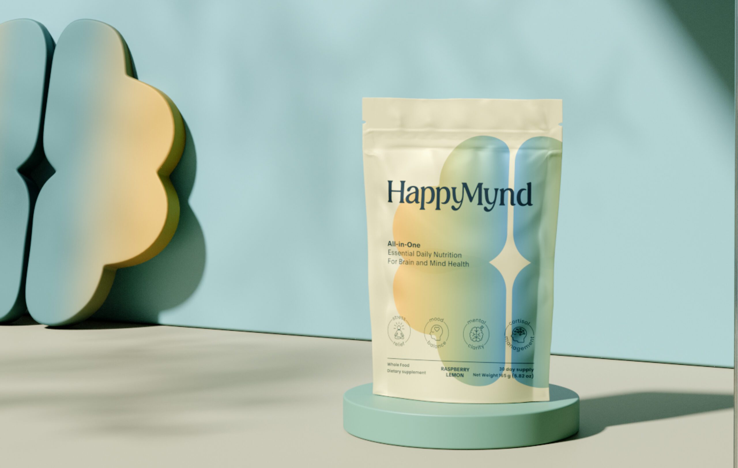
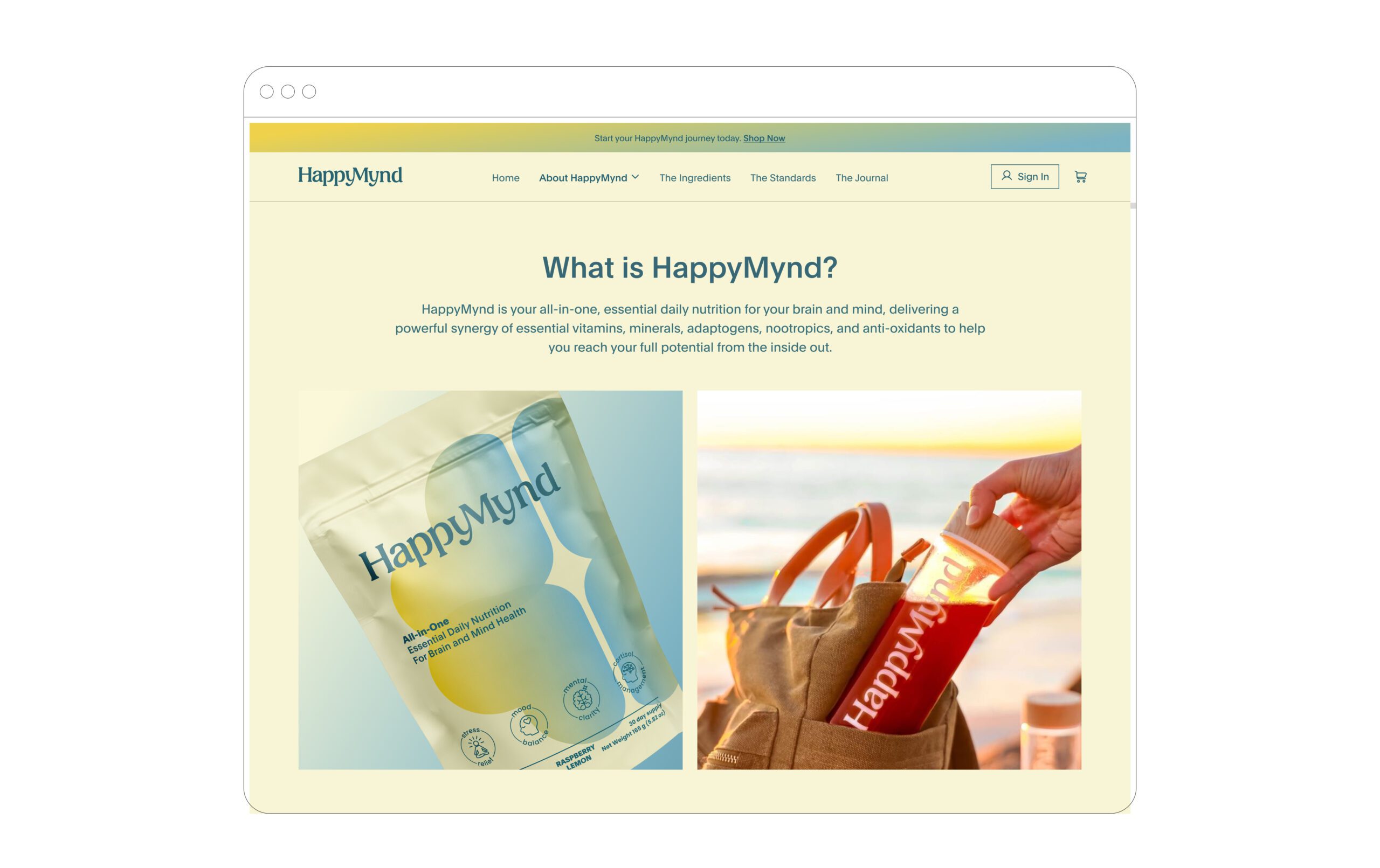
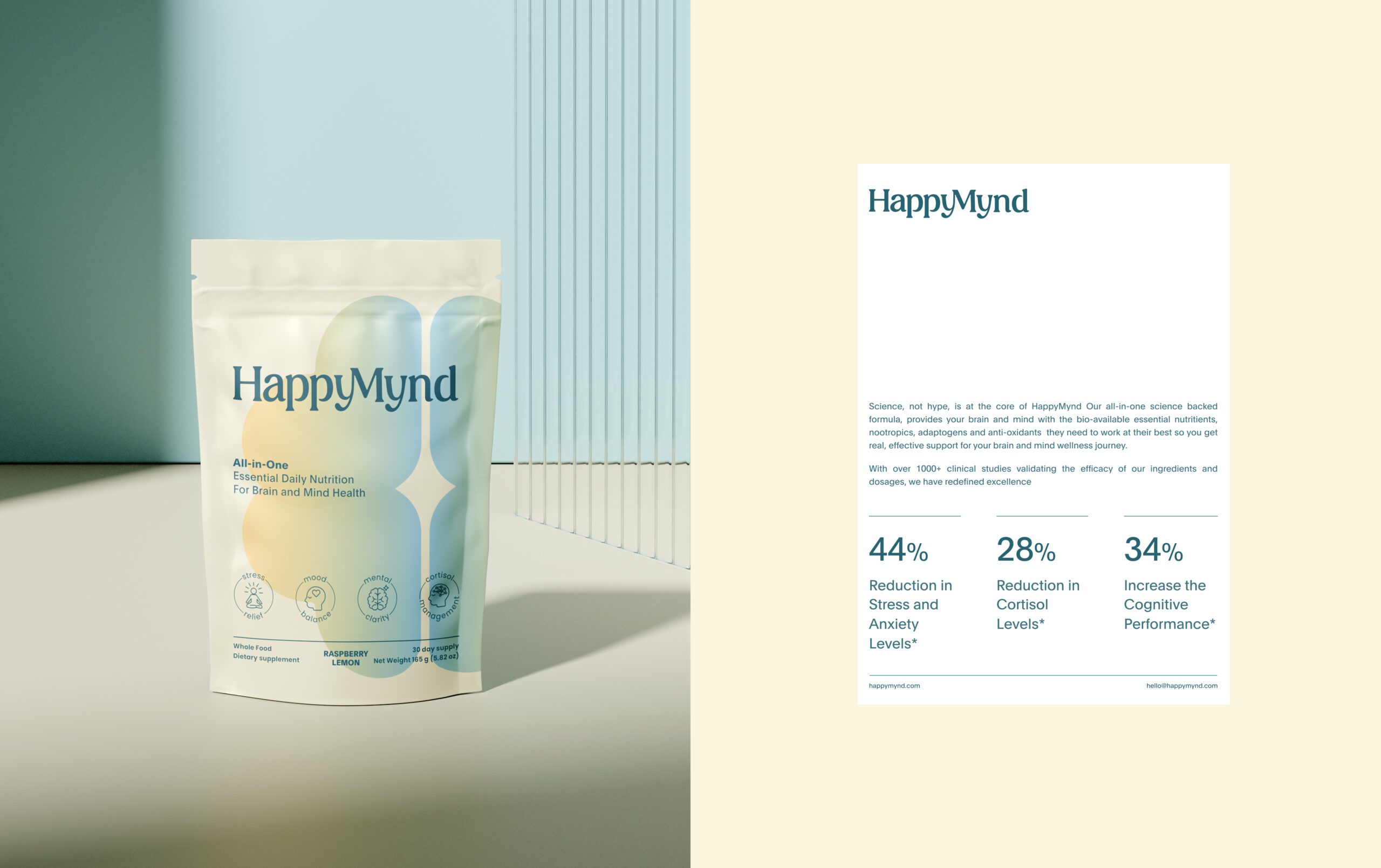
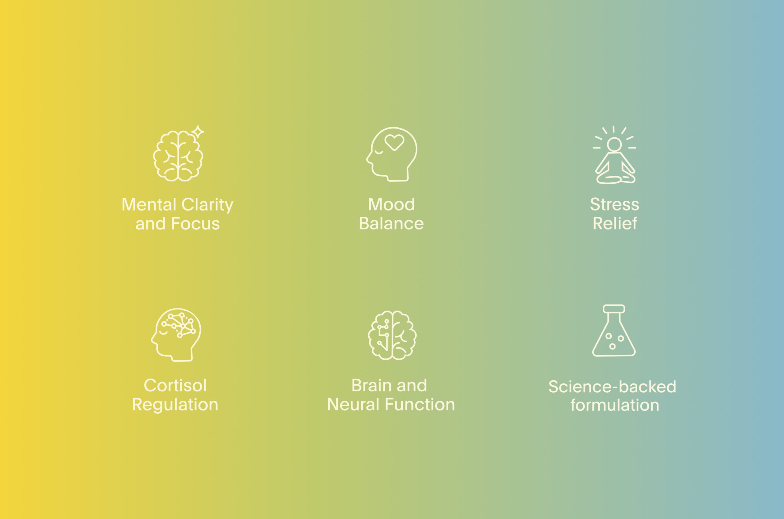
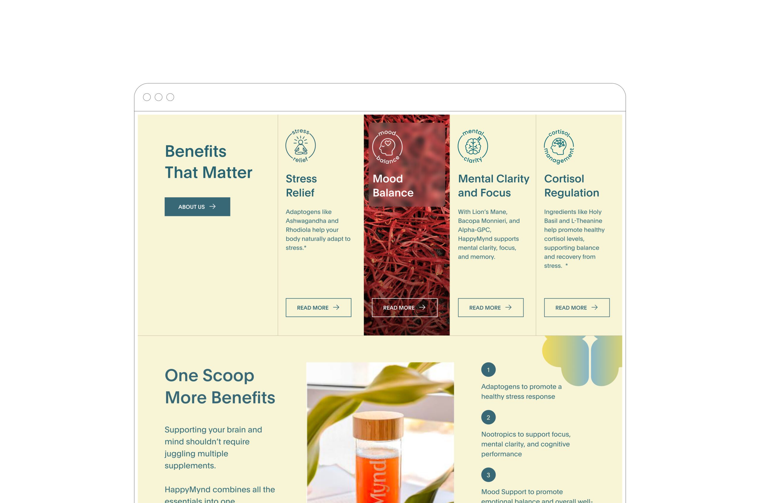
From packaging to digital presence, the system was designed to feel consistent and flexible. Shapes inspired by the human brain became recurring visual motifs, reinforcing the connection to mind and wellness. Iconography highlights key product benefits such as focus, stress relief, and mood balance, ensuring clarity of communication.

Tone & Mood
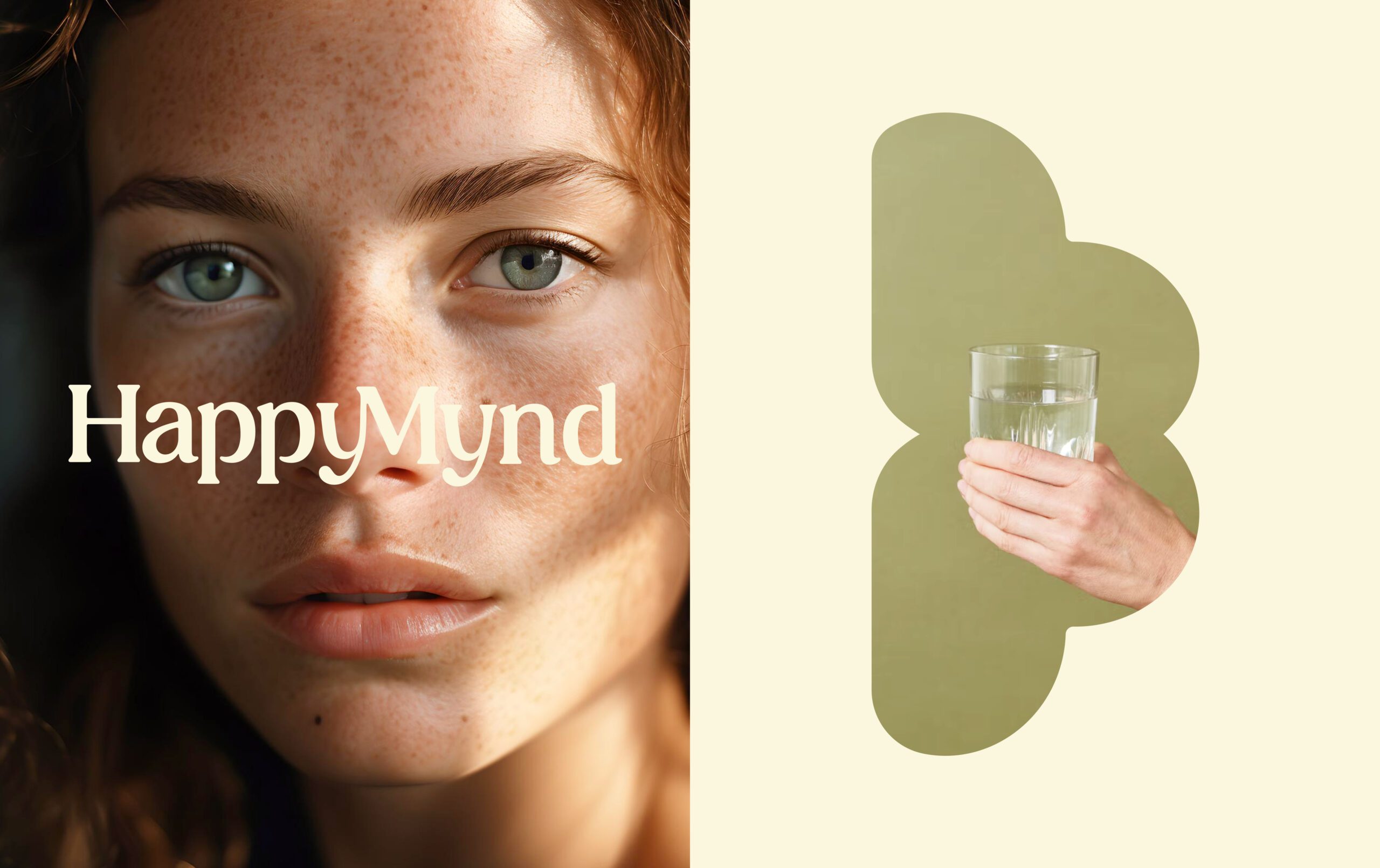
HappyMynd’s tone is optimistic and effortless. Photography emphasizes natural light, authentic expressions, and everyday rituals, placing wellness into a real, relatable context.
Outcome
The result is a brand identity that not only communicates trust and scientific credibility but also sparks an emotional connection, making mental wellness feel simple, positive, and accessible.

Let’s make the work they’ll copy.
Talk to an expert now
Work with a 22 team of the
industry’s top 1% talent.