GUUT
Prebiotic Soda Branding & Packaging Design
The New Soda Standard.
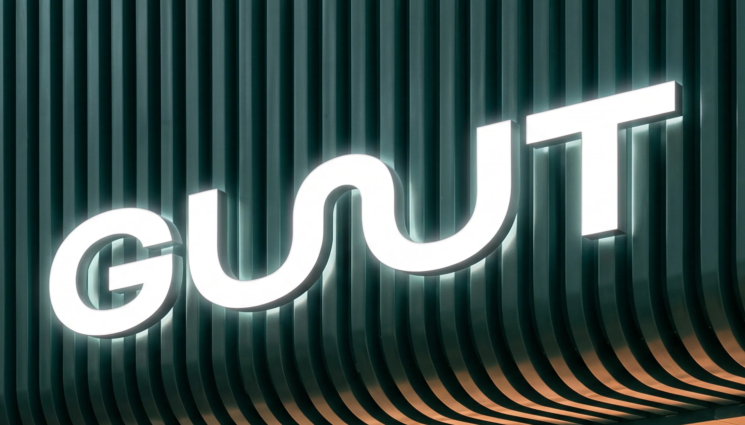
MarkaWorks developed the brand identity, packaging and art direction for GUUT, a functional prebiotic soda brand built around plant-based fibre, natural flavour and a more uncomplicated approach to everyday wellness.
The Challenge
GUUT needed to communicate a genuine functional benefit without looking medicinal, overly scientific or like another traditional wellness product. At the same time, the brand had to compete within the fast-moving soda category, where flavour, personality and shelf impact are just as important as what is inside the can.
The challenge was to make gut health feel desirable, accessible and easy to understand without allowing the functional message to overpower the drinking experience.
The Solution
“The New Soda Standard” became the positioning behind the identity. Rather than treating wellness as something serious or restrictive, GUUT presents it as something colourful, social and easy to integrate into everyday life.
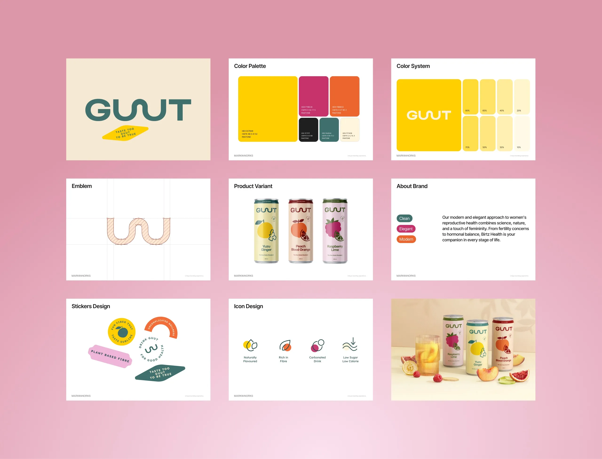
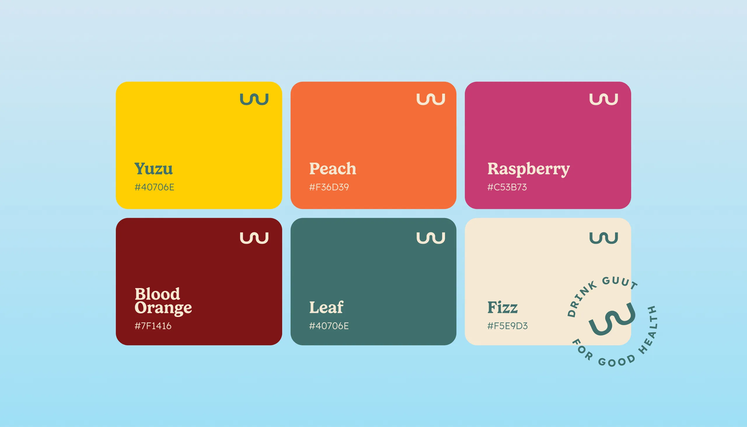
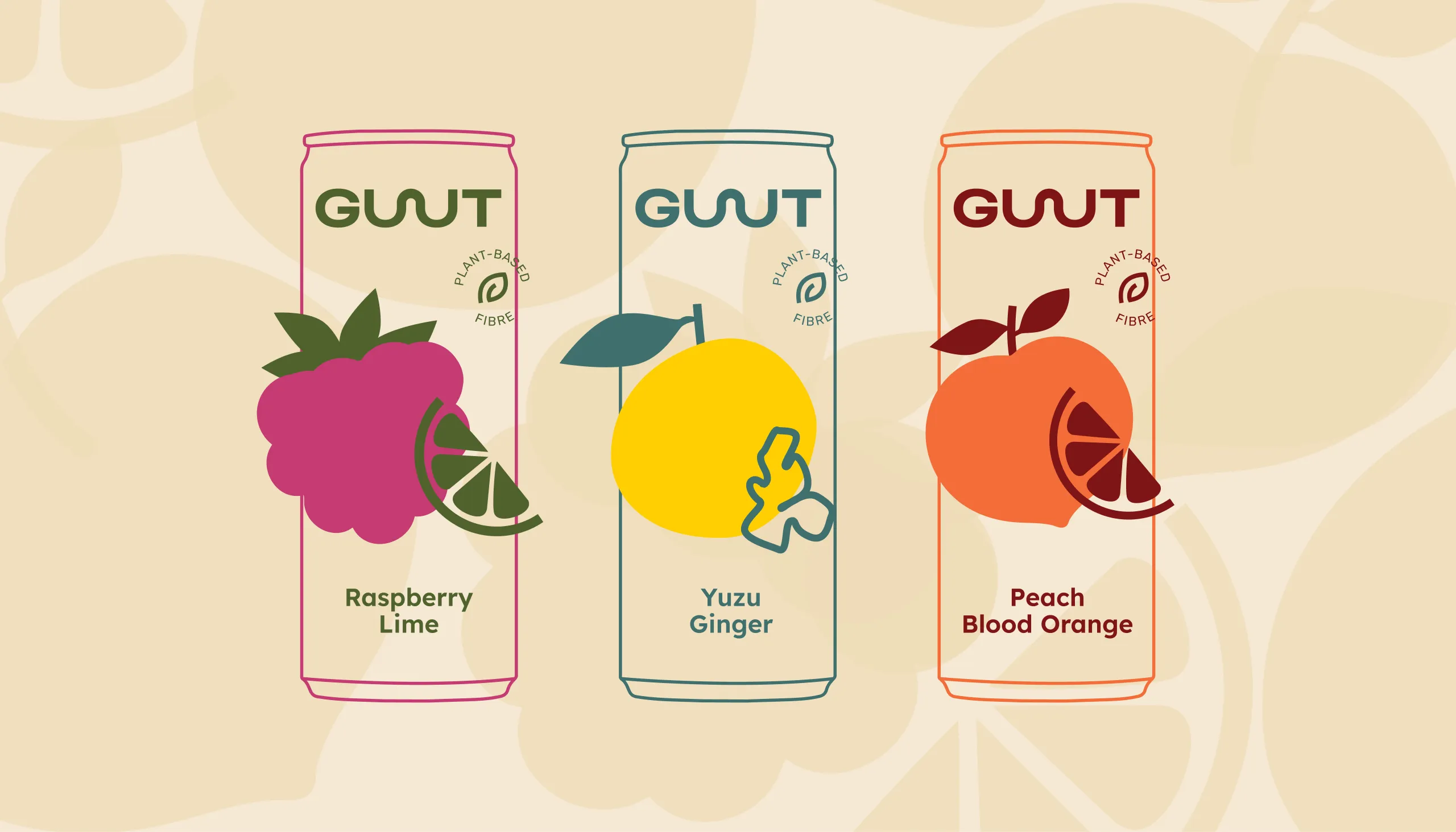
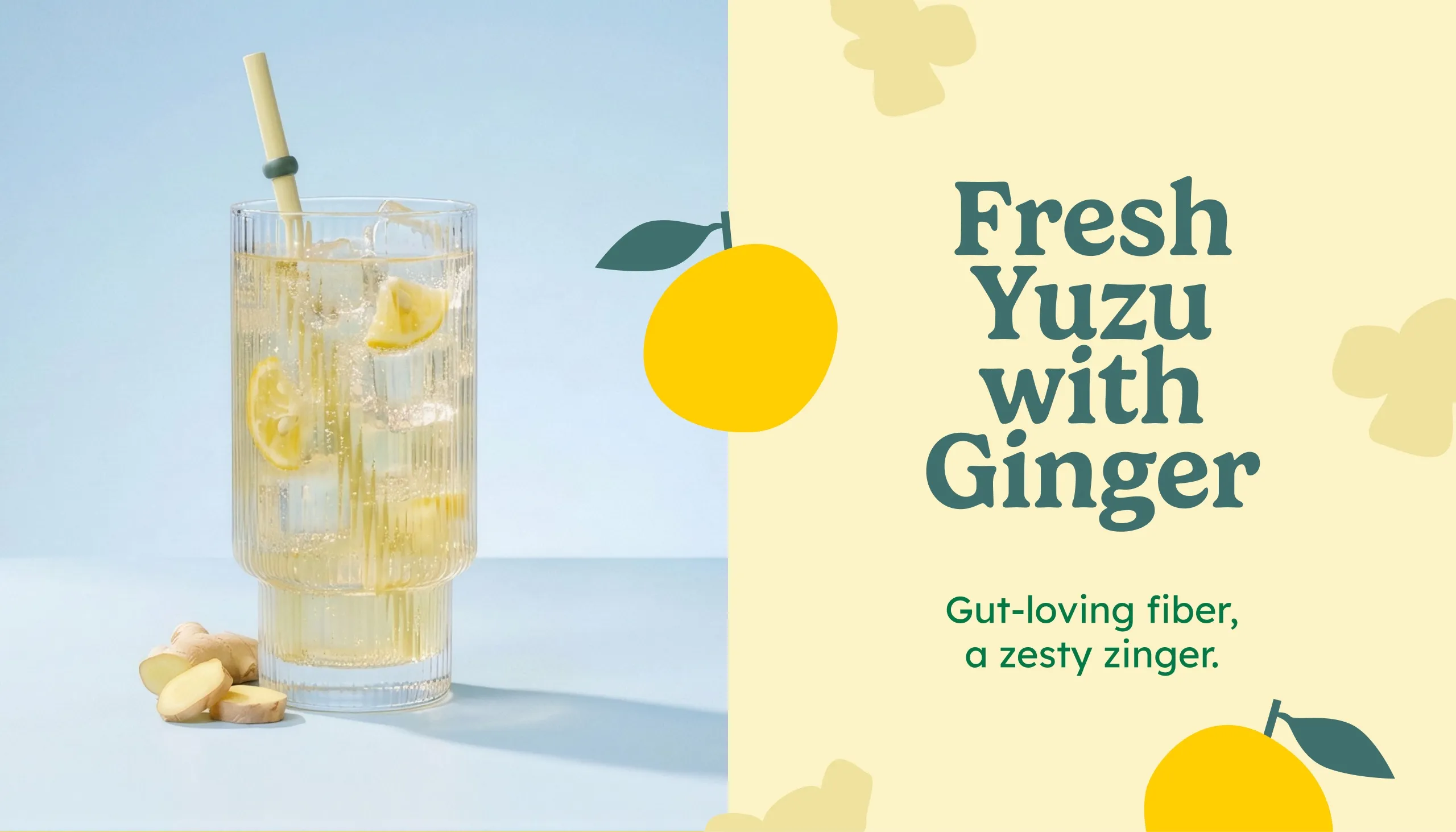
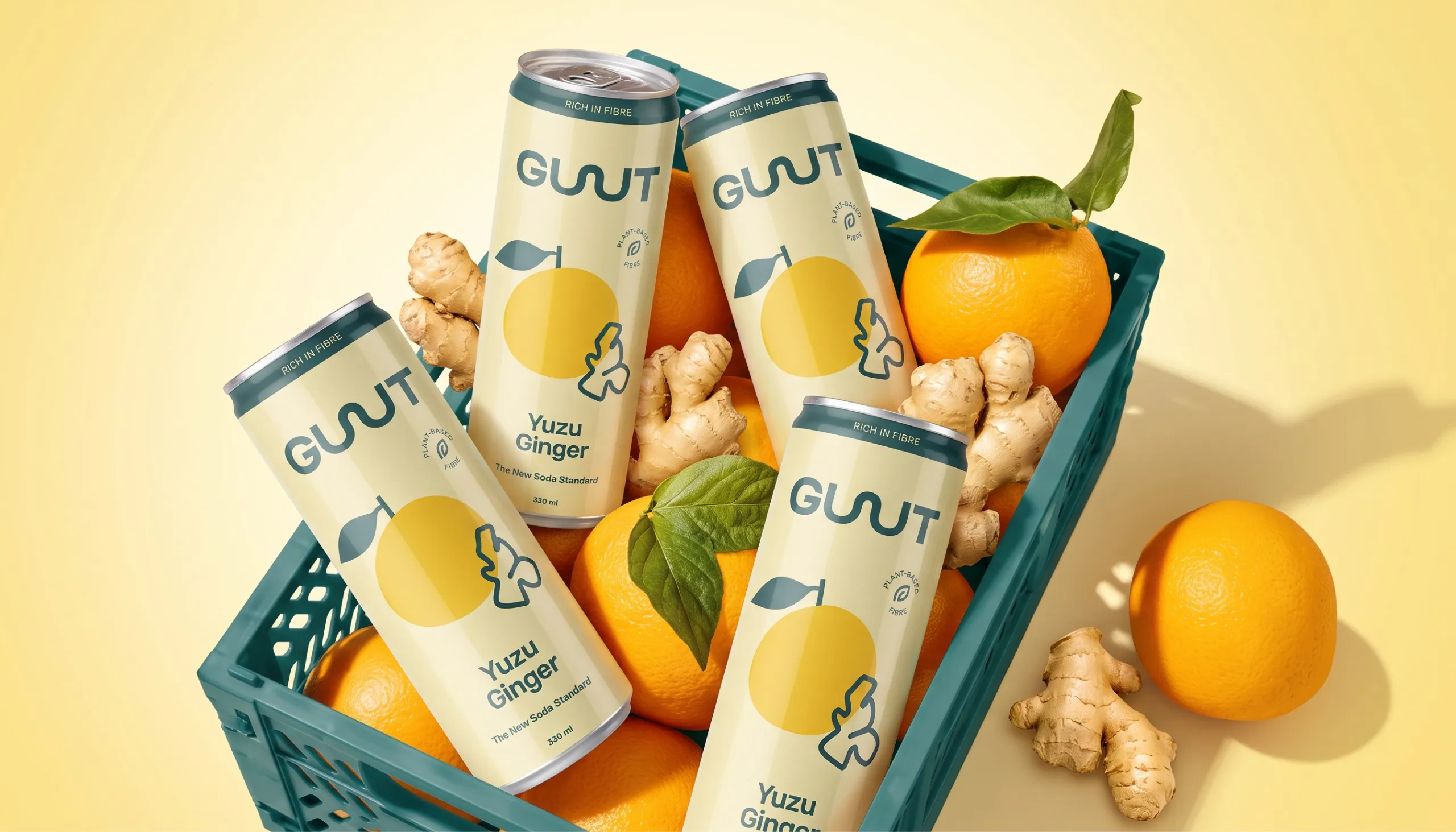
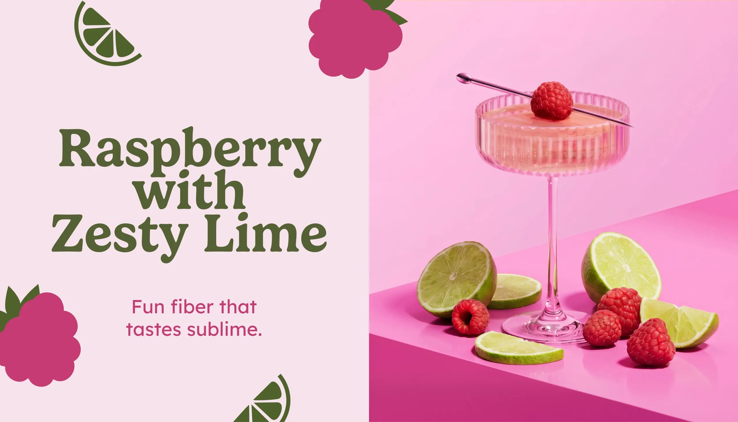
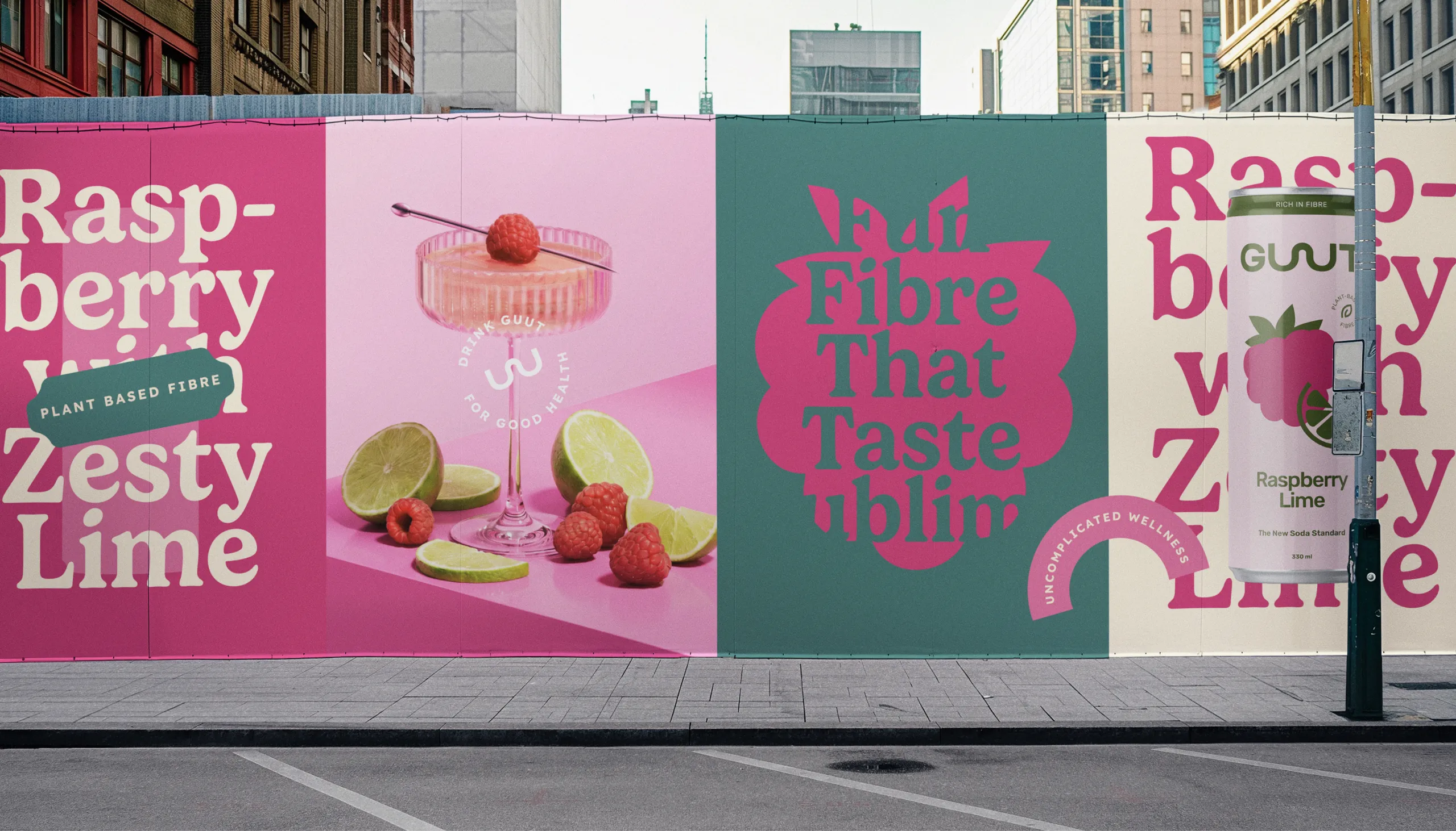
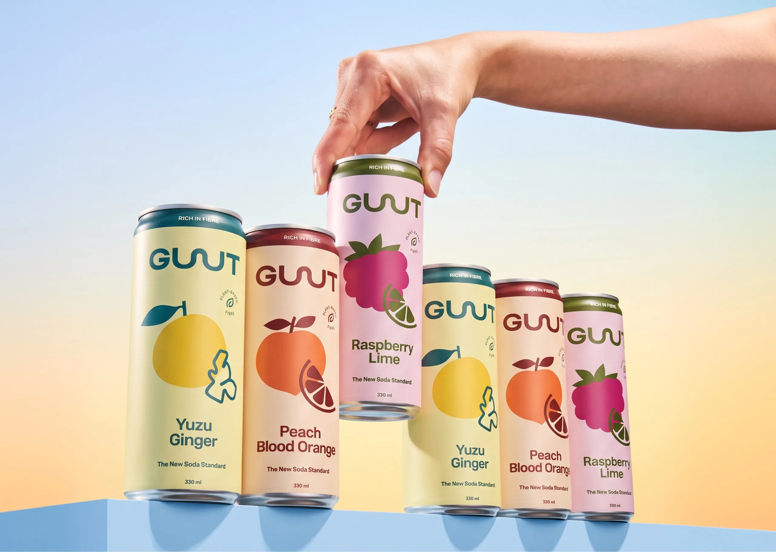
A custom wordmark, bold fruit illustrations and a bright flavour-led colour system create immediate recognition. Soft cream provides a consistent base across the range, while yellow, raspberry, orange, green and deep red build distinct personalities for each flavour.
The result balances two sides of the brand: good for your gut, but made to be enjoyed like soda.
The Process
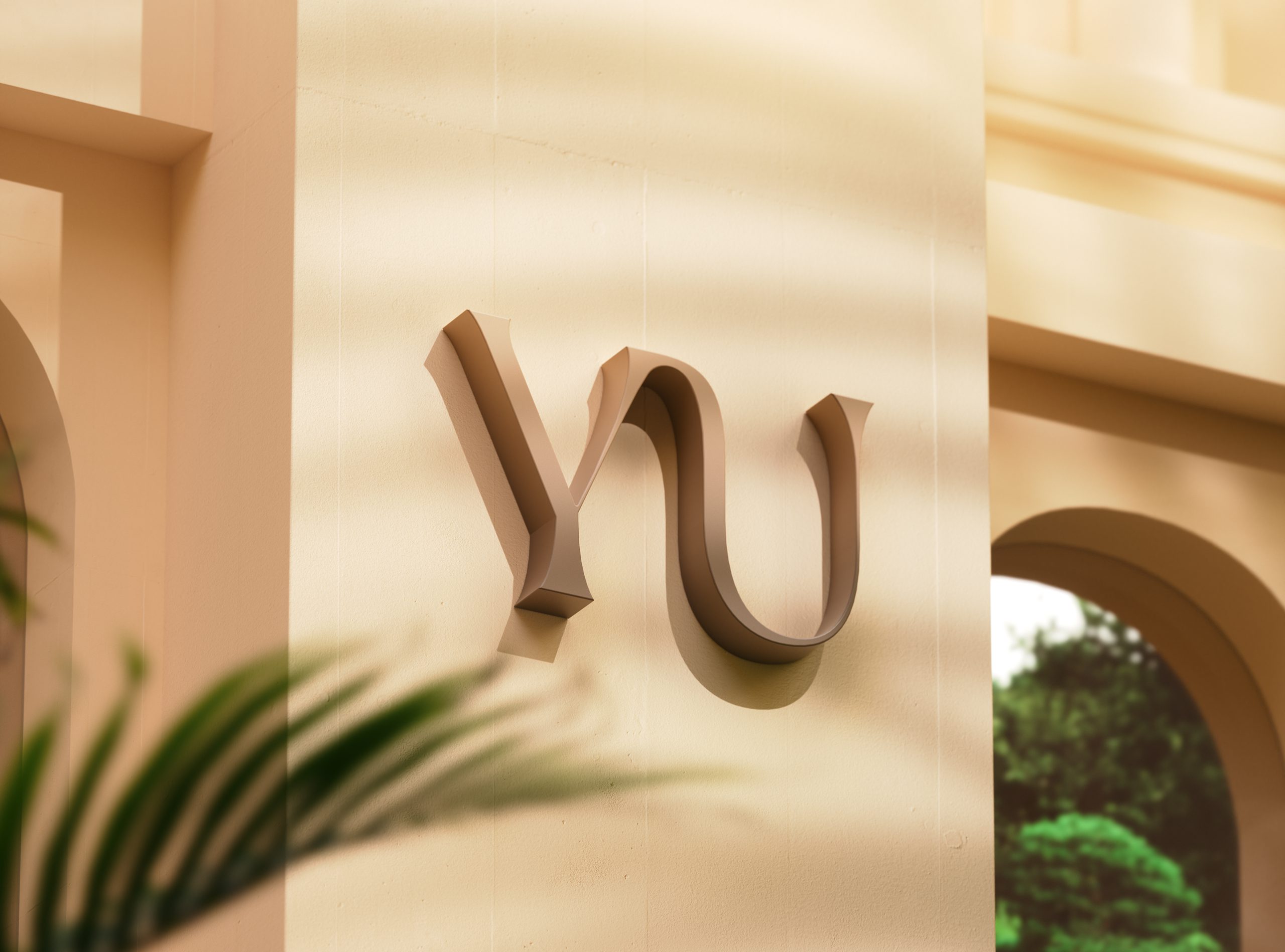
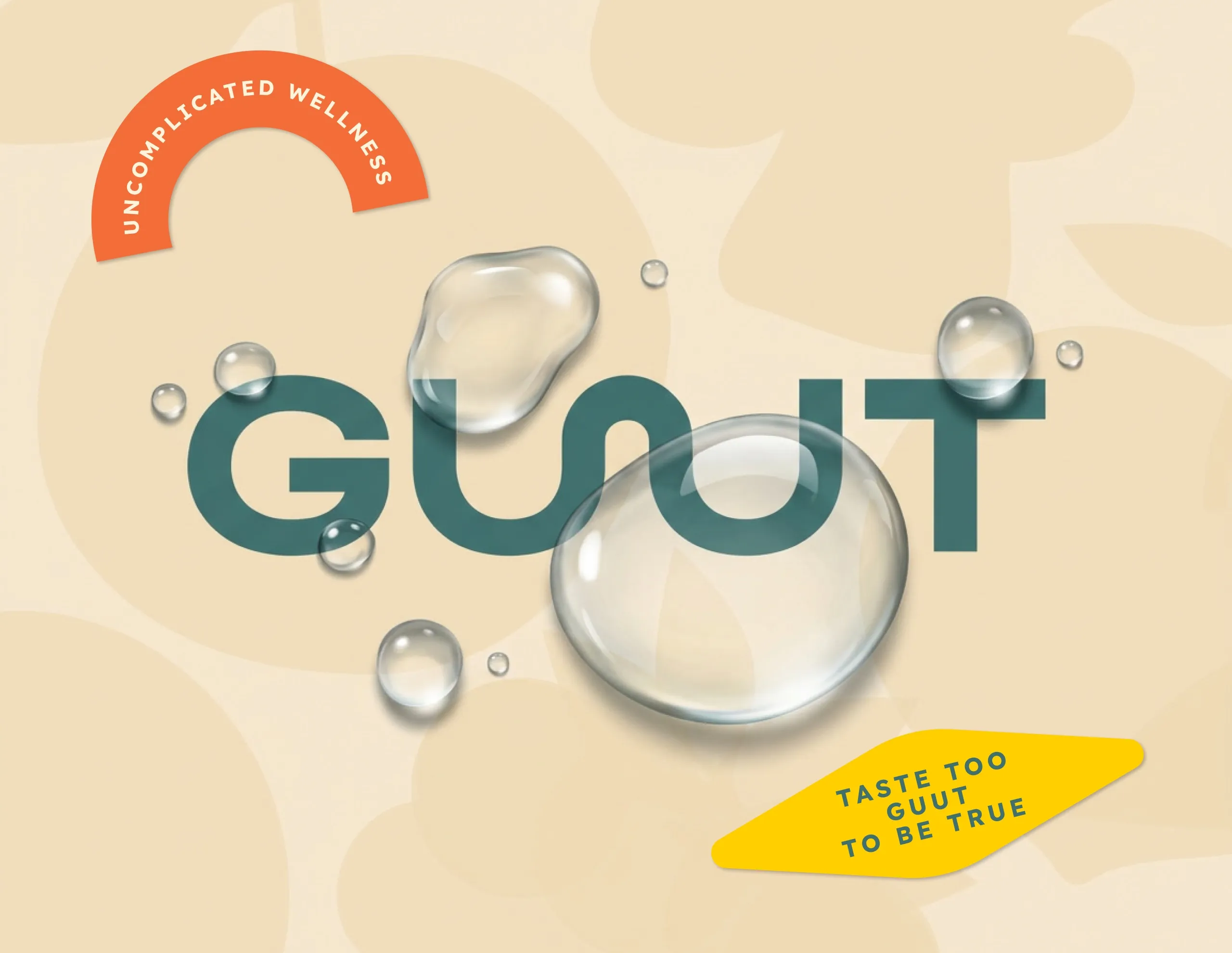
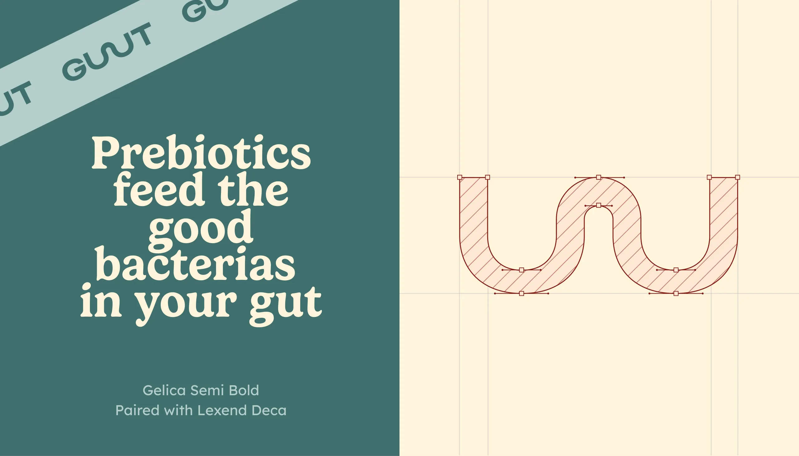
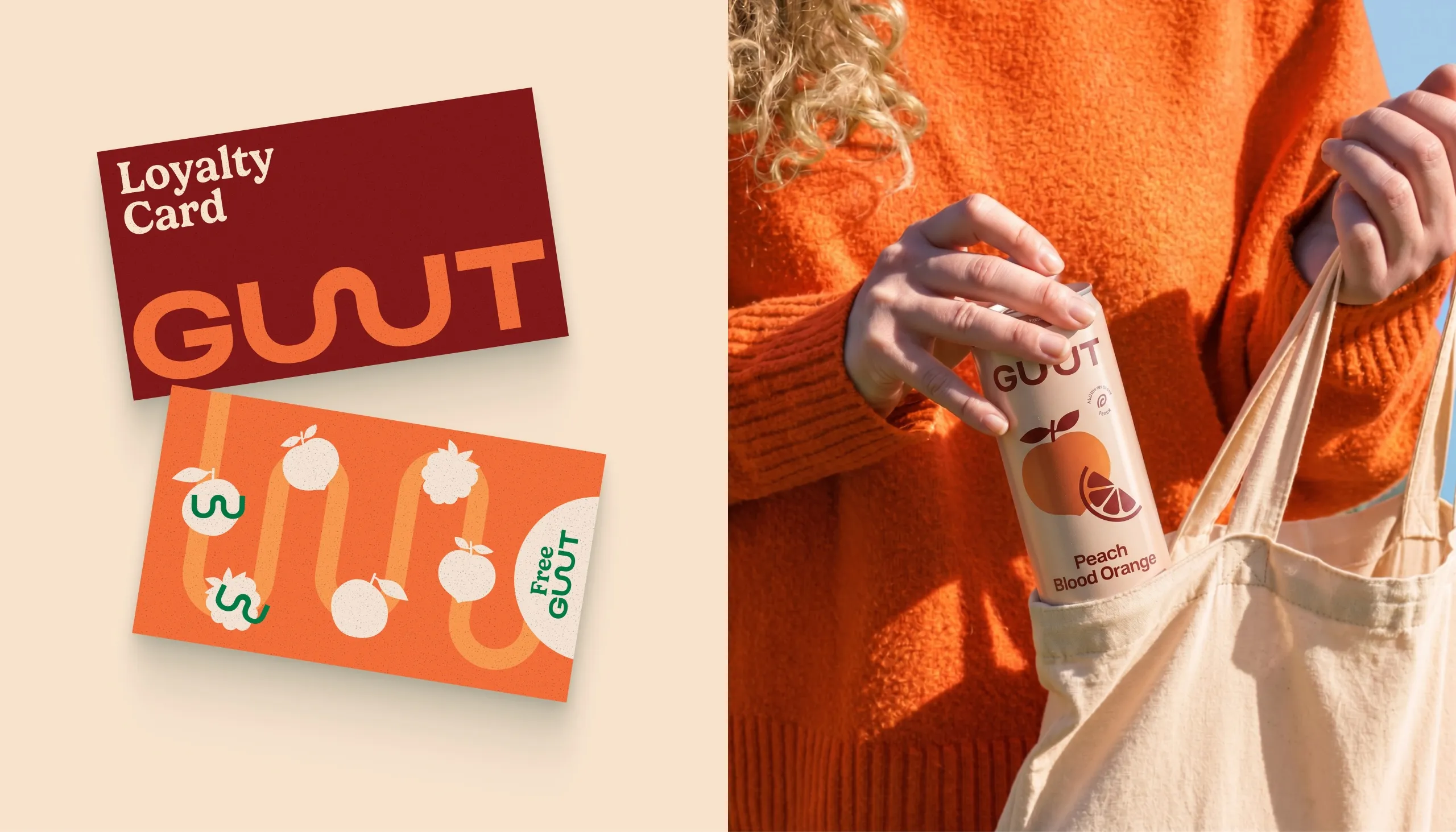
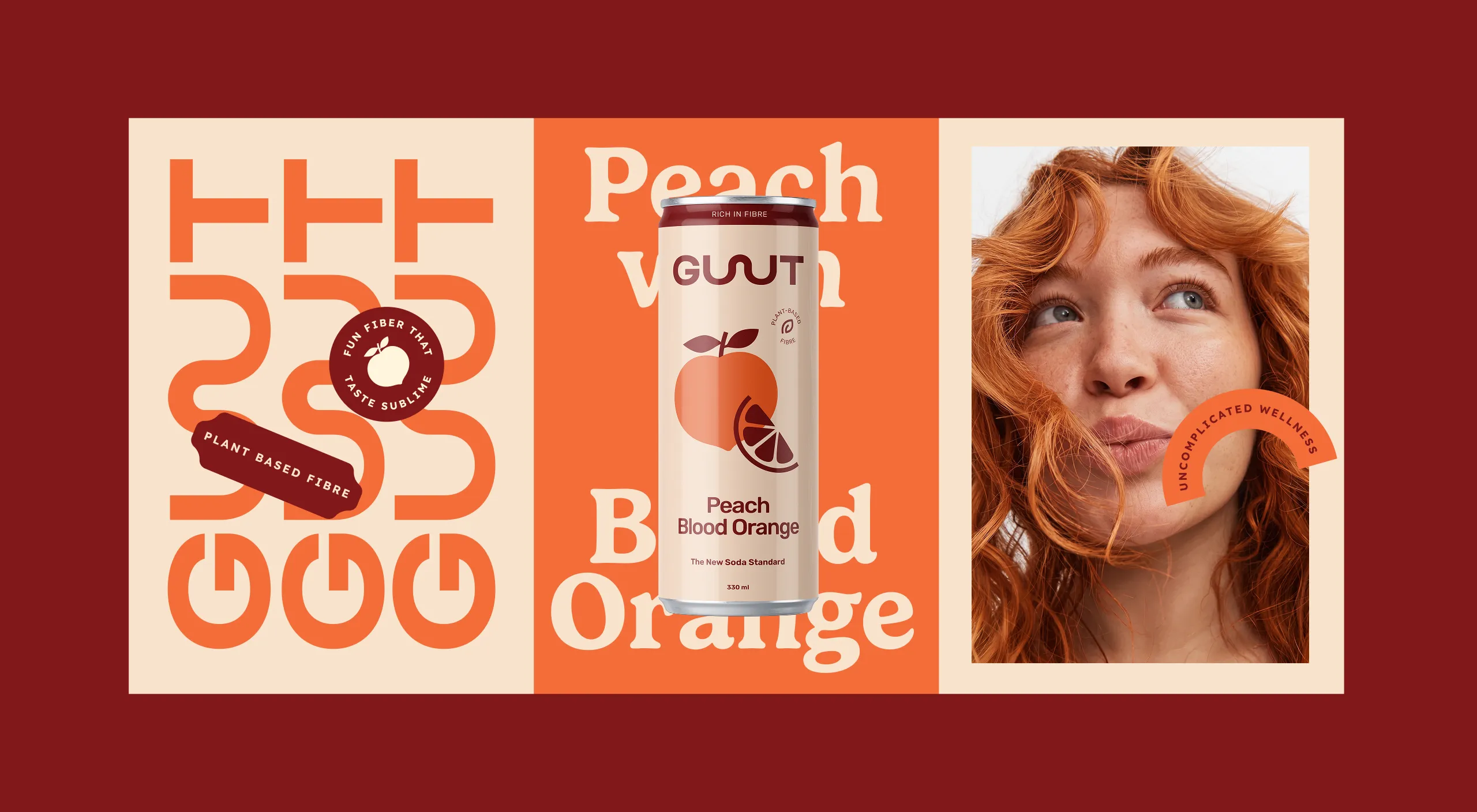
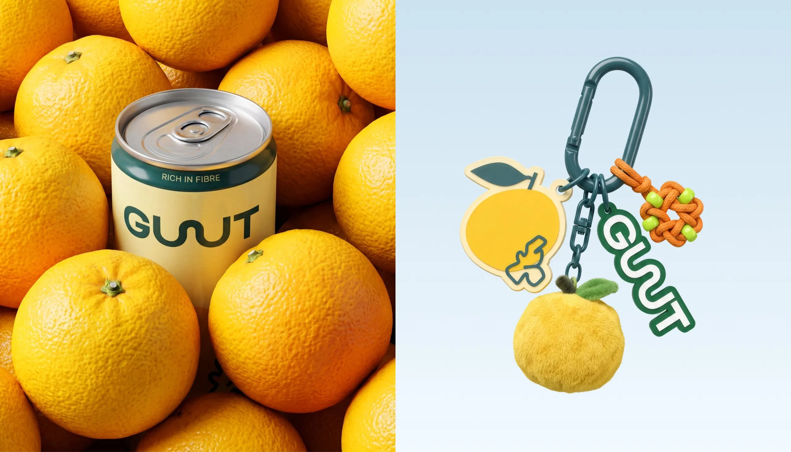
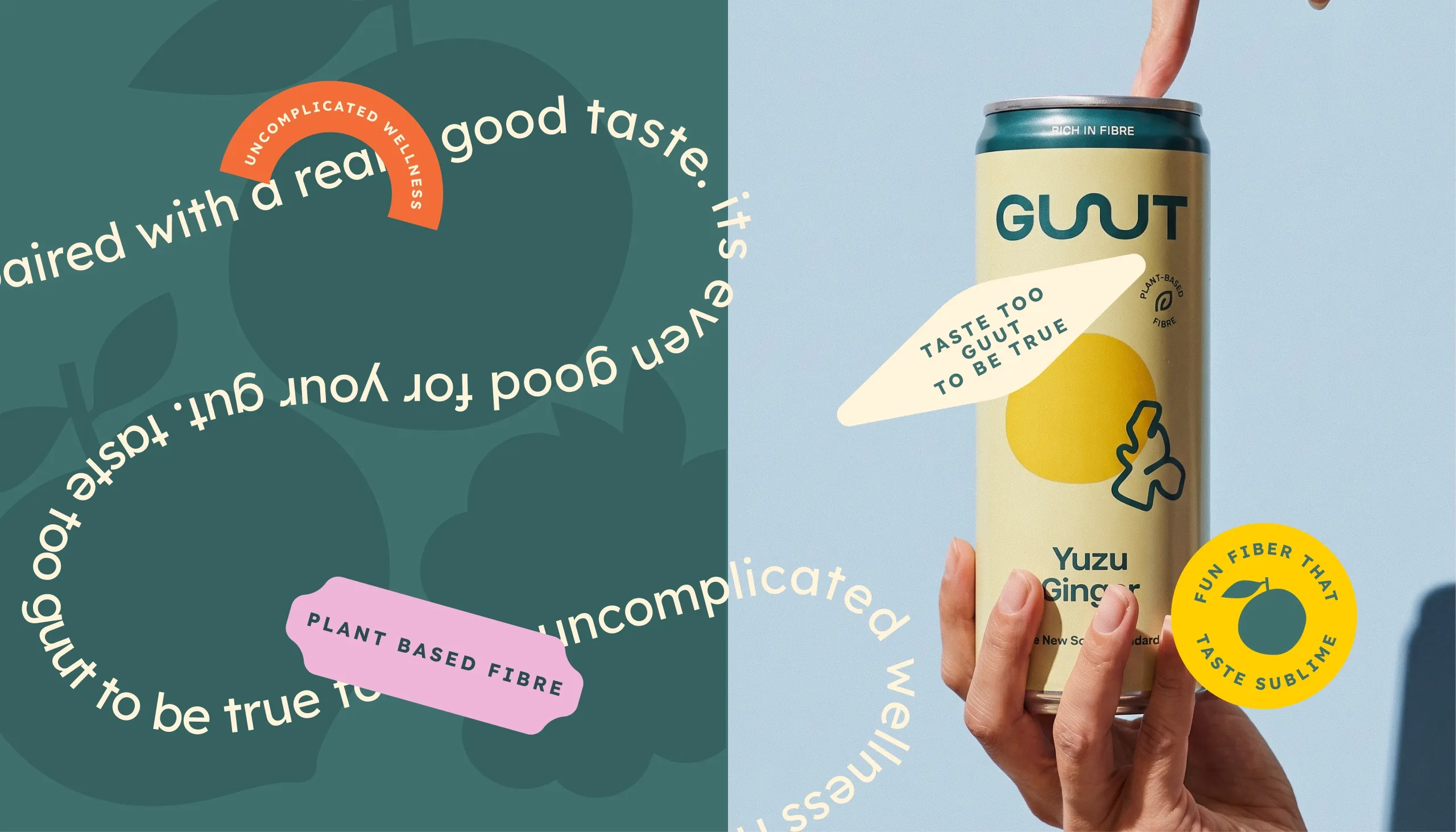
The GUUT wordmark was developed around a continuous curved form within the double “U”, creating a simple visual reference to movement through the gut. The same shape was extracted as a standalone graphic device and extended across patterns, icons, stickers and campaign applications.
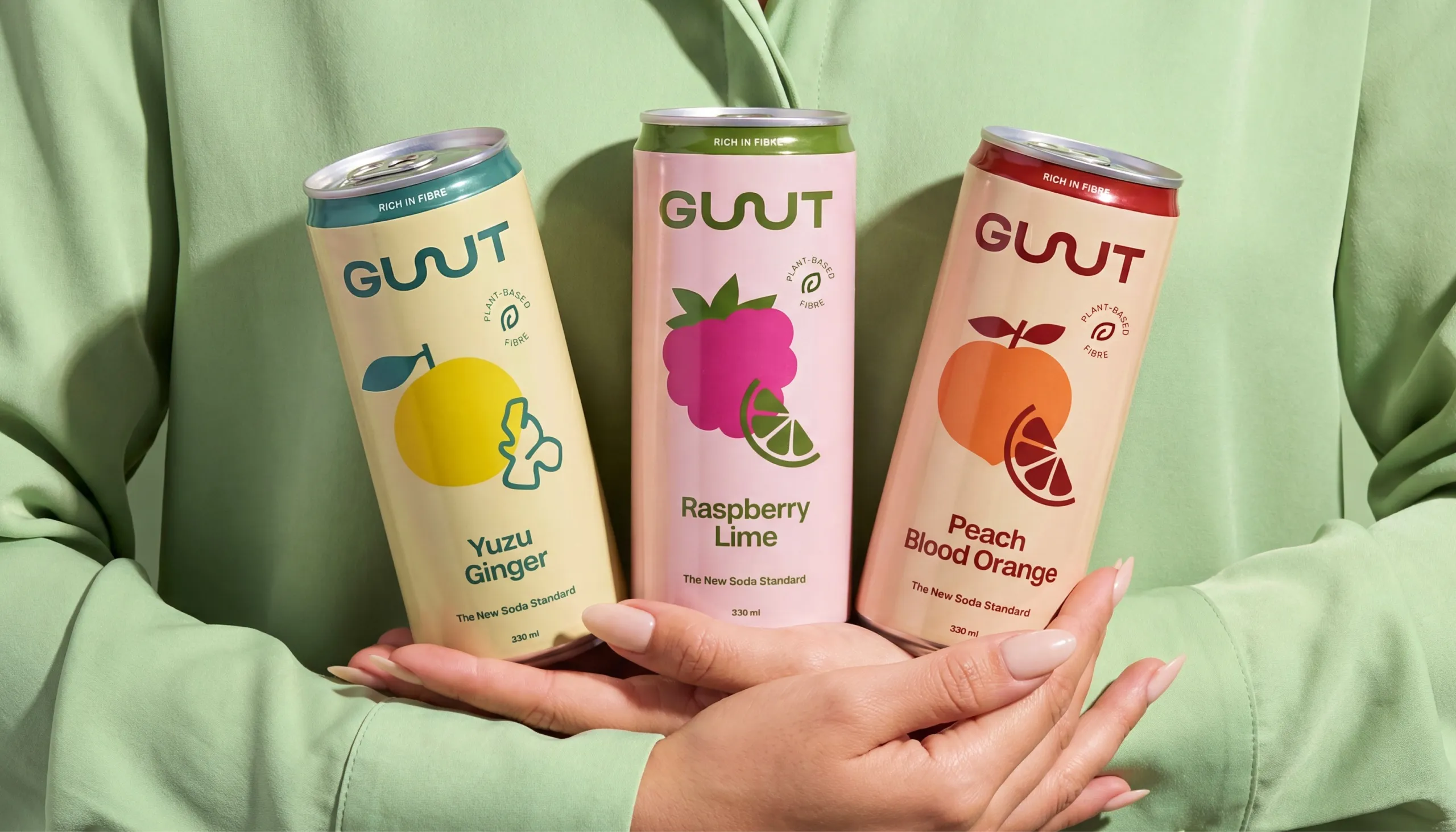
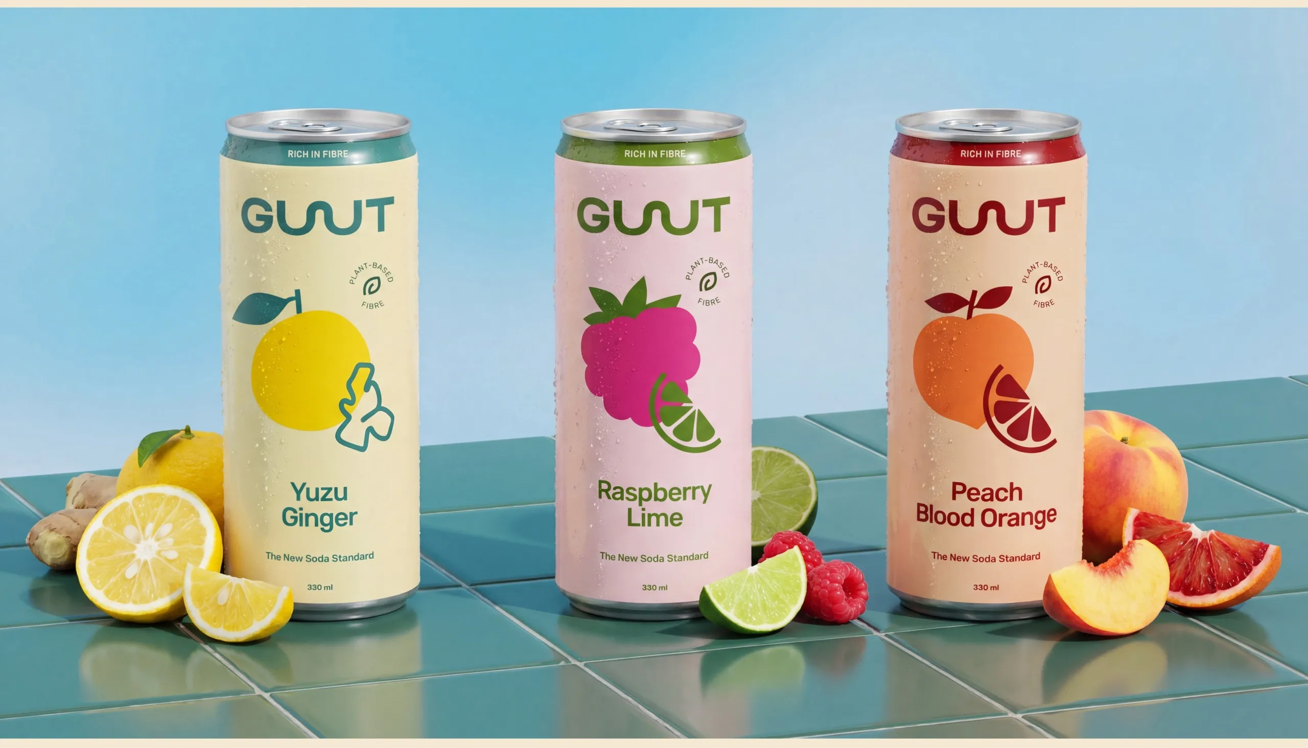
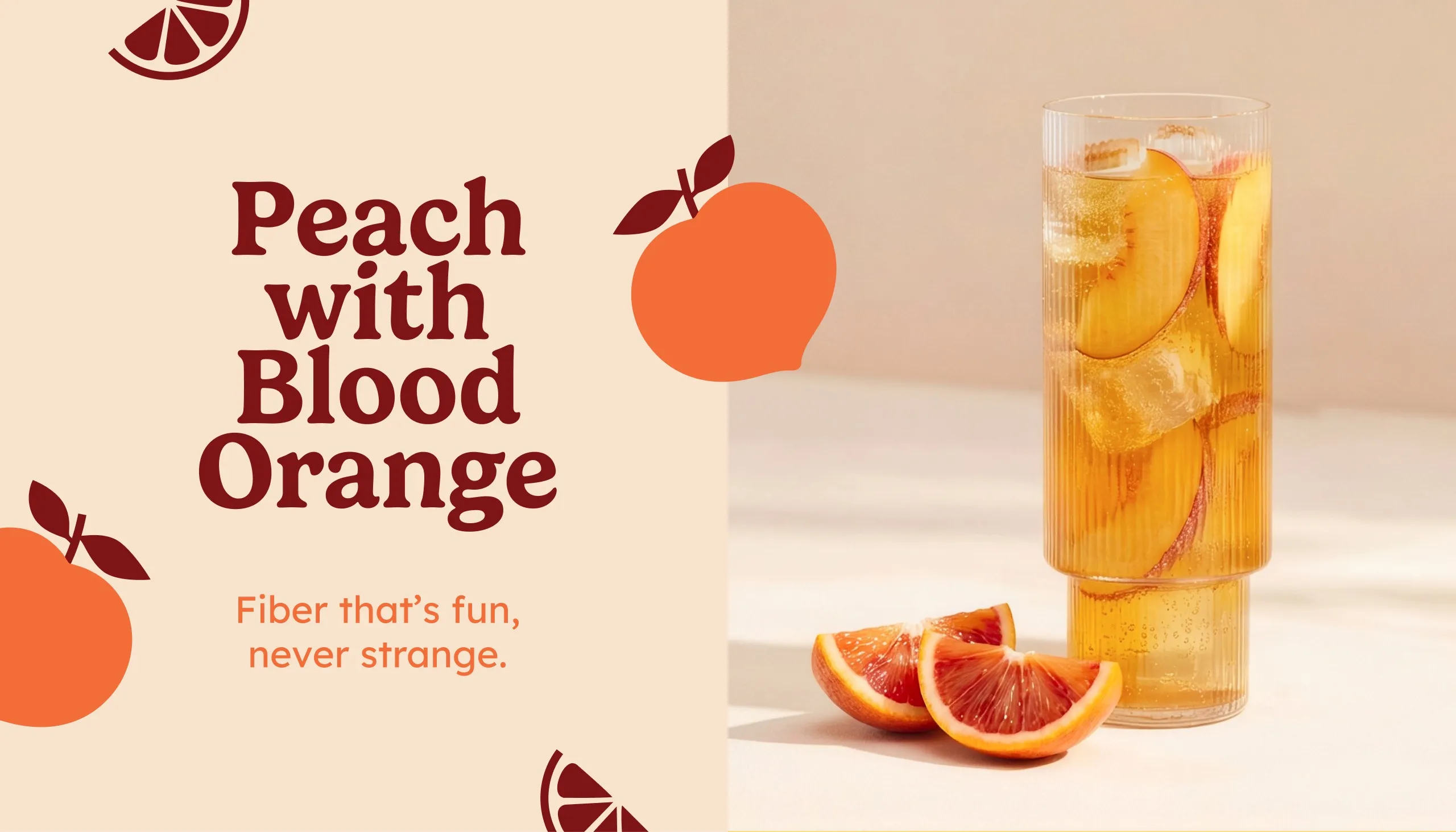
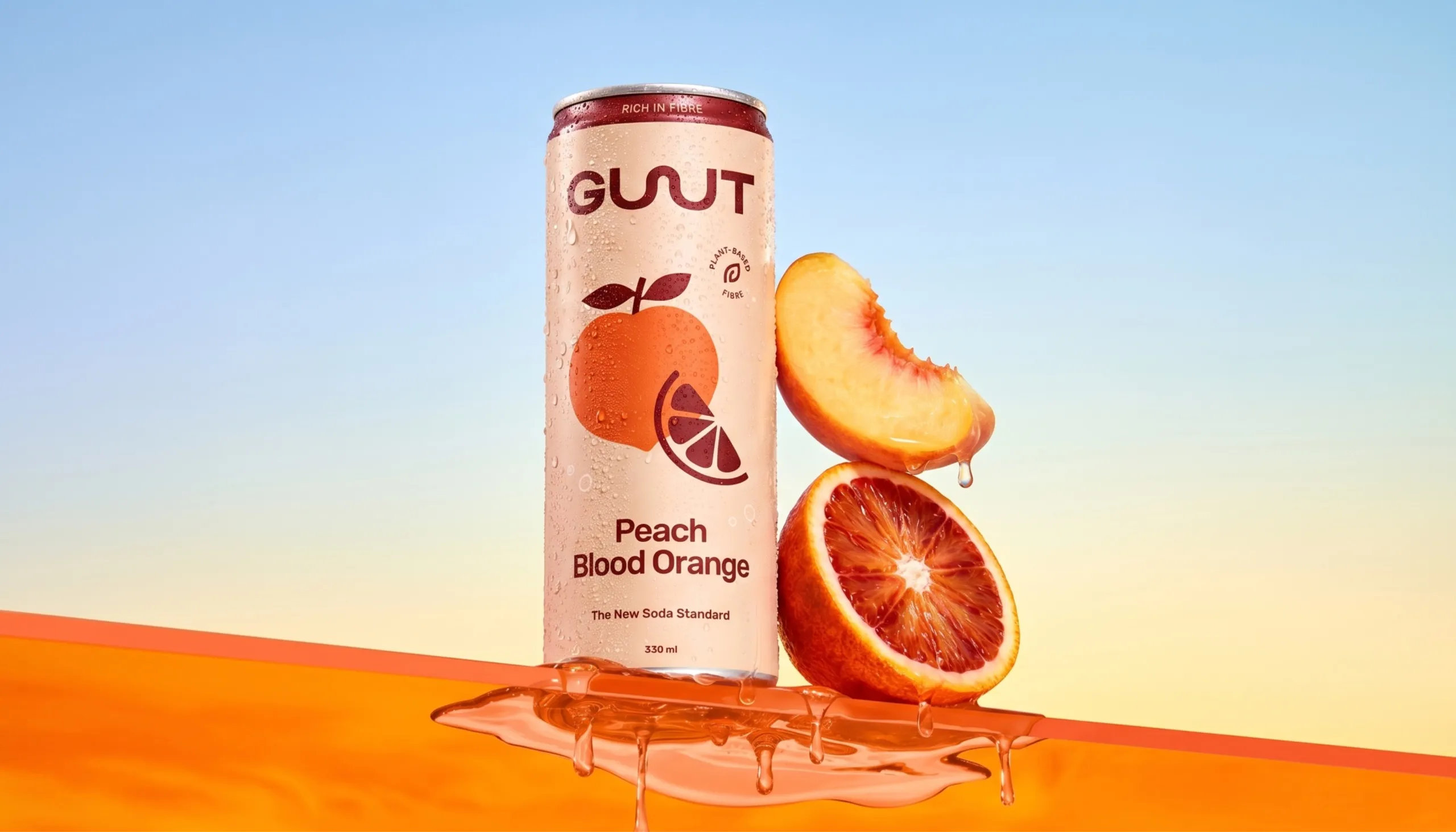
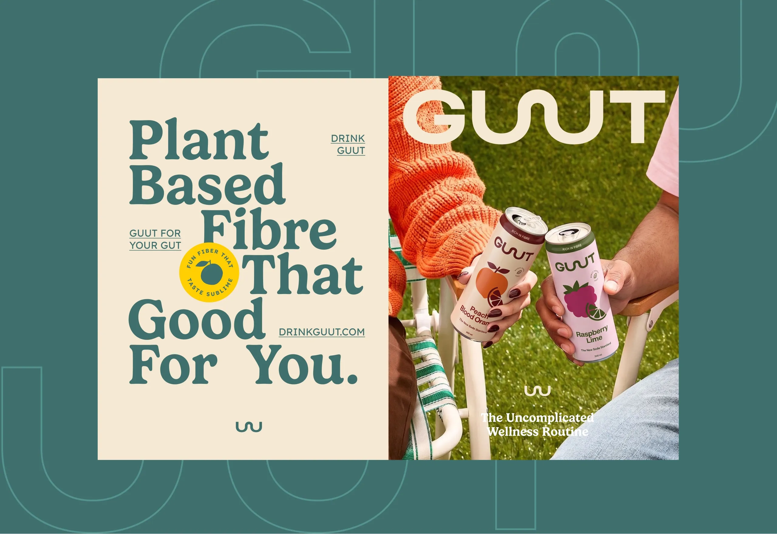
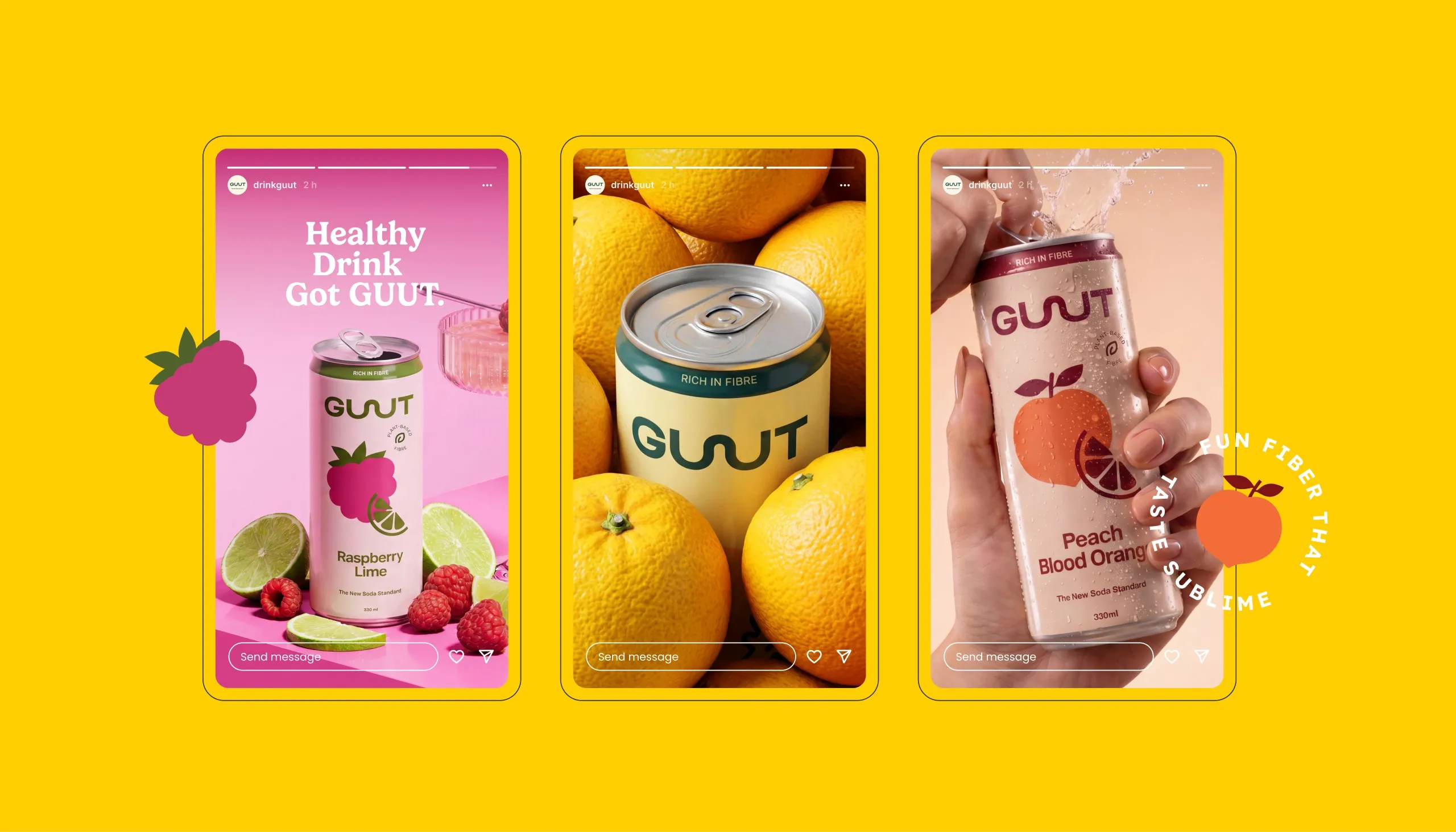
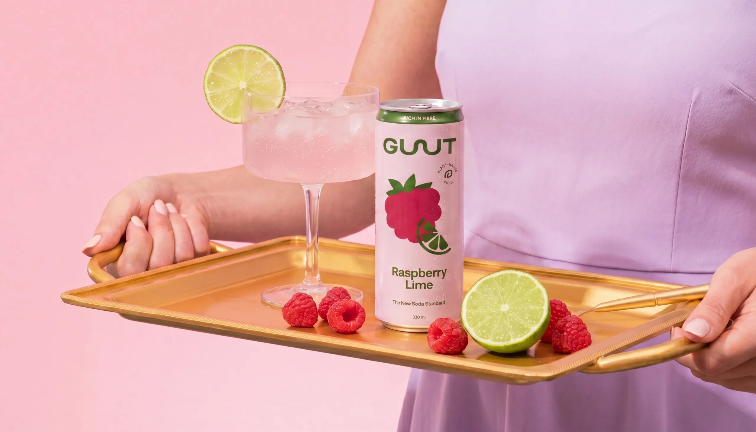
Packaging was designed to work as a clear family while giving each flavour its own character. Yuzu Ginger, Raspberry Lime and Peach Blood Orange share the same hierarchy and cream foundation, while fruit illustrations and colour-coded details make variants instantly distinguishable.
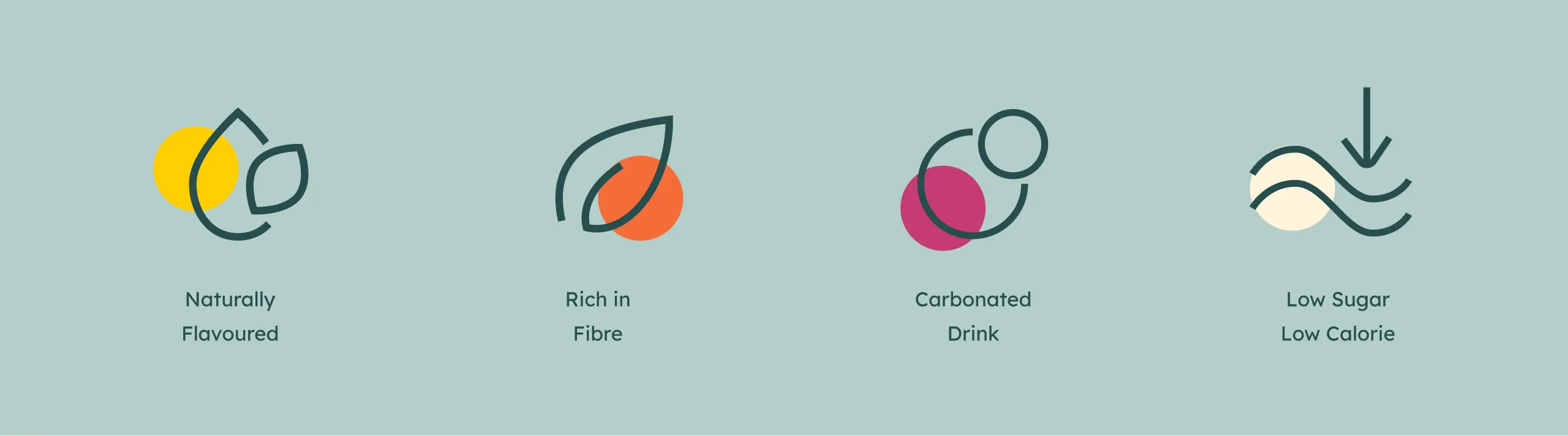
A supporting icon system simplifies the functional story into four clear benefits: naturally flavoured, rich in fibre, carbonated, and low in sugar and calories. Rather than presenting these claims through technical language, the graphics keep the communication light and approachable.
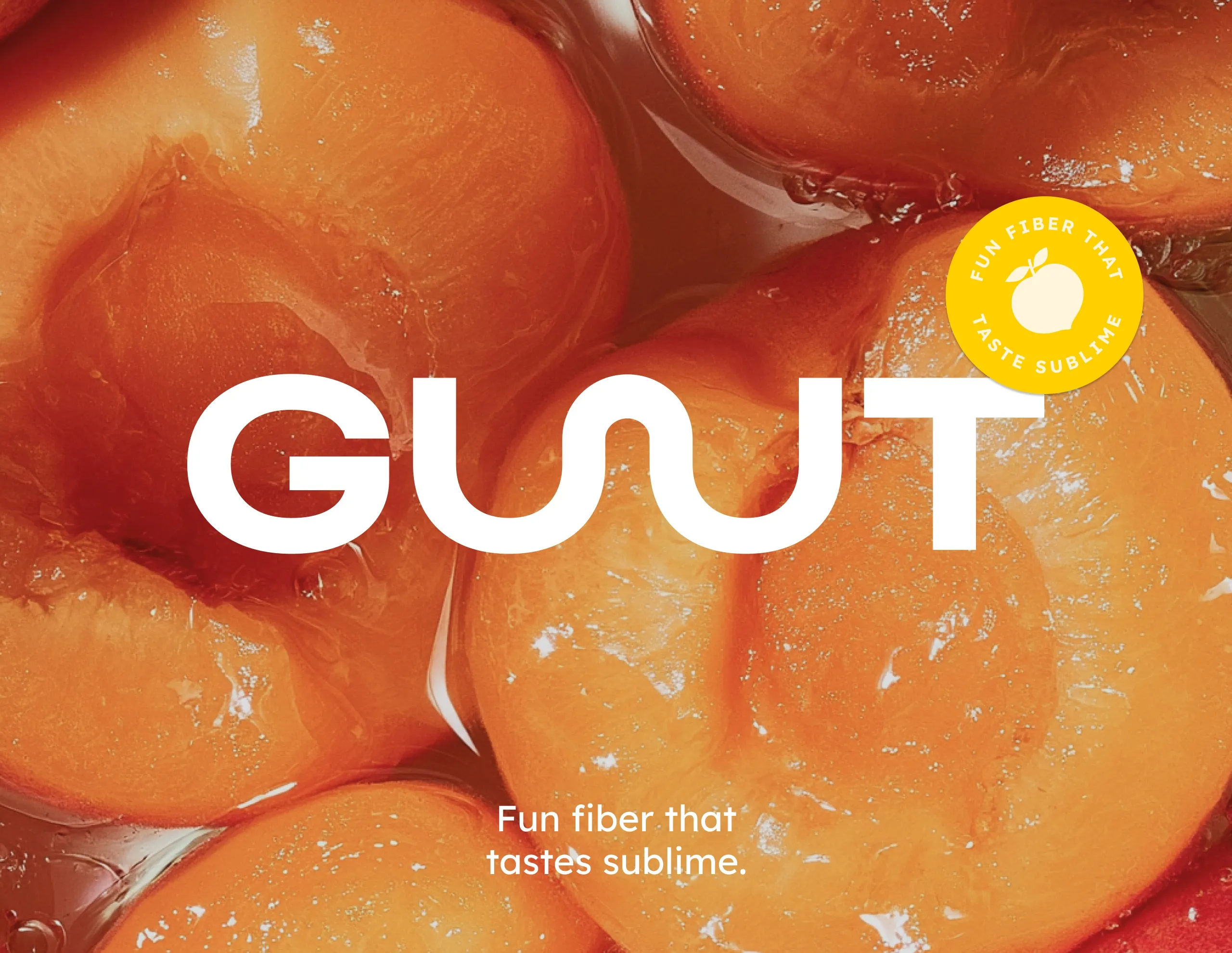
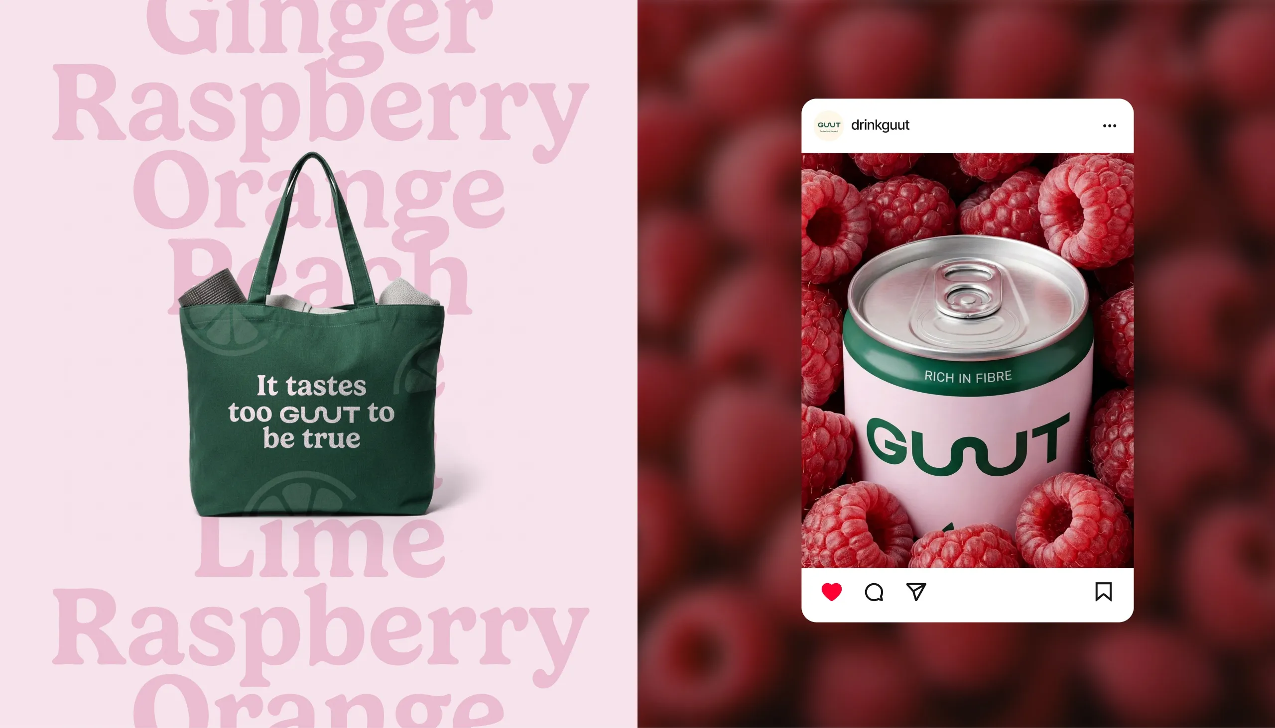
Typography adds another layer of personality. A friendly serif is paired with a contemporary sans serif, allowing the system to move between functional information and more expressive statements such as “Uncomplicated Wellness,” “Fun Fibre That Tastes Sublime,” and “It Tastes Too GUUT to Be True.”
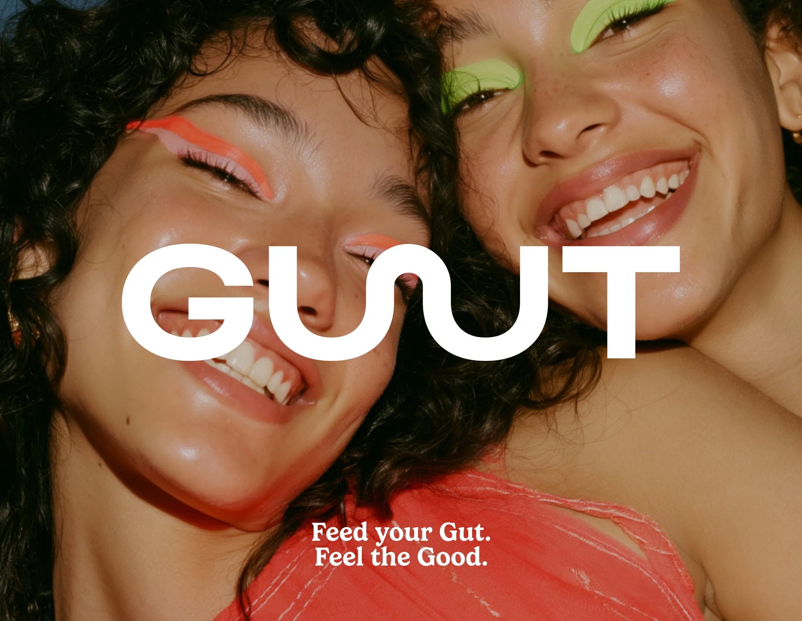
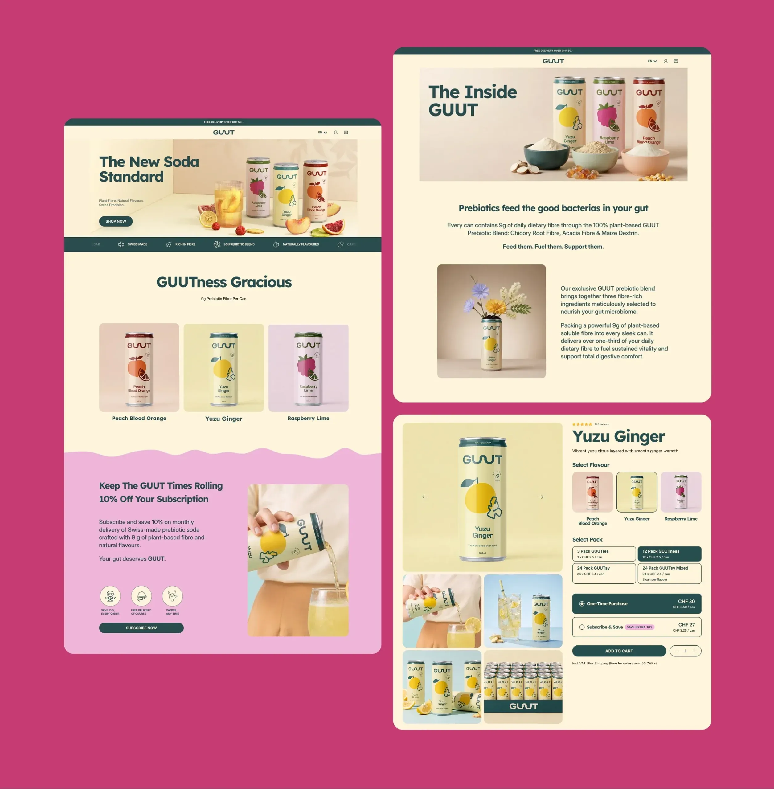
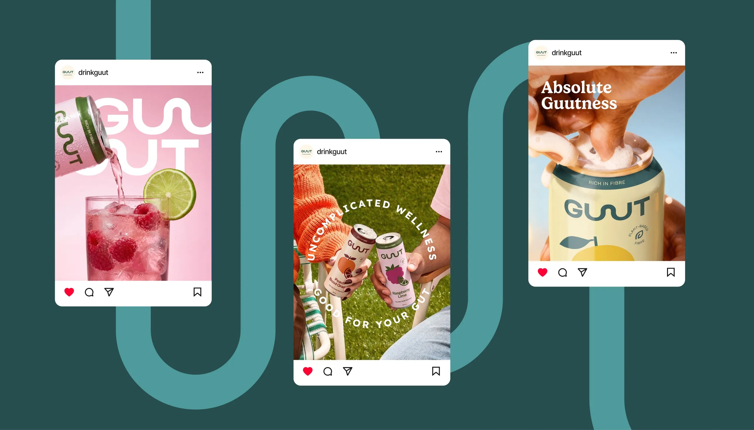
The art direction pushes the brand further into lifestyle territory. Fresh fruit, saturated colours, tactile surfaces and playful compositions create a visual world that feels closer to modern soda culture than traditional health products. The same system extends across social content, outdoor campaigns, merchandise and e-commerce, creating consistency from shelf to screen.
The Outcome
GUUT turns gut health into a vibrant consumer brand rather than a functional compromise. The identity gives the range strong shelf recognition, clear flavour navigation and a communication system capable of explaining product benefits without losing energy or appetite appeal.
The result is a scalable brand world where function, flavour and personality live together making better-for-you soda feel simply like better soda.
See more food and drink branding case studies.

Let’s make the work they’ll copy.
Talk to an expert now
Work with a 22 team of the
industry’s top 1% talent.