What an ice bucket, a fridge and a wet hand do to a label, which parts of the damage design can limit, and how to test the real bottle before the print run.
Design the label for its wet state. Keep small type and mandatory text inside a safe zone away from the edges, print them in the darkest ink at a regular weight, and choose stock, adhesive and finish with your label printer. EU food rules set a minimum x-height of 1.2 mm. Then stand the real bottle in ice water and read it.
What ice, fridges and condensation do to a label
A drinks label is applied dry and then spends most of its life cold and wet. It sits in a fridge, a cooler box or a bucket of ice and water. In a warm room, condensation forms on the cold bottle and runs down to the lower edge of the label. 4 kinds of damage follow.
- The paper takes up water. Uncoated paper absorbs it, swells and turns darker, usually from the edges inwards.
- The edges lift. Water finds a corner or the overlap seam, the adhesive lets go, and the label peels or slides.
- The ink moves. Print with nothing over it can soften, run or rub off under a wet thumb.
- The label wrinkles. Wet paper expands and glass does not, so the label creases or bubbles.
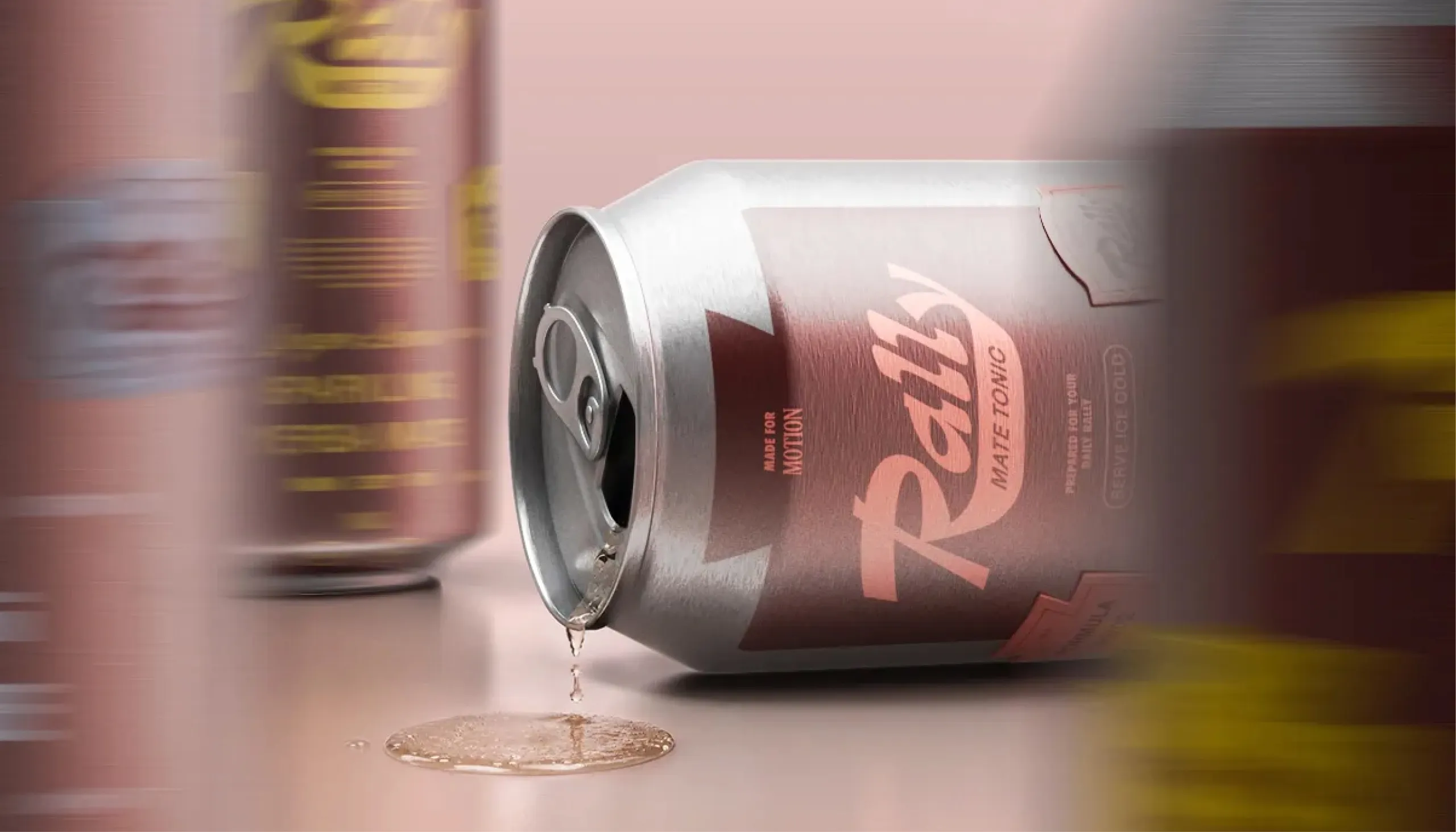
How far each of these goes depends on the stock, the adhesive and the finish. Those are production choices. Ask your label printer which combination they recommend for a bottle that will stand in ice water, and ask for printed samples.
Design controls something else: what the customer loses when the damage happens. If the net contents run along the bottom edge, they are the first thing to go. If the brand name sits in the middle in heavy letters, it is the last. The table below sets out 5 problems and what the layout does about each.
| Problem | Why it happens | What the design does |
|---|---|---|
| Paper darkens and looks grey | Uncoated paper absorbs water from the edges inwards | Dark type on pale paper for the mandatory block; contrast checked on a wet proof |
| Edges and corners lift | Water gets under a corner or the overlap seam and the adhesive lets go | No small text, barcode or hairline border in the outer band or on the seam |
| Ink runs or rubs off | Print with no finish over it softens under water and a wet thumb | Finish agreed with the label printer; fine detail kept out of the areas a hand grips |
| Label wrinkles or bubbles | Wet paper expands and the glass underneath does not | Mandatory text set in a compact block, clear of the bottom edge where water collects |
| Droplets hide thin lines | Drops on film, glass and cans bend the light over small detail | Regular or medium weight type with wider spacing; thin pale lines avoided |
What EU food labelling rules expect of the print
Legibility on a food pack is a legal matter as well as a design one. In the EU the general rule is in Article 13 of Regulation (EU) No 1169/2011 on food information to consumers. It says mandatory food information must be marked in a conspicuous place so that it is “easily visible, clearly legible and, where appropriate, indelible”.
The same paragraph adds a second test: “It shall not in any way be hidden, obscured, detracted from or interrupted by any other written or pictorial matter or any other intervening material.” A label that has turned grey, creased across the ingredient list or lost its lower third has trouble with both sentences.
Article 13 also sets a size. The mandatory particulars must be printed in characters whose x-height “is equal to or greater than 1,2 mm”. Where the largest surface of the pack is under 80 cm2, the minimum x-height is 0.9 mm. Our guide to how small type can be on packaging covers the print side.
Article 2 defines legibility. The definition lists font size, letter spacing, line spacing, stroke width, type colour and typeface, and ends with “the surface of the material and significant contrast between the print and the background”. Water changes the last 2 items on that list.
Which particulars are mandatory for your drink is a question for your regulatory adviser. They confirm the wording; we design the layout around it.
What US rules say about a spirits label
The United States regulates distilled spirits labels in 27 CFR Part 5, Subpart E. It covers one category in one market, but 3 of its points are useful to anyone who designs a bottle.
First, it defines what counts as a label. The list starts with “Material affixed to the container, whether made of paper, plastic, metal, or other matter” and goes on to include information etched into the glass or printed directly on it.
Second, loose items do not count. Section 5.61 says materials that are “not firmly affixed to the container, including booklets, leaflets, and hang tags” fall outside the definition. The bottom of the container does not satisfy the mandatory information rules either, and the same goes for closures and foil capsules unless a TTB officer authorises a closure to carry it. So the required text cannot move to a neck tag when the main label gets crowded.
Third, the regulation groups information by what can be seen at once. The brand name, the class or type and the alcohol content must appear within the same field of vision, which it explains as a single side of the container, and “for a cylindrical container, a side is 40 percent of the circumference”.
Use that 40 percent as a working width for the front of any round bottle. See what makes a spirits label premium. For beer, wine, soft drinks and other markets, check the rules with your adviser.
Keep small type away from the edges
Damage starts at the perimeter. The bottom edge sits in the water, and the corners are where a thumb starts to peel. So the first design rule is about position: the smaller and more important the text, the further it sits from an edge.
Draw 2 zones on the label before any artwork goes in. The outer band, all the way round, takes colour, pattern or nothing. The inner zone takes everything that has to be read. On a wrap label, also mark the overlap seam and keep text and the barcode clear of it. Our guide to barcode colours and size covers the print rules for the code itself.
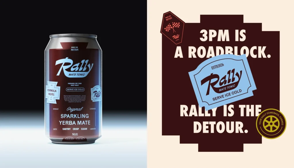
A fixed reading order helps here. The Rally case study describes it this way: “Packaging follows a consistent hierarchy: brand first, flavour and formula second, followed by product descriptors and functional information.” When the order is fixed, the safe zone can be fixed too, and every flavour inherits it.
3 more habits follow:
- No hairline borders close to the trim. A thin frame shows every lift and crease.
- No full lines of small text across the bottom edge. Stack them in a block higher up.
- Rounded corners where the printer offers them. Ask your label printer whether the shape changes how the label holds on your bottle.
Hold the contrast when the paper turns dark
Uncoated and textured papers feel good in the hand, and they change most when wet. The sheet darkens and loses its brightness, so the gap between the paper and the ink narrows. Dark type on a pale paper usually survives this. Pale, thin or metallic type on a mid-tone paper is where reading fails first.
Check contrast twice: once on the dry proof and once on a wet one. Our article on brand colours and contrast explains how to measure the gap between 2 colours before anything is printed.
Stroke width matters as much as colour. Article 2 of the EU regulation names stroke width and the surface of the material as parts of legibility. A light typeface with fine serifs breaks up on a rough, damp surface before a regular weight does. For the mandatory block, choose a plain typeface in a regular or medium weight and print it in the darkest ink on the label.
Droplets add a second problem on films and cans. Each drop bends the light, and a thin pale line under it can vanish. Larger letters and wider spacing cope better.
If a colour change when wet is unacceptable, raise it with the printer early. A different stock or finish also changes how the colours print.
Bottle, can and box are 3 different problems
One brand often appears on a glass bottle, a can and a carton, and each meets water differently.
- A paper label on glass has edges, a seam and an adhesive. Everything above applies.
- A can or a directly printed bottle has no label edge to lift. The risks that remain are contrast under droplets and print that scuffs when wet cans rub together in a cooler. Ask your printer or can supplier how the finish stands up to that.
- A carton, sleeve or multipack wrap is board. It can sit in a fridge or on a wet counter.
The carton does not replace the label. For distilled spirits in the US, Subpart E says that when containers are enclosed in sealed opaque cartons, “such coverings, cartons, or other containers must bear all mandatory label information”. It also says the container inside is subject to all labelling requirements “regardless of whether the packaging bears such information”. The bottle has to stand on its own, because it is the bottle that reaches the ice.
Solve the 2 surfaces separately. The carton has flat panels and can carry longer text. The bottle label carries the brand, the variant and the mandatory text, set for wet conditions. Stock containers limit the label area and shape, which our comparison of custom and stock packaging covers. Finish options depend on the process, as our guide to printing methods and minimum orders explains.
Test the real bottle in ice water
A screen cannot show what water does to paper, so test the object. The test needs a printed label on the production stock, the real bottle or can, a bucket, ice and a phone camera. It takes about 20 minutes of attention.

- Apply the label the way the production line will, and leave it for as long as your printer advises before wetting it.
- Photograph the dry bottle at arm’s length.
- Stand it in ice and water so the lower part of the label is under the surface.
- Take it out at intervals, photograph it and read the smallest text aloud.
- Rub the print with a wet thumb, pull gently at a corner, then let the bottle dry and look for wrinkles.
Note 4 things each time: whether the brand and variant read at arm’s length, whether every line of mandatory text is readable, whether an edge has moved, and whether the colour has changed.
If your retailer or market asks for a formal durability test, your label printer can tell you which one and who runs it.
Include the other printed pieces that meet cold drinks. Bar and restaurant brands have menus and coasters that sit next to wet glasses. Our article on testing packaging before launch lists other checks to run before artwork is approved.
How our team designs labels for cold drinks
MarkaWorks starts a packaging project with the structure. In our packaging and product design work, the pack format, the material, the closure and the production method come before the artwork, because those 4 choices decide what the label has to survive.
For a drink that will be served cold, that first stage includes the questions for your label printer: stock, adhesive, finish and how the label is applied.
Ranges get one set of rules. In our range systems the fixed parts of the label are decided before the flavours are drawn. On a drinks label the safe zone is one of those fixed parts, so a new flavour needs a new colour and new text and nothing else moves. Our food and drink page lists 17 case studies.
Your regulatory adviser confirms the mandatory wording for each market. We design the label so that wording sits inside the safe zone at a legal size and stays readable when wet.
Final artwork is drawn on the dieline from whoever produces the label, and you get the working files too.
If you are launching a drink or fixing a label that fails in ice, this is a job for our team. Send us your bottle or can, tell us where it will be sold and served, and we will show you how we would lay out the label.
Questions brand owners ask about labels for cold drinks
Which label paper holds up in an ice bucket?
That is a question for your label printer, because the answer depends on the stock, the adhesive and the finish together. Ask which combination they recommend for a bottle that stands in ice water, and ask for printed samples so you can test them on your own bottle.
How small can the mandatory text be on a drinks label in the EU?
Article 13 of Regulation (EU) No 1169/2011 sets a minimum x-height of 1.2 mm for the mandatory particulars, and 0.9 mm where the largest surface of the pack is under 80 cm2. Your regulatory adviser confirms which particulars apply to your drink.
Can required information go on a neck tag?
For distilled spirits in the US, no. 27 CFR 5.61 says materials that are not firmly affixed to the container, including booklets, leaflets and hang tags, are not labels for the purposes of mandatory information. For other drinks and markets, check with your adviser.
How do you test a drinks label before printing the full run?
Apply a printed sample to the real bottle, photograph it dry, stand it in ice and water, then take it out at intervals and read the smallest text. Rub the print with a wet thumb, pull at a corner, and check again once the bottle has dried.
More brands we brought to life: