Updated November 2026
Naming & Story Building
Naming and story building is the word side of a brand: a name with meaning, the place it takes on the pack and a story the design can act on. We handle it inside the MarkaWorks brand strategy work, and the 6 cases on this page, all published since November 2025, show what happens to a name once it is drawn and placed.
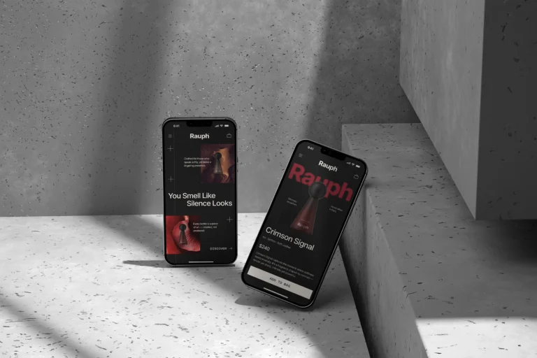
ARC CO and Redefyned carry their names in custom letterforms. LA MAMA and Rauph carry a story instead, and Rauph’s whole system, from the typography and grid to the packaging and the website, was guided by one line: “You smell like silence looks”.
Four ways a name works on our case pages
- The name drawn in its own letters
- The name in a fixed reading order
- A story the design acts on
- One line that guides the system
What each name carries
Each card below sets one name from our case pages next to the line on that page that says what the name, its letters or its story does. The line on every card is quoted from the case page.
ARC CO
In the lettersGiving the name a recognisable silhouette while retaining clarity across packaging and digital applications
AKME
In the reading orderPackaging follows a consistent reading order: brand, product name and supporting information.


Two of these six names are carried by their letters, ARC CO and Redefyned; two by a story, LA MAMA and Rauph.
A name drawn in letters
A name becomes part of the identity once it is drawn. The ARC CO wordmark was developed with custom letterforms and distinctive internal cuts, which gives the name a recognisable silhouette that stays clear on packaging and on screen.

Redefyned followed the same idea. We drew its wordmark with distinctive letterforms that give the name its own rhythm, so it is recognisable beyond a standard typographic treatment.
In both cases a monogram carries the name into smaller places: a circular ARC CO mark for cups, stickers and merchandise, and an RD monogram for garments, accessories and packaging.
The name in the reading order

On a pack the name has a place, and the place is part of the system. AKME packaging follows a consistent reading order:
- Brand
- Product name
- Supporting information
ARC CO uses the same principle with more to carry. Coffee name, country, variety, process, altitude and tasting information sit in clearly defined zones, so each coffee keeps its own name in the same place on every bag.
In both, the structure takes in new products without a redesign: the AKME range as it grows, and ARC CO with seasonal releases and new coffees.
A story told without being told
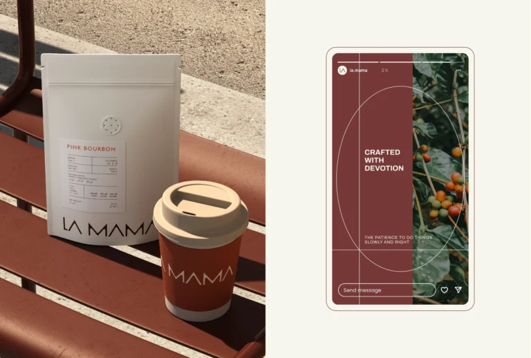
A brand story does not have to be written on the pack. LA MAMA was conceived around the idea of care as something learned, practiced and repeated, and its narrative focuses on the feeling of being looked after without being told so.
The design tells it instead. The logotype we drew is steady rather than expressive, and clear hierarchy, generous spacing and structured grids are how the brand demonstrates the kind of care it talks about.
The brand does not ask for attention. It earns trust over time, through familiarity and repetition.
One line that guides the system
Rauph is a perfume house, and its system was guided by one line: “You smell like silence looks”. Every element of the visual system, from typography and grid to packaging and the website, was built to carry depth without making noise.
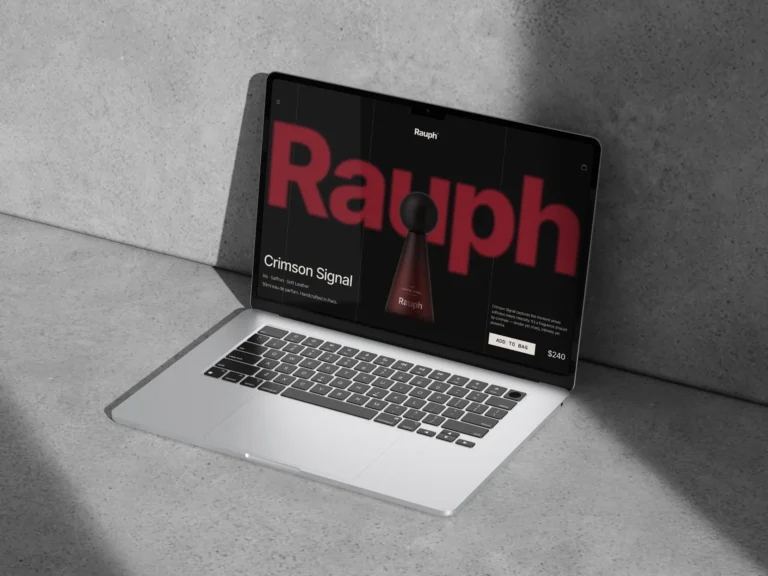
On the website each section frames the fragrances as sculptural objects surrounded by texture, narrative and atmosphere, and the visitor is guided through rituals rather than pages.
Fragrance branding has no product to show, which is why Rauph treats silence as material, and why the restraint reads as intent rather than as absence.
From the name to the brand voice
Naming and story building sit next to the rest of the strategy work. Our brand voice and messaging page shows how the words around the name are written, and our audience and persona analysis page shows who the name has to speak to.
A name for more than one market raises its own questions. Our blog post on choosing a product brand name that works in more than one country sets out the checks to run before any logo is drawn.

Frequently asked questions
Naming is one of the services in our brand strategy work: crafting names with meaning and stories with depth, and shaping a brand identity through words. The cases on this page show the design side of that work, how a name is drawn, placed and told.
In a fixed place in the reading order. AKME packaging reads brand, product name and supporting information, in that order; on ARC CO the coffee name has its own zone beside country, variety, process, altitude and tasting information.

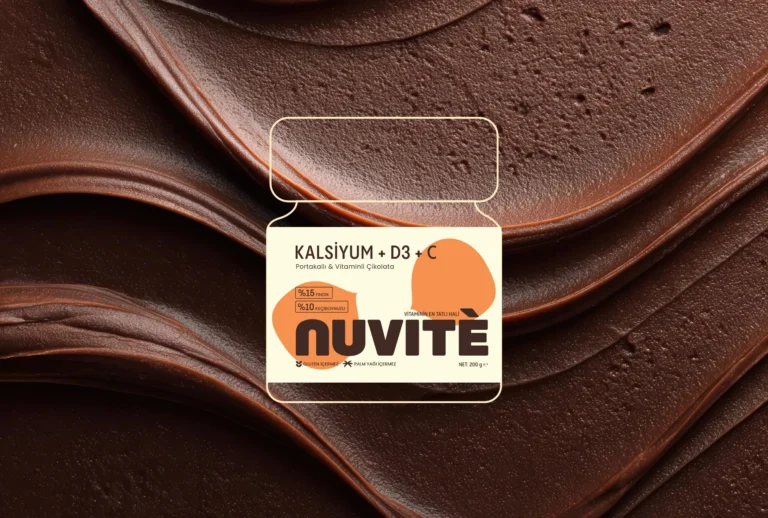
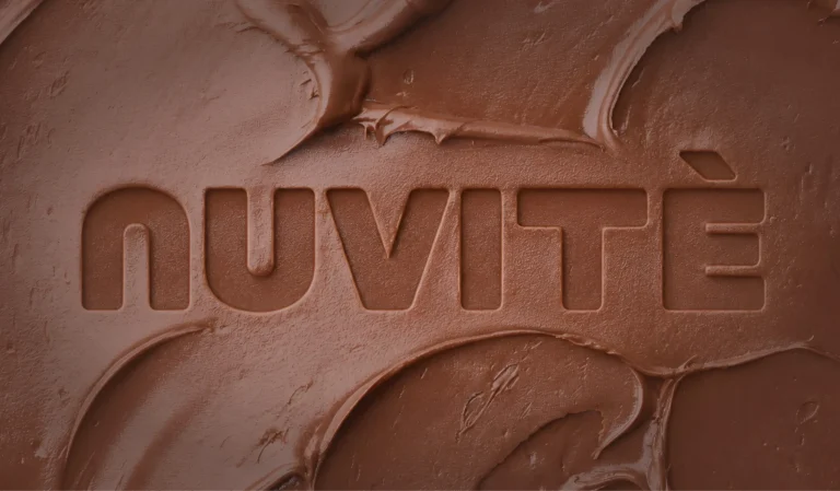
Not always. NUVITÉ is a chocolate brand with a functional side, and the everyday nutrition part is present in the product and in the naming. The design lets it stay there instead of turning the pack into a label about itself.
In our projects it is an idea the design acts on rather than a paragraph on the pack. LA MAMA is built around care as something learned, practiced and repeated; Rauph around one phrase, "You smell like silence looks".
Our blog post on choosing a product brand name for more than one country tests a shortlist against 4 questions in every market: can people say it, does it mean something bad in the local language, can it be registered as a trademark, and are the domain and social handles free.

A first call about your brand
Tell us in a first call where the brand stands today, or ask for a written proposal; either way we come back with a suggested scope.
Talk to an expert now