Updated November 2026
Audience & Persona Analysis
Audience and persona analysis names who a product is for and the moment they meet it, before the identity is drawn. It sits inside the MarkaWorks brand strategy work, and we turn it into personas that guide tone, visuals and strategy. In each of the 7 cases on this page, all published since November 2025, a design rule follows from that reader.
Sometimes the reader comes with the brief: for Milksta it was expectant and new mothers. In other projects the reader is defined by the moment of use, and the MUUM website was built around new parents who decide under time pressure, often with one hand occupied.
What this stage has produced
- A reader named in the brief
- The moment they meet the brand
- One design rule for each reader
- Tone and structure set for that reader
Who each case was designed for
Each case page below names its reader, and a design decision that follows from that reader. The reader line on every card is quoted from the case page; the note under it sums up the decision that page describes.
- Who we designed for
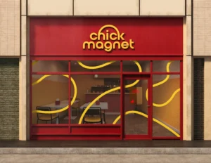
A customer who saw the truck sign
What the design doesA custom wordmark and strong color contrasts stay legible at speed, so the same customer knows the box without reading it again
- Who we designed for
New parents are not browsing, they are deciding under time pressure and often with one hand occupied
What the design doesA mobile-first structure arranged for one-handed use, and a path to purchase that was shortened rather than decorated
- Who we designed for
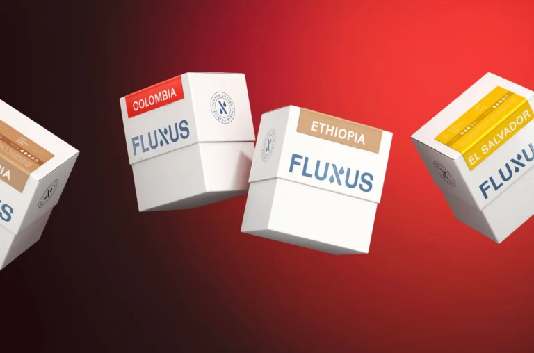
The people who already buy it
What the design doesA restrained color system that lets an enthusiast compare two bags and an everyday drinker pick one
- Who we designed for
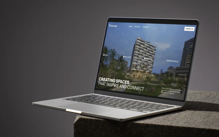
A new generation of investors and homeowners
What the design doesAn information hierarchy that keeps projects, company heritage and investment opportunities separable
- Who we designed for
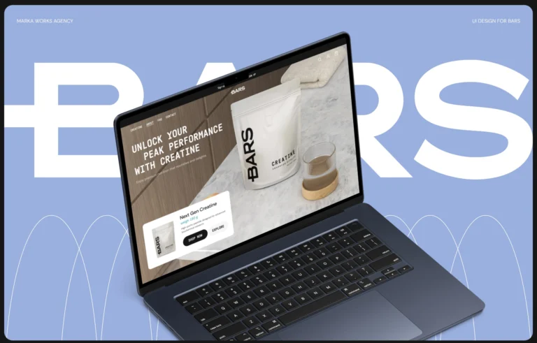
Someone landing on the homepage and someone arriving directly at a product page
What the design doesA product story sequenced so the hierarchy holds in both directions
- Who we designed for
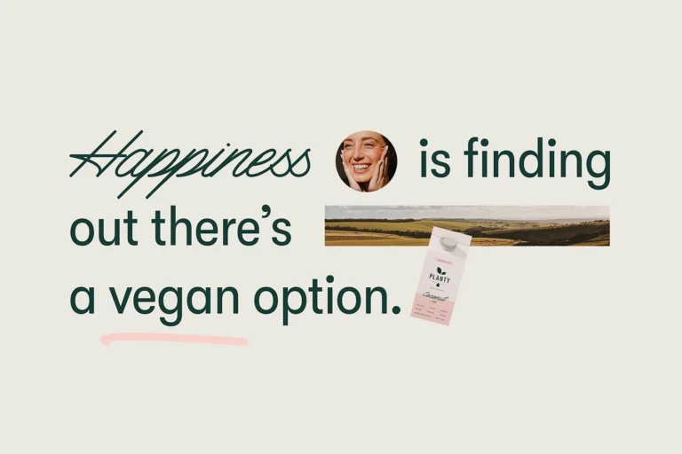
A design-oriented audience
What the design doesPackaging modern enough for that audience, but soft enough to signal natural, plant-based purity

Two of these six cases serve two readers with one structure, Fluxus and BARS UI.
A reader named in the brief

For Milksta the audience was part of the brief: expectant and new mothers. We aimed for a minimal brand identity that describes the product correctly and connects emotionally with nursing mothers.
That reader shaped the emblem, a mother’s breast drawn in the form of a heart, and the goal for the packaging: something mothers would feel proud to display.
It shaped the color system too. Each product variant has its own color inside one brand harmony, which makes it easy for mothers to identify their preferred formula.
When the reader is short of time
The MUUM website was built around one observation about its reader: new parents are not browsing, they are deciding under time pressure and often with one hand occupied.

So the structure is mobile-first and arranged for one-handed use. Benefits appear at first glance, ingredient blocks are shown plainly, and the path from discovery to purchase was shortened rather than decorated.
The same reader explains the type pairing. A serif alone would read as formal and a rounded sans alone as childish; together they land where the brand needed to be, beside photography of real parent and baby moments rather than stock imagery.
Two readers, one range
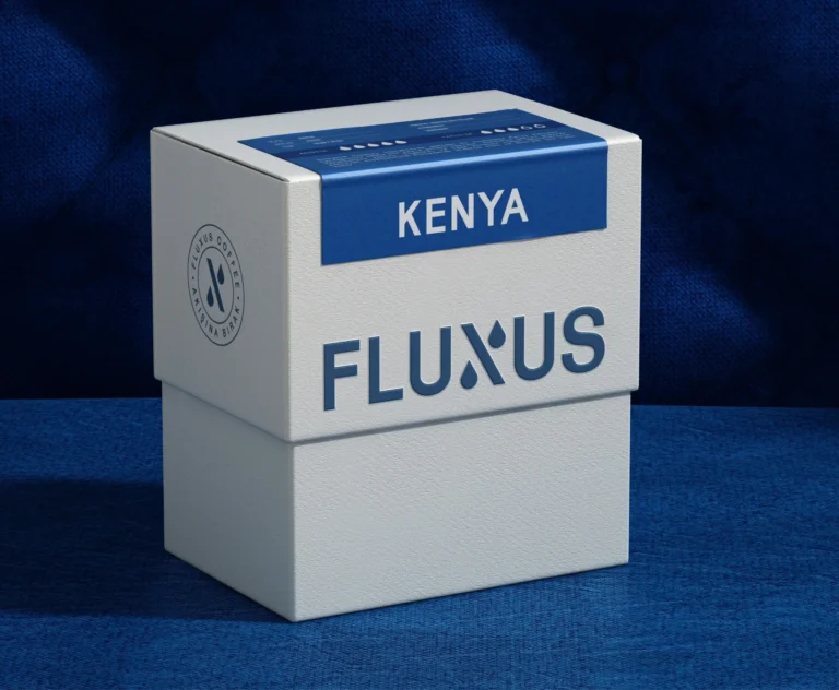
Fluxus Coffee came back to us as an established brand, so the first reader was the one it already had. The risk in the brief was that the brand would stop being recognizable to the people who already buy it.
The range had to serve two more. A restrained color system separates variants without breaking the range apart, which lets an enthusiast compare two bags and an everyday drinker pick one without comparing anything.
The result is still recognizable to the people who already knew it, and a new origin enters the system without a new design.
Where the reader arrives
A reader can also be defined by the way they arrive. On the BARS website, someone landing on the homepage and someone arriving directly at a product page need the same information, but not in the same order.
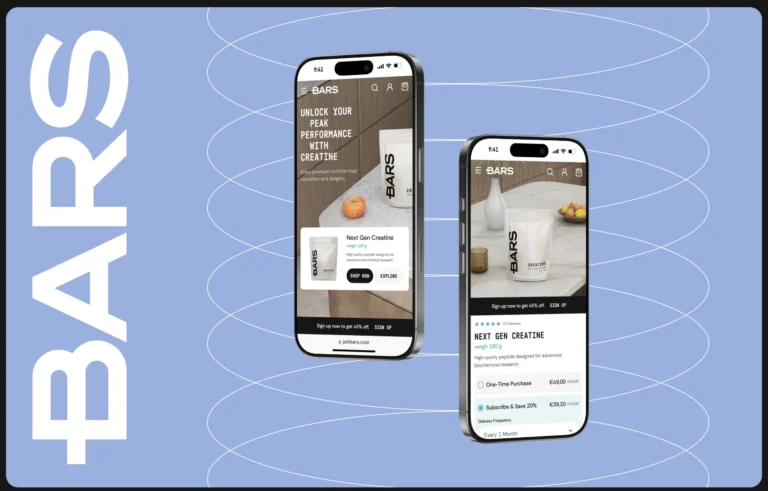
The product story is sequenced, and the hierarchy holds in both directions because it was built around what the reader needs next rather than around what the page has to show.
SOLANKI is judged online long before anyone visits a building, so its site had to carry the same authority as the identity, with projects, company heritage and investment opportunities kept separable rather than stacked.
From the audience to a position
Audience analysis says who the brand is for. Our brand positioning page shows where the brand then stands for that reader, and our competitor analysis page reads what the category already shows them.
The persona also sets the tone of voice. Our brand voice and messaging page shows how a voice is written and checked across a brand.


Frequently asked questions
In our projects it names the reader and the moment they meet the brand. For Milksta the audience was in the brief, expectant and new mothers; for MUUM UI it was a new parent deciding under time pressure. The result is a persona that guides tone, visuals and strategy.
As a test for each decision. On the MUUM website, a parent with one hand occupied led to a mobile-first structure for one-handed use; on the Fluxus range, two readers led to a color system that one can compare and the other can pick from at a glance.
Not always from zero. For Fluxus the first reader was the one the brand already had, and the brief was about what to keep so that the brand stayed recognizable to the people who already buy it.

Before the identity is drawn, as part of the strategy stage. For Milksta the audience was already named in the brief, and it shaped the emblem, the packaging goal and the color system.
The seven cases here cover baby care, a supplement brand for nursing mothers, specialty coffee, real estate, a sports nutrition website, plant-based milk and a quick-service chicken brand. All of our case studies are grouped by category on the projects page.


A first call about your brand
Tell us in a first call where the brand stands today, or ask for a written proposal; either way we come back with a suggested scope.
Talk to an expert now