The 6 decisions that make a cosmetic pack read as premium, why extra weight and size are the wrong route under UK and EU packaging rules, and where the mandatory text goes.
Cosmetics packaging looks expensive when it shows restraint: few elements on the front, spacing that repeats on every pack, 1 strong material or finish decision, 2 or 3 colours, and a cap and carton that match the container. Extra weight is the wrong route: UK packaging rules limit volume and weight to the minimum adequate amount.
Why does adding decoration make a pack look cheaper?
When a brand owner tells us the pack looks cheap, the first instinct is usually to add something: a gold foil, a second typeface, a pattern, a badge. Together they compete, and a front where 9 things ask for attention reads as a pack that is unsure of itself.
The packs people describe as expensive tend to do the opposite. They commit to a small number of decisions and carry each one out precisely. The Rauph case study describes the aim as an identity “free from visual noise, where every element serves a purpose”.
So the useful question is which decisions carry the impression. In our work there are 6:
- How many elements sit on the front.
- Whether the spacing repeats from pack to pack.
- How the type is set.
- How many colours are used.
- Which single material or finish the pack is known for.
- Whether the cap, the container and the carton agree.
Print quality sits under all 6, because a precise design printed badly looks worse than a busy one. The sections below take them in order, then cover 2 limits: the rules on packaging weight and volume, and the mandatory label text. For the brand side of the same question, see our article on why simplicity reads as luxury in branding.
How many elements should the front carry?
Count what is on the front panel of your current pack. Include the logo, the product name, the variant, the product type, each claim, each icon, the volume and every decorative shape. If the count passes 6 or 7, the front is doing work that belongs to the back panel.

Then rank them. On a cosmetic pack the order that serves the buyer is usually the brand, then the product name or variant, then the product type. Everything else is a candidate to move: claims to the side or back panel, icons to the carton, the longer story to the website.
The front that remains should have 1 thing that is clearly largest. If the logo, the product name and a claim are all about the same size, the eye has no starting point, and the pack looks crowded even when it has few elements.
Empty area is part of the design. The Rauph case study describes the approach: “The visual language was shaped to feel structured and architectural rather than decorative.”
A quick test: photograph the pack from 2 metres away, then shrink the photo to the size of a product thumbnail. Whatever can still be read is your real front. Our guide to how small type can be on packaging covers the lower limits for the text that stays.
Spacing and type that repeat on every pack
Expensive packs look measured. The distance from the logo to the edge, the gap between the product name and the product type, and the margin around the information block are the same on the serum, the cleanser and the carton.
Write the spacing down as rules. Pick 1 unit, for example the height of a capital letter in the logo, and express every margin as a multiple of it. A rule such as 2 units from the top edge survives a change of container. A position judged by eye does not.
Type follows the same logic:
- Use 1 typeface family, or 2 at most, with a separate job for each.
- Limit the sizes. On most front panels 3 sizes are enough.
- Give small text enough letter spacing and line spacing to print cleanly.
- Align to a grid, so that text blocks share edges.
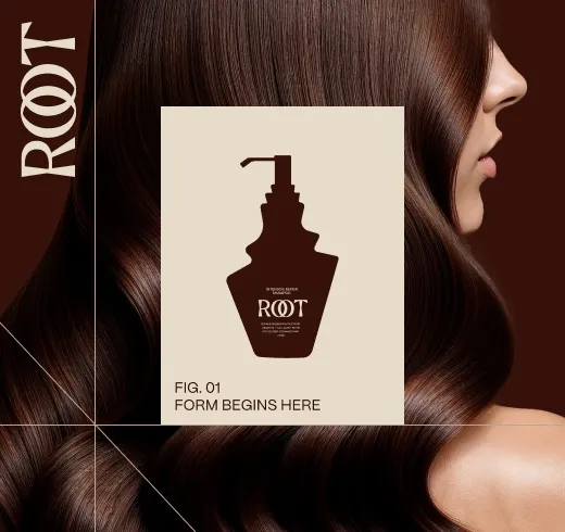
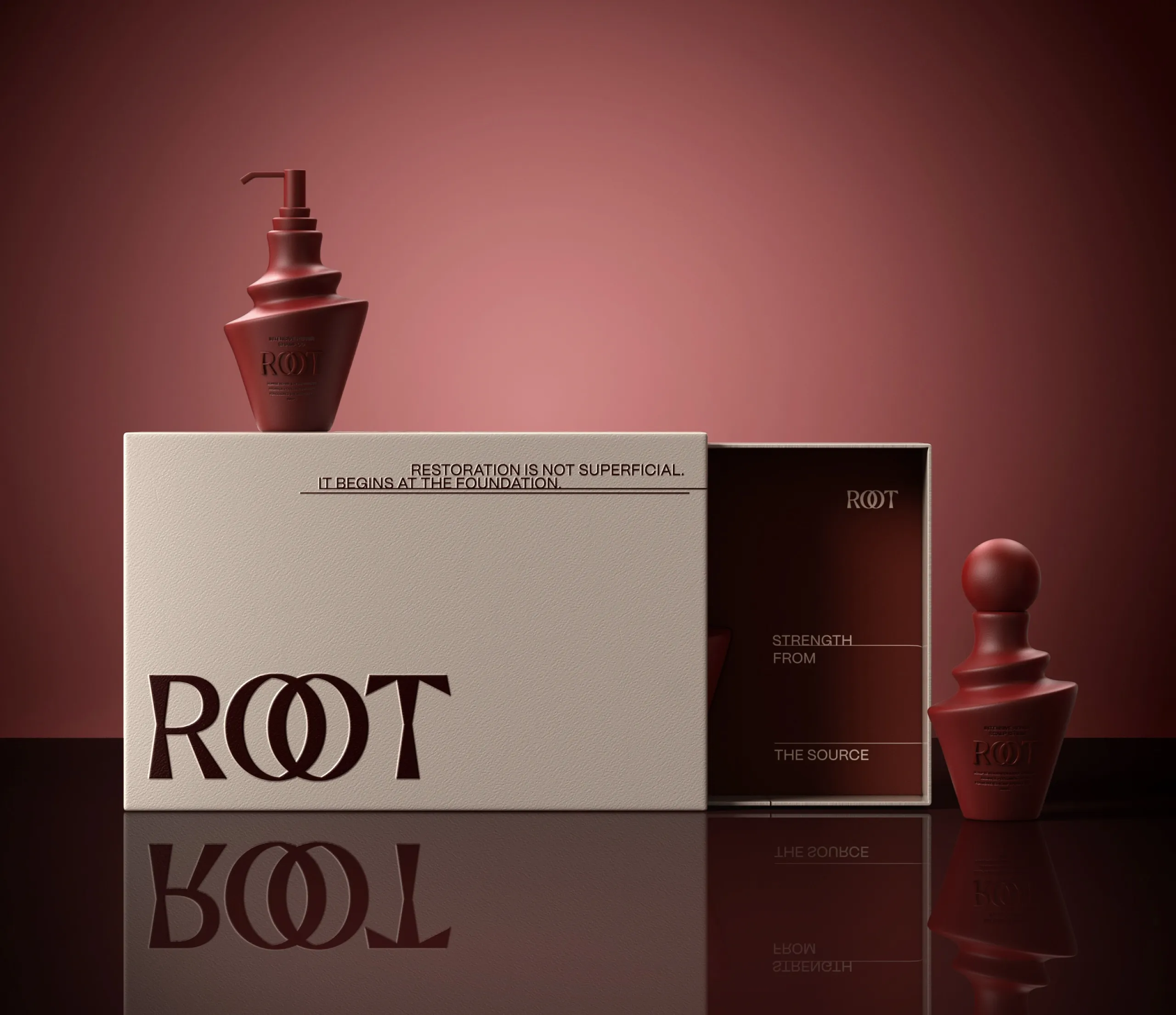
The ROOT hair care range shows how this works with expressive bottle shapes. The ROOT case study says: “Fine rules, open grids and restrained sans-serif typography organise information around expressive product forms and photography.”
One caution on thin type. Light weights and hairline rules look refined on screen and can break up in print, especially when they are reversed out of a dark colour. Ask for a printed proof at actual size before you approve them.
One material decision and fewer colours
Decoration is where restraint is hardest. Foil, embossing, a soft-touch coating, a metallic ink and a textured paper are all available, and each one adds something. Put 4 of them on one carton and none of them stands out.

Choose 1 material or finish decision and make it the thing the pack is known for. It might be frosted glass, an uncoated paper with a blind emboss, a single metallic ink for the wordmark, or an unusual container shape. If the container is clear or frosted glass, our article on keeping a label readable on clear and frosted bottles covers the label side of that choice. ROOT made the shape the decision: its case study describes “layered, sculptural forms that feel closer to designed objects than disposable cosmetics”.
Colour works the same way. A palette of 2 or 3 colours, used in fixed proportions, looks more deliberate than 6. Close tones often read as more expensive than strong contrasts. Rauph is an example; its case study says: “Strong contrasts were avoided in favor of subtle transitions, considered spacing, and balanced proportions.” ROOT uses 4 related tones: walnut, rosewood, clay and oat.
There are 2 practical points. Low contrast belongs to the brand surface. The mandatory text still has to be legible, so check it separately; our article on brand colours and contrast explains how. A narrow palette also makes colour drift between print runs easy to see, which our guide to why brand colour shifts in print deals with.
| Decision | Looks cheap | Looks expensive |
|---|---|---|
| Elements on the front | Logo, name, claims, icons and shapes at similar sizes | A short ranked list with 1 element clearly largest |
| Spacing | Margins judged by eye and different on each pack | Margins written as multiples of 1 unit and repeated across the range |
| Typography | Several typefaces and many sizes | 1 or 2 typeface families and about 3 sizes on a grid |
| Colour | 6 or more colours competing | 2 or 3 colours in fixed proportions, often close in tone |
| Material and finish | Foil, emboss, coating and metallic ink together | 1 material or finish decision carried out precisely |
| Cap, container and carton | Whites and finishes that nearly match | Components matched from physical samples under the same light |
| Size and weight | A carton much larger than the product inside | A close fit, with volume and weight kept to what the product needs |
| Mandatory text | Squeezed into leftover space | 1 planned information block on the same margins as the front |
Do the cap, the container and the carton agree?
A cosmetic product is rarely one object. There is a container, a closure, often a carton, and sometimes a leaflet. The parts frequently come from different suppliers, and that is where an expensive design starts to look assembled.
Check 4 things across the components:
- Colour. A white cap, a white tube and a white carton are 3 different whites unless someone matches them. Ask each supplier for physical samples and compare them under the same light.
- Finish. A glossy cap on a matt bottle can be a deliberate contrast. A slightly glossier cap on a slightly glossy bottle looks like an error.
- Proportion. On a small pack the cap is a large share of what the buyer sees. Its height and diameter should relate to the container.
- Alignment. The logo on the carton and the logo on the container should sit at the same relative position.
Print quality is the last link. The registration between colours, the sharpness of small type, the evenness of a solid colour and the accuracy of a foil edge are what the eye judges at close range.
The print method sets what is achievable, so choose it early. Our guide to printing methods and minimum orders compares the options. Then approve a physical proof on the real material before the run.
Is heavier and bigger packaging the answer?
Weight has long been a shortcut to a premium feel: thick glass, a heavy cap, a carton much larger than the jar inside. Packaging rules push against that shortcut.
In the United Kingdom, Schedule 1 of the Packaging (Essential Requirements) Regulations 2015 states: “Packaging must be so manufactured that the packaging volume and weight is limited to the minimum adequate amount to maintain the necessary level of safety, hygiene and acceptance for the packed product and for the consumer.”
The sentence names acceptance by the consumer alongside safety and hygiene, so we read it as leaving room for a pack that feels good in the hand. The starting point is still the minimum adequate amount, and extra volume or weight needs a reason.
In the EU, the European Commission’s packaging waste page describes Regulation (EU) 2025/40, in force since 11 February 2025 with an application date of 12 August 2026. The page says: “The rules aim to minimise the quantities of packaging and waste generated”. One listed aim is to “Make all packaging on the EU market recyclable in an economically viable way by 2030”.
For design, this moves the premium signal from mass to precision. A carton that fits the jar closely and a wall thickness chosen for the product can look expensive. Ask your supplier and your adviser how each component and finish is assessed in the markets where you sell.
Where does the mandatory text go on a minimal pack?
A restrained front is only possible when the mandatory information has a planned home. For cosmetics sold in the EU, Article 19 of Regulation (EC) No 1223/2009 requires the container and the packaging to carry a list of items “in indelible, easily legible and visible lettering”. The items include the nominal content, the batch number and the list of ingredients.
That phrase sets 3 limits for a minimal design. Indelible rules out print that rubs off in a wet bathroom. Easily legible rules out pale grey text on a slightly darker grey. Visible rules out text hidden under a flap.
The regulation also gives room. Article 19 says of the ingredient list: “This information may be indicated on the packaging alone.” The longest block of text can therefore sit on the carton, and the container keeps a short back label.
Plan the information block on its own grid:
- 1 block in 1 typeface, aligned to the same margins as the front.
- A fixed order, so every product in the range reads the same way.
- A clear area for the batch code, which is applied on the filling line.
- Room for a second language. Article 19 leaves the language of several items to the law of the Member State where the product is sold.
This is the EU text. For Great Britain or any other market, check with your adviser.
What to do when a cosmetics pack needs to look more premium
The work starts with the pack you have. Look at it against the 6 decisions above and mark which ones cause the cheap impression. The aim is to change as few as possible and keep what already works.
Our packaging and product design work begins with structure: what the pack is, what it is made of, how it closes and how it is produced. For a premium brief this is the stage where the single material or finish decision is made, before any artwork is drawn.
Then set the system. In a MarkaWorks range, where the mark sits and how the type is ranked are settled once and written down, and each variant changes only what those rules allow. Restraint holds across a range only when the constants are on paper.
The wording of the mandatory text is confirmed by your responsible person or regulatory adviser, and the layout is ours.
The project ends with print-ready artwork set on the dieline your manufacturer supplies, and the working files are yours. Our cosmetics and skincare projects page lists 15 case studies if you want to see how these decisions look on finished packs.
If your cosmetics pack looks less considered than the product deserves, that is work we take on. Show us your current pack and tell us where it is sold, and we will reply with the decisions we would change first.
Questions brand owners ask about premium cosmetics packaging
Does heavier packaging make a cosmetic product look more expensive?
Weight can add to the feel in the hand, but it is a weak base for a design. The UK Packaging (Essential Requirements) Regulations 2015 limit packaging volume and weight to the minimum adequate amount, and EU rules aim to minimise the quantities of packaging. Precision in fit, finish and print does more.
How many colours should premium cosmetics packaging use?
Start with 2 or 3 colours in fixed proportions. Close tones often read as more expensive than strong contrasts, as long as the mandatory text stays easily legible. Adding a colour for every variant works when the rest of the palette is held constant.
Does foil or embossing make a pack look premium?
One of them can, when it is the single finish decision on the pack and it is produced accurately. Several finishes on one carton compete with each other. Ask for a physical proof, because a foil edge that is slightly off is more visible on a plain design.
Where does the ingredient list go on a minimal cosmetic pack?
For the EU, Article 19 of Regulation (EC) No 1223/2009 says the list of ingredients may be indicated on the packaging alone, so it can sit on the carton. The lettering has to be indelible, easily legible and visible. For other markets, check with your adviser.
More brands we brought to life: