On clear glass the background is the product, the shelf and the back label, and it changes as the bottle empties. What to print solid, what can stay transparent, and how to test it.
Give the text its own background. On a clear or frosted bottle the label is read against the liquid, the shelf and the back label, and all 3 change. Print an opaque white layer or a solid panel behind small and mandatory text, keep only large elements transparent, and check the bottle full, half full and empty.
What is the background on a clear bottle?
On a paper label the designer chooses the background. On a clear bottle with a transparent label, nobody chooses it. The type sits on whatever is behind the glass, and that is 3 different things at once:
- The product. Amber whiskey, green olive oil and a colourless toner give the same white type 3 different levels of contrast.
- The shelf. Where the liquid is pale, the eye reads the wall, the next bottle or the bathroom tiles through it.
- The back label. Its unprinted side and its text show through from the front, reversed.
The first of these also changes over time. As the bottle empties, the upper part of the label moves from a coloured background to a clear one, so a design that reads well when full can lose its brand name at the halfway mark.
EU food law names the issue directly. Regulation (EU) No 1169/2011 defines legibility in Article 2 as the physical appearance of information, set by elements such as font size, stroke width, type colour, the surface of the material and “significant contrast between the print and the background”. On glass, the designer has to build the last 2 items on that list. Our article on brand colours and contrast covers the general case.
What do labelling rules say about legibility?
Legibility rules depend on the product and the market. Here are 3 of them.
For food and drink sold in the EU, Article 13 of Regulation (EU) No 1169/2011 says mandatory information must be “easily visible, clearly legible and, where appropriate, indelible”. It adds: “It shall not in any way be hidden, obscured, detracted from or interrupted by any other written or pictorial matter or any other intervening material.” The mandatory particulars need a font with an x-height of at least 1.2 mm, or 0.9 mm when the largest surface of the pack is under 80 cm2.
For cosmetics sold in the EU, Article 19 of Regulation (EC) No 1223/2009 requires the container and the packaging to carry the listed information “in indelible, easily legible and visible lettering”.
For distilled spirits in the United States, 27 CFR Part 5, Subpart E requires the brand name, the class and type and the alcohol content within the same field of vision. It defines that as a single side of the container, which for a cylindrical container is 40 percent of the circumference, “where all of the pieces of information can be viewed simultaneously without the need to turn the container”.
None of these passages gives a contrast figure. For other products and markets, check with your adviser. Our guide to how small type can be on packaging covers type size.
| Surface | Problem | Fix |
|---|---|---|
| Clear glass with a coloured liquid | Contrast depends on the liquid and drops as the bottle empties | Opaque white underprint behind the type, or a solid label panel |
| Clear glass with a colourless liquid | The shelf and the back label become the background | Solid panel for all small text and a printed reverse on the back label |
| Frosted glass | The surface is pale and soft, so light inks and thin strokes fade | Darker or denser ink, heavier letterforms and an opaque panel for mandatory text |
| Transparent film label | Ink with no white layer under it is see-through | Keep only large elements transparent and put a white layer under everything else |
| Back label seen through the bottle | Its text shows reversed behind the front design | Print the reverse side solid or patterned, or use an opaque stock |
| Print directly on the glass | Etched or sandblasted text has low contrast | Large simple marks on the glass, mandatory text in a solid block |
Opaque white underprint and solid label panels
The most direct fix is to put a background back. There are 2 ways to do it, and they suit different bottles.
An opaque white underprint is a layer of white ink printed on a transparent label, under the colours, only where it is needed. The label still looks clear around the artwork, but the type sits on white and keeps its colour. Ask your printer how opaque the white is on the chosen film and whether a second layer of white is available, since 1 thin layer can still let a dark liquid show through. Our guide to printing methods and minimum orders compares the processes.
A solid label panel is the older answer: paper or an opaque film, with the glass visible around it. For a dark spirit it is often the better choice, because the liquid is already the strongest colour on the shelf and the label only has to be read against it.
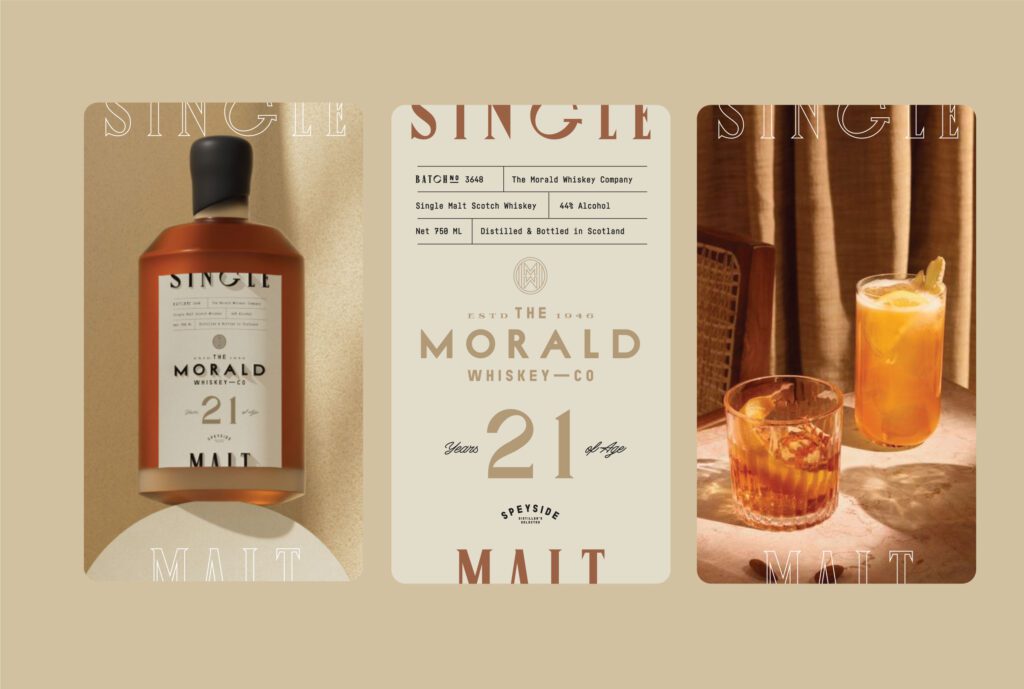
The Morald Whiskey Co. project shows why the background matters on a spirits bottle. The case study says of the typography: “the label area is small, and anything competing with the brand name costs legibility at exactly the distance where the choice gets made”. A liquid showing through the type is one more thing competing with the brand name.
What can stay transparent on a clear label?
A fully transparent label is still possible. It needs a rule about which elements are allowed to sit on a background you do not control, and that rule has 2 parts.
Large elements can stay transparent. A wordmark several centimetres wide, a bold illustration or a big variant numeral survives a change of background, because the eye reads its outline. Give these elements heavy strokes and avoid colours close to the colour of the liquid. A gold logo on a golden oil has no visible edge.
Small elements get a panel. That covers the ingredient list, the net quantity, the address, the warnings, the batch code area and the barcode. Each of these is either mandatory text or something a scanner has to read, and each is usually set near the smallest size the pack allows. Group them into 1 information block with an opaque white layer behind it, on the back or the side of the bottle. Our guide to barcode colours and size deals with the barcode on its own.
A label built this way looks clear from the front and behaves like paper where the small text sits. The same split works across a range: the transparent front changes with each variant, while the opaque block keeps the same position and layout on every bottle.
Why does the back label show through the front?
On a clear bottle the back label is visible from the front, through the glass and the liquid, and what the buyer sees is its reverse side. If the label stock is thin, the back text shows as grey reversed lines behind the brand name.
Article 13 of the EU food regulation asks that mandatory information is not interrupted by other written or pictorial matter or by intervening material. The same idea works in the other direction as a design brief: the back of the bottle should not interrupt the front.
There are 3 working options:
- Print the reverse. A back label can be printed on its adhesive side with a solid colour or a pattern. From the front, the buyer sees a field of colour behind the logo, and the back text is hidden.
- Use an opaque stock. A dense paper, or a film with a blocking layer, stops the text showing through. The label then shows as a plain rectangle behind the front design, so choose its size and position with the front in view.
- Make it part of the design. Some brands print an image on the reverse of the back label, to be seen through the liquid. More of it appears as the level drops.
In each case the front and the back are drawn together, on 1 layout that shows both labels through the glass.
Frosted glass and printing directly on the bottle
Frosted glass solves part of the problem and creates another. The matt surface blurs whatever is behind it, so the shelf and the back label stop showing as sharp shapes. It also turns the bottle into a pale, soft background. White and pastel type lose contrast on it and thin strokes look weaker than on clear glass. On frosted glass, use darker or denser inks and heavier letterforms, and keep the opaque panel for mandatory text.
Printing straight on the glass removes the label altogether. US spirits rules allow for it: the definition of a label in 27 CFR 5.61 includes “Information branded, stenciled, painted, printed, or otherwise directly applied on to the surface of the container” and “Information etched, engraved, sandblasted, or otherwise carved into the surface of the container”. Etched or sandblasted text has low contrast, though, so it suits a logo better than an address line. For any other product or market, ask your adviser whether printed or etched text is accepted.
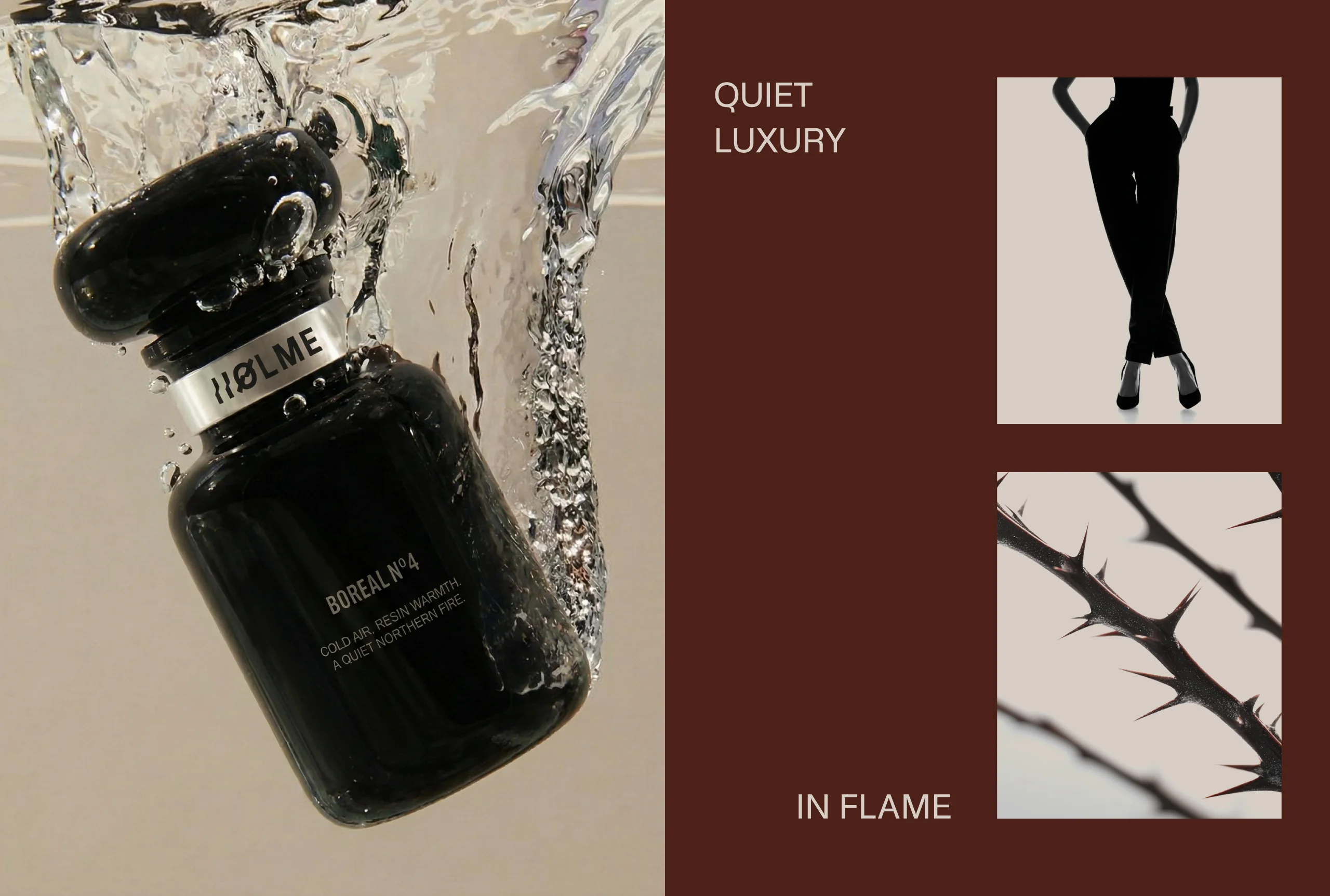
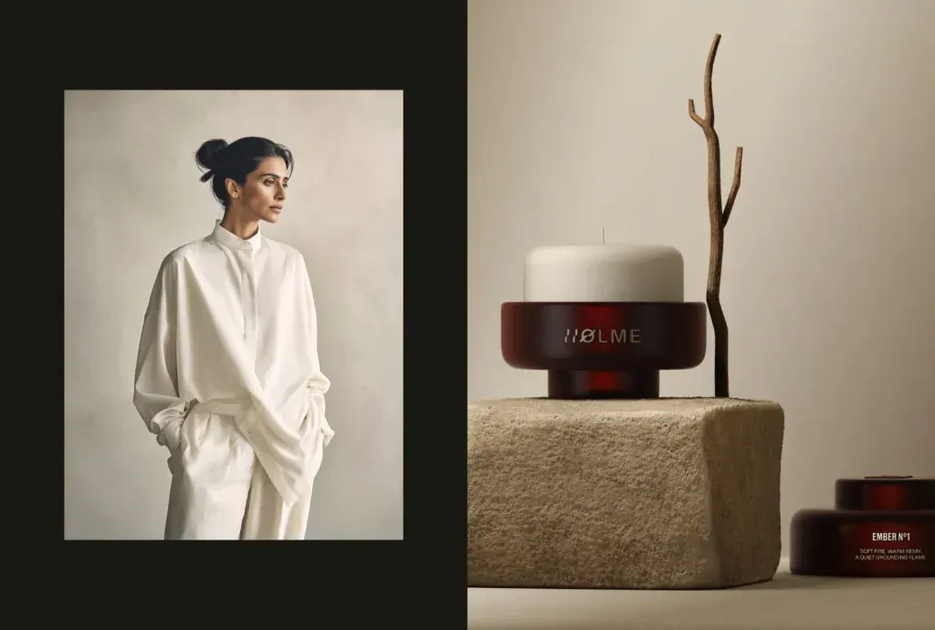
The surface is a design decision of its own. Our Holme case study says the range has its coherence because “the objects are related by how they are made and how they behave in light, not by a repeated motif applied across them”. Frosted, clear and opaque vessels each behave differently in light, and the label has to be drawn for the one you chose.
How do you test a label on a clear bottle?
A flat proof on white paper says very little about a clear bottle, because the paper supplies a background the bottle will not have. Test with the real container and the real product, in 3 states:
- Full. This is how the product appears on the shelf. Check the brand name and the variant at arm’s length.
- Half full. The label now crosses 2 backgrounds. Check whether a line of type sits across the liquid level, and whether the upper half can still be read.
- Empty. This is the hardest case for light type and the clearest view of the back label. If the brand name can be read here, it can be read at every level.
Repeat each state against 2 backgrounds, 1 light and 1 dark, since you do not control the shelf. Then turn the bottle and read the mandatory text on its panel. For a US spirits label, confirm that the brand name, the class and type and the alcohol content can all be seen without turning the bottle, within 40 percent of the circumference.
Photograph all 6 combinations. The pictures show how the bottle will look in a customer’s home once it has been used. Our article on testing packaging before launch lists other checks to make before the print order. For bottles that are served cold, our guide to drinks labels that survive ice and condensation deals with water on the label.
If 1 state fails, change the background before the type.
Label projects on glass at MarkaWorks
Our packaging and product design work starts with the structure: the kind of pack, its material and closure, and the way it is produced. On a glass project that means 3 questions before the first layout. Is the glass clear or frosted? What colour is the product? Is the decoration a paper label, a clear film or print on the bottle?
For a range, MarkaWorks settles first what stays the same on every bottle, including where the opaque information block sits, and only then what each variant may change. On clear bottles the product colour is often the variant signal, so the system has to hold on the darkest and the palest liquid in the range.
Legal wording stays with the people responsible for it. Your responsible person or regulatory adviser confirms the wording; we design the layout, so that the text fits, sits on a background that keeps it readable and still looks like your brand. Our project pages list 17 case studies in food and beverage and 15 in cosmetics and skincare.
At the end you have artwork on the dieline from the partner who prints or decorates the bottle, and the working files with it.
If you are choosing between a clear label, a paper label and direct print, we can work through it with you. Send us a photo of your bottle, filled with the product if you can, and we will tell you how we would approach the label.
Questions brand owners ask about labels on clear and frosted glass
Is white ink behind the text enough on a clear label?
Usually, if the white is opaque enough. 1 thin layer can let a dark liquid show through, so ask the printer for a sample on your film and look at it on a full bottle. For mandatory text, use a solid white block behind the whole group of lines.
Does EU food law set a contrast ratio for labels?
Articles 2 and 13 of Regulation (EU) No 1169/2011 do not give one. Article 2 lists significant contrast between the print and the background as 1 element of legibility, and Article 13 sets a minimum x-height of 1.2 mm for the mandatory particulars.
Can mandatory information be printed directly on a spirits bottle in the US?
27 CFR 5.61 counts information printed, painted or otherwise directly applied to the container as a label, along with etched, engraved or sandblasted information. The brand name, the class and type and the alcohol content still have to appear within the same field of vision.
Is frosted glass easier to label than clear glass?
It hides the shelf and the back label better, because the matt surface blurs them. It is harder for white, pastel and thin type, which lose contrast on a pale surface. Use darker inks and heavier strokes, and test the bottle full and empty as you would with clear glass.
More brands we brought to life: