Updated November 2026
Logo & Identity Design
Logo and identity design draws the mark itself, the symbol and overall look a brand is recognized and remembered by. It is the drawing stage of the MarkaWorks brand strategy work, and the 6 brand cases on this page show what a mark is built from, how it holds from a sign to a profile picture and when one brand needs a set of marks.
We judge a logo on the pack, the sign and the screen rather than on a white board. The Drypt emblem works cut into signage, printed small on a bag and cropped for a profile picture, and Roque 78 works with a whole set of marks: badges, stamps, coasters and a 78 RPM device.
Marks on our case pages
- A wordmark drawn in its own letters
- A smaller mark for the small places
- One emblem from a sign to a profile picture
- A set of marks for one brand
What each mark is built from
Each card below sets one mark from our case pages next to the line on that page that says how it was built. The line on every card is quoted from the case page.
- A set of marks
Roque 78
Rather than relying on a single rigid logo system, the identity was designed as a collection of marks and visual signatures.
- Wordmark and symbol
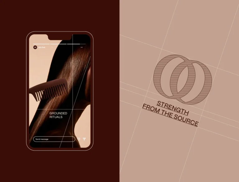
ROOT
The same geometry was extracted into a standalone symbol used across packaging, accessories and digital applications.
- An emblem
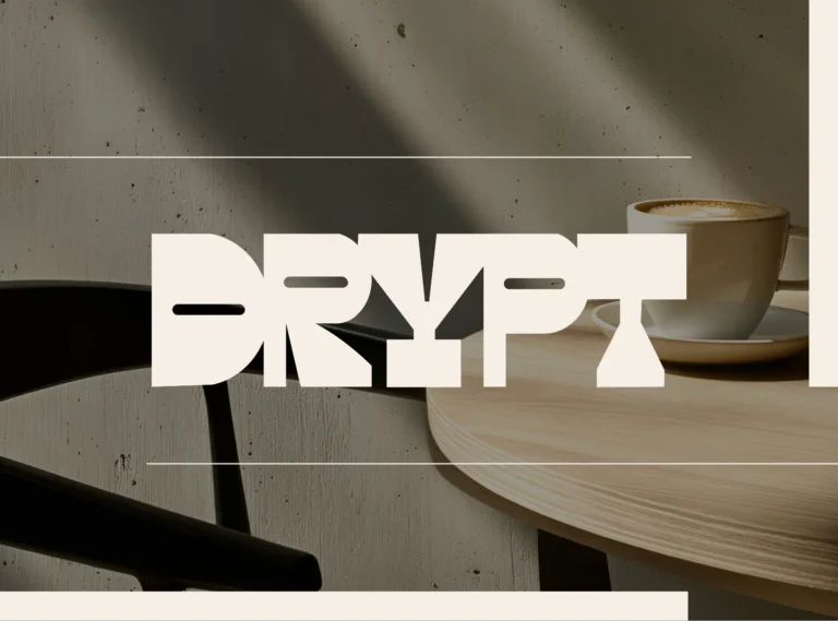
Drypt
At the core of the identity is a custom emblem designed to become the brand’s most recognizable asset.
- A logotype
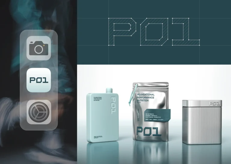
P01
That construction is also what lets the mark hold on a pouch, a screen, a garment, and a wall without being redrawn for any of them.
- A secondary mark
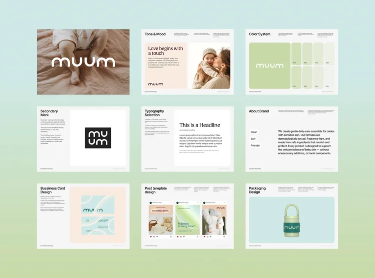
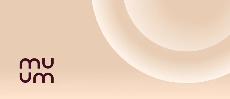
MUUM
A secondary mark was developed for compact and digital-first applications, ensuring a flexible, scalable identity system.
- A wordmark
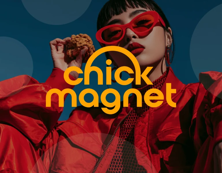
Chick Magnet
A custom wordmark, vibrant color oppositions, and expressive graphic elements that stay legible at speed

Three of these six brands use more than one mark: ROOT and MUUM pair the wordmark with a smaller mark, and Roque 78 works with a whole set.
One mark at every size
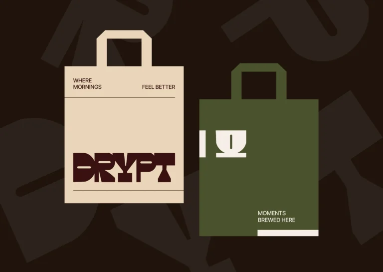
A mark has to survive scale. Drypt is a specialty roaster in a category crowded with sameness, and MarkaWorks designed its emblem to be the brand’s most recognizable asset. Its bold geometric construction lets the same mark work:
- cut into signage
- printed small on a bag
- stitched into merchandise
- cropped for a profile picture
The icon set, the graphic patterns and the palette were built around the emblem as a system rather than as separate assets, which keeps every touchpoint recognizably Drypt.
P01 shows the same idea in a different category. Its logotype is a custom geometric construction with sharp industrial forms and a condensed horizontal footprint, and that construction lets the mark hold on a pouch, a screen, a garment and a wall without being redrawn.
A set of marks instead of one
Some brands need more than one mark. For Roque 78, a grill and cocktail bar, the Roque wordmark was developed around custom letterforms, with the extended Q giving the logo its most recognizable gesture.

The number 78 became a flexible secondary identifier. It appears as badges, stamps, coasters and a 78 RPM device that ties the restaurant directly to music culture.
Oval stamps, handwritten phrases, cocktail illustrations and typographic lockups let the brand move between menus, signage, uniforms, takeaway packaging and social content, and the place still reads as one.
A wordmark and a smaller mark

A wordmark often comes with a smaller mark for the places where the full name does not fit.
The ROOT wordmark was designed around two interlocking O forms, a visual metaphor for connection and for the relationship between root and strand. The same geometry was extracted into a standalone symbol for packaging, accessories and digital applications.
MUUM works the same way in a softer register. Its logotype is built on rounded, human-centered geometry, and a secondary mark was developed for compact and digital-first applications.
How we judge a logo
Our Logos & Marks 2026 page gathers the wordmarks, symbols and lockups we drew for food and drink, sports nutrition, home fragrance, hospitality, media and industrial brands, each shown on the material it was made for.

The same page states the test: a logo is the smallest piece of a brand system and the one that travels furthest, so we judge it on the pack, the sign and the screen rather than on a white board.
Chick Magnet shows why. In quick service the pack is held for minutes and seen for seconds, so its custom wordmark, color contrasts and graphic elements were built to stay legible at speed, and a customer who saw the truck sign recognizes the box without reading it again.
From the logo to the rest of the identity
Logo and identity design sits inside our brand strategy and visual identity work. Our brand positioning page shows the decisions a mark has to carry, and our naming and story building page shows what happens to a name once it is drawn.
Once the marks are set, our brand guidelines page shows how the rules that keep them stable are written down, and Logos & Marks 2026 collects the year’s selection on the materials each mark was made for.
Frequently asked questions
Either. Our brand strategy work covers positioning, naming, brand identity design as a system and the guidelines that keep it stable, together or one at a time. In the cases on this page the logo is drawn with the system around it: a wordmark, often a smaller mark, and the patterns, type and palette that support them.
A wordmark is the brand name drawn in its own letters, like the custom serif wordmark of Roque 78. A symbol is a compact mark that can stand without the name, like the ROOT symbol taken from the two interlocking O forms of its wordmark. An emblem is a mark built to carry the brand on its own, like the Drypt emblem.

In our cases it is designed to. The Drypt emblem works cut into signage, printed small on a bag, stitched into merchandise and cropped for a profile picture, and MUUM has a secondary mark for compact and digital-first applications.
On the material it was made for. A logo is the smallest piece of a brand system and the one that travels furthest, so we judge it on the pack, the sign and the screen rather than on a white board.
Logos & Marks 2026 gathers selected identity systems, wordmarks and applications from the year, and the full case studies sit in our projects section.

A first call about your brand
Tell us in a first call where the brand stands today, or ask for a written proposal; either way we come back with a suggested scope.
Talk to an expert now