An MVP is not supposed to look like a finished company. It is supposed to prove that a real problem can be solved in a better way.
But “early” is not permission to look careless.
Customers, pilot partners, and early hires cannot see your roadmap. They judge the company they can see now: the name in their inbox, the landing page they open, the deck they are forwarded, the product they are asked to trust. A lean brand system makes those first moments feel intentional without forcing you to fund a full-scale identity before the business is ready.
The goal is not to imitate a Fortune 500 company. The goal is to look like a focused company with a clear view of where it is going.
Start with the decisions, not the logo
A global-feeling brand begins with clarity. Before a designer makes a mark, define a few strategic decisions that every visual choice can support:
- Who is the first audience that must believe you?
- What high-stakes problem are they trying to solve?
- Which category assumptions are you challenging?
- What should someone feel after encountering the brand: reassured, energized, protected, invited, ahead?
- What is the shortest honest sentence that explains why you matter?
These answers do more for trust than a complicated identity ever will. They stop you from borrowing the visual language of a category you do not actually belong in.
Build an essential-only identity system
At the MVP stage, you do not need every possible brand asset. You need a small system that is flexible enough to work everywhere you will show up in the next six months.
A strong lean kit usually includes:
- A clear wordmark or logo. It should work at tiny and large sizes, in one color, and beside other brands.
- A compact color palette. One lead color, one supporting color, a neutral base, and clear rules for contrast.
- A type pairing. Choose a primary typeface and a practical supporting style. Resist building a font collection.
- A repeatable visual device. This can be a grid, shape language, illustration principle, or image treatment that makes a page recognizably yours.
- A short voice guide. A few examples of how you introduce the product, write headlines, and explain the value.
- Core templates. Website blocks, a pitch deck, a social post, and a simple one-pager are often enough to get traction without visual drift.
This is the difference between a logo file and an identity. The first is an asset. The second is a decision-making tool.
Trust comes from coherence, not extravagance
Early startups often overspend in the wrong places: expensive photography before they have a stable product story, elaborate animation before the landing page is clear, or a dozen brand applications nobody will use. Meanwhile, the basics remain inconsistent.
The simpler alternative is coherence. Use the same writing tone in product copy and sales outreach. Use the same spacing and color rules in the deck and the website. Choose imagery with a clear point of view instead of filling every layout with generic stock photos.
Coherence makes a young business feel reliable because it tells people there is a system underneath it.
Make “global” a behavior, not an aesthetic
Looking global does not mean copying the visual cues of a major technology company: blue gradients, vague orbital shapes, or jargon-heavy language. It means making the brand easy to understand across cultures, screens, and contexts.
Use plain, precise language. Check that name, imagery, and color choices travel well. Design for accessibility and mobile from the beginning. Leave room for the business to expand beyond its first product or first geography.
Most importantly, avoid making claims your experience cannot yet support. Trust is built when the brand feels ambitious and honest about what exists today.
Put your budget where belief is formed
For most MVPs, the highest-return places to invest are the moments closest to a decision:
- A homepage that communicates the value in seconds
- A sales or investor deck with a logical story
- A product interface or prototype that feels considered
- A case study or proof page that turns early results into confidence
- A concise brand guide that keeps new contributors aligned
Everything else can grow from there. The right initial system will make later expansion less expensive, because new packaging, campaign assets, product screens, and market-specific materials start with rules rather than a blank page.
The real advantage of starting strategically
An MVP brand should not make you look bigger than you are. It should make you look ready for the next conversation.
That is where an agile identity earns its value: it gives founders a credible front door, gives teams a shared language, and gives the market a reason to pay attention before the company has the budget of its larger competitors.
MarkaWorks helps startups build exactly that kind of essential system: strategy first, beautifully expressed, and built to evolve when traction turns into scale.
Building a company the market needs to take seriously? Start with MarkaWorks.
A lean, strategic approach to MVP branding that helps early-stage startups look credible, global, and ready for growth.
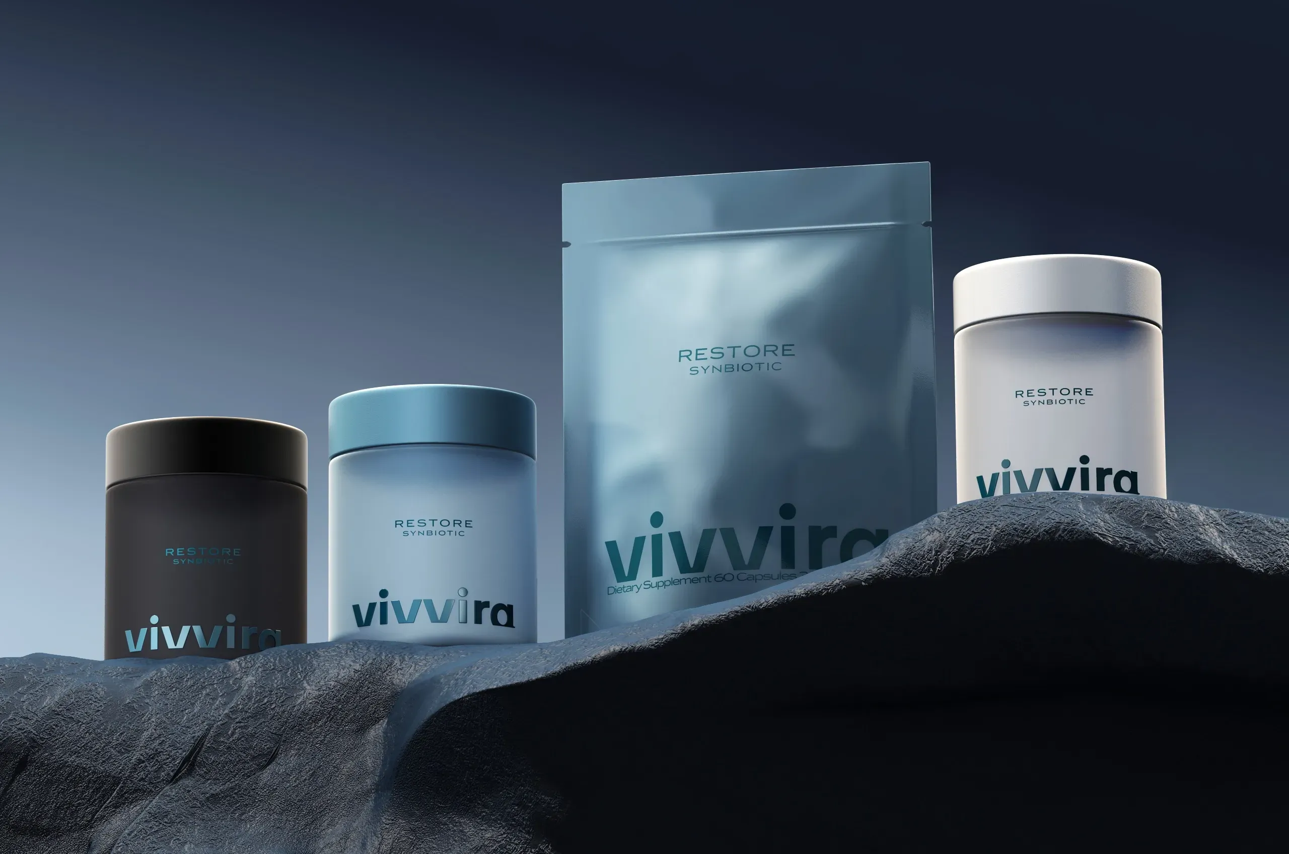
More brands we brought to life: