6 design answers for a reader with no glasses, wet hands and steam: a large product type, separate signals for shampoo and conditioner, and print that holds in water.
Design hair care packaging for the shower by making the product type the largest word on the bottle, set as 1 word, and by giving shampoo and conditioner at least 2 different signals, such as colour and container shape. Add a tactile cue, keep the contrast high when wet, and use print that holds in water, because EU and Great Britain rules ask for indelible lettering.
What the shower takes away from the reader
Most packaging is judged on a shelf or a screen, in good light. Shampoo and conditioner are used somewhere else. The person holding the bottle has taken off their glasses, their hands are wet and soapy, the air is full of steam, and water is running over the label.
Those conditions remove most of what a label normally relies on. Small type goes first. Fine differences in colour go next, because steam and a film of water flatten them. What is left is the outline of the bottle, 1 or 2 large words, a block of colour and whatever the hand can feel.
The usual failure is simple. The shampoo and the conditioner from one range look like the same bottle. The brand owner matched them on purpose, the 2 names sit in small type under the logo, and the customer learns which one they picked up once it is already in their hair.
So we design hair care packaging for 2 readers. The first stands in a shop or scrolls a product page and wants to know what the brand is. The second stands under running water and has 1 question: which bottle is this? The second reader meets the pack every day, so the 6 answers below start with them.
Write the product type large and in 1 word
The product type is the most useful word on the pack in the shower, and on many bottles it is among the smallest. Reverse that. Shampoo or Conditioner is set as a single word, large enough to read at arm’s length without glasses, and placed where the holding hand does not cover it.

A long product name makes the reader hunt for the noun. The variant, the scent and the hair type can sit on a second line in smaller type. They are read once, in the shop. The type word is read every day.
The same word does a legal job. In the EU and in Great Britain, Article 19 of Regulation (EC) No 1223/2009 requires the pack to carry “the function of the cosmetic product, unless it is clear from its presentation”. The GOV.UK guidance for Great Britain puts it this way: “Unless this is clear from the presentation, the function of the product must be clearly stated on both the primary container and outer packaging in English.”
Run 3 checks on the word:
- It is set in a heavier weight, because thin strokes break up under water drops.
- It reads from both sides if the bottle can stand either way round.
- It stays above the size the printer can hold. See our guide to how small type can be on packaging.
Give shampoo and conditioner different signals
A word still has to be read. Faster signals work without reading, and a range has 3 of them to use.

- Colour. Give the 2 products clearly different colours, or a dark and a light value of 1 colour. Two close tints of the same hue look identical through steam.
- Container shape. A tall bottle beside a short one, or a bottle beside a tube, can be told apart by outline alone.
- Cap direction. One product stands on its base and the other on its cap, so the hand learns which is which.
Use at least 2 of the 3. Colour alone fails for customers who do not see colour differences well, and for everyone in low light.
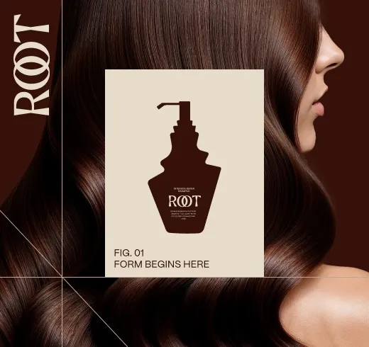
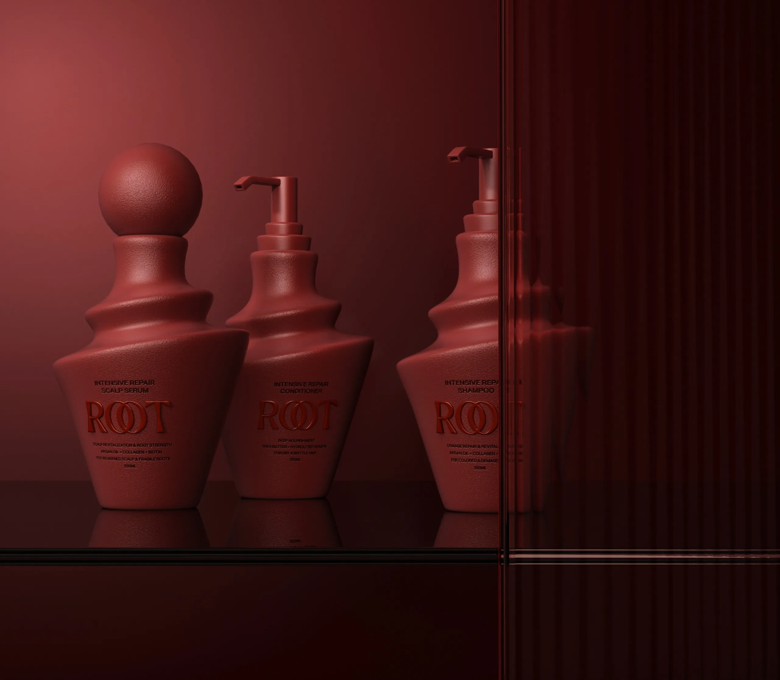
Our work for ROOT, a hair care brand, shows the shape route. The range uses layered, sculptural forms in place of conventional cylindrical bottles. Each silhouette is distinctive while remaining part of the same family, so the shampoo and the conditioner are recognised individually without breaking the system.
A custom form is a larger decision than a colour change. If the range uses stock containers, a difference in height or closure can do the same job, and we have a separate guide to custom and stock packaging. Write the chosen signal into the range rules; see our guide to a packaging system that grows.
Add a cue the hand can find
Eyes are often closed in the shower, so a tactile cue lets the hand do the work. There are 4 ways to add one:
- Raised ribs or a band moulded into 1 of the 2 containers.
- An embossed mark on 1 cap.
- Different closures, such as a flip cap on the shampoo and a pump on the conditioner.
- A different surface feel, such as a matt finish on 1 bottle and a gloss finish on the other.
Mark 1 product only. The difference between a marked and an unmarked bottle is easier to learn than the difference between 2 marks. The cue goes where the hand lands, which is usually the shoulder or the cap, and it stays constant across sizes and variants, so every conditioner in the range carries it.
Moulded features belong to the structure of the pack, and they are hard to change late. That is one reason our packaging projects start with the structure. A raised varnish on a stock container is a lighter option; ask your printer whether it holds on your material.
A cue only works once the customer has learned it, so say it in 1 line on the carton or the product page. Then try both bottles with closed eyes and wet hands before the tooling is ordered. We also have a guide to testing packaging before launch.
| Problem in the shower | Design answer | Where it is decided |
|---|---|---|
| No glasses, so small type cannot be read | Product type as 1 large word on the front | Type hierarchy |
| Shampoo and conditioner look alike | At least 2 signals: colour, container shape or cap direction | Range rule and structure |
| Eyes closed | A tactile cue on 1 of the 2 products | Structure, closure or finish |
| Water film, drops and steam lower contrast | Strong light and dark difference; opaque panel on clear bottles | Colour and print specification |
| Print rubs or a label lifts | Material, adhesive and coating confirmed for wet use, then a soak and rub trial | Printer or label supplier |
| Too much text on the front | Brand, product type and variant on the front; the rest on the back, still legible | Information block |
Keep the contrast when the surface is wet
Contrast that looks fine on a screen proof can drop on a wet bottle. Water sits on the surface as a film and as drops, a gloss surface reflects the bathroom light, and steam dulls everything in the room.
Plan for that from the first colour decision. The product type is dark on a light ground or light on a dark ground. The difference is carried by lightness, because 2 colours of similar lightness merge when the eye cannot focus.
Finishes matter as much as colours. Keep the product type out of foil and metallic ink. Those finishes read by reflection, so they depend on the light. On a clear bottle, the type gets an opaque panel behind it. Type printed straight onto a clear container sits over the product, and that background changes as the bottle empties.
A muted brand palette can still work. The ROOT case study names deep walnut, rosewood, clay and oat tones. A palette like that has dark and light ends for the product type to sit across.
The check is quick. Print the artwork at full size, wrap it around the container, wet it, and look at it from 1 metre without your glasses under the kind of light a bathroom has. If you cannot name the product in 1 second, the type word needs more size or more contrast. For colour pairs in general, see our guide to brand colours and contrast.
Choose print and labels that stay put in water
Article 19 opens with a condition that applies to every mandatory item on a cosmetic pack. In the EU and in Great Britain, the container and the packaging must carry them “in indelible, easily legible and visible lettering”. The GOV.UK guidance describes the same duty as information “clearly and indelibly marked on their container and packaging”.
Article 19 does not say how indelible is measured. Our reading is that a hair care bottle spends its working life in water, so that is where the lettering has to last. Your responsible person or regulatory adviser confirms how the requirement applies to your product.
There are 2 routes: print directly on the container, or apply a label. With a label, the face material, the adhesive and the ink or coating all have to hold. Send 4 questions to the printer or label supplier:
- Are the label material and the adhesive specified for wet use?
- Does the ink need a varnish or a laminate to resist rubbing by wet, soapy hands?
- Will the product itself mark the print when it runs down the bottle?
- Can they send printed samples for a soak and rub trial?
Then run the trial. Leave the samples in a shower in normal use for 2 weeks and rub the mandatory text with a wet thumb. We have a separate guide to printing methods and minimum orders.
Move the secondary text to the back and keep it legible
The front of a shower bottle carries 3 things: the brand, the product type and the variant. Everything else moves to the back, or to the outer carton if there is one. That includes the directions and the brand story.
Moving text is different from hiding it. Article 19 lists 7 items for a cosmetic pack, and the legibility condition applies to each of them wherever it sits. The regulation allows the ingredient list on the packaging alone. For precautions, the GOV.UK guidance says they “will normally appear on both the primary container and outer packaging”.
A product with a minimum durability of more than 30 months carries a period after opening. The guidance describes it as “a symbol representing an open cream jar” with the period in months or years, for example 12 m, and says it must appear on both the primary container and the outer packaging.
A shower bottle usually loses its carton on day 1, so the container is the label the customer keeps. Order the back panel for that reader. Directions and precautions come first, in the largest type on the back. The ingredient list follows if the product has no carton. The responsible person, the batch number, the content and the period after opening close the panel.
The GOV.UK guidance asks for English in Great Britain. In the EU the language is set by the law of each Member State, so check with your adviser.
Our approach to hair care packaging
Hair care projects at MarkaWorks begin with the structure. Our packaging and product design work starts with the pack format, the material, the closure and the production method. In hair care those 4 decisions settle the shape signal and the tactile cue.
We then design the range as a system. The parts that stay the same on every bottle are decided first, the type hierarchy above all, and the variant differences come after. For shampoo and conditioner, the product type word and the signals that separate the 2 bottles are written into that rule.
The mandatory text is planned with the layout. The wording is confirmed by your responsible person or regulatory adviser, and we lay it out. The label material, the adhesive and the finish are confirmed with your production partner.
Cosmetics and skincare are categories we work in regularly. Our cosmetics and skincare projects page lists 15 case studies, and the ROOT case study shows a hair care range built on distinct silhouettes. If the range will also be sold as refills, our guide to refill pack design for beauty brands covers the second pack.
Each container and carton is delivered as production artwork on the producer’s dieline, with the working files.
If you are planning a hair care range, MarkaWorks can design it with you. Tell us about your hair care range and the products in it, and we will send back a first view of the system.
Questions brand owners ask about hair care packaging
Does the product type have to be printed on the bottle itself?
In the EU and Great Britain, Article 19 asks for the function of the cosmetic product on the container and the packaging unless it is clear from the presentation. The GOV.UK guidance asks for it on both the primary container and the outer packaging, in English.
Is a different colour enough to tell shampoo from conditioner?
Use at least 2 signals. Colour alone fails in low light and for customers who do not see colour differences well. Pairing colour with a different container shape, cap direction or a tactile cue means 1 signal still works when the other does not.
Does the law say a shampoo label has to be waterproof?
The regulation does not use that word. In the EU and Great Britain, Article 19 requires the mandatory information in indelible, easily legible and visible lettering. For a bottle used in the shower, ask the supplier to confirm the label material, adhesive and coating for wet use.
What can move to the back of a hair care bottle?
Directions, the brand story and longer descriptive lines can move to the back. The 7 mandatory items in Article 19 stay legible wherever they sit. The ingredient list may go on the outer packaging alone, and precautions normally appear on both the container and the outer packaging.
More brands we brought to life: