What a glass door, frost and a chest freezer do to a pack, how tubs, cartons and sticks differ, and where US and EU rules fix the size of the type.
Design ice cream and frozen food packaging for a fast read through cold glass. Set the brand and the flavour in large, high-contrast type, give each flavour its own colour, and keep mandatory text clear of seams and lids. The FDA puts a home freezer at 0° F (-18° C), and US rules ask for a flavour name at least one-half the height of the words ice cream.
What a freezer does to a pack
A frozen pack is seen in harder conditions than most packs in a shop. It sits behind a glass door or at the bottom of a chest freezer. The glass can mist when a shopper opens the door, frost can settle on the pack itself, and the decision is quick because the door is open.
The product fixes the temperature. For storage at home, the FDA guidance on storing food says: “The freezer temperature should be 0° F (-18° C).” The same page adds that at this temperature “quality will decrease the longer the food is in the freezer”. A pack may spend a long time in the cold, first in the shop and then in a kitchen drawer.
Design can answer 4 of these conditions:
- Distance and glass. The brand and the flavour need large type and strong contrast.
- Frost. Thin strokes and pale tints are the first things a layer of frost hides.
- Angle. A chest freezer shows the lid, and an upright freezer shows the side.
- Time. The date and the storage line have to be easy to find months later.
A wet label on a bottle is a related problem. Our guide to drinks labels that survive ice and condensation covers label stock, adhesive and the ice water test for bottles and cans.
Readability through a freezer door
Start with the reading order. Through a freezer door a shopper takes in 3 things: whose product it is, which flavour it is, and what kind of product it is.
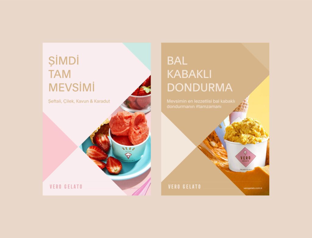
Our Vero Gelato case study describes the condition in one line: “In a dessert case the pack is read fast and from an angle”. For that range we chose typography that holds its structure at speed, so product names stay legible. Each flavour has its own tone, so a shopper can find a variant by colour and then confirm it by reading the name.
Apply 4 rules to the front of a frozen pack:
- Set the flavour name in a regular or bold weight, because hairline strokes are hard to read through frost.
- Use 1 strong contrast pair for the brand and the flavour, either dark on light or light on dark.
- Keep the flavour name horizontal and high on the visible face, where a shelf lip or the pack in front is less likely to cover it.
- Repeat the flavour on the lid and on at least 1 side, since nobody controls how the freezer is stocked.
Small type has a floor of its own, and our article on how small type can be on packaging gives the figures. Illustrations of ingredients help recognition, and they sit behind the name in the reading order.
Tub, carton and stick: 3 formats and their fronts
The format decides which surface is the front, so settle it before any artwork starts. Ice cream and frozen food usually reach the freezer in 1 of 3 forms.
- The tub. A round tub has a lid and a curved wall. In a chest freezer the lid is the face in view, so it carries the brand and the flavour in full. On an upright shelf the wall faces out, and a curved wall shows only part of its width from the front. Keep the brand and the flavour inside that part.
- The carton. A box of sticks, cones or a frozen meal has flat panels, which makes it the easiest format for long text. It may stand on an edge or lie flat, so the brand and the flavour go on the front panel and on the edge panels.
- The stick or single wrapper. A wrapper is small and is often sold from a counter freezer, away from its multipack box. It needs the brand, the flavour and its own mandatory text.
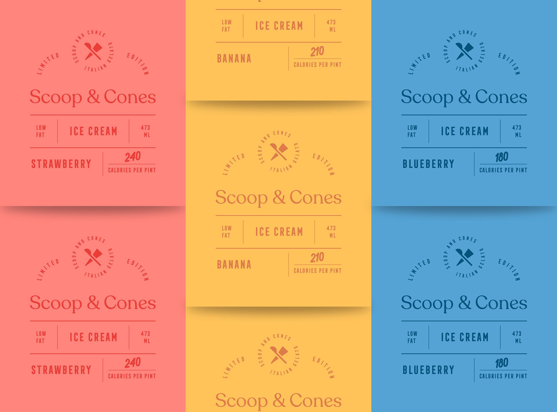
On the Scoop and Cones tubs, the colour of each cap is connected to the colour of that flavour’s pattern, which lets the flavour be read from above. A larger tub also has a wider lid, so the brand mark and the flavour name are redrawn for each size. Each size is then a separate print file, and our print-ready packaging artwork checklist lists what each one needs.
A flavour range as one system
A range that launches with 6 flavours has to leave room for the 7th. We decide first what stays fixed: the position of the brand mark, the type hierarchy, the information block and the panel that faces the shopper. Then we define what changes for each flavour and limit it to 2 or 3 things, usually the colour, the flavour name and an illustration.
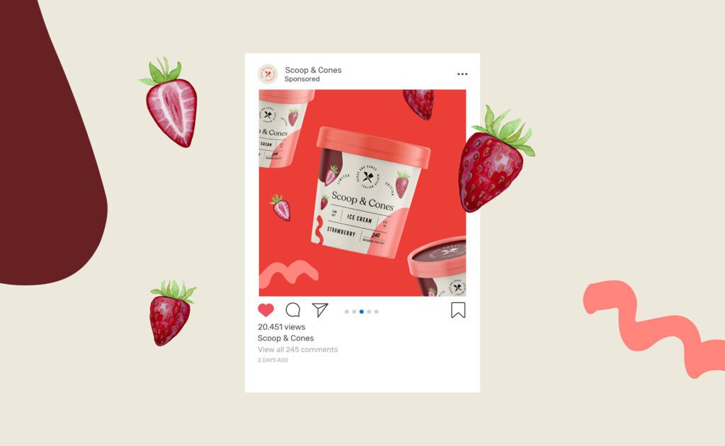
Scoop and Cones shows how this works on tubs. The palette is divided into 2 sets. The first is a neutral combination of black and grey shades, and the second holds red, peach and maroon. Some flavours received additional colours connected to their ingredients. For the tubs themselves, the case study says “we created separate patterns, including illustrations of the main ingredients for visual comprehension of the flavour”. The primary logotype is a minimal sans serif, so the name stays calm against the patterns.
Behind misted glass, flavour colours need distance from each other. If strawberry and raspberry sit in 2 close reds, the name has to do all the work. View the full range side by side from across the room before the palette is approved.
The Scoop and Cones label layout carries the phrase Limited Edition, and our guide to limited edition packaging explains what may change on such a pack. For sort order, sizes and barcodes across a growing range, see packaging for many flavours, sizes and formats.
US rules for the product name and the flavour
In the United States, ice cream has a standard of identity, 21 CFR 135.110. It defines the product before it says anything about the label. One of its figures: “Ice cream contains not less than 10 percent milkfat”. Whether a recipe may carry the name is a formula question, and your regulatory adviser confirms it. When the egg yolk solids content is above the level set for ice cream, the name of the food becomes frozen custard or french ice cream.
For the design, the section fixes proportions on the principal display panel:
- The flavour name accompanies the words ice cream, in letters at least one-half the height of the letters in those words.
- Where a natural flavour and an artificial one are both used and the natural one predominates, the word flavored follows the flavour name, at least one-half the height of that name.
- Where the section prescribes wording about artificial flavour, its minimum type size rises with the pack. One step in the scale reads “not less than 8-point on packages containing at least 1 pint but less than one-half gallon”.
A flavour name set small in a decorative corner therefore fails beside a large product name. Draw the product name and the flavour as 1 lockup with the ratio built in, so each new flavour inherits it. The table below lists the published minimums from the US and EU sources used here.
| Market and source | Applies to | Minimum |
|---|---|---|
| US, 21 CFR 135.110 | Flavour name beside the words ice cream | One-half the height of the letters in the words ice cream |
| US, 21 CFR 135.110 | Prescribed artificial flavour wording, packages under 1 pint | 6-point |
| US, 21 CFR 135.110 | Prescribed artificial flavour wording, 1 pint to under one-half gallon | 8-point |
| US, 21 CFR 135.110 | Prescribed artificial flavour wording, one-half gallon to under 1 gallon | 10-point |
| US, 21 CFR 135.110 | Prescribed artificial flavour wording, 1 gallon or over | 12-point |
| EU, Regulation 1169/2011, Article 13 | Mandatory particulars on the package or label | x-height of 1.2 mm |
| EU, Regulation 1169/2011, Article 13 | Packs whose largest surface is under 80 cm2 | x-height of 0.9 mm |
EU rules for legibility, storage conditions and dates
Food sold in the EU is labelled under Regulation (EU) No 1169/2011. Article 13 says mandatory food information must be “easily visible, clearly legible and, where appropriate, indelible”. It continues: “It shall not in any way be hidden, obscured, detracted from or interrupted by any other written or pictorial matter or any other intervening material.” Keep mandatory text off seams, lid overlaps and tear strips.
Article 13 also sets the size. The mandatory particulars are printed with an x-height of at least 1.2 mm. Where the largest surface of the pack has an area of less than 80 cm2, the minimum is 0.9 mm. Measure the largest surface of a stick wrapper or a small cup before relying on the lower figure.
Article 25 states: “In cases where foods require special storage conditions and/or conditions of use, those conditions shall be indicated.” On a frozen product that is the storage line. Annex X adds that for a best before date on foods “which will keep for more than 3 months but not more than 18 months, an indication of the month and year shall be sufficient”.
Some frozen food carries a second date. Annex III requires the date of freezing on frozen meat, frozen meat preparations and frozen unprocessed fishery products. Annex X sets its form: the words Frozen on, then the day, the month and the year. Ice cream is not in that entry. For Great Britain, check with your adviser.
Barcode, date and storage line placement
On the back and the base, 3 items need a planned place before the artwork is final.
- The barcode. GS1 US says that for an item scanned at checkout “you would put the barcode in the lower right-hand section of the back of the package”. It adds: “Avoid the edge of the package, and allow enough white space surrounding the barcode to help to ensure a clean scan.” GS1 US also asks for a smooth printed surface and notes that curved items have their own placement guidelines, which matters on a round tub. Our guide to barcode colours and size covers the colour and size limits.
- The date. A date changes with every batch, so it is applied on the filling line. Leave a flat, unprinted area for it. Annex X accepts a reference to where the date is given on the labelling, so the printed label can point to the lid or the base.
- The storage line. Place it beside the date, at the minimum type size or above.
Then check the pack where it will live. Print the artwork at 100% size, fix it to the real tub or carton, leave it in a freezer overnight and read it through the closed door from a few steps away. Our article on testing packaging before launch describes the block test, which sets the pack among its neighbours.
Working with MarkaWorks on frozen packaging
Our packaging and product design work starts with the structure: the pack format, the material, the closure and the production method. For a frozen product, the tub, carton or wrapper is agreed before the first layout is drawn.
We build flavour ranges as systems. The constant elements are fixed first, which are the mark position, the type hierarchy, the information block and the shelf-facing panel. Then we define what changes for each variant.
Food and drink is a category MarkaWorks works in regularly, and our food and drink category page lists 17 case studies. The 2 shown above are Scoop and Cones, where we designed the logo, the colour palettes and the packaging, and Vero Gelato, a brand identity and packaging system for a gelato range.
Your regulatory adviser confirms the wording; we design the layout. That covers the product name, the flavour statement, the storage line and the dates, each placed at the size the rules ask for. You receive production artwork drawn on your production partner’s dieline, together with the working files.
If you are planning an ice cream range or a frozen food line, you can work with us on the packaging. Tell us about the products and the freezers they will be sold from, and we will show you how we would approach the range.
Questions brand owners ask about ice cream and frozen food packaging
What temperature should frozen food packaging be designed for?
The FDA guidance on storing food says a home freezer should be at 0° F (-18° C). Plan the pack for long storage in the cold, and test a printed sample in a real freezer before the print run.
How large does the flavour name have to be on a US ice cream pack?
Under 21 CFR 135.110, the flavour name accompanies the words ice cream on the principal display panel in letters at least one-half the height of the letters in those words. Your regulatory adviser confirms which flavour wording applies to your recipe.
What is the minimum type size for mandatory text on frozen food in the EU?
Article 13 of Regulation (EU) No 1169/2011 sets an x-height of at least 1.2 mm for the mandatory particulars. Where the largest surface of the pack is under 80 cm2, the minimum is 0.9 mm.
Where should the barcode go on an ice cream tub?
GS1 US places the barcode for a checkout item in the lower right-hand section of the back of the package, away from the edge and on a smooth surface. It notes that curved items have separate placement guidelines, so check them for a round tub.
More brands we brought to life: