What stays fixed, what is allowed to change, how to say that the pack is a limited edition, and what happens to the barcode and the label text.
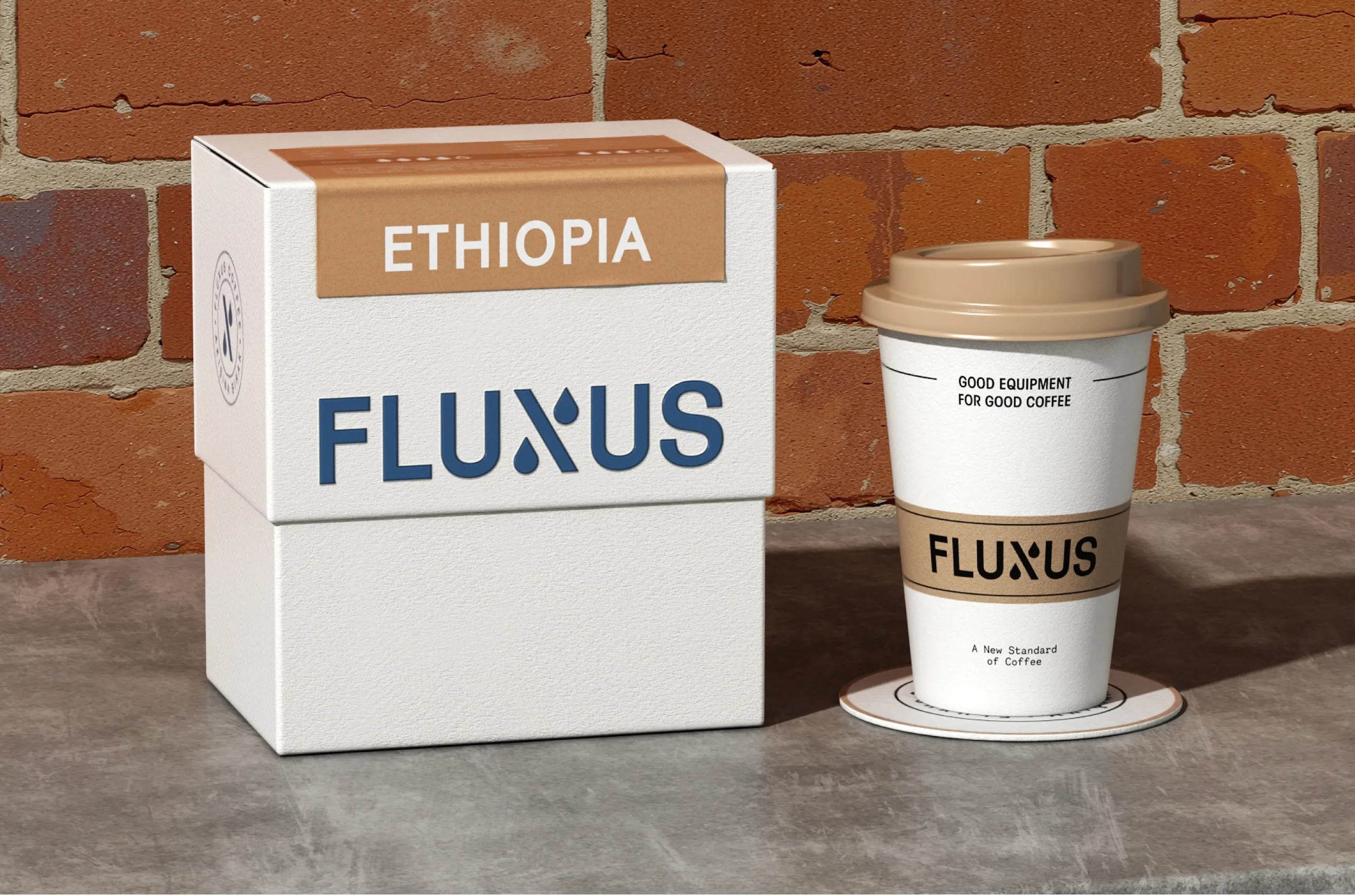
Keep 4 things fixed on a limited edition pack: the logo position, the product name, the variant marker and the container shape. Change only colour, illustration and surface finish. Print the words limited edition on the front, leave the mandatory information exactly where it is, and settle the barcode question with GS1 before the artwork is final.
Start by deciding what the edition is
A regular buyer does not read the shelf. They look for a shape and a colour they already know. A limited edition changes some of those cues on purpose, and if it changes too many, the person who buys the product every month walks past it.
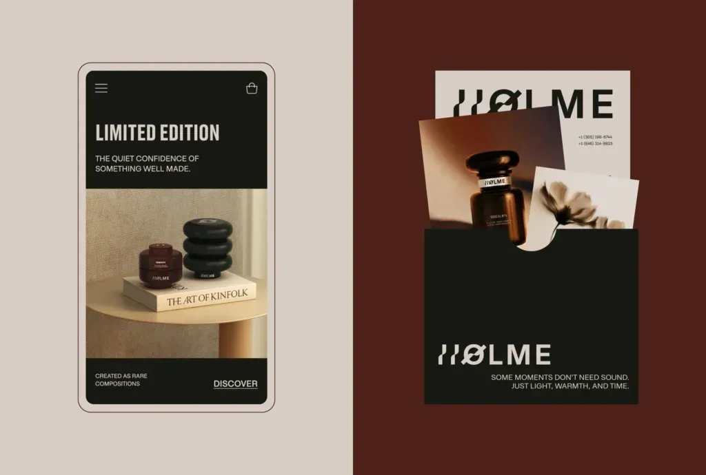
We met the same risk when Fluxus Coffee returned to us with an identity that still worked. The Fluxus case study says: “The risk is that the brand stops being recognizable to the people who already buy it.” That sentence is about a rebrand. An edition carries the same risk for a shorter time.
Before any design starts, decide which of 2 things the edition is:
- The same product in a temporary pack. The contents are what the buyer already knows, and only the outside changes. This pack should stay as close to the regular one as the idea allows.
- A new product sold for a short time. A seasonal flavour, a one-off scent or a single harvest. This is a new variant, and it needs its own name and its own variant marker.
Either way, the edition is 1 product in the range with 1 clear name. The Holme interface we designed works like this: the case study says limited editions are handled “at a product level, not as a collection concept”. If your range has no written rules yet, our guide to a packaging system that can grow explains how to set them first. If the edition is sold as a set of small sizes, our article on travel size and discovery set packaging covers the small formats.
What stays fixed on a limited edition pack
Keep 4 things fixed on every edition. They are the cues a regular buyer uses without thinking about them.
- The logo and its position. Same mark, same place, same size relative to the panel. An edition can put the logo on a new background. It should not move it to a corner or redraw it.
- The product name. Same wording, same typeface, same place in the reading order. If the regular pack says the product name on the second line, the edition says it on the second line.
- The variant marker. If the range tells flavours or scents apart with a colour band, a number or a word in a fixed spot, that marker stays, even when the rest of the panel changes colour.
- The container shape. The silhouette is recognised from further away than any print. A new bottle or a new box size for 1 run also means a new dieline and new production set-up.
The information block stays where it is too, for a reason covered below. When these are fixed, the edition still reads as part of the family from 3 metres away, and the differences show when the buyer is close. Our article on adding new products without losing brand consistency covers the same question for permanent variants.
What is allowed to change
With the fixed elements protected, the edition has 3 areas to work in.

- Colour. The background or the main colour field can change completely, as long as the variant marker is still readable against it. Check the new colour beside every existing variant, so that the edition is not mistaken for one of them.
- Illustration and pattern. This is where most of the idea lives: a commissioned drawing or a partner’s artwork. It takes the space the regular pattern or photograph normally fills and stays out of the logo and the name.
- Surface and finish. A foil, an emboss, a different paper or a matt varnish makes the pack feel different in the hand without changing what it says. Ask the printer early, because a special finish can change the print method and the minimum run. Our guide to printing methods and minimum orders explains the trade-offs.
The Fluxus range is built so that this kind of change is easy. The case study describes the result: “a new origin enters the system without a new design.” Colour and pattern carry the difference between coffees, and the layout does not move. An edition built the same way needs 1 new pattern and 1 new colour, and the 2 packs still look related side by side.
| Element | Stays fixed | May change |
|---|---|---|
| Logo | The mark, its position and its relative size | The background it sits on |
| Product name | Wording, typeface and place in the reading order | Colour of the type, if contrast holds |
| Variant marker | Its position and form (band, number or word) | A new marker colour or name when the contents are new |
| Container | Shape, size and closure | Surface finish, paper or label stock |
| Colour and illustration | The areas reserved for logo, name and information | Background colour, pattern and illustration |
| Edition statement | Its position on every edition | The name of the occasion |
| Mandatory information | Content, position, type size and plain background | Nothing |
| Barcode symbol | Size, quiet zones and contrast | The number, if the GS1 rules require a new one |
Say that it is a limited edition, in words
A buyer who sees an unfamiliar colour on a familiar product has 3 possible explanations: the brand has changed its packaging, this is a different product, or this is a special run. Only the pack can tell them which. So write it down. The words Limited Edition, or the name of the occasion, belong on the front panel, close to the product name, in the brand’s own typeface.
A few rules keep the statement useful:
- Put it in the same place on every edition you make, so that buyers learn where to look.
- Keep it small enough that the product name is still the first thing read.
- If the contents are the regular product, say so near the statement, with a short line such as same recipe or original blend.
- If the contents are different, the variant marker and the new name do that job, and the edition statement comes second.
- Repeat the statement in the product page title, so the online listing matches what arrives.
Avoid a statement the pack cannot keep. A numbered run needs real numbers, and a seasonal claim needs an end date that somebody in the business owns. An edition that is still on the shelf 2 years later no longer reads as an edition.
Does a limited edition need a new barcode?
The designer is not the person who answers this question, but the artwork cannot be finished without the answer. The barcode carries a Global Trade Item Number, or GTIN, and GS1 publishes the rules for when a product keeps its number and when it needs a new one. GS1 describes the purpose like this: “The Global Trade Item Number (GTIN) Management Standard is designed to help industry make consistent decisions about the unique identification of trade items in open supply chains.”
The standard has a section headed New product versus product change, followed by 10 numbered GTIN Management Rules. Several of the headings touch a typical edition directly:
- Rule 1: New product introduction
- Rule 2: Declared formulation or functionality
- Rule 3: Declared net content
- Rule 7: Time critical or promotional product
- Rule 8: Pack/case quantity
Read rule 7 first, and rule 2 if the recipe or scent is different. The same GS1 page links to a decision support tool. How each rule applies to your product is a question for GS1 through your membership, so ask before the artwork is final.
Our part is the artwork. Whichever number is used, the symbol keeps its size, its clear margins and its contrast on the edition pack. Check it against the new background colour; our guide to barcode colours and size covers both.
The mandatory information does not change
A limited edition is a design decision. The 2 EU label articles below make no allowance for one.
For food sold in the EU, Article 13 of Regulation (EU) No 1169/2011 says that “mandatory food information shall be marked in a conspicuous place in such a way as to be easily visible, clearly legible and, where appropriate, indelible”. It continues: “It shall not in any way be hidden, obscured, detracted from or interrupted by any other written or pictorial matter or any other intervening material.” An edition adds pictorial matter, so we read that sentence as a reason to keep illustration out of the information block entirely. The same article sets a minimum x-height of 1.2 mm for the mandatory particulars, or 0.9 mm where the largest surface of the pack is under 80 cm2.
For cosmetics, Article 19 of Regulation (EC) No 1223/2009 requires the container and packaging to carry its list of information “in indelible, easily legible and visible lettering”. The article contains no shorter list for a limited run. The responsible person, the nominal content, the batch number and the ingredients are needed on the edition as they are on the regular pack.
In practice, lock the information block before the edition artwork starts and give it a plain background. For markets outside the EU, check with your adviser. Your responsible person or regulatory adviser confirms the wording; we design the layout.
When the edition ends: the return to the shelf
Plan the end of the edition together with the launch. For a while both packs will be on sale at once, and the regular buyer should not have to wonder which one is current.
- Decide the quantity and the end date before printing, and order packaging for that quantity only. Leftover edition packs cannot be used for anything else.
- Keep the regular artwork files untouched. The edition is a copy of the master file with its own name, so that nobody sends the wrong file to the printer afterwards.
- Tell retailers which pack follows, and update the product images on the day the regular pack returns.
- If the edition was a new product and it sold well, decide whether it joins the range as a permanent variant. If it does, it moves to the regular layout and gets a variant colour of its own.
Then write the edition into the rules of the system. A single page in the brand guidelines is enough: the 4 fixed elements, the 3 areas that may change, where the edition statement sits and how large it is, and 1 or 2 finished examples. Our article on what a brand guidelines document contains covers the rest of that document. With the page in place, the second edition starts from decisions already made.
Planning a limited edition with MarkaWorks
MarkaWorks designs limited editions as part of the range they belong to. Our packaging and product design work starts with the structure, from the format to the way the pack is produced, because a special finish or a different paper has to be possible on the line before it is drawn.
A range we design has a written rule for what never changes and what a variant may change. An edition uses the same rule with a wider allowance for colour, illustration and surface. If your range does not have that rule yet, we write it as the first step, and the edition becomes its first test.
The edition is delivered as production artwork on the dieline of your production partner, working files included.
For brands that release an edition every season or every harvest, the work has a pace instead of an end. Our ongoing design partnership is the working model for that.
If you are planning an edition, bring it to us. Tell us about the edition you have in mind, together with the product it belongs to and the date it has to be on the shelf, and we will reply with how the edition could be built.
Questions brand owners ask about limited edition packaging
How different can a limited edition pack look from the regular one?
As different as colour, illustration and surface finish allow, provided 4 things do not move: the logo position, the product name, the variant marker and the container shape. If a regular buyer can still find the product from 3 metres away, the edition has enough in common with the range.
Does a limited edition need its own barcode?
It depends on what changed. GS1 publishes 10 GTIN Management Rules, and rule 7 is headed Time critical or promotional product. Read the rule, use the GS1 decision support tool, and confirm the answer through your GS1 membership and with your retailers before the artwork is final.
Can the edition artwork run over the ingredient list?
No. For food in the EU, Article 13 of Regulation (EU) No 1169/2011 says mandatory information must not be hidden, obscured, detracted from or interrupted by other written or pictorial matter. Keep the information block on a plain background at its regular size.
What should happen to the pack when the edition ends?
The regular pack returns unchanged. Order edition packaging for the planned quantity only, keep the master artwork separate from the edition file, update the product images on the day the regular pack returns, and add a limited edition page to the brand guidelines for the next run.
More brands we brought to life: