What 3 peer-reviewed studies from Croatia, China and Brazil measured about pack colour, windows and label content, and where the evidence stops short of sales.
Packaging design changes what shoppers look at and how likely they say they are to buy. In 3 peer-reviewed studies from Croatia, China and Brazil, pack colour, product pictures and label layout shifted attention or stated purchase intention. None of the 3 recorded sales in a shop, so proof of a sales effect has to come from your own figures.
What research on packaging and sales measures
Brand owners ask whether packaging design affects sales because they are about to pay for it. The 3 studies we read for this article measure 2 things: where people look, recorded with an eye tracker, and how likely they say they are to buy, marked on a scale or a list of statements. None of the 3 followed a pack through a shop till. The Chinese and Brazilian studies asked for the rating on a 7-point scale.
The difference matters when you read a headline. A higher score for willingness to purchase means that people in a lab, looking at a picture of a pack, said they were more likely to buy it. Whether the product then sells also depends on price, distribution, the product itself and what sits beside it on the shelf, and a lab study holds all of those still.
We chose 3 open-access, peer-reviewed studies that test different parts of a pack: its colour, a window or picture on the front, and the information on the label. If your question is whether to spend on the pack or on the logo first, our article on whether you need a new logo or better packaging covers that choice.
Pack colour and buyer expectations: a 2022 study in Croatia
The first study, published in Frontiers in Sustainable Food Systems on 01 September 2022, used webcam eye tracking and a survey with participants in Croatia. 168 participants were involved, 87 completed the whole experiment and 33 produced usable eye-tracking recordings. The authors’ own calculation called for 84.
Participants saw 2 products from a large Croatian food company, a spice mix and a mashed tomato product, each in 3 pack versions shown for 5 seconds. Some versions changed the pack colour to blue and some removed the BIO label. After each image they marked which of 4 statements applied.
The answers show how far liking and buying can sit apart. For the spice mix in its original pack, 80.68% marked that it is visually appealing and 21.59% that it is something they would buy. For the tomato product the order reversed: 39.77% found the original pack visually appealing and 48.86% said they would buy it. On the statement “The color of the packaging is the primary reason for buying the product”, 13.64% completely agreed and 52.27% somewhat agreed.
The eye-tracking data pointed the same way on colour. Participants fixated more often on the BIO label on the blue pack, and the authors read that as processing difficulty: buyers have associated blue with the standard spice mix for decades. Their advice is that the BIO label should be visually highlighted.
A window or a picture: a 2020 study in China
The second study asks whether the front should show the real product through a window or a picture of it. It was published in Frontiers in Psychology on 12 November 2020. The researchers recruited 55 college students at a university in Xi’an, China, and analysed 45.
Each student viewed on-screen pack images of 27 food products in 3 categories: nuts, preserved fruits and instant cereals. Every product existed in 3 versions: with a transparent window, with a food picture of the same size in the same place, or with a non-food picture as the baseline. After each image the students rated their willingness to purchase and the attractiveness of the pack on 7-point scales.
Windows and food pictures both held attention longer than the baseline in all 3 categories, and total viewing time did not differ significantly between the 2. For nuts, the window version scored 4.82 against 3.93 for the baseline, a significant difference. For preserved fruits and instant cereals the effect of pack type was not significant. With preserved fruits the picture version had the highest average, 4.93 against 4.73 for the window, and the authors link this to sugar and honey coatings that smear against the film.
The authors conclude that “a transparent window does not always gain more benefit than an attractive image”. They list the limits themselves: Chinese college students, a laboratory, and participants who knew they would be asked about buying.
Label content and position: a 2025 coffee study in Brazil
The third study looks at information. Published in the journal Foods (2025 Dec 9) and available on PubMed Central, it recorded the eye movements of 105 regular specialty coffee consumers in Brazil while they viewed the front and back of 6 coffee labels sold in the Brazilian market, shown on a screen. Each participant then rated purchase intention on a 7-point scale.
Attention gathered in the centre of both panels. Sensory claims, the cupping score and origin information drew strong attention, and more attention to those elements was positively associated with purchase intention. Net weight was among the least attended elements on 5 of the 6 labels.
For a designer the most useful result is Label 6. It shared many information elements with the 2 best-rated labels, whose mean scores were close to 6, and it scored 2.92, the lowest of the set. The authors write that “the mere presence of information on a label is not sufficient to ensure higher purchase intention” and point to visual hierarchy, colour and layout as the likely cause. That part is the authors’ explanation; the study did not vary design. Our guide to what should be on a coffee bag label covers the content side.
Social and sustainability messages attracted long looks on some labels, and the authors note that “high attention did not always translate into a strong positive impact on purchase intention”.
| Study | Country and participants | What was measured | Result |
|---|---|---|---|
| Pack colour and BIO label (Frontiers in Sustainable Food Systems, 2022) | Croatia; 168 involved, 87 completed, 33 usable eye-tracking recordings | Webcam eye tracking and survey statements | Spice mix, original pack: 80.68% visually appealing, 21.59% would buy |
| Window or picture (Frontiers in Psychology, 2020) | China; 55 college students recruited, 45 analysed | Eye tracking; willingness to purchase and pack attractiveness on 7-point scales | Nuts: window 4.82, baseline 3.93; no significant effect for the other 2 foods |
| Coffee label information (Foods, 2025) | Brazil; 105 regular specialty coffee consumers | Eye tracking; purchase intention on a 7-point scale | 2 best-rated labels close to 6; Label 6 scored 2.92 with many of the same elements |
| Earlier study reported in the 2020 paper | Not given in the 2020 paper | Sales of a vegetable meal in 2 pack types | Transparent cover: 30% lower sales than the opaque wrapper |
Where the 3 studies agree and where they stop
Read together, the 3 studies support 4 statements, and each one keeps the limits of its study.
- Among 45 students in China, showing the product through a window or in a picture held attention longer than a pack that showed neither.
- In that study, attractiveness ratings and willingness to purchase were correlated at 0.88 for nuts, 0.83 for preserved fruits and 0.94 for instant cereals. Both ratings came from the same people in the same sitting. The Croatian answers point the other way for one product: 80.68% found the spice mix pack appealing and 21.59% would buy it.
- Looking longer is a weak signal on its own. The Chinese study states that “long gaze duration does not necessarily lead to a final purchase decision”.
- On 6 coffee labels in Brazil, attention to sensory and origin information went with higher purchase intention.
All 4 statements concern attention and stated intention. The only sales number in the 3 papers is second-hand: the Chinese paper reports an earlier study in which a vegetable meal under a transparent cover had 30% lower sales than the meal in an opaque wrapper with a picture. The paper gives no country or sample for it, and we have not read the original.
A promise that a redesign will lift sales by a set percentage therefore has no support in these 3 papers. Use any single finding as a hypothesis for your own product and check it.
Accuracy rules for packaging that sells
For food sold in the EU, Article 7 of Regulation (EU) No 1169/2011 sets the standard in one line: “Food information shall be accurate, clear and easy to understand for the consumer.” The same article says food information must not mislead, including “by attributing to the food effects or properties which it does not possess”.
Article 7 reaches the design as well as the words. Paragraph 4 applies the rule to advertising and to “the presentation of foods, in particular their shape, appearance or packaging”.
The research connects to these rules in 3 practical ways.
- A product picture attracts attention, as the Chinese study found, so the picture has to show what is in the pack.
- A window shows the real product. If the product smears against the film, as the preserved fruits did, a picture may serve it better, and the picture then has to match the contents.
- Statements about origin or a quality score, which drew attention on the coffee labels, need evidence that your producer can supply.
We read Article 7 in the version adopted in 2011, and it covers food in the EU. Other markets and other product categories have their own rules, so check with your adviser. The words go to your regulatory adviser for confirmation, and we design the layout that carries them.
How to check whether your own pack sells
Your own figures settle the question. We suggest 4 steps, in this order.
- Write down the baseline before anything changes. Record units sold per store per week and product page conversion for a fixed period before the new pack ships.
- Test the design before the print run. Show the pack among its real shelf neighbours to people who buy the category. Our article on testing packaging before launch covers that step.
- Change one thing at a time where you can. If the price, the recipe and the pack all change in the same month, the sales data cannot separate them.
- Compare like with like after launch: the same stores and the same weeks of the year, with promotions noted.
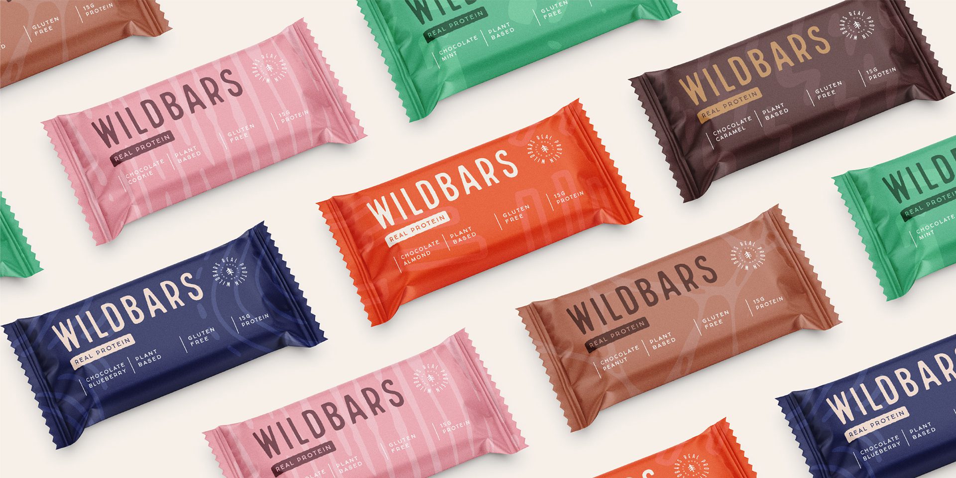
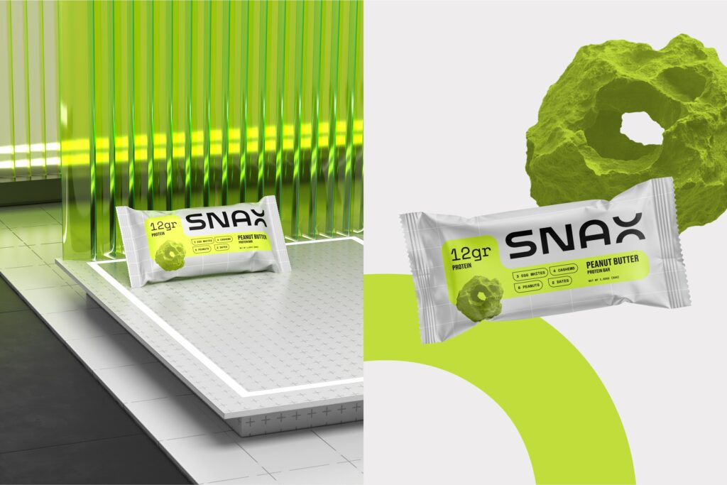
Our Snax case study describes protein bars this way: “bars are small, they are stacked densely, and they are usually chosen in a hurry”. The Wildbars wrapper answers the same condition with a minimal layout. In the words of our Wildbars case study, “the pack states what the product is and lets the pattern system do the shelf work”. Our guide to protein bar packaging design goes further into that category.
For a change to an existing pack, our article on measuring whether a rebrand worked sets out which figures to compare.
Working with MarkaWorks on packaging that has to sell
Packaging projects at MarkaWorks start with the structure. Our packaging and product design work begins with the pack format, material, closure and production method, because those decide what a buyer sees before any graphic does.
For a range, the parts that repeat on every pack, the shelf-facing panel among them, are fixed before the parts that change by variant. In the coffee study the centre of each panel held the longest looks, so that panel is where the name, the variant and the one statement you can prove belong.
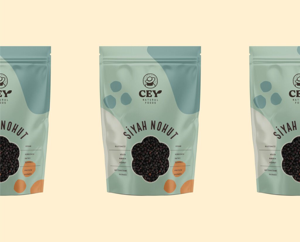
Our nutrition projects page lists 25 case studies and our food and drink page lists 17. For Cey Natural Foods, the case study records that “Distinct visual cues were introduced for each product variant within the shared system”.
The artwork is drawn on your production partner’s dieline and the working files are yours. After launch, your sales data is read against the baseline described in the previous section, with price and distribution changes noted beside it.
If you are planning a new pack or questioning an old one, we can work on it with you. Tell us about your product, where it is sold and what you want the pack to do, and we will come back with how we would approach it.
Questions brand owners ask about packaging and sales
Does better packaging design increase sales?
The 3 studies we reviewed show that design changes attention and stated purchase intention, and they did not record sales. In a 2020 study of 45 students in China, a window raised willingness to purchase for nuts and had no significant effect for 2 other foods, so results depend on the category.
Is a window better than a product photo on food packaging?
In the 2020 Frontiers in Psychology study, windows and food pictures both held attention longer than a baseline pack, and viewing time did not differ significantly between them. For preserved fruits the picture version had the higher average rating. Test both on your own product.
Which information on a label is linked to purchase intention?
In a 2025 study of 105 specialty coffee consumers in Brazil, attention to sensory claims and origin information was positively associated with purchase intention. Net weight was among the least attended elements on 5 of 6 labels. The result covers coffee labels viewed on a screen.
How can I tell whether new packaging changed my sales?
Record a baseline before the change, alter one thing at a time, and compare the same stores and the same weeks after launch. A test with category buyers before the print run shows whether the pack is noticed and understood.
More brands we brought to life: