Usually the packaging, and the way to find out costs you nothing. A shopper gives about 13 seconds to a brand choice in store and sees roughly one in seven products on the shelf, measured in published shopper research by Kantar and others. Run the three checks below on your own pack before you commission a redesign of anything.
The test that separates the two
Start by separating recognition from communication, and judge the mark on what it does rather than on how familiar it is. A known logo is not the same as a working logo: the useful tests are whether the mark is memorable, whether it scales from an app icon to a shop front, and whether it stays itself across packaging, screens and print. A mark that fails those tests is a reason for a new logo design. A mark that passes them while the pack is hard to read at shelf distance, or the range looks like several brands, points to a packaging system problem, and rebuilding the structure around the mark is the cheaper move.
Three checks you can run this week
Each one takes minutes and needs nothing you do not already have.
| Check | How you run it | What it tells you |
|---|---|---|
| Arm’s length | Stand back 2 metres from your pack and read it | If you cannot tell what the product is, the problem is hierarchy, not the mark |
| App icon | Drop your mark into a 64 pixel square | If it dissolves, the mark has a scaling problem |
| Family test | Put every variant you sell side by side | If they look like several brands, the problem is the range system |
The first and third failures are packaging work. Only the second is a reason to redraw the mark.
What a packaging system problem looks like
A range that has grown one product at a time. Each pack was approved on its own, on a screen, against the pack before it rather than against all of them together, and the drift is invisible until you line them up.
Three symptoms recur. Variant colours that were chosen to be different end up too close to read apart at a glance. The product name sits in a different place on each pack because each layout was solved separately. And the mandatory panel, which is the one element with a legal minimum size, was fitted last on every pack and pushed something else out of position.
None of that is fixed by a new mark. It is fixed by deciding the architecture once, then applying it to every pack in the range.
What a logo problem looks like
A mark that cannot survive the conditions your business actually puts it in. It needs a horizontal version and only has a stacked one. It has a gradient that flattens in single-colour print. It carries detail that disappears below a certain size, so your own team keeps making a slightly different version to get it to work.
The honest signal here is your own file folder. If there are five unofficial variants of your mark in circulation because none of the official ones fitted, that is a mark that does not cover its own job.
Order before budget
Rebuilding the pack system around a mark that is about to change wastes the pack work. Redrawing a mark to solve a range problem leaves the range problem exactly where it was, with a new mark on it.
So decide the mark question first, and decide it with the three checks rather than with taste.
- Run the arm’s length, app icon and family tests on the packs you sell today.
- If the mark passes, put the money in the pack architecture and leave the mark alone.
- If the mark fails, settle the identity first and let the packs inherit from it, which is the order MarkaWorks works in when both are in scope.
Inside each path
The two answers are not the same size of job, and the difference is worth knowing before you ask for a price.
A packaging system project starts with the range rather than a pack. The architecture gets decided once: where the product name sits, how the label blocks stack, what stays constant across every variant, and which layer does the coding that separates one flavour from another. The mandatory panel is placed as part of that layout instead of squeezed in at the end. What you receive is a rule set plus artwork for each pack, and the test of it is that a tenth product can join the family later without anybody redrawing anything.
An identity project starts earlier. It settles the logo in all its versions, a hierarchy for type, colour built on process values, and rules clear enough for someone who was not in the room to apply. The packs then inherit from that system rather than negotiating with it.
If both are in scope, the identity is decided first and the packs are built to it. If only one is, the three checks above tell you which one.
Evidence you can inspect before you brief anyone
Four product categories hold most of the MarkaWorks case pages, counted page by page from the live case pages: 25 nutrition and wellness, 20 coffee and tea, 17 food and drink, and 15 cosmetics and skincare case studies. Most are range projects rather than single packs, which is exactly the case where the architecture question decides the outcome.
Open three of them and look for the thing your own range is missing: whether every variant places the product name in the same position, whether the coding layer that separates flavours still reads at a glance, and whether the mandatory panel sits inside the layout instead of on top of it. If your answer to the family test was “they look like several brands”, that is the pattern to look for.
What to take into the first conversation
Run the three checks and write down which one failed. That single line is the most useful thing you can hand an agency, because “our variants do not read apart at 2 metres” produces a scoped proposal and a real price, while “we want a refresh” produces an estimate for work nobody has defined yet.
Two different problems with two different price tags. Three checks you can run on your own pack this week, before you commission anything.
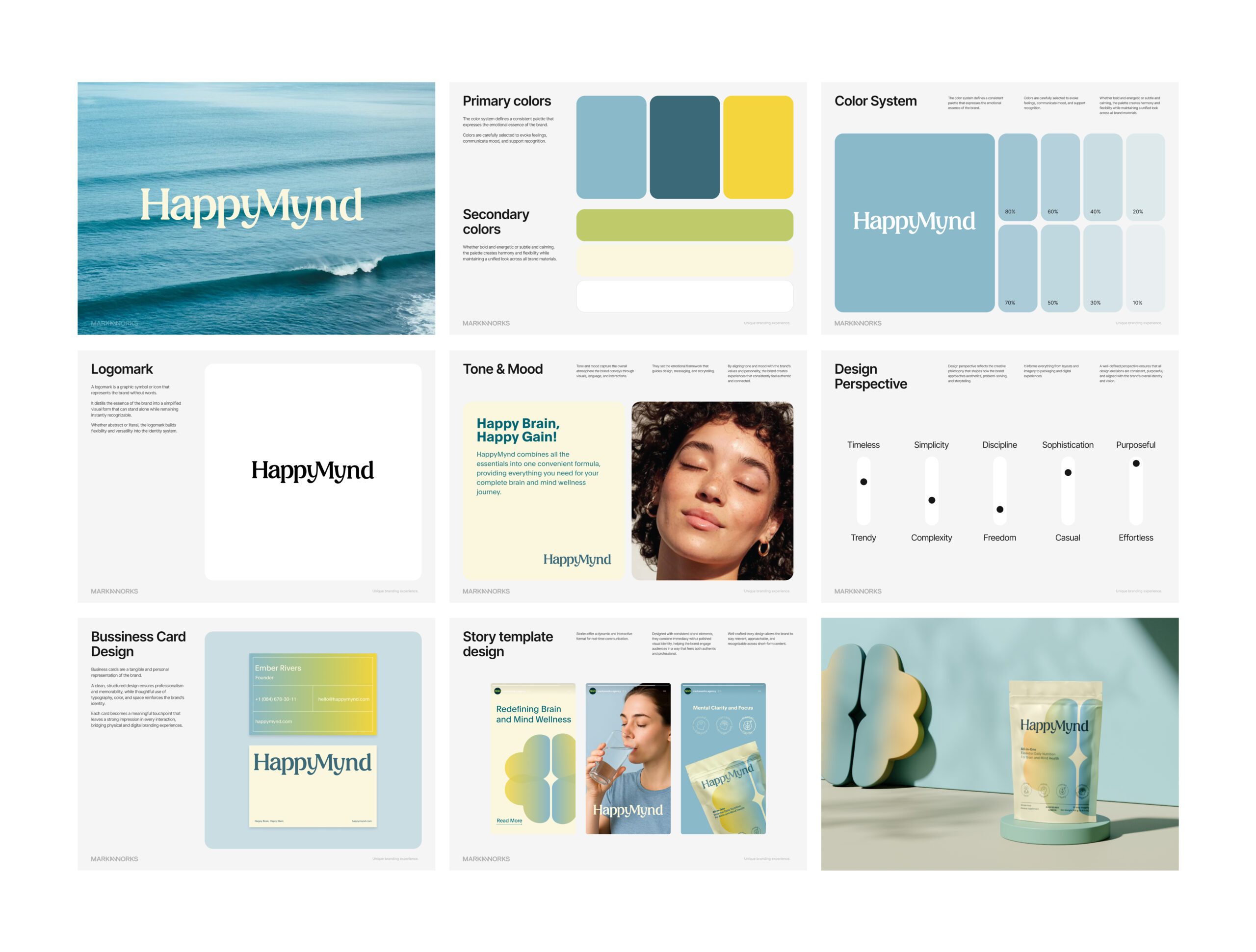
More brands we brought to life: