Updated November 2026
Brand Assets (business cards, templates, packaging, etc.)
Brand assets carry an identity past the logo: the icons, patterns and templates that support it on business cards, stationery, packaging, signage and social content. They are built in the MarkaWorks brand strategy work, and the 10 brand cases on this page show what goes into the kit, where it travels and how it grows.
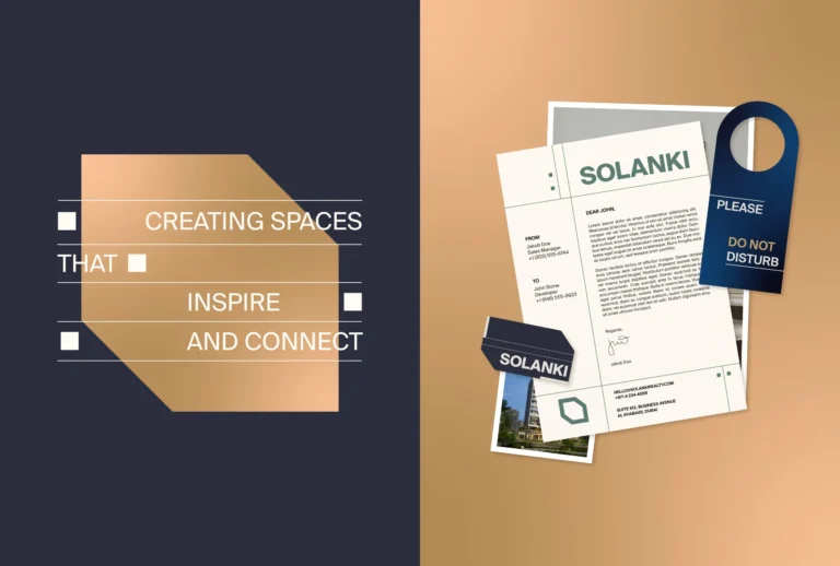
For Redefyned the kit started with a custom wordmark, an RD monogram and a structured graphic system, and it had to work across apparel, packaging, retail and social media from the start. Solanki sits at the other end of the scale: a development brand met in physical space first, so its identity extends into signage, stationery and environmental graphics.
How brand assets work on our case pages
- A kit of parts around the mark
- The same kit on every surface
- Small formats and building scale
- Packaging inside the kit
- Room for the brand to grow
A kit of parts around the mark
The kit starts with the mark and the parts around it. For Redefyned we drew a custom wordmark, an interconnected RD monogram and a structured graphic system to give the brand a recognizable foundation, and the identity had to work across apparel, packaging, retail and social media from the start.
01Business card
02Garment tags
03Stationery
04Card and Instagram story


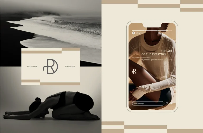
RedefynedThese elements structure information without making layouts feel rigid, creating continuity between business cards, tags, boxes, shopping bags and social content.
The same kit on every surface
Each row below takes one of our cases and lists the surfaces its own case page names, in its own words.
Arc Co
- packaging
- wholesale materials
- cups
- shipping boxes
- digital communication
The system makes a diverse coffee range easier to understand while giving the brand a consistent presence across packaging, wholesale materials, cups, shipping boxes and digital communication.
Fluxus
- packaging
- cups
- signage
- digital communication
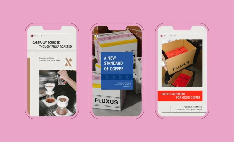
The identity is applied across packaging, cups, signage, and digital communication, and it behaves the same way in each.
Solanki
- signage
- print collateral
- digital platforms
- environmental graphics
- marketing materials
The system extends across signage, print collateral, digital platforms, environmental graphics, and marketing materials.
Chick Magnet
- packaging
- signage
- digital campaigns
- environmental graphics
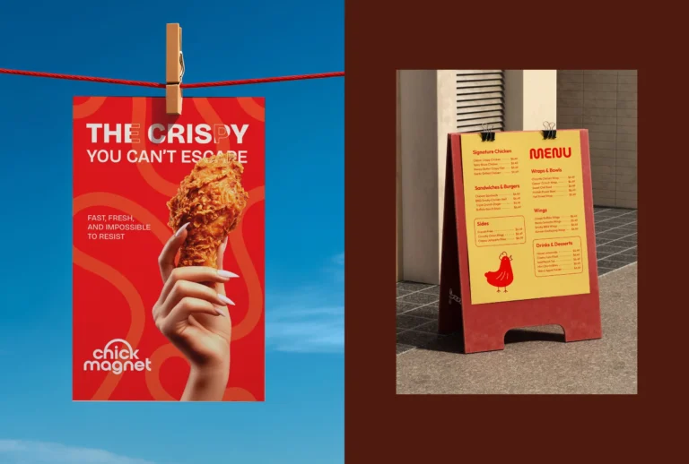
From packaging and signage to digital campaigns and environmental graphics, every detail is designed to reinforce the feeling of being drawn in by flavor.


Each list is the case page’s own and is not a full inventory of the brand.
Small formats and building scale
For Nuvite the system was not built for the pack alone. Stationery and campaign imagery were treated as part of the same range rather than as support material, and the system holds its character in each because the rules that make it work are structural rather than decorative.

A cup and a bag are read at different distances and for different lengths of time. On Fluxus the hierarchy has to survive being shrunk, wrapped and glanced at rather than studied.
At the other end of the scale, a development brand like Solanki is met in physical space before it is met anywhere else. A system designed only for screens falls apart at building scale, so the Solanki identity extends into signage, stationery, marketing materials and environmental graphics.
Packaging inside the kit
Packaging is one of the brand assets, and on our case pages it is designed with the rest of the kit rather than after it. For ROOT, a contemporary hair care brand, we developed the brand identity, packaging and art direction together, and packaging became a key part of the identity.

Redefyned works the same way. Its packaging follows the same principle as the rest of the kit: restrained typography, clear hierarchy and repeated graphic elements create a system that can adapt across collections and formats.
On Rally, a sparkling yerba mate, the system gives each flavor a clear identity while keeping it consistent across cans, multipacks, merchandise and social content. The structure, artwork and production files of a pack are covered on our packaging and product design page.
Room for the brand to grow

For Roque 78 the palette, handwritten typography and illustration give the brand a distinctive presence across signage, menus, interiors and social media, while staying flexible enough to evolve with changing events, seasonal menus and late-night programming. Menus and printed materials keep the system restrained and tactile, while campaign imagery becomes more expressive.
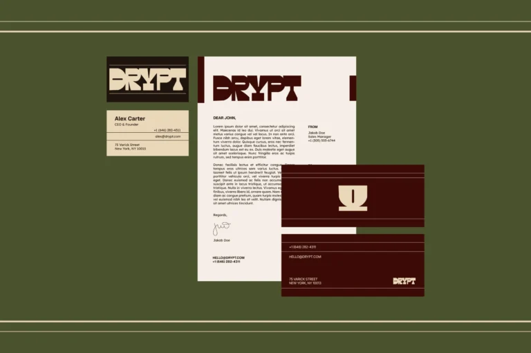
At Drypt every element was designed to work as part of a flexible system rather than as standalone graphics, so the brand stays consistent across every customer touchpoint and leaves room for future growth. Redefyned is set up the same way: consistent enough to stay recognizable across retail, packaging and digital communication, flexible enough to grow into new collections and product categories.
From brand assets to the rest of the identity
Brand assets sit inside our brand strategy and visual identity work. Our logo and identity design page shows the marks the kit is built around, our color, typography and grid systems page shows the rules it follows, and our brand guidelines page shows how those rules are written down.
One of our articles covers a question that comes up once the kit exists: who owns the logo and design files after a branding project.


Frequently asked questions
Either. Our brand strategy work covers positioning, naming, brand identity design as a system and the guidelines that keep it stable, together or one at a time. In the cases on this page the assets are drawn with the marks they extend, as with the wordmark, RD monogram and graphic system of Redefyned.
On our services page, brand assets are the design elements such as icons, patterns and templates that support and express a brand's identity. At Chick Magnet the identity centers on a custom wordmark, vibrant color contrasts and expressive graphic elements that carry across every touchpoint.
Because it reads as part of the same brand. For Nuvite, stationery and campaign imagery were treated as part of the same range rather than as support material.

By keeping the rules the same and letting the format change. The Fluxus identity is applied across packaging, cups, signage and digital communication and behaves the same way in each, and Redefyned stays recognizable across retail, packaging and digital communication.


A first call about your brand
Tell us in a first call where the brand stands today, or ask for a written proposal; either way we come back with a suggested scope.
Talk to an expert now