A packaging system that can grow is a written rule that fixes 4 elements on every pack, the mark position, type hierarchy, information block and shelf-facing panel, and lets only a few change per product, such as variant colour, product name and icon. A new flavour or size then fits the existing layout, and under GS1 rules each new product still gets its own GTIN.
What a packaging system is
A packaging system is the set of rules that decides what a pack looks like before anyone designs the next one. A single pack can be designed by eye. A range of 5 or 15 products cannot, because every new product reopens every decision unless something written down closes it.
Our packaging and product design page puts the problem in one sentence: “Most packaging work fails at the second product.” The same page says what the fix is: “a range needs a rule that tells anyone which element changes per variant and which never moves.”
That rule has 2 halves. One half lists the elements that stay identical on every product in the range. The other half lists the elements a new product is allowed to change, and how. Everything else on the pack follows from those 2 lists, including the information layout, the formats and the way a new size is added.
The test of a system is practical. When a new flavour arrives, a designer who has never seen the range should be able to produce the pack from the rules alone, and the result should sit on the shelf beside the others as one family. If that needs a meeting about what the new pack should look like, the system is not finished yet.
The elements that never move
The fixed half comes first, because it is the part a shopper uses to recognise the brand before reading anything. Our range systems fix 4 constants: “mark position, type hierarchy, information block, shelf-facing panel.” Each one is a decision taken once for the whole range.

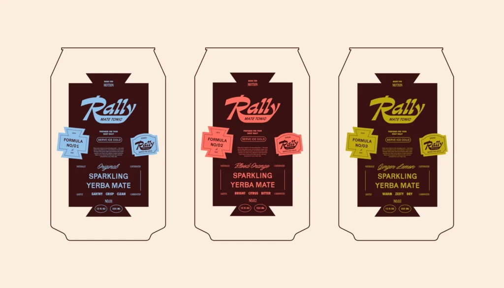
The mark position is where the brand sits on the front and how large it is relative to the pack. The type hierarchy is the order in which a shopper reads the pack. Rally, a sparkling yerba mate tonic whose identity and packaging MarkaWorks designed, sets that order in so many words: brand first, flavour and formula second, followed by product descriptors and functional information. On the Rally case study, every can follows it.
The information block is the panel that holds the product facts in the same place on every pack, and the shelf-facing panel is the side a retailer turns to the aisle. Fixing both means a buyer who knows one product can find the same fact on any other in the range without searching.
A constant is only useful if it is written precisely. “The logo goes at the top” leaves room for many readings. A position, a size relative to the pack face and a clear space rule leave room for one.
The elements allowed to change
The second list is shorter, and it should be. Our service page names the parts that move: “Variant color, flavor name and product icon are the parts allowed to move.” A system with too many variable elements stops reading as a family; one with too few cannot tell its products apart.
Colour reads from a distance, and it is the first variable in both case studies here. Rally uses a deep burgundy base for the whole range and 3 accent colours, blue, coral and yellow, as flavour-specific signals. Its case study describes the result: “Each variant uses the same structural layout while changing accent colour, allowing Original, Blood Orange and Ginger Lemon to feel distinct without fragmenting the range.”
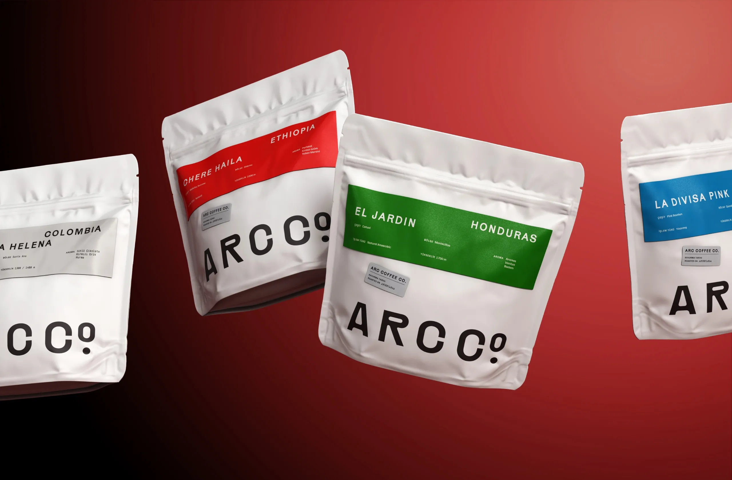
The Arc Co Coffee Roastery case study applies the same logic to a coffee range, where the variable is the origin of the beans. A restrained neutral base keeps the brand together, while origin-specific colours introduce distinction across the range.
The colour rule needs its own limits. Write down how many variant colours the palette can hold, which colours are reserved for the brand and cannot be given to a product, and what happens when the range outgrows the palette. A range that skips this step has no answer ready on the day the palette runs out.
| Element | Fixed or variable | Example from the case studies |
|---|---|---|
| Mark position | Fixed | Rally: brand first on every can |
| Type hierarchy | Fixed | Rally: brand, then flavour and formula, then descriptors |
| Information block | Fixed | Arc Co: 6 fields in defined zones |
| Shelf-facing panel | Fixed | Same panel faces the aisle on every product |
| Variant colour | Variable | Rally: 3 accent colours on a burgundy base; Arc Co: a colour per origin |
| Product name and icon | Variable | Rally: Original, Blood Orange, Ginger Lemon |
An information block with fixed zones
The information block is where a growing range can break, because every new product brings different facts. Arc Co’s packaging solves this with what its case study calls “a modular information system”. Coffee name, country, variety, process, altitude and tasting information are organised into clearly defined zones, so the 6 fields sit in the same place whichever coffee is in the bag.
The case study states why: “colour is used to differentiate origins without changing the underlying structure. This creates a repeatable system that can grow with seasonal releases and new coffees.” A seasonal coffee does not need a new layout. It needs its 6 fields filled in and its origin colour assigned.
The same method works outside coffee. List every fact any product in the range might carry, including the ones only a future product will need, and give each a zone with a maximum length. A zone drawn for the longest likely name can stay as it is. A zone drawn for the first product’s name has to be redrawn as soon as a later name is longer.
Where a category carries legal labelling rules, those panels are fixed by law rather than by design, and the system is drawn around them from the first sketch.
One system across sizes and formats
Both case studies here run across more than one format: a coffee brand with cups, shipping boxes and wholesale materials, a drinks brand with multipacks. The system has to say how the constants behave on each one, or every format becomes a new design.
Arc Co shows the scale. The identity has a custom wordmark and a circular monogram, and the case study explains that the monogram condenses the same geometry into a compact mark “for cups, stickers, merchandise and smaller touchpoints.” Its outcome lists packaging, wholesale materials, cups, shipping boxes and digital communication as surfaces the same system covers. Rally’s system is described as consistent “across cans, multipacks, merchandise and social content.”
Whether each format is a stock structure or a custom one is a separate decision, covered in our article on custom packaging or stock packaging. Either way, two rules make this work. First, each constant needs a small-format version, such as a monogram for the mark or a shortened information block, decided in advance rather than improvised on the first small pack. Second, the type hierarchy has to survive the change in scale: brand, then product, then supporting information, on a 4-can sleeve as on a single can.
The outer packaging belongs in the system too. The GS1 rule on new product introduction says: “A unique GTIN is assigned at every level of the packaging hierarchy above the retail consumer trade item/base unit level.” An outer case or a multipack is a product in its own right.
Barcodes and new products
A design system that grows has a numbering system growing beside it. GS1, which maintains the GTIN standard behind retail barcodes, publishes 10 rules for when a change needs a new number. 3 of them matter most to a growing range.
The first is new product introduction: “Any new product requires the assignment of a GTIN”. GS1’s own examples include a flavour or aroma that does not yet exist in the brand owner’s portfolio, and state that “Each style, colour and size variation is considered a unique product and is assigned a unique GTIN.”
The second is declared net content: “Any change (increase or decrease) to the legally-required declared net content that is printed on the pack, requires assignment of a new GTIN.” A new pack size is a new product for the barcode, even when the design is identical.
The third is the primary brand rule: “A change to the primary brand that appears on the trade item, requires assignment of a new GTIN.” A rebrand of the range is a renumbering of the range.
For the design, this means the barcode position belongs in the information block from the start, with room for every size the range may add.
How to test the system before the next product
A system can be tested before the range grows, using products that do not exist yet. The checks below show where the rules are still loose.
- Add a hypothetical flavour. Can the pack be produced from the written rules alone, without a design meeting?
- Add the longest product name the range might carry. Does it fit its zone at the planned type size?
- Add a new size, smaller and larger than the current packs. Do the constants have a version for each?
- Run out of colours. Is there a rule for the variant after the palette is full?
- Put 3 products side by side at shelf distance. Do they read as one family and as 3 different products?
- Check the outer case and the multipack. Do they follow the same hierarchy?
- Mark the barcode position and the space for a new GTIN on every format.
Every check that needs a judgement call instead of a rule shows a gap to close now, while closing it costs a document edit rather than a reprint. Our article on packaging that does not match the brand covers what happens when the gap is found after printing.
How MarkaWorks builds range systems
MarkaWorks is a branding agency for product brands, and range systems have their own section on our packaging service page. On our service page we describe the order: the constants are fixed first, the variables second, and “Adding a product later then needs no redesign, and the shelf still reads as one family.” Among the finished work on our site are 20 published coffee and tea case studies and 17 in food and drink.
The 2 case studies in this article were both published in October 2026. Arc Co separates origins by colour inside a fixed information structure, and Rally separates flavours by accent colour inside a fixed layout and hierarchy. More range work is collected on our food and drink branding and coffee and tea branding pages.
When a range has to carry many flavours, sizes and formats at once, the system needs a few more rules, which our article on packaging a range across many variants, sizes and formats sets out. If you are planning a range now, send us the products, sizes and markets you expect in the next few years through our contact page, and we will design the rules before the first pack. The rules and artwork files are deliverables too; see who owns the logo and design files.
Questions brand owners ask about packaging systems
What is the difference between a packaging design and a packaging system?
A packaging design is one pack. A packaging system is the written rule set that produces every pack in the range: the 4 constants that never move, the few variables a new product may change, and how both behave on each format.
Which elements should stay the same across a product range?
Our range systems fix the mark position, the type hierarchy, the information block and the shelf-facing panel. These are what a shopper uses to recognise the brand before reading the product name, so they stay identical on every product.
How many variant colours can a range use?
There is no fixed number, so write the limit down: how many colours the palette holds, which are reserved for the brand, and what happens when the range outgrows the palette. Rally uses 3 accent colours on one burgundy base.
Does every new flavour or size need a new barcode?
Under the GS1 GTIN rules, yes. Any new product requires a GTIN, each flavour, colour and size variation is a unique product, and any change to the declared net content printed on the pack requires a new GTIN.
When should a brand create its packaging system?
Before the second product, because that is where a range without rules starts to drift. Testing the system with a hypothetical flavour, a long name and a new size shows the gaps while fixing them still costs a document edit.
The fixed elements, the elements allowed to change, the information block and the barcode rules that let a range add products without a redesign.
More brands we brought to life: