Restraint and hierarchy do the work: 1 focal point, 2 typefaces, finishes used sparingly, and the mandatory lines for the United States and for Scotch placed inside the layout.
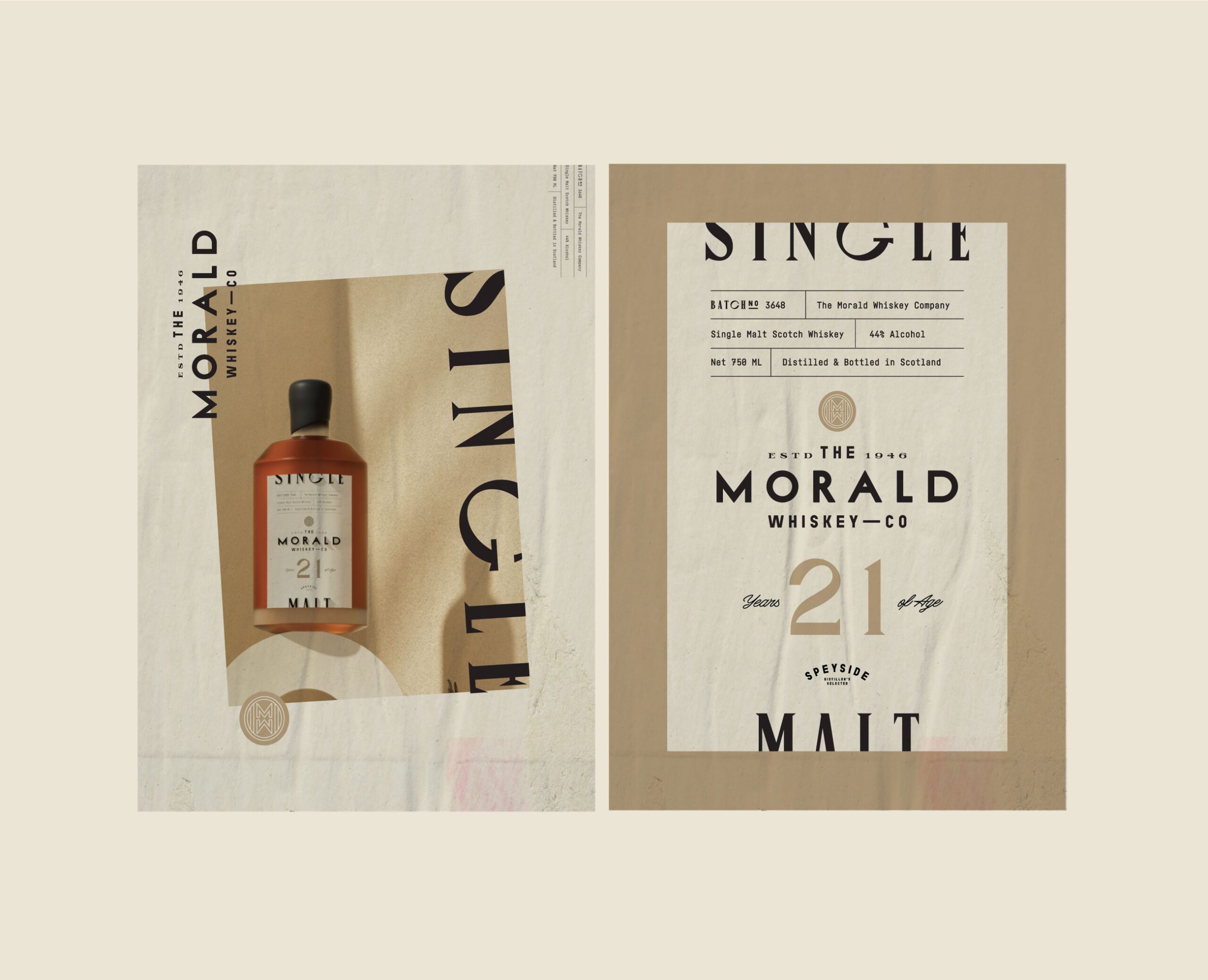
Restraint and a clear hierarchy make a whiskey or spirits label look premium. Give the label 1 focal point, which is the name, the age or the origin, set it in no more than 2 typefaces, and use embossing or foil on 1 element each. In the United States, the brand name, designation and alcohol content must share 1 field of vision.
Where does a premium look come from on a spirits label?
A whiskey or spirits label looks premium when it is restrained and its hierarchy is clear. At a glance the reader should know what the bottle is called and which 1 fact the brand wants remembered. Everything else is on the label because a rule or the buyer needs it, and it is set quietly.
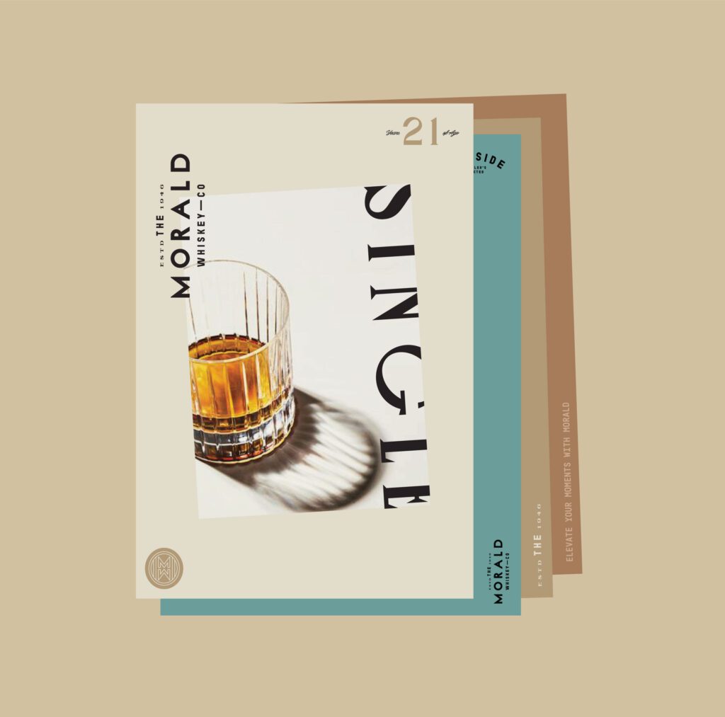
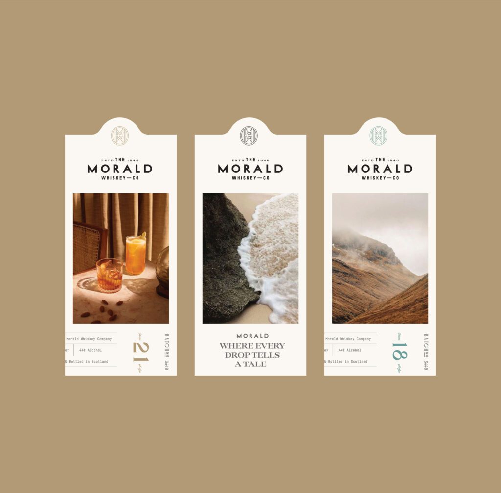
That is the position we took on The Morald Whiskey Co. brand and label. The brief asked for no ornament and no heritage pastiche. Our case study gives the reasoning: crests, serif flourishes and distressed textures appear on bottles at every level of the market, so they stopped separating one bottle from another. In its words: “What still reads as considered is spacing, balance, and the confidence to leave a label mostly empty.”
An empty label is harder to design than a full one. With less on it, every remaining decision is visible. Check 4 things on a first layout:
- Is there 1 element the eye goes to first?
- Can every other line be ranked second, third or fourth?
- Does each typeface have a job?
- Is the empty area a deliberate shape, or is it leftover space?
We set out the same reasoning for other categories in why simplicity reads as luxury in branding.
Pick 1 focal point: the name, the age or the origin
Most spirits labels have 3 candidates for the lead role: the brand name, an age statement and a place. Choose 1 and let the other 2 support it.
- Name first suits a new brand, because the name is what a buyer has to remember to find the bottle again.
- Age first suits a range that is sold by age, where the number is how buyers tell the bottles apart.
- Origin first suits a spirit whose place is its main difference from the bottle next to it.
The choice decides the rest of the layout. If the name leads, it takes the largest size and the most space around it, and the age and the origin drop to a second level in a plainer style. On Morald the name leads and the type does nearly all the work. The case study explains why: “the label area is small, and anything competing with the brand name costs legibility at exactly the distance where the choice gets made”.
Age and origin also have written rules in the 2 regulations cited below, so read the rule before choosing either as the focal point. If the brand is moving up at the same time, see our guide to repositioning a brand for a higher price.
Typefaces, paper and print finishes, used with measure
Restraint starts with the type. Most spirits labels need 2 typefaces at most: 1 for the name and 1 for everything else, with a second weight of the same family if a third level is needed. The small legal lines still have to print cleanly, and our guide to how small type can be on packaging covers the limits.
Paper carries much of the character once decoration is removed. A textured stock gives the label a surface the hand notices, and it changes how fine lines and dark solids print. Ask for a proof on the actual stock before approving small type.
Embossing and foil work best when each is given 1 job. Emboss the mark or the name, and foil a single line or a border. On Morald the palette is warm and earthy, drawn from natural stone and aged wood, and the labels leave out decoration so that texture, type and proportion carry the character.
Each finish is an extra step at the printer, so raise it early, alongside printing methods and minimum orders. Decoration on the glass can count as labelling too. In the United States, 27 CFR 5.61 includes in the term label any information “etched, engraved, sandblasted, or otherwise carved into the surface of the container”.
What has to be on the front of a bottle sold in the United States?
For the United States, the list is in 27 CFR Part 5, Subpart E. Section 5.63 puts 3 items within the same field of vision:
- the brand name
- the class, type or other designation
- the alcohol content
The regulation defines that field as a single side of the container “where all of the pieces of information can be viewed simultaneously without the need to turn the container”. For a cylindrical container, a side is 40 percent of the circumference. On a round bottle that fixes the working width of the front before design begins.
2 more items may appear anywhere on the container: the name and address of the bottler, distiller or importer, and the net contents. The net contents may be blown, embossed or moulded into the container, which takes 1 line off the paper.
The alcohol content is stated as a percentage of alcohol by volume. Section 5.65 allows alcohol to be shortened to alc and volume to vol.
The design decides the order and weight of the 3 front lines. Usually the brand name takes the lead, the designation is a clear second line and the alcohol content sits small at the base of the label. The wording itself is for your regulatory adviser to confirm. If you sell in more than 1 country, read what changes on the label in a second market.
| Label element | Premium signal | Rule note |
|---|---|---|
| Brand name | The largest element, with clear space around it | United States: 27 CFR 5.63 puts it in the same field of vision as the designation and the alcohol content |
| Class or category name | 1 plain line, second in the hierarchy, in 1 size and weight | Scotch: on the front of the container, equal prominence to each word, not overlaid or interrupted |
| Alcohol content | Short form, small, at the base of the label | United States: a percentage of alcohol by volume, in the same field of vision as the brand name |
| Age statement | Either the focal point or a quiet second line | United States: overstatements of age are prohibited. Scotch: age expressed in years |
| Net contents, name and address | On the side or back, or the contents in the glass | United States: anywhere on the container; net contents may be blown, embossed or moulded into it |
| Carton | The same hierarchy as the label | United States: a sealed opaque carton must bear all mandatory label information |
Age statements and origin claims: read the rule, then design
In the United States, 27 CFR 5.74 defines age as the time the spirits have been stored in oak barrels after distillation and before bottling. It says “it is permissible to understate the age of a product, but overstatements of age are prohibited”. For whiskeys aged less than 4 years, an age statement is required on the label unless the whiskey is labelled as bottled in bond. Where it contains no neutral spirits, the age shown is that of the youngest whiskey.
For Scotch, the Scotch Whisky Regulations 2009 do not allow a reference to maturation period or age “unless the maturation period or age is expressed in years”. A year of distillation may appear only if all of the whisky was distilled in that single year, and the year of bottling, the maturation period or the age must sit in the same field of vision. Regulation 12 also bars any number that may confuse the public about age, maturation or the year of distillation. We read the 2009 text as made; confirm the current version with your adviser.
Origin works the same way. The 2009 regulations protect 2 localities, Campbeltown and Islay, and 3 regions, Highland, Lowland and Speyside, for Scotch Whisky distilled there. In the United States, Section 5.64 bars a brand name that creates “any erroneous impression or inference as to the age, origin, identity, or other characteristics of the distilled spirits”.
Use the category name exactly as the rule writes it
On Scotch, the category name is a compulsory sales description. The 2009 regulations list 5: Single Malt Scotch Whisky, Single Grain Scotch Whisky, Blended Malt Scotch Whisky, Blended Grain Scotch Whisky and Blended Scotch Whisky. Regulation 8 requires the category on the front of the container.
The typography of that line is regulated too. The name must be “printed in a way that gives equal prominence to each word making up the name of the category”. It must not be “overlaid or interrupted by other written or pictorial matter”, and it must not be used in conjunction with any other words. The 1 exception is a Scottish locality or region name placed immediately before the category, where the whisky was distilled there.
For the layout, 4 habits follow:
- Set the whole category name in 1 size, 1 weight and 1 colour, so that no word outranks another.
- Keep illustration and foil patterns clear of the line.
- Make it as prominent as any other description of the whisky.
- Leave the phrase pure malt off the pack. Regulation 11 bars it for Scotch.
The same regulations define Scotch Whisky, including maturation for not less than 3 years and a minimum strength of 40%. In the United States the matching line is the class, type or other designation, defined in Subpart I of Part 5. Confirm it with your adviser.
Bottle shape, closure, neck label and box
A label is read together with the glass. A tall, narrow bottle suits a vertical hierarchy, and a short, wide one leaves room for a wide name. Draw the label on the outline of the real bottle with the closure in place, because the closure sits directly above the label and is seen in the same glance. Stock or custom bottle is a separate decision, covered in custom and stock packaging.
In the United States, the closure and the capsule are not the place for mandatory text. Section 5.61 says that information on the bottom of the container, on caps, corks or other closures, and on “Foil or heat shrink bottle capsules” will not satisfy the mandatory label requirements, unless the appropriate TTB officer authorises a closure to carry it. A neck label is different: material affixed to the container counts as a label, so it can hold the name and address or the net contents, which may appear anywhere on the container. Booklets, leaflets and hang tags that are not firmly affixed are not labels under Part 5, and its advertising rules apply to them.
The box needs the same reading. Under Section 5.62, where bottles are enclosed in sealed opaque cartons, “such coverings, cartons, or other containers must bear all mandatory label information”, and the bottle inside still carries its own. For Scotch, Regulation 8 requires the category on individual packaging too, unless the front of the container is clearly visible through it. Our guide to limited edition packaging covers single releases.
Designing a spirits label with MarkaWorks
MarkaWorks designs a spirits label as part of the whole pack. Our packaging and product design work begins with the structure, which means the format, material, closure and production method, because those decide what the label can do. For a spirit, the bottle, closure and carton are settled before the label is drawn.
If the brand is new or changing, the label follows the identity. Our brand strategy and visual identity work sets the positioning, the mark and the type that the label then uses.
For a range, the hierarchy and the place of the mark are held constant from bottle to bottle. Then we define what changes for each bottling, such as the age, the category line or the colour.
We place the mandatory information for the markets you name inside that hierarchy. Your regulatory adviser confirms the wording; we design the layout. The label, the neck and the carton are delivered as production artwork on your production partner’s dielines, along with the working files.
If you are planning a whiskey, a gin or another spirit, we can design the label with you. Tell us about your spirit and the markets you plan to sell in, and we will answer with the hierarchy we would start from.
Questions brand owners ask about premium spirits labels
How many typefaces should a premium spirits label use?
Use 2 at most on most spirits labels: 1 for the name and 1 for everything else, with a second weight of the same family where a third level is needed. Each extra typeface competes with the name for attention.
Does the alcohol content have to be on the front of a bottle in the United States?
It has to be in the same field of vision as the brand name and the class, type or other designation. 27 CFR 5.63 defines that as a single side of the container, and for a cylindrical container a side is 40 percent of the circumference.
Can a Scotch label give the age in months?
No. The Scotch Whisky Regulations 2009 do not allow a reference to maturation period or age unless it is expressed in years. The definition of Scotch Whisky in the same regulations requires maturation for not less than 3 years.
Can required information go on a hang tag or the capsule in the United States?
No. Under 27 CFR 5.61, hang tags, booklets and leaflets that are not firmly affixed are not labels, and information on foil or heat shrink capsules does not satisfy the mandatory label requirements. Keep required text on a label on the bottle.
More brands we brought to life: