A category colour code helps buyers find a type of product and a variety. Following it makes you easier to find; breaking it makes you easier to tell apart. How to choose, and how to do both in 1 range.

Follow the category colour code for the variety and break it for the brand. Use the colours buyers already expect to mark each flavour or type, and keep 1 base colour of your own across the whole range. Stay closer to the code when buyers search a physical shelf and the brand is new; move further from it when they browse on a screen.
What is a category colour code?
Stand in front of a shelf and many of the packs in a category share a small set of colours. Nobody wrote the rule down. It builds up as brands copy what already sells, and buyers learn it without noticing. That shared habit is what we call a category colour code.
A code does 2 jobs for the buyer:
- It names the type of product. A block of colour can be recognised from a distance at which small type cannot be read, so it tells the buyer which part of the shelf they are in before the words do.
- It names the variety. Inside a range, 1 colour per flavour, scent or strength lets a returning buyer pick up the same one again without reading.
Examples are easy to overstate, so we give only 2, and as things we have noticed, with no claim that they are rules. In many drinks ranges the citrus flavour gets a yellow or orange pack. In many ranges with a mint variety, that variety is green. Both habits vary by market and by shop.
So the question in the title has no single answer. A code is a shortcut that buyers already carry with them. Use it and they find you sooner. Ignore it and they notice you sooner, but they may not know what you are.
When does following the code help?
Following the code is the right call when the buyer already knows what they want and is scanning for it. Someone looking for a particular type of product moves along a shelf quickly and sorts packs by colour before reading any of them. A pack that does not look like the type is skipped, however good the design is.
The code earns its place in 3 situations:
- The buyer is searching. They came for a type of product or a specific variety, and they want to be finished quickly.
- Nobody is there to explain. In a self-service shop the pack has to say what it is without help.
- The product type is unfamiliar. If buyers have to learn what the product is, an unfamiliar colour gives them a second thing to work out.
The weakness is the other side of the same effect. A pack that matches the code completely is found as a member of the category and is harder to recall as a brand. If you follow the code, something else has to carry the brand: the shape of the pack, the position and size of the name, or a pattern. Our guide to positioning a product brand covers how to choose what the brand stands against.
When does breaking the code help?
Break the code when being told apart matters more than being sorted. That is usually so when the buyer is browsing, or when the context has already said what the product is.
A screen is the clearest example. On a product page or in a search result, the title, the category filter and the photograph caption say what the product is. Colour is released from that job and can work for the brand alone. Our article on packaging for shelves and product pages goes through the other differences between the 2 settings.
A break also makes sense when the code stands for something you do not want to be. If every pack in a category shares a look, and your product is positioned against the habits of that category, wearing its colours works against the positioning.
A break has to be paid for elsewhere on the pack. Check 3 things:
- The product type is in words, and large. If colour no longer says what the product is, the type line has to, at a size that reads from a step away.
- Another code is kept. Pack format, material or the usual place for the variety name can stay conventional while colour moves.
- The colour is used consistently. Keep the same colour in the same place on every pack, so buyers read it as the brand and not as a variety.
Whichever colour you choose, the text printed on it still has to be read. For food sold in the EU, Article 2 of Regulation (EU) No 1169/2011 lists “significant contrast between the print and the background” among the elements of legibility.
3 questions that decide how far to go
Most colour decisions come down to 3 questions. Each one pushes the answer towards the code or away from it.
1. Is the buyer searching or browsing? A searching buyer has a type or a variety in mind and uses colour to find it. A browsing buyer is open to being stopped by something that looks different. Most brands have both kinds of buyer, so ask which one the next 12 months of sales depend on.
2. Is the pack seen on a shelf or on a screen? On a shelf the pack sits among competitors and has to be sorted by eye. On a screen it is usually seen alone, next to a title that names it. A brand that sells in both places needs a colour plan that works in the harder of the 2, which is the shelf.
3. Is the brand new or known? A known brand can be found by its own colour, because buyers have learned it. A new brand has no learned colour yet. If it also drops the category colour, the buyer has nothing familiar to hold on to.
The answers rarely all point the same way. A new brand sold mainly online can break further than a new brand going into shops.
| Situation | Follow the code | Break the code |
|---|---|---|
| Buyer is searching for a known type or variety | Yes: colour is how they sort the shelf | Only on the brand layer |
| Buyer is browsing with no fixed product in mind | Less needed | Yes: difference gives them a reason to stop |
| Pack is sold on a physical shelf among competitors | Yes for the variety colour | For the base colour, if the type line reads from a step away |
| Pack is sold on a screen next to a title that names it | Less needed: the title says what the product is | Yes: colour can work for the brand alone |
| Brand is new and has no learned colour | Stay closer, so buyers have something familiar | Break 1 layer and keep it identical on every pack |
| Brand is known and buyers have learned its colour | For varieties inside the range | Yes: the brand colour is already how buyers find it |
| Positioning is against the habits of the category | For flavours or types only | Yes: the category colours would work against the positioning |
The middle route: variety colour follows, brand colour breaks
The 3 questions often give a split result, so split the colour as well: 2 layers, each with its own job.
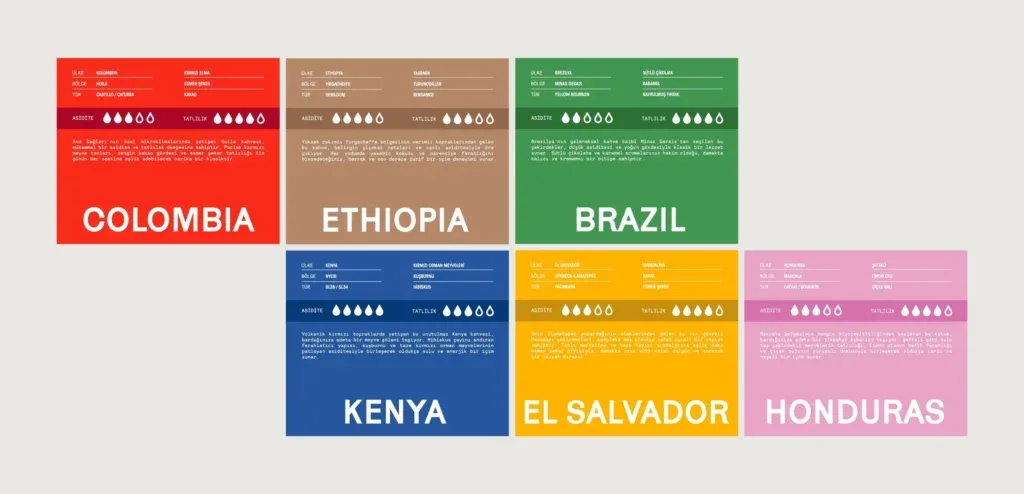
- The variety colour follows. The colour that marks a flavour, origin or strength uses what buyers already expect where an expectation exists, so a returning buyer finds their variety without reading.
- The brand colour breaks. A base colour, a band or a pattern that stays the same on every pack is chosen to be unlike the neighbours on the shelf, so the range is recognised as one brand.
The 2 layers need fixed places: the brand colour always the base, the variety colour always an accent in the same position.
Our work for Fluxus Coffee shows the 2 jobs being separated. Fluxus sells coffee by origin, and the case study describes the label as answering 2 questions at once: “which coffee is this and whose coffee is this”. The layout is not redrawn for each coffee; the difference between coffees is carried by colour and pattern. In the words of the case study: “A restrained color system separates variants without breaking the range apart”. Because the layout does not change, a new origin enters the range as a new colour and pattern, with no new design. Our guide to packaging for many flavors, sizes and formats explains how to set up a range this way.
A worked example: Rally breaks the category code and keeps a flavour code
Rally is a sparkling yerba mate tonic, and its brief contained the question this article is about. The case study records that Rally needed to communicate natural caffeine and everyday energy “without falling into the visual codes of conventional energy drinks”. The category had a code, and the brief was to stay out of it.
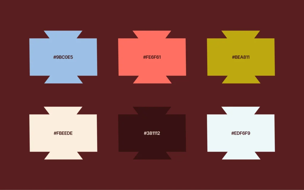
The same brief asked for the opposite inside the range. There are 3 flavours, Original, Blood Orange and Ginger Lemon, and a buyer has to tell them apart quickly. So the colour system has 2 layers:
- 1 base colour for the brand. Deep burgundy forms the base of the system.
- 3 accent colours for the flavours. Blue, coral and yellow act as flavour signals across the range.
The layout holds the 2 layers in place. The hierarchy on pack is brand first, flavour and formula second, then product descriptors and functional information. The case study puts the range rule in 1 sentence: “Each variant uses the same structural layout while changing accent colour”.
The exchange has a price. A buyer who scans a shelf by colour for the conventional product may pass any pack that leaves the code. The words on the pack and the product name then have to do that work.
Can you own the colour you choose?
Can a colour that breaks the code be protected? 1 United States decision answers part of it.
In 1995 the US Supreme Court decided Qualitex Co. v. Jacobson Products Co. (Cornell LII). Qualitex had used a green gold colour on dry cleaning press pads since the 1950s. A rival used a similar colour from 1989, and Qualitex registered its own in 1991. The Court held that “there is no rule absolutely barring the use of color alone” as a trade mark under the Lanham Act, enacted in 1946.
It sets 2 conditions:
- Buyers must have learned the colour. The Court said customers may over time come to see a particular colour, such as “a color that in context seems unusual”, as signifying a brand. It calls this secondary meaning. A new brand has none yet.
- The colour must have no other job. A feature is functional, and cannot be a mark, “if it is essential to the use or purpose of the article or if it affects the cost or quality of the article”. It noted a lower court ruling that the blue of a fertiliser was functional because it indicated nitrogen.
We read the second condition as a warning about code colours: a colour that tells buyers the type of product is doing another job. This is United States law. How a colour is handled in the EU or any other market is a question for your trade mark adviser, who confirms what applies; we design the colour system. Our article can you trademark a colour covers other cases.
How we choose a colour strategy with a client
Colour is decided inside a larger piece of work, so we start from the positioning. In our brand strategy and visual identity work, the strategy decides what the identity has to carry. For colour, that means settling what the brand should be told apart from before any colour is picked.
With MarkaWorks, packaging and product design starts with the structure, meaning what the pack is made of and how it is produced. Colour comes after that, because a colour has to behave on the real surface, whether that is a curved container, a foil pouch or a flat carton.
Then the 2 layers are written into the range system. Our range systems decide the constant elements before anything else, and then define what is allowed to move for each variant. Variant colour is one of the parts that moves. The brand colour stays with the constant elements.
Ranges with many varieties are where this matters most: our coffee and tea page lists 20 case studies and our food and drink page lists 17. Delivery is production artwork on the dieline your production partner uses, plus the working files.
If you are deciding how far your packaging should follow its category, we can work on it together. Tell us about your category and where the product will be sold, and we will reply with a first view of the colour plan.
Questions brand owners ask about category colour codes
What is a category colour code in packaging?
It is the set of colours that most packs in a category share, which buyers have learned to read. It does 2 jobs: it tells the buyer what type of product they are looking at, and inside a range it tells them which variety a pack is.
Should a new brand follow the colours of its category?
A new brand has no colour that buyers have learned yet, so it should usually stay closer to the code than a known brand. A workable split is to follow the code for the variety colour and choose 1 base colour of its own that stays identical on every pack.
Does colour matter less when the product is sold online?
It matters differently. On a product page the title and the category filter already say what the product is, so colour is free to work for the brand. A brand that also sells in shops should plan its colours for the shelf first, because that is the harder setting.
Can a brand own a colour in the United States?
Sometimes. In Qualitex Co. v. Jacobson Products Co. in 1995, the US Supreme Court held that there is no rule absolutely barring the use of colour alone as a trade mark. Buyers must have come to identify the colour with the source, and the colour must not be functional. Your trade mark adviser confirms what applies to you.
More brands we brought to life: