Packaging works on shelves and product pages when 3 things read at both sizes: the brand mark, the product or variant name, and the colour that separates one product from the next. On a shelf the front panel is seen from about 2 metres; online the same pack is a photo that may be under 200 pixels wide, so everything else on the front is secondary.
One pack, two viewing distances
Our website page describes the situation in one line: “A shopper meets a product twice: as a photograph on a screen and as an object in a hand.” The pack is the same object both times, but the conditions are very different.
On a shelf, the pack is seen from 1 or 2 metres away, usually in a row of the same product and next to competitors. The shopper scans the shelf, recognises a shape or a colour, steps closer and picks the pack up. The design has the whole front panel, real light, real materials and, once the pack is in the hand, the back and sides as well.
On a product page, the first view is a photograph in a grid of results or a listing, often on a phone, where the image may be a few centimetres wide. The shopper cannot pick it up or turn it, and the detail that a shelf rewards, such as small type, fine texture or a foil finish, is lost or flattened. Only after a tap does the larger gallery open.
A pack designed only for the shelf can disappear online, and a pack designed only for the screen can look thin in the hand. The work is to plan one front panel that does its job at both distances.
The front panel, as the label rules define it
Food labelling rules in the United States give the front of the pack a precise name. Under 21 CFR 101.1, the principal display panel is “the part of a label that is most likely to be displayed, presented, shown, or examined under customary conditions of display for retail sale.” The same section says the panel must be large enough for the mandatory information “with clarity and conspicuousness and without obscuring design, vignettes, or crowding.”
The rule also sets how large that panel is. For a rectangular pack, it is the height times the width of the side that faces the shopper. For a cylindrical container, such as a jar, a can or a tub, it is “40 percent of the product of the height of the container times the circumference”. Less than half of a round pack is its front.
That definition is useful for design beyond the legal minimum, because it describes what a camera sees too. A straight-on product photo of a round tub shows roughly the same 40 percent the rule calls the front. If the brand mark or the product name wraps round to the back, it will be missing from both the shelf view and the main product photo. The detailed type rules are in our guide to how small type can be on packaging, and requirements differ by product category and market.
A hierarchy that survives shrinking
The test of a front panel is what remains when it is shrunk. At thumbnail size, a shopper can usually take in 3 things: the brand mark, the product or variant name, and a colour. Ingredient lists, small claims and decorative detail become texture. That gives a clear order for the front panel: mark and product name first, colour coding second, everything else after.

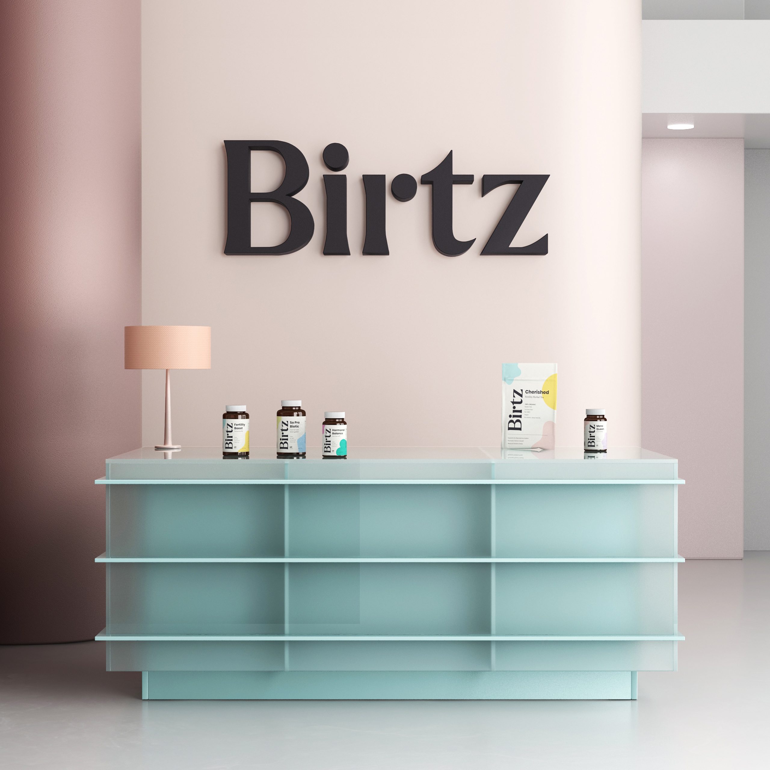
For Birtz, a women’s supplement brand whose packaging and website we designed, the case study sets out how that order works: “A vertical logotype creates instant shelf recognition, and a color-coded system lets a customer navigate to her specific need without reading every label.” The vertical mark runs the full height of the bottle, so it reads at shelf distance and in a small photo, and the colour tells products apart before any text is read.
The same order carries into the online store. In the Birtz shop grid, each product card shows the pack with the vertical logotype and its colour, so a returning customer finds her product by the same signals she used in the store. The case study puts it this way: “Separating the stages by color lets the shelf answer the question the copy would otherwise have to.”
| Question | On a shelf | On a product page |
|---|---|---|
| First view | Front panel from 1 to 2 metres | A photo in a results grid, often on a phone |
| What reads first | Shape, colour, brand mark | Brand mark, product name, colour |
| What the shopper can do | Pick it up, turn it, read the back | Tap for a larger gallery |
| What gets lost | Little, the pack is seen at full size | Small type, fine texture, foil and finish |
| Rules that apply | Label rules, such as 21 CFR 101.1 in the US | Platform image rules, such as Google Merchant Center |
| Range navigation | Colour and position in the row | One image per variant, same colour coding |
Colour coding that works on a shelf and a screen
Colour is the element most likely to survive at every size, which is why ranges lean on it. But a colour that separates products under store lighting can blur together on a phone screen, and 2 shades that look distinct in print can look almost the same in a small photograph.
Plan the colour coding for the smaller view. Choose colours that differ clearly in lightness, not only in hue, so the products can still be told apart in a grey-scale view or for a shopper with colour vision deficiency. Keep each colour in a large, flat area of the front panel, where it reads at a glance, rather than in thin lines or small accents. And keep the colour in the same place on every pack in the range, so the eye learns where to look.
Screen and print colour are not the same, so the colour values need to be set for both. Our guide to brand colours and contrast explains how to choose colours that hold up, and our article on carrying packaging design into Shopify covers setting the pack colours in the online store.
Photographing the pack for product pages
On a product page, the shopper sees the pack only through its photograph. Google’s Merchant Center image requirements set the baseline for product listings in its shopping results. If the product is shown in its original packaging, Google asks that the image “clearly displays multidimensional product packaging and not just the front of the packaging.” The main image must offer “an unobstructed, clean view of the item for sale”, without added text, marketing callouts or watermarks.
The same page sets the size. Google has announced a minimum of 500 x 500 pixels for all product images from 31 January 2027, and recommends images of 1500 x 1500 pixels or above. For a range, it asks brands to “submit a distinct, dedicated image for every individual variant”, so each flavour or colour needs its own photograph rather than one shared image.
These rules shape the pack as well as the photo. A pack photographed at an angle, showing the front and one side, has to look right from that angle, so the side panel needs to carry the brand too. A variant shown in its own image needs a colour and a name that read in that image. Whether to shoot the pack or render it is a separate choice, and we compare the 2 in our article on product photography vs 3D rendering.
Checking the pack at both sizes before print
A front panel can be checked at both distances before anything is printed. The checks take an afternoon, and they find most of the problems that would otherwise show up on the shelf or in the first product photos.
- Print the front panel at full size, put it in a row with 3 or 4 competitor packs and look at the row from 2 metres. Can you find your pack and name the product?
- Shrink the same front panel to 150 pixels wide on a phone screen. Can you still read the brand mark and the product name?
- Convert the range to grey scale. Can you still tell the products apart?
- Photograph a mock-up at an angle, as a product page would. Does the side panel carry the brand?
- Lay out the product page with the pack photo and check that the words on the page match the words on the pack.
When a pack fails one of these checks, the fix is usually in the hierarchy (a larger mark, a shorter product name, a stronger colour field) rather than in a new design. Our guide to testing packaging before launch covers tests with real shoppers. If the pack will also ship to customers, the route changes what the outer box has to do, which we cover in our article on ecommerce vs retail packaging.
How MarkaWorks designs for the shelf and the screen
MarkaWorks is a branding agency for product brands, and we design packaging and websites in one team. When there is a pack, our website page says, “MarkaWorks builds the two surfaces in one order”: “The color build and the type system are shared between the pack and the site”, and “Product photography is planned against the pack artwork.”
That order matters for a pack that has to work on a shelf and on a product page. The front panel hierarchy is set with the thumbnail in mind, the colour values are set for print and for screen at the same time, and the product photography brief is written from the pack, not after it. For Birtz, the case study says it directly: “The website and its e-commerce flow follow the same principles.”
Recent work across shelf and screen is on our Birtz and Nutrio case pages. To plan packaging and a product page together, see our packaging and product design and website and digital design services, or start from our contact page.
Questions brand owners ask about packaging for shelves and screens
What is the principal display panel on packaging?
It is the part of the label most likely to be seen at retail. Under 21 CFR 101.1, for a rectangular pack it is the height times the width of that side, and for a cylindrical container it is 40 percent of the height times the circumference.
What should be readable on a product thumbnail?
Usually 3 things: the brand mark, the product or variant name, and the colour that separates it from the rest of the range. Ingredient lists, small claims and decorative detail are rarely readable at that size.
What size should product images be for Google Shopping?
Google has announced a minimum of 500 x 500 pixels for all product images from 31 January 2027, and recommends 1500 x 1500 pixels or above for the best performance in listings.
Should each flavour have its own product photo?
Yes. Google’s Merchant Center rules ask for a distinct, dedicated image for every individual variant, so each flavour or colour in a range should be photographed on its own.
Can I show only the front of the pack in product photos?
For products shown in their original packaging, Google asks that the image displays multidimensional packaging and not just the front. An angled photo showing the front and one side works, so the side panel should carry the brand.
One pack is seen at shelf distance and as a small photograph on a phone. How to plan the front panel, the colour coding and the product photos so it reads in both places.
More brands we brought to life: