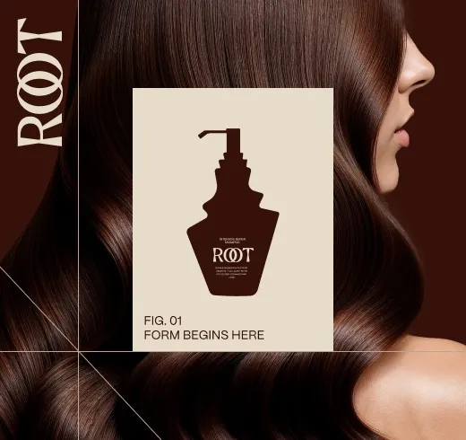
Carry packaging design into a Shopify store by moving 4 values from the pack into the store’s settings: the colour build, the type system, the logo set and the photography style. In Shopify, colours and fonts sit in the theme editor’s Theme settings, and brand colours and logos in Settings, General, Brand assets, so every page uses the pack’s values.
Start from the values on the pack
A product brand with finished packaging already has its store design half done, because the pack has fixed the decisions a website also needs: colours, type, logo use, image style and the order in which a buyer reads product information. The store’s job is to repeat those decisions on a screen.
Our website and digital design page puts the reason in one line: “A shopper meets a product twice: as a photograph on a screen and as an object in a hand.” When the 2 disagree, the same page warns, “the disagreement reads as a different product, not as a design choice.”
So the first step is an inventory, taken from the packaging files rather than from memory:
- The colour build: every brand and variant colour, with the screen values next to the print values.
- The type system: typefaces, weights and the hierarchy the pack uses.
- The logo set: primary logo, compact mark, and the minimum sizes.
- The image style: how the pack is photographed or rendered.
- The reading order: what the front of the pack says first, second and third.
That list is the brief for the store, and the theme is set up against it. Whether a theme can carry the list at all, or the store needs its own design, is the subject of our article on a Shopify theme or a custom store design.
Set the brand colours in Shopify
Shopify keeps colour in 2 places, and both need the pack’s values. The first is the store’s brand assets. Shopify’s help centre page on managing brand assets states: “Your brand can have specific primary, secondary, and contrasting colors used on your online store or social media.” They are added in the Shopify admin under Settings, then General, then Brand assets, with a colour picker or a HEX code.
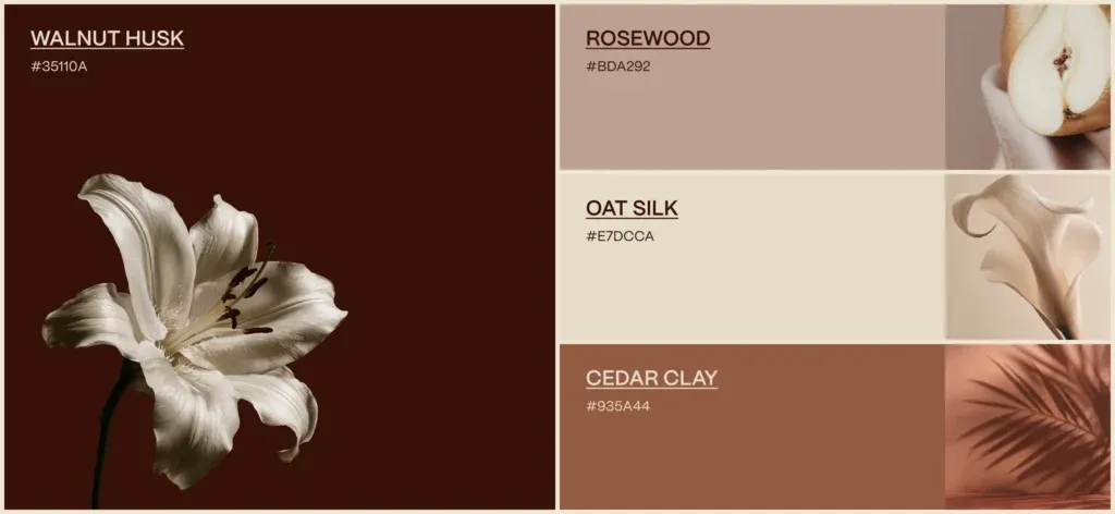
The second is the theme. Shopify’s page on theme settings describes a “color scheme” as “a group of different colors, such as background, text, and button, that you then apply to different sections throughout your online store.” A theme can hold several schemes, and a colour palette lets one colour be reused: “When you change a color from the color palette, all settings that use that color dynamically update to the new color.”
The translation from pack to screen is the part that needs care. Print colours are specified for ink on a given substrate; screen colours are HEX values, and the 2 are matched by eye on calibrated proofs, not by a formula alone. Our service page describes the order we use: “The color build and the type system are shared between the pack and the site.”
One check belongs here before launch. The GOV.UK Design System, written for UK government services, says the contrast of “text and interactive elements in your service meets Web Content Accessibility Guidelines (WCAG 2.2) success criterion 1.4.3 Contrast (minimum) level AA.” A pack colour that works on a shelf can fail that test as a button or text colour, and the scheme then uses it for backgrounds and accents instead.
Carry the type system
A store can drift from its pack in its type, because the theme arrives with fonts of its own. Shopify’s help centre explains the setting: “You can set the font style and size for the text on your online store. You can choose a system font or add a custom font.” Headings and body text are set separately, under Theme settings, then Typography.
Shopify also notes a trade off: “Using system fonts avoids downloading new fonts to your customer’s computer, which can negatively impact your store’s loading speed.” That leaves 3 routes for a product brand:
- Use the pack’s typeface as a custom font, where the licence covers web use.
- Use the pack’s typeface for headings only, and a system font for body text.
- Choose the closest face in Shopify’s font library, matched to the pack’s hierarchy.
The licence question comes first. A typeface bought for print does not automatically cover a website, and our article on what your font licence allows covers the terms to check. Whichever route is chosen, keep the pack’s hierarchy: the same order of brand, product name and supporting text, at sizes that read on a phone.
| Pack value | Shopify setting | Where it shows |
|---|---|---|
| Brand colours | Settings, General, Brand assets: primary, secondary, contrasting | Sales channels, apps and compatible themes |
| Colour schemes | Theme settings: color schemes and color palette | Backgrounds, text and buttons by section |
| Typefaces and hierarchy | Theme settings: Typography, headings and body | Every page of the online store |
| Primary logo | Brand assets default logo, theme Logo setting | Header across all pages, password page |
| Square logo | Brand assets square logo | Social channels and profile pictures |
| Compact mark | Favicon in the theme | Browser tab, history and bookmarks |
| Slogan and description | Brand assets: up to 80 and 150 characters | Bios and listings across channels |
Logo, favicon and the small sizes
A store shows the brand mark at sizes the pack may never use. The header logo, the favicon in the browser tab and the square profile image on social channels each need a version of the mark drawn for that size.
Shopify’s brand settings ask for 2 logo files: a default logo “used for most common logo applications” and a square logo that “is required for social media channels and profile pictures, and might be cropped to a circle.” The help centre adds a practical rule: “Ensure that your logo image doesn’t have margins or space around it.” In the theme, the logo also takes alt text, which Shopify describes as “a brief description of the image.”
The compact marks from the identity are the right source here. On our packaging page, Glowie is the example of a range whose products “still read when shrunk to a thumbnail on a listing.” The same small-size test applies to the favicon, which Shopify shows in “your web browser tab” and in bookmarks.
Photograph the product against the pack
Product photography is where the shopper decides whether the screen and the box agree. Our service page sets the order: “Product photography is planned against the pack artwork.” The listing is then “built from those values, so the image on the listing and the object in the box carry the same weight of color.”
Three decisions carry the pack into the images:
- Background and light that keep the pack colours true, checked against a printed pack under the same light.
- One angle set for the whole range, so variants line up on a collection page.
- Context shots that use the brand’s own colours and materials rather than generic props.
Renders are an option when the pack is not yet printed. For Roadster Coffee, “High-end 3D renders let the packs be seen in realistic settings, from countertops to retail bags, before anything went to production.” On Golly, the pack system was produced as 3D visualisations “so the same design sells the product in e-commerce and marketing channels where the buyer cannot pick the pack up.”
Build product pages and range navigation from the pack
A product page repeats the pack’s reading order, then answers the questions the pack cannot. Our service page describes the job: “answer the questions a buyer asks before paying, in the order they ask them”. The decisive information comes first: “what the product is, what it is for, what is in the box, how it ships.”
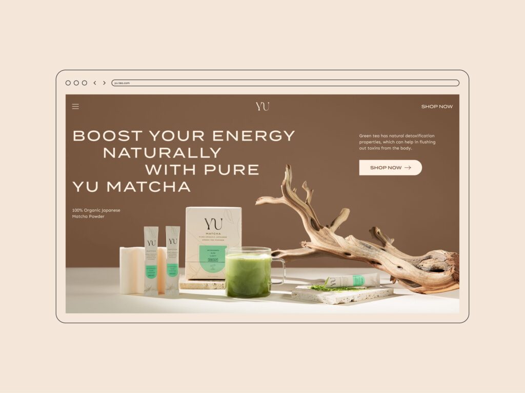
Range navigation follows from the pack’s variant system. The same page explains why: “Range navigation comes next, because a brand with several variants loses sales when a buyer cannot tell them apart on screen.” If the pack separates flavours by colour, the variant selector, the collection page and the product images use the same colours in the same order. Our article on packaging a range across many variants, sizes and formats covers how that variant system is built on the pack.
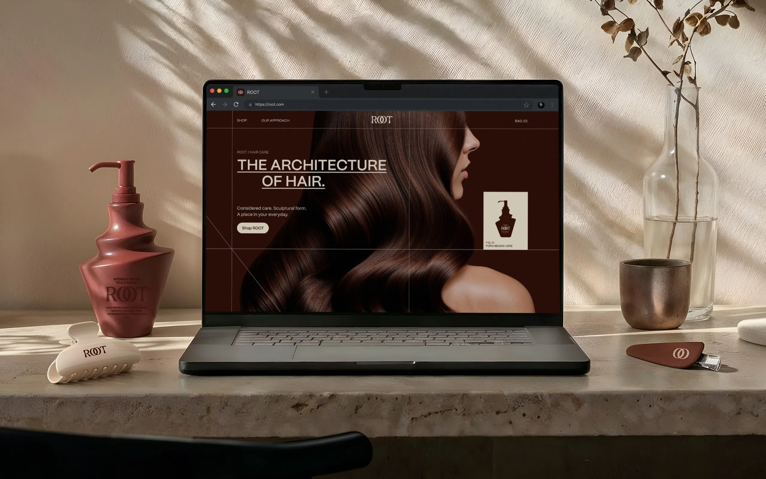
Layout matters as much as colour. For the ROOT haircare website, published as a case study in October 2026, “The website was built around a modular responsive grid, allowing the same visual logic to move consistently between desktop and mobile.” On MUUM, the service page records that we shortened the steps between finding a product and buying it, and arranged the mobile layout for one-handed use.
Keep the words on the page and the pack the same
The words carry over too. The product name, the descriptor and any claim printed on the pack should read the same on the product page, so a buyer comparing the 2 finds no difference.
This matters most in regulated categories. Our service page states it for supplement brands: “the claims allowed on a product page are the claims allowed on the label.” We keep the 2 surfaces consistent instead of writing them separately, so a claim that was removed from the label does not survive on the website.
Shopify’s brand settings hold 2 short texts that travel across channels: a slogan, which “can be up to 80 characters long”, and a description that “shouldn’t exceed 150 characters in length.” Shopify notes one limit: “Brand assets can’t be localized based on market or language.” A brand selling in several markets sets market-specific logos in the theme instead.
How MarkaWorks carries packaging into a store
MarkaWorks is a branding agency for product brands, and our web and digital work sits with the same team as the packaging. Our service page counts 13 published case studies in this area, and lists the store as one of the surfaces we hand over: “Storefront, range navigation, product pages; Shopify builds included”. More are on our web and digital design page.
Glowie is the direct example: identity, packaging and store were designed together, and the case study states that “The e-commerce build runs on Shopify.” Its art direction kept “packaging, site, and content” reading as one brand. The ROOT haircare website shows the same move from the other side, a store designed after the packaging: “The ROOT digital experience extends the identity from packaging into a complete commerce environment.”
When we start a store from finished packaging, the order is the one in this article: the values inventory, colours and type in the theme, the logo set, photography, then product pages. Design tokens make the result maintainable. Our service page defines them as “the color, spacing and type values stored by name in one file the developers read”. To plan a store around your packaging, start from our contact page.
Questions brand owners ask about packaging and Shopify
Can a Shopify theme use the same font as our packaging?
Yes, if the font licence covers web use. Shopify lets you choose a system font or add a custom font for headings and body text. Shopify notes that system fonts avoid extra downloads, so some brands use the pack font for headings only.
Where do brand colours go in Shopify?
In 2 places. Brand assets, under Settings and General, hold primary, secondary and contrasting colours for channels and apps. The theme’s color schemes apply background, text and button colours to sections of the store.
Do print colours and screen colours match automatically?
No. Print colours are specified for ink on a material, while screen colours are HEX values. The 2 are matched on calibrated proofs and checked against a printed pack before the store goes live.
Should product photos be taken before or after the packaging is printed?
Photography is planned against the final pack artwork. If the pack is not printed yet, 3D renders can stand in, as they did for Roadster Coffee, and are checked against the first printed proofs.
Can MarkaWorks build the Shopify store as well as design it?
Yes. Our website and digital design page states that we design and build sites, Shopify stores included, and that clients with their own developer receive the design system and the components instead.
Colour build, type, logo set, product photography, range navigation and claims: how the values on the pack become the settings of the store.
More brands we brought to life: