Updated November 2026
Color, Typography, Grid Systems
Color, typography and grid systems are the visual rules of a brand: the colors it uses, the fonts that carry its voice and the layout structure under every format. They form one stage of the MarkaWorks brand strategy work, and the 10 brand cases on this page show what stays fixed across a range, how a type pairing holds the voice and how a grid keeps every format in order.
In the four ranges in the first section below, the structure is the constant and color is the variable, so a new product enters the system without a new layout. For Holme, color, typography and form were developed in parallel, which is why the same rules hold on a catalogue page, a product page and in brand communication.
Four rules from our case pages
- Color that tells a range apart
- A type pairing that sets the voice
- A grid under every format
- Color, type and form decided together
What stays fixed across a range
A product range is where color has the most work to do. Each card below sets one range from our case pages next to the line on that page that says what stays fixed and what changes. The line on every card is quoted from the case page.
Rally
- Stays fixed
- The structural layout
- Changes
- The accent color
Each variant uses the same structural layout while changing accent colour, allowing Original, Blood Orange and Ginger Lemon to feel distinct without fragmenting the range.
Fluxus
- Stays fixed
- The layout
- Changes
- Color and pattern
We renewed the pattern approach and rebalanced the palette so that difference between coffees is carried by color and pattern rather than by redrawing the layout each time.
Arc Co
- Stays fixed
- The information zones
- Changes
- The color of each origin
Coffee name, country, variety, process, altitude and tasting information are organised into clearly defined zones, while colour is used to differentiate origins without changing the underlying structure.
Nuvite
- Stays fixed
- The structure around each product
- Changes
- The color of each product
Each product carries its own color personality while the structure around it stays fixed, which means the range can grow without a new design decision each time and a shopper can tell two products apart at a glance while still reading them as one family.
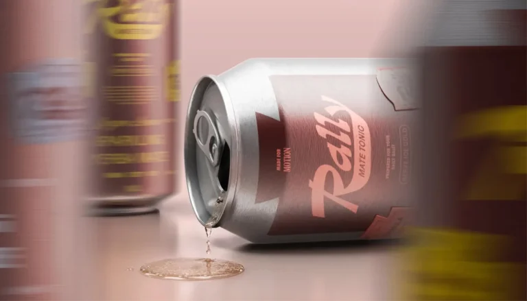
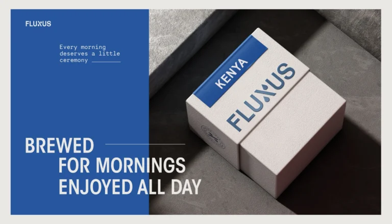

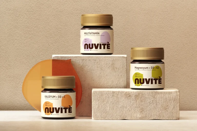
In all four ranges the constant is the structure and the variable is color, so a new product enters the system without a new layout.
A type pairing that holds the voice
Type carries the voice before a word is read. BARS is built on a disciplined typographic structure: the hierarchy sits in the type, soft neutrals and controlled blue hold the tone, and black appears only as an anchor.
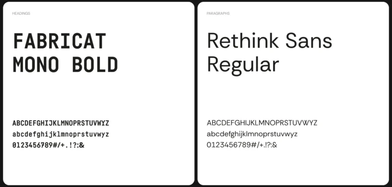
For MUUM we paired a serif with a rounded sans. A serif alone would read as formal, a rounded sans alone as childish, and the combination lands where the brand needed to be.
On Fluxus packs the type holds a reading order. Origins and roast profiles come in a fixed order, and the typographic hierarchy lands the eye on the origin first, so product names, roast details and tasting notes stay readable on pack.
A grid under every format

A grid is what keeps a pack, a page and a post in the same order. For La Mama, clear hierarchy, generous spacing and structured grids are not styling choices: they are how the brand demonstrates the kind of care it talks about.
BARS runs its social content, posters and web layouts on a modular grid system, which keeps consistency and structure across all platforms. For AKME Performance, structured grids sit next to the geometric wordmark and PP Mori typography in a controlled foundation, and in the photography the grid becomes part of the imagery rather than an overlay.
On screen the grid does the same job. MarkaWorks built the Solanki site on a structured grid and spacious layouts, with deep navy holding authority and warm gold marking investment value.
Color, type and form together
Holme shows why the three are decided at once. Color, typography and form were developed in parallel rather than in sequence: when type is chosen after a palette is fixed, the two end up negotiating.
Because the three were resolved together, the same rules survive all three without needing a separate set for each. On the Holme site, typography, color palette and spacing were selected to support a tactile and architectural feel, and layout decisions follow proportion and balance, so each product has its own visual space.
- Color
- Typography
- Form
Developed in parallel, not in sequence

From color and type to the rest of the identity
Color, typography and grid systems sit inside our brand strategy and visual identity work. Our logo and identity design page shows the marks these rules are built around, and our brand guidelines page shows how the rules are written down so they stay stable.
Three of our articles go into the details: whether a brand palette passes a contrast check, why a brand color shifts in print and what a font license actually allows.
Frequently asked questions
Either. Our brand strategy work covers positioning, naming, brand identity design as a system and the guidelines that keep it stable, together or one at a time. In the cases on this page the palette, the type and the grid are set with the marks they support, as with the geometric wordmark, circular monogram and structured typographic language of Arc Co.
Because each one changes how the other reads. For Holme, color, typography and form were developed in parallel: when type is chosen after a palette is fixed, the two end up negotiating, and resolving them together lets the same rules hold across all three.
By keeping the structure fixed and letting color change. Rally keeps the same structural layout and changes the accent color for each variant, Arc Co keeps its information in clearly defined zones and gives each origin its own color, and at Fluxus a new origin enters the system without a new design.
It keeps every format in the same order. BARS uses a modular grid system across social content, posters and web layouts, and for La Mama clear hierarchy, generous spacing and structured grids make everything feel intentional and easy to navigate.



A first call about your brand
Tell us in a first call where the brand stands today, or ask for a written proposal; either way we come back with a suggested scope.
Talk to an expert now