Rebrand the packaging and the website as one project with 2 outputs. Fix the colour codes, typefaces and photography rules once, decide what must stay recognisable, design both surfaces against those rules, then switch the site when the new pack can be bought. If page addresses change, map each old URL to its new one with a 301 redirect before launch.
Why the pack and the site belong in one rebrand
A product brand is seen in 2 places that are designed by different people more often than not: on the shelf or in the parcel, and on the screen. Our website design page puts it simply: “A shopper meets a product twice: as a photograph on a screen and as an object in a hand.” When the 2 meetings look like 2 brands, the shopper has to work out whether they are buying the same thing, and some of them will not bother.
Rebrands make this worse because they rarely land on both surfaces at once. A brand orders new packaging, the printer has a lead time, and the site is left for later. Or the site is redesigned first because it is quicker to change, and for months the product photographs show a pack that no longer matches the one in the box. Each surface can be well designed and the brand can still look inconsistent, because the problem sits between them.
Treating the pack and the site as one project means 1 set of decisions is made first and both surfaces are designed against it, even when different people draw them. The rest of this guide follows that order: the shared system, what stays, how each surface carries it, when each one switches over, and how to keep the search traffic the old site earned.
Start from one system: colour, type and photography
The shared system is short when it is written down properly. It names every brand colour with its screen value and its print value, the typefaces and the role of each, the rules for photography and image style, and how the logo behaves at small sizes. If the brand already has a guidelines document, the rebrand updates it; if it does not, this is the moment to write one, and our guide to the brand guidelines document lists what goes in it.

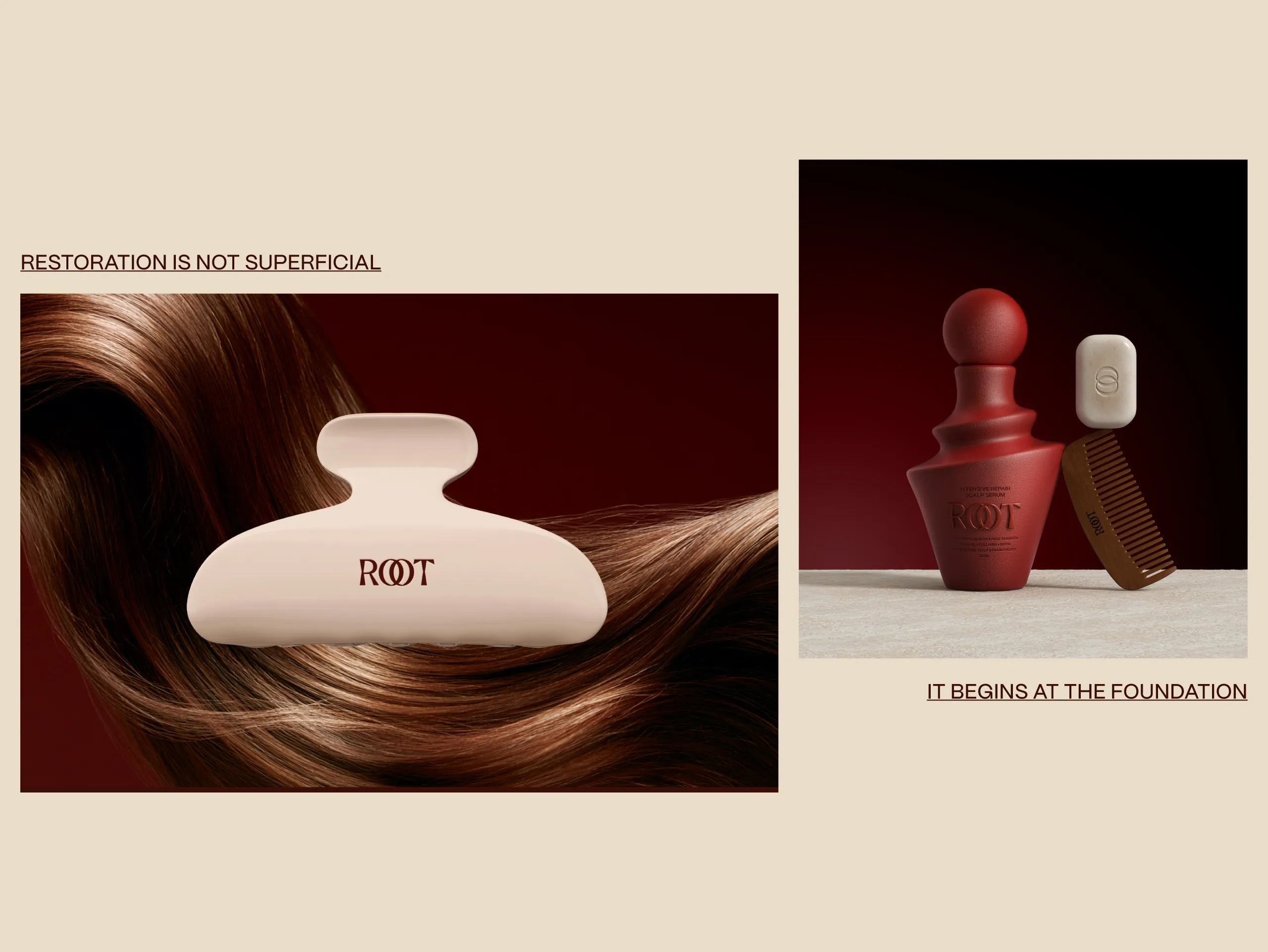
Colour is where the 2 surfaces drift first, because print and screen use different values for the same colour. Our ROOT hair care identity names 4 colours and gives each a HEX value for screen and a Pantone reference for print: Walnut Husk (#35110A, Pantone 4975 C), Rosewood (#AA8979, Pantone 4725 C), Cedar Clay (#935A44, Pantone 6035 C) and Oat Silk (#E7DCCA, Pantone 7527 C). With both values on one sheet, the printer and the web developer start from the same colour, and nobody has to pick a screen colour by eye from a printed sample.
Type needs the same care. On the pack, ROOT pairs a custom serif wordmark with restrained sans-serif typography, fine rules and open grids. On the ROOT website, the case study says “PP Mori creates continuity between headlines, navigation and product information”, and “deep walnut tones and warm neutrals provide continuity with the physical brand.” The site takes the colours and the structural ideas of the pack and applies them to a grid that works on a phone.
On the website side, these values work best when the developer stores them once. Our website page describes design tokens as “the color, spacing and type values stored by name in one file the developers read”, so a later colour change moves through the whole site in 1 step.
Decide what changes and what stays
Every rebrand of a product that is already on sale has an audience that knows the old version. The pack is how they find the product on a shelf, and the site is where they reorder it. Before anything is redrawn, list the elements those buyers rely on: the logo or wordmark, the main colour, the pack shape, the product names and the way the range is organised.
Our Fluxus Coffee case study describes the risk in 1 line: “The risk is that the brand stops being recognizable to the people who already buy it.” In that project the existing wordmark and its geometric language stayed, and the work went into the parts of the system that had to carry a larger range. Most rebrands sit somewhere between a full change and a refresh, and the list of what stays is what tells the 2 surfaces how far to move.
The same list applies to the website, where the elements that survive are often invisible: the page addresses that already earn visits, the product names people search for, and the page titles that appear in results. A rebrand that renames every product and moves every page at once makes the brand harder to find on both surfaces in the same month.
Printed stock is the other constraint. If the warehouse holds packs in the old design, the site has to sell those packs for a while. We cover counting stock, barcode changes and phasing in our guide to rebranding without wasting packaging, and those decisions set the earliest date the site can show only the new pack.
Design both surfaces to the same rules
Once the system and the list of what stays are agreed, the pack and the site can be designed in parallel. Parallel work is faster, but only if both teams check their work against the same rules rather than against each other’s latest file.
The pack has constraints the screen does not: a fixed shape, mandatory information, print methods that limit fine detail and colour. The site has its own: small screens, loading speed and product pages that must carry more information than the front of a pack. The shared rules decide what each surface may adapt. A typical split is that the colour values, the typefaces and the logo are fixed everywhere, while the layout and the amount of text change by surface.
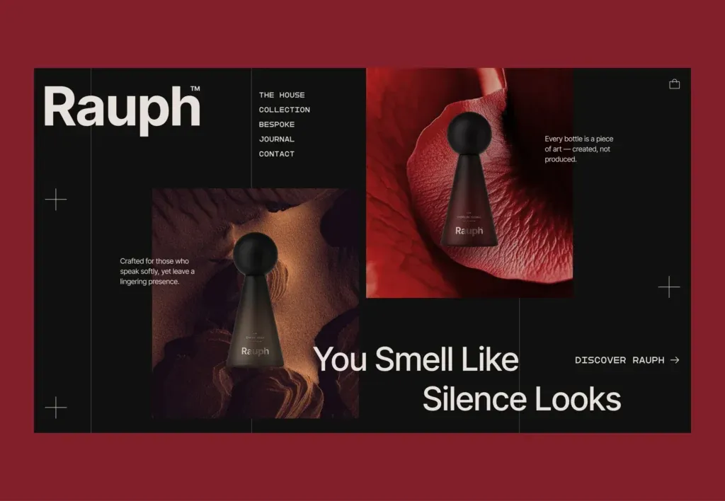
Our Rauph UI case study, for a perfume house, shows the same idea from the website side. The case study says: “We built every surface, from packaging to the digital experience, to the same rule, so the restraint reads as intent rather than as absence.” The homepage carries the brand line, the colour and the bottle photography from the packaging work, laid out for a screen.
Product photography is the piece that ties the 2 together, and it needs the new pack. If the packs are still at the printer, the site can launch with renders made from the print files, which is common for a rebrand on a tight date. We compare the 2 routes in product photography vs 3D rendering. Whichever route is chosen, every image on the product pages should show the pack the customer will receive.
Choose the launch order
There are 3 common ways to sequence the switch, and each one moves the inconsistency to a different place. Which one is right depends on the printer’s lead time, the stock of old packs and how much of the brand’s sales come through the site.
The order we usually recommend is to keep the site on the old look until the new pack can be bought, then switch the site, the product photographs and the pack in the same week. That keeps the photograph and the parcel in agreement for every order. If old stock will sell alongside the new pack for a while, the product page can say so plainly, so a customer who receives the old design knows it is the same product.
Some brands launch the site first because a rebrand announcement needs somewhere to point. That works if the product pages show the pack that is being shipped, even when the rest of the site is new. Launching the new pack first and the site months later is the order that most often happens by accident, and it is the one to avoid: customers see one design on the screen and receive another. Our guides to what a Shopify website needs before launch and carrying packaging design into Shopify cover the store side of the switch.
Keep search traffic through the change
A visual rebrand does not have to touch the site’s addresses. If the URLs stay the same, search engines see new content on familiar pages, and there is nothing to redirect. Addresses usually change when the brand name changes, when the domain changes, or when products are renamed and their pages get new slugs.
When addresses do change, Google’s site move guidance starts with a list: “Prepare a URL mapping from the current URLs to their corresponding new format.” Every old product, category and article page gets 1 new destination, and the server redirects each old address to its new one. Google’s redirect documentation explains that permanent redirects, the 301 and 308 status codes, are used as a signal that the redirect target should be canonical, and the site move guide states that “301 and other permanent redirects don’t cause a loss in PageRank.” Submitting an updated sitemap helps Google find the new addresses sooner.
Product images need the same attention, because a rebrand replaces most of them. Google’s image guidance says that “Google uses alt text along with computer vision algorithms and the contents of the page to understand the subject matter of the image”, and it recommends descriptive file names over generic ones. When the new pack photographs go up, name the files after the product, write alt text that describes the new pack, and remove the old pack images from the pages so the 2 designs do not appear side by side in image results.
After launch, check the redirects and the indexed pages for a few weeks. Our guide on how to measure whether a rebrand worked lists what to compare before and after.
| Launch order | When it suits | What the customer sees | What to watch |
|---|---|---|---|
| Pack and site in the same week | The new pack can be bought on a known date | The same design on the screen and in the parcel | Photographs or renders of the new pack must be ready before the switch |
| Site first, pack later | The rebrand needs a launch page before the packs arrive | A new site with product pages that still show the pack being shipped | Product photographs stay on the old pack until the new one ships |
| Pack first, site later | Rarely chosen on purpose; usually a delayed site project | One design on the screen and another in the parcel | The gap between the 2 dates; keep it as short as possible |
How MarkaWorks rebrands a pack and a site together
MarkaWorks is a branding agency for product brands, and identity, packaging and web design are separate disciplines held by separate people on 1 team. That makes the shared system the working document for everyone. Our website page states the rule we work to: “We design the site on the identity your brand already uses, and when a brand also sells a pack, the site and the pack agree.”
For an existing site, our website page also explains the order: “We audit the current site against the brand system first, then improve the pages that carry the most traffic before touching anything structural.” On the ROOT project, the packaging case study and the website case study are 2 halves of one system, and the website case study describes the result as an experience that “extends the identity from packaging into a complete commerce environment.”
To plan a rebrand across both surfaces, see our services for brand strategy and visual identity, packaging and product design and website and digital design, or start from our contact page.
Questions brand owners ask about rebranding packaging and a website
Should the website or the packaging be redesigned first?
Design them in parallel against one shared system, then switch both in the same week once the new pack can be bought. If the site has to launch first, keep its product photographs on the pack that customers will receive.
Does a rebrand hurt search rankings?
A change of look on the same addresses usually does not change much for search. Risk comes from changed URLs without redirects. Map every old address to its new one and use permanent 301 redirects, which Google says do not cause a loss in PageRank.
Do the colours on the pack and the website have to match exactly?
They should come from the same brand colour, defined twice: a HEX value for screens and a Pantone or CMYK reference for print. Screen and print reproduce colour differently, so both values sit side by side in the guidelines.
Can the website use different typefaces from the packaging?
It can, if the guidelines give each typeface a role. Many brands keep the logo and headline face on both surfaces and use a separate text face on screen. Check the font licence covers web use before the site is built.
What happens to product photos when the pack changes?
They are replaced, ideally on the day the new pack ships. Renders made from the print files can stand in until photography is done. Give the new image files descriptive names and update the alt text to describe the new pack.
One set of colour, type and photography rules for both surfaces, a launch order that keeps them in step, and the redirects and product images that protect the traffic the old site earned.
More brands we brought to life: