Updated October 2026
Nutrition and wellness branding: 25 case studies
This page collects 25 case studies across three shelves: 9 in nutrition, 11 in sports nutrition and 5 in wellness. The shared problem is a label that has to order more information than most food packaging, in a range that grows quickly and is usually bought on repeat, so the pack has to answer “which one” faster than “which brand”.

Holding the middle of the shelf
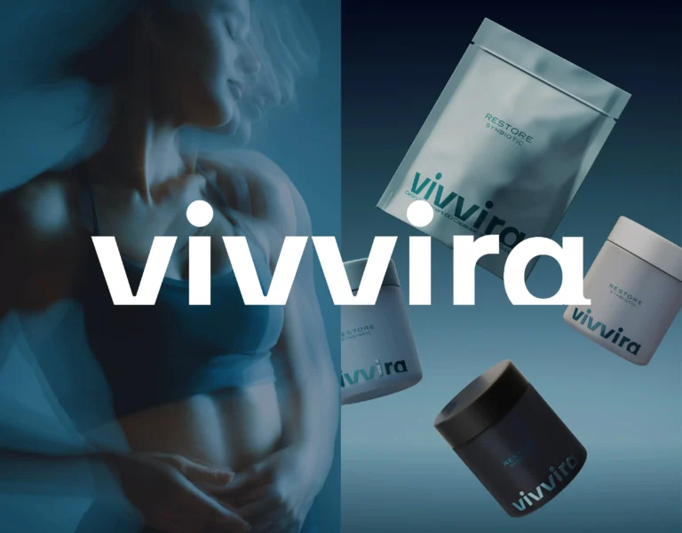
Nutrition and wellness branding is the identity and label system for products that carry mandatory information on a small surface and are bought on repeat, so the pack has to be trusted at arm’s length and found again in a growing range. Most brands in this aisle lean one of two ways, sterile and clinical or loudly lifestyle driven. The brief on Elevated was to hold the middle: a geometric, rounded, lowercase logotype, minimal labels, a subtle metallic cap and layered transparency that lets the product become part of the design. Vivvira came with a constraint we agreed with immediately, no pharmaceutical cues, so the system was built around clarity and calm, a soft blue palette and typography that carries the information without dressing it. META BIO moved the references sideways, to laboratory environments and biomedical materials rather than the visual shorthand of medicine. Resetcare resolves vitality and reliability by placing the energy in the palette and keeping the mark sleek.
Labels built for ranges that grow
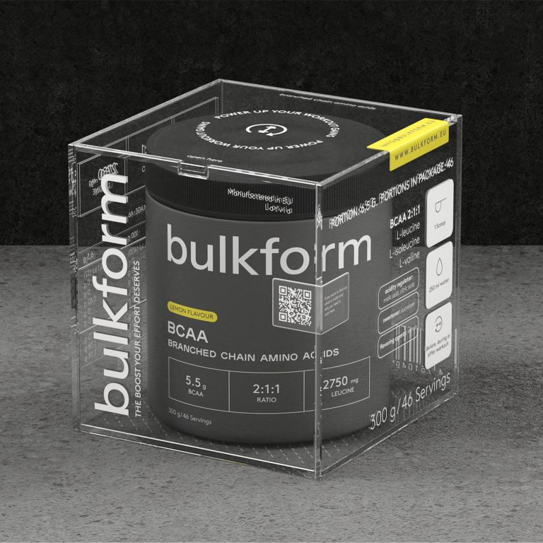
On a shelf bought on repeat, a color that maps to a product line shortens the reorder to a glance. Bulkform uses black and white for the base and neon yellow and burgundy to separate product categories. GreenWhey’s structured labels and color coding let a buyer read protein type and functional use at once across whey isolates, plant proteins, amino acids and vitamins. Better separates proteins and amino blends with geometric patterns and bold color blocks inside one system, and its greens and blues stand apart from a shelf that defaults to black, red and metallic. Wildbars generates each flavor’s pattern from one color and its shades, and SNAX organizes flavors as a modular grid of saturated tones against sterile neutrals, because a bar is small, stacked densely and chosen in a hurry. Birtz color codes the range so a woman moving from fertility to hormonal balance moves inside one brand rather than checking every label; its secondary mark carries the line “Nourishing women, inspiring lives”.
Wellness without the usual cliches
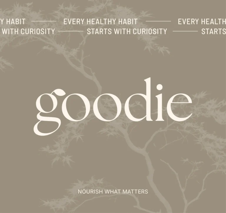
Goodie is built on an idea its page states in its own words: “wellness should feel like a positive daily habit, not a response to a problem”. Instead of the conventional greens, its palette pairs sand and linen with stone and dark wood, and the hierarchy is flexible enough to cover several product formats. Natura runs four color families in one palette, earthy neutrals, calming greens, deep blues and coral, so the range can grow without the family breaking. Bloomy Wellness serves two audiences at once, the parents who buy and the children who use, with the letters “o” turned into emblems and product names set at least as prominent as the brand. Awelly was designed for women in midlife transitions, calm and trustworthy without becoming muted. Serenique gives every product its own name and visual treatment inside one family look, rooted in nature and supported by science.
Cases by product type
| Product type | Cases on this page | Examples |
|---|---|---|
| Nutrition and dietary products | 9 | Nutrio, Elevated, Vivvira, Serenique, Natura, Law of Nature, Vera Sambucus, Milksta, Birtz |
| Sports nutrition, protein and bars | 11 | AKME Performance, Better, Bulkform, GreenWhey, Hyfuel, Wildbars, SNAX, P01, GL Peptides, BARS, BARS UI |
| Wellness brands | 5 | Goodie, Resetcare, Bloomy Wellness, Awelly, META BIO |
The cases on this page
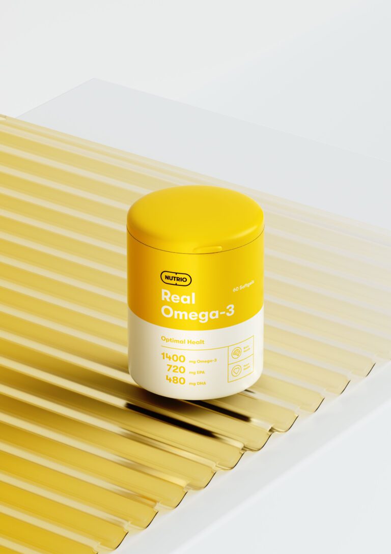
Nutrio: brand strategy, visual identity, packaging, digital experience and 3D visualization delivered as one project.
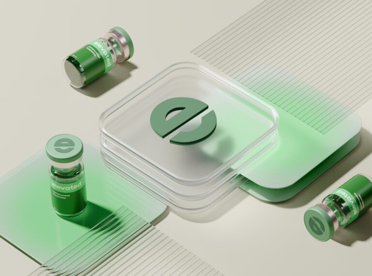
Elevated: three strategic pillars written before design, a rounded geometric logotype, minimal labels with a metallic cap.
Vivvira: no pharmaceutical cues, a soft blue system, fluid forms and atmospheric imagery.
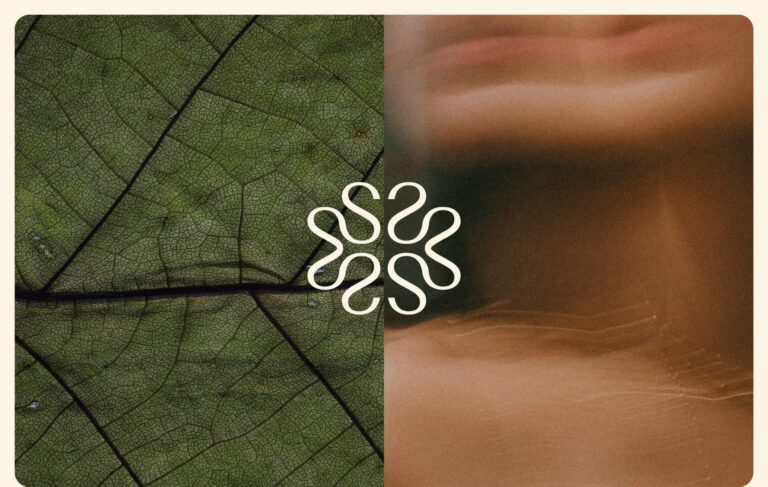
Serenique: every product with its own name and visual treatment inside one family look.
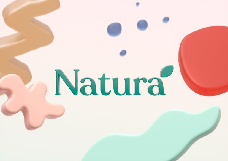
Natura: four color families in one palette, softness and movement kept in the system.
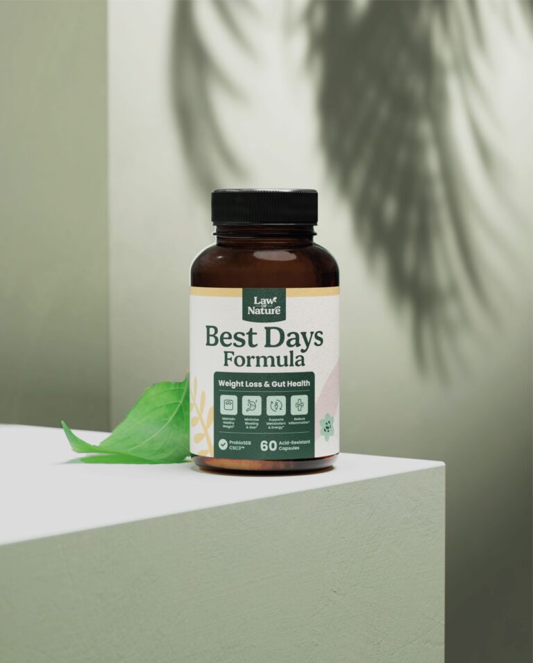
Law of Nature: a clear information hierarchy so the pack is read in one pass.
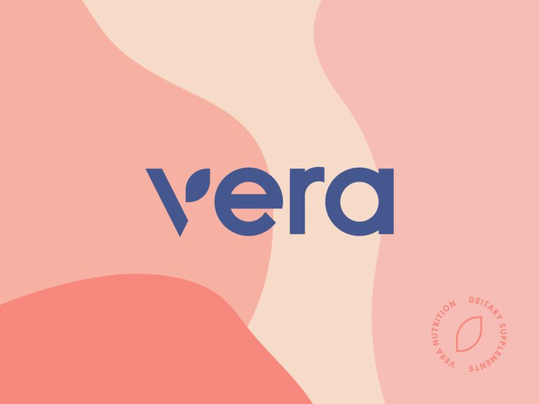
Vera Sambucus: a minimal typeface with a single leaf highlight carrying the natural origin.
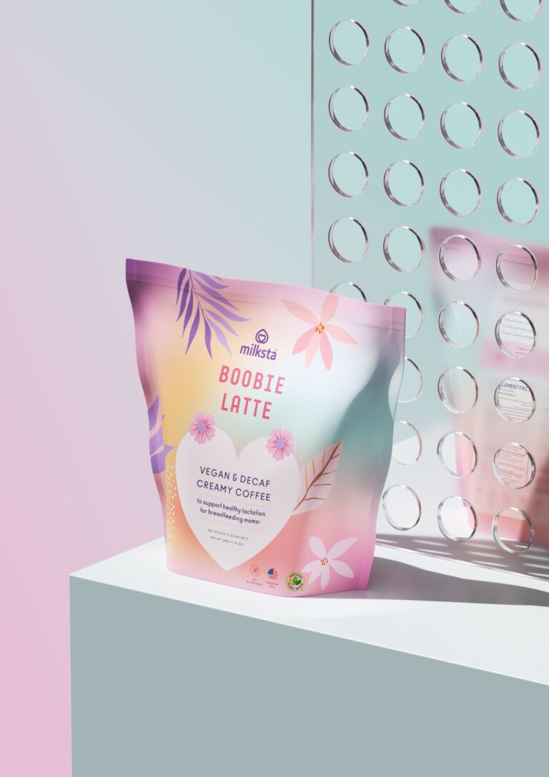
Milksta: identity and packaging for a brand made for nursing mothers, a cohesive color system across the range.
Goodie: a warm custom wordmark and “g” monogram, with earthy neutrals in place of wellness greens.
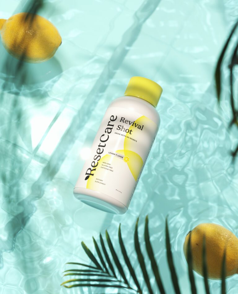
Resetcare: vitality, recovery and reliability, a sleek mark against a lively palette.
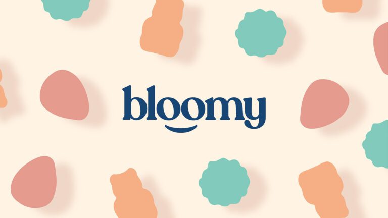
Bloomy Wellness: the “o” letters as emblems, three products separated by pastel palettes.
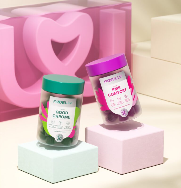
Awelly: calm and trustworthy without becoming muted, packaging that communicates through clarity.
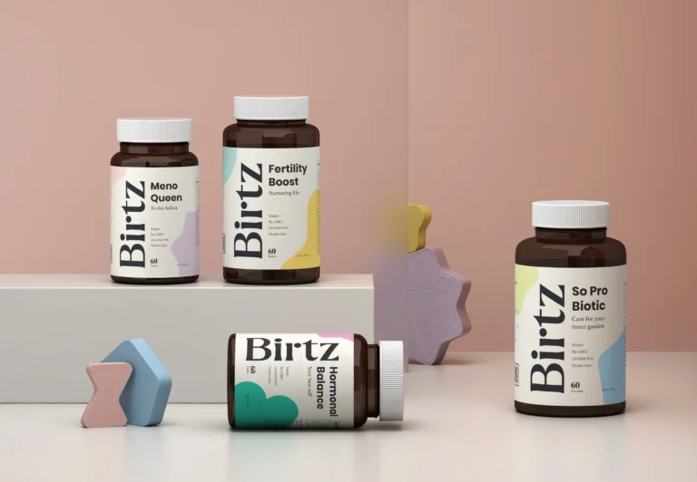
Birtz: a modern serif logotype, a vertical logotype on pack, a color coded range, 3D product visualization.
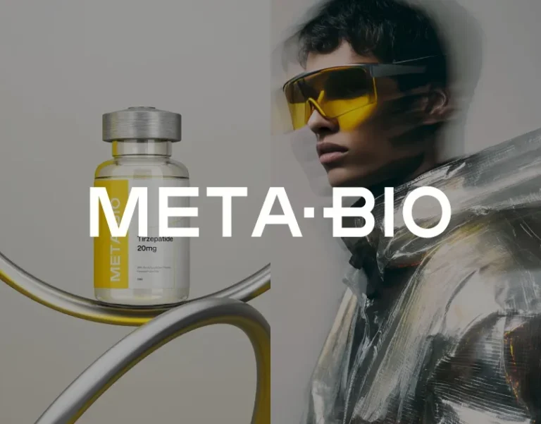
META BIO: laboratory and biomedical references, metallic gradients, soft industrial tones.
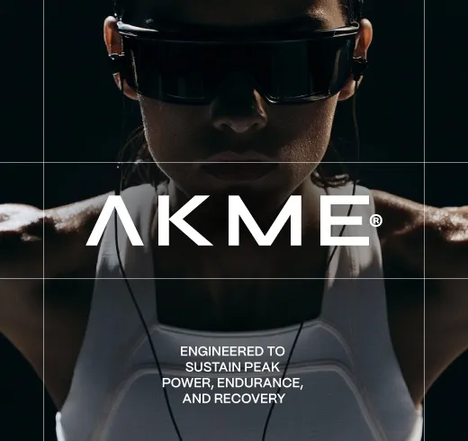
AKME Performance: a geometric wordmark whose apex “A” doubles as a standalone symbol, matte-black packs with fine color accents across creatine, protein and pre-workout.
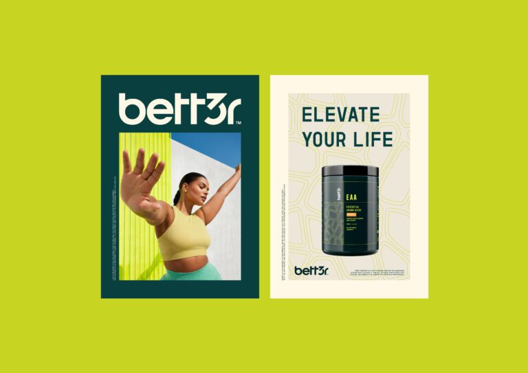
Better: a clean scientific aesthetic, greens and blues, geometric patterns per product.
Bulkform: a lowercase wordmark, black and white base with neon yellow and burgundy accents, signage and stationery in the same system.
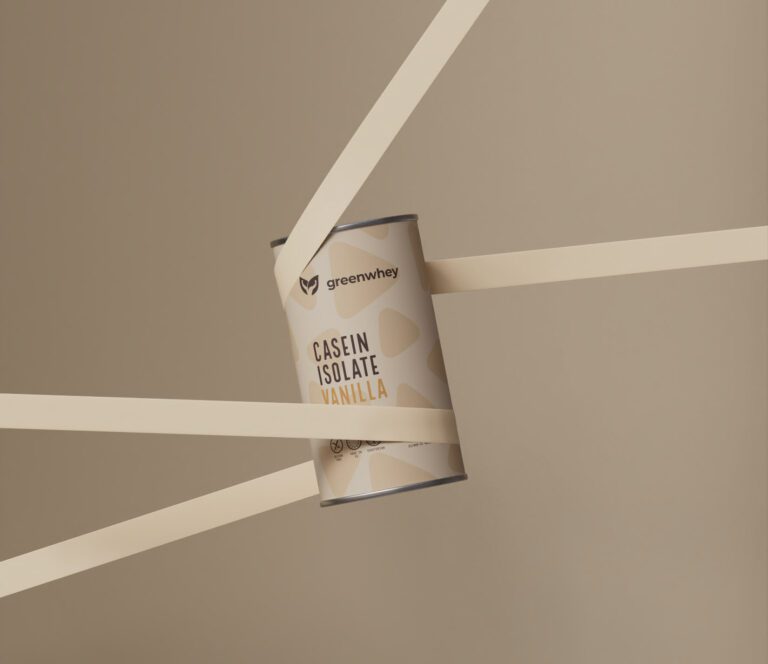
GreenWhey: structured labels and color coding across a wide range.
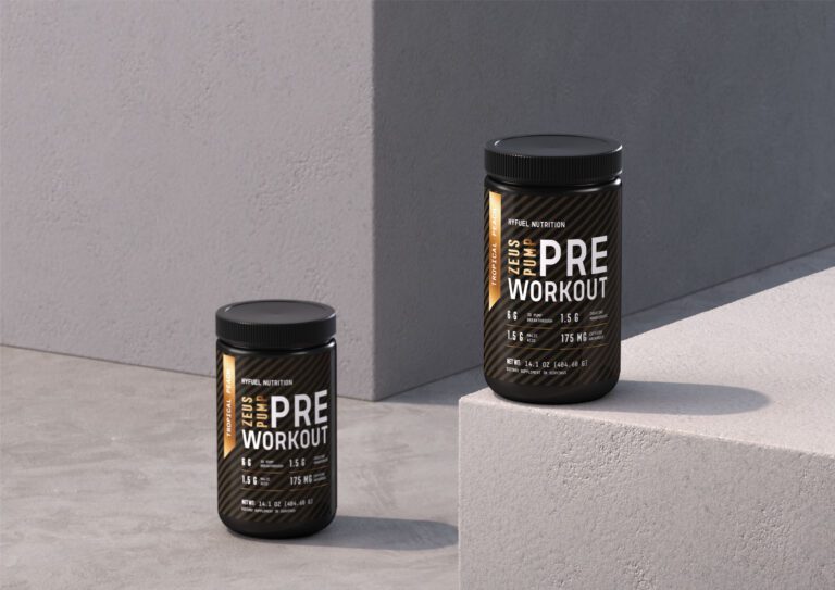
Hyfuel Nutrition: purposeful typography, geometric forms, labels ordered purpose, ingredients, usage.
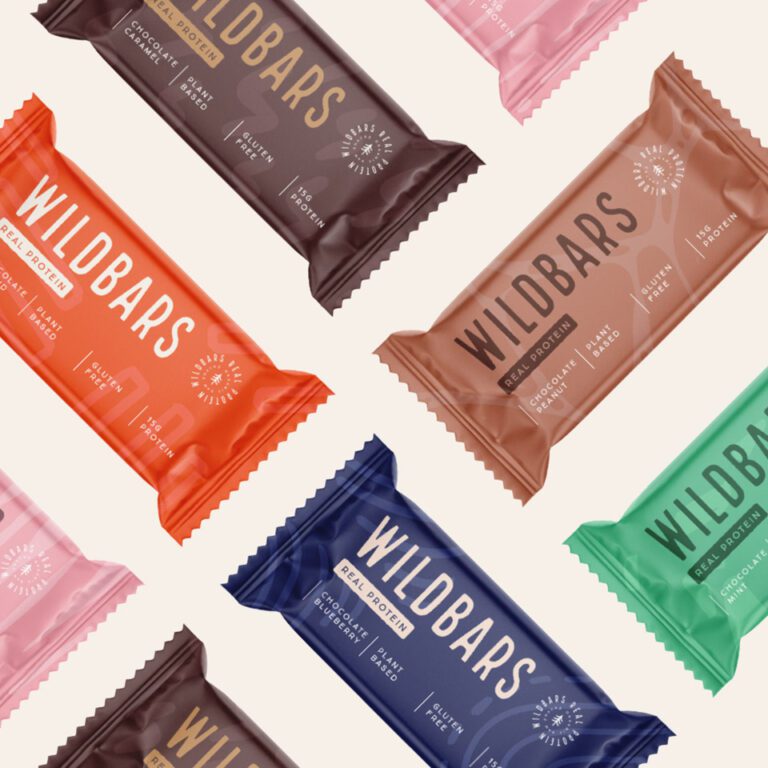
Wildbars: a bold mark with a tree emblem, a flavor keyed pattern system, a minimal wrapper layout.
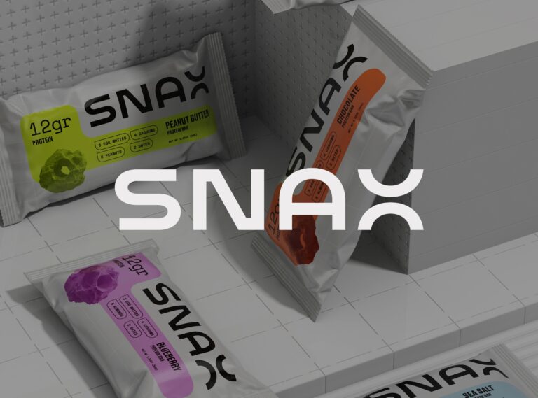
SNAX: a custom wordmark with an extended X, a modular flavor grid, bold monospaced typography.
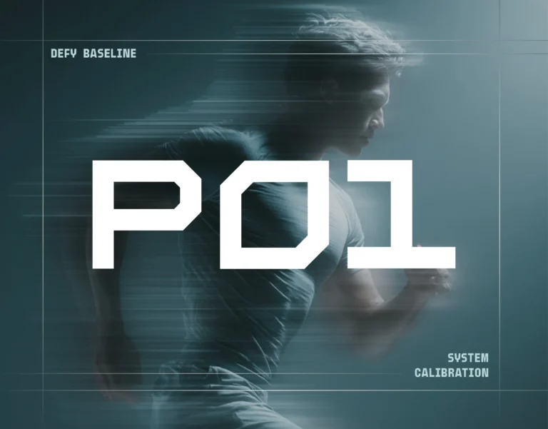
P01: a condensed geometric logotype with the character of an instrument, petroleum depth and metal in the palette.
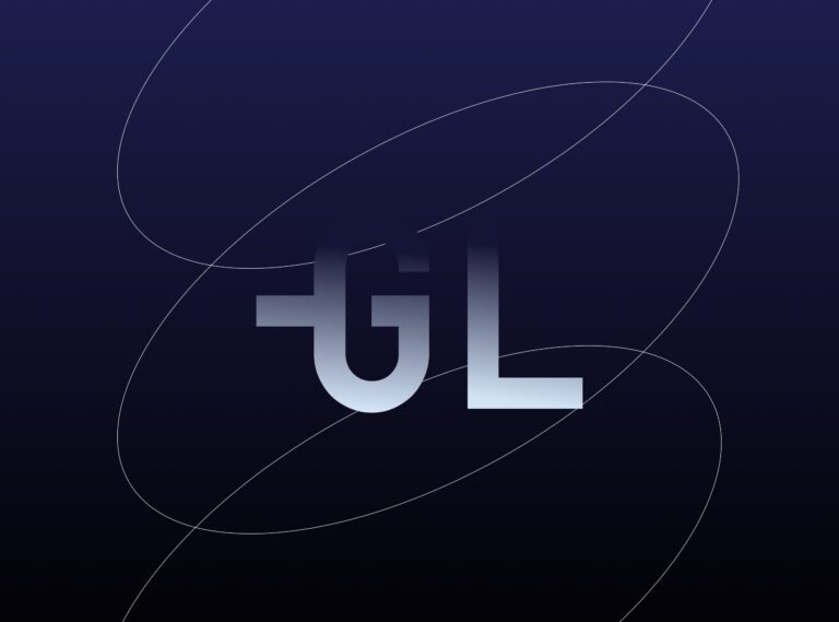
GL Peptides: clarity, consistency and credibility as pillars, across labels, packs and digital.
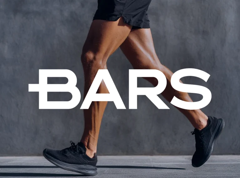
BARS: a deliberately minimal pouch, disciplined typographic structure, soft neutrals with controlled blue.
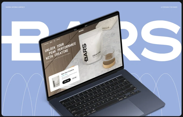
BARS UI: the same restraint carried into the website, one uninterrupted flow from homepage to product.
The questions we are asked most in this category, from choosing an agency to compliant labeling, are answered on the service page for this shelf.